Download as PDF, PPTX
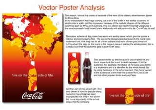

This poster analyzes a vector poster for Coca-Cola that depicts the shapes of various countries emerging from the recognizable Coke bottle. It interprets this as representing that Coke is sold worldwide. The poster uses warm, earthy colors and the trademark Coke font to positively promote the brand. The large Coke logo ensures viewers easily recognize it as an ad for the iconic brand, tapping into audience association of the bottle shape with Coca-Cola. The poster cleverly incorporates the popular nickname for Coke into its slogan.


