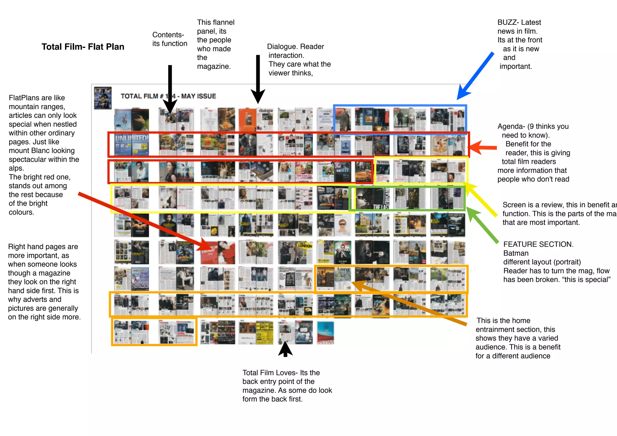
This document summarizes and analyzes the layout and sections of the Total Film magazine. It notes that the magazine contains sections for news, reader interaction, reviews, features on films, and home entertainment. The document discusses how some elements like special features are set apart through different formatting like portrait pages. It also analyzes design choices like placing most important information like advertisements and pictures on right-hand pages, as readers typically view those first. Overall, the document examines how the magazine's form and sections work to provide a varied content experience for its audience of film enthusiasts.
1. Total Film- Flat Plan
Contents-
its function
This flannel
panel, its
the people
who made
the
magazine.
Dialogue. Reader
interaction.
They care what the
viewer thinks,
BUZZ- Latest
news in film.
Its at the front
as it is new
and
important.
Agenda- (9 thinks you
need to know).
Benefit for the
reader, this is giving
total film readers
more information that
people who don't read
Screen is a review, this in benefit an
function. This is the parts of the mag
that are most important.
FEATURE SECTION.
Batman
different layout (portrait)
Reader has to turn the mag, flow
has been broken. “this is special”
FlatPlans are like
mountain ranges,
articles can only look
special when nestled
within other ordinary
pages. Just like
mount Blanc looking
spectacular within the
alps.
The bright red one,
stands out among
the rest because
of the bright
colours.
This is the home
entrainment section, this
shows they have a varied
audience. This is a benefit
for a different audience
Total Film Loves- Its the
back entry point of the
magazine. As some do look
form the back first.
Right hand pages are
more important, as
when someone looks
though a magazine
they look on the right
hand side first. This is
why adverts and
pictures are generally
on the right side more.