Download as PDF, PPTX

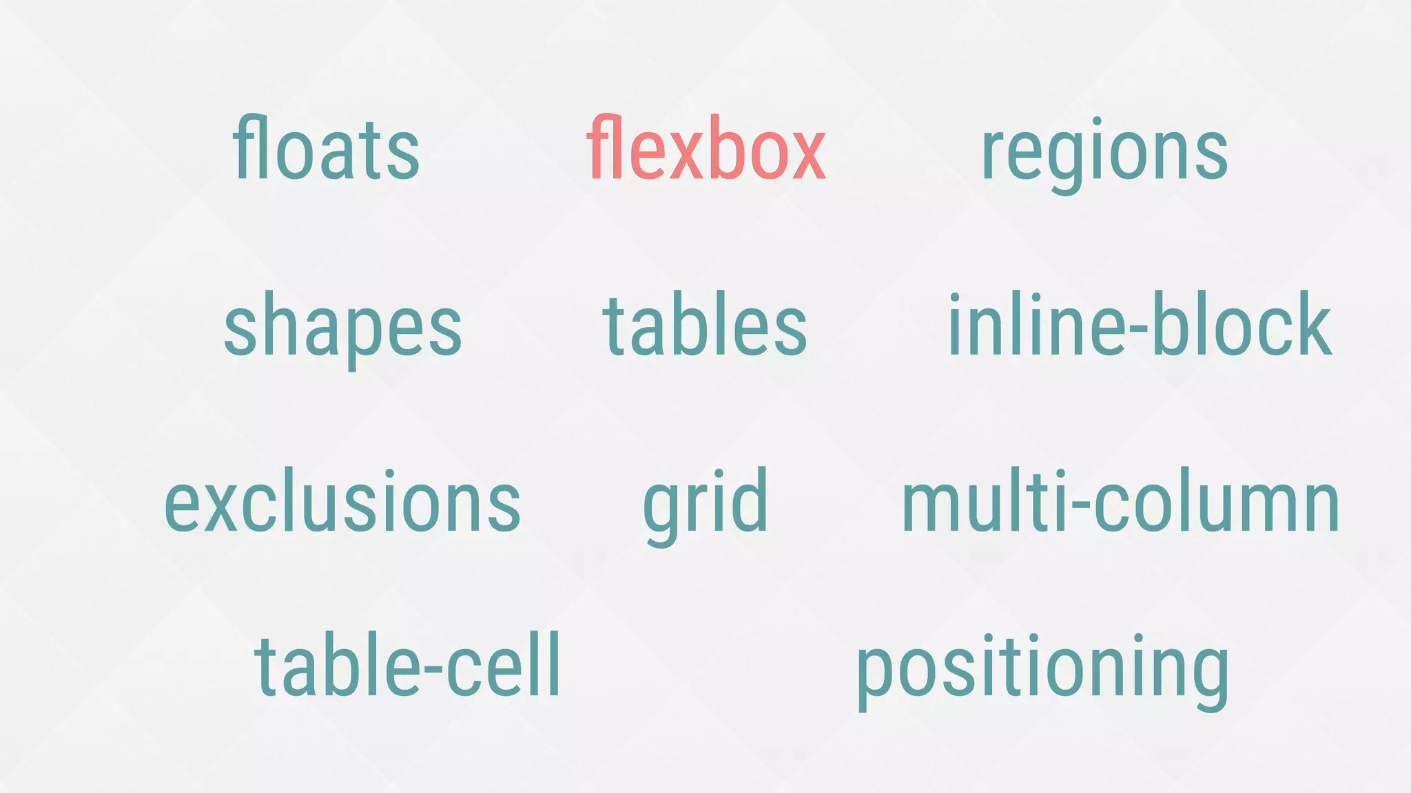
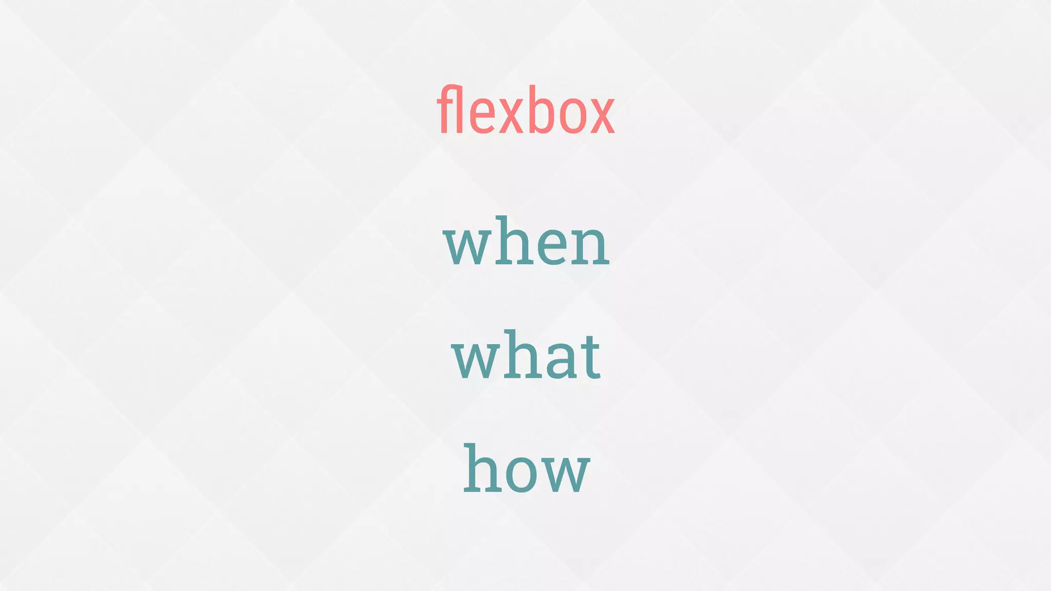
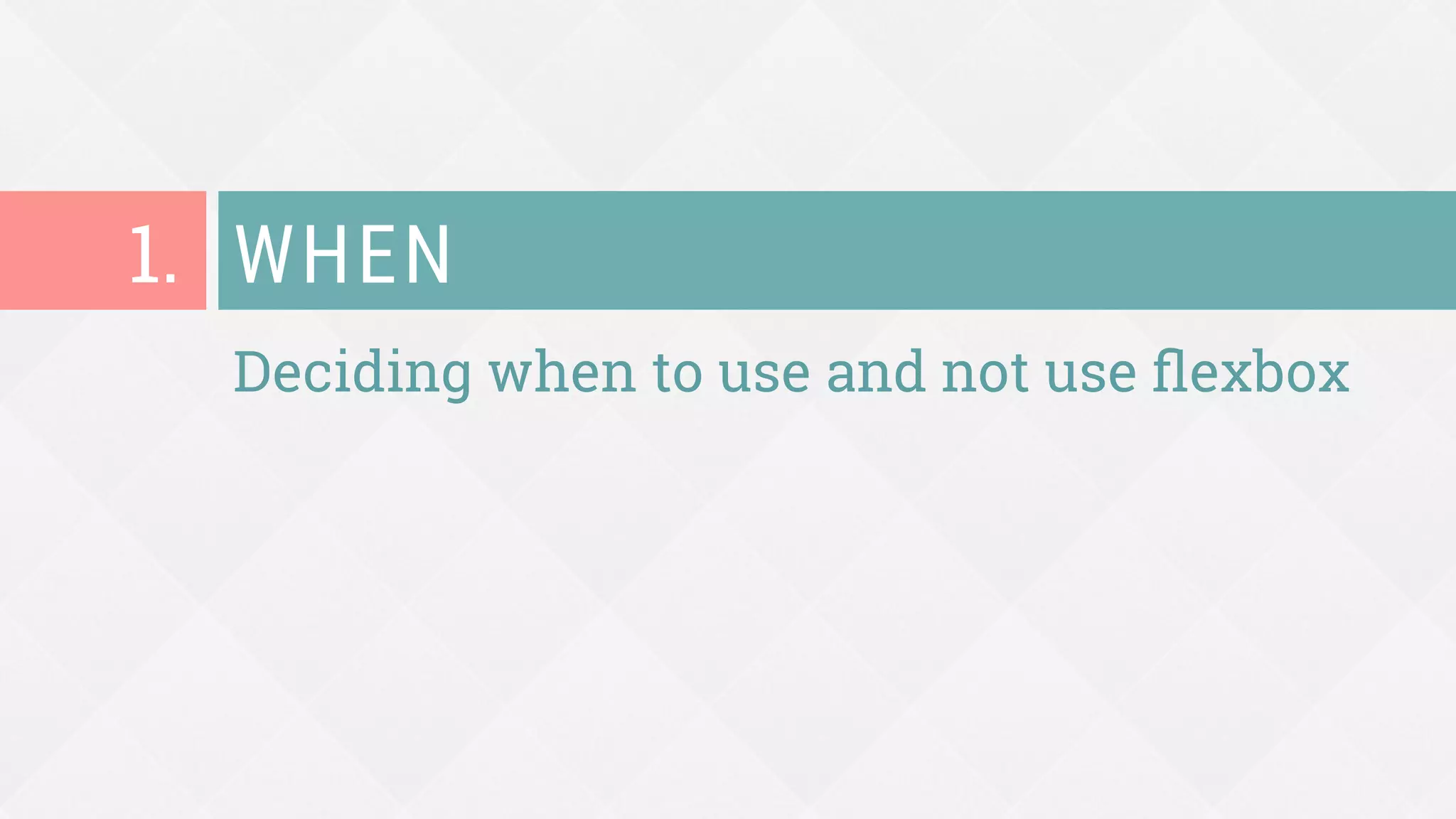
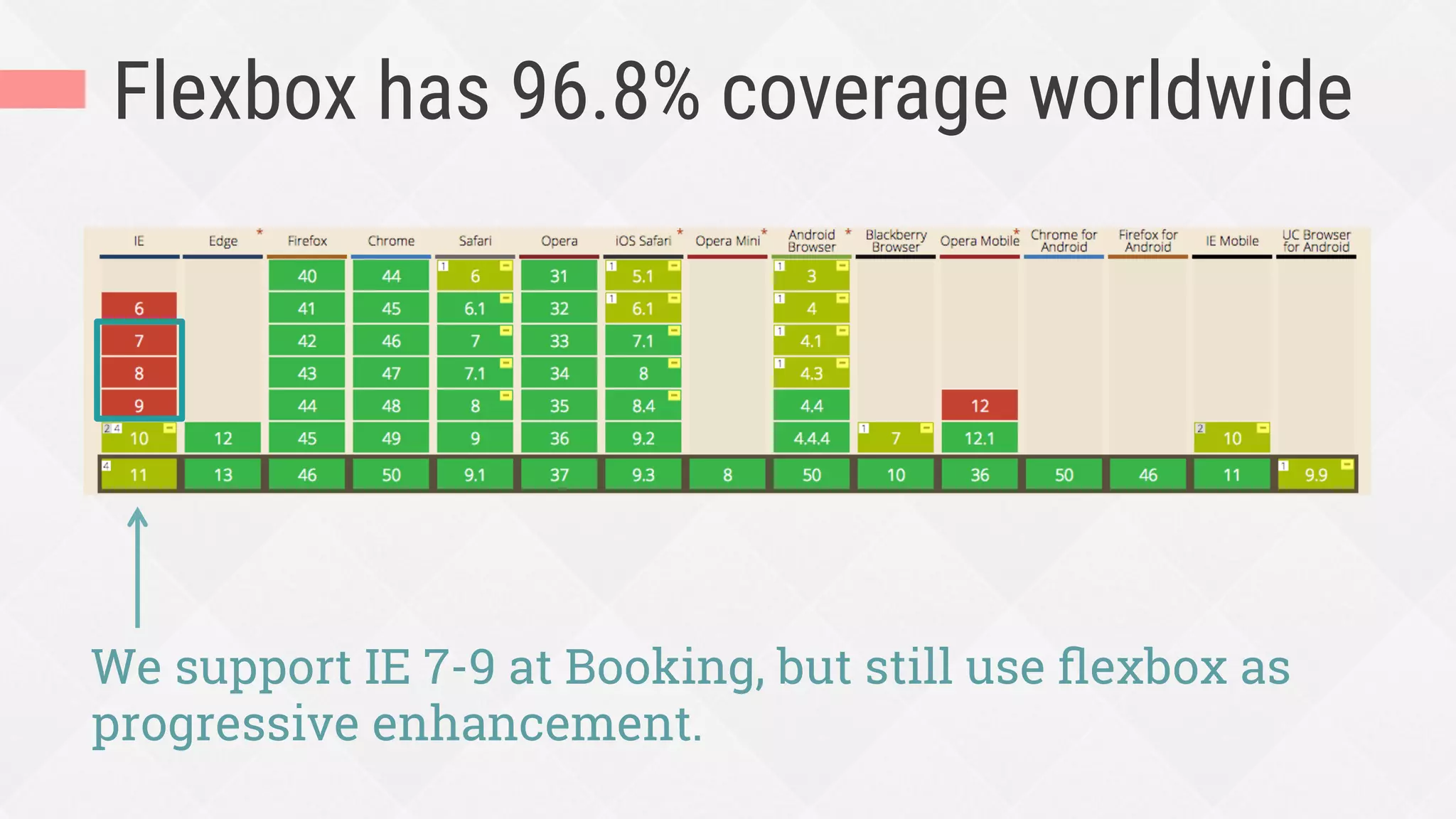
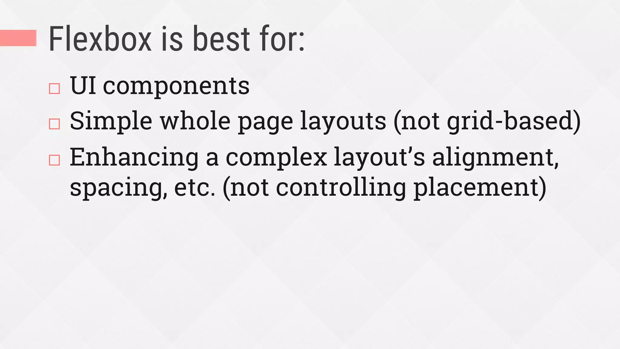
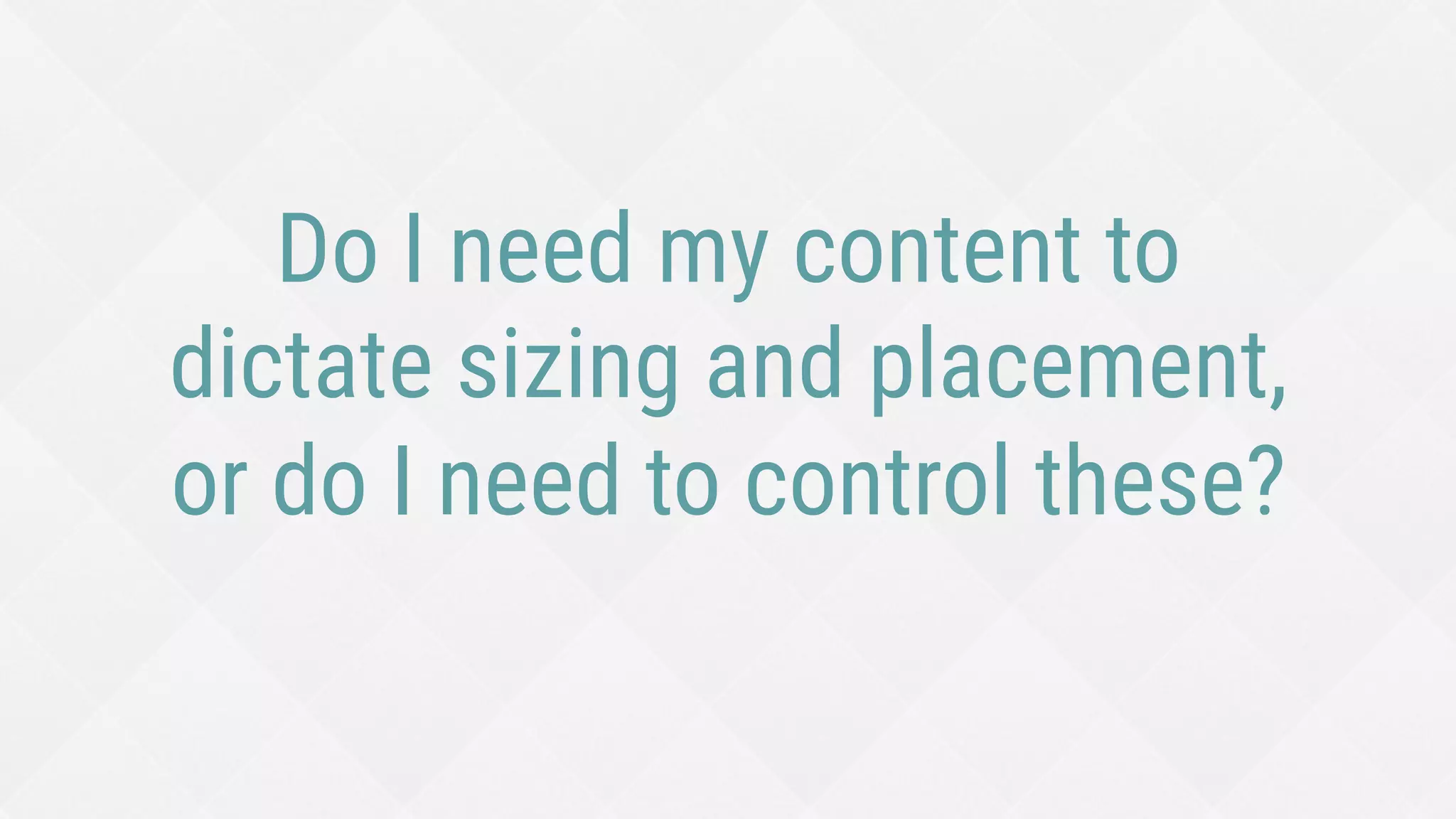
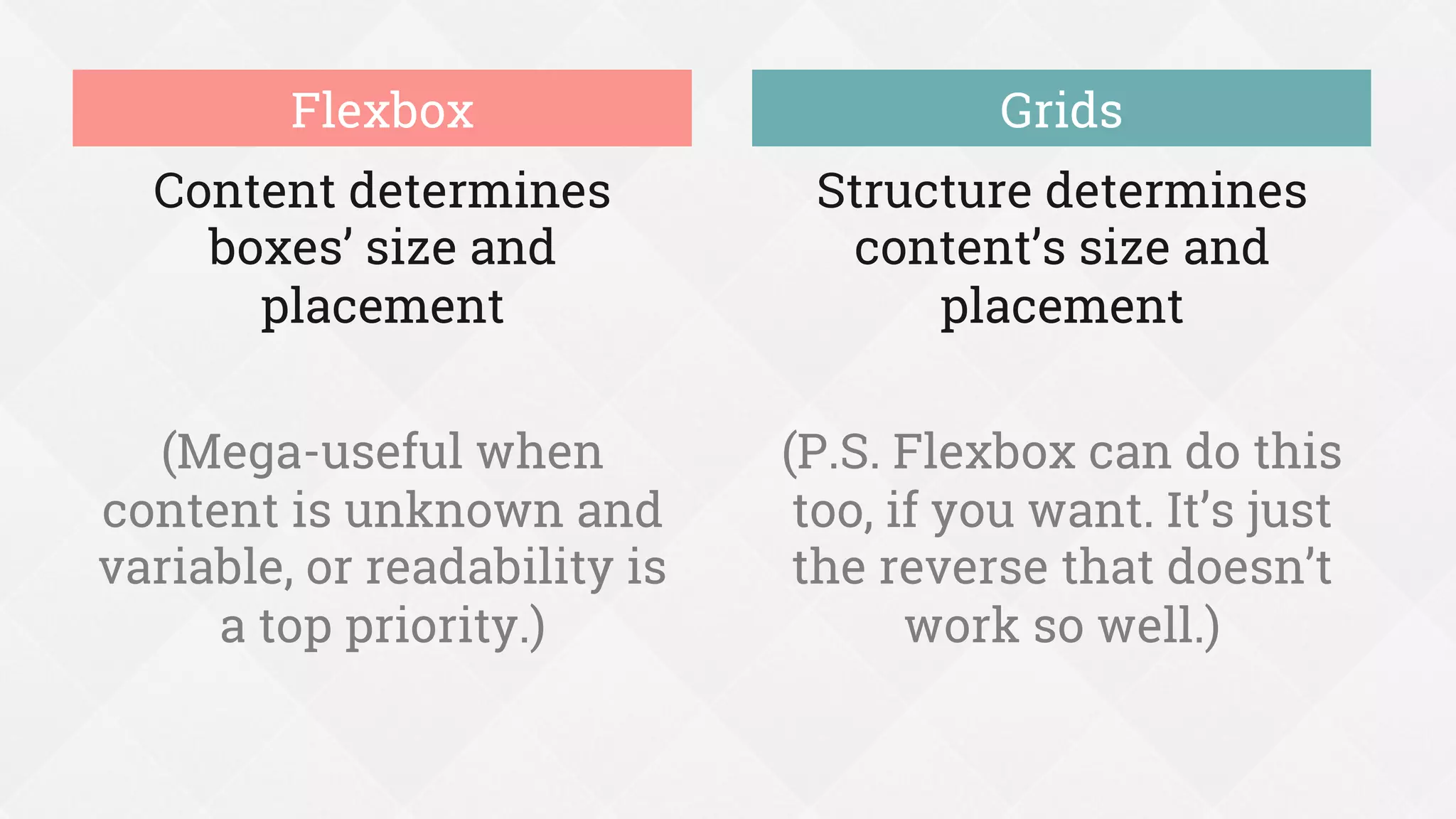

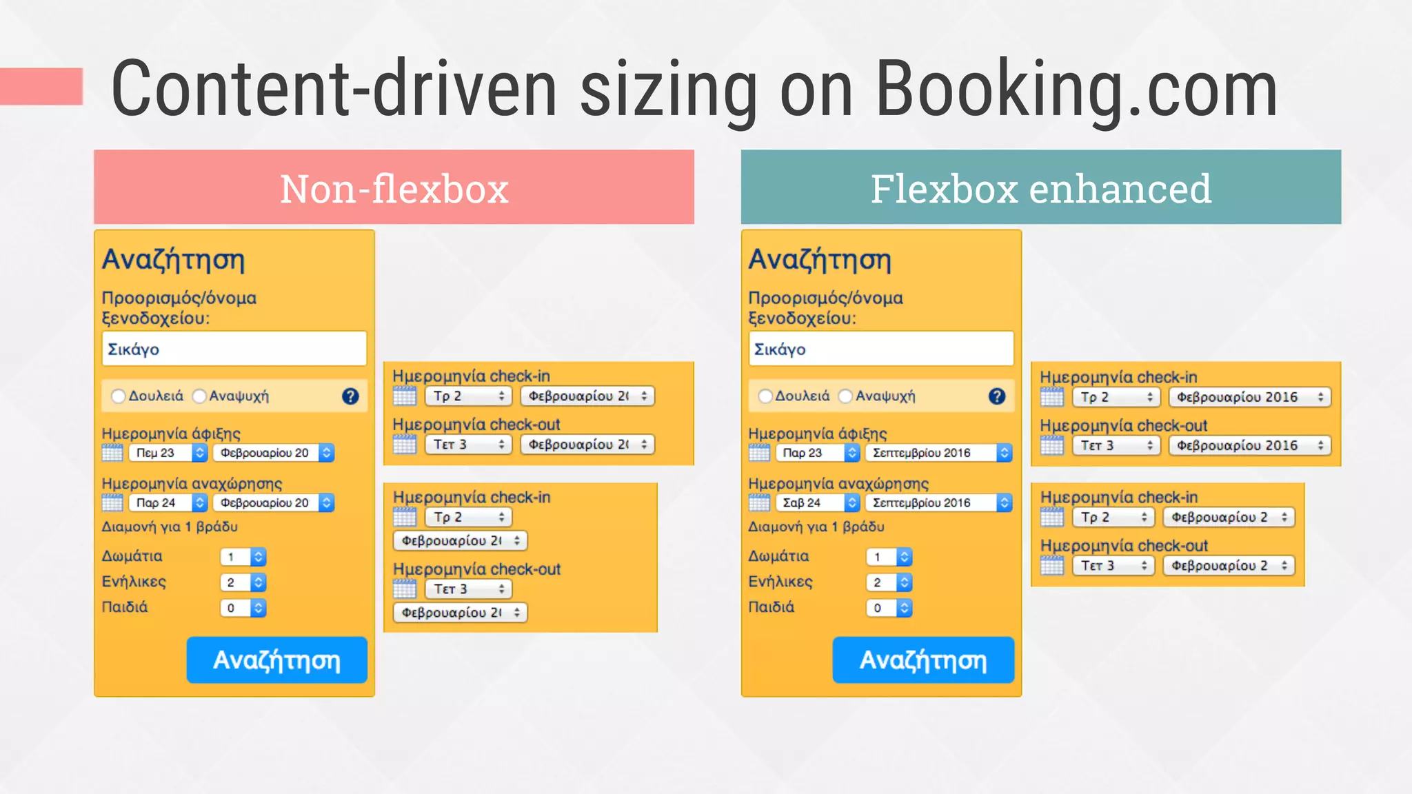
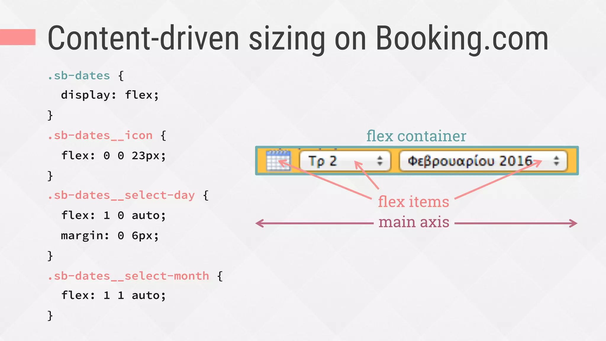
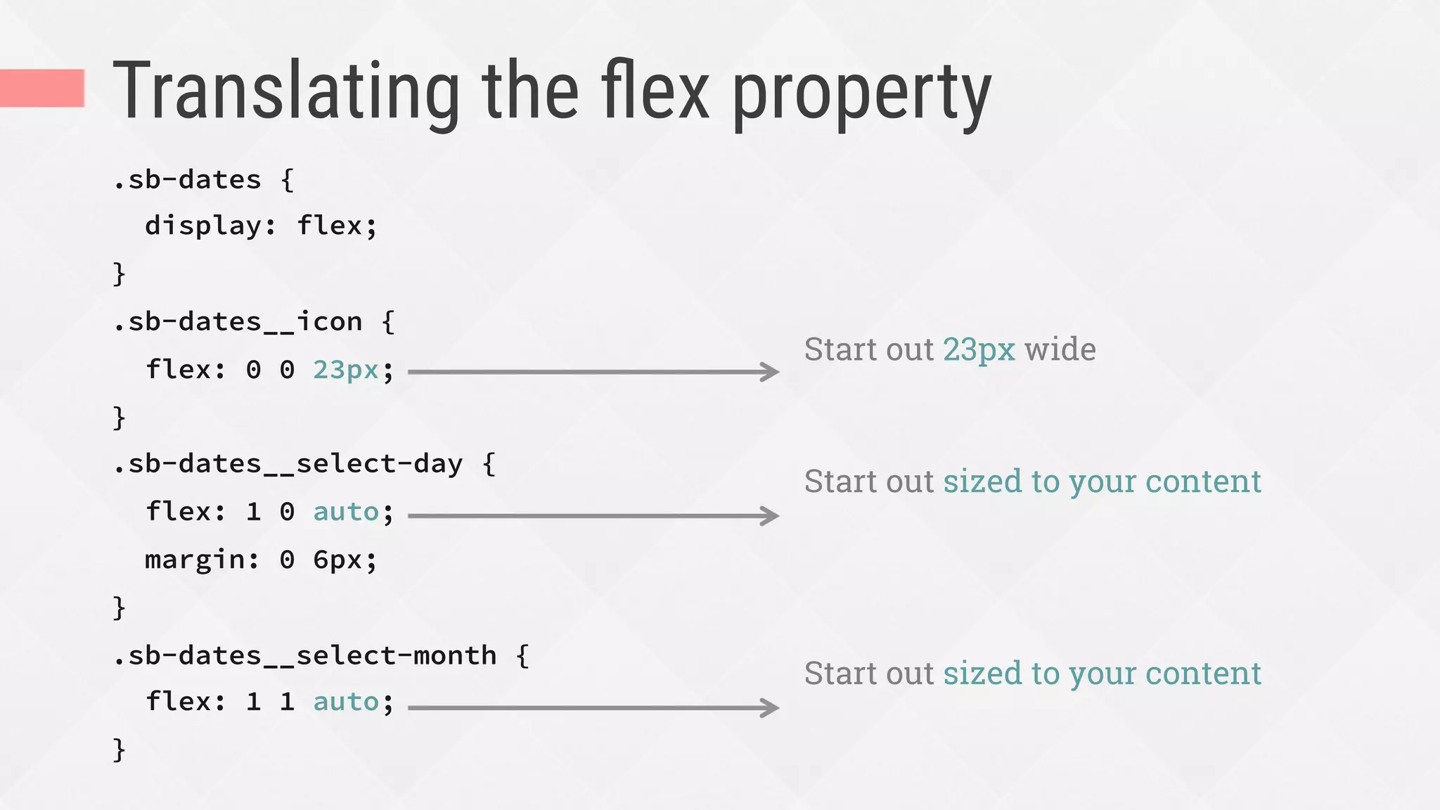
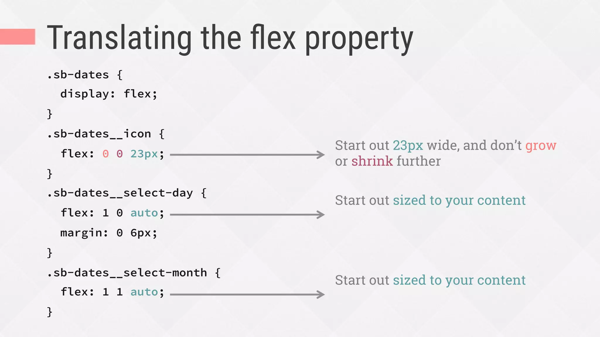
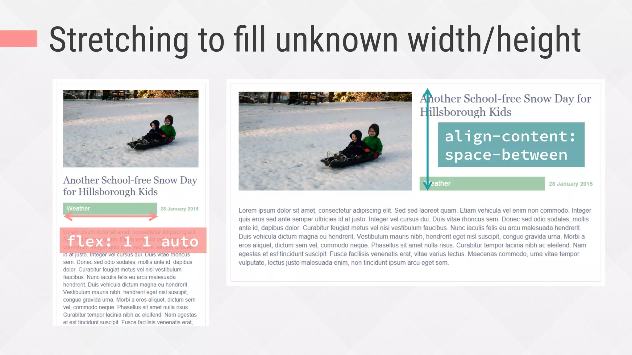
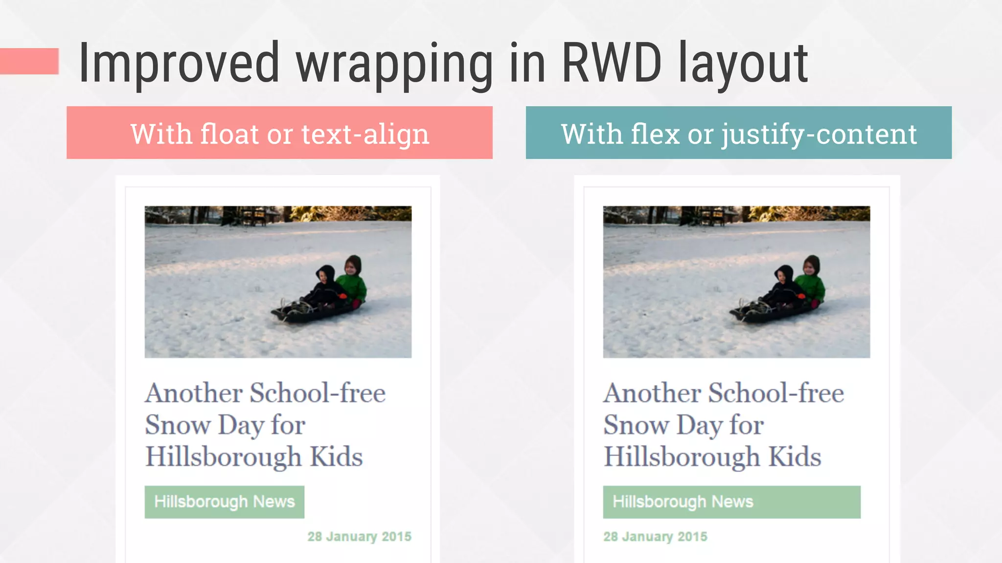
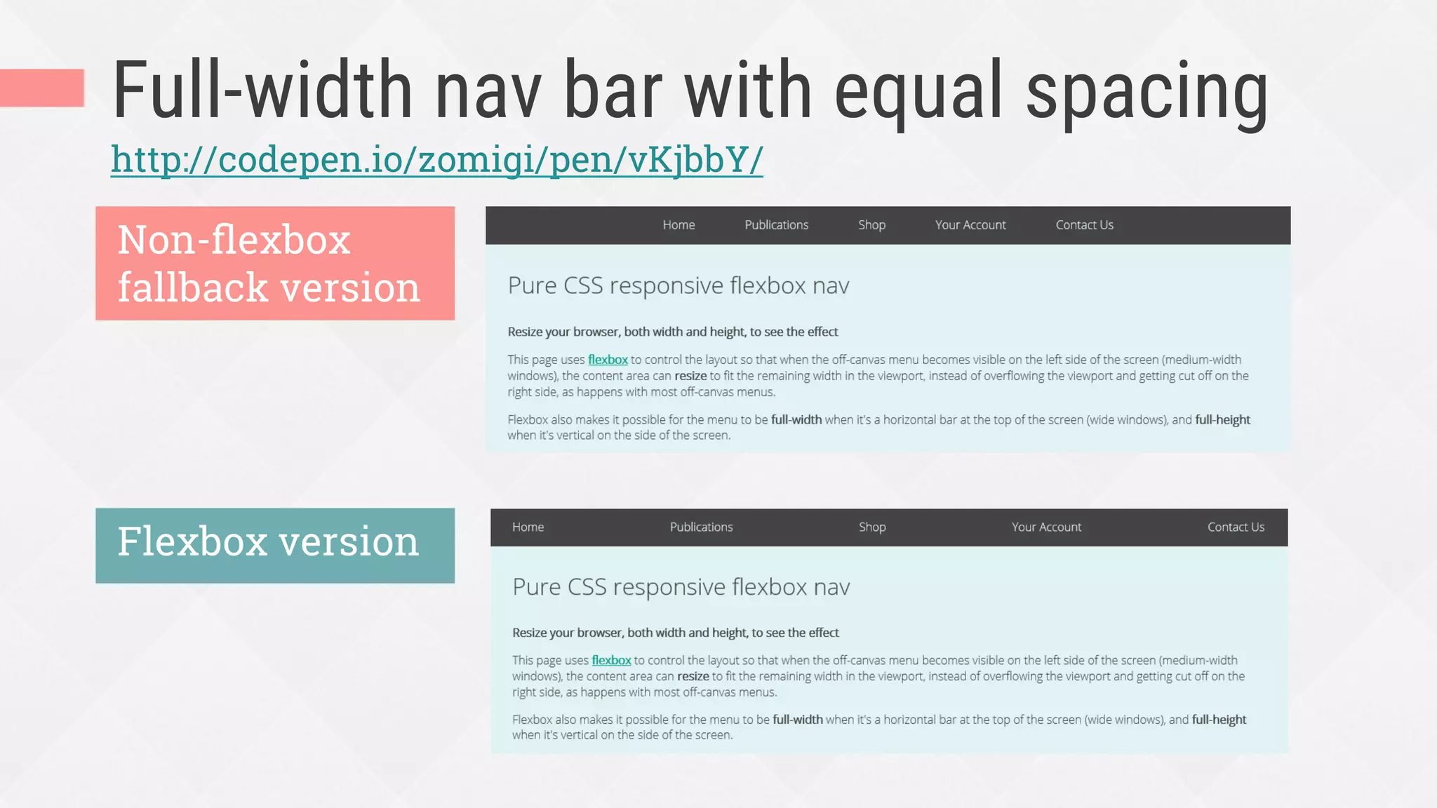
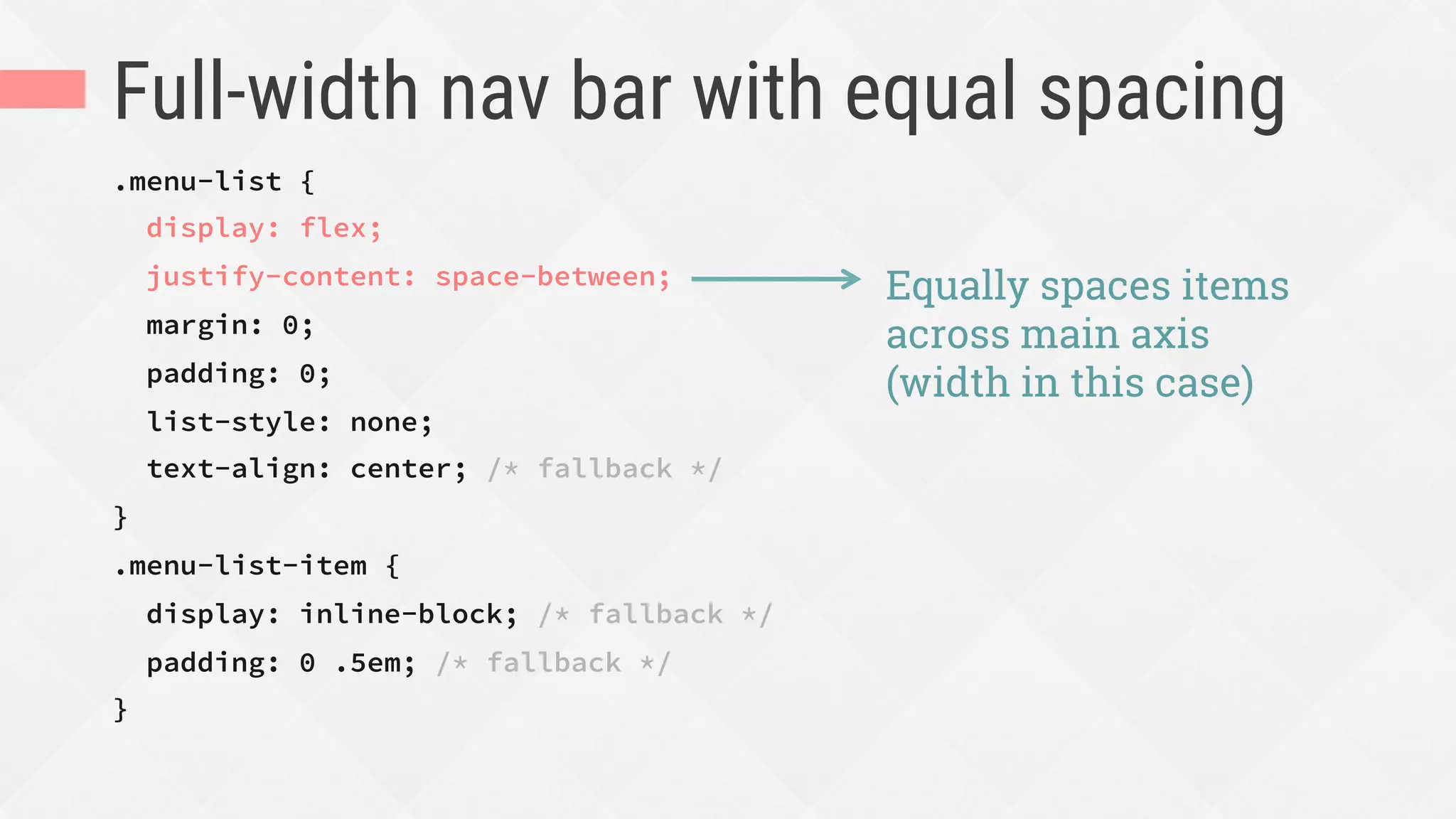
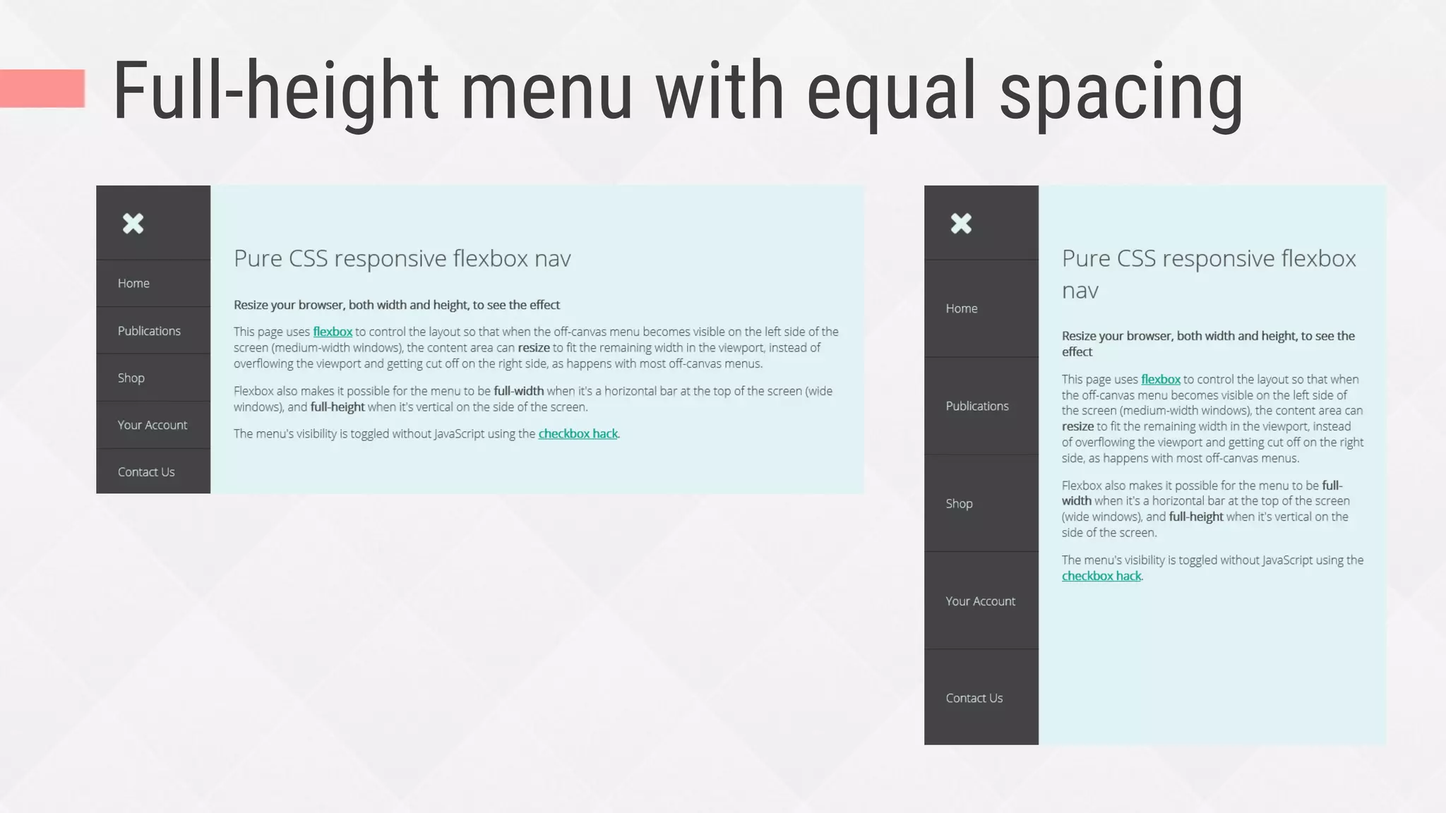
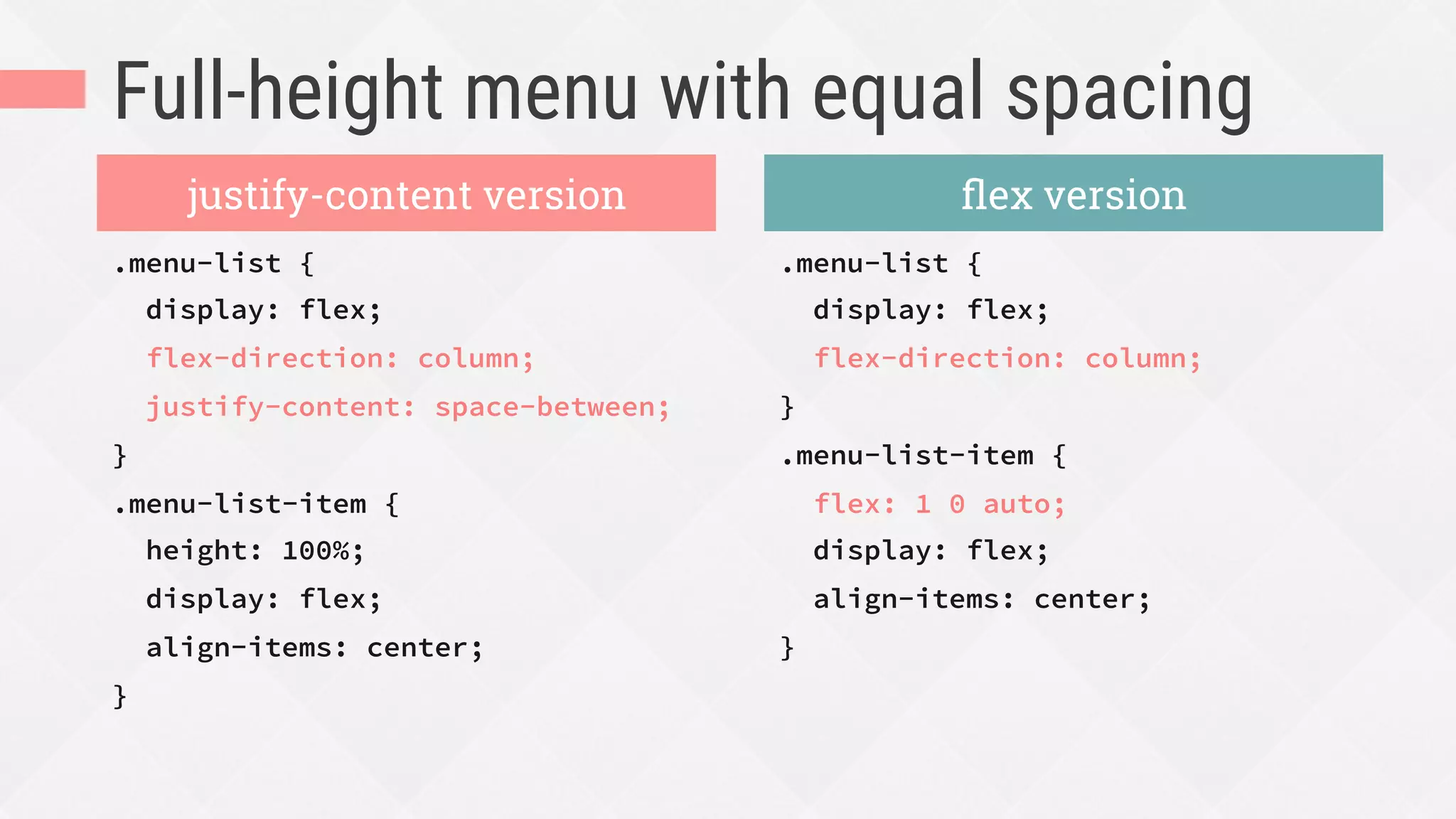
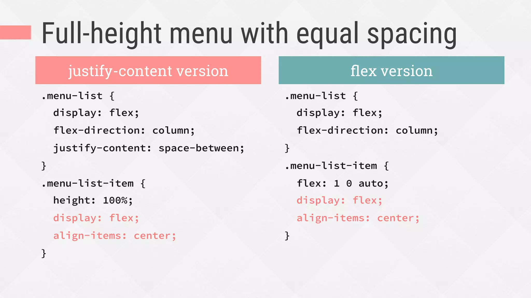
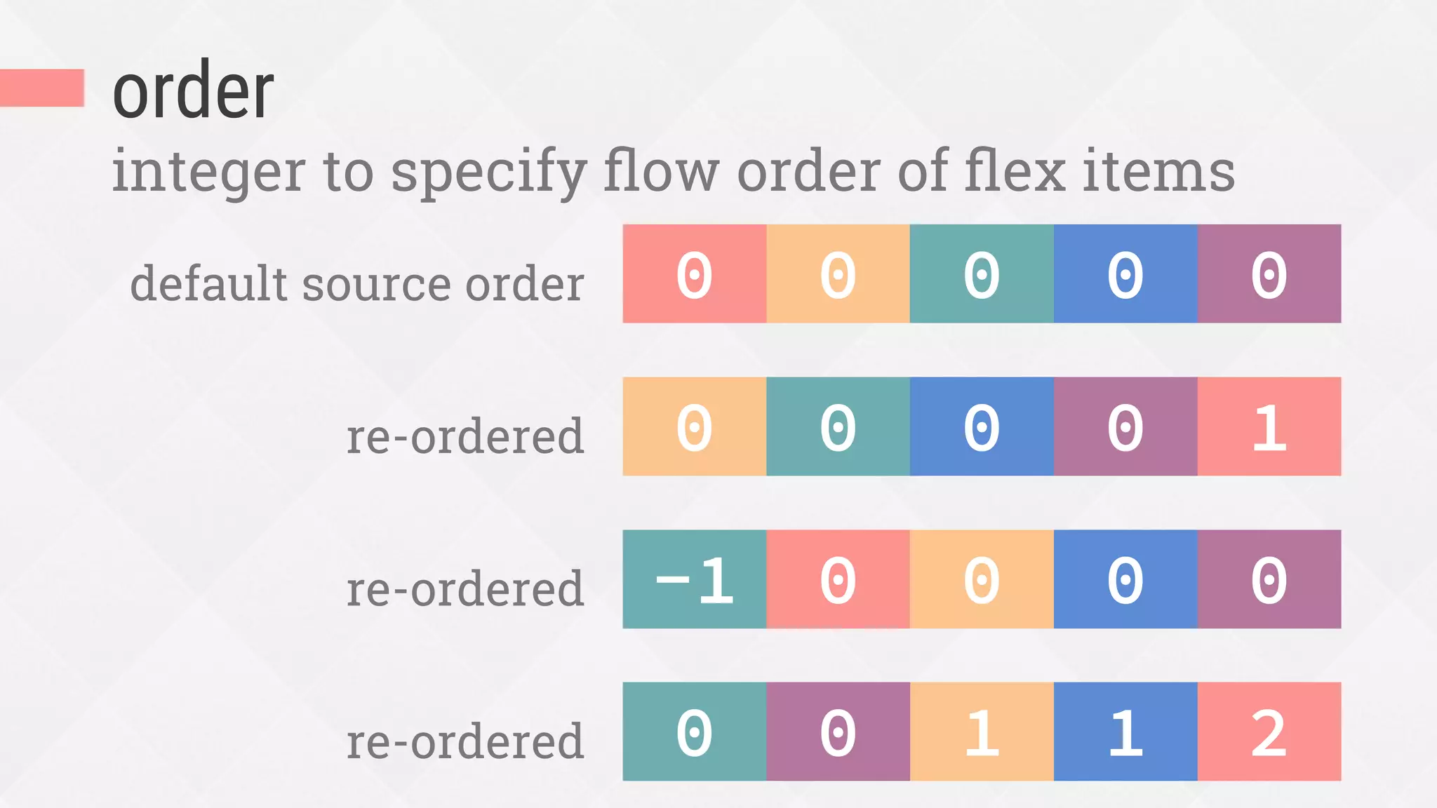

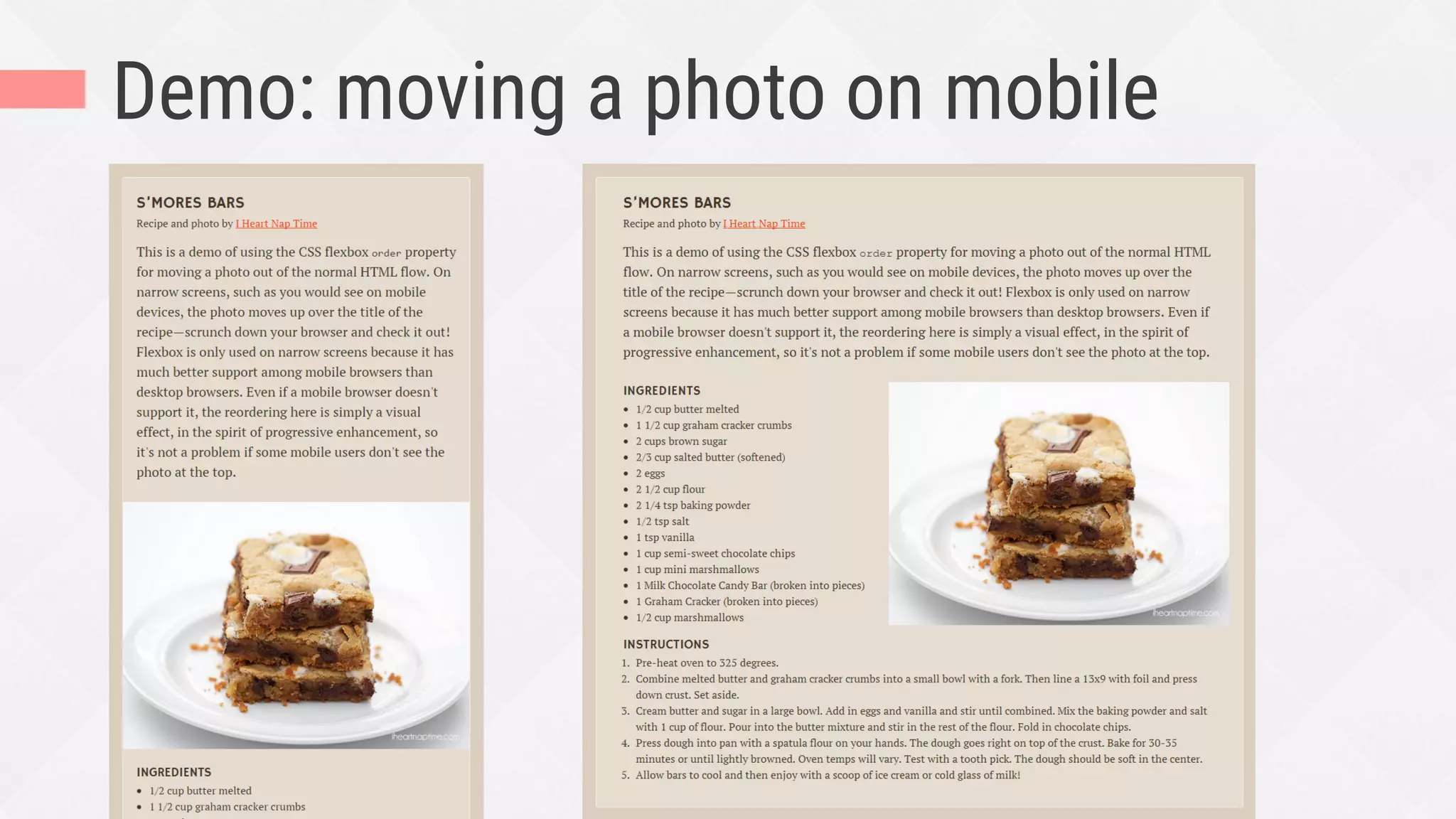
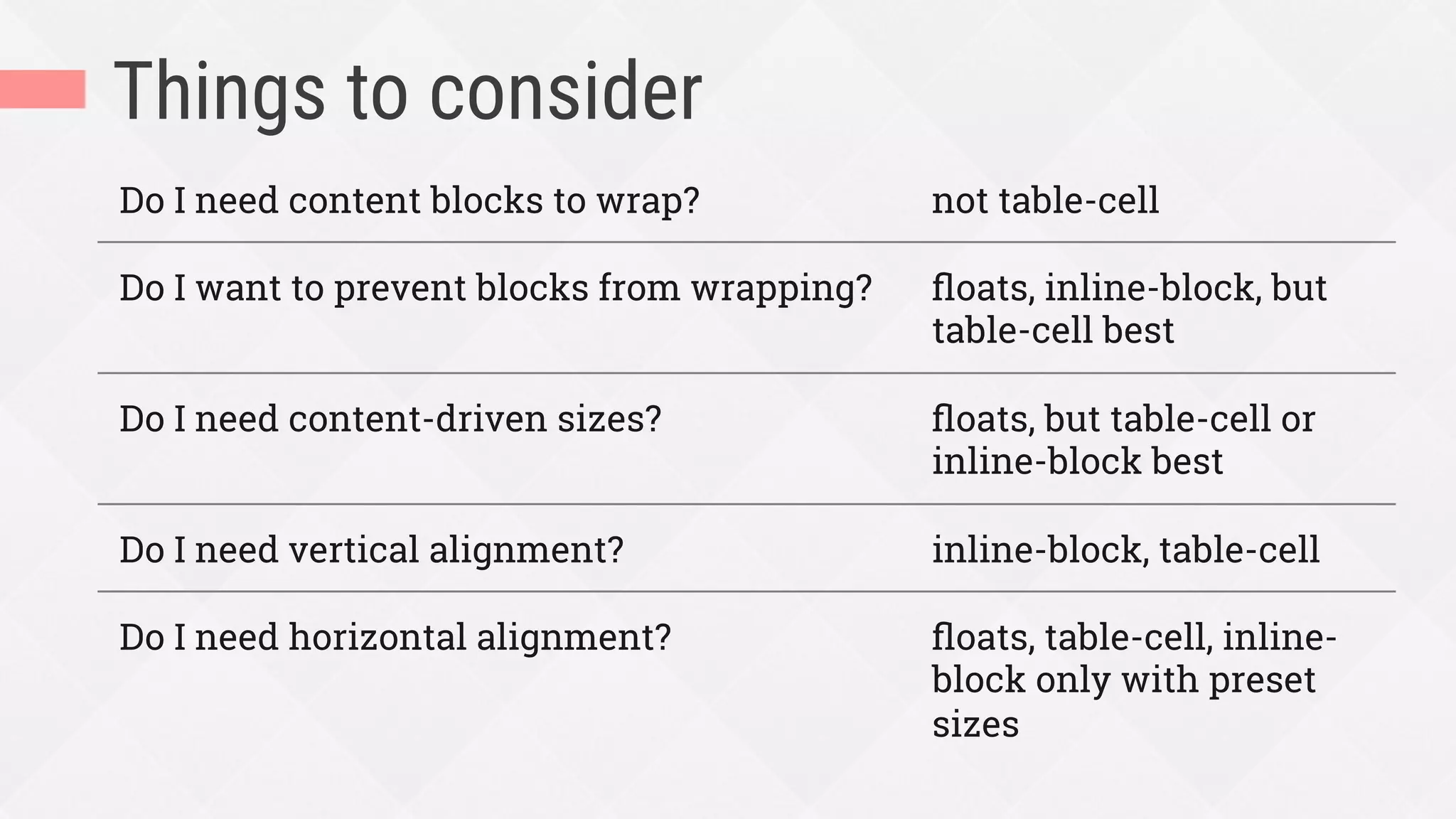


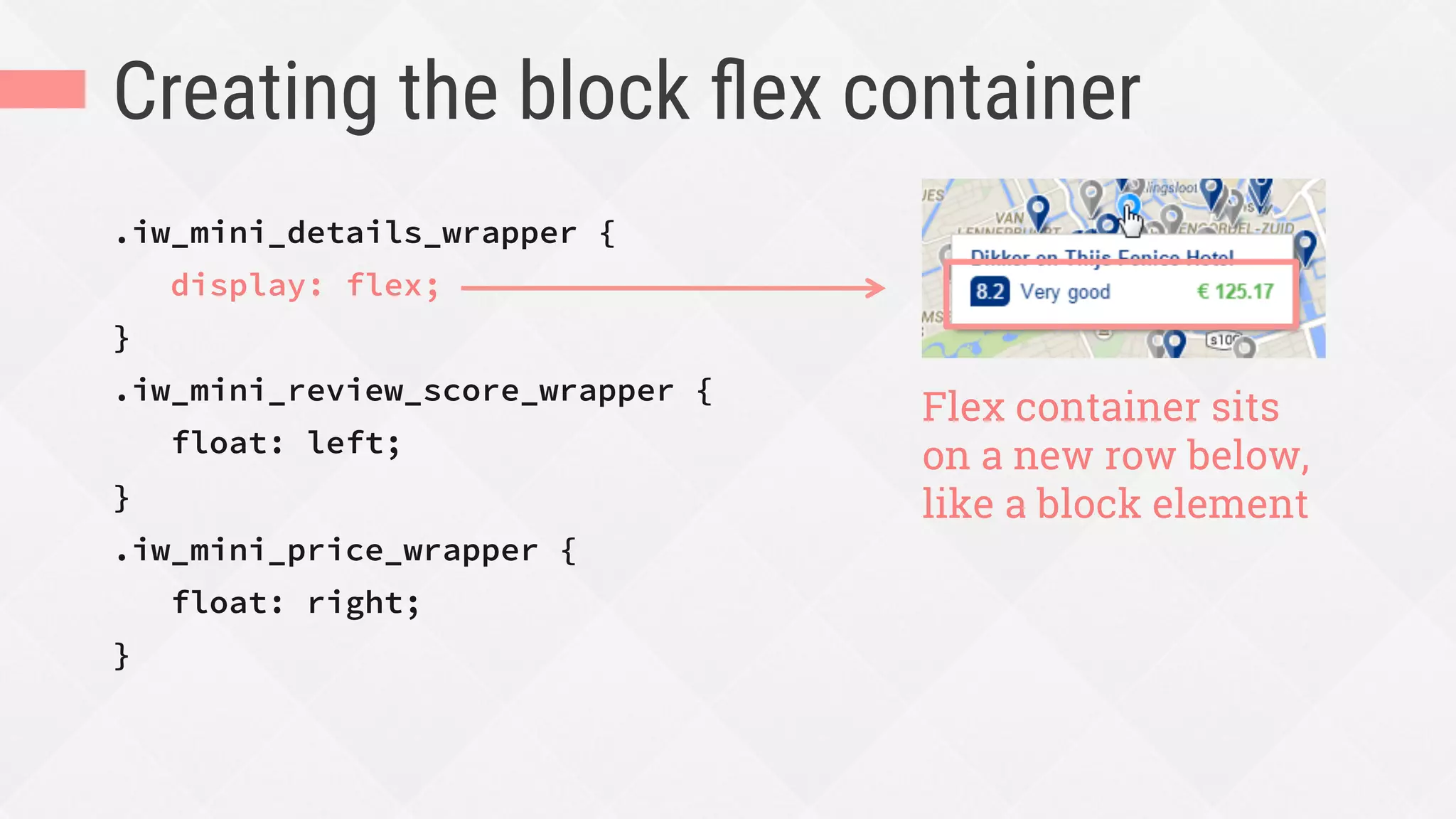

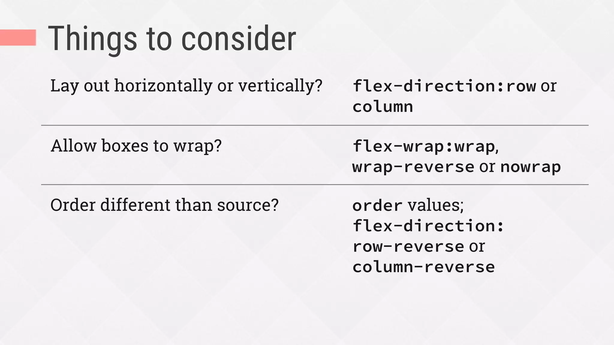
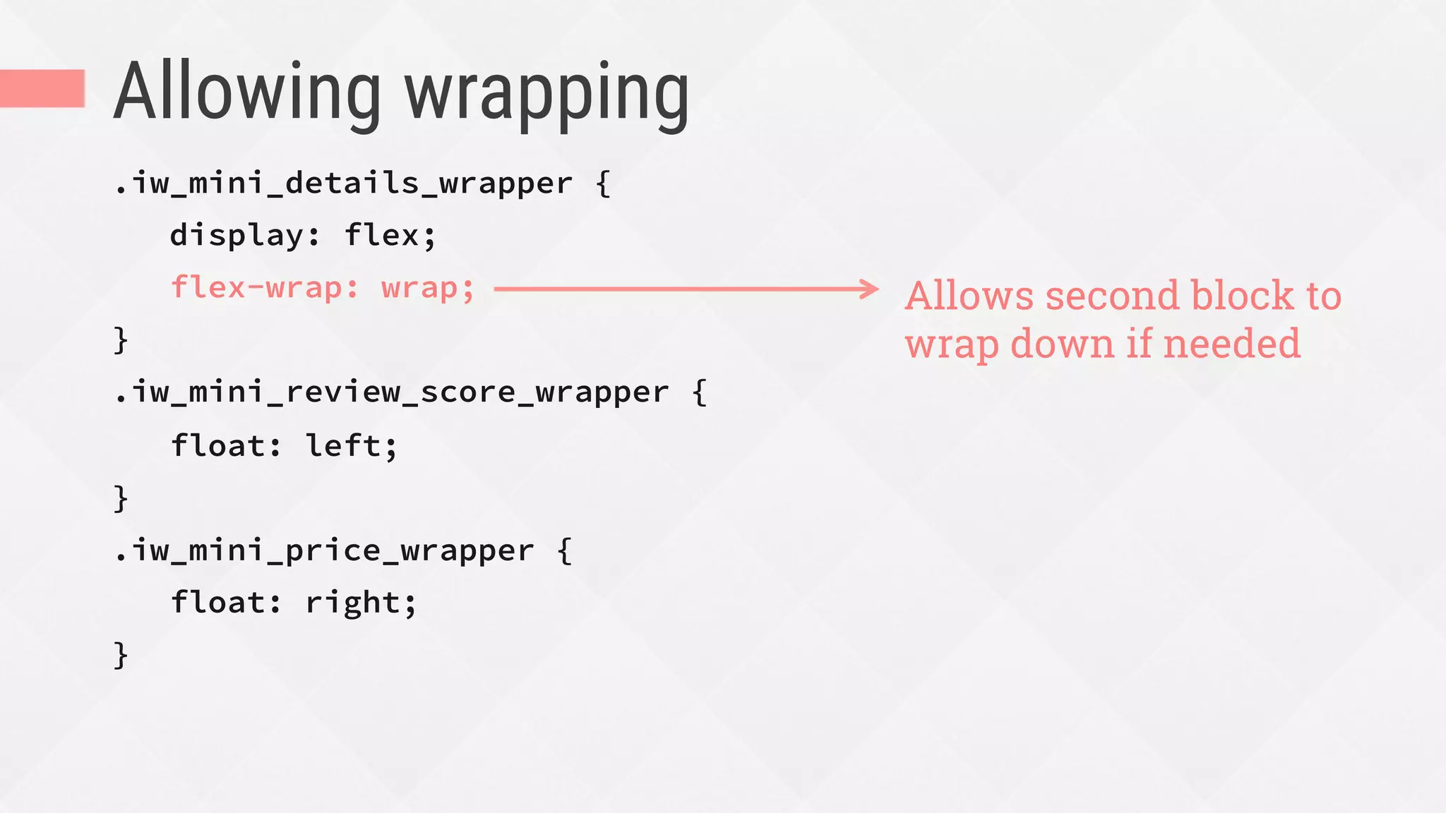
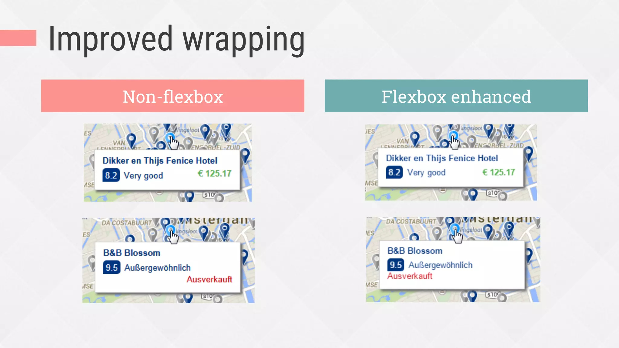
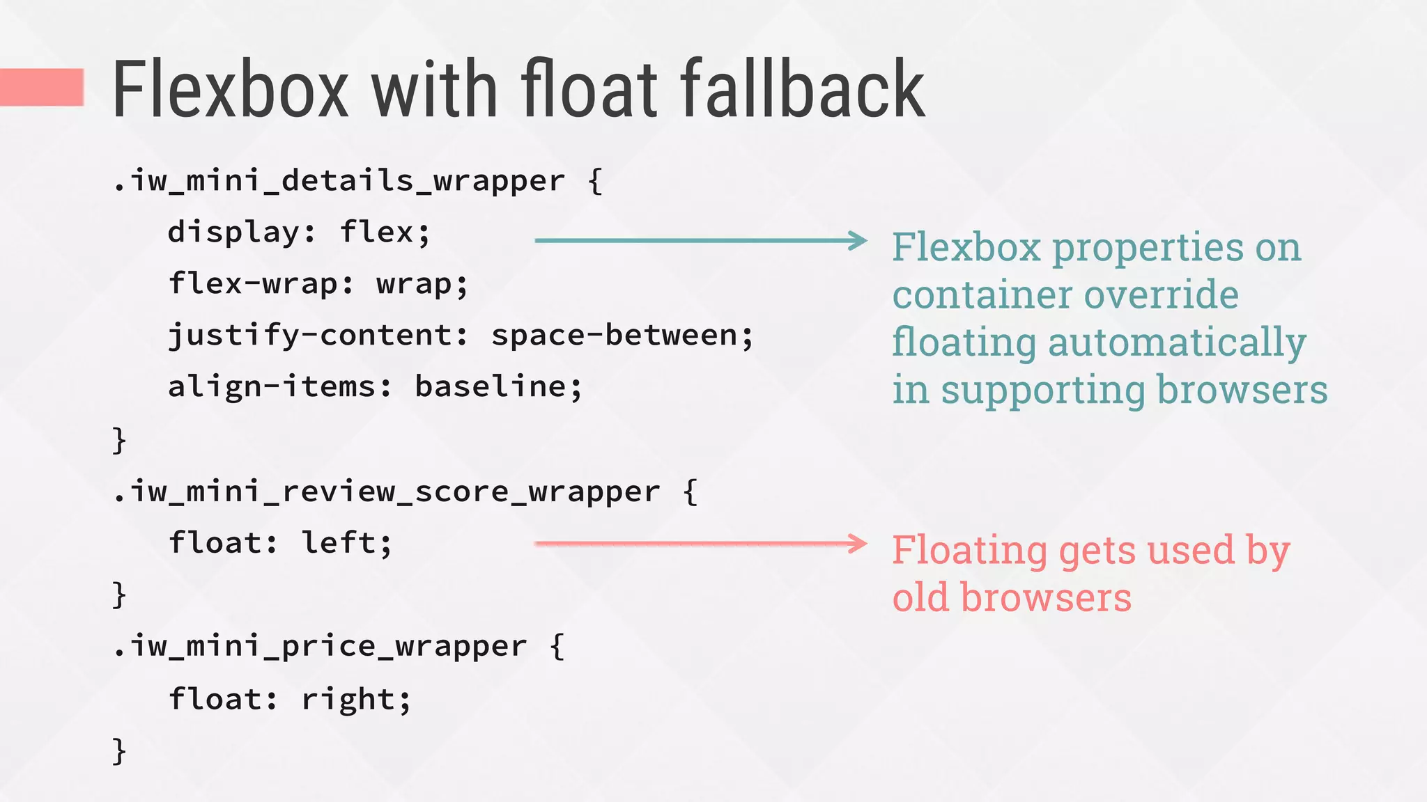

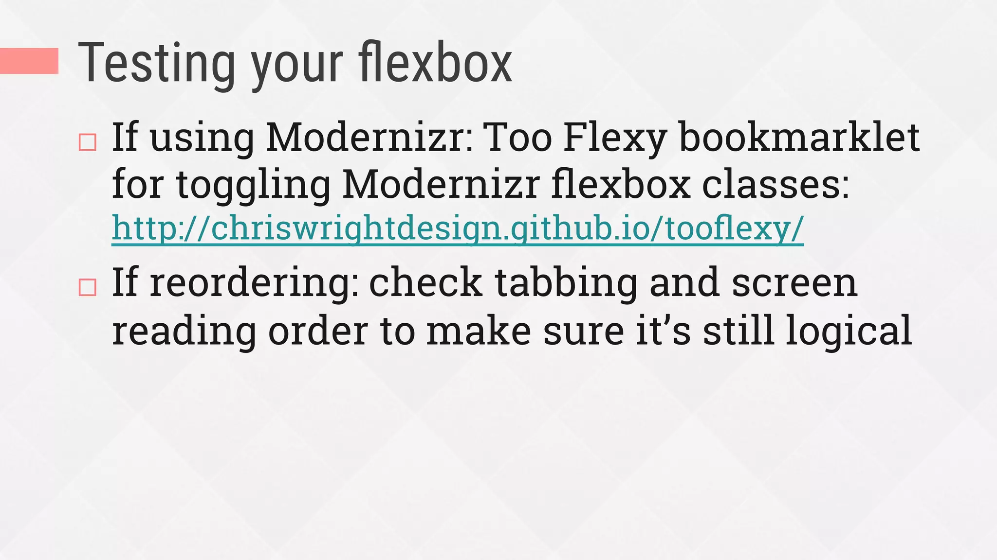

The document discusses the use of Flexbox for web layout design, highlighting its advantages and when it is most appropriate to use. It contrasts Flexbox with other layout methods like grid and traditional techniques, emphasizing its suitability for UI components and responsive design without relying on fixed measurements. Additionally, it provides guidelines for integrating Flexbox into existing designs and troubleshooting common issues.


![Number_Guessing_Game_Dsbsbssbzboc[1].pptx](https://cdn.slidesharecdn.com/ss_thumbnails/numberguessinggamedoc1-251206215042-a076fc05-thumbnail.jpg?width=640&height=640&fit=bounds)


