Download as PDF, PPTX


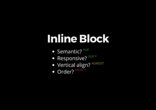
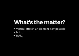

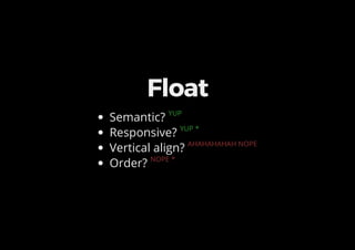

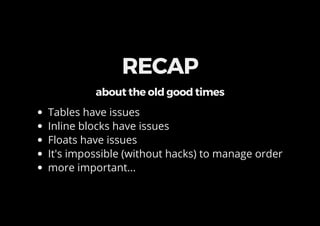

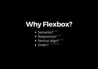


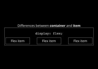
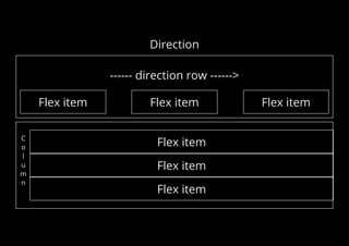
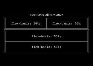

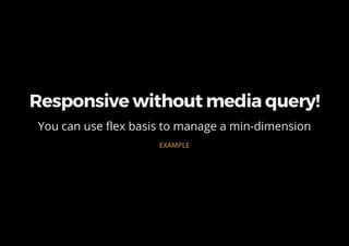


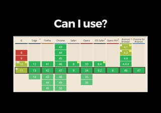
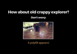

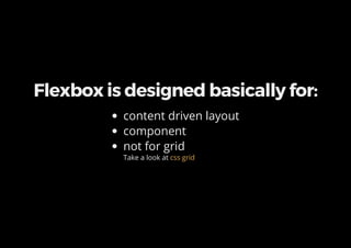
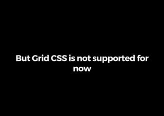
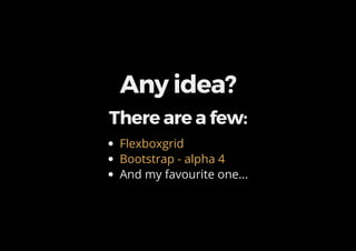


Flexbox provides a new way to lay out items in rows or columns and allows developers to easily align and distribute space among items within the parent flex container. It solves common layout problems like equal height columns more semantically and responsively than previous techniques like floats or tables. While flexbox is not a silver bullet and is designed primarily for content-driven layouts rather than grids, it handles responsive design, vertical alignment, and ordering of items better than previous methods. Polyfills exist to support older browsers, and tools like Flexbox Grid and Bootstrap's alpha grid system provide frameworks to help build layouts with flexbox.


