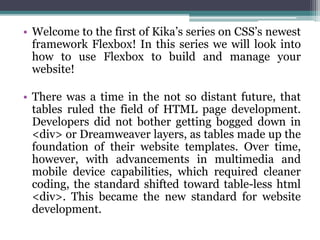
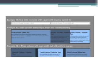
There was a time in the not so distant future, that tables ruled the field of HTML page development. Kika Marketing and Communications is here to give you an idea about Flexbox.
Flexbox: One Giant Leap for Web Layout (Breaking Development 2013)Stephen Hay
This document discusses the benefits of using Flexbox for web layout. It begins with an overview of Flexbox terminology including flex containers, items, main/cross axes. It then covers Flexbox properties like flex-direction, justify-content, align-items and order. Common use cases like centering, multi-item layouts and reordering content are demonstrated. Browser support and syntax variations are noted. While Flexbox is well-suited for components, it has limitations for full page layouts. Designers should learn when different tools like Flexbox are best applied.
With solidified syntax and great browser support, flexbox, the CSS layout module that can make your layouts more flexible and responsive with ease, is finally ready to be used in your real-world work. We’ll talk about the when, what, and how of using flexbox today: when it’s a great choice use flexbox (and when not to), what UI and UX problems it can help you solve, and how to add it to your layouts in a robust way that doesn’t harm non-supporting browsers or accessibility. You’ll learn a step-by-step process for deciding on and deploying flexbox, with lots of examples along the way of flexbox in the wild.
Enhancing Responsiveness With Flexbox (Smashing Conference)Zoe Gillenwater
View the demos and get links to related files at http://zomigi.com/blog/rwd-flexbox. In this presentation, I talked about how to actually put flexbox to use in the real world—today. I demonstrated a bunch of practical ideas for how to use flexbox as progressive enhancement to improve sizing, spacing, and order in responsive web design, while still ensuring non-supporting browsers get an acceptable fallback experience.
Enhancing Responsiveness With Flexbox (CSS Day)Zoe Gillenwater
View the demos and get links to related files at http://zomigi.com/blog/rwd-flexbox. In this presentation, I talked about how to actually put flexbox to use in the real world—today. I demonstrated a bunch of practical ideas for how to use flexbox as progressive enhancement to improve sizing, spacing, and order in responsive web design, while still ensuring non-supporting browsers get an acceptable fallback experience.
Enhancing Responsiveness with Flexbox (RWD Summit)Zoe Gillenwater
This document discusses using flexbox for responsive web design. It begins with an overview of problems with other layout methods like floats and tables. Flexbox solves many of these issues by allowing boxes to automatically grow and shrink, be proportionally sized, and be laid out in any direction. The document demonstrates several uses of flexbox properties like flex-direction, justify-content, align-items and order to create responsive navigation bars, stacked icons, equal height columns, and reordering content. It emphasizes using flexbox now for progressive enhancement and discusses techniques for providing non-flexbox fallbacks.
Flexbox is a smart new layout mode for CSS that solves many problems we've struggled with for years. It adds a degree of control we didn't have before. No longer will you need to struggle with floats and clearfixes to address page layout challenges they were never designed to handle.
But wait, I hear you say, a new layout mode? Surely the browser support is awful? It's actually quite good, and I will show you how to write future-proof code that will work flawlessly in browsers that support flexbox while providing a fallback to those that don't.
In this talk, I will introduce the flexbox layout module and explain what it's good for (and what's it's NOT good for). I'll give examples of usage, outline a strategy for browser support, and prepare you to use flexbox TODAY!
This is a beginner level talk. You do not need to know anything about flexbox, but a basic understanding of CSS layout will be helpful.
If you hate floats, you will love flexbox. If you hate media queries, you will love Flexbox. Flexbox gives you more control in creating a responsive layout than the traditional box model. In this session I will introduce you to Flexbox by showing how to use it to solve common website problems. You will learn how easy it is to implement Flexbox into your existing website design.
While the CSS Flexible Box Layout Module (Flexbox) has gone through some radical changes over the past two years, the specification is now stable enough for designers and developers to give it a hard look. Find out what Flexbox can (and can't) do to save your layout woes and how to integrate into your projects!
Flex stands for flexibility, adaptability. Thus, flexible layout elements are flexible boxes. The ability to fill extra areas without using javascript is one of the key advantages of flexbox.
[React Native] Lecture 4: Basic Elements and UI Layout by using FlexBoxKobkrit Viriyayudhakorn
This document provides information and instructions for setting up a React Native development environment and building a basic flexbox layout application. It includes links to source code and tutorials for setting up React Native on Windows and Mac systems. The document then explains key React Native concepts like JSX syntax, basic elements, styles, and Flexbox layout properties. It provides code examples and instructions for exercises to build out a flexbox application.
Flexbox: One Giant Leap for Web Layout (GenerateConf 2013)Stephen Hay
This document provides an introduction to using Flexbox for web layout. It discusses key Flexbox terminology like flex containers, flex items, main axis and cross axis. It explains how to set the flex direction and wrap behavior. The document covers how to use flex properties to control flex grow, shrink and basis behaviors. It also discusses alignment of flex items along the main and cross axes using properties like justify-content and align-items. The document provides examples of common use cases for Flexbox like centering, wrapping items, and form layouts. It encourages leaving behind old layout methods and exploring the capabilities of Flexbox.
1. The document discusses the CSS Flexible Box Layout Module (flexbox) and how to implement it.
2. Flexbox allows items to be laid out flexibly on a page and makes it easier to create responsive page layouts without needing many media queries.
3. The document demonstrates how to use various flexbox properties like flex-direction, flex-wrap, justify-content, and order to create common layouts like navigation bars, forms, and grids.
You have some basic knowledge of HTML and CSS? Go further by learning how to build advanced layouts of real-life apps like Airbnb, Medium or Slack using the most recent CSS techniques.
Expression Blend is an interactive design tool for creating XAML-based interfaces for WPF and Silverlight applications. It features visual design tools like behaviors, visual state manager, and transitions. Silverlight is for rich browser apps while WPF is for desktop apps. The interface is similar to Photoshop with design and code views. Common containers include grids, canvases, stack panels, and dock panels. Other controls include listboxes, trees, expanders, and data grids.
We will cover whole of the web development basics comprising of HTML, CSS, JavaScript in this series.
Following are topics useful for any newbie to intermediate who is interested in learning Web Development
Putting Flexbox into Practice presentation for Fronteers conference, October 10, 2013. Slightly updated version of slides posted in September. Get links to the demo page and related resources at http://www.zomigi.com/blog/flexbox-presentation.
Enhancing Responsiveness with Flexbox (CSS Conf EU 2015)Zoe Gillenwater
Flexbox and responsive web design go great together, like peanut butter and jelly! Flexbox gives you more control over the things you care about in a responsive layout and lets you create much morecomplex and reliable layouts than you can with floats, table display, or inline-block. All with far less CSS.
In this talk, you’ll learn what flexbox features are particularly suited to responsive layouts and how you can harness them by applying flexbox as a progressive enhancement. We’ll look at examples of responsive page components and patterns that you can enhance further by layering flexbox on top of other layout methods, ensuring all users get a good experience.
This document provides an overview of CSS layout techniques for arranging user interface content, including flexible box and grid layout models. It discusses the traditional box model and block/inline elements, and covers CSS flexbox properties for flexible layouts like flex-direction and flex-wrap. CSS grid properties are explained for controlling column, row, and cell sizes. The grid template layout module is also introduced for positioning items alphabetically within a grid.
CSS Flex Box Layout is a CSS3 web layout model that allows elements within a container to be automatically arranged and resized depending on screen size. It defines flex containers and flex items, with properties that control alignment, order, sizing, and distribution of space. Common flex properties include flex-direction, flex-wrap, justify-content, align-items, and properties for individual flex items like order, flex-grow, and align-self. Flexbox provides more flexible layout options compared to traditional CSS box model properties.
The document discusses various CSS topics including animations, variables, media queries, floats and displays, flexbox, grid, importing files, and browser support. It provides examples and code for flexbox layouts, grids, and styling a login form. Key points covered include using CSS properties to animate elements, declaring variables, using media queries for responsive design, the float and display properties, activating the flex and grid layout systems, importing other CSS files, and ensuring browser compatibility. Practical examples demonstrate how to style elements within a flexbox, use grids to lay out content, and generate styles for a login form.
Discover timeless style with the 2022 Vintage Roman Numerals Men's Ring. Crafted from premium stainless steel, this 6mm wide ring embodies elegance and durability. Perfect as a gift, it seamlessly blends classic Roman numeral detailing with modern sophistication, making it an ideal accessory for any occasion.
https://rb.gy/usj1a2
Cover Story - China's Investment Leader - Dr. Alyce SUmsthrill
In World Expo 2010 Shanghai – the most visited Expo in the World History
https://www.britannica.com/event/Expo-Shanghai-2010
China’s official organizer of the Expo, CCPIT (China Council for the Promotion of International Trade https://en.ccpit.org/) has chosen Dr. Alyce Su as the Cover Person with Cover Story, in the Expo’s official magazine distributed throughout the Expo, showcasing China’s New Generation of Leaders to the World.
SATTA MATKA DPBOSS KALYAN MATKA RESULTS KALYAN CHART KALYAN MATKA MATKA RESULT KALYAN MATKA TIPS SATTA MATKA MATKA COM MATKA PANA JODI TODAY BATTA SATKA MATKA PATTI JODI NUMBER MATKA RESULTS MATKA CHART MATKA JODI SATTA COM INDIA SATTA MATKA MATKA TIPS MATKA WAPKA ALL MATKA RESULT LIVE ONLINE MATKA RESULT KALYAN MATKA RESULT DPBOSS MATKA 143 MAIN MATKA KALYAN MATKA RESULTS KALYAN CHART
❼❷⓿❺❻❷❽❷❼❽ Dpboss Matka Result Satta Matka Guessing Satta Fix jodi Kalyan Final ank Satta Matka Dpbos Final ank Satta Matta Matka 143 Kalyan Matka Guessing Final Matka Final ank Today Matka 420 Satta Batta Satta 143 Kalyan Chart Main Bazar Chart vip Matka Guessing Dpboss 143 Guessing Kalyan night
Best Competitive Marble Pricing in Dubai - ☎ 9928909666Stone Art Hub
Stone Art Hub offers the best competitive Marble Pricing in Dubai, ensuring affordability without compromising quality. With a wide range of exquisite marble options to choose from, you can enhance your spaces with elegance and sophistication. For inquiries or orders, contact us at ☎ 9928909666. Experience luxury at unbeatable prices.
AI Transformation Playbook: Thinking AI-First for Your BusinessArijit Dutta
I dive into how businesses can stay competitive by integrating AI into their core processes. From identifying the right approach to building collaborative teams and recognizing common pitfalls, this guide has got you covered. AI transformation is a journey, and this playbook is here to help you navigate it successfully.
The Genesis of BriansClub.cm Famous Dark WEb PlatformSabaaSudozai
BriansClub.cm, a famous platform on the dark web, has become one of the most infamous carding marketplaces, specializing in the sale of stolen credit card data.
During the budget session of 2024-25, the finance minister, Nirmala Sitharaman, introduced the “solar Rooftop scheme,” also known as “PM Surya Ghar Muft Bijli Yojana.” It is a subsidy offered to those who wish to put up solar panels in their homes using domestic power systems. Additionally, adopting photovoltaic technology at home allows you to lower your monthly electricity expenses. Today in this blog we will talk all about what is the PM Surya Ghar Muft Bijli Yojana. How does it work? Who is eligible for this yojana and all the other things related to this scheme?
Ellen Burstyn: From Detroit Dreamer to Hollywood Legend | CIO Women MagazineCIOWomenMagazine
In this article, we will dive into the extraordinary life of Ellen Burstyn, where the curtains rise on a story that's far more attractive than any script.
Satta matka fixx jodi panna all market dpboss matka guessing fixx panna jodi kalyan and all market game liss cover now 420 matka office mumbai maharashtra india fixx jodi panna
Call me 9040963354
WhatsApp 9040963354
Unveiling the Dynamic Personalities, Key Dates, and Horoscope Insights: Gemin...my Pandit
Explore the fascinating world of the Gemini Zodiac Sign. Discover the unique personality traits, key dates, and horoscope insights of Gemini individuals. Learn how their sociable, communicative nature and boundless curiosity make them the dynamic explorers of the zodiac. Dive into the duality of the Gemini sign and understand their intellectual and adventurous spirit.
Zodiac Signs and Food Preferences_ What Your Sign Says About Your Tastemy Pandit
Know what your zodiac sign says about your taste in food! Explore how the 12 zodiac signs influence your culinary preferences with insights from MyPandit. Dive into astrology and flavors!
2. • Welcome to the first of Kika’s series on CSS’s newest
framework Flexbox! In this series we will look into
how to use Flexbox to build and manage your
website!
• There was a time in the not so distant future, that
tables ruled the field of HTML page development.
Developers did not bother getting bogged down in
<div> or Dreamweaver layers, as tables made up the
foundation of their website templates. Over time,
however, with advancements in multimedia and
mobile device capabilities, which required cleaner
coding, the standard shifted toward table-less html
<div>. This became the new standard for website
development.
3.
4. • However, even with the simplification of coding
under the new framework, early CSS came with
challenges of its own. Simple vertical alignment
of a child div inside a parent div required writing
extra research, coding and testing. This was just
one of the many complications with early CSS
that web developers had to deal with.
• Since then, new HTML and CSS frameworks
have been developed like Bootstrap and Skeleton
that were much more developer friendly. One of
these frameworks is CSS3’s newest layout;
Flexbox.
5. According to W3Schools.com:
• “Use of flexbox [or Flexible Boxes] ensures that
elements behave predictably when the page
layout must accommodate different screen sizes
and different display devices.
• For many applications, the flexible box model
provides an improvement over the block model
in that it does not use floats, nor do the flex
container’s margins collapse with the margins of
its contents.”
6. • In order to give you a better idea of how Flexbox
can work for you, let’s take a closer look at it’s
functionality!
7. #1 Adjusting multiple child elements
with equal width inside a parent div
• Supposed you want to have a form with two fields
vertically aligned with one another other vertically, each
having an equal width. In the past, a common solution to
this problem was to implement
the float:left and float:right declarations.
8. • Now under Flexbox, you can simply add the display:
flex declaration to the parent container (example-1-
parent) and add flex:1 declaration to the child div.
• In this screenshot, display:flex would cause your
parent container to aligned its children divs
vertically, while flex:1 cause the children divs to
have evenly distributed width.
9. #2 Setting multiple columns with
varying width, margins and ordering.
• Adding display:flex to your Container css code will
cause the Divs to sit side by side and by default
allocates more page space to the column with the
most text by default.
• This can be good as it adds more space for areas
with more content, but suppose you want all your
columns to be the same width?
• In this case, like with the previous example, you
would add the flex: 1 declaration to each child div.
This will bring each column to an equal width. The
reason for this is that the flex: 1 declaration
represents a kind of baseline value.
10. • In the case that you wanted to assign a given column
more space on the page, in relation to your other
columns, you would simply have to assign a higher
flex value to that column.
• For example, if you had 3 columns (A,B,C), and you
wanted column A to be 2x bigger than the other two,
then you would assign column a with the flex: 2
syntax. Similarly, if you wanted column A to be 3x
bigger than the other two you would assign flex: 3
syntax. As flex: 1 is the base value that makes all
elements equally distributed, then any value you
place on other divs in the same container will act as
a multiplier of the baseline.
12. Ordering
• Ordering your content is a breeze with Flexbox,
using the the previous example with our 3
columns. If you would like to reorder your
columns from the A,B,C order to B,C,A . you
must simply add the order declaration below the
flex.
14. Margins
• So we have looked at how to set up and order
multiple content columns and reorder and
reshape them using Flexbox.
• Now let’s take a look at how we can further
customize these columns by including margins
between the columns we have set up:
15. • In the past, the best way of changing the margins
in your layout was to adjust the div’s width.
However with Flexbox, adding margins is as easy
as adding display:flex and justify-content:space-
between to the parent container and add the
syntaxes box-sizing:border-box (as you would in
the past) but instead of modifying the width of
the child container you would input the
following declaration: flex-basis: x%;
17. • This concludes our initial look into Flexbox
framework, we hoped you enjoyed this first
chapter and that is proved useful in the
development of your website. Stay tuned for the
next chapter of our series on Flexbox, where we
will be covering container responsiveness.