Download as PDF, PPTX
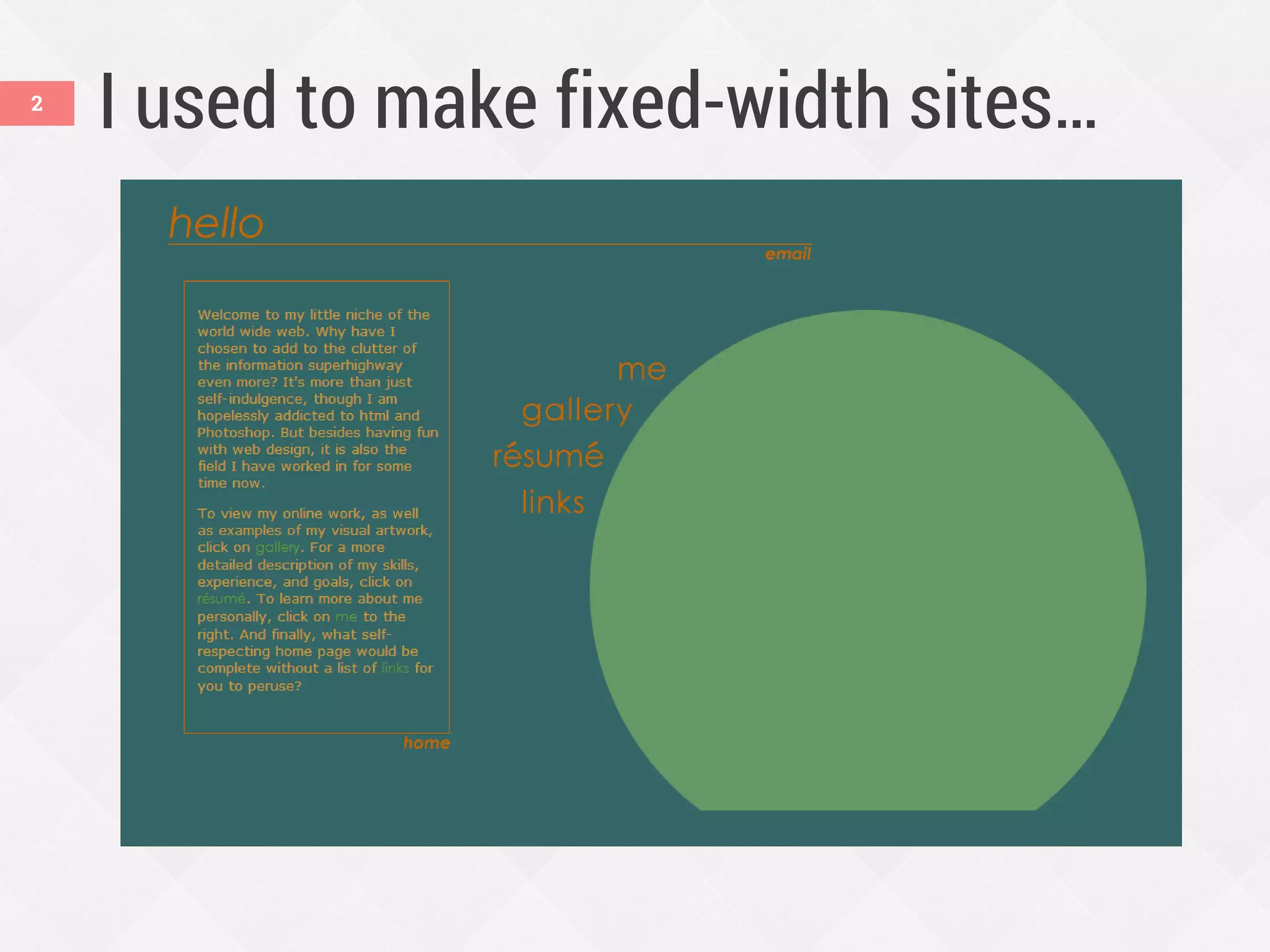
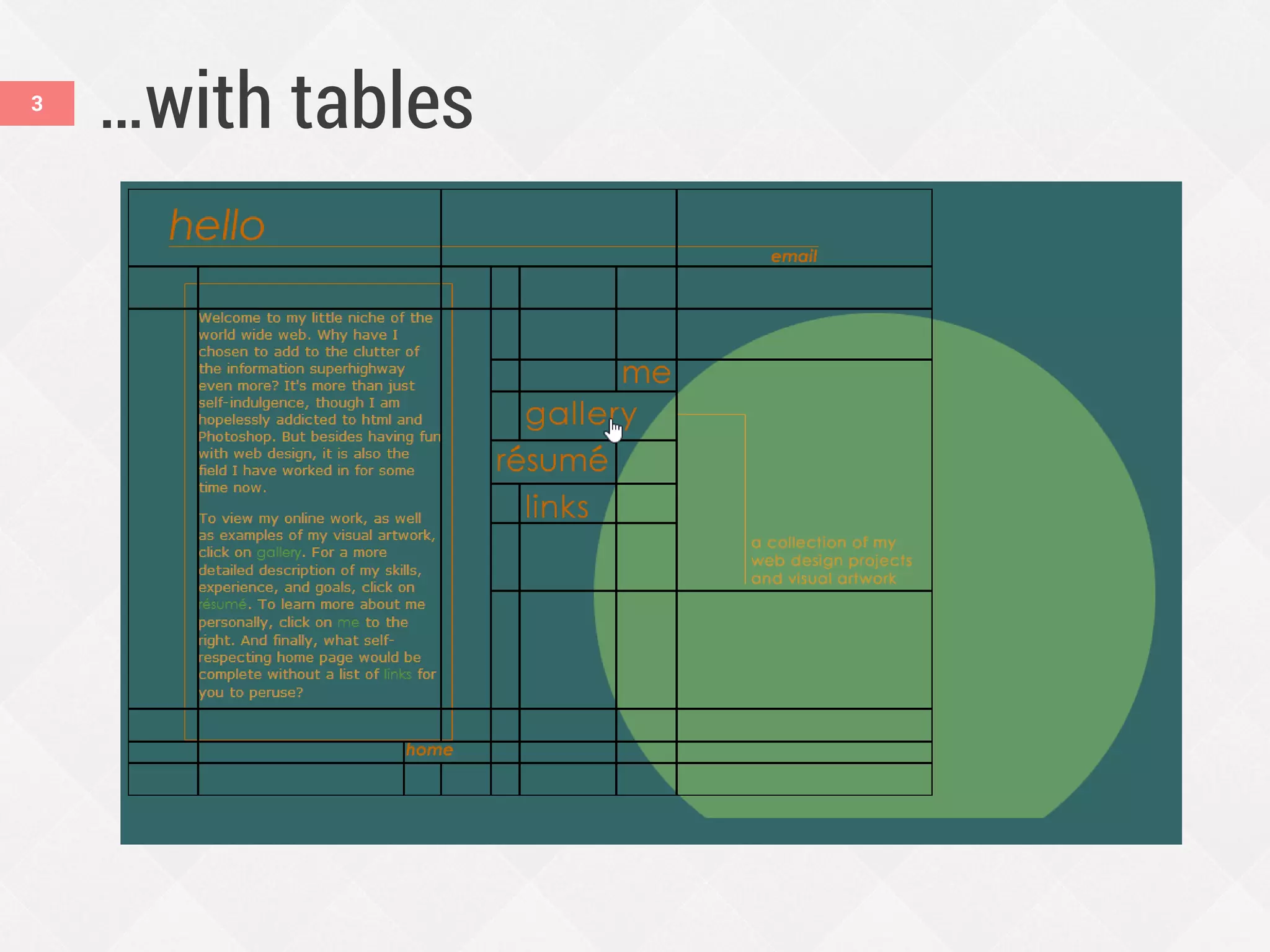
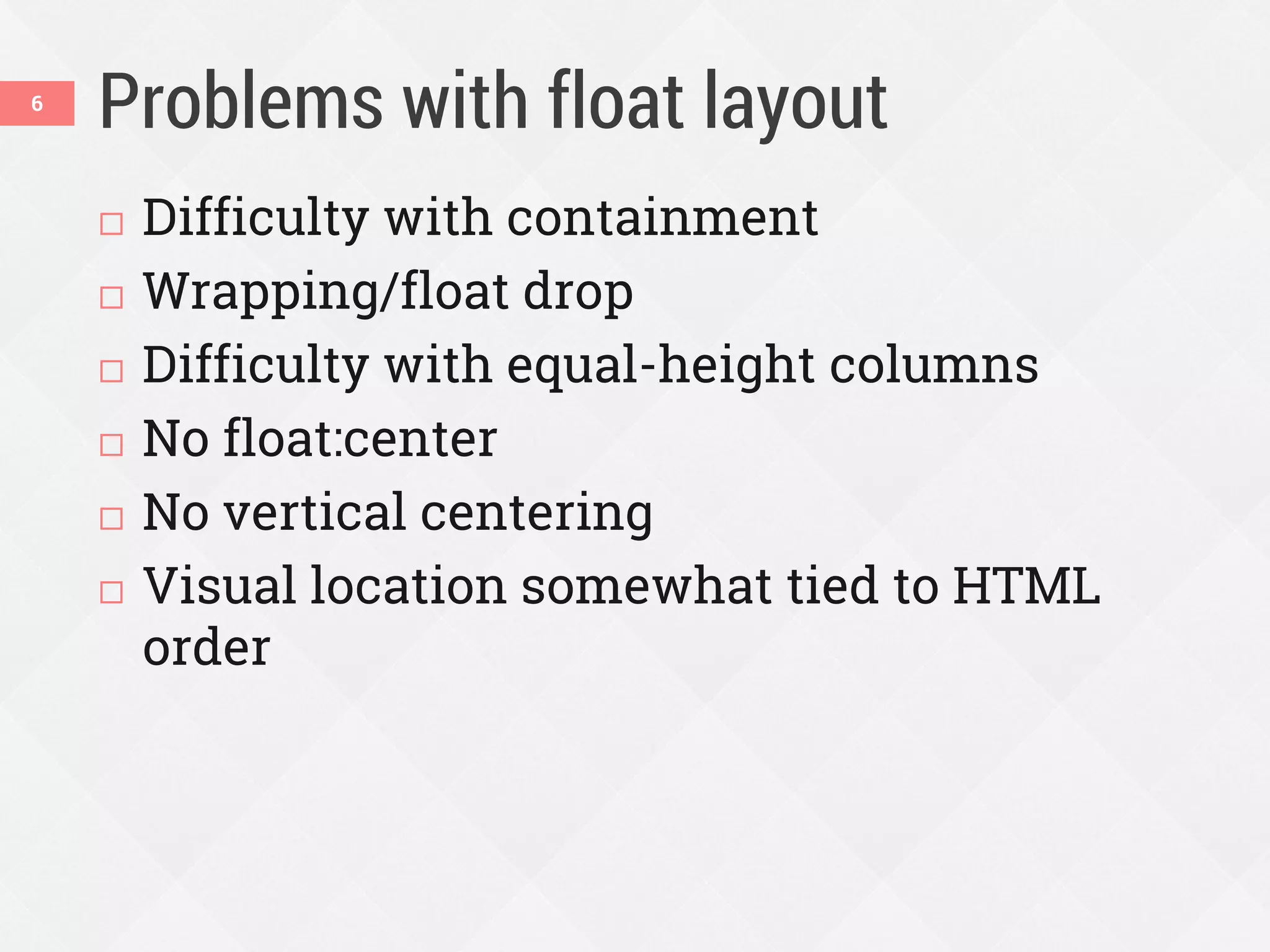
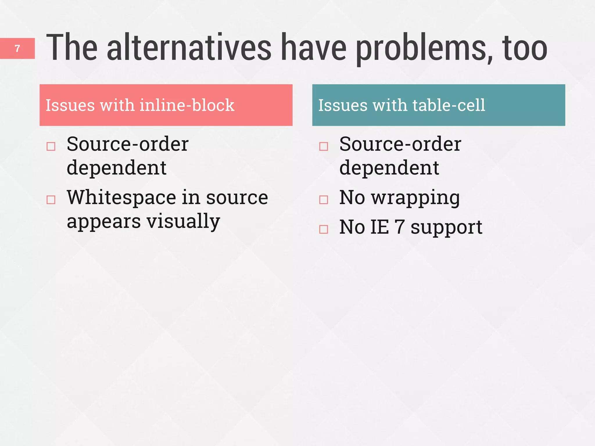
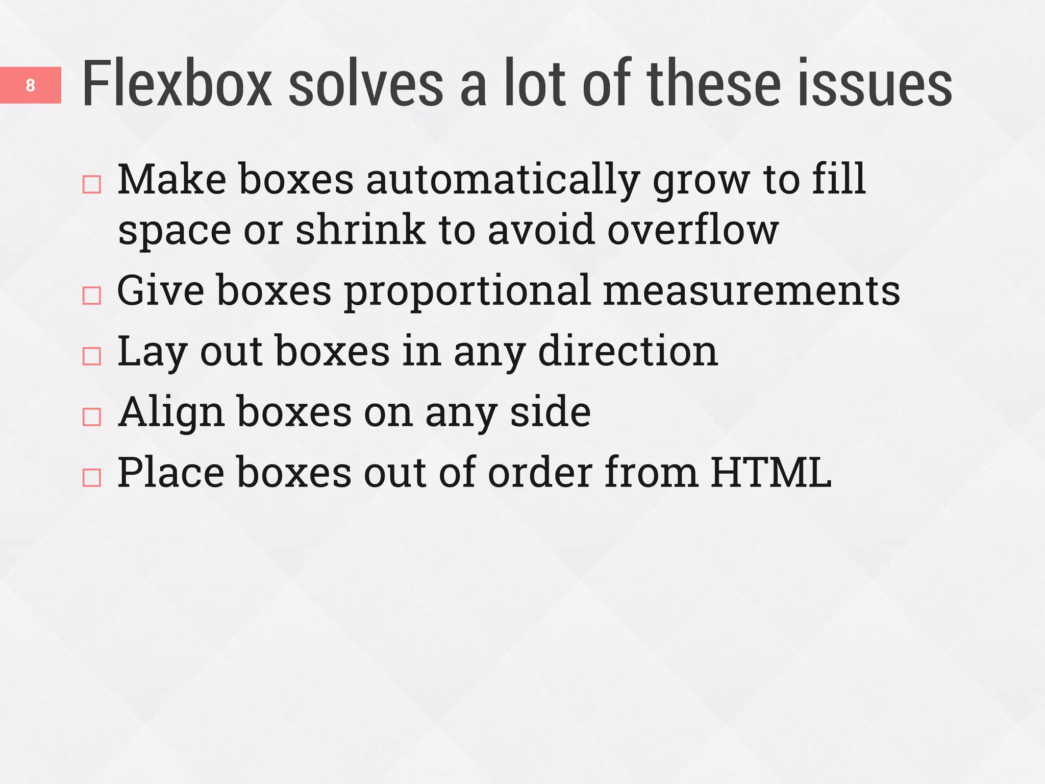
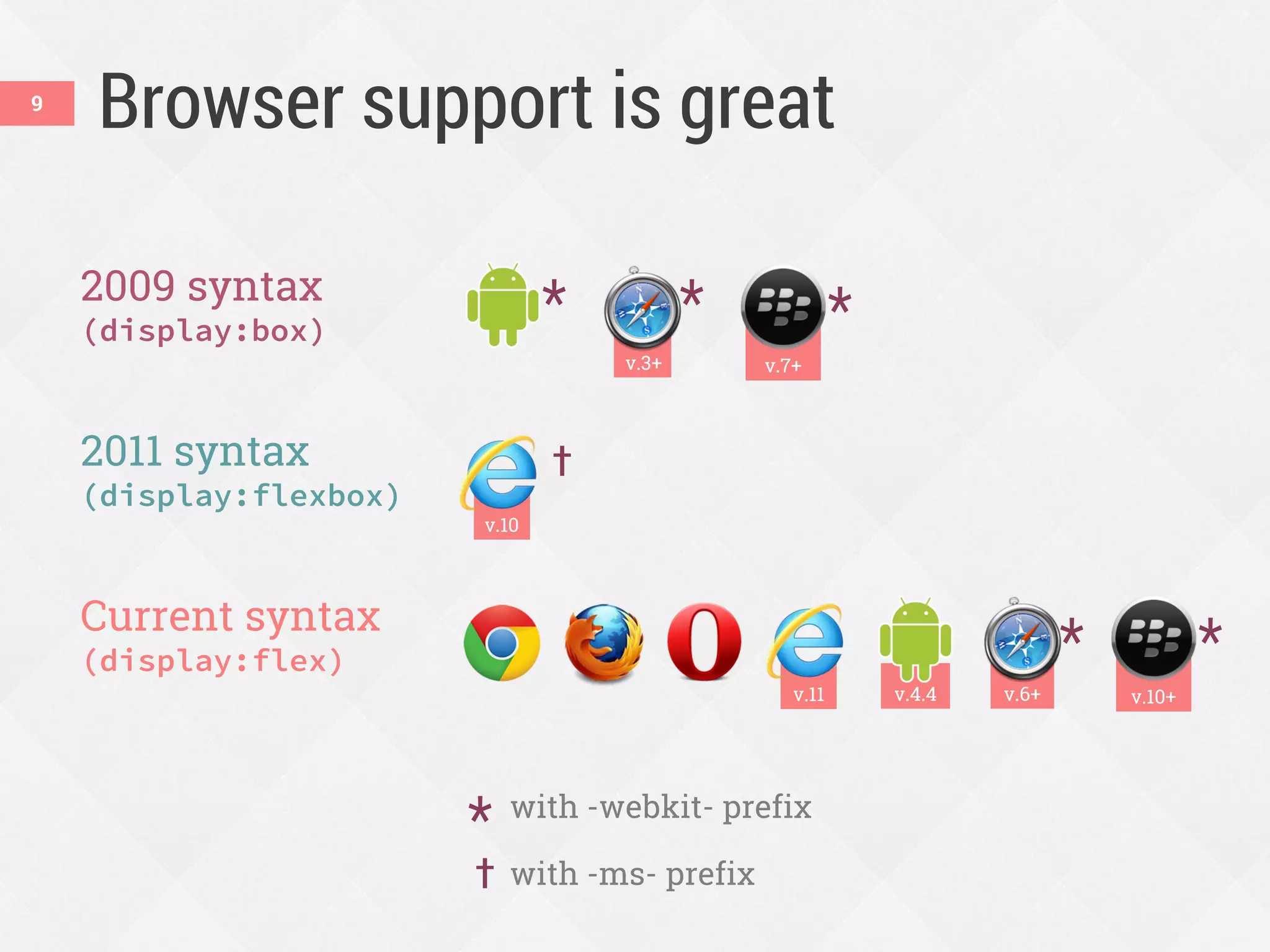
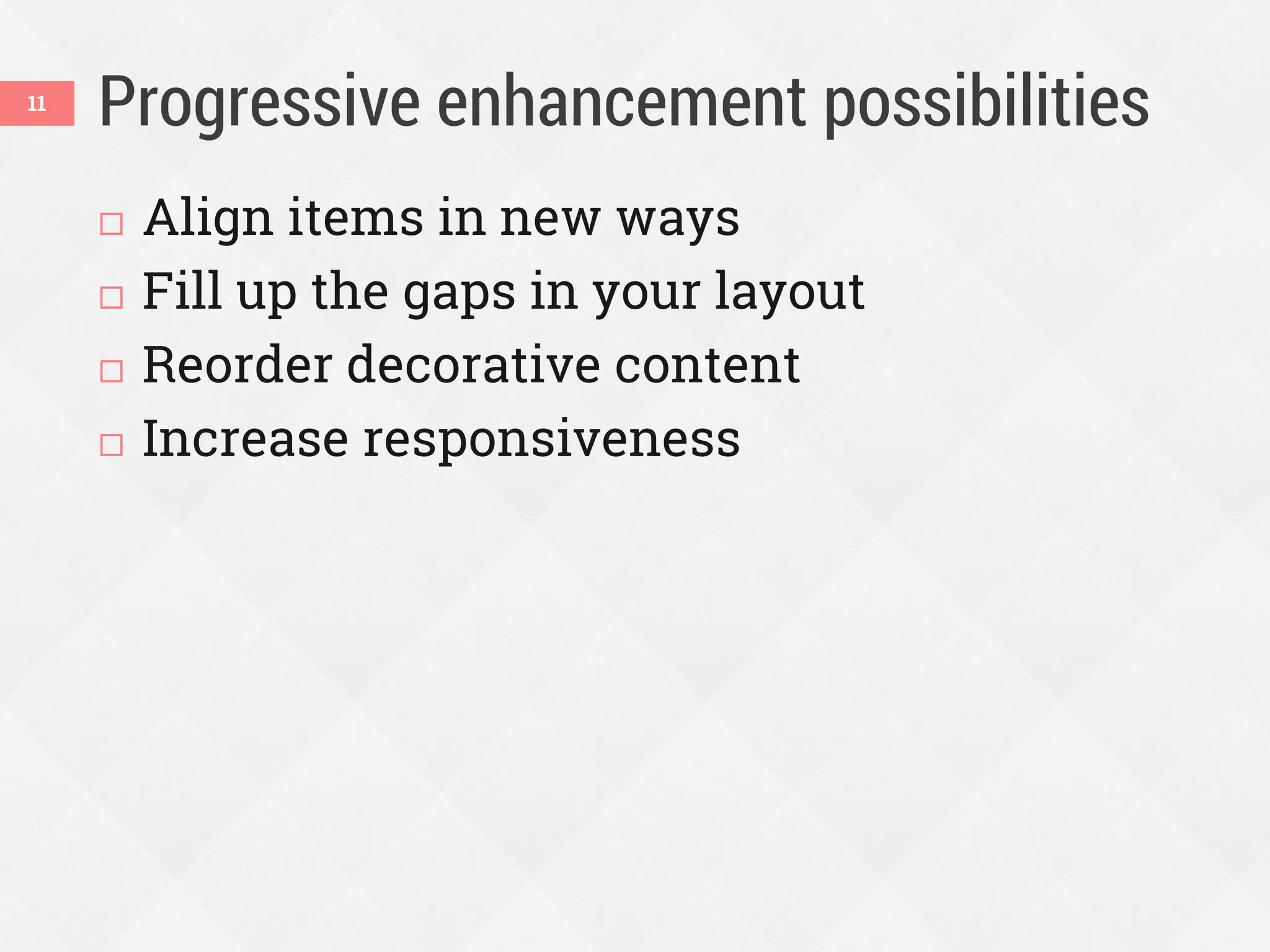
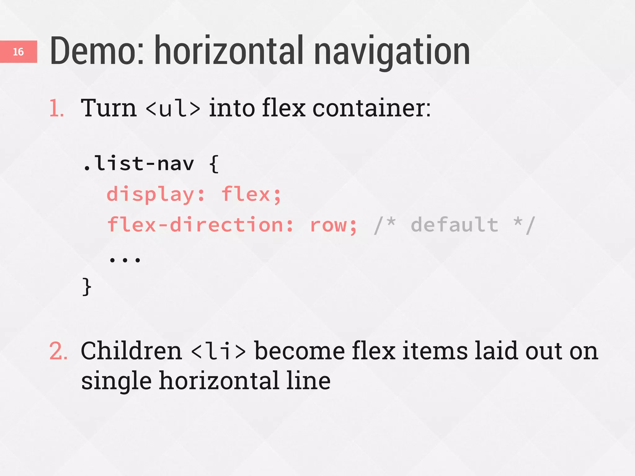
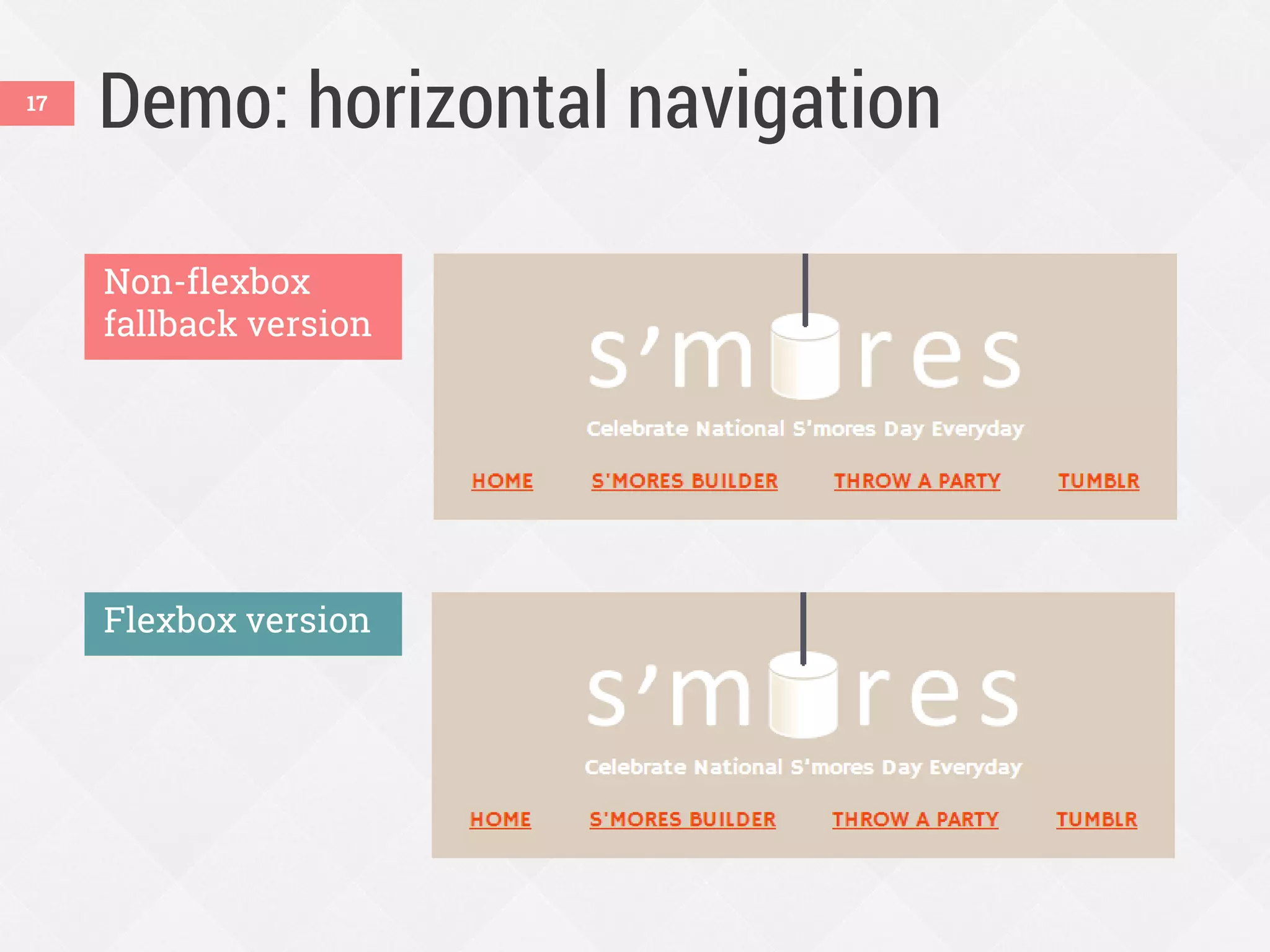
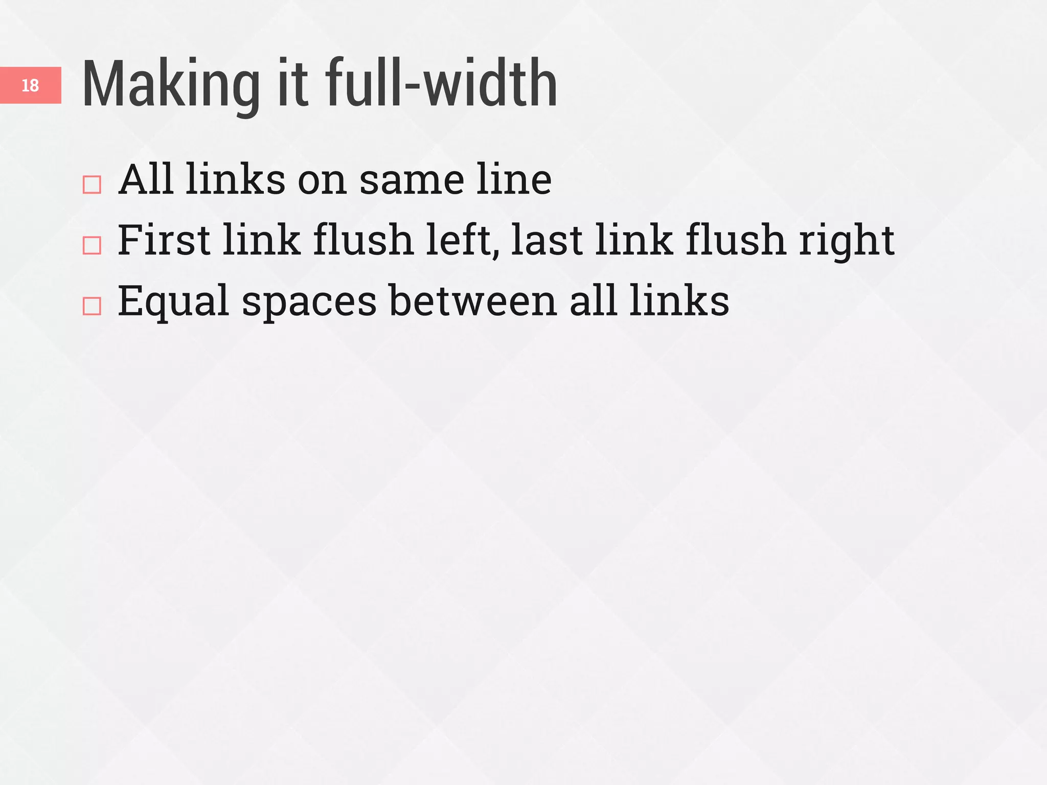
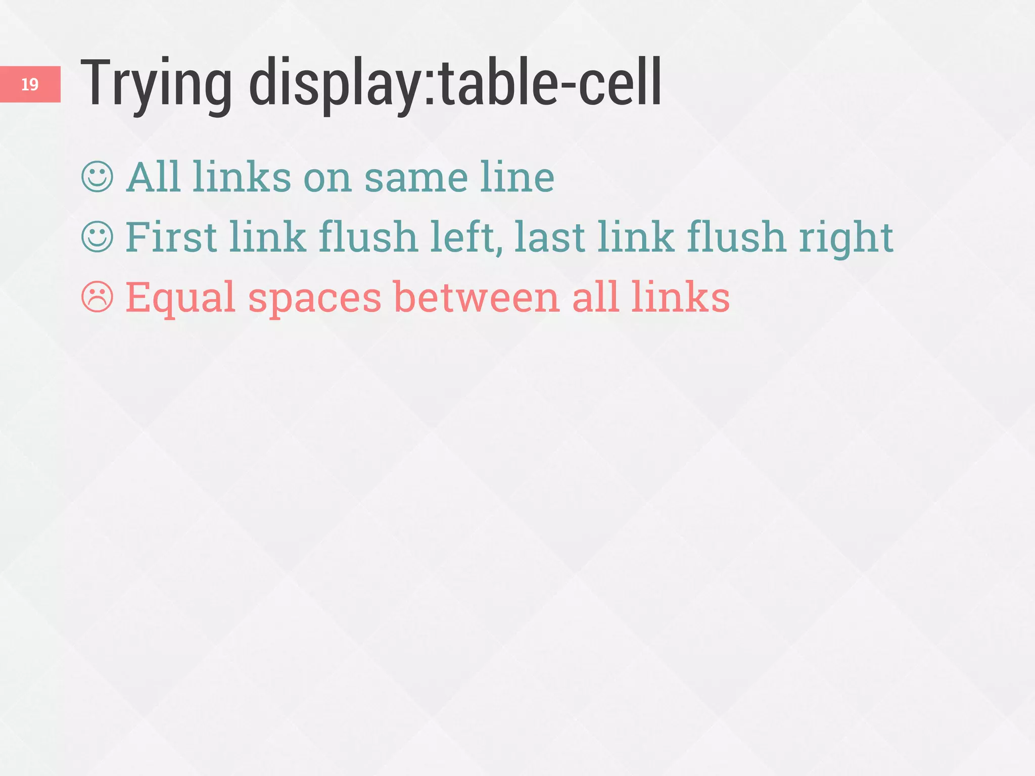
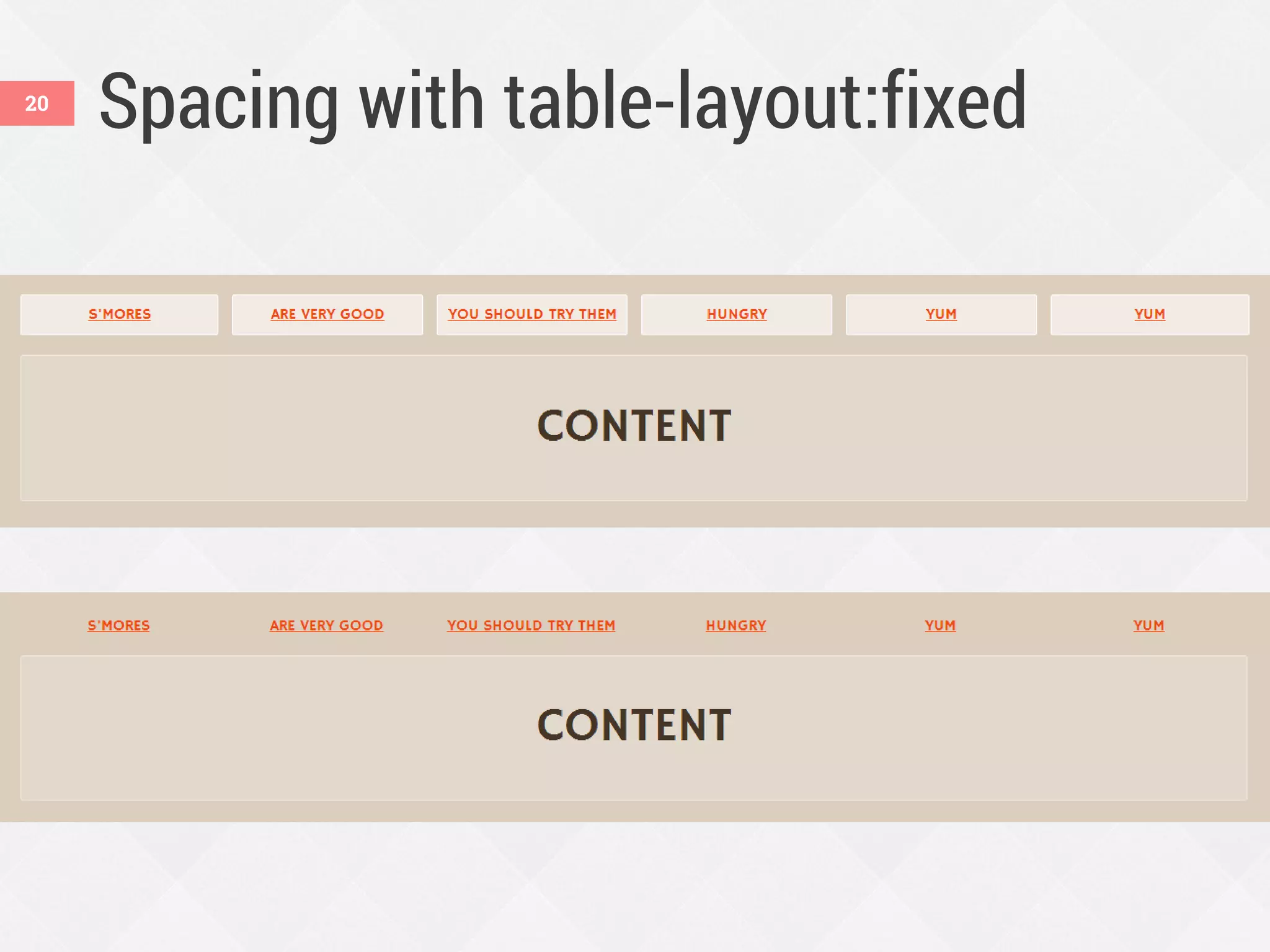
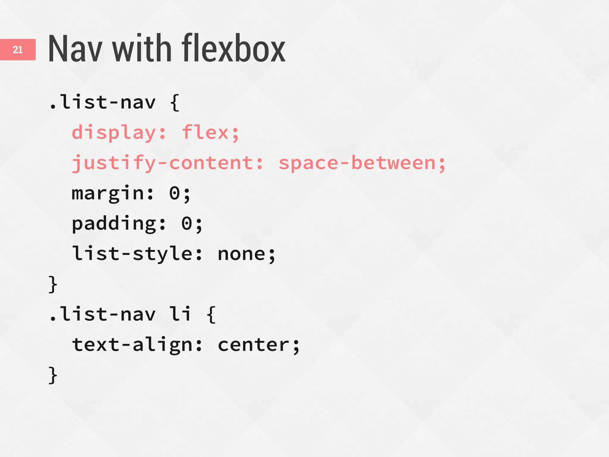
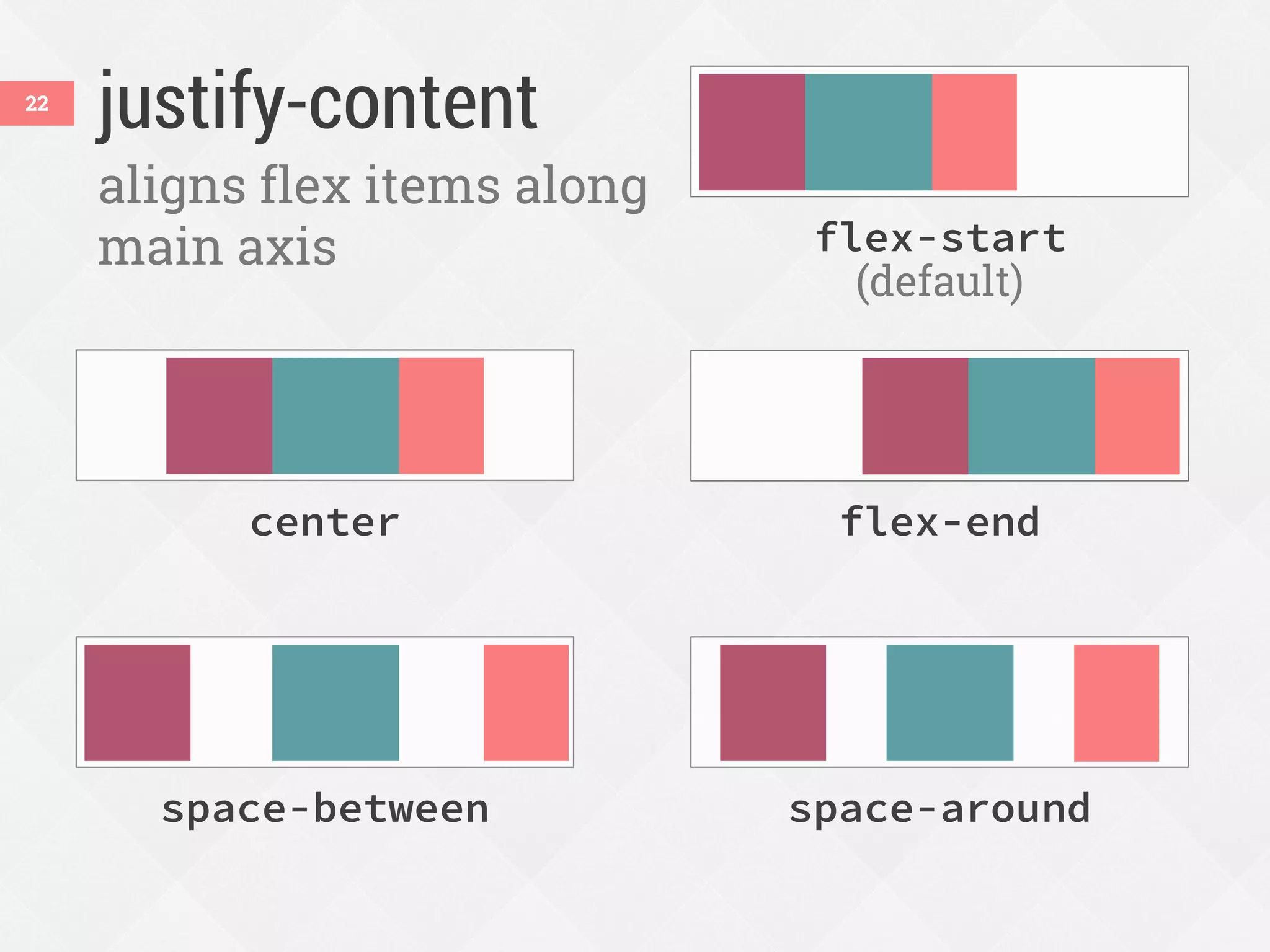
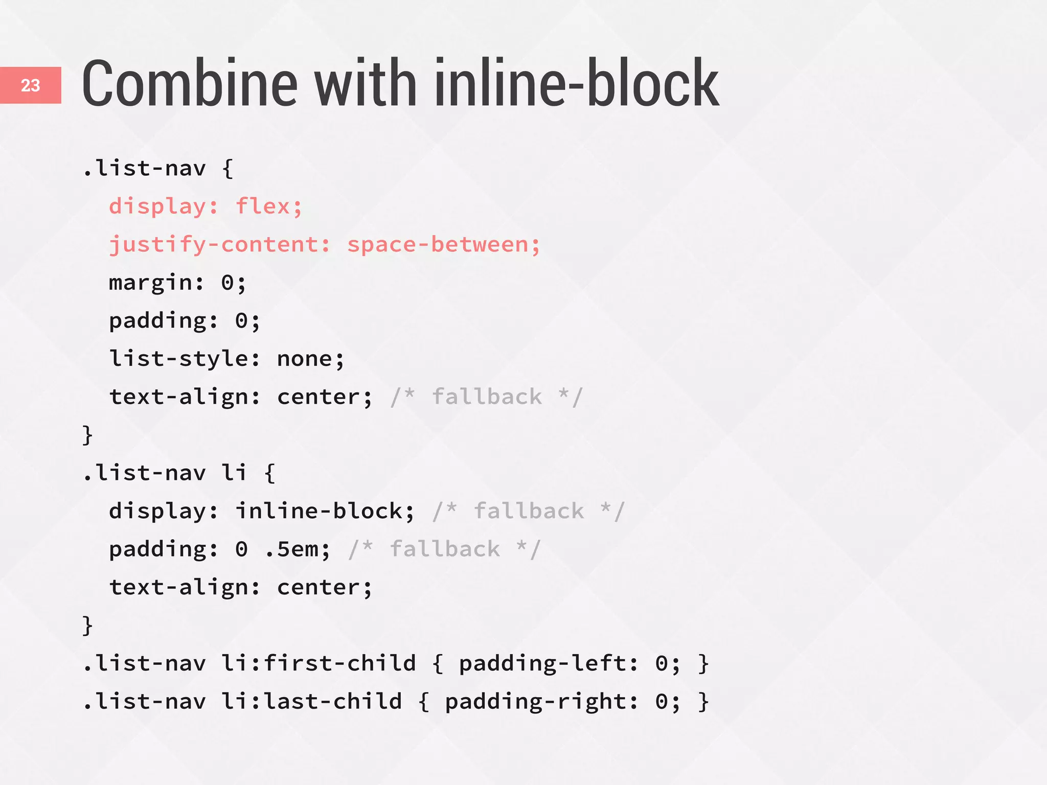
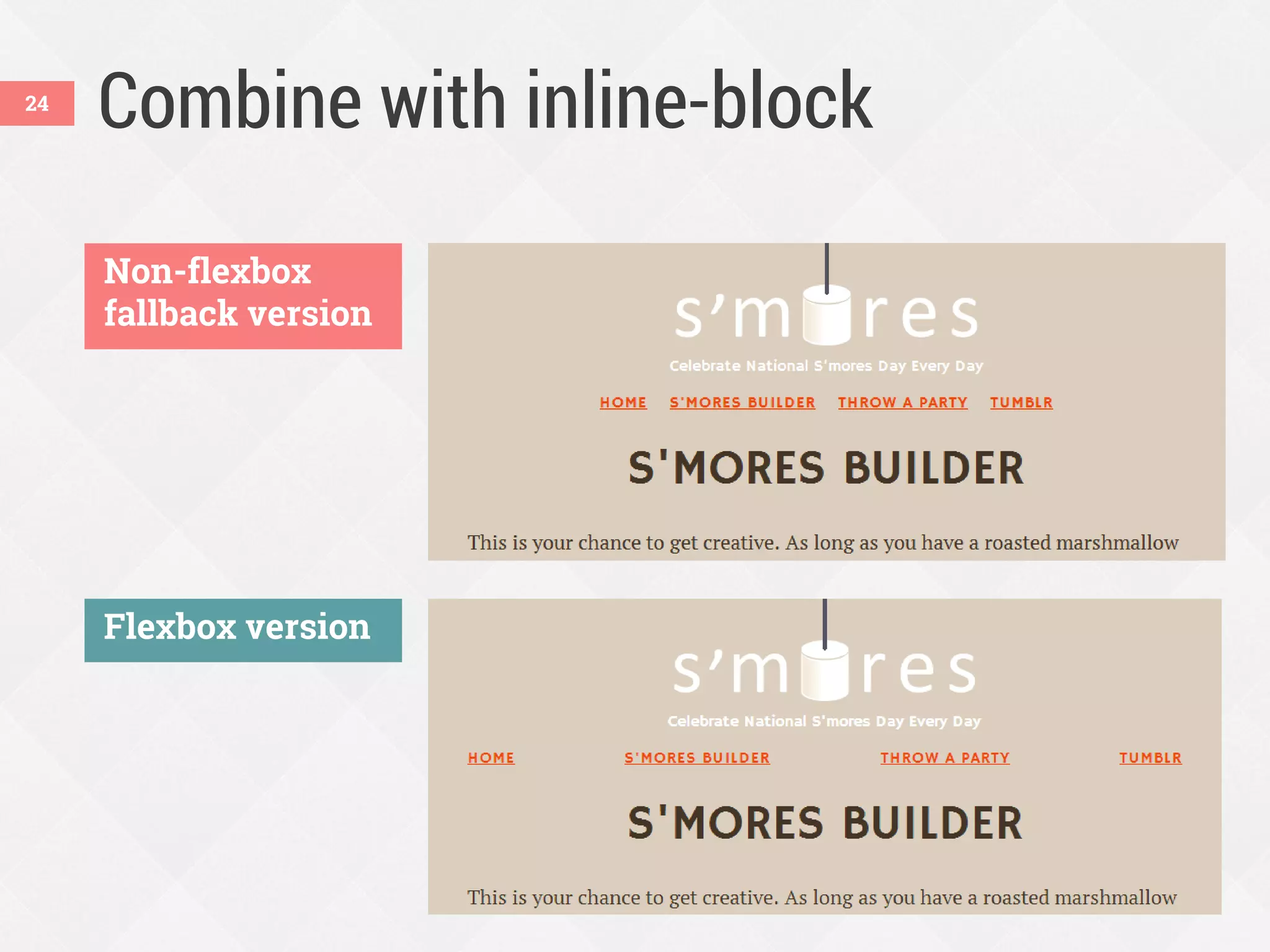
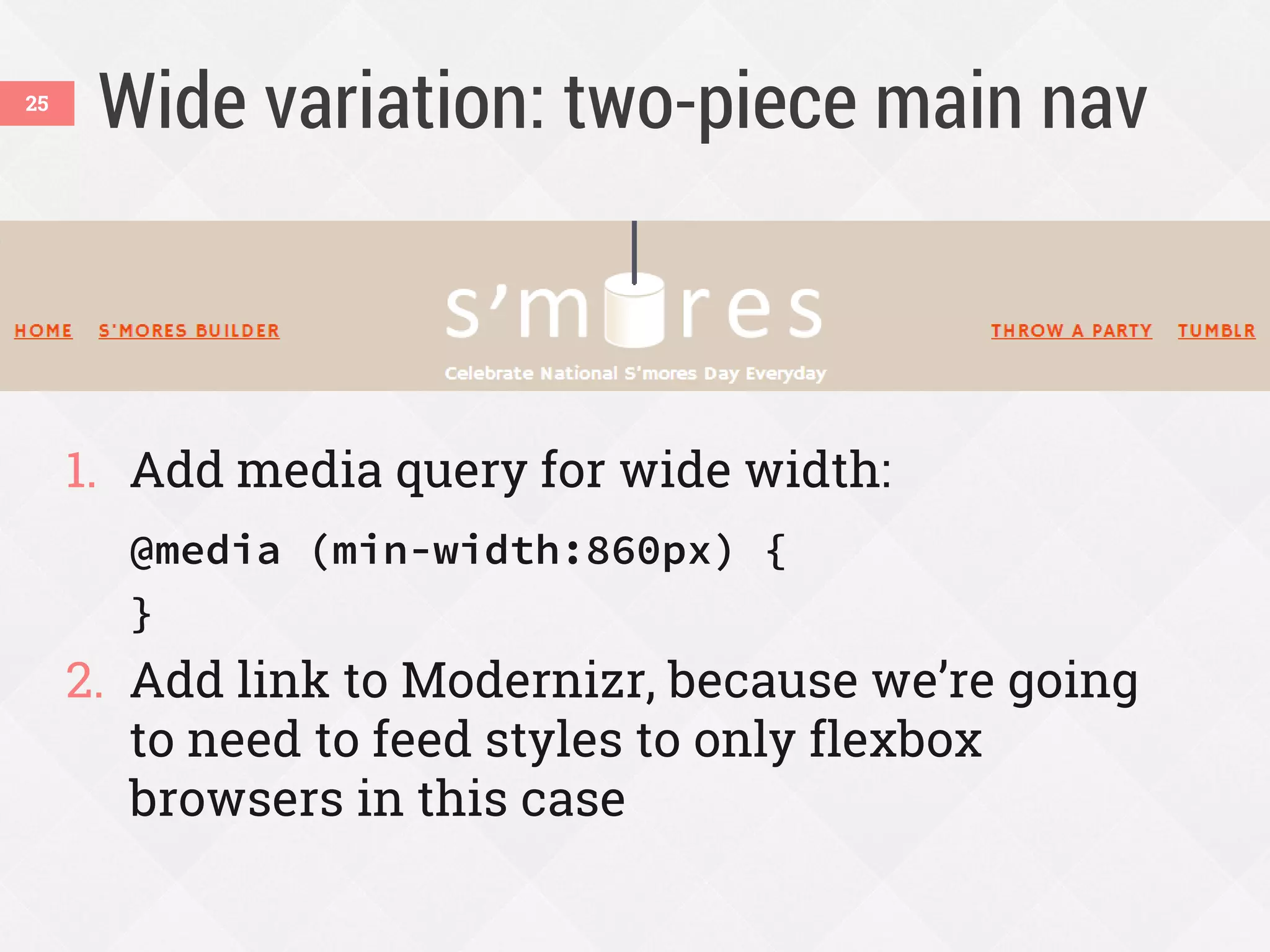
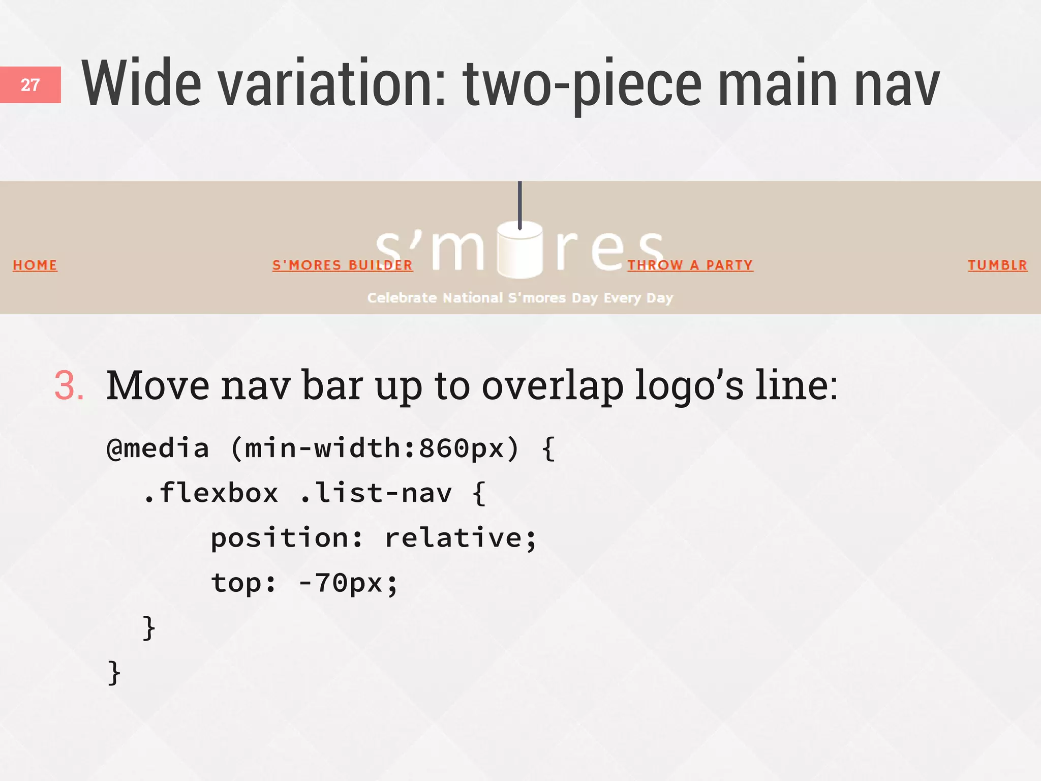
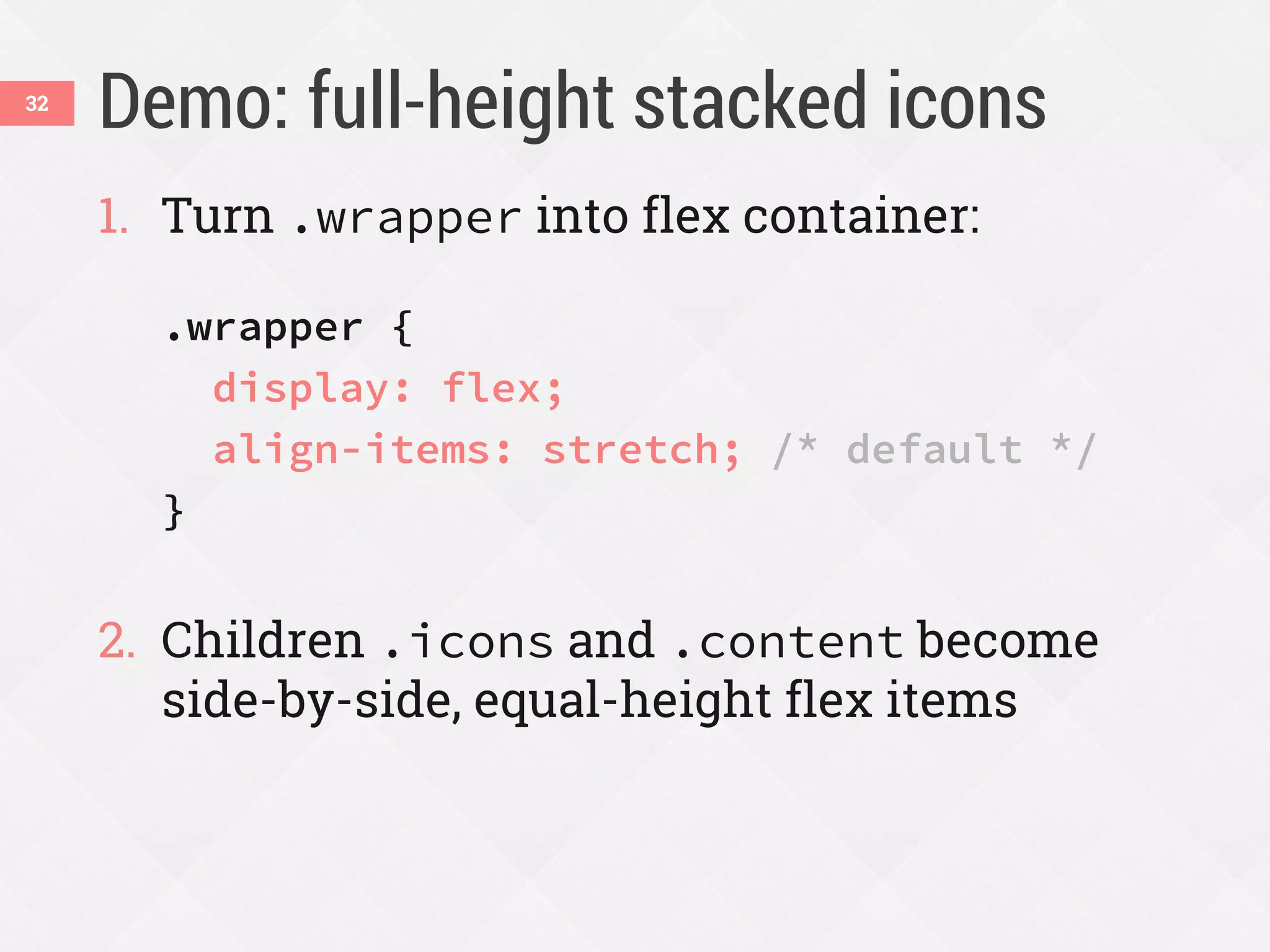
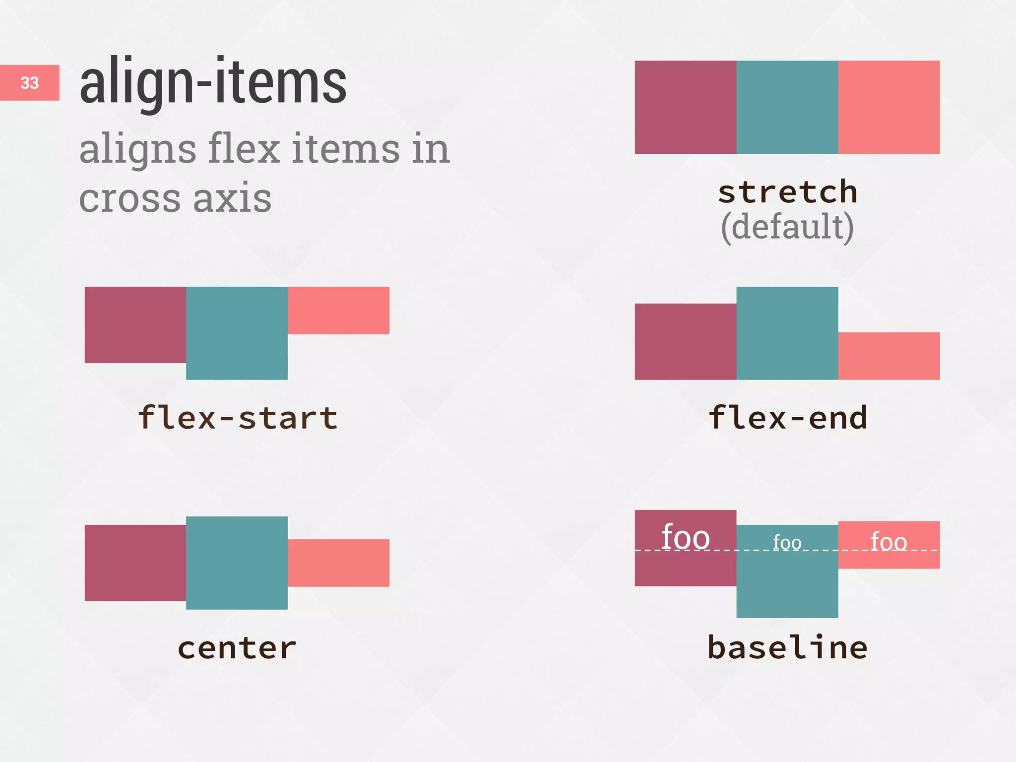
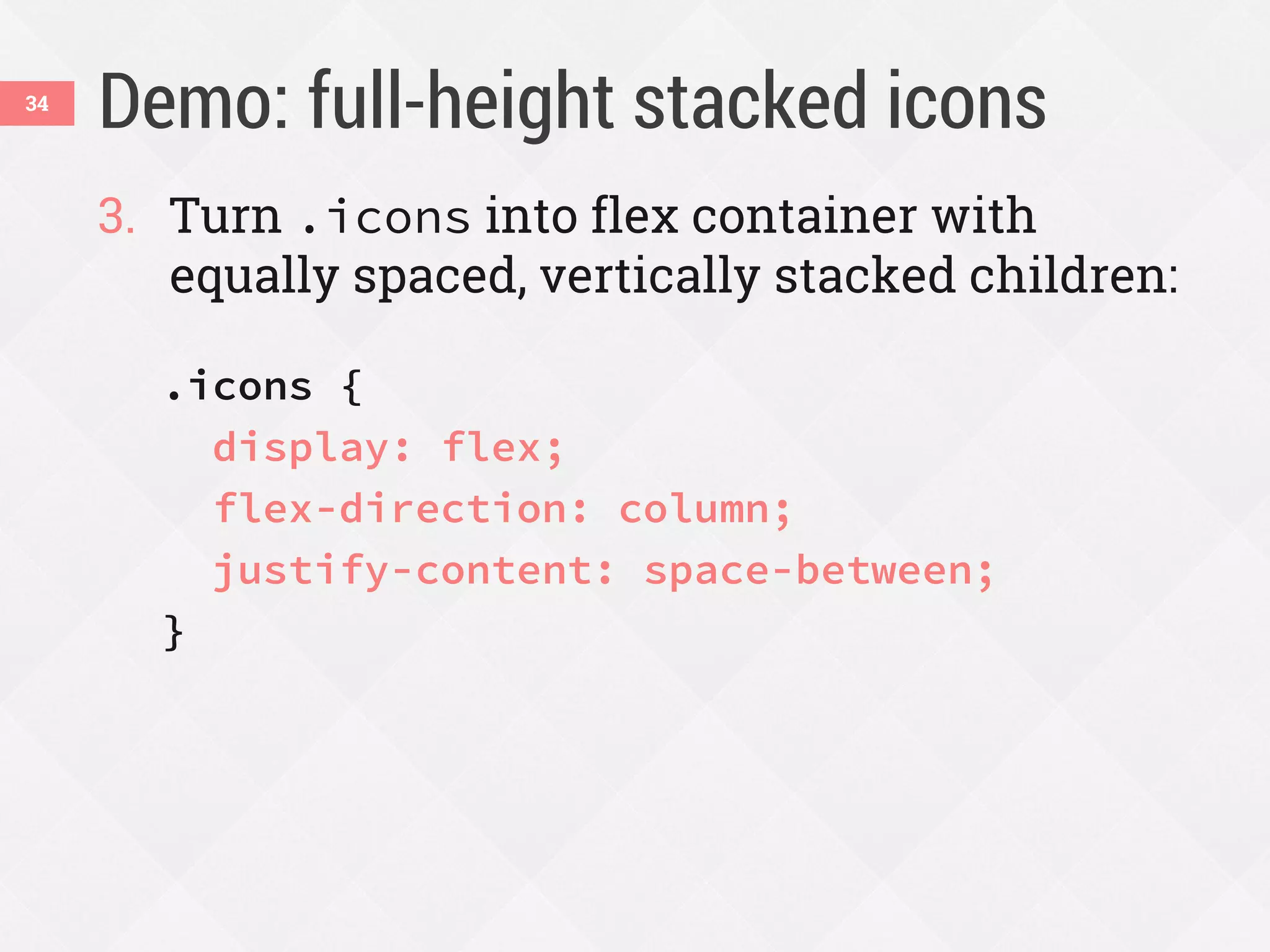
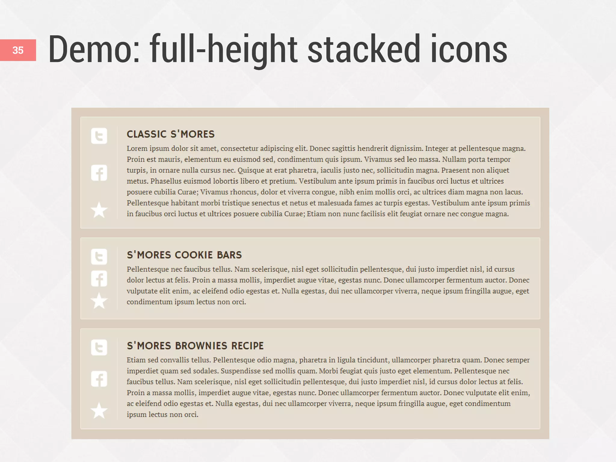
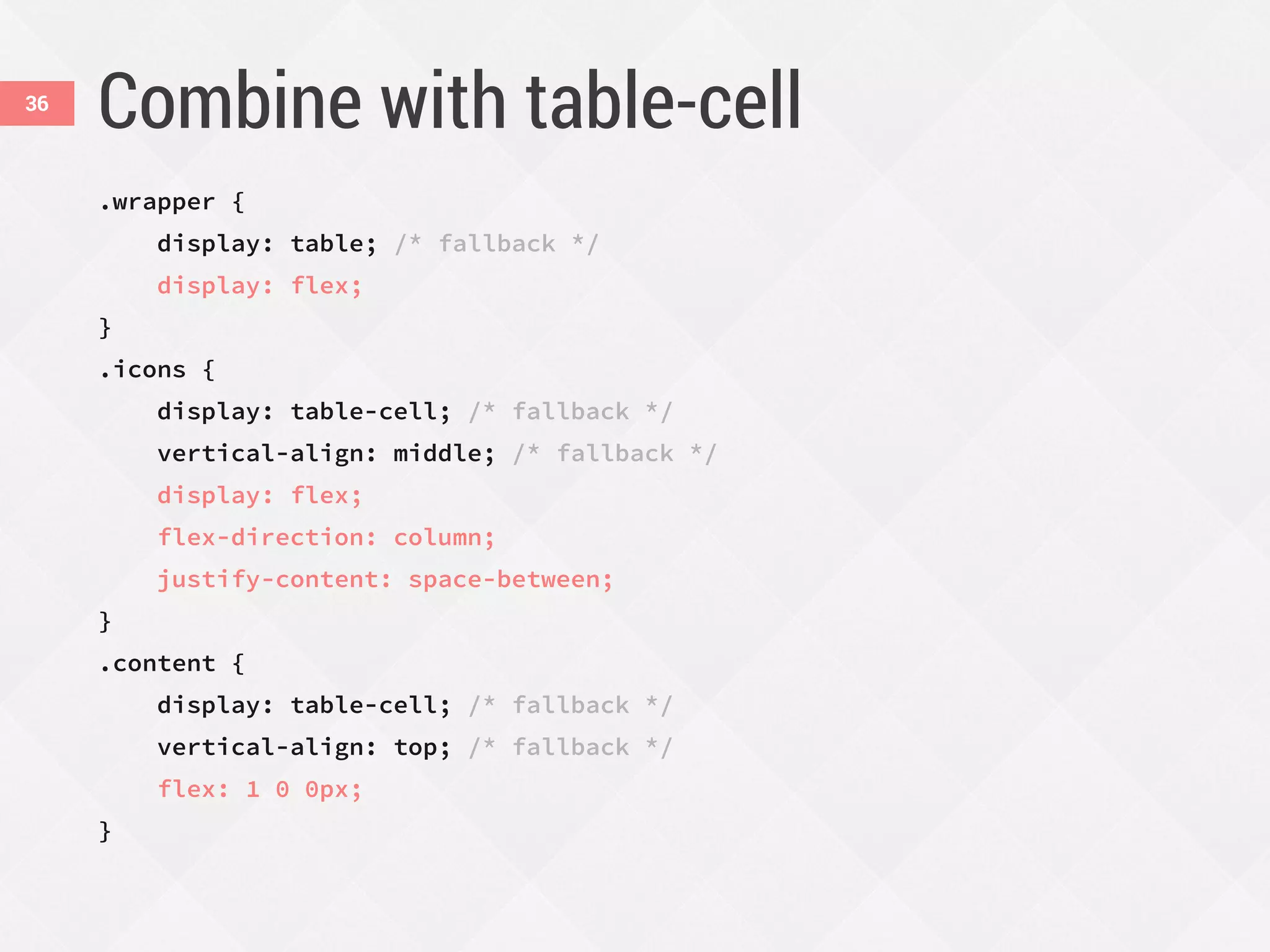
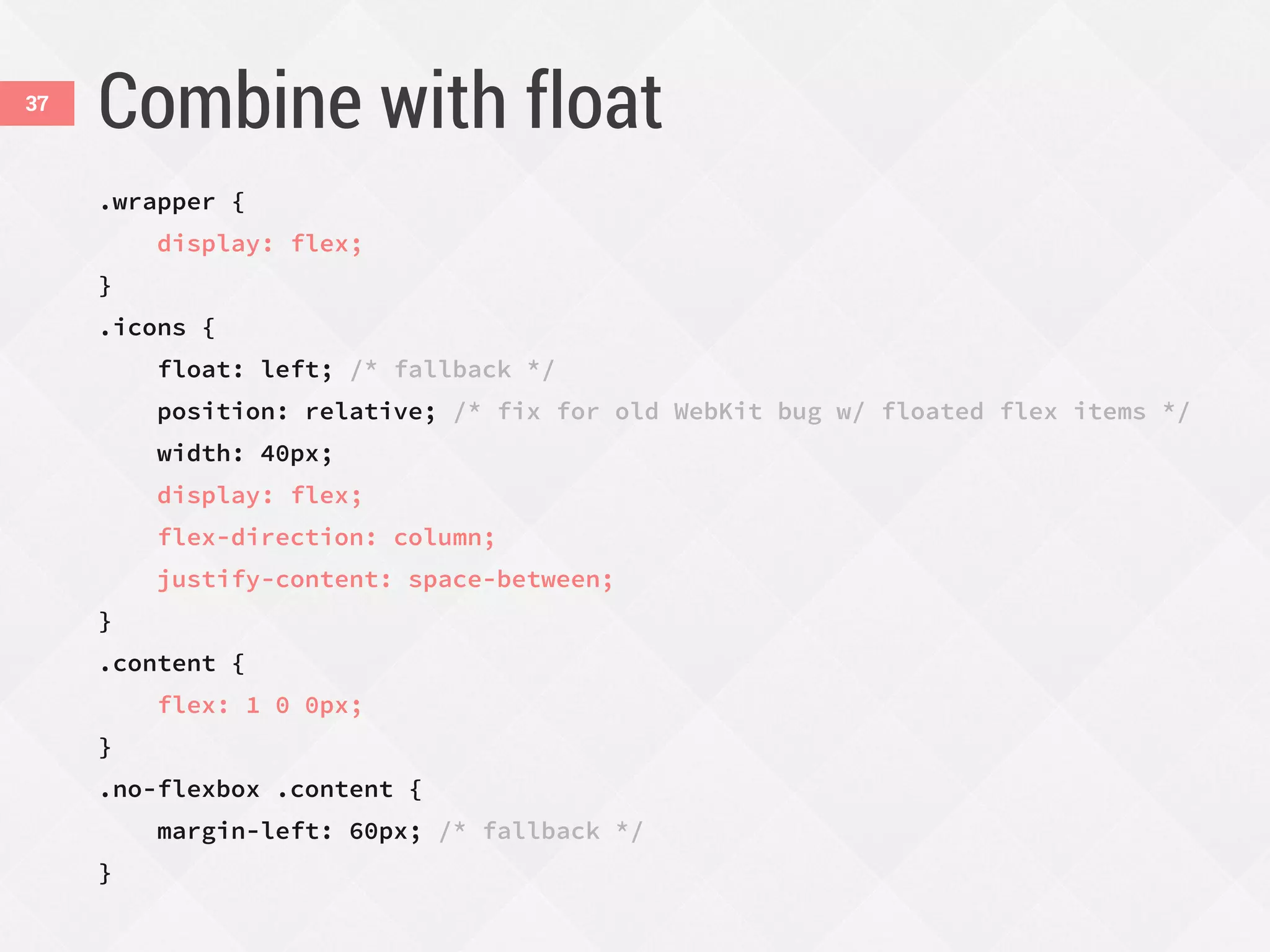
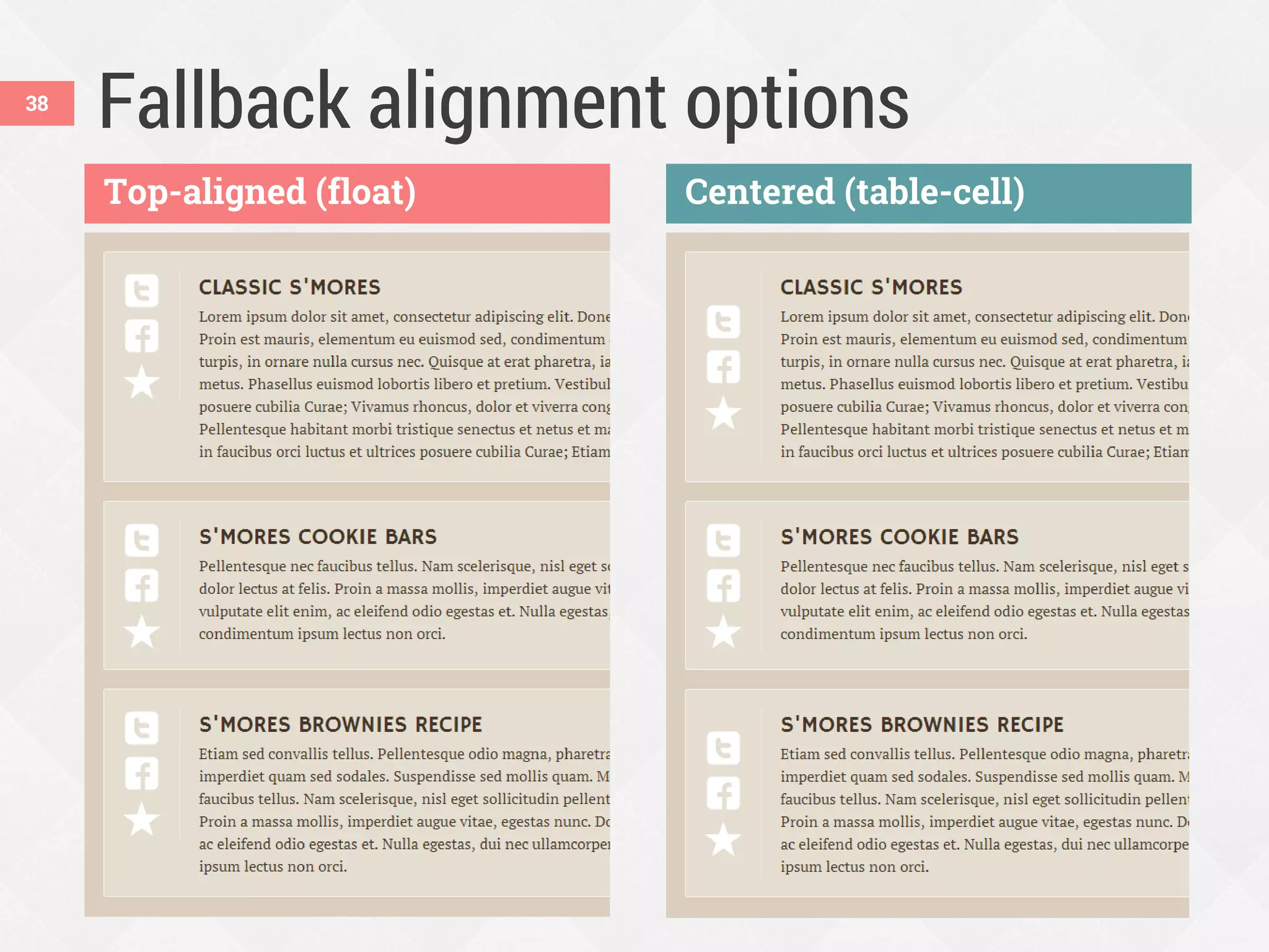
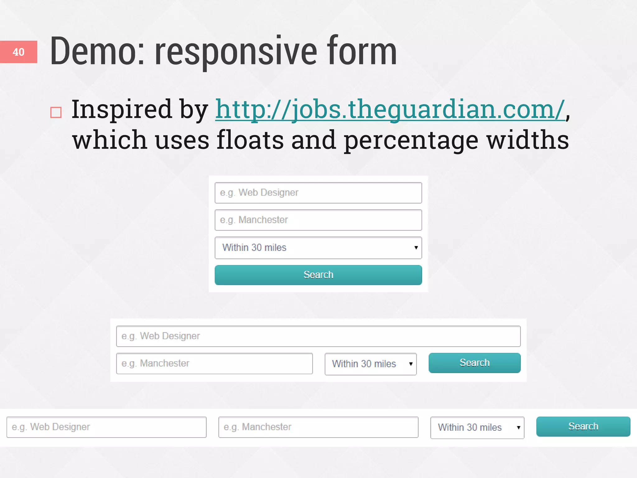
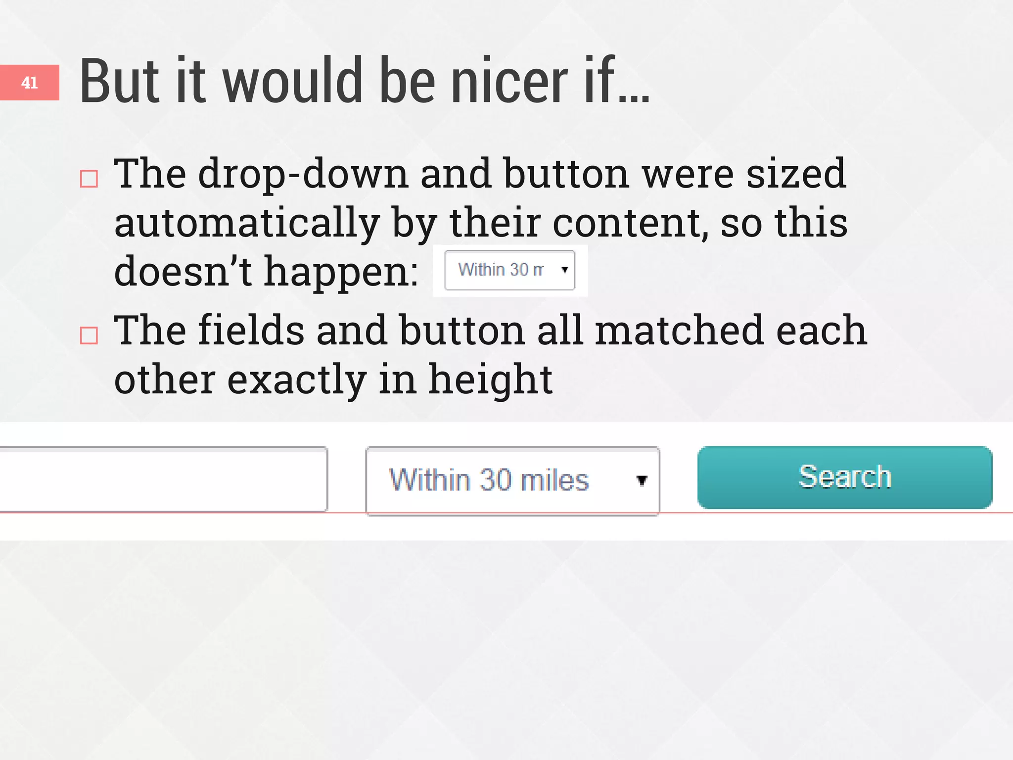
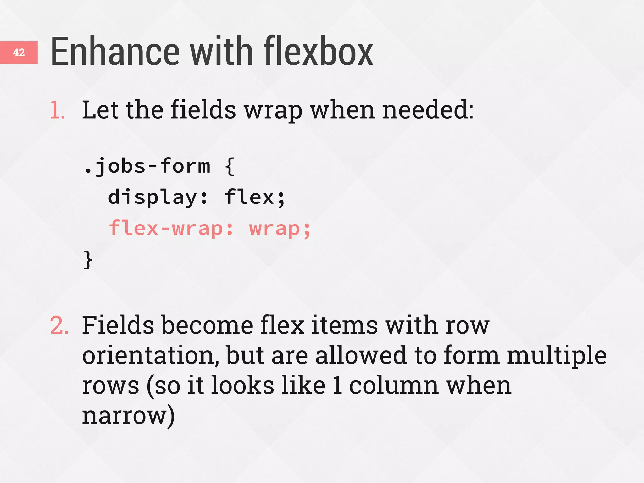
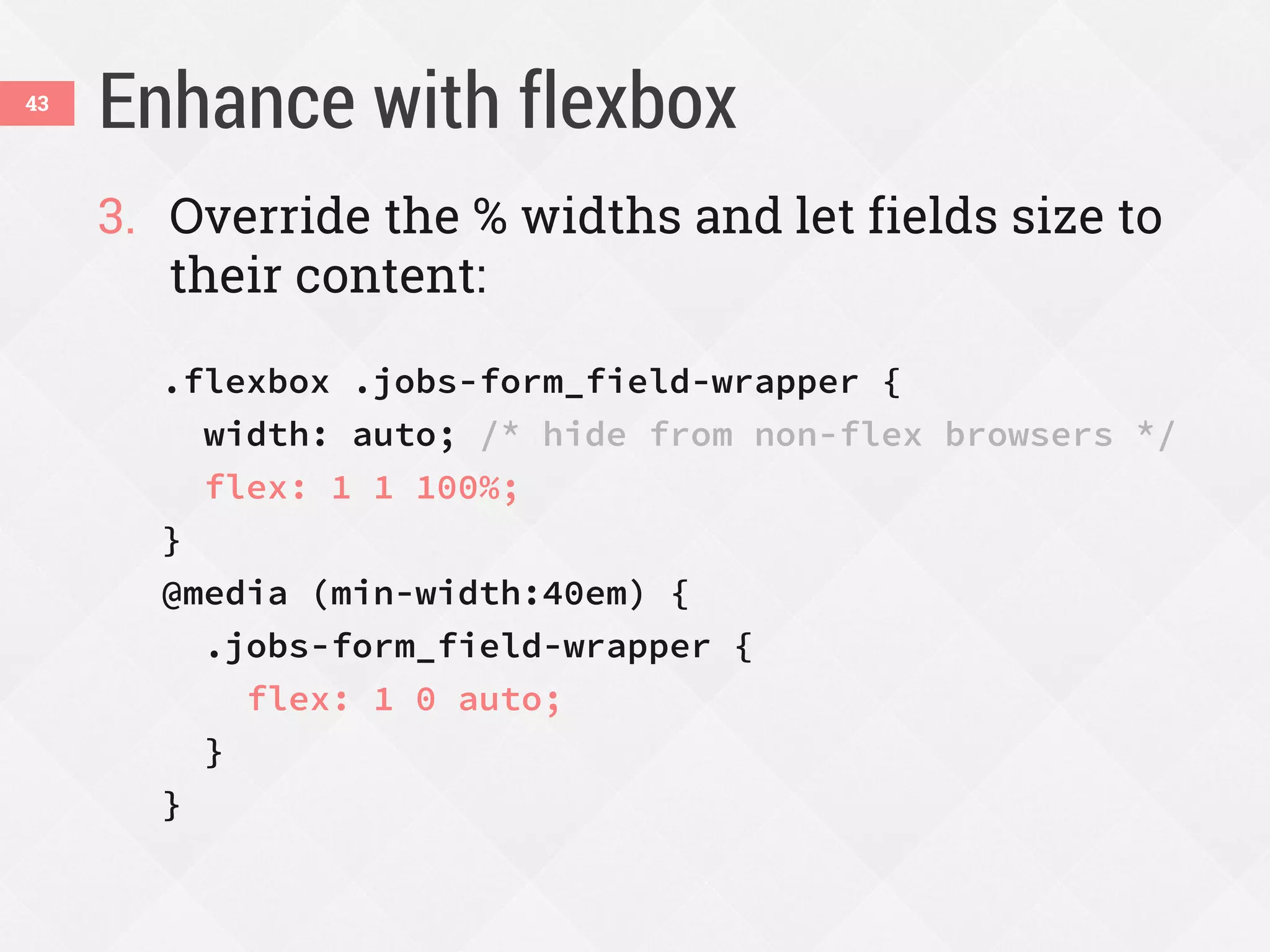
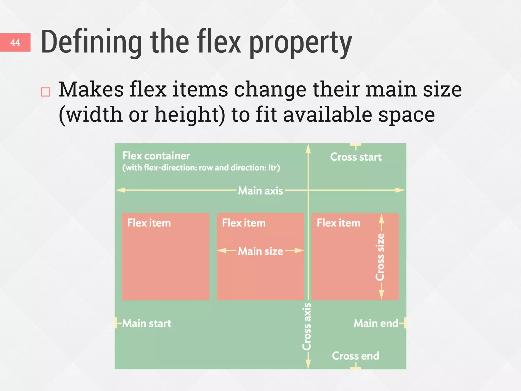
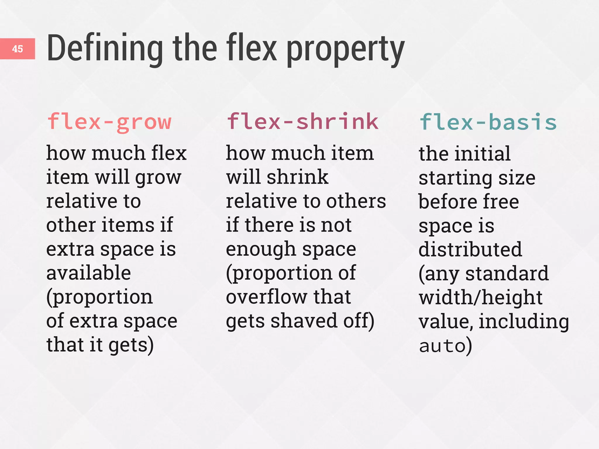
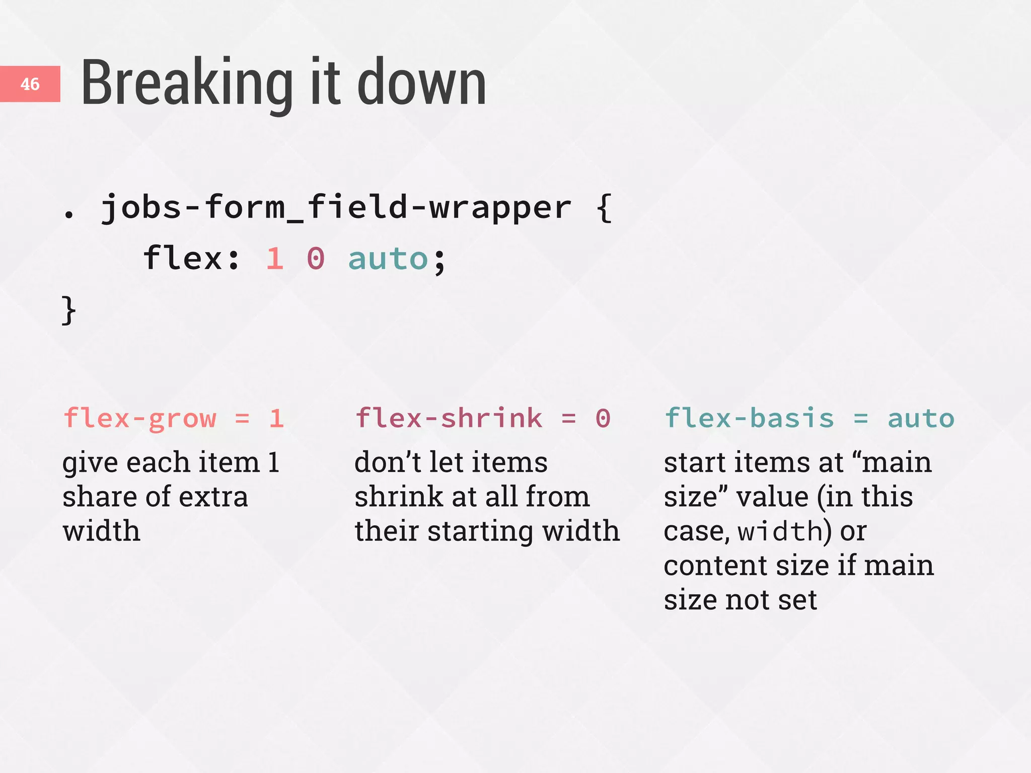
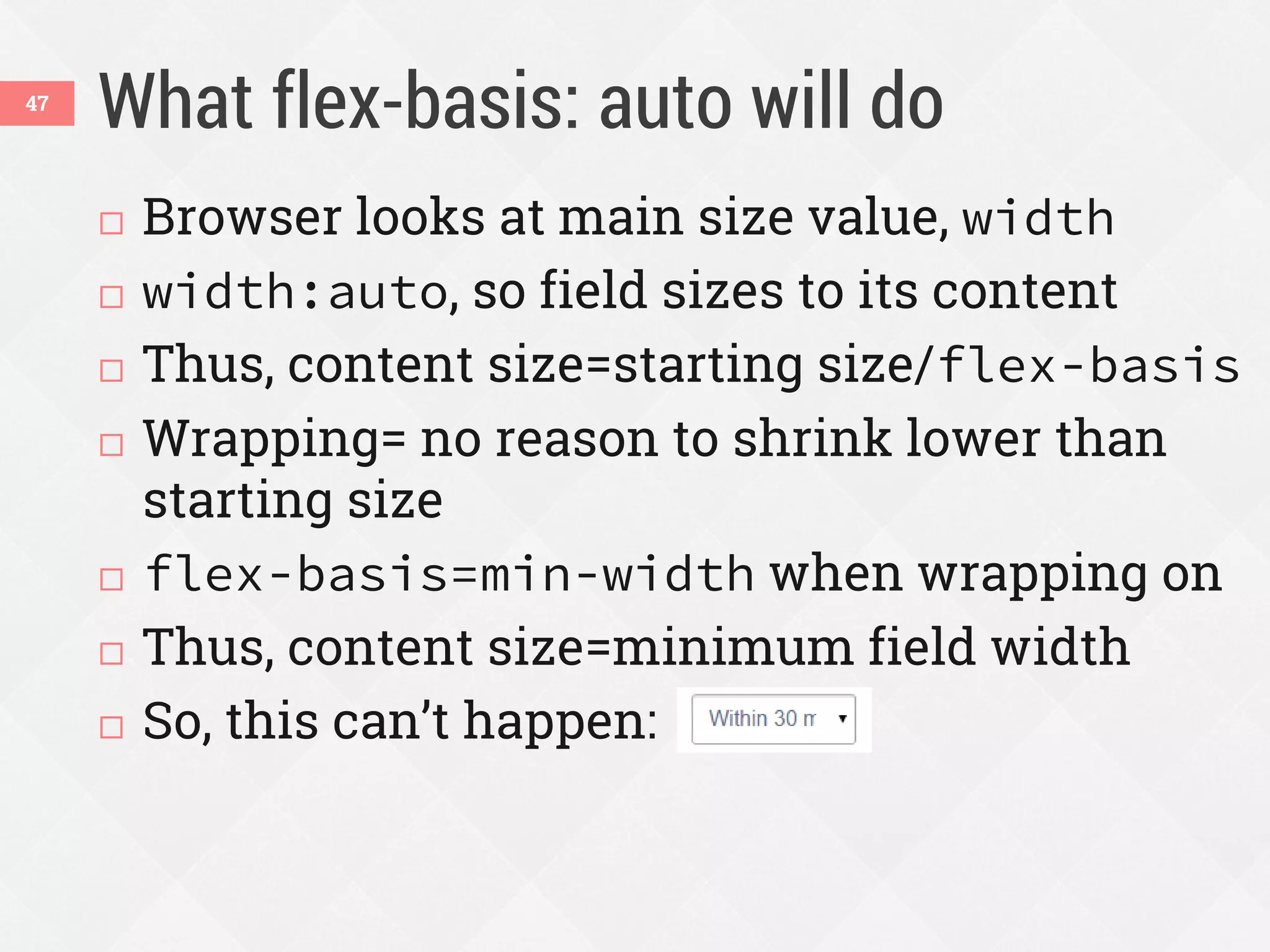
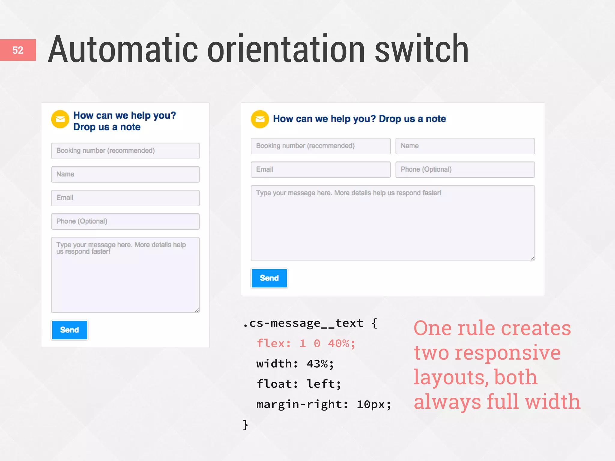
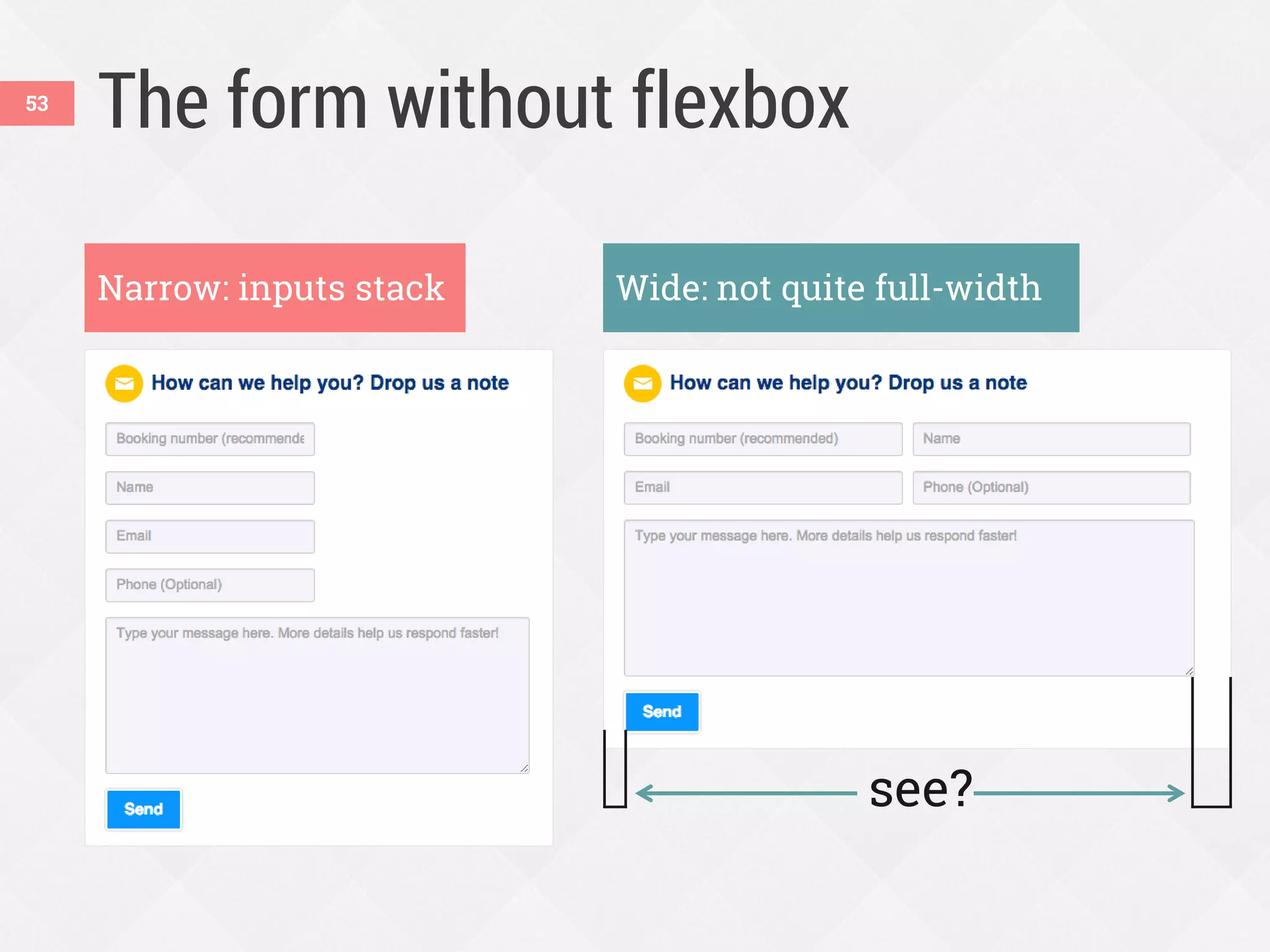
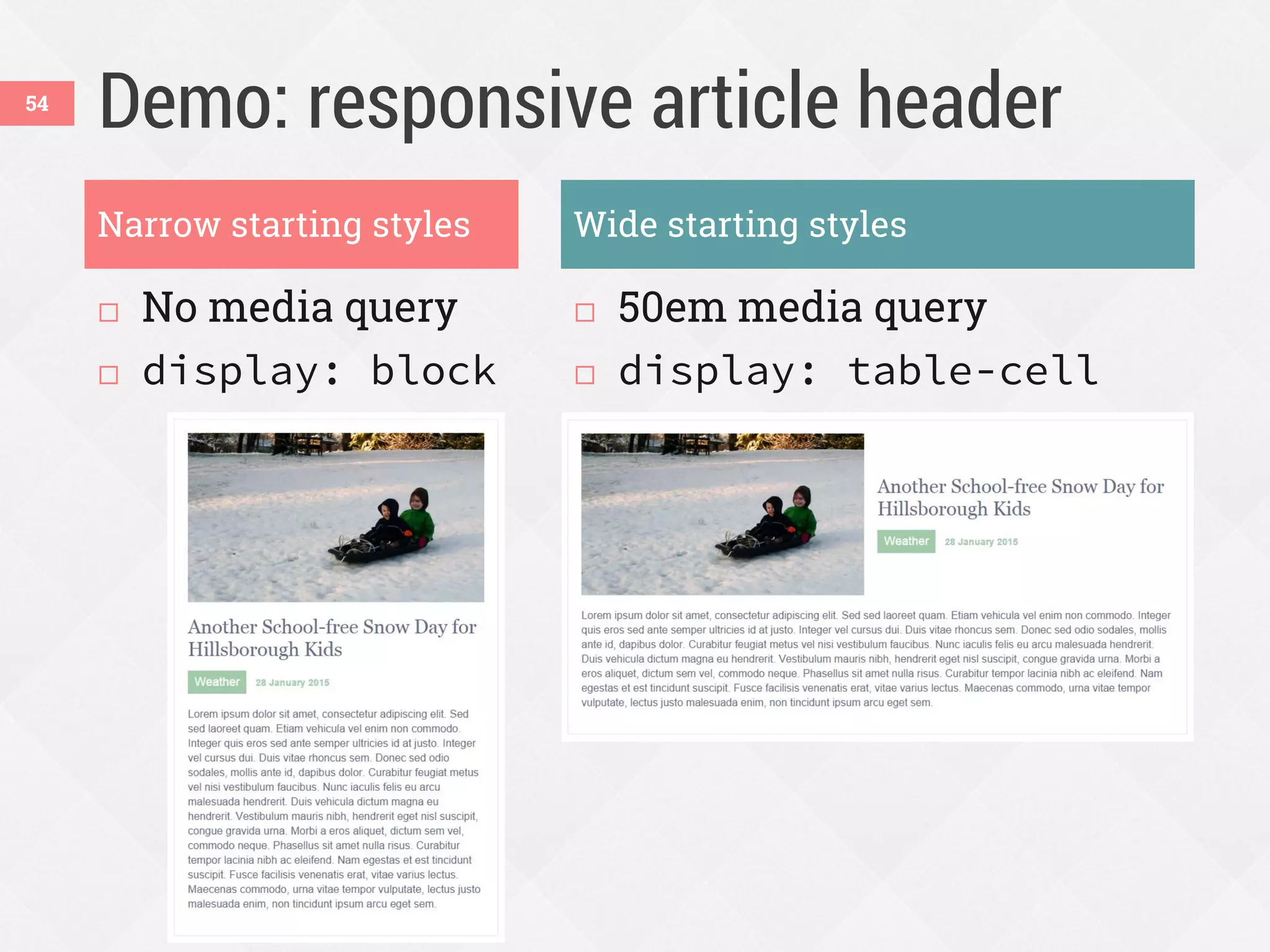
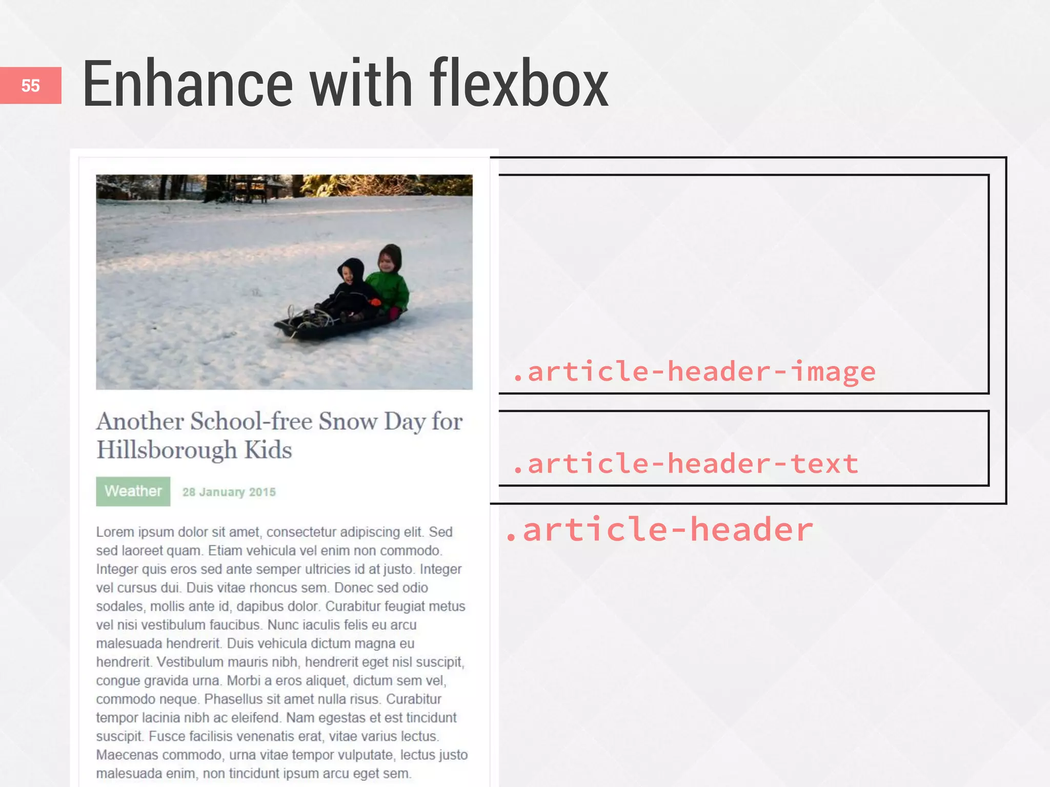
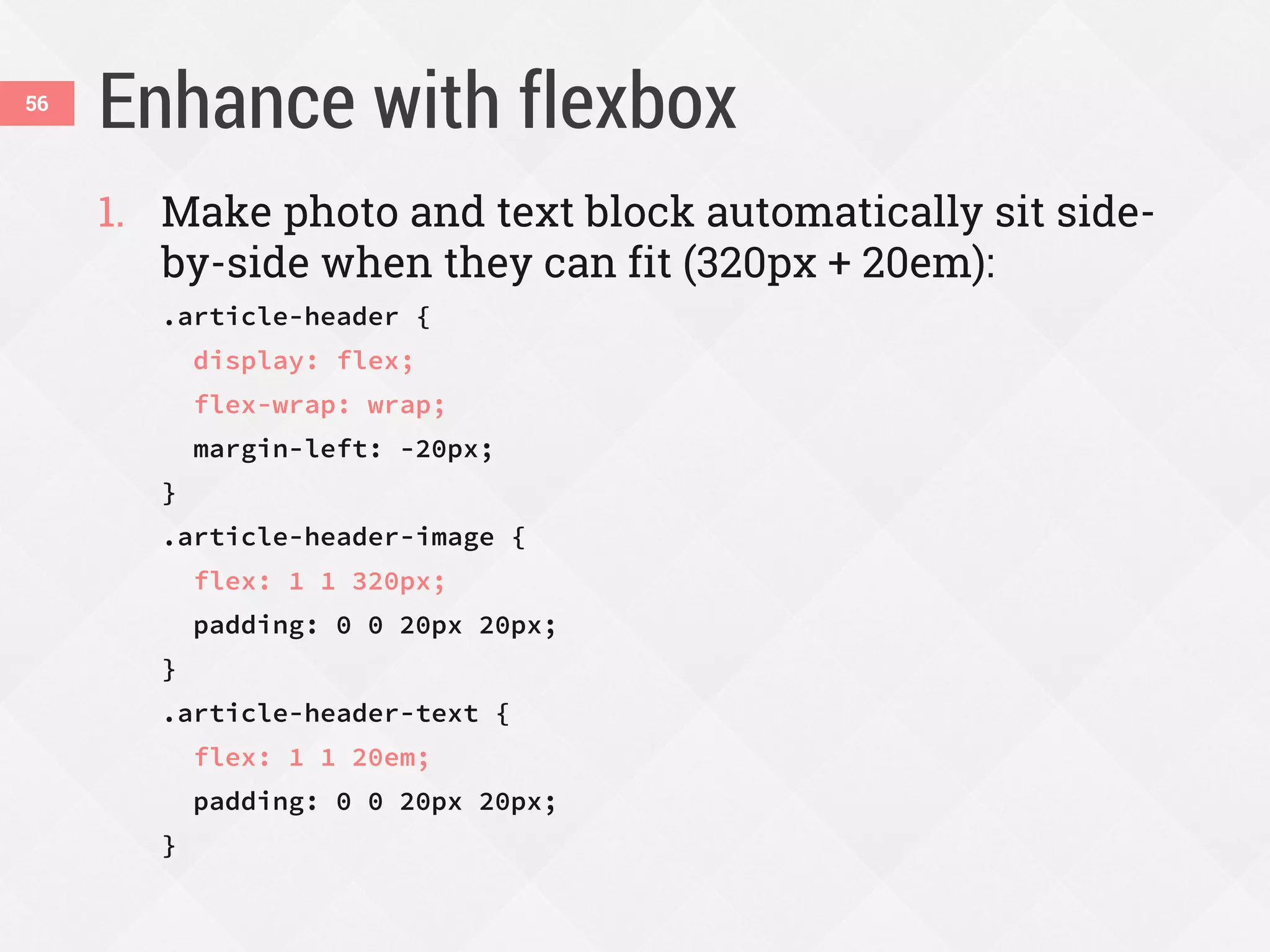
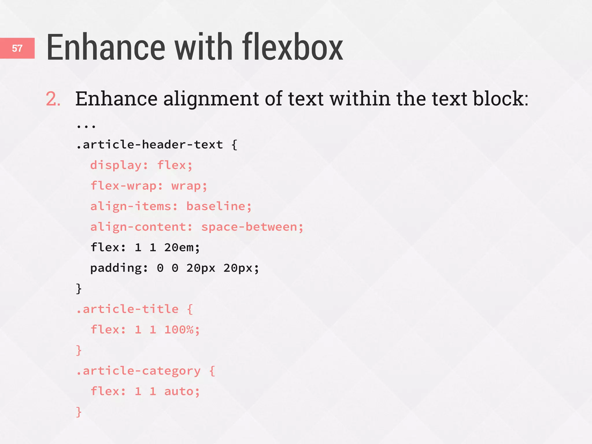
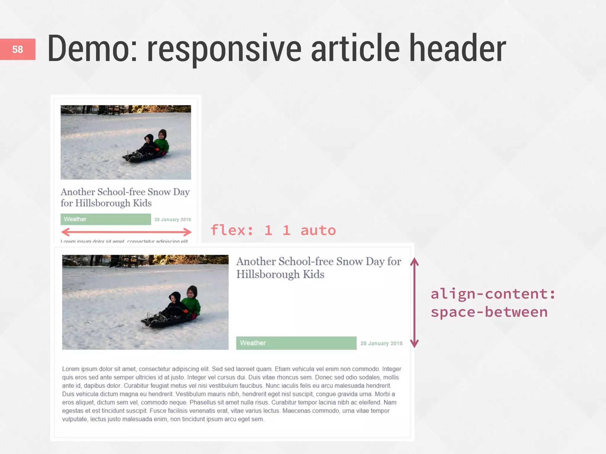
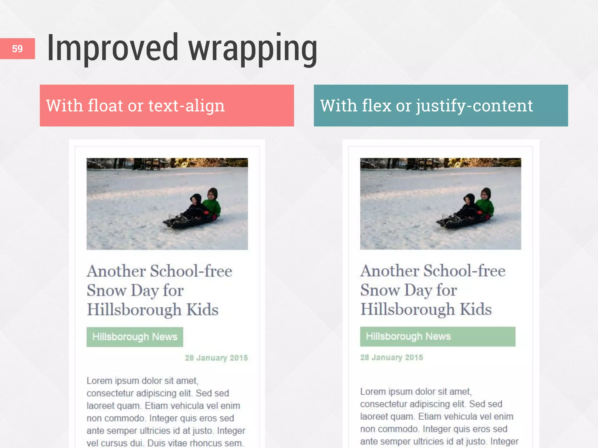
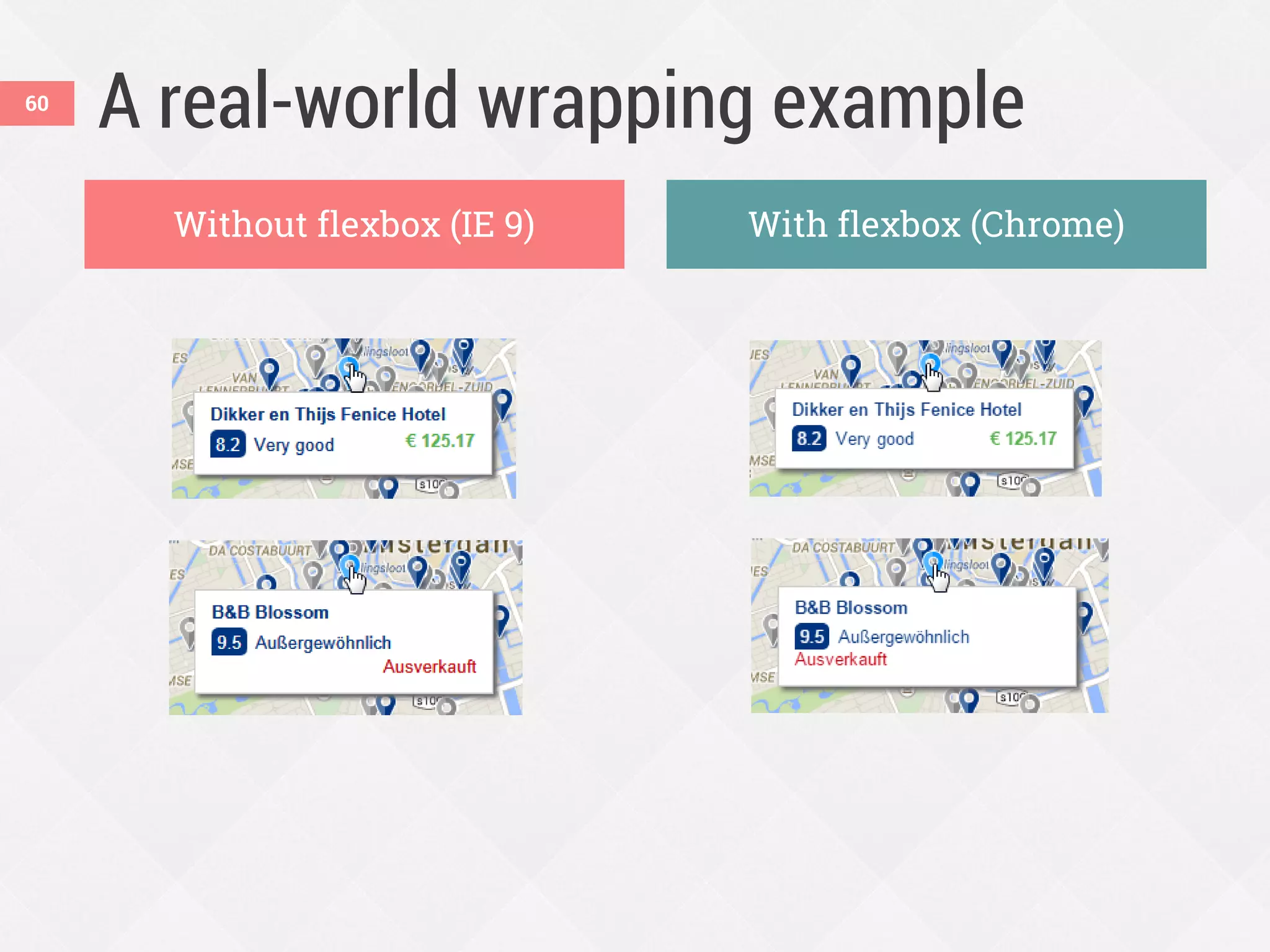
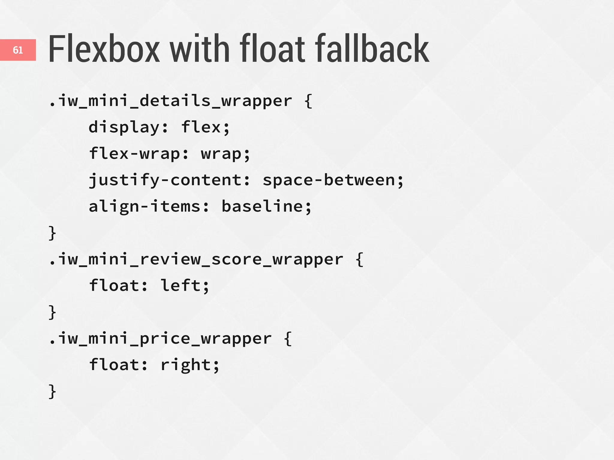
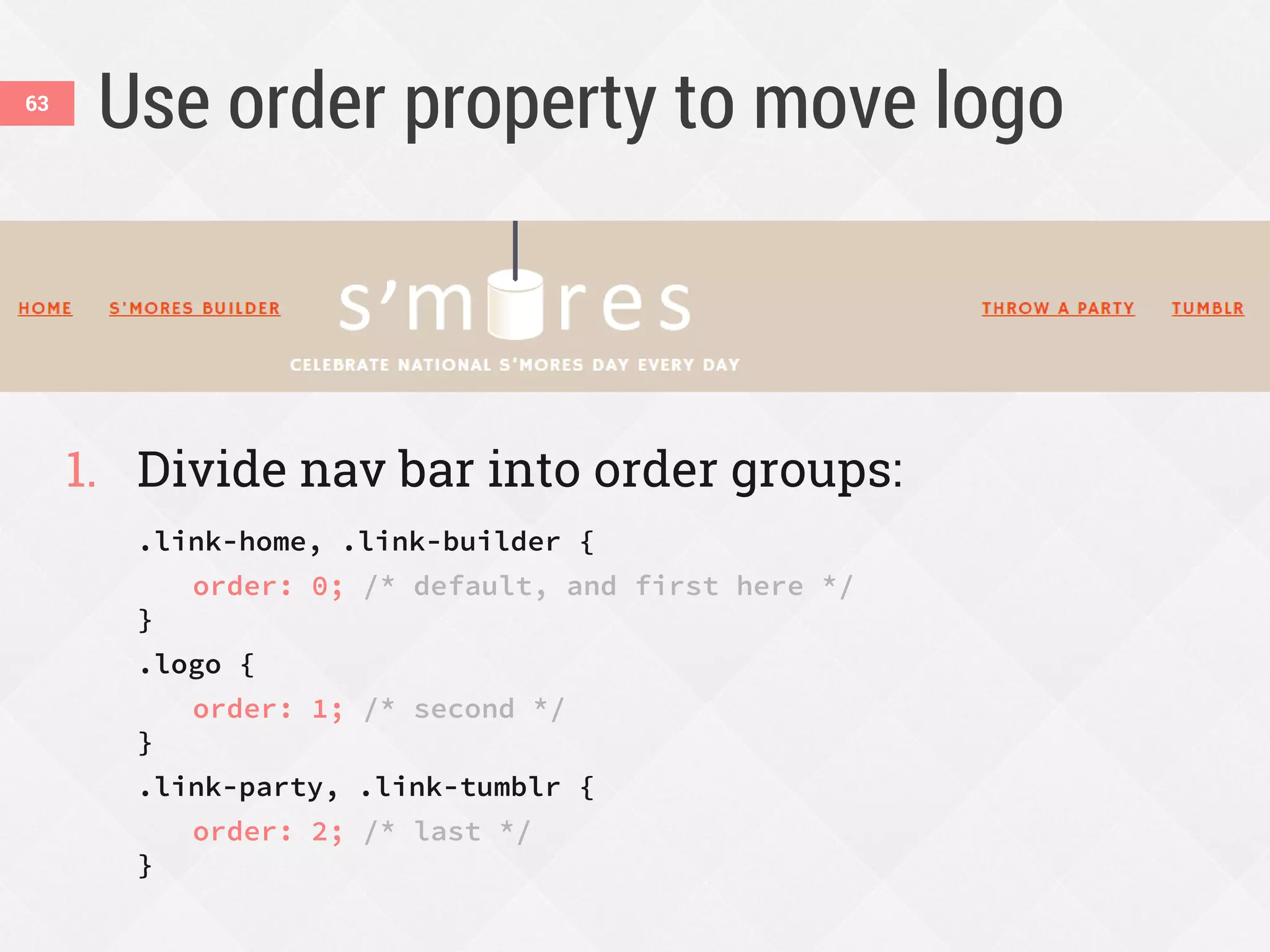
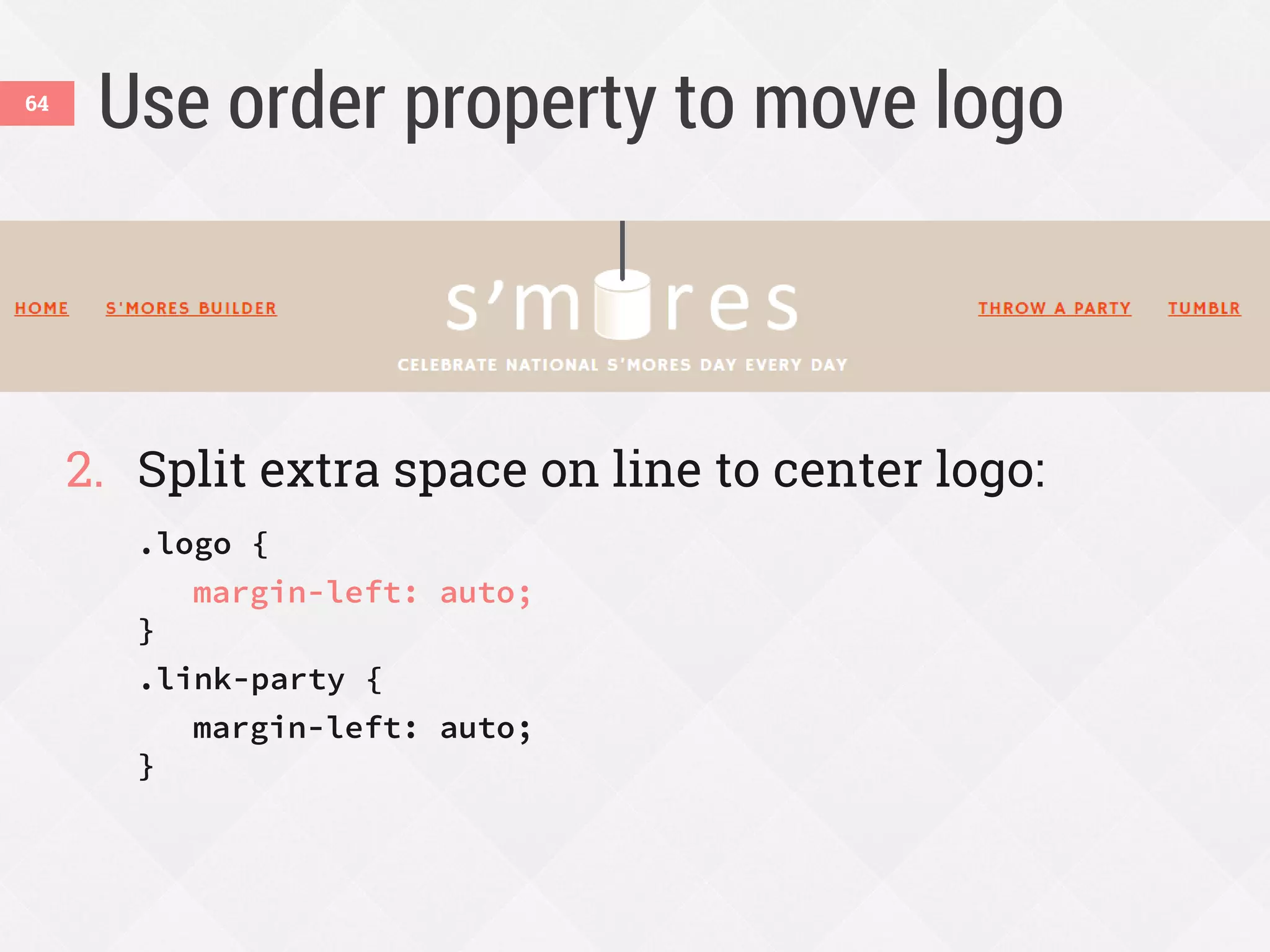
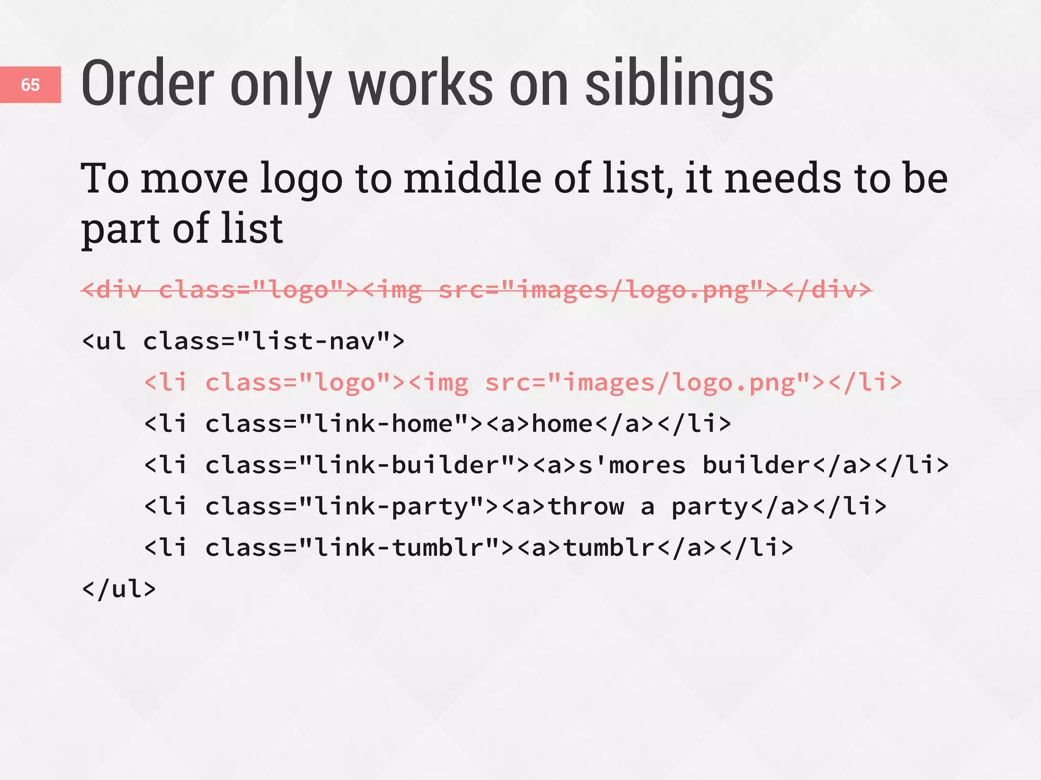
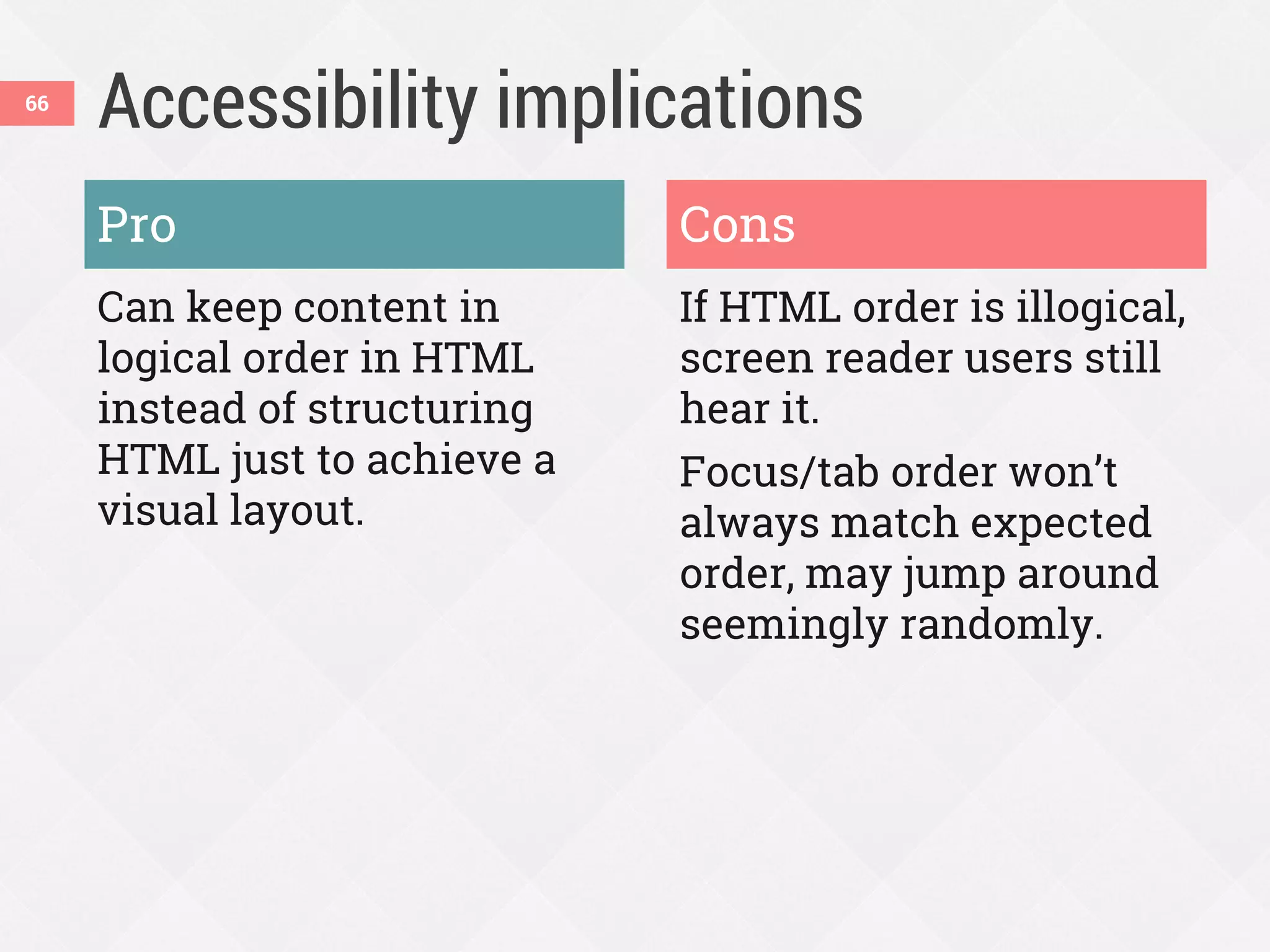
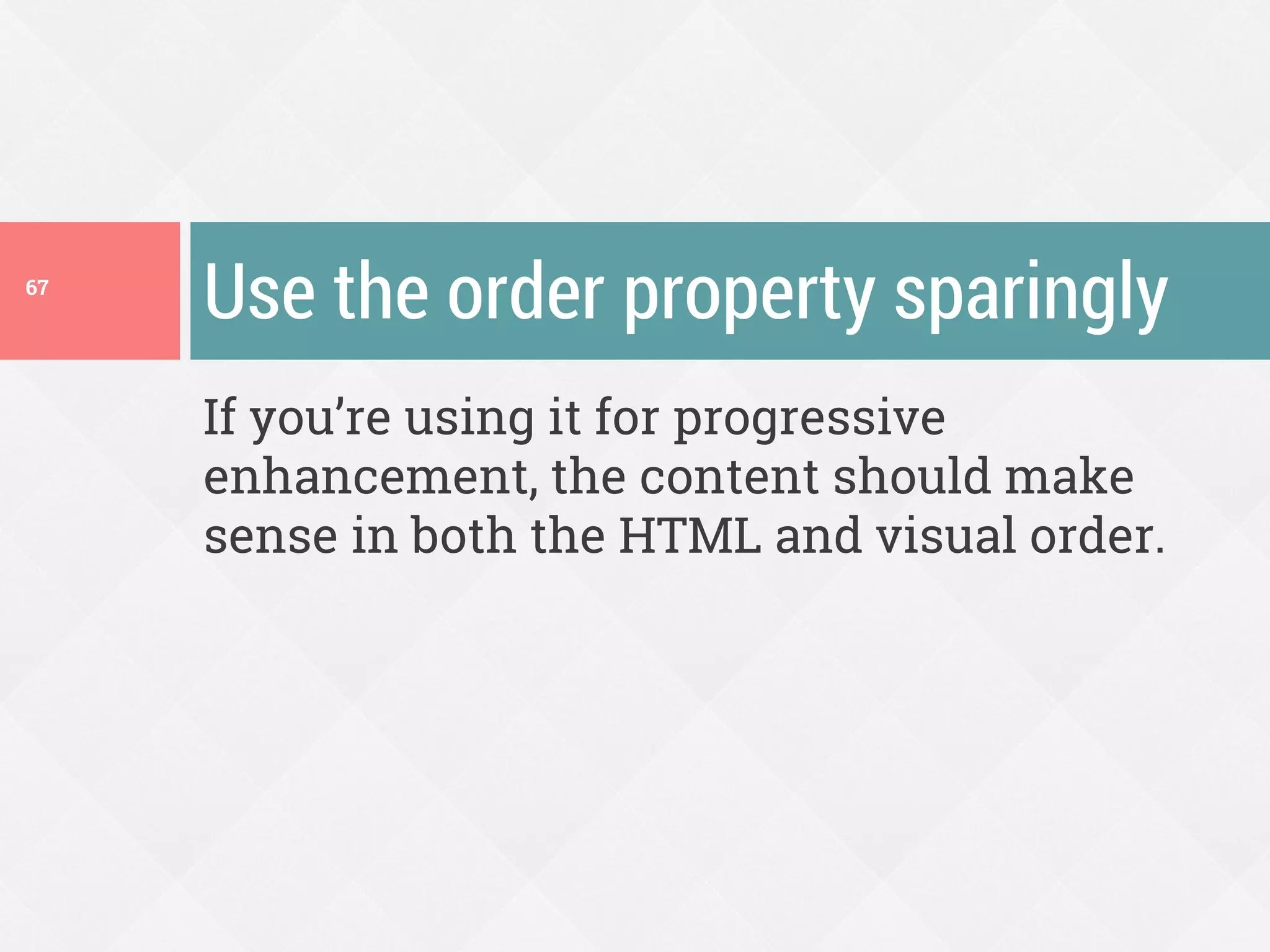
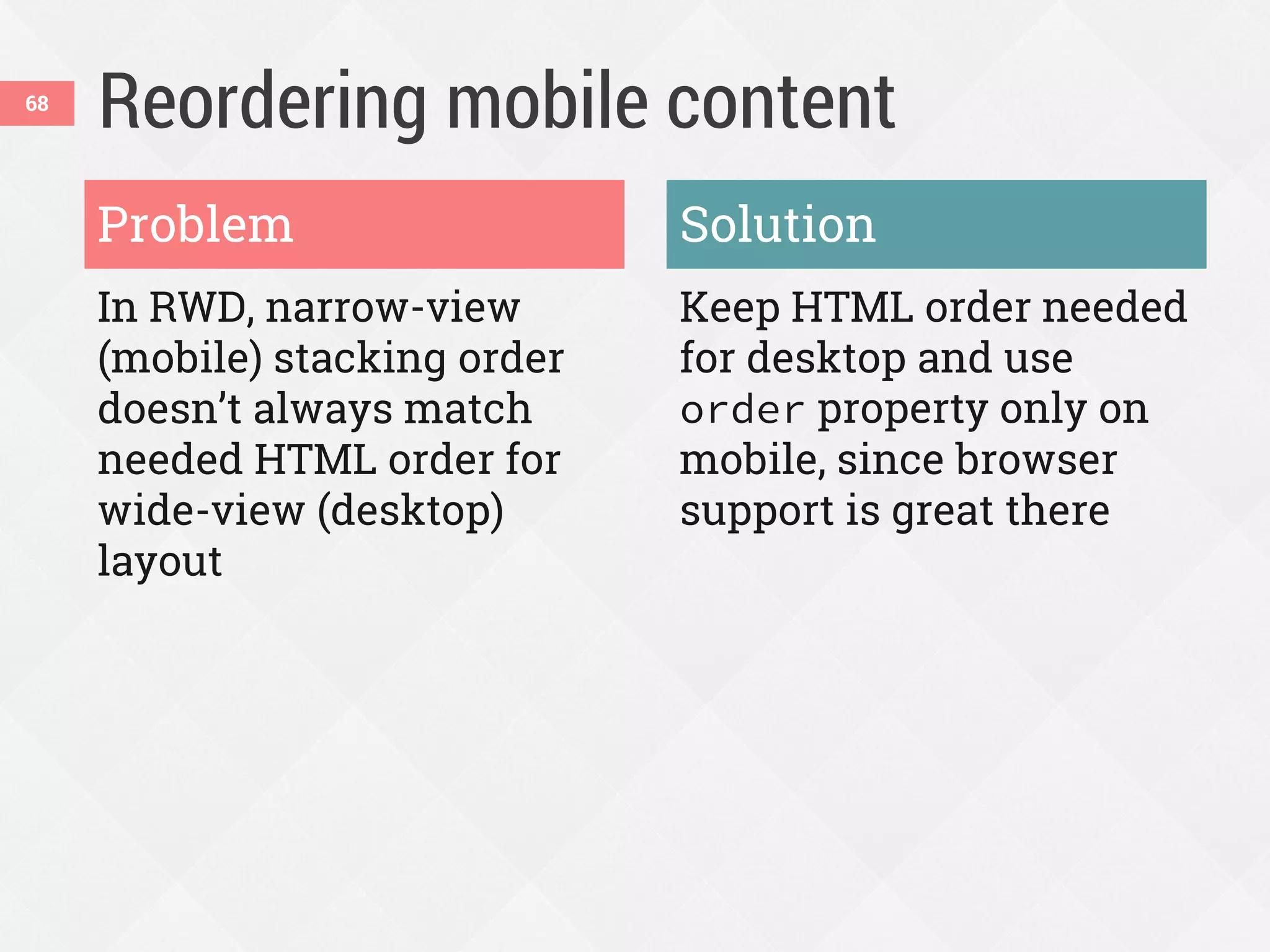
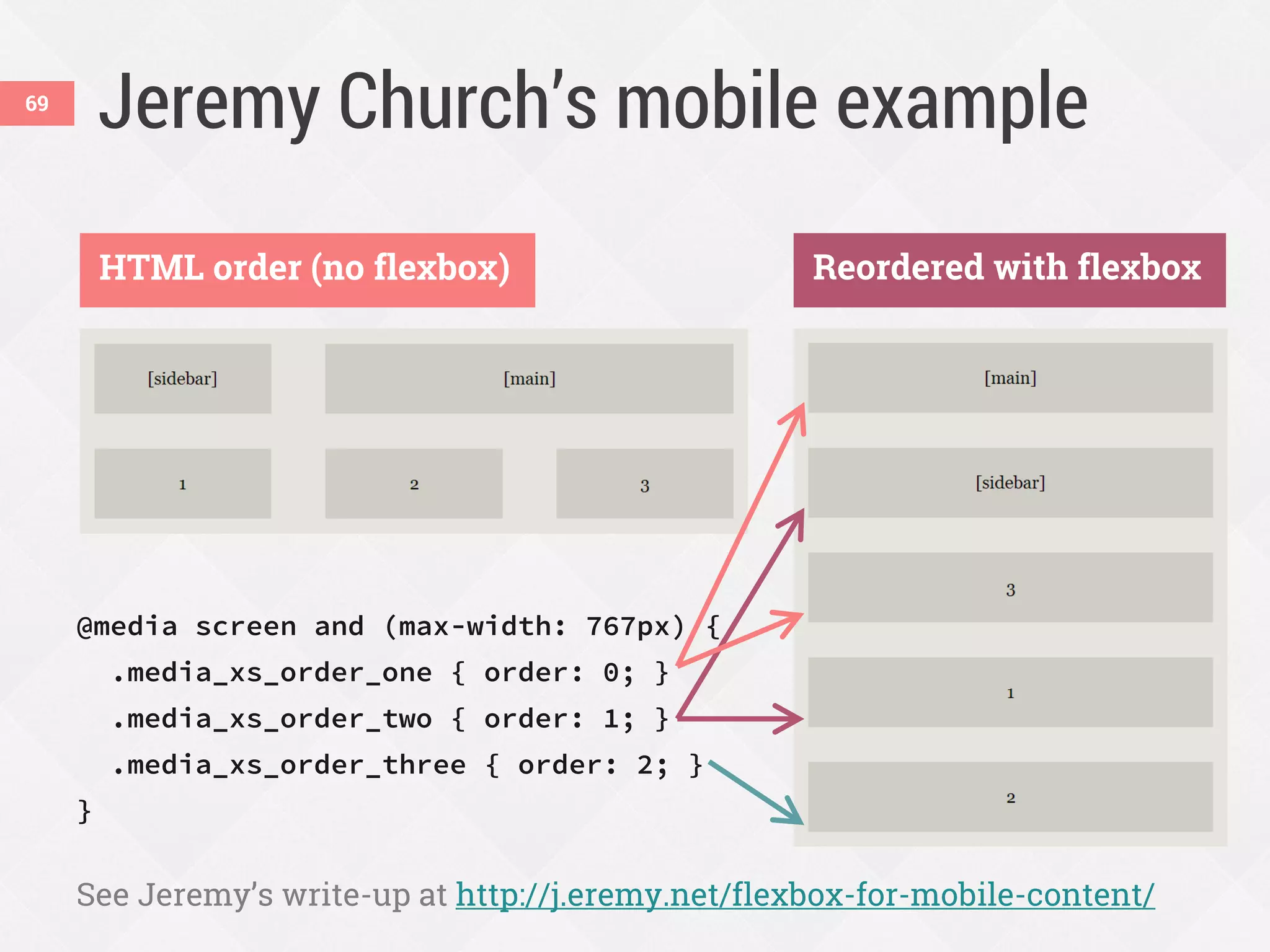
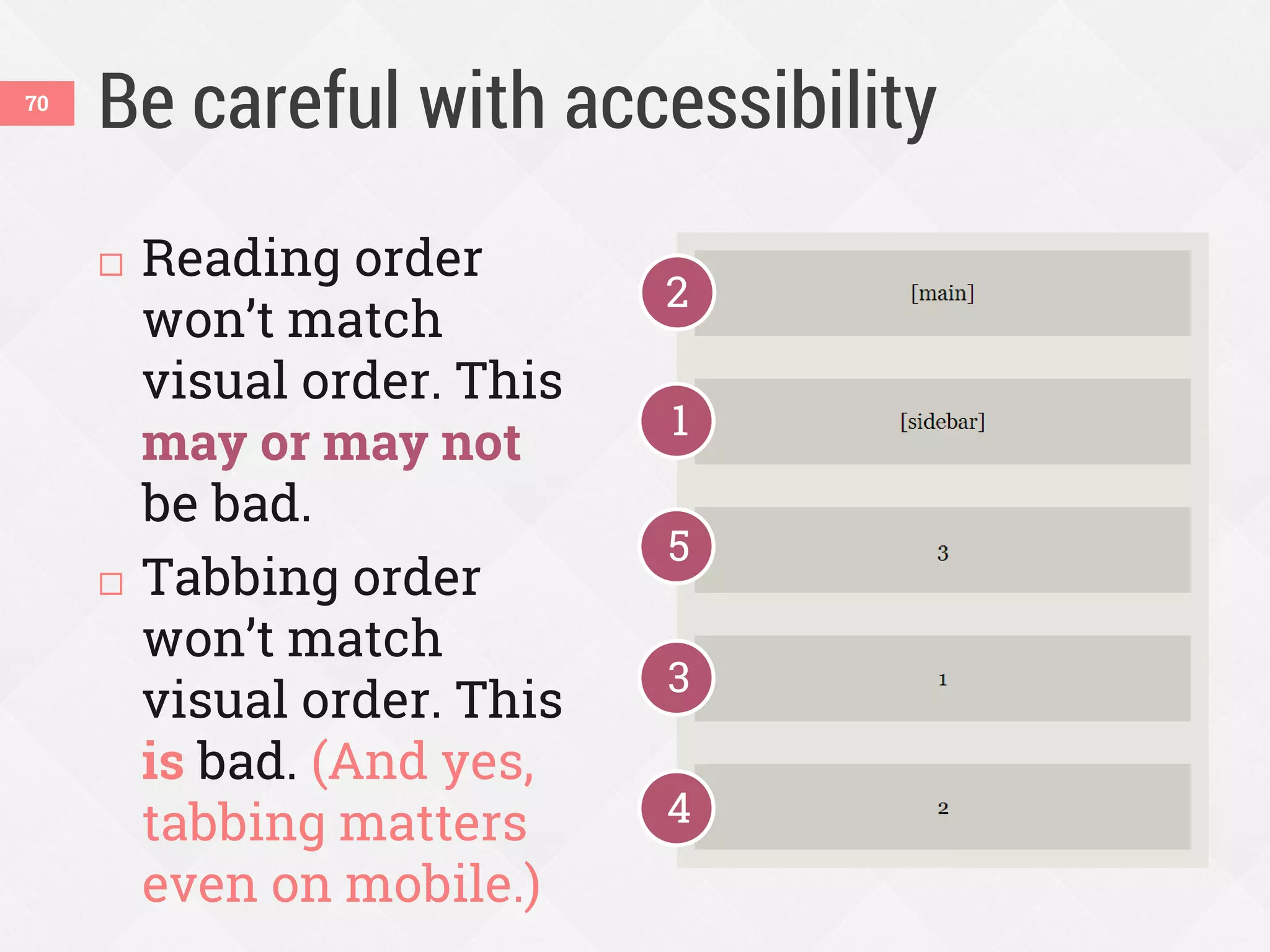
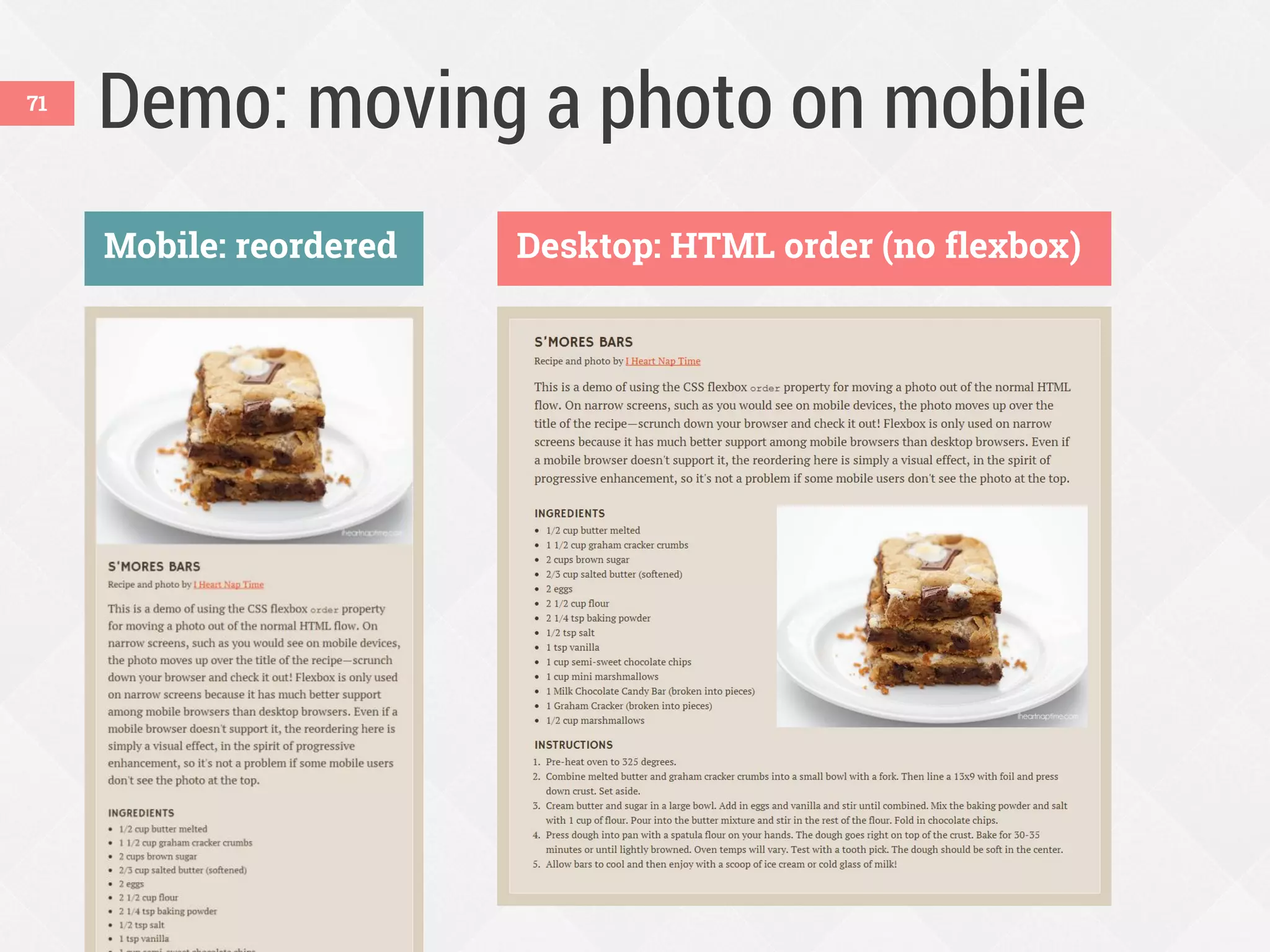
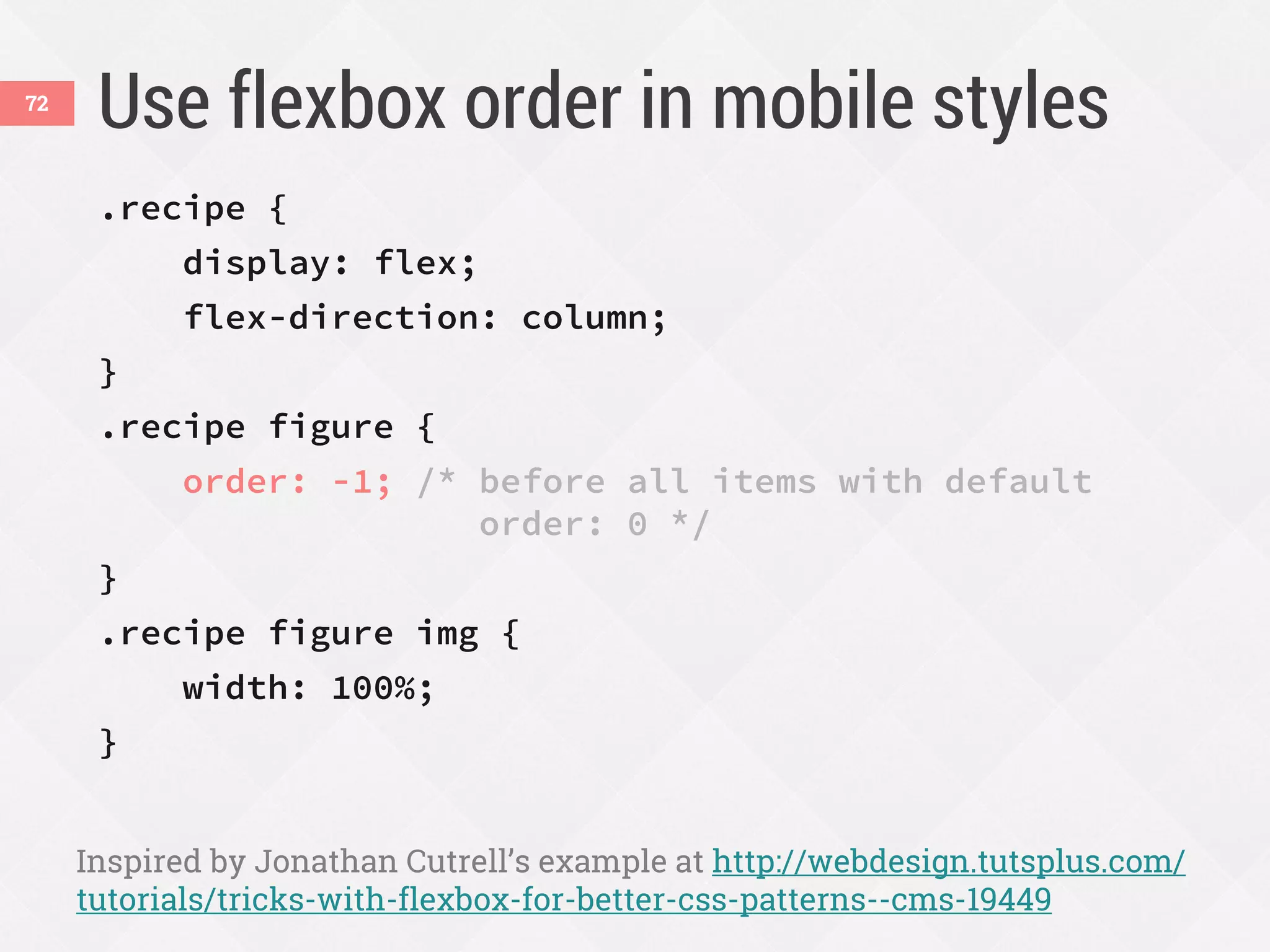
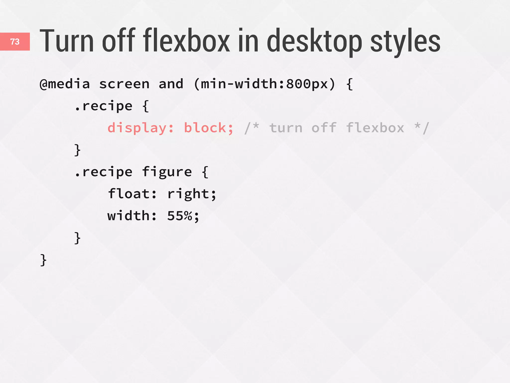
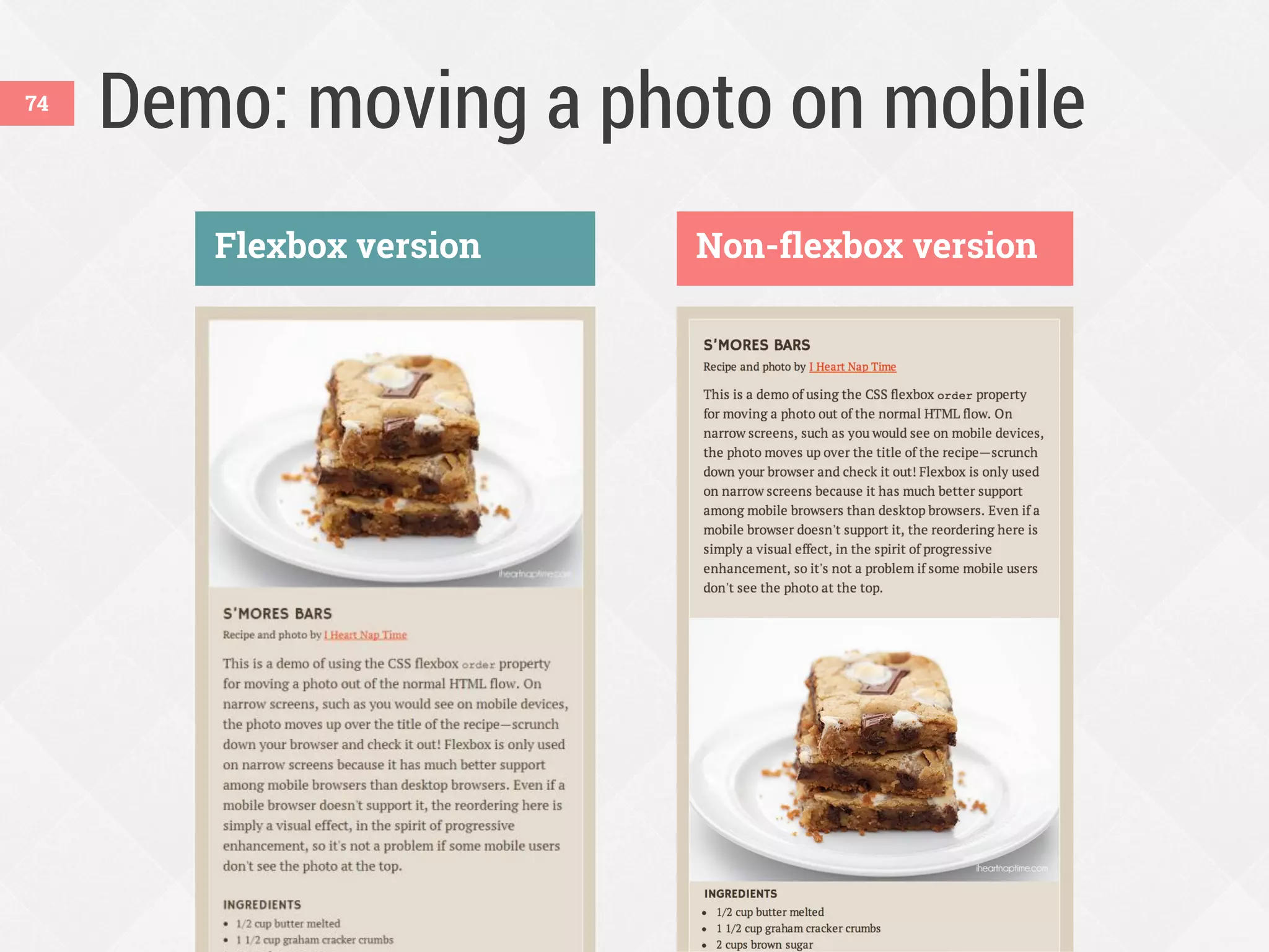
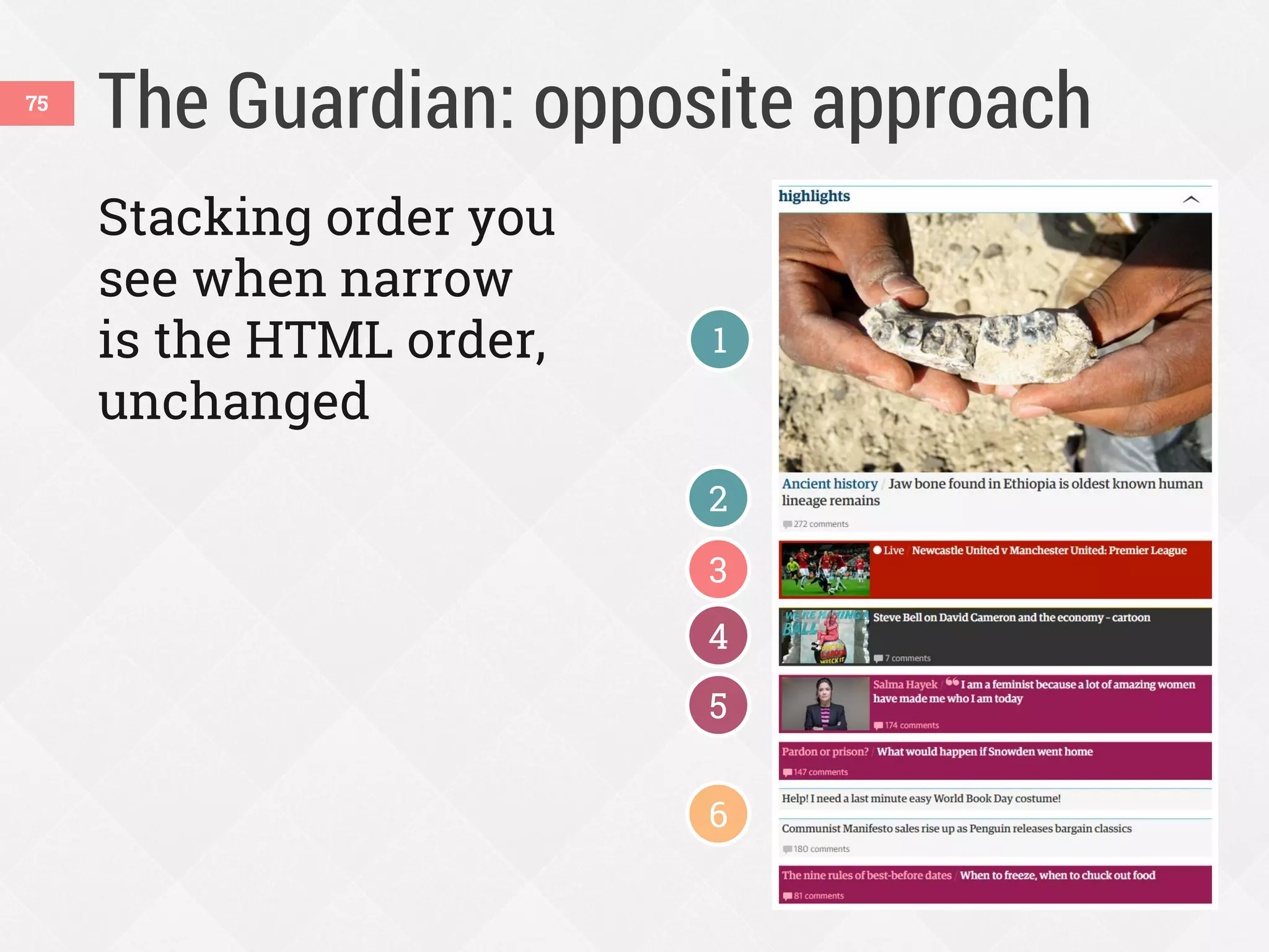
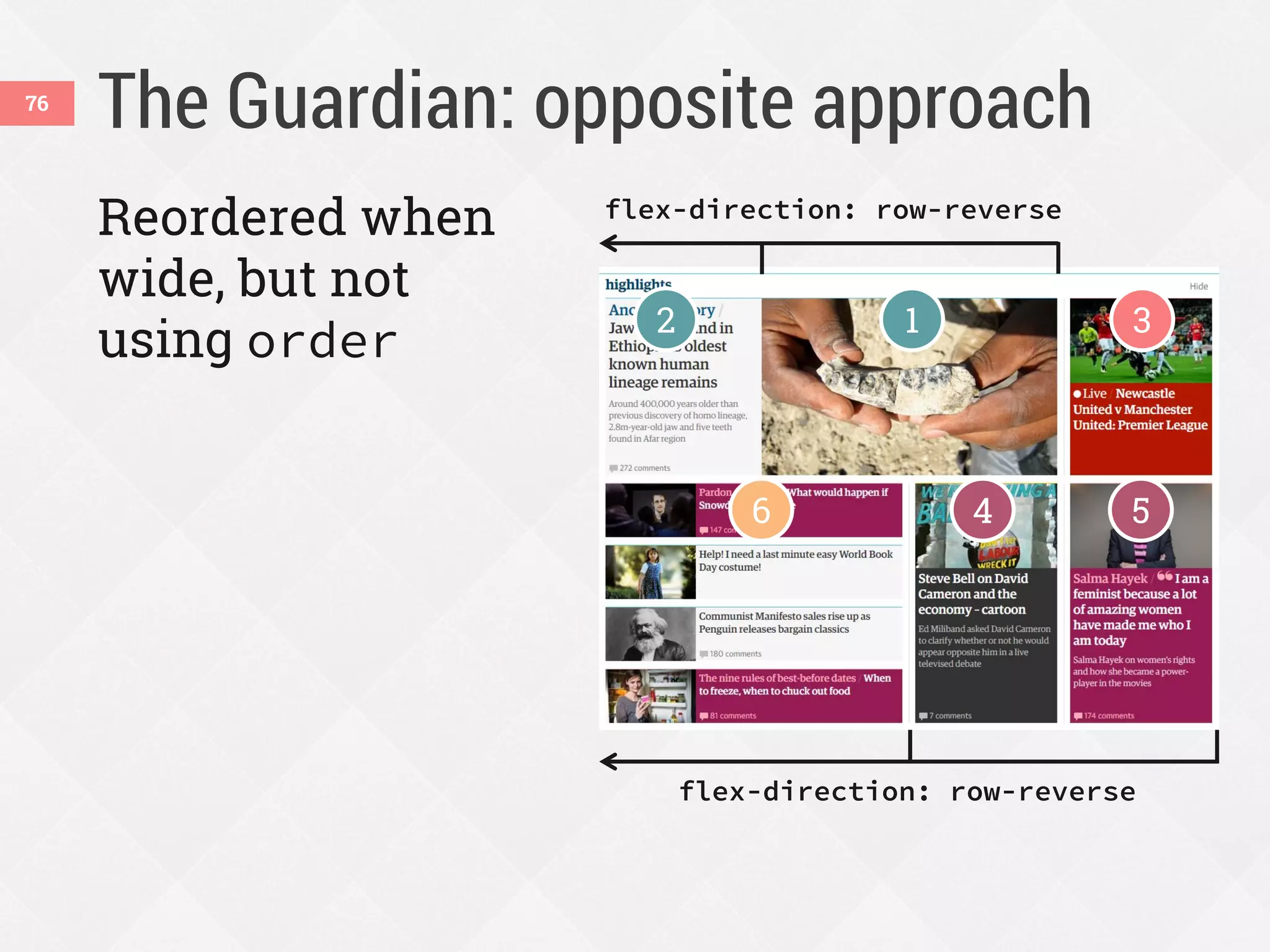
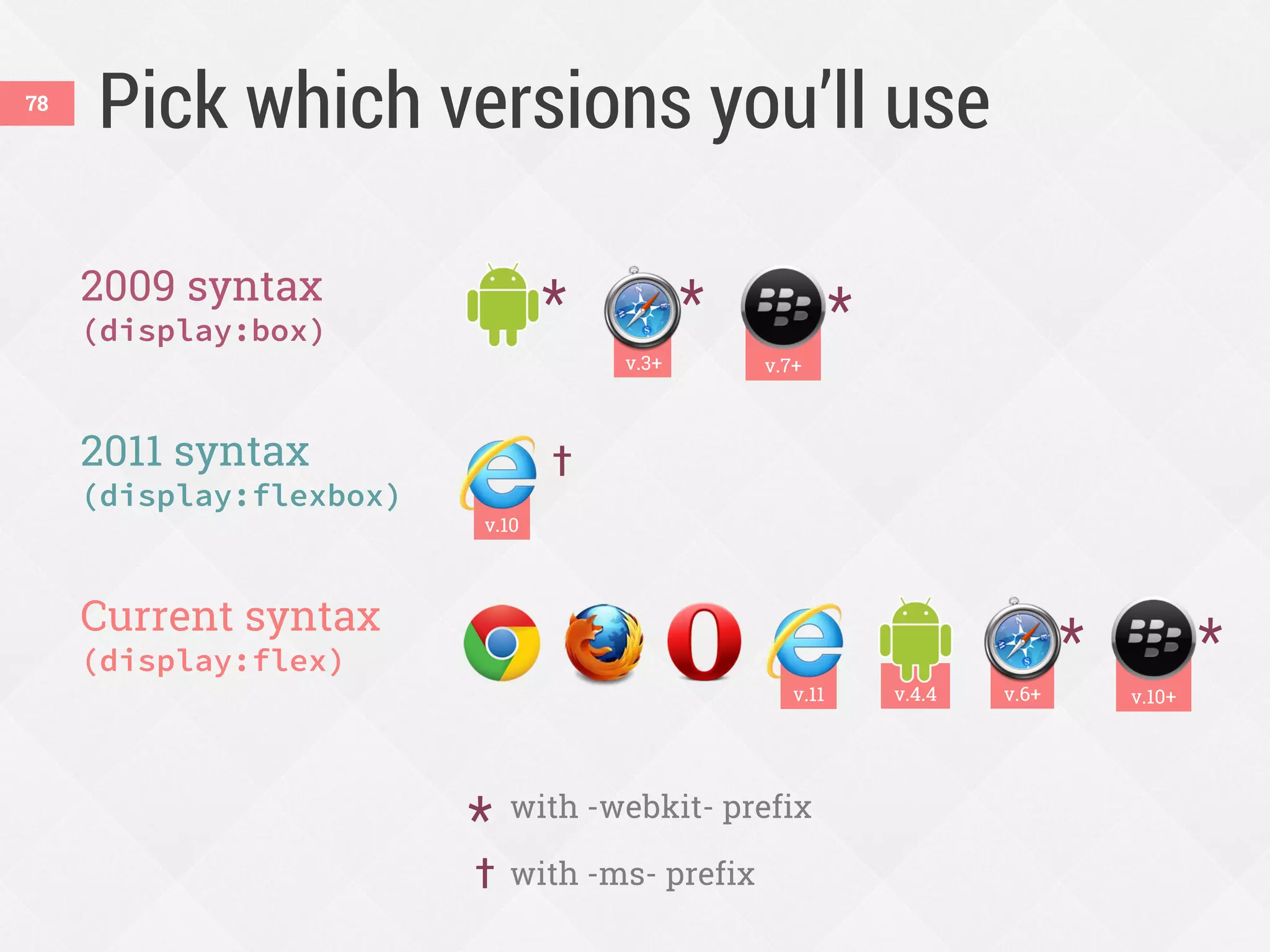
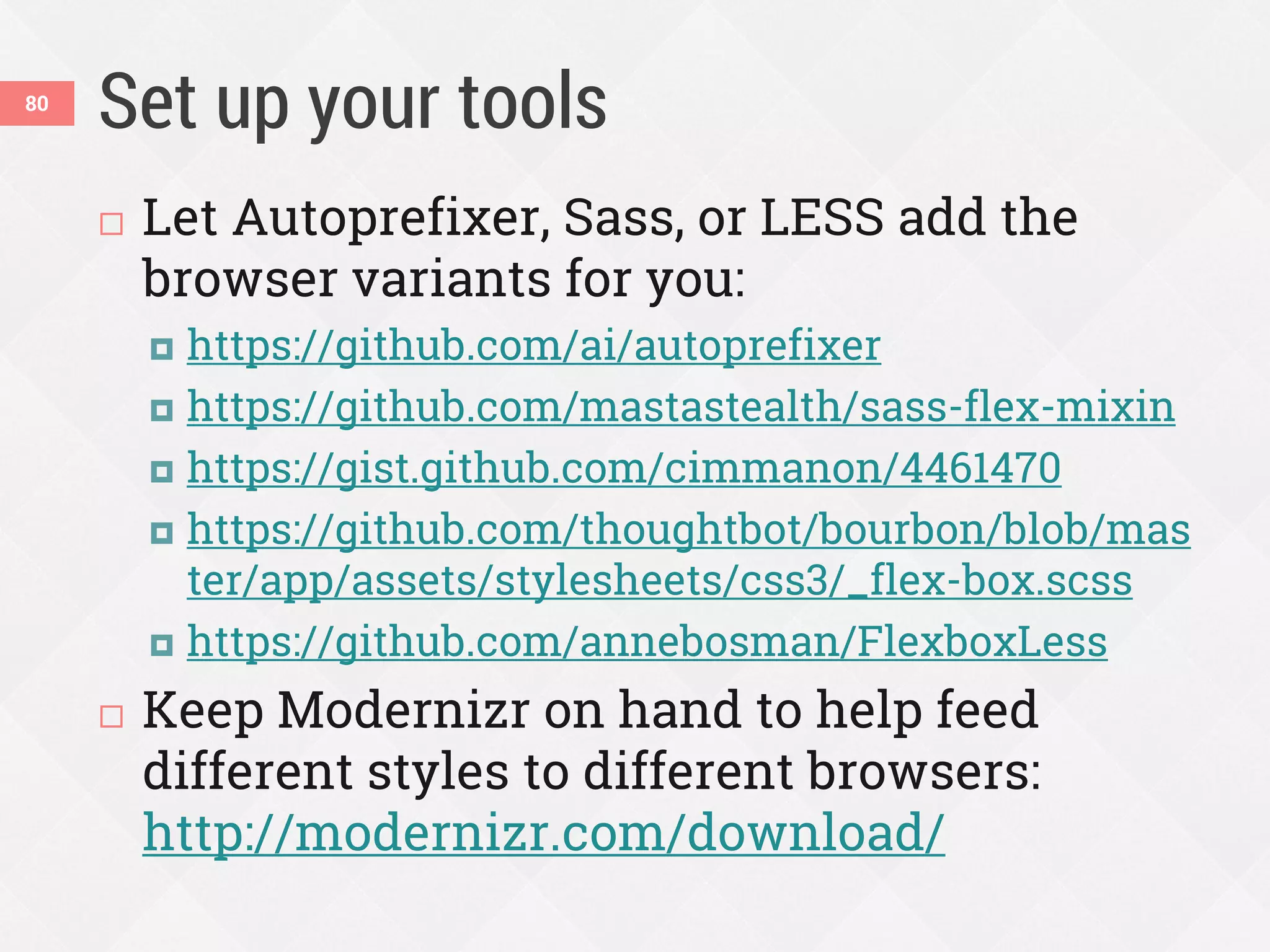
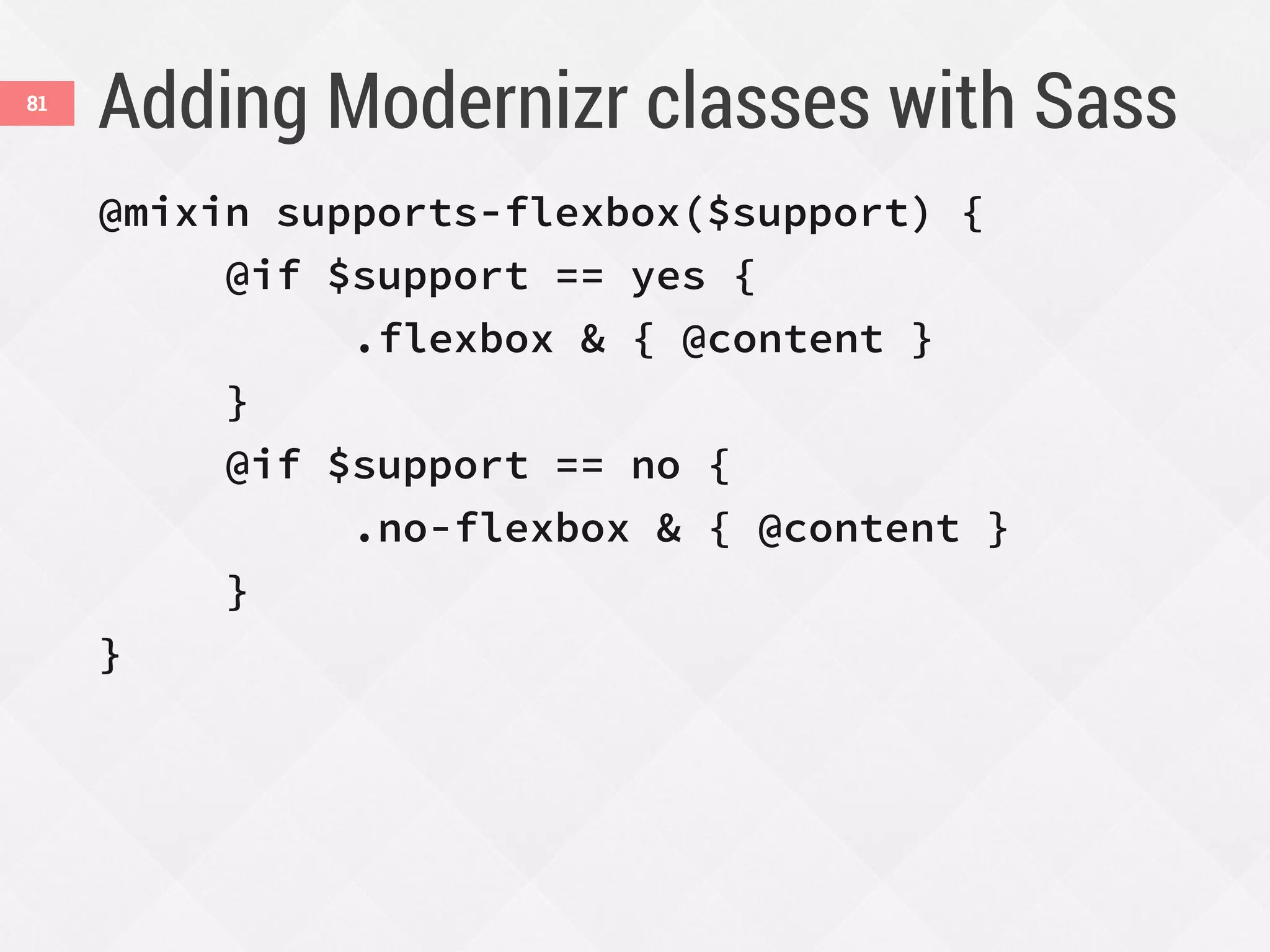
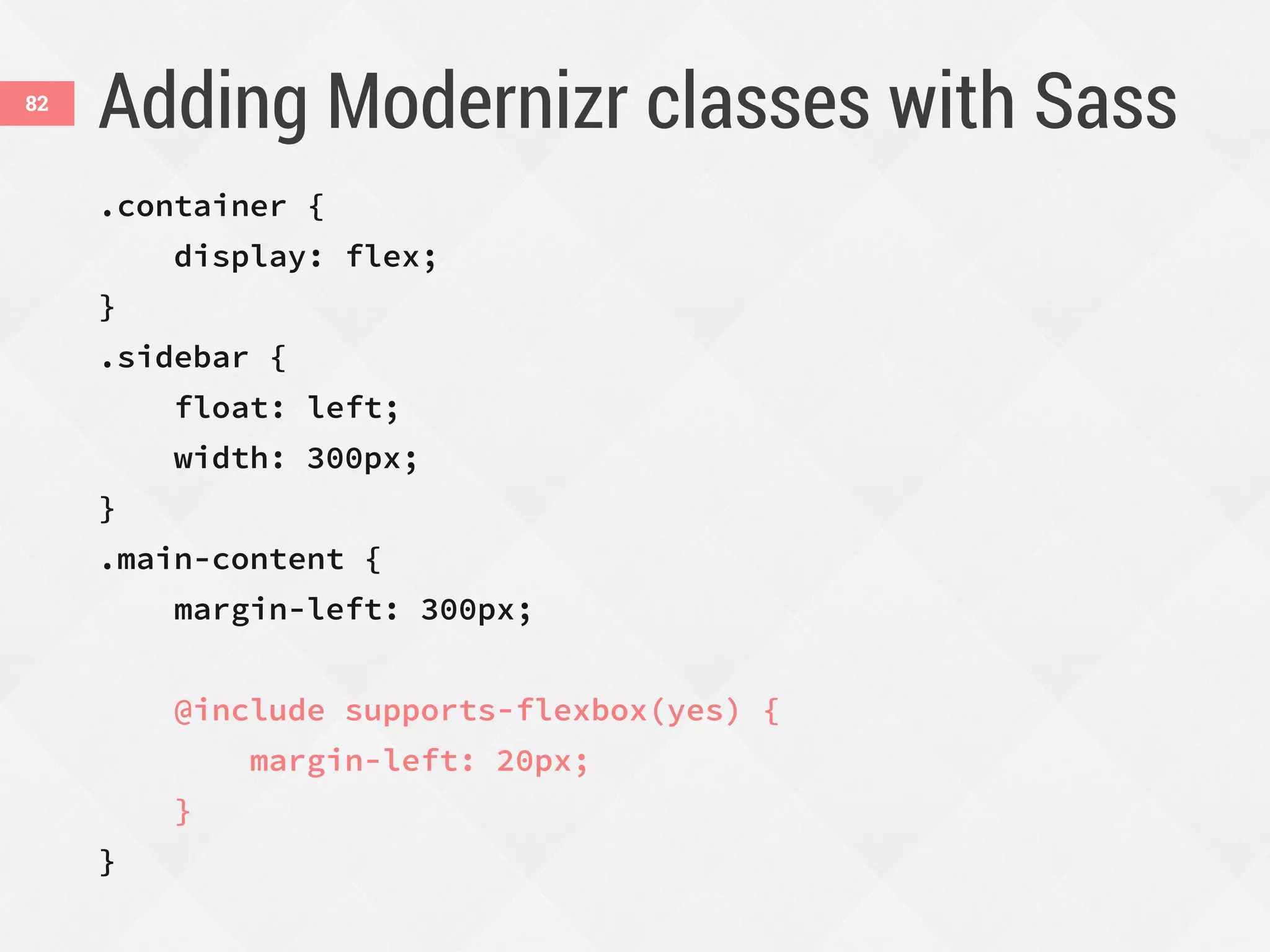
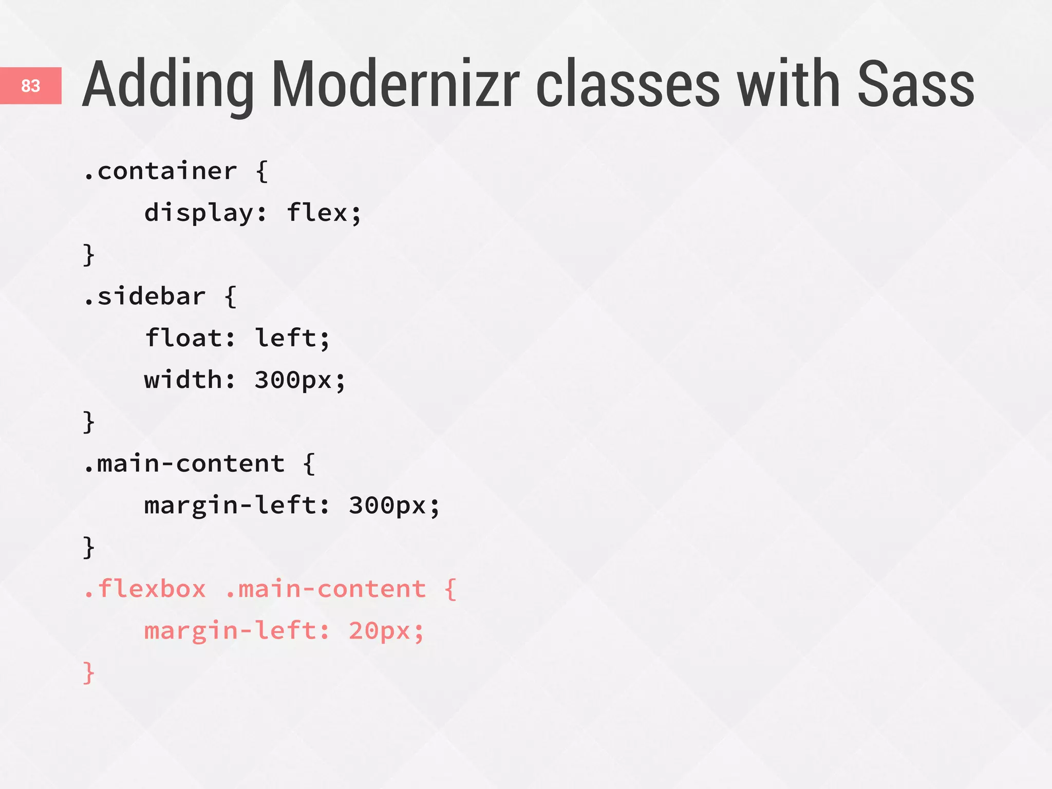
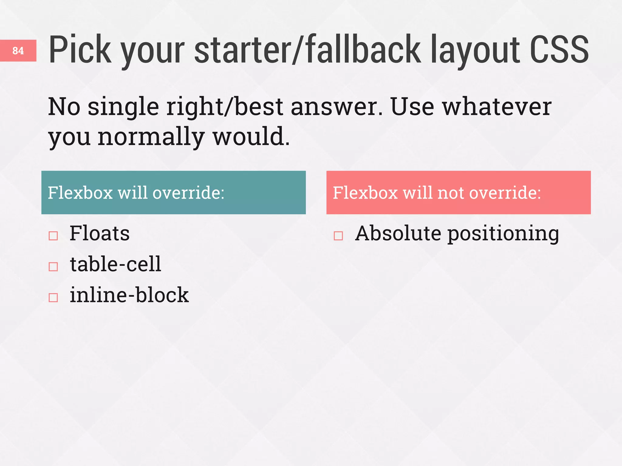


This document discusses using flexbox for responsive web design. It begins with an overview of problems with other layout methods like floats and tables. Flexbox solves many of these issues by allowing boxes to automatically grow and shrink, be proportionally sized, and be laid out in any direction. The document demonstrates several uses of flexbox properties like flex-direction, justify-content, align-items and order to create responsive navigation bars, stacked icons, equal height columns, and reordering content. It emphasizes using flexbox now for progressive enhancement and discusses techniques for providing non-flexbox fallbacks.