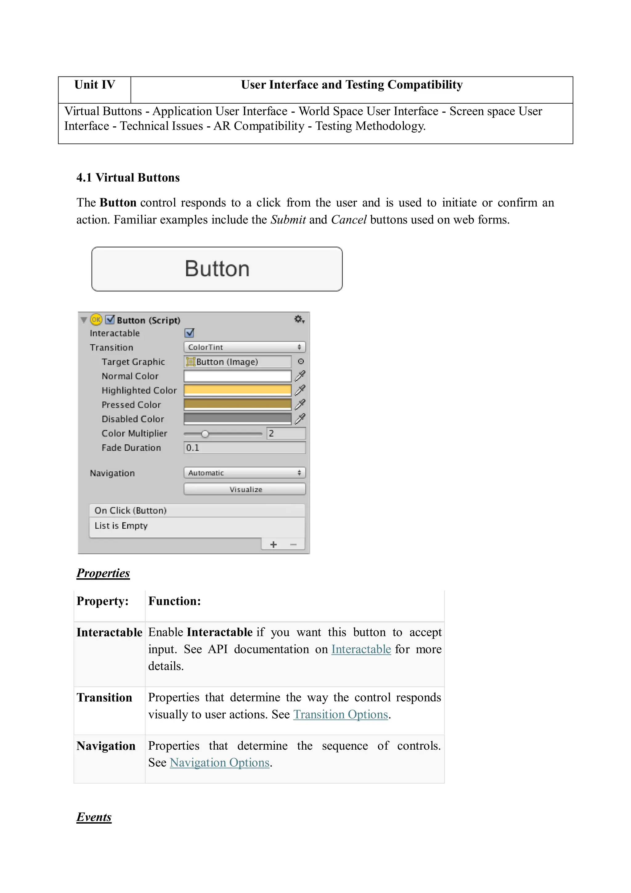
Unit IV User Interface and Testing Compatibility
Virtual Buttons - Application User Interface - World Space User Interface - Screen space User
Interface - Technical Issues - AR Compatibility - Testing Methodology.
4.1 Virtual Buttons
The Button control responds to a click from the user and is used to initiate or confirm an
action. Familiar examples include the Submit and Cancel buttons used on web forms.
Properties
Property: Function:
Interactable Enable Interactable if you want this button to accept
input. See API documentation on Interactable for more
details.
Transition Properties that determine the way the control responds
visually to user actions. See Transition Options.
Navigation Properties that determine the sequence of controls.
See Navigation Options.
Events
Property: Function:
On Click A UnityEvent that Unity invokes when a user clicks the
button and releases it.
Details
The button is designed to initiate an action when the user clicks and releases it. If the mouse
is moved off the button control before the click is released, the action does not take place.
The button has a single event called On Click that responds when the user completes a click.
Typical use cases include:
 Confirming a decision (eg, starting gameplay or saving a game)
 Moving to a sub-menu in a GUI
 Cancelling an action in progress (eg, downloading a new scene)
UnityEvents are a way of allowing user driven callback to be persisted from edit time to run
time without the need for additional programming and script configuration.
UnityEvents are useful for a number of things:
 Content driven callbacks
 Decoupling systems
 Persistent callbacks
 Preconfigured call events
UnityEvents can be added to any MonoBehaviour and are executed from code like a standard
.net delegate. When a UnityEvent is added to a MonoBehaviour it appears in the Inspector
and persistent callbacks can be added.
UnityEvents have similar limitations to standard delegates. That is, they hold references to
the element that is the target and this stops the target being garbage collected. If you have a
UnityEngine.Object as the target and the native representation disappears the callback will
not be invoked.
Using UnityEvents
To configure a callback in the editor there are a few steps to take:
1. Make sure your script imports/uses UnityEngine.Events.
2. Select the + icon to add a slot for a callback
3. Select the UnityEngine.Object you wish to receive the callback (You can use the
object selector for this)
4. Select the function you wish to be called
5. You can add more than one callback for the event
When configuring a UnityEvent in the Inspector there are two types of function calls that are
supported:
 Static. Static calls are preconfigured calls, with preconfigured values that are set in
the UI
. This means that when the callback is invoked, the target function is invoked with the
argument that has been entered into the UI.
 Dynamic. Dynamic calls are invoked using an argument that is sent from code, and
this is bound to the type of UnityEvent that is being invoked. The UI filters the
callbacks and only shows the dynamic calls that are valid for the UnityEvent.
Generic UnityEvents
By default a UnityEvent in a Monobehaviour binds dynamically to a void function. This does
not have to be the case as dynamic invocation of UnityEvents supports binding to functions
with up to 4 arguments. To do this you need to define a custom UnityEvent class that
supports multiple arguments. This is quite easy to do:
[Serializable]
public class StringEvent : UnityEvent <string> {}
By adding an instance of this to your class instead of the base UnityEvent it will allow the
callback to bind dynamically to string functions.
This can then be invoked by calling the Invoke() function with a string as argument.
UnityEvents can be defined with up to 4 arguments in their generic definition.
How To Implement Virtual Buttons
This page concerns the Vuforia Engine API version 9.8 and earlier. It has been deprecated and
will no longer be actively updated.
Virtual Buttons invokes interactivity for your Vuforia Targets moving on screen interactions
to the real world. Learn from the Virtual Buttons sample on how to implement and configure
Virtual Buttons and immerse your end users in to your AR application.
Virtual buttons provide a useful mechanism for making image-based targets interactive.
Handle the events with OnButtonPressed and OnButtonReleased when the button is visually
obstructed from the camera. When creating a Virtual Button, the size and placement must be
considered carefully with respect to the user experience. There are several factors that will
affect the responsiveness and usability of Virtual buttons.
 The length and width of the button.
 The area of the target that it covers.
 The placement of the button in relation to both the border of the image, and other
buttons on the target.
 The underlying area of the button has a high contrast and detail so that events are
easily activated.
Design and Placement
Sizing Buttons
The rectangle that you define for the area of a Virtual button should be equal to, or greater
than, 10% of the overall target area. Button events are triggered when a significant proportion
of the features underlying the area of the button are concealed from the camera. This can
occur when the user covers the button or otherwise blocks it in the camera view. For this
reason, the button should be sized appropriately for the source of the action it is intended to
respond to. For example, a button that should be triggered by a user's finger needs to be
smaller than one that will be triggered by their entire hand.
Sensitivity Setting
Virtual Buttons can be assigned multiple sensitivities, which define how readily the
button's OnButtonPressed willfire.
Buttons with a HIGH sensitivity will fire more easily than those with a LOW sensitivity. The
button's sensitivity is a reflection of the proportion of the button area that must be covered,
and the coverage time. It's advisable to test the responsiveness of each of your buttons in a
real-world setting to verify that they perform as expected.
Place Over Features
Virtual Buttons detect when underlying features of the target image are obscured from the
camera view. You will need to place your button over an area of the image that is rich in
features in order for it to reliably fire its OnButtonPressed event. To determine where these
features are in your image, use the Show Features link on your image in the Target Manager.
You will see the available features marked with yellow hatch marks as in the example image
below.
Inset the Buttons
Virtual buttons should not be placed against the border of the target. Image based targets have
a margin, equivalent to ~8% of the target area, at the edge of the target rectangle that is not
used for recognition or tracking. For this reason, it is not possible to detect when a user
covers this area. Be sure to inset your buttons so that you are able to
detect OnButtonPressed events across their entire button area.
Avoid Stacking Buttons
It is recommended that you don't arrange buttons in a column in the direction that the user is
facing the target. This is because the user will need to reach over lower buttons to press
higher ones, which can result in the lower buttons firing their OnButtonPressed events.
If you do need to stack buttons in an arrangement that may result in this behavior, you should
implement app logic that filters these results to determine which button was actually intended
to be selected.
The image on the right shows the its features and its feature exclusion buffer area along the
outer borders.
Virtual Button Attributes
Attributes of an ideal virtual button are listed in the following table.
Attribute Suggestions
Size
Choose areas in the images that have dimensions of approximately 10%
of the image target’s size.
Shape
Make buttons easily identifiable to stand out from rest of image.
Highlight active buttons in the augmentation layer to hint at active
regions on the target.
Texture or contrast
Avoid defining buttons on low contrast areas of the targets. The
underlying target area needs to have sufficient features to be evaluated.
Choose a button design that is different in texture from the object that
causes the occlusion.
Arrangement on Arrange buttons around the target’s borders with enough space between to
the target avoid losing tracking when the end user presses a button.
Examples
Explore the Virtual Buttons sample from the Unity Asset Store or from Vuforia’s download
page to see it in action and get yourself familiar with the feature. Print the Image Targets
included in the sample and test the sample in either Unity’s play mode or by deploying the
build to your device.
Virtual Buttons in Unity
In Unity, the Virtual Button functionality can be added to a mesh via
the VirtualButtonBehaviour script or by copying the Virtual Button GameObjects from the
sample. Choose the button’s sensitivity in the Inspector Window. Add as well,
the VirtualButtonEventHandler to the image-based target that you intend to place the Virtual
Button on.
Virtual Buttons in Native
Virtual buttons are created by defining them in the Dataset Configuration XML file as a
property of image targets or by adding and destroying Virtual Buttons at application run
time through a set of well-defined APIs. Virtual buttons are demonstrated in
the Wood.xml target configuration in the native core samples.
4.2 User Interface
Unity has multiple UI systems for developing user interfaces for games and applications,
including Unity UI and UI Toolkit:
 Unity UI: Also known as uGUI, this is an older GameObject-based UI system that
uses the Game View and Components to position, arrange, and style user interfaces. It
supports advanced text and rendering features.
 UI Toolkit: Unity's other UI system
Unity UI is a UI toolkit for developing user interfaces for games and applications. It is a
GameObject-based UI system that uses Components and the Game View to arrange, position,
and style user interfaces.You cannot use Unity UI to create or change user interfaces in the
Unity Editor
Unity UI (uGUI) is a GameObject-based UI system that you can use to develop user
interfaces for games and applications. It uses Components and the Game view to arrange,
position, and style user interfaces.
Topic Description
Canvas The Canvas is an area where you can place UI elements.
Basic Layout Position elements like text and images on a canvas.
Visual Components Learn how to add text and images to a canvas.
Interaction Components Set up user interactions with elements on a canvas.
Animation Integration Animate elements like buttons when highlighted and
clicked.
Auto Layout Change the size of layouts automatically.
Rich Text Use rich text in UI elements.
Events The Event System sends events to objects in the application
based on input.
Comparison of UI systems in Unity
UI Toolkit is recommended if you create complex editor tools. UI Toolkit is also
recommended for the following reasons:
 Better reusability and decoupling
 Visual tools for authoring UI
 Better scalability for code maintenance and performance
IMGUI is an alternative to UI Toolkit for the following:
 Unrestricted access to editor extensible capabilities
 Light API to quickly render UI on screen
Usecase
Multi-resolution menus and HUD in intensive UI projects -UI Toolkit
World space UI and VR&UI that requires customized shaders and materials - Unity UI
Components of Unity UI
1. Canvas
The Canvas is the area that all UI elements should be inside. The Canvas is a Game Object
with a Canvas component on it, and all UI elements must be children of such a Canvas.
Creating a new UI element, such as an Image using the menu GameObject> UI > Image,
automatically creates a Canvas, if there isn't already a Canvas in the scene. The UI element is
created as a child to this Canvas.
The Canvas area is shown as a rectangle in the Scene View. This makes it easy to position UI
elements without needing to have the Game View visible at all times.
Canvas uses the EventSystem object to help the Messaging System.
Draw order of elements
UI elements in the Canvas are drawn in the same order they appear in the Hierarchy. The first
child is drawn first, the second child next, and so on. If two UI elements overlap, the later one
will appear on top of the earlier one.
To change which element appear on top of other elements, simply reorder the elements in the
Hierarchy by dragging them. The order can also be controlled from scripting by using these
methods on the Transform component: SetAsFirstSibling, SetAsLastSibling, and
SetSiblingIndex.
Render Modes
The Canvas has a Render Mode setting which can be used to make it render in screen space
or world space.
Screen Space - Overlay
This render mode places UI elements on the screen rendered on top of the scene. If the screen
is resized or changes resolution, the Canvas will automatically change size to match this.
Screen Space - Camera
This is similar to Screen Space - Overlay, but in this render mode the Canvas is placed a
given distance in front of a specified Camera. The UI elements are rendered by this camera,
which means that the Camera settings affect the appearance of the UI. If the Camera is set
to Perspective, the UI elements will be rendered with perspective, and the amount of
perspective distortion can be controlled by the Camera Field of View. If the screen is resized,
changes resolution, or the camera frustum changes, the Canvas will automatically change size
to match as well.
World Space
In this render mode, the Canvas will behave as any other object in the scene. The size of the
Canvas can be set manually using its Rect Transform, and UI elements will render in front of
or behind other objects in the scene based on 3D placement. This is useful for UIs that are
meant to be a part of the world. This is also known as a "diegetic interface".
2. Basic Layout
This will help to position UI elements relative to the Canvas and each other. If you want to
test yourself while reading, you can create an Image using the menu GameObject -> UI ->
Image.
The Rect Tool
Every UI element is represented as a rectangle for layout purposes. This rectangle can be
manipulated in the Scene View using the Rect Tool in the toolbar. The Rect Tool is used
both for Unity's 2D features and for UI, and in fact can be used even for 3D objects as well.
The Rect Tool can be used to move, resize and rotate UI elements. Once you have selected a
UI element, you can move it by clicking anywhere inside the rectangle and dragging. You
can resize it by clicking on the edges or corners and dragging. The element can be rotated by
hovering the cursor slightly away from the corners until the mouse cursor looks like a
rotation symbol. You can then click and drag in either direction to rotate.
Just like the other tools, the Rect Tool uses the current pivot mode and space, set in the
toolbar. When working with UI it's usually a good idea to keep those set to Pivot and Local.
Rect Transform
The Rect Transform is a new transform component that is used for all UI elements instead
of the regular Transform component.
Rect Transforms have position, rotation, and scale just like regular Transforms, but it also has
a width and height, used to specify the dimensions of the rectangle.
Resizing Versus Scaling
When the Rect Tool is used to change the size of an object, normally for Sprites in the 2D
system and for 3D objects it will change the local scale of the object. However, when it's
used on an object with a Rect Transform on it, it will instead change the width and the height,
keeping the local scale unchanged. This resizing will not affect font sizes, border on sliced
images, and so on.
Pivot
Rotations, size, and scale modifications occur around the pivot so the position of the pivot
affects the outcome of a rotation, resizing, or scaling. When the toolbar Pivot button is set to
Pivot mode, the pivot of a Rect Transform can be moved in the Scene View.
Anchors
Rect Transforms include a layout concept called anchors. Anchors are shown as four small
triangular handles in the Scene View and anchor information is also shown in the Inspector.
If the parent of a Rect Transform is also a Rect Transform, the child Rect Transform can be
anchored to the parent Rect Transform in various ways. For example, the child can be
anchored to the center of the parent, or to one of the corners.
The anchoring also allows the child to stretch together with the width or height of the parent.
Each corner of the rectangle has a fixed offset to its corresponding anchor, i.e. the top left
corner of the rectangle has a fixed offset to the top left anchor, etc. This way the different
corners of the rectangle can be anchored to different points in the parent rectangle.
The positions of the anchors are defined in fractions (or percentages) of the parent rectangle
width and height. 0.0 (0%) corresponds to the left or bottom side, 0.5 (50%) to the middle,
and 1.0 (100%) to the right or top side. But anchors are not limited to the sides and middle;
they can be anchored to any point within the parent rectangle.
You can drag each of the anchors individually, or if they are together, you can drag them
together by clicking in the middle in between them and dragging. If you hold down Shift key
while dragging an anchor, the corresponding corner of the rectangle will move together with
the anchor.
A useful feature of the anchor handles is that they automatically snap to the anchors of sibling
rectangles to allow for precise positioning.
Anchor presets
In the Inspector, the Anchor Preset button can be found in the upper left corner of the Rect
Transform component. Clicking the button brings up the Anchor Presets dropdown. From
here you can quickly select from some of the most common anchoring options. You can
anchor the UI element to the sides or middle of the parent, or stretch together with the parent
size. The horizontal and vertical anchoring is independent.
The Anchor Presets buttons displays the currently selected preset option if there is one. If the
anchors on either the horizontal or vertical axis are set to different positions than any of the
presets, the custom options is shown.
Anchor and position fields in the Inspector
You can click the Anchors expansion arrow to reveal the anchor number fields if they are not
already visible. Anchor Min corresponds to the lower left anchor handle in the Scene View,
and Anchor Max corresponds to the upper right handle.
The position fields of rectangle are shown differently depending on whether the anchors are
together (which produces a fixed width and height) or separated (which causes the rectangle
to stretch together with the parent rectangle).
When all the anchor handles are together the fields displayed are Pos X, Pos Y, Width and
Height. The Pos X and Pos Y values indicate the position of the pivot relative to the anchors.
When the anchors are separated the fields can change partially or completely to Left, Right,
Top and Bottom. These fields define the padding inside the rectangle defined by the anchors.
The Left and Right fields are used if the anchors are separated horizontally and the Top and
Bottom fields are used if they are separated vertically.
Note that changing the values in the anchor or pivot fields will normally counter-adjust the
positioning values in order to make the rectangle stay in place. In cases where this is not
desired, enable Raw edit mode by clicking the R button in the Inspector. This causes the
anchor and pivot value to be able to be changed without any other values changing as a result.
This will likely cause the rectangle to be visually moved or resized, since its position and size
is dependent on the anchor and pivot values
3. Visual Components
With the introduction of the UI system, new Components have been added that will help you
create GUI specific functionality. This section will cover the basics of the new Components
that can be created.
Text
The Text component, which is also known as a Label, has a Text area for entering the text
that will be displayed. It is possible to set the font, font style, font size and whether or not the
text has rich text capability.
There are options to set the alignment of the text, settings for horizontal and vertical overflow
which control what happens if the text is larger than the width or height of the rectangle, and
a Best Fit option that makes the text resize to fit the available space.
Image
An Image has a Rect Transform component and an Image component. A sprite can be applied
to the Image component under the Target Graphic field, and its colour can be set in the Color
field. A material can also be applied to the Image component. The Image Type field defines
how the applied sprite will appear, the options are:
 Simple - Scales the whole sprite equally.
 Sliced - Utilises the 3x3 sprite division so that resizing does not distort corners and
only the center part is stretched.
 Tiled - Similar to Sliced, but tiles (repeats) the center part rather than stretching it.
For sprites with no borders at all, the entire sprite is tiled.
 Filled - Shows the sprite in the same way as Simple does except that it fills in the
sprite from an origin in a defined direction, method and amount.
The option to Set Native Size, which is shown when Simple or Filled is selected, resets the
image to the original sprite size.
Images can be imported as UI sprites by selecting Sprite( 2D / UI) from the 'Texture Type'
settings. Sprites have extra import settings compared to the old GUI sprites, the biggest
difference is the addition of the sprite editor. The sprite editor provides the option of 9-
slicing the image, this splits the image into 9 areas so that if the sprite is resized the corners
are not stretched or distorted.
Raw Image
The Image component takes a sprite but Raw Image takes a texture (no borders etc). Raw
Image should only be used if necessary otherwise Image will be suitable in the majority of
cases.
Mask
A Mask is not a visible UI control but rather a way to modify the appearance of a control’s
child elements. The mask restricts (ie, “masks”) the child elements to the shape of the parent.
So, if the child is larger than the parent then only the part of the child that fits within the
parent will be visible.
Effects
Visual components can also have various simple effects applied, such as a simple drop
shadow or outline. See the UI Effects reference page for more information.
UI Effect Components
The effects components allow adding simple effects to Text and Image graphics, such as
shadow and outline.
 Shadow
The Shadow component adds a simple outline effect to graphic components such as
Text or Image. It must be on the same GameObject as the graphic component.
Properties
Property: Function:
Effect Color The color of the shadow.
Effect Distance The offset of the shadow expressed as a vector.
Use Graphic Alpha Multiplies the color of the graphic onto the color
of the effect.
 Outline
The Outline component adds a simple outline effect to graphic components such as
Text or Image. It must be on the same GameObject as the graphic component.
Properties
Property: Function:
Effect Color The color of the outline.
Effect
Distance
The distance of the outline effect horizontally and vertically.
Use Graphic
Alpha
Multiplies the color of the graphic onto the color of the effect.
 Position as UV1
This adds a simple Position as UV1 effect to text and image graphics.
Properties
4. Interaction Component
The interaction components are not visible on their own, and must be combined with one or
more visual components in order to work correctly.
Common Functionality
Most of the interaction components have some things in common. They are selectables,
which means they have shared built-in functionality for visualising transitions between states
(normal, highlighted, pressed, disabled), and for navigation to other selectables using
keyboard or controller. This shared functionality is described on the Selectable page.
The interaction components have at least one UnityEvent that is invoked when user interacts
with the component in specific way. The UI system catches and logs any exceptions that
propagate out of code attached to UnityEvent.
Button
A Button has an OnClick UnityEvent to define what it will do when clicked.
See the Button page for details on using the Button component.
Toggle
A Toggle has an Is On checkbox that determines whether the Toggle is currently on or off.
This value is flipped when the user clicks the Toggle, and a visual checkmark can be turned
on or off accordingly. It also has an OnValueChanged UnityEvent to define what it will do
when the value is changed.
See the Toggle page for details on using the Toggle component.
Toggle Group
A Toggle Group can be used to group a set of Toggles that are mutually exclusive. Toggles
that belong to the same group are constrained so that only one of them can be selected at a
time - selecting one of them automatically deselects all the others.
See the Toggle Group page for details on using the Toggle Group component.
Slider
A Slider has a decimal number Value that the user can drag between a minimum and
maximum value. It can be either horizontal or vertical. It also has
a OnValueChanged UnityEvent to define what it will do when the value is changed.
See the Slider page for details on using the Slider component.
Scrollbar
A Scrollbar has a decimal number Value between 0 and 1. When the user drags the scrollbar,
the value changes accordingly.
Scrollbars are often used together with a Scroll Rect and a Mask to create a scroll view. The
Scrollbar has a Size value between 0 and 1 that determines how big the handle is as a fraction
of the entire scrollbar length. This is often controlled from another component to indicate
how big a proportion of the content in a scroll view is visible. The Scroll Rect component can
automatically do this.
The Scrollbar can be either horizontal or vertical. It also has a OnValueChanged UnityEvent
to define what it will do when the value is changed.
See the Scrollbar page for details on using the Scrollbar component.
Dropdown
A Dropdown has a list of options to choose from. A text string and optionally an image can
be specified for each option, and can be set either in the Inspector or dynamically from code.
It has a OnValueChanged UnityEvent to define what it will do when the currently chosen
option is changed.
See the Dropdown page for details on using the Dropdown component.
Input Field
An Input Field is used to make the text of a Text Element editable by the user. It has a
UnityEvent to define what it will do when the text content is changed, and an another to
define what it will do when the user has finished editing it.
See the Input Field page for details on using the Input Field component.
Scroll Rect (Scroll View)
A Scroll Rect can be used when content that takes up a lot of space needs to be displayed in a
small area. The Scroll Rect provides functionality to scroll over this content.
Usually a Scroll Rect is combined with a Mask in order to create a scroll view, where only
the scrollable content inside the Scroll Rect is visible. It can also additionally be combined
with one or two Scrollbars that can be dragged to scroll horizontally or vertically.
5. Animation Integration
Animation allows for each transition between control states to be fully animated using Unity's
animation system. This is the most powerful of the transition modes due to the number of
properties that can be animated simultaneously.
To use the Animation transition mode, an Animator Component needs to be attached to the
controller element. This can be done automatically by clicking "Auto Generate Animation".
This also generates an Animator Controller with states already set up, which will need to be
saved.
The new Animator controller is ready to use straight away. Unlike most Animator
Controllers, this controller also stores the animations for the controller's transitions and these
can be customised, if desired.
For example, if a Button element with an Animator controller attached is selected, the
animations for each of the button's states can be edited by opening the Animation window
(Window>Animation).
There is an Animation Clip pop-up menu to select the desired clip. Choose from "Normal",
"Highlighted", "Pressed" and "Disabled".
The Normal State is set by the values on button element itself and can be left empty. On all
other states, the most common configuration is a single keyframe at the start of the timeline.
The transition animation between states will be handled by the Animator.
As an example, the width of the button in the Highlighted State could be changed by
selecting the Highlighted state from the Animation Clip pop-up menu and with the playhead
at the start of the time line:
 Select the record Button
 Change the width of the Button in the inspector
 Exit the record mode.
Change to play mode to see how the button grows when highlighted.
Any number of properties can have their parameters set in this one keyframe.
Several buttons can share the same behaviour by sharing Animator Controllers.
The UI Animation transition mode is not compatible with Unity's legacy animation
system. You should only use the Animator Component.
6. Auto Layout
The Rect Transform layout system is flexible enough to handle a lot of different types of
layouts and it also allows placing elements in a complete freeform fashion. However,
sometimes something a bit more structured can be needed.
The auto layout system provides ways to place elements in nested layout groups such as
horizontal groups, vertical groups, or grids. It also allows elements to automatically be sized
according to the contained content. For example a button can be dynamically resized to
exactly fit its text content plus some padding.
The auto layout system is a system built on top of the basic Rect Transform layout system. It
can optionally be used on some or all elements.
Understanding Layout Elements
The auto layout system is based on a concept of layout elements and layout controllers. A
layout element is an Game Object with a Rect Transform and optionally other components as
well. The layout element has certain knowledge about which size it should have. Layout
elements don't directly set their own size, but other components that function as layout
controllers can use the information they provide in order to calculate a size to use for them.
A layout element has properties that defines its own:
 Minimum width
 Minimum height
 Preferred width
 Preferred height
 Flexible width
 Flexible height
Examples of layout controller components that use the information provided by layout
elements are Content Size Fitter and the various Layout Group components. The basic
principles for how layout elements in a layout group are sized is as follows:
 First minimum sizes are allocated.
 If there is sufficient available space, preferred sizes are allocated.
 If there is additional available space, flexible size is allocated.
Any Game Object with a Rect Transform on it can function as a layout element. They will by
default have minimum, preferred, and flexible sizes of 0. Certain components will change
these layout properties when added to the Game Object.
The Image and Text components are two examples of components that provide layout
element properties. They change the preferred width and height to match the sprite or text
content.
Layout Element Component
If you want to override the minimum, preferred, or flexible size, you can do that by adding a
Layout Element component to the Game Object.
The Layout Element component lets you override the values for one or more of the layout
properties. Enable the checkbox for a property you want to override and then specify the
value you want to override with.
Understanding Layout Controllers
Layout controllers are components that control the sizes and possibly positions of one or
more layout elements, meaning Game Objects with Rect Transforms on. A layout controller
may control its own layout element (the same Game Object it is on itself) or it may
control child layout elements.
A component that functions as a layout controller may also itself function as a layout element
at the same time.
Content Size Fitter
The Content Size Fitter functions as a layout controller that controls the size of its own layout
element. The simplest way to see the auto layout system in action is to add a Content Size
Fitter component to a Game Object with a Text component.
If you set either the Horizontal Fit or Vertical Fit to Preferred, the Rect Transform will adjust
its width and/or height to fit the Text content.
Aspect Ratio Fitter
The Aspect Ratio Fitter functions as a layout controller that controls the size of its own layout
element.
It can adjust the height to fit the width or vice versa, or it can make the element fit inside its
parent or envelope its parent. The Aspect Ratio Fitter does not take layout information into
account such as minimum size and preferred size.
Layout Groups
A layout group functions as a layout controller that controls the sizes and positions of its
child layout elements. For example, a Horizontal Layout Group places its children next to
each other, and a Grid Layout Group places its children in a grid.
A layout group doesn't control its own size. Instead it functions as a layout element itself
which may be controlled by other layout controllers or be set manually.
Whatever size a layout group is allocated, it will in most cases try to allocate an appropriate
amount of space for each of its child layout elements based on the minimum, preferred, and
flexible sizes they reported. Layout groups can also be nested arbitrarily this way.
See the reference pages for Horizontal Layout Group, Vertical Layout Group and Grid
Layout Group for more information.
Driven Rect Transform properties
Since a layout controller in the auto layout system can automatically control the sizes and
placement of certain UI elements, those sizes and positions should not be manually edited at
the same time through the Inspector or Scene View. Such changed values would just get reset
by the layout controller on the next layout calculation anyway.
The Rect Transform has a concept of driven properties to address this. For example, a
Content Size Fitter which has the Horizontal Fit property set to Minimum or Preferred will
drive the width of the Rect Transform on the same Game Object. The width will appear as
read-only and a small info box at the top of the Rect Transform will inform that one or more
properties are driven by Conten Size Fitter.
The driven Rect Transforms properties have other reasons beside preventing manual editing.
A layout can be changed just by changing the resolution or size of the Game View. This in
turn can change the size or placement of layout elements, which changes the values of driven
properties. But it wouldn't be desirable that the Scene is marked as having unsaved changes
just because the Game View was resized. To prevent this, the values of driven properties are
not saved as part of the Scene and changes to them do not mark the scene as changed.
Layout Interfaces
A component is treated as a layout element by the auto layout system if it implements the
interface ILayoutElement.
A component is expected to drive the Rect Transforms of its children if it implements the
interface ILayoutGroup.
A component is expected to drive its own RectTransform if it implements the
interface ILayoutSelfController.
Layout Calculations
The auto layout system evaluates and executes layouts in the following order:
1. The minimum, preferred, and flexible widths of layout elements are calculated by
calling CalculateLayoutInputHorizontal on ILayoutElement components. This is
performed in bottom-up order, where children are calculated before their parents, such
that the parents may take the information in their children into account in their own
calculations.
2. The effective widths of layout elements are calculated and set by calling
SetLayoutHorizontal on ILayoutController components. This is performed in top-
down order, where children are calculated after their parents, since allocation of child
widths needs to be based on the full width available in the parent. After this step the
Rect Transforms of the layout elements have their new widths.
3. The minimum, preferred, and flexible heights of layout elements are calculated by
calling CalculateLayoutInputVertical on ILayoutElement components. This is
performed in bottom-up order, where children are calculated before their parents, such
that the parents may take the information in their children into account in their own
calculations.
4. The effective heights of layout elements are calculated and set by calling
SetLayoutVertical on ILayoutController components. This is performed in top-down
order, where children are calculated after their parents, since allocation of child
heights needs to be based on the full height available in the parent. After this step the
Rect Transforms of the layout elements have their new heights.
As can be seen from the above, the auto layout system evaluates widths first and then
evaluates heights afterwards. Thus, calculated heights may depend on widths, but calculated
widths can never depend on heights.
Triggering Layout Rebuild
When a property on a component changes which can cause the current layout to no longer be
valid, a layout recalculation is needed. This can be triggered using the call:
LayoutRebuilder.MarkLayoutForRebuild (transform as RectTransform);
The rebuild will not happen immediately, but at the end of the current frame, just before
rendering happens. The reason it is not immediate is that this would cause layouts to be
potentially rebuild many times during the same frame, which would be bad for performance.
Guidelines for when a rebuild should be triggered:
 In setters for properties that can change the layout.
 In these callbacks:
o OnEnable
o OnDisable
o OnRectTransformDimensionsChange
o OnValidate (only needed in the editor, not at runtime)
o OnDidApplyAnimationProperties
7. Rich Text
The text for UI elements and text meshes can incorporate multiple font styles and sizes. Rich
text is supported both for the UI System and the legacy GUI system. The Text, GUIStyle,
GUIText and TextMesh classes have a Rich Text setting which instructs Unity to look for
markup tags within the text. The Debug.Log function can also use these markup tags to
enhance error reports from code. The tags are not displayed but indicate style changes to be
applied to the text.
Markup format
The markup system is inspired by HTML but isn't intended to be strictly compatible with
standard HTML. The basic idea is that a section of text can be enclosed inside a pair of
matching tags:-
We are <b>not</b> amused.
As the example shows, the tags are just pieces of text inside the "angle bracket"
characters, < and >.
You place the opening tag at the beginning of the section. The text inside the tag denotes its
name (which in this case is just b).
You place another tag at the end of the section. This is the closing tag. It has the same name
as the opening tag, but the name is prefixed with a slash / character. Every opening tag must
have a corresponding closing tag. If you don't close an opening tag, it is rendered as regular
text.
The tags are not displayed to the user directly but are interpreted as instructions for styling
the text they enclose. The b tag used in the example above applies boldface to the word "not",
so the text appears ons creen as:-
We are not amused
A marked up section of text (including the tags that enclose it) is referred to as an element.
Nested elements
It is possible to apply more than one style to a section of text by "nesting" one element inside
another
We are <b><i>definitely not</i></b> amused
The <i> tag applies italic style, so this would be presented onscreen as
We are definitely not amused
Note the ordering of the closing tags, which is in reverse to that of the opening tags. The
reason for this is perhaps clearer when you consider that the inner tags need not span the
whole text of the outermost element
We are <b>absolutely <i>definitely</i> not</b> amused
which gives
We are absolutely definitely not amused
Tag parameters
Some tags have a simple all-or-nothing effect on the text but others might allow for
variations. For example, the color tag needs to know which color to apply. Information like
this is added to tags by the use of parameters:-
We are <color=green>green</color> with envy
Which produces this result:
Note that the ending tag doesn't include the parameter value. Optionally, the value can be
surrounded by quotation marks but this isn't required.
Tag parameters cannot include blank spaces. For example:
We are <color = green>green</color> with envy
does not work because of the spaces to either side of the = character.
Supported tags
The following list describes all the styling tags supported by Unity.
Tag Description Example Notes
b Renders the text in
boldface.
We are <b>not</b> amused.
i Renders the text in italics. We are <i>usually</i> not amused.
size Sets the size of the text
according to the
parameter value, given in
pixels.
We are <size=50>largely</size>
unaffected.
Although this tag is
available for Debug.Log,
you will find that the line
spacing in the window bar
Tag Description Example Notes
and Console looks strange if
the size is set too large.
color Sets the color of the text
according to the
parameter value. The
color can be specified in
the traditional HTML
format. #rrggbbaa ...where
the letters correspond to
pairs of hexadecimal
digits denoting the red,
green, blue and alpha
(transparency) values for
the color. For example,
cyan at full opacity would
be specified
by color=#00ffffff...
You can specify
hexadecimal values in
uppercase or
lowercase; #FF0000 is
equivalent to #ff0000.
We are
<color=#ff0000ff>colorfully</color>
amused
Another option is to use the
name of the color. This is
easier to understand but
naturally, the range of colors
is limited and full opacity is
always
assumed. <color=cyan>some
text</color> The available
color names are given in
the table below.
material This is only useful for text
meshes and renders a
section of text with a
material specified by the
parameter. The value is an
index into the text mesh's
array of materials as
shown by the inspector.
We are
<material=2>texturally</material>
amused
quad This is only useful for text
meshes and renders an
image inline with the text.
It takes parameters that
specify the material to use
for the image, the image
height in pixels, and a
further four that denote a
<quad material=1 size=20 x=0.1
y=0.1 width=0.5 height=0.5>
This selects the material at
position in the renderer's
material array and sets the
height of the image to 20
pixels. The rectangular area
of image starts at given by
the x, y, width and height
values, which are all given
Tag Description Example Notes
rectangular area of the
image to display. Unlike
the other tags, quad does
not surround a piece of
text and so there is no
ending tag - the slash
character is placed at the
end of the initial tag to
indicate that it is "self-
closing".
as a fraction of the unscaled
width and height of the
texture.
Rich text is disabled by default in the editor GUI system but it can be enabled explicitly using
a custom GUIStyle. The richText property should be set to true and the style passed to the
GUI function in question:
GUIStyle style = new GUIStyle ();
style.richText = true;
GUILayout.Label("<size=30>Some <color=yellow>RICH</color> text</size>",style);
8. Events
The Event System supports a number of events, and they can be customized further in user
custom user written Input Modules.
The events that are supported by the Standalone Input Module and Touch Input Module are
provided by interface and can be implemented on a MonoBehaviour by implementing the
interface. If you have a valid Event System configured the events will be called at the correct
time.
 IPointerEnterHandler - OnPointerEnter - Called when a pointer enters the object
 IPointerExitHandler - OnPointerExit - Called when a pointer exits the object
 IPointerDownHandler - OnPointerDown - Called when a pointer is pressed on the
object
 IPointerUpHandler- OnPointerUp - Called when a pointer is released (called on the
GameObject that the pointer is clicking)
 IPointerClickHandler - OnPointerClick - Called when a pointer is pressed and
released on the same object
 IInitializePotentialDragHandler - OnInitializePotentialDrag - Called when a drag
target is found, can be used to initialize values
 IBeginDragHandler - OnBeginDrag - Called on the drag object when dragging is
about to begin
 IDragHandler - OnDrag - Called on the drag object when a drag is happening
 IEndDragHandler - OnEndDrag - Called on the drag object when a drag finishes
 IDropHandler - OnDrop - Called on the object where a drag finishes
 IScrollHandler - OnScroll - Called when a mouse wheel scrolls
 IUpdateSelectedHandler - OnUpdateSelected - Called on the selected object each tick
 ISelectHandler - OnSelect - Called when the object becomes the selected object
 IDeselectHandler - OnDeselect - Called on the selected object becomes deselected
 IMoveHandler - OnMove - Called when a move event occurs (left, right, up, down)
 ISubmitHandler - OnSubmit - Called when the submit button is pressed
 ICancelHandler - OnCancel - Called when the cancel button is pressed
Raycasters
A Raycaster is a component that determines what objects are under a specific screen space
position, such as the location of a mouse click or a touch. It works by projecting a ray from
the screen into the scene and identifying objects that intersect with that ray. Raycasters are
essential for detecting user interactions with UI elements, 2D objects, or 3D objects.
Different types of Raycasters are used for different types of objects:
 Graphic Raycaster: Detects UI elements on a Canvas.
 Physics 2D Raycaster: Detects 2D physics elements.
 Physics Raycaster: Detects 3D physics elements.
The Event System uses Raycasters to determine where to send input events. When a
Raycaster is present and enabled in the scene, the Event System uses it to determine which
object is closest to the screen at a given screen space position. If multiple Raycasters are
active, the system will cast against all of them and sort the results by distance.
Input Modules
An Input Module is where the main logic of an event system can be configured and
customized. Out of the box there are two provided Input Modules, one designed for
Standalone, and one designed for Touch input. Each module receives and dispatches events as
you would expect on the given configuration.
Input modules are where the 'business logic' of the Event System take place. When the Event
System is enabled it looks at what Input Modules are attached and passes update handling to
the specific module.
Input modules are designed to be extended or modified based on the input systems that you
wish to support. Their purpose is to map hardware specific input (such as touch, joystick,
mouse, motion controller) into events that are sent via the messaging system.
The built in Input Modules are designed to support common game configurations such as
touch input, controller input, keyboard input, and mouse input. They send a variety of events
to controls in the application, if you implement the specific interfaces on your
MonoBehaviours. All of the UI components implement the interfaces that make sense for the
given component.
Messaging System
The new UI system uses a messaging system designed to replace SendMessage. The
system is pure C# and aims to address some of the issues present with SendMessage. The
system works using custom interfaces that can be implemented on a MonoBehaviour to
indicate that the component is capable of receiving a callback from the messaging system.
When the call is made a target GameObject is specified; the call will be issued on all
components of the GameObject that implement the specified interface that the call is to be
issued against. The messaging system allows for custom user data to be passed, as well as
how far through the GameObject hierarchy the event should propagate; that is should it just
execute for the specified GameObject, or should it also execute on children and parents. In
addition to this the messaging framework provides helper functions to search for and find
GameObjects that implement a given messaging interface.
The messaging system is generic and designed for use not just by the UI system but
also by general game code. It is relatively trivial to add custom messaging events and they
will work using the same framework that the UI system uses for all event handling.
4.3 World Space User Interface
Creating a World Space UI
The UI system makes it easy to create UI that is positioned in the world among other 2D or
3D objects in the Scene.
Start by creating a UI element (such as an Image) if the scene doesn’t already have one in
your scene by using GameObject> UI > Image. This will also create a Canvas.
Set the Canvas to World Space
Select your Canvas and change the Render Mode to World Space.
Now your Canvas is already positioned in the World and can be seen by all cameras if they
are pointed at it, but it is probably huge compared to other objects in your Scene. We'll get
back to that.
Decide on a resolution
First decide what the resolution of the Canvas should be. If it was an image, what should the
pixel resolution of the image be? Something like 800x600 might be a good starting point.
enter the resolution in the Width and Height values of the Rect Transform of the Canvas. It's
probably a good idea to set the position to 0,0 at the same time.
Specify the size of the Canvas in the world
Now consider how big the Canvas should be in the world. Use the Scale tool to simply scale
it down until it has a size that looks good, or you can decide how big it should be in meters.
If you want it to have a specific width in meters, you can can calculate the needed scale by
using meter_size / canvas_width. For example, if you want it to be 2 meters wide and the
Canvas width is 800, you would have 2 / 800 = 0.0025. You then set the Scale property of the
Rect Transform on the Canvas to 0.0025 for both X, Y, and Z in order to ensure that it's
uniformly scaled.
Another way to think of it is that you are controlling the size of one pixel in the Canvas. If the
Canvas is scaled by 0.0025, then that is also the size in the world of each pixel in the Canvas.
Position the Canvas
Unlike a Canvas set to Screen Space, a World Space Canvas can be freely positioned and
rotated in the Scene. You can put a Canvas on any wall, floor, ceiling, or slanted surface (or
hanging freely in the air of course). Just use the normal Translate and Rotate tools in the
toolbar.
Create the UI
Now you can begin setting up your UI elements and layouts the same way you would with a
Screen Space Canvas.
4.4. Screen space User Interface
There are two main types of UI categories in Unity.
 Screen space UI – projects the UI onto the viewer’s screen
 World space UI – directly projects the UI in the scene environment
Creating UI begins with creating canvas. The canvas object defines that what is not the part
of the UI system but it governs how the UI is rendered on the screen.
The Canvas component represents the abstract space in which the UI is laid out and
rendered. All UI elements must be children of a GameObject that has a Canvas component
attached. When you create a UI element object from the menu (GameObject > Create UI), a
Canvas object will be created automatically if there isn't one in the scene already.
Properties
Property:
Function:
Render Mode The way the UI is rendered to the screen or as an object in
3D space (see below). The options are Screen Space -
Overlay, Screen Space - Camera and World Space.
Pixel Perfect (Screen
Space modes only)
Should the UI be rendered without antialiasing for
precision?
Render Camera
(Screen Space -
Camera mode only)
The camera to which the UI should be rendered (see below).
Plane Distance (Screen
Space - Camera mode
only)
The distance at which the UI plane should be placed in front
of the camera.
Event Camera (World
Space mode only)
The camera that will be used to process UI events.
Receives Events Are UI events processed by this Canvas?
Details
A single Canvas for all UI elements is sufficient but multiple Canvases in the scene is
possible. It is also possible use nested Canvases, where one Canvas is placed as a child of
another for optimization purposes. A nested Canvas uses the same Render Mode as its parent.
Traditionally, UIs are rendered as if they were simple graphic designs drawn directly on the
screen. That is to say, they have no concept of a 3D space being viewed by a camera. Unity
supports this kind of screen space rendering but also allows UIs to rendered as objects in the
scene, depending on the value of the Render Mode property. The modes available are Screen
Space - Overlay, Screen Space - Camera and World Space.
Screen Space - Overlay
In this mode, the Canvas is scaled to fit the screen and then rendered directly without
reference to the scene or a camera (the UI will be rendered even if there is no camera in the
scene at all). If the screen's size or resolution are changed then the UI will automatically
rescale to fit. The UI will be drawn over any other graphics such as the camera view.
Note: The Screen Space - Overlay canvas needs to be stored at the top level of the hierarchy.
If this is not used then the UI may disappear from the view. This is a built-in limitation. Keep
the Screen Space - Overlay canvas at the top level of the hierarchy to get expected results.
Screen Space - Camera
In this mode, the Canvas is rendered as if it were drawn on a plane object some distance in
front of a given camera. The onscreen size of the UI does not vary with the distance since it is
always rescaled to fit exactly within the camera frustum. If the screen's size or resolution or
the camera frustum are changed then the UI will automatically rescale to fit. Any 3D objects
in the scene that are closer to the camera than the UI plane will be rendered in front of the UI,
while objects behind the plane will be obscured.
1. Canvas Scaler
The Canvas Scaler component is used for controlling the overall scale and pixel density of UI
elements in the Canvas. This scaling affects everything under the Canvas, including font sizes
and image borders.
Properties
Property: Function:
UI Scale Mode Determines how UI elements in the Canvas are scaled.
Constant Pixel Size Makes UI elements retain the same size in pixels regardless of
screen size.
Scale With Screen
Size
Makes UI elements bigger the bigger the screen is.
Constant Physical
Size
Makes UI elements retain the same physical size regardless of
screen size and resolution.
Settings for Constant Pixel Size:
Property: Function:
Scale Factor Scales all UI elements in the Canvas by this factor.
Reference Pixels
Per Unit
If a sprite has this 'Pixels Per Unit' setting, then one pixel in the sprite
will cover one unit in the UI.
Settings for Scale With Screen Size:
Property: Function:
Reference
Resolution
The resolution the UI layout is designed for. If the screen resolution is
larger, the UI will be scaled up, and if it's smaller, the UI will be scaled
down.
Screen Match
Mode
A mode used to scale the canvas area if the aspect ratio of the current
resolution doesn't fit the reference resolution.
Match Width or
Height
Scale the canvas area with the width as reference, the height as
reference, or something in between.
Property: Function:
Expand Expand the canvas area either horizontally or vertically, so the size of
the canvas will never be smaller than the reference.
Shrink Crop the canvas area either horizontally or vertically, so the size of the
canvas will never be larger than the reference.
Match Determines if the scaling is using the width or height as reference, or a
mix in between.
Reference Pixels
Per Unit
If a sprite has this 'Pixels Per Unit' setting, then one pixel in the sprite
will cover one unit in the UI.
Settings for Constant Physical Size:
Property: Function:
Physical Unit The physical unit to specify positions and sizes in.
Fallback Screen
DPI
The DPI to assume if the screen DPI is not known.
Default Sprite
DPI
The pixels per inch to use for sprites that have a 'Pixels Per Unit' setting
that matches the 'Reference Pixels Per Unit' setting.
Reference
Pixels Per Unit
If a sprite has this 'Pixels Per Unit' setting, then its DPI will match the
'Default Sprite DPI' setting.
Settings for World Space Canvas (shown when Canvas component is set to World Space):
Property: Function:
Dynamic Pixels
Per Unit
The amount of pixels per unit to use for dynamically created bitmaps in
the UI, such as Text.
Reference
Pixels Per Unit
If a sprite has this 'Pixels Per Unit' setting, then one pixel in the sprite
will cover one unit in the world. If the 'Reference Pixels Per Unit' is set
to 1, then the 'Pixels Per Unit' setting in the sprite will be used as-is.
Details
For a Canvas set to 'Screen Space - Overlay' or 'Screen Space - Camera', the Canvas Scaler
UI Scale Mode can be set to Constant Pixel Size, Scale With Screen Size, or Constant
Physical Size.
Constant Pixel Size
Using the Constant Pixel Size mode, positions and sizes of UI elements are specified in pixels
on the screen. This is also the default functionality of the Canvas when no Canvas Scaler is
attached. However, With the Scale Factor setting in the Canvas Scaler, a constant scaling can
be applied to all UI elements in the Canvas.
Scale With Screen Size
Using the Scale With Screen Size mode, positions and sizes can be specified according to the
pixels of a specified reference resolution. If the current screen resolution is larger than the
reference resolution, the Canvas will keep having only the resolution of the reference
resolution, but will scale up in order to fit the screen. If the current screen resolution is
smaller than the reference resolution, the Canvas will similarly be scaled down to fit.
If the current screen resolution has a different aspect ratio than the reference resolution,
scaling each axis individually to fit the screen would result in non-uniform scaling, which is
generally undesirable. Instead of this, the ReferenceResolution component will make the
Canvas resolution deviate from the reference resolution in order to respect the aspect ratio of
the screen. It is possible to control how this deviation should behave using the Screen Match
Mode setting.
Constant Physical Size
Using the Constant Physical Size mode, positions and sizes of UI elements are specified in
physical units, such as millimeters, points, or picas. This mode relies on the device reporting
its screen DPI correctly. You can specify a fallback DPI to use for devices that do not report a
DPI.
2. Canvas Group
The Canvas Group can be used to control certain aspects of a whole group of UI elements
from one place without needing to handle them each individually. The properties of the
Canvas Group affect the GameObject it is on as well as all children.
Properties
Property: Function:
Alpha The opacity of the UI elements in this group. The value is between 0 and 1
where 0 is fully transparent and 1 is fully opaque. Note that elements retain their
own transparency as well, so the Canvas Group alpha and the alpha values of the
individual UI elements are multiplied with each other.
Property: Function:
Interactable Determines if this component will accept input. When it is set to false interaction
is disabled.
Block
Raycasts
Will this component act as a collider for Raycasts? You will need to call the
RayCast function on the graphic raycaster attached to the Canvas. This
does not apply to Physics.Raycast.
Ignore
Parent
Groups
Will this group also be affected by the settings in Canvas Group components
further up in the Game Object hierarchy, or will it ignore those and hence
override them?
Details
Typical uses of Canvas Group are:
 Fading in or out a whole window by adding a Canvas Group on the GameObject of
the Window and control its Alpha property.
 Making a whole set of controls non-interactable ("grayed out") by adding a Canvas
Group to a parent GameObject and setting its Interactable property to false.
 Making one or more UI elements not block mouse events by placing a Canvas Group
component on the element or one of its parents and setting its Block Raycasts
property to false.
3. Canvas Renderer
The Canvas Renderer component renders a graphical UI object contained within a Canvas.
Properties
The Canvas Renderer has no properties exposed in the inspector.
Details
The standard UI objects available from the menu (GameObject > Create UI) all have
Canvas Renderers attached wherever they are required but you may need to add this
component manually for custom UI objects.
Issue related to AR supported device compatibility
For Device Compatibility Details Refer the below link (AR Core):
https://developers.google.com/ar/devices
4.7 Testing Methodology
Augmented Reality Testing:
Augmented reality is the real environment with an additional layer of information. This
augmented layer is put on top of the environment viewed through the camera and is meant to
enhance the real world with relevant text, images, or 3D objects.
Before starting the testing process, the QA team examines product requirements first to see
the conditions under which the product will be used. It includes specified devices and types
of interaction with the product. The selected AR development environment — whether it is
based on Apple ARKit, Vuforia, or Unity 3D — is monitored as well. This analysis helps to
develop an effective software testing strategy.
After those necessary steps, it’s time to create a storyboard of use cases that should be tested
in a real environment. Use cases help QA engineers cover all the potential scenarios and
provide a holistic view of the product — far more thoroughly than a simple review of what
wireframes might provide.
The process involves setting up specific environments and exposing the app to various
physical objects, scenes, and lighting conditions. While it aligns with the traditional testing
pyramid (User Interface/Integration/Unit Testing), AR testing requires additional specifics.
Let’s take a detailed look at them.
Choosing the Right Testing Environment
Proper environment emulation for AR app testing is crucial because augmented reality is tied
to real-world interactions. AR apps are designed to overlay virtual elements onto the physical
environment. Choosing the appropriate testing environments is essential to ensure the
optimal performance of AR apps when it comes to:
 measurements
 design
 in-store shopping experiences
 navigation
 AR-enhanced maps
 healthcare
 retail
 training
 gaming
 tourism
 and exploration
During the testing process, we specifically create diverse scenes, examining the app’s
functionality across varied conditions. This helps to ensure that the app works well in real-
world scenarios.
The scope of AR interactions varies, including strictly indoor, exclusively outdoor, or a blend
of both. The choice depends on the goals and use cases of the AR application. Let’s examine
all the possible scenarios in depth.
Indoor AR testing
Firstly, let’s give a short characteristic of the indoor testing environment. It is strictly limited
to indoor spaces like homes, offices, malls, galleries, or museums and there definitely will be
interactions with indoor objects, surfaces, and features. Applications for interior design,
indoor navigation, training, or virtual try-on experiences often fall into this category.
Here are the main six environmental properties we have to consider and include in indoor AR
testing.
1. Varied lighting
To examine the app’s adaptability to different indoor lighting conditions, it’s necessary to
consider different options, including natural light, various types of artificial lighting, and low-
light scenarios during testing. Vary light sources by including overhead lighting, ambient
lighting, or direct lighting setups. Additionally, consider placing light sources at different
heights and angles to simulate real-life conditions.
2. Specific conditions like small and confined spaces
Testing the app’s performance in compact and confined indoor spaces helps to ensure a
comprehensive assessment of its spatial adaptability. I recommend including testing scenarios
in diverse environments, such as small offices, narrow hallways, or compact storage rooms,
to simulate common spatial constraints.
3. Furniture and decor interaction assessment
Testing app capabilities in varied scenarios, including settings with different furniture types,
layouts, and decorations, ensures that the app adeptly recognizes these real-world elements
and seamlessly allows the placement and manipulation of virtual objects around them.
4. Various surface recognition and interactions
It is important to consider this when we examine how the specific app’s features can identify
and respond to different surfaces commonly found in indoor environments like carpets,
textured walls, and wooden floors. Also, this can be reflective surfaces such as glass surfaces
(including transparent ones), polished metal, glossy, or mirrored surfaces.
5. Moving objects (testing in the dynamic environment)
QA assesses how well the AR app deals with dynamic elements in indoor environments,
considering factors like pets or people moving around, changing lighting conditions, mirror
reflections, open/closed doors and windows, digital screens, and any added or removed decor,
etc.
6. Architectural complexity, building size, and indoor multi-level structures
Testing in such spaces is especially crucial for AR indoor navigation applications designed to
guide users within complex structures such as huge shopping malls, airport terminals,
university campuses, workshops, business centers, or any other large buildings.
Outdoor AR testing
The environment might not be limited to evaluating AR app performance in different indoor
spaces and lighting, it extends far beyond, introducing new challenges. For instance, we had a
case of non-static scenes, where an AR-enhanced mobile application would allow passengers
in moving transport to augment the outside reality. The application was tested in moving
vehicles, with a detailed comparison of results in various use cases and the evaluation of
whether it achieved the desired precision or not. In such cases, factors like potential
disruptions in GPS signals, varying speeds, and changing scenery usually add layers of
testing complexity.
The outdoor environment is always more dynamic and less controlled than the indoors.
Therefore, let’s check the five outdoor environment properties QA engineers should
consider in this case.
1. Light conditions
Similar to indoor AR testing, we can face various situations. There can be different outdoor
lighting conditions: direct sunlight that may give intense and harsh lighting, shade or partial
shade, and more dark lightning scenarios with low light intensity.
2. Dynamic environments and crowded spaces
Testing the app in crowded outdoor spaces to evaluate how well it handles a high density of
people and dynamic elements is key. Our goal is to verify that it maintains accurate tracking
and object placement in such conditions.
3. Variable terrain and uneven ground
Unlike indoor surfaces that are typically flat and even, outdoor environments introduce
challenges such as irregularities, bumps, and changes in elevation. Testing on variable terrain
and uneven ground focuses on the app’s ability to handle these outdoor conditions and
accurately place and interact with virtual objects even when the ground is not uniform.
4. Outdoor objects and structures
These objects can vary significantly from indoor objects like furniture and decorations in
terms of size, shape, scale, and material, and they are subject to changing environmental
conditions. Testing the interaction with outdoor objects like trees, rocks, statues, signs, etc
ensures that the AR app adapts effectively.
5. The complexity of navigation in large environments
Similar to indoor AR testing, navigation functionality poses a few challenges here. In case the
AR app depends on GPS or other location-based services, QA engineers provide the
integration testing to verify that the service delivers the information with minimal drift and
lag, especially in high-density urban areas.
The testing focuses on how the application mitigates GPS drifting and on checking whether
the virtual overlay elements stay aligned with the user’s actual position over time. Depending
on application use cases, QA engineers can test it in urban conditions with a high
concentration of landmarks, between tall buildings, skyscrapers, street intersections, parks, or
other open landscapes.
Mixed environment AR testing
The final physical environment that I would like to talk about is a mixed one, which
combines interactions with both outdoor and indoor spaces. In this case, the testing focus will
be on the app’s adaptability capabilities. Here are the two unique properties we have to
consider in this case.
1. Transition
Transitions between indoor and outdoor environments in AR applications involve adapting to
changes in various factors: sunlight to artificial light, switching of used navigation
technology, the appearance of dynamic objects and obstacles, etc. It’s important to evaluate
all of them during the testing process.
2. Network switching
Users can change the type of network connection almost everywhere, but it happens more
often during transitions from indoor to outdoor. Wi-Fi can be switched to mobile networks
and vice versa. In case of network coverage gaps or weak signals, the app must handle the
transition to offline mode and connection restoration without data loss. In such a case, the app
should provide relevant cached content, ideally.
Evaluation of user experience quality while testing AR apps
Once the appropriate testing environment aligns with specific use cases, the next critical
aspect involves evaluating the quality of the user experience in AR apps. Let’s take a look
at four aspects that can be useful here.
1. Guideline adherence
The influence of guideline adherence on UX and user satisfaction is significant. When users
interact with a familiar and consistent interface, they feel more comfortable navigating the
app. Consistency contributes to a positive learning curve, and promotes a sense of trust, as
users are more likely to trust an app that behaves as expected based on platform conventions.
So, the application design must comply with platform-specific guidelines (e.g., Apple
ARKit, Google ARCore, Unity guidelines, Kudan, DeepAR, etc). In the preliminary testing
phase, we usually conduct a checklist-based assessment to verify compliance and to confirm
that AR features are implemented correctly.
2. User interactions in AR
AR user interactions refer to how users engage with augmented reality apps. These
interactions involve real and virtual elements blending. We can divide interactions into
implicit and explicit.
Implicit interactions leverage various cues and inputs, such as gestures, head movements,
location-based interactions, and real object recognition, to enable the system to autonomously
understand and respond to the user’s intentions.
Explicit interactions involve direct and intentional input from the user to interact with AR
elements or perform specific actions within the AR environment. Examples are tapping,
touching, pressing the physical button, or swiping.
3. Accessibility testing
The purpose of mobile accessibility testing is to make sure your app is equally usable for as
many different people as possible. To confirm the app is accessible (usable and inclusive),
QA engineers evaluate the app’s compatibility with accessibility features, such as screen
readers, and ensure that AR content is perceivable and operable for users with disabilities. As
examples of quality criteria, we can consider the integration with screen readers, such as
VoiceOver (iOS), and TalkBack (Android), the presence of contrast and color settings, and
the presence of the ability to adjust the text size to improve readability.
4. Working with feedback
Frank Chimero, a renowned designer and author of The Shape of Design says, “People ignore
design that ignores people.” For me, this is an important aspect. Collected feedback, crash
reports, and any statistical data have to be analyzed and used as a source of ideas for future
user experience improvements and necessary optimizations. To reach this goal (to collect
data) we can use in-app feedback forms, crash reporting tools, complex analytical tools like
Firebase and Mixpanel, AR-specific metrics (custom logging, ARKit/ARCore diagnostic
tools), beta-testing (TestFlight, Google Play Console), etc.
Compatibility and performance of AR applications
Compatibility and performance are primarily technical characteristics, focusing on how the
app functions across various devices and the efficiency of its underlying processes. Testing
for compatibility and performance often requires a deep understanding of hardware
configurations, operating systems, and technical optimizations. What do you need to pay
attention to here?
Compatibility testing in the AR context
Keeping in mind the diversity of AR-supporting smartphones, tablets, and AR headsets,
testing on all devices listed in the product requirements is essential. While emulators and
cloud-based devices are valuable tools, they fall short in comparison to testing on actual
physical devices when we talk about AR.
The specificity of AR testing lies in the unique interaction of AR apps with the real-world
environment, and only real devices can accurately replicate the myriad conditions users might
encounter. That’s why testing on all devices outlined in the product requirements becomes
more than a checkbox exercise.
Performance testing in the AR сontext
Performance analysis of the AR app is important, especially considering its resource-
intensive character. Performance testing and analysis help to minimize the risk of app
crashes or slowdowns during resource-intensive tasks for end users because such bugs will
be found during the testing phase.
Based on identified performance issues, it’s possible to choose the best performance
optimization strategies for the app. By doing so, delivered AR experiences can not only meet
but exceed user expectations in terms of visual fidelity, responsiveness, and overall
immersion. AR apps performance testing can also be divided into several parts.
#
What is
tested
Why it’s important Metrics to evaluate
1 GPU usage
AR apps rely on the device's GPU to
render overlays (digital content) and
virtual objects during real-time camera
processing.
GPU utilization during various AR
interactions. Frame rates and smooth
rendering, especially during complex 3D
renderings.
#
What is
tested
Why it’s important Metrics to evaluate
2 CPU usage
The CPU handles various computations
and AR feature processing.
CPU usage during different app
interactions. Identify potential
bottlenecks during image recognition,
object tracking, or complex
computations.
3 Battery usage
Battery efficiency is crucial in scenarios
where users depend on the app for
extended periods. AR apps can be battery-
intensive due to continuous camera usage,
sensor processing, and graphics rendering.
Monitor battery consumption during
different app scenarios. Evaluate the app's
impact on battery life over extended
usage periods.
4
Memory
usage
AR apps need to efficiently manage
memory for textures, 3D models, and AR
session data.
Track memory usage during various app
interactions and over time. Identify
memory leaks or excessive memory
consumption.
5
Network
usage
Some AR apps rely on network
connectivity for content updates, cloud-
based features, or collaborative
experiences.
Monitor data transfer during network-
dependent interactions. Assess the impact
of varying network conditions on app
performance.
Our main goal here, what we want to achieve by performing performance analysis, is the
efficient use of device resources. It means that the AR app runs effectively across a range of
devices, supporting both high-end and lower-end hardware.
Limitations of AR applications
It’s important to remember that AR apps, like any technology, have limitations and may
encounter known issues. Let’s get familiar with some of them.
1. Tracking limitations: Issues related to tracking accuracy and stability may be
observed during dynamic movements or in environments with poor lighting. ARCore
and ARKit both rely on visual tracking features, and Unity may integrate them. Older
devices with less advanced camera capabilities may experience tracking limitations.
2. Environmental sensitivity: Environmental factors such as complex or reflective
surfaces, lack of visual features, or extreme lighting conditions can impact AR app
performance. AR technologies are continually improving environmental awareness,
but challenges persist in areas with limited distinctive features. High-end devices with
advanced sensors and cameras may provide a more robust AR experience in diverse
environments.
3. Limited Field of View (FoV): Users may notice a restricted field of view, limiting
the area where AR objects can be placed or interacted with. FoV limitations are often
inherent to the device’s hardware and may not be solely related to the AR technology
that we are using. Smart glasses and some AR-enabled devices may have a narrower
FoV compared to smartphones.
4. Depth perception challenges: Users may experience issues with accurate depth
perception, leading to virtual objects appearing disconnected from the real world. AR
technologies/cores have depth-sensing capabilities, but challenges may arise in certain
scenarios, affecting depth accuracy. Devices equipped with advanced depth sensors
may mitigate some challenges, while others may rely on stereoscopic cameras.
5. Real-time occlusion: Virtual objects may not consistently interact realistically with
physical objects in real-time, leading to improper occlusion.
6. Battery consumption: AR apps may drain device batteries quickly, affecting the
overall user experience.
By considering these limitations, AR developers and QA engineers can set realistic
expectations, work towards continuous improvement, and deliver a more reliable and
enjoyable AR experience for users across different devices and platforms.
Testing Augmented Reality Apps: Valuable Practical Insights
Here are some QA insights based on our testing experience of several AR apps.
1. Communication
The user has to know how the app works and how to use it effectively. Also, the best choice is
user-friendly communication, without difficult tech terms — the instructions shouldn’t be
confusing to support different types of users. Necessary information should be displayed on
the screen when needed. Unnecessary UI elements should be hidden to help focus on what is
important.
2. Interactivity
This criteria in the context of AR applications, refers to the level of engagement and
responsiveness that users experience when interacting with virtual objects (AR objects)
within an augmented reality environment. It encompasses how users can engage with,
manipulate, and receive feedback from virtual models or objects overlaid in the real-world
environment. Interactions with virtual objects like 3D models of furniture, decorations, and
areas, have to be simple and intuitive.
What can we analyze?
 The time taken for users to initiate interactions, and what number of actions
performed to achieve the desired activity/goal
 User satisfaction level (Is the product an aesthetically pleasing and sensually
satisfying one?)
 The app’s responsiveness to different user gestures, such as taps, swipes, and gestures
 Compatibility of interactive features with accessibility settings
 A presence of the ability to use the entire display during interactions with AR objects
 If the interface elements for indirect manipulations have a fixed place on the screen
during the interactions with objects
 Objects continue to be visible during interactions with them like scaling, rotating,
position/placement changes, etc
The quality of the object interactions directly impacts the usability of the app, ensuring that
virtual objects align precisely with the physical surroundings.
3. Integrity and Reliability/ Measurement Accuracy
During the testing, QAs document the minimum and maximum error of measurements if the
app processes quantitative data obtained from outside with the help of augmented reality
technologies.
What can influence the measurement’s accuracy?
 The shape/form of an area
 The area was modified — adjusted, rotated layouts
 Lightning conditions
 Incorrect calculation logic was used
 Distance to the object
This involves using standardized markers or known objects. QA engineers measure known
real-world distances using physical tools to verify the app’s accuracy. The evaluation extends
to diverse surfaces — flat, inclined, or irregular terrains — to measure how surface variations
impact measurement precision.
4. Presence
“Presence” refers to the extent to which users feel physically and emotionally connected to
the augmented reality environment. It assesses how convincingly virtual elements are
integrated into the real world, creating a sense of coexistence.
What do we pay attention to?
1. AR objects do not fall through the surface and do not go beyond the boundaries of the
room model.
2. The object stays in the user-selected location.
3. Change of scale of the object is possible.
4. Object retains its shape and texture when the device camera changes location, at
different angles
5. Realistic rendering and visual consistency — 3D models and assets look like a part of
the real world and have a realistic design.
5. Depth
“Depth” in AR applications refers to the perception of distance and three-dimensional space.
It involves how well virtual models are presented in terms of depth and spatial relationships
within the augmented environment.
What do we consider?
1. User interaction depth: Users should be able to interact with the AR model by
rotating, scaling, and moving items in three-dimensional space. The depth of these
interactions should feel natural and responsive, contributing to a sense of depth and
control.
2. Occlusion realism: When placing a virtual sofa, it should realistically appear partially
hidden behind a real coffee table, demonstrating accurate occlusion. This enhances the
user’s perception of depth and the physical presence of virtual objects.
6. Compatibility
Apple devices running iOS 11 or higher are natively compatible with AR applications, so that
could be the entry point to decide from what OS version we start to support.
In practice, compatibility criteria included device (+ screen orientation, screen size, LiDar,
and resolution adaptability) and iOS and Android compatibility. How well the AR app is
optimized for both iPad and iPhone devices also impacts leveraging ARKit features for a
consistent augmented reality experience.
7. Environment adaptability
Environment adaptability refers to the system’s/application’s ability to intelligently respond
and optimize its performance in diverse physical surroundings. Through the physical context,
we understand the conditions in which the app will be used. This can be just an indoor space
limited by rooms with all its surfaces and indoor objects, or an outdoor living space, such as a
backyard. Usage models refer to patterns of interactions. That is surface measurements and
room planning, AR objects catalog integration and placement, materials selections, etc.
Consideration of how the device is held or positioned also affects the user’s field of view and
interaction dynamics.
What do we consider?
1. How does the app work during the user movements and in static conditions?
2. Do shadows, landmarks, or other physical objects interfere with accurate
measurements, or surface detection and scanning?
3. If the light conditions change, will the digital objects render the same way as before,
or will the image be adapted to the environment?
WHY CHOOSE MOBIDEV TO BUILD AND TEST YOUR AR PRODUCT
If you have a product idea that requires AR features, MobiDev is here to make it real. As part
of our AR consulting services, we will be able to examine the specific requirements of your
project, sync them with the needs of the market, and offer a roadmap for the technical
implementation of the most effective solution.
Having vast experience with innovative technologies, our AR experts know how to overcome
the limits of existing AR frameworks to create more effective solutions. If you already have
an AR product, MobiDev is ready to provide you with qualified QA engineers experienced in
testing AR apps to ensure that you give your users the best possible AR experience ever.
A combination of cross-domain multi-platform AR expertise and quality assurance services is
the key to success, so contact us to start a conversation!

Unity UI and Compatibility Testing Content.pdf

  • 1.
    Unit IV UserInterface and Testing Compatibility Virtual Buttons - Application User Interface - World Space User Interface - Screen space User Interface - Technical Issues - AR Compatibility - Testing Methodology. 4.1 Virtual Buttons The Button control responds to a click from the user and is used to initiate or confirm an action. Familiar examples include the Submit and Cancel buttons used on web forms. Properties Property: Function: Interactable Enable Interactable if you want this button to accept input. See API documentation on Interactable for more details. Transition Properties that determine the way the control responds visually to user actions. See Transition Options. Navigation Properties that determine the sequence of controls. See Navigation Options. Events
  • 2.
    Property: Function: On ClickA UnityEvent that Unity invokes when a user clicks the button and releases it. Details The button is designed to initiate an action when the user clicks and releases it. If the mouse is moved off the button control before the click is released, the action does not take place. The button has a single event called On Click that responds when the user completes a click. Typical use cases include:  Confirming a decision (eg, starting gameplay or saving a game)  Moving to a sub-menu in a GUI  Cancelling an action in progress (eg, downloading a new scene) UnityEvents are a way of allowing user driven callback to be persisted from edit time to run time without the need for additional programming and script configuration. UnityEvents are useful for a number of things:  Content driven callbacks  Decoupling systems  Persistent callbacks  Preconfigured call events UnityEvents can be added to any MonoBehaviour and are executed from code like a standard .net delegate. When a UnityEvent is added to a MonoBehaviour it appears in the Inspector and persistent callbacks can be added. UnityEvents have similar limitations to standard delegates. That is, they hold references to the element that is the target and this stops the target being garbage collected. If you have a UnityEngine.Object as the target and the native representation disappears the callback will not be invoked. Using UnityEvents To configure a callback in the editor there are a few steps to take: 1. Make sure your script imports/uses UnityEngine.Events. 2. Select the + icon to add a slot for a callback 3. Select the UnityEngine.Object you wish to receive the callback (You can use the object selector for this)
  • 3.
    4. Select thefunction you wish to be called 5. You can add more than one callback for the event When configuring a UnityEvent in the Inspector there are two types of function calls that are supported:  Static. Static calls are preconfigured calls, with preconfigured values that are set in the UI . This means that when the callback is invoked, the target function is invoked with the argument that has been entered into the UI.  Dynamic. Dynamic calls are invoked using an argument that is sent from code, and this is bound to the type of UnityEvent that is being invoked. The UI filters the callbacks and only shows the dynamic calls that are valid for the UnityEvent. Generic UnityEvents By default a UnityEvent in a Monobehaviour binds dynamically to a void function. This does not have to be the case as dynamic invocation of UnityEvents supports binding to functions with up to 4 arguments. To do this you need to define a custom UnityEvent class that supports multiple arguments. This is quite easy to do: [Serializable] public class StringEvent : UnityEvent <string> {} By adding an instance of this to your class instead of the base UnityEvent it will allow the callback to bind dynamically to string functions. This can then be invoked by calling the Invoke() function with a string as argument. UnityEvents can be defined with up to 4 arguments in their generic definition. How To Implement Virtual Buttons This page concerns the Vuforia Engine API version 9.8 and earlier. It has been deprecated and will no longer be actively updated. Virtual Buttons invokes interactivity for your Vuforia Targets moving on screen interactions to the real world. Learn from the Virtual Buttons sample on how to implement and configure Virtual Buttons and immerse your end users in to your AR application. Virtual buttons provide a useful mechanism for making image-based targets interactive. Handle the events with OnButtonPressed and OnButtonReleased when the button is visually obstructed from the camera. When creating a Virtual Button, the size and placement must be considered carefully with respect to the user experience. There are several factors that will affect the responsiveness and usability of Virtual buttons.  The length and width of the button.  The area of the target that it covers.
  • 4.
     The placementof the button in relation to both the border of the image, and other buttons on the target.  The underlying area of the button has a high contrast and detail so that events are easily activated. Design and Placement Sizing Buttons The rectangle that you define for the area of a Virtual button should be equal to, or greater than, 10% of the overall target area. Button events are triggered when a significant proportion of the features underlying the area of the button are concealed from the camera. This can occur when the user covers the button or otherwise blocks it in the camera view. For this reason, the button should be sized appropriately for the source of the action it is intended to respond to. For example, a button that should be triggered by a user's finger needs to be smaller than one that will be triggered by their entire hand. Sensitivity Setting Virtual Buttons can be assigned multiple sensitivities, which define how readily the button's OnButtonPressed willfire. Buttons with a HIGH sensitivity will fire more easily than those with a LOW sensitivity. The button's sensitivity is a reflection of the proportion of the button area that must be covered, and the coverage time. It's advisable to test the responsiveness of each of your buttons in a real-world setting to verify that they perform as expected. Place Over Features Virtual Buttons detect when underlying features of the target image are obscured from the camera view. You will need to place your button over an area of the image that is rich in features in order for it to reliably fire its OnButtonPressed event. To determine where these features are in your image, use the Show Features link on your image in the Target Manager. You will see the available features marked with yellow hatch marks as in the example image below. Inset the Buttons Virtual buttons should not be placed against the border of the target. Image based targets have a margin, equivalent to ~8% of the target area, at the edge of the target rectangle that is not used for recognition or tracking. For this reason, it is not possible to detect when a user covers this area. Be sure to inset your buttons so that you are able to detect OnButtonPressed events across their entire button area. Avoid Stacking Buttons It is recommended that you don't arrange buttons in a column in the direction that the user is facing the target. This is because the user will need to reach over lower buttons to press higher ones, which can result in the lower buttons firing their OnButtonPressed events.
  • 5.
    If you doneed to stack buttons in an arrangement that may result in this behavior, you should implement app logic that filters these results to determine which button was actually intended to be selected. The image on the right shows the its features and its feature exclusion buffer area along the outer borders. Virtual Button Attributes Attributes of an ideal virtual button are listed in the following table. Attribute Suggestions Size Choose areas in the images that have dimensions of approximately 10% of the image target’s size. Shape Make buttons easily identifiable to stand out from rest of image. Highlight active buttons in the augmentation layer to hint at active regions on the target. Texture or contrast Avoid defining buttons on low contrast areas of the targets. The underlying target area needs to have sufficient features to be evaluated. Choose a button design that is different in texture from the object that causes the occlusion. Arrangement on Arrange buttons around the target’s borders with enough space between to
  • 6.
    the target avoidlosing tracking when the end user presses a button. Examples Explore the Virtual Buttons sample from the Unity Asset Store or from Vuforia’s download page to see it in action and get yourself familiar with the feature. Print the Image Targets included in the sample and test the sample in either Unity’s play mode or by deploying the build to your device. Virtual Buttons in Unity In Unity, the Virtual Button functionality can be added to a mesh via the VirtualButtonBehaviour script or by copying the Virtual Button GameObjects from the sample. Choose the button’s sensitivity in the Inspector Window. Add as well, the VirtualButtonEventHandler to the image-based target that you intend to place the Virtual Button on.
  • 7.
    Virtual Buttons inNative Virtual buttons are created by defining them in the Dataset Configuration XML file as a property of image targets or by adding and destroying Virtual Buttons at application run time through a set of well-defined APIs. Virtual buttons are demonstrated in the Wood.xml target configuration in the native core samples. 4.2 User Interface Unity has multiple UI systems for developing user interfaces for games and applications, including Unity UI and UI Toolkit:  Unity UI: Also known as uGUI, this is an older GameObject-based UI system that uses the Game View and Components to position, arrange, and style user interfaces. It supports advanced text and rendering features.  UI Toolkit: Unity's other UI system Unity UI is a UI toolkit for developing user interfaces for games and applications. It is a GameObject-based UI system that uses Components and the Game View to arrange, position, and style user interfaces.You cannot use Unity UI to create or change user interfaces in the Unity Editor Unity UI (uGUI) is a GameObject-based UI system that you can use to develop user interfaces for games and applications. It uses Components and the Game view to arrange, position, and style user interfaces.
  • 8.
    Topic Description Canvas TheCanvas is an area where you can place UI elements. Basic Layout Position elements like text and images on a canvas. Visual Components Learn how to add text and images to a canvas. Interaction Components Set up user interactions with elements on a canvas. Animation Integration Animate elements like buttons when highlighted and clicked. Auto Layout Change the size of layouts automatically. Rich Text Use rich text in UI elements. Events The Event System sends events to objects in the application based on input. Comparison of UI systems in Unity UI Toolkit is recommended if you create complex editor tools. UI Toolkit is also recommended for the following reasons:  Better reusability and decoupling  Visual tools for authoring UI  Better scalability for code maintenance and performance IMGUI is an alternative to UI Toolkit for the following:  Unrestricted access to editor extensible capabilities  Light API to quickly render UI on screen Usecase Multi-resolution menus and HUD in intensive UI projects -UI Toolkit World space UI and VR&UI that requires customized shaders and materials - Unity UI Components of Unity UI 1. Canvas The Canvas is the area that all UI elements should be inside. The Canvas is a Game Object with a Canvas component on it, and all UI elements must be children of such a Canvas.
  • 9.
    Creating a newUI element, such as an Image using the menu GameObject> UI > Image, automatically creates a Canvas, if there isn't already a Canvas in the scene. The UI element is created as a child to this Canvas. The Canvas area is shown as a rectangle in the Scene View. This makes it easy to position UI elements without needing to have the Game View visible at all times. Canvas uses the EventSystem object to help the Messaging System. Draw order of elements UI elements in the Canvas are drawn in the same order they appear in the Hierarchy. The first child is drawn first, the second child next, and so on. If two UI elements overlap, the later one will appear on top of the earlier one. To change which element appear on top of other elements, simply reorder the elements in the Hierarchy by dragging them. The order can also be controlled from scripting by using these methods on the Transform component: SetAsFirstSibling, SetAsLastSibling, and SetSiblingIndex. Render Modes The Canvas has a Render Mode setting which can be used to make it render in screen space or world space. Screen Space - Overlay This render mode places UI elements on the screen rendered on top of the scene. If the screen is resized or changes resolution, the Canvas will automatically change size to match this. Screen Space - Camera
  • 10.
    This is similarto Screen Space - Overlay, but in this render mode the Canvas is placed a given distance in front of a specified Camera. The UI elements are rendered by this camera, which means that the Camera settings affect the appearance of the UI. If the Camera is set to Perspective, the UI elements will be rendered with perspective, and the amount of perspective distortion can be controlled by the Camera Field of View. If the screen is resized, changes resolution, or the camera frustum changes, the Canvas will automatically change size to match as well. World Space In this render mode, the Canvas will behave as any other object in the scene. The size of the Canvas can be set manually using its Rect Transform, and UI elements will render in front of or behind other objects in the scene based on 3D placement. This is useful for UIs that are meant to be a part of the world. This is also known as a "diegetic interface".
  • 11.
    2. Basic Layout Thiswill help to position UI elements relative to the Canvas and each other. If you want to test yourself while reading, you can create an Image using the menu GameObject -> UI -> Image. The Rect Tool Every UI element is represented as a rectangle for layout purposes. This rectangle can be manipulated in the Scene View using the Rect Tool in the toolbar. The Rect Tool is used both for Unity's 2D features and for UI, and in fact can be used even for 3D objects as well. The Rect Tool can be used to move, resize and rotate UI elements. Once you have selected a UI element, you can move it by clicking anywhere inside the rectangle and dragging. You can resize it by clicking on the edges or corners and dragging. The element can be rotated by hovering the cursor slightly away from the corners until the mouse cursor looks like a rotation symbol. You can then click and drag in either direction to rotate. Just like the other tools, the Rect Tool uses the current pivot mode and space, set in the toolbar. When working with UI it's usually a good idea to keep those set to Pivot and Local. Rect Transform
  • 12.
    The Rect Transformis a new transform component that is used for all UI elements instead of the regular Transform component. Rect Transforms have position, rotation, and scale just like regular Transforms, but it also has a width and height, used to specify the dimensions of the rectangle. Resizing Versus Scaling When the Rect Tool is used to change the size of an object, normally for Sprites in the 2D system and for 3D objects it will change the local scale of the object. However, when it's used on an object with a Rect Transform on it, it will instead change the width and the height, keeping the local scale unchanged. This resizing will not affect font sizes, border on sliced images, and so on. Pivot Rotations, size, and scale modifications occur around the pivot so the position of the pivot affects the outcome of a rotation, resizing, or scaling. When the toolbar Pivot button is set to Pivot mode, the pivot of a Rect Transform can be moved in the Scene View. Anchors Rect Transforms include a layout concept called anchors. Anchors are shown as four small triangular handles in the Scene View and anchor information is also shown in the Inspector. If the parent of a Rect Transform is also a Rect Transform, the child Rect Transform can be anchored to the parent Rect Transform in various ways. For example, the child can be anchored to the center of the parent, or to one of the corners.
  • 13.
    The anchoring alsoallows the child to stretch together with the width or height of the parent. Each corner of the rectangle has a fixed offset to its corresponding anchor, i.e. the top left corner of the rectangle has a fixed offset to the top left anchor, etc. This way the different corners of the rectangle can be anchored to different points in the parent rectangle.
  • 14.
    The positions ofthe anchors are defined in fractions (or percentages) of the parent rectangle width and height. 0.0 (0%) corresponds to the left or bottom side, 0.5 (50%) to the middle, and 1.0 (100%) to the right or top side. But anchors are not limited to the sides and middle; they can be anchored to any point within the parent rectangle. You can drag each of the anchors individually, or if they are together, you can drag them together by clicking in the middle in between them and dragging. If you hold down Shift key while dragging an anchor, the corresponding corner of the rectangle will move together with the anchor. A useful feature of the anchor handles is that they automatically snap to the anchors of sibling rectangles to allow for precise positioning. Anchor presets In the Inspector, the Anchor Preset button can be found in the upper left corner of the Rect Transform component. Clicking the button brings up the Anchor Presets dropdown. From
  • 15.
    here you canquickly select from some of the most common anchoring options. You can anchor the UI element to the sides or middle of the parent, or stretch together with the parent size. The horizontal and vertical anchoring is independent. The Anchor Presets buttons displays the currently selected preset option if there is one. If the anchors on either the horizontal or vertical axis are set to different positions than any of the presets, the custom options is shown. Anchor and position fields in the Inspector You can click the Anchors expansion arrow to reveal the anchor number fields if they are not already visible. Anchor Min corresponds to the lower left anchor handle in the Scene View, and Anchor Max corresponds to the upper right handle. The position fields of rectangle are shown differently depending on whether the anchors are together (which produces a fixed width and height) or separated (which causes the rectangle to stretch together with the parent rectangle). When all the anchor handles are together the fields displayed are Pos X, Pos Y, Width and Height. The Pos X and Pos Y values indicate the position of the pivot relative to the anchors. When the anchors are separated the fields can change partially or completely to Left, Right, Top and Bottom. These fields define the padding inside the rectangle defined by the anchors.
  • 16.
    The Left andRight fields are used if the anchors are separated horizontally and the Top and Bottom fields are used if they are separated vertically. Note that changing the values in the anchor or pivot fields will normally counter-adjust the positioning values in order to make the rectangle stay in place. In cases where this is not desired, enable Raw edit mode by clicking the R button in the Inspector. This causes the anchor and pivot value to be able to be changed without any other values changing as a result. This will likely cause the rectangle to be visually moved or resized, since its position and size is dependent on the anchor and pivot values 3. Visual Components With the introduction of the UI system, new Components have been added that will help you create GUI specific functionality. This section will cover the basics of the new Components that can be created. Text The Text component, which is also known as a Label, has a Text area for entering the text that will be displayed. It is possible to set the font, font style, font size and whether or not the text has rich text capability. There are options to set the alignment of the text, settings for horizontal and vertical overflow which control what happens if the text is larger than the width or height of the rectangle, and a Best Fit option that makes the text resize to fit the available space. Image
  • 17.
    An Image hasa Rect Transform component and an Image component. A sprite can be applied to the Image component under the Target Graphic field, and its colour can be set in the Color field. A material can also be applied to the Image component. The Image Type field defines how the applied sprite will appear, the options are:  Simple - Scales the whole sprite equally.  Sliced - Utilises the 3x3 sprite division so that resizing does not distort corners and only the center part is stretched.  Tiled - Similar to Sliced, but tiles (repeats) the center part rather than stretching it. For sprites with no borders at all, the entire sprite is tiled.  Filled - Shows the sprite in the same way as Simple does except that it fills in the sprite from an origin in a defined direction, method and amount. The option to Set Native Size, which is shown when Simple or Filled is selected, resets the image to the original sprite size. Images can be imported as UI sprites by selecting Sprite( 2D / UI) from the 'Texture Type' settings. Sprites have extra import settings compared to the old GUI sprites, the biggest difference is the addition of the sprite editor. The sprite editor provides the option of 9- slicing the image, this splits the image into 9 areas so that if the sprite is resized the corners are not stretched or distorted. Raw Image
  • 18.
    The Image componenttakes a sprite but Raw Image takes a texture (no borders etc). Raw Image should only be used if necessary otherwise Image will be suitable in the majority of cases. Mask A Mask is not a visible UI control but rather a way to modify the appearance of a control’s child elements. The mask restricts (ie, “masks”) the child elements to the shape of the parent. So, if the child is larger than the parent then only the part of the child that fits within the parent will be visible. Effects Visual components can also have various simple effects applied, such as a simple drop shadow or outline. See the UI Effects reference page for more information. UI Effect Components The effects components allow adding simple effects to Text and Image graphics, such as shadow and outline.  Shadow The Shadow component adds a simple outline effect to graphic components such as Text or Image. It must be on the same GameObject as the graphic component. Properties Property: Function: Effect Color The color of the shadow. Effect Distance The offset of the shadow expressed as a vector. Use Graphic Alpha Multiplies the color of the graphic onto the color of the effect.  Outline The Outline component adds a simple outline effect to graphic components such as Text or Image. It must be on the same GameObject as the graphic component.
  • 19.
    Properties Property: Function: Effect ColorThe color of the outline. Effect Distance The distance of the outline effect horizontally and vertically. Use Graphic Alpha Multiplies the color of the graphic onto the color of the effect.  Position as UV1 This adds a simple Position as UV1 effect to text and image graphics. Properties 4. Interaction Component The interaction components are not visible on their own, and must be combined with one or more visual components in order to work correctly. Common Functionality Most of the interaction components have some things in common. They are selectables, which means they have shared built-in functionality for visualising transitions between states (normal, highlighted, pressed, disabled), and for navigation to other selectables using keyboard or controller. This shared functionality is described on the Selectable page. The interaction components have at least one UnityEvent that is invoked when user interacts with the component in specific way. The UI system catches and logs any exceptions that propagate out of code attached to UnityEvent. Button A Button has an OnClick UnityEvent to define what it will do when clicked.
  • 20.
    See the Buttonpage for details on using the Button component. Toggle A Toggle has an Is On checkbox that determines whether the Toggle is currently on or off. This value is flipped when the user clicks the Toggle, and a visual checkmark can be turned on or off accordingly. It also has an OnValueChanged UnityEvent to define what it will do when the value is changed. See the Toggle page for details on using the Toggle component. Toggle Group A Toggle Group can be used to group a set of Toggles that are mutually exclusive. Toggles that belong to the same group are constrained so that only one of them can be selected at a time - selecting one of them automatically deselects all the others. See the Toggle Group page for details on using the Toggle Group component. Slider A Slider has a decimal number Value that the user can drag between a minimum and maximum value. It can be either horizontal or vertical. It also has a OnValueChanged UnityEvent to define what it will do when the value is changed. See the Slider page for details on using the Slider component. Scrollbar A Scrollbar has a decimal number Value between 0 and 1. When the user drags the scrollbar, the value changes accordingly.
  • 21.
    Scrollbars are oftenused together with a Scroll Rect and a Mask to create a scroll view. The Scrollbar has a Size value between 0 and 1 that determines how big the handle is as a fraction of the entire scrollbar length. This is often controlled from another component to indicate how big a proportion of the content in a scroll view is visible. The Scroll Rect component can automatically do this. The Scrollbar can be either horizontal or vertical. It also has a OnValueChanged UnityEvent to define what it will do when the value is changed. See the Scrollbar page for details on using the Scrollbar component. Dropdown A Dropdown has a list of options to choose from. A text string and optionally an image can be specified for each option, and can be set either in the Inspector or dynamically from code. It has a OnValueChanged UnityEvent to define what it will do when the currently chosen option is changed. See the Dropdown page for details on using the Dropdown component. Input Field An Input Field is used to make the text of a Text Element editable by the user. It has a UnityEvent to define what it will do when the text content is changed, and an another to define what it will do when the user has finished editing it. See the Input Field page for details on using the Input Field component. Scroll Rect (Scroll View) A Scroll Rect can be used when content that takes up a lot of space needs to be displayed in a small area. The Scroll Rect provides functionality to scroll over this content. Usually a Scroll Rect is combined with a Mask in order to create a scroll view, where only the scrollable content inside the Scroll Rect is visible. It can also additionally be combined with one or two Scrollbars that can be dragged to scroll horizontally or vertically.
  • 22.
    5. Animation Integration Animationallows for each transition between control states to be fully animated using Unity's animation system. This is the most powerful of the transition modes due to the number of properties that can be animated simultaneously. To use the Animation transition mode, an Animator Component needs to be attached to the controller element. This can be done automatically by clicking "Auto Generate Animation". This also generates an Animator Controller with states already set up, which will need to be saved. The new Animator controller is ready to use straight away. Unlike most Animator Controllers, this controller also stores the animations for the controller's transitions and these can be customised, if desired.
  • 23.
    For example, ifa Button element with an Animator controller attached is selected, the animations for each of the button's states can be edited by opening the Animation window (Window>Animation). There is an Animation Clip pop-up menu to select the desired clip. Choose from "Normal", "Highlighted", "Pressed" and "Disabled".
  • 24.
    The Normal Stateis set by the values on button element itself and can be left empty. On all other states, the most common configuration is a single keyframe at the start of the timeline. The transition animation between states will be handled by the Animator. As an example, the width of the button in the Highlighted State could be changed by selecting the Highlighted state from the Animation Clip pop-up menu and with the playhead at the start of the time line:  Select the record Button  Change the width of the Button in the inspector  Exit the record mode. Change to play mode to see how the button grows when highlighted. Any number of properties can have their parameters set in this one keyframe. Several buttons can share the same behaviour by sharing Animator Controllers. The UI Animation transition mode is not compatible with Unity's legacy animation system. You should only use the Animator Component. 6. Auto Layout The Rect Transform layout system is flexible enough to handle a lot of different types of layouts and it also allows placing elements in a complete freeform fashion. However, sometimes something a bit more structured can be needed. The auto layout system provides ways to place elements in nested layout groups such as horizontal groups, vertical groups, or grids. It also allows elements to automatically be sized according to the contained content. For example a button can be dynamically resized to exactly fit its text content plus some padding. The auto layout system is a system built on top of the basic Rect Transform layout system. It can optionally be used on some or all elements. Understanding Layout Elements The auto layout system is based on a concept of layout elements and layout controllers. A layout element is an Game Object with a Rect Transform and optionally other components as well. The layout element has certain knowledge about which size it should have. Layout elements don't directly set their own size, but other components that function as layout controllers can use the information they provide in order to calculate a size to use for them. A layout element has properties that defines its own:  Minimum width  Minimum height  Preferred width  Preferred height  Flexible width  Flexible height
  • 25.
    Examples of layoutcontroller components that use the information provided by layout elements are Content Size Fitter and the various Layout Group components. The basic principles for how layout elements in a layout group are sized is as follows:  First minimum sizes are allocated.  If there is sufficient available space, preferred sizes are allocated.  If there is additional available space, flexible size is allocated. Any Game Object with a Rect Transform on it can function as a layout element. They will by default have minimum, preferred, and flexible sizes of 0. Certain components will change these layout properties when added to the Game Object. The Image and Text components are two examples of components that provide layout element properties. They change the preferred width and height to match the sprite or text content. Layout Element Component If you want to override the minimum, preferred, or flexible size, you can do that by adding a Layout Element component to the Game Object. The Layout Element component lets you override the values for one or more of the layout properties. Enable the checkbox for a property you want to override and then specify the value you want to override with. Understanding Layout Controllers Layout controllers are components that control the sizes and possibly positions of one or more layout elements, meaning Game Objects with Rect Transforms on. A layout controller may control its own layout element (the same Game Object it is on itself) or it may control child layout elements. A component that functions as a layout controller may also itself function as a layout element at the same time. Content Size Fitter The Content Size Fitter functions as a layout controller that controls the size of its own layout element. The simplest way to see the auto layout system in action is to add a Content Size Fitter component to a Game Object with a Text component.
  • 26.
    If you seteither the Horizontal Fit or Vertical Fit to Preferred, the Rect Transform will adjust its width and/or height to fit the Text content. Aspect Ratio Fitter The Aspect Ratio Fitter functions as a layout controller that controls the size of its own layout element. It can adjust the height to fit the width or vice versa, or it can make the element fit inside its parent or envelope its parent. The Aspect Ratio Fitter does not take layout information into account such as minimum size and preferred size. Layout Groups A layout group functions as a layout controller that controls the sizes and positions of its child layout elements. For example, a Horizontal Layout Group places its children next to each other, and a Grid Layout Group places its children in a grid. A layout group doesn't control its own size. Instead it functions as a layout element itself which may be controlled by other layout controllers or be set manually. Whatever size a layout group is allocated, it will in most cases try to allocate an appropriate amount of space for each of its child layout elements based on the minimum, preferred, and flexible sizes they reported. Layout groups can also be nested arbitrarily this way. See the reference pages for Horizontal Layout Group, Vertical Layout Group and Grid Layout Group for more information. Driven Rect Transform properties Since a layout controller in the auto layout system can automatically control the sizes and placement of certain UI elements, those sizes and positions should not be manually edited at the same time through the Inspector or Scene View. Such changed values would just get reset by the layout controller on the next layout calculation anyway. The Rect Transform has a concept of driven properties to address this. For example, a Content Size Fitter which has the Horizontal Fit property set to Minimum or Preferred will drive the width of the Rect Transform on the same Game Object. The width will appear as read-only and a small info box at the top of the Rect Transform will inform that one or more properties are driven by Conten Size Fitter. The driven Rect Transforms properties have other reasons beside preventing manual editing. A layout can be changed just by changing the resolution or size of the Game View. This in turn can change the size or placement of layout elements, which changes the values of driven properties. But it wouldn't be desirable that the Scene is marked as having unsaved changes just because the Game View was resized. To prevent this, the values of driven properties are not saved as part of the Scene and changes to them do not mark the scene as changed.
  • 27.
    Layout Interfaces A componentis treated as a layout element by the auto layout system if it implements the interface ILayoutElement. A component is expected to drive the Rect Transforms of its children if it implements the interface ILayoutGroup. A component is expected to drive its own RectTransform if it implements the interface ILayoutSelfController. Layout Calculations The auto layout system evaluates and executes layouts in the following order: 1. The minimum, preferred, and flexible widths of layout elements are calculated by calling CalculateLayoutInputHorizontal on ILayoutElement components. This is performed in bottom-up order, where children are calculated before their parents, such that the parents may take the information in their children into account in their own calculations. 2. The effective widths of layout elements are calculated and set by calling SetLayoutHorizontal on ILayoutController components. This is performed in top- down order, where children are calculated after their parents, since allocation of child widths needs to be based on the full width available in the parent. After this step the Rect Transforms of the layout elements have their new widths. 3. The minimum, preferred, and flexible heights of layout elements are calculated by calling CalculateLayoutInputVertical on ILayoutElement components. This is performed in bottom-up order, where children are calculated before their parents, such that the parents may take the information in their children into account in their own calculations. 4. The effective heights of layout elements are calculated and set by calling SetLayoutVertical on ILayoutController components. This is performed in top-down order, where children are calculated after their parents, since allocation of child heights needs to be based on the full height available in the parent. After this step the Rect Transforms of the layout elements have their new heights. As can be seen from the above, the auto layout system evaluates widths first and then evaluates heights afterwards. Thus, calculated heights may depend on widths, but calculated widths can never depend on heights. Triggering Layout Rebuild When a property on a component changes which can cause the current layout to no longer be valid, a layout recalculation is needed. This can be triggered using the call: LayoutRebuilder.MarkLayoutForRebuild (transform as RectTransform); The rebuild will not happen immediately, but at the end of the current frame, just before rendering happens. The reason it is not immediate is that this would cause layouts to be potentially rebuild many times during the same frame, which would be bad for performance. Guidelines for when a rebuild should be triggered:  In setters for properties that can change the layout.  In these callbacks:
  • 28.
    o OnEnable o OnDisable oOnRectTransformDimensionsChange o OnValidate (only needed in the editor, not at runtime) o OnDidApplyAnimationProperties 7. Rich Text The text for UI elements and text meshes can incorporate multiple font styles and sizes. Rich text is supported both for the UI System and the legacy GUI system. The Text, GUIStyle, GUIText and TextMesh classes have a Rich Text setting which instructs Unity to look for markup tags within the text. The Debug.Log function can also use these markup tags to enhance error reports from code. The tags are not displayed but indicate style changes to be applied to the text. Markup format The markup system is inspired by HTML but isn't intended to be strictly compatible with standard HTML. The basic idea is that a section of text can be enclosed inside a pair of matching tags:- We are <b>not</b> amused. As the example shows, the tags are just pieces of text inside the "angle bracket" characters, < and >. You place the opening tag at the beginning of the section. The text inside the tag denotes its name (which in this case is just b). You place another tag at the end of the section. This is the closing tag. It has the same name as the opening tag, but the name is prefixed with a slash / character. Every opening tag must have a corresponding closing tag. If you don't close an opening tag, it is rendered as regular text. The tags are not displayed to the user directly but are interpreted as instructions for styling the text they enclose. The b tag used in the example above applies boldface to the word "not", so the text appears ons creen as:- We are not amused A marked up section of text (including the tags that enclose it) is referred to as an element. Nested elements It is possible to apply more than one style to a section of text by "nesting" one element inside another We are <b><i>definitely not</i></b> amused The <i> tag applies italic style, so this would be presented onscreen as We are definitely not amused
  • 29.
    Note the orderingof the closing tags, which is in reverse to that of the opening tags. The reason for this is perhaps clearer when you consider that the inner tags need not span the whole text of the outermost element We are <b>absolutely <i>definitely</i> not</b> amused which gives We are absolutely definitely not amused Tag parameters Some tags have a simple all-or-nothing effect on the text but others might allow for variations. For example, the color tag needs to know which color to apply. Information like this is added to tags by the use of parameters:- We are <color=green>green</color> with envy Which produces this result: Note that the ending tag doesn't include the parameter value. Optionally, the value can be surrounded by quotation marks but this isn't required. Tag parameters cannot include blank spaces. For example: We are <color = green>green</color> with envy does not work because of the spaces to either side of the = character. Supported tags The following list describes all the styling tags supported by Unity. Tag Description Example Notes b Renders the text in boldface. We are <b>not</b> amused. i Renders the text in italics. We are <i>usually</i> not amused. size Sets the size of the text according to the parameter value, given in pixels. We are <size=50>largely</size> unaffected. Although this tag is available for Debug.Log, you will find that the line spacing in the window bar
  • 30.
    Tag Description ExampleNotes and Console looks strange if the size is set too large. color Sets the color of the text according to the parameter value. The color can be specified in the traditional HTML format. #rrggbbaa ...where the letters correspond to pairs of hexadecimal digits denoting the red, green, blue and alpha (transparency) values for the color. For example, cyan at full opacity would be specified by color=#00ffffff... You can specify hexadecimal values in uppercase or lowercase; #FF0000 is equivalent to #ff0000. We are <color=#ff0000ff>colorfully</color> amused Another option is to use the name of the color. This is easier to understand but naturally, the range of colors is limited and full opacity is always assumed. <color=cyan>some text</color> The available color names are given in the table below. material This is only useful for text meshes and renders a section of text with a material specified by the parameter. The value is an index into the text mesh's array of materials as shown by the inspector. We are <material=2>texturally</material> amused quad This is only useful for text meshes and renders an image inline with the text. It takes parameters that specify the material to use for the image, the image height in pixels, and a further four that denote a <quad material=1 size=20 x=0.1 y=0.1 width=0.5 height=0.5> This selects the material at position in the renderer's material array and sets the height of the image to 20 pixels. The rectangular area of image starts at given by the x, y, width and height values, which are all given
  • 31.
    Tag Description ExampleNotes rectangular area of the image to display. Unlike the other tags, quad does not surround a piece of text and so there is no ending tag - the slash character is placed at the end of the initial tag to indicate that it is "self- closing". as a fraction of the unscaled width and height of the texture. Rich text is disabled by default in the editor GUI system but it can be enabled explicitly using a custom GUIStyle. The richText property should be set to true and the style passed to the GUI function in question: GUIStyle style = new GUIStyle (); style.richText = true; GUILayout.Label("<size=30>Some <color=yellow>RICH</color> text</size>",style); 8. Events The Event System supports a number of events, and they can be customized further in user custom user written Input Modules. The events that are supported by the Standalone Input Module and Touch Input Module are provided by interface and can be implemented on a MonoBehaviour by implementing the interface. If you have a valid Event System configured the events will be called at the correct time.  IPointerEnterHandler - OnPointerEnter - Called when a pointer enters the object  IPointerExitHandler - OnPointerExit - Called when a pointer exits the object  IPointerDownHandler - OnPointerDown - Called when a pointer is pressed on the object  IPointerUpHandler- OnPointerUp - Called when a pointer is released (called on the GameObject that the pointer is clicking)  IPointerClickHandler - OnPointerClick - Called when a pointer is pressed and released on the same object  IInitializePotentialDragHandler - OnInitializePotentialDrag - Called when a drag target is found, can be used to initialize values
  • 32.
     IBeginDragHandler -OnBeginDrag - Called on the drag object when dragging is about to begin  IDragHandler - OnDrag - Called on the drag object when a drag is happening  IEndDragHandler - OnEndDrag - Called on the drag object when a drag finishes  IDropHandler - OnDrop - Called on the object where a drag finishes  IScrollHandler - OnScroll - Called when a mouse wheel scrolls  IUpdateSelectedHandler - OnUpdateSelected - Called on the selected object each tick  ISelectHandler - OnSelect - Called when the object becomes the selected object  IDeselectHandler - OnDeselect - Called on the selected object becomes deselected  IMoveHandler - OnMove - Called when a move event occurs (left, right, up, down)  ISubmitHandler - OnSubmit - Called when the submit button is pressed  ICancelHandler - OnCancel - Called when the cancel button is pressed Raycasters A Raycaster is a component that determines what objects are under a specific screen space position, such as the location of a mouse click or a touch. It works by projecting a ray from the screen into the scene and identifying objects that intersect with that ray. Raycasters are essential for detecting user interactions with UI elements, 2D objects, or 3D objects. Different types of Raycasters are used for different types of objects:  Graphic Raycaster: Detects UI elements on a Canvas.  Physics 2D Raycaster: Detects 2D physics elements.  Physics Raycaster: Detects 3D physics elements. The Event System uses Raycasters to determine where to send input events. When a Raycaster is present and enabled in the scene, the Event System uses it to determine which object is closest to the screen at a given screen space position. If multiple Raycasters are active, the system will cast against all of them and sort the results by distance. Input Modules An Input Module is where the main logic of an event system can be configured and customized. Out of the box there are two provided Input Modules, one designed for Standalone, and one designed for Touch input. Each module receives and dispatches events as you would expect on the given configuration. Input modules are where the 'business logic' of the Event System take place. When the Event System is enabled it looks at what Input Modules are attached and passes update handling to the specific module. Input modules are designed to be extended or modified based on the input systems that you wish to support. Their purpose is to map hardware specific input (such as touch, joystick, mouse, motion controller) into events that are sent via the messaging system.
  • 33.
    The built inInput Modules are designed to support common game configurations such as touch input, controller input, keyboard input, and mouse input. They send a variety of events to controls in the application, if you implement the specific interfaces on your MonoBehaviours. All of the UI components implement the interfaces that make sense for the given component. Messaging System The new UI system uses a messaging system designed to replace SendMessage. The system is pure C# and aims to address some of the issues present with SendMessage. The system works using custom interfaces that can be implemented on a MonoBehaviour to indicate that the component is capable of receiving a callback from the messaging system. When the call is made a target GameObject is specified; the call will be issued on all components of the GameObject that implement the specified interface that the call is to be issued against. The messaging system allows for custom user data to be passed, as well as how far through the GameObject hierarchy the event should propagate; that is should it just execute for the specified GameObject, or should it also execute on children and parents. In addition to this the messaging framework provides helper functions to search for and find GameObjects that implement a given messaging interface. The messaging system is generic and designed for use not just by the UI system but also by general game code. It is relatively trivial to add custom messaging events and they will work using the same framework that the UI system uses for all event handling. 4.3 World Space User Interface Creating a World Space UI The UI system makes it easy to create UI that is positioned in the world among other 2D or 3D objects in the Scene. Start by creating a UI element (such as an Image) if the scene doesn’t already have one in your scene by using GameObject> UI > Image. This will also create a Canvas. Set the Canvas to World Space Select your Canvas and change the Render Mode to World Space. Now your Canvas is already positioned in the World and can be seen by all cameras if they are pointed at it, but it is probably huge compared to other objects in your Scene. We'll get back to that. Decide on a resolution
  • 34.
    First decide whatthe resolution of the Canvas should be. If it was an image, what should the pixel resolution of the image be? Something like 800x600 might be a good starting point. enter the resolution in the Width and Height values of the Rect Transform of the Canvas. It's probably a good idea to set the position to 0,0 at the same time. Specify the size of the Canvas in the world Now consider how big the Canvas should be in the world. Use the Scale tool to simply scale it down until it has a size that looks good, or you can decide how big it should be in meters. If you want it to have a specific width in meters, you can can calculate the needed scale by using meter_size / canvas_width. For example, if you want it to be 2 meters wide and the Canvas width is 800, you would have 2 / 800 = 0.0025. You then set the Scale property of the Rect Transform on the Canvas to 0.0025 for both X, Y, and Z in order to ensure that it's uniformly scaled. Another way to think of it is that you are controlling the size of one pixel in the Canvas. If the Canvas is scaled by 0.0025, then that is also the size in the world of each pixel in the Canvas. Position the Canvas Unlike a Canvas set to Screen Space, a World Space Canvas can be freely positioned and rotated in the Scene. You can put a Canvas on any wall, floor, ceiling, or slanted surface (or hanging freely in the air of course). Just use the normal Translate and Rotate tools in the toolbar. Create the UI Now you can begin setting up your UI elements and layouts the same way you would with a Screen Space Canvas. 4.4. Screen space User Interface There are two main types of UI categories in Unity.  Screen space UI – projects the UI onto the viewer’s screen  World space UI – directly projects the UI in the scene environment Creating UI begins with creating canvas. The canvas object defines that what is not the part of the UI system but it governs how the UI is rendered on the screen. The Canvas component represents the abstract space in which the UI is laid out and rendered. All UI elements must be children of a GameObject that has a Canvas component attached. When you create a UI element object from the menu (GameObject > Create UI), a Canvas object will be created automatically if there isn't one in the scene already.
  • 35.
    Properties Property: Function: Render Mode Theway the UI is rendered to the screen or as an object in 3D space (see below). The options are Screen Space - Overlay, Screen Space - Camera and World Space. Pixel Perfect (Screen Space modes only) Should the UI be rendered without antialiasing for precision? Render Camera (Screen Space - Camera mode only) The camera to which the UI should be rendered (see below). Plane Distance (Screen Space - Camera mode only) The distance at which the UI plane should be placed in front of the camera. Event Camera (World Space mode only) The camera that will be used to process UI events. Receives Events Are UI events processed by this Canvas? Details A single Canvas for all UI elements is sufficient but multiple Canvases in the scene is possible. It is also possible use nested Canvases, where one Canvas is placed as a child of another for optimization purposes. A nested Canvas uses the same Render Mode as its parent.
  • 36.
    Traditionally, UIs arerendered as if they were simple graphic designs drawn directly on the screen. That is to say, they have no concept of a 3D space being viewed by a camera. Unity supports this kind of screen space rendering but also allows UIs to rendered as objects in the scene, depending on the value of the Render Mode property. The modes available are Screen Space - Overlay, Screen Space - Camera and World Space. Screen Space - Overlay In this mode, the Canvas is scaled to fit the screen and then rendered directly without reference to the scene or a camera (the UI will be rendered even if there is no camera in the scene at all). If the screen's size or resolution are changed then the UI will automatically rescale to fit. The UI will be drawn over any other graphics such as the camera view. Note: The Screen Space - Overlay canvas needs to be stored at the top level of the hierarchy. If this is not used then the UI may disappear from the view. This is a built-in limitation. Keep the Screen Space - Overlay canvas at the top level of the hierarchy to get expected results. Screen Space - Camera In this mode, the Canvas is rendered as if it were drawn on a plane object some distance in front of a given camera. The onscreen size of the UI does not vary with the distance since it is always rescaled to fit exactly within the camera frustum. If the screen's size or resolution or the camera frustum are changed then the UI will automatically rescale to fit. Any 3D objects in the scene that are closer to the camera than the UI plane will be rendered in front of the UI, while objects behind the plane will be obscured. 1. Canvas Scaler
  • 37.
    The Canvas Scalercomponent is used for controlling the overall scale and pixel density of UI elements in the Canvas. This scaling affects everything under the Canvas, including font sizes and image borders. Properties Property: Function: UI Scale Mode Determines how UI elements in the Canvas are scaled. Constant Pixel Size Makes UI elements retain the same size in pixels regardless of screen size. Scale With Screen Size Makes UI elements bigger the bigger the screen is. Constant Physical Size Makes UI elements retain the same physical size regardless of screen size and resolution. Settings for Constant Pixel Size: Property: Function: Scale Factor Scales all UI elements in the Canvas by this factor. Reference Pixels Per Unit If a sprite has this 'Pixels Per Unit' setting, then one pixel in the sprite will cover one unit in the UI. Settings for Scale With Screen Size: Property: Function: Reference Resolution The resolution the UI layout is designed for. If the screen resolution is larger, the UI will be scaled up, and if it's smaller, the UI will be scaled down. Screen Match Mode A mode used to scale the canvas area if the aspect ratio of the current resolution doesn't fit the reference resolution. Match Width or Height Scale the canvas area with the width as reference, the height as reference, or something in between.
  • 38.
    Property: Function: Expand Expandthe canvas area either horizontally or vertically, so the size of the canvas will never be smaller than the reference. Shrink Crop the canvas area either horizontally or vertically, so the size of the canvas will never be larger than the reference. Match Determines if the scaling is using the width or height as reference, or a mix in between. Reference Pixels Per Unit If a sprite has this 'Pixels Per Unit' setting, then one pixel in the sprite will cover one unit in the UI. Settings for Constant Physical Size: Property: Function: Physical Unit The physical unit to specify positions and sizes in. Fallback Screen DPI The DPI to assume if the screen DPI is not known. Default Sprite DPI The pixels per inch to use for sprites that have a 'Pixels Per Unit' setting that matches the 'Reference Pixels Per Unit' setting. Reference Pixels Per Unit If a sprite has this 'Pixels Per Unit' setting, then its DPI will match the 'Default Sprite DPI' setting. Settings for World Space Canvas (shown when Canvas component is set to World Space): Property: Function: Dynamic Pixels Per Unit The amount of pixels per unit to use for dynamically created bitmaps in the UI, such as Text. Reference Pixels Per Unit If a sprite has this 'Pixels Per Unit' setting, then one pixel in the sprite will cover one unit in the world. If the 'Reference Pixels Per Unit' is set to 1, then the 'Pixels Per Unit' setting in the sprite will be used as-is. Details For a Canvas set to 'Screen Space - Overlay' or 'Screen Space - Camera', the Canvas Scaler UI Scale Mode can be set to Constant Pixel Size, Scale With Screen Size, or Constant Physical Size. Constant Pixel Size
  • 39.
    Using the ConstantPixel Size mode, positions and sizes of UI elements are specified in pixels on the screen. This is also the default functionality of the Canvas when no Canvas Scaler is attached. However, With the Scale Factor setting in the Canvas Scaler, a constant scaling can be applied to all UI elements in the Canvas. Scale With Screen Size Using the Scale With Screen Size mode, positions and sizes can be specified according to the pixels of a specified reference resolution. If the current screen resolution is larger than the reference resolution, the Canvas will keep having only the resolution of the reference resolution, but will scale up in order to fit the screen. If the current screen resolution is smaller than the reference resolution, the Canvas will similarly be scaled down to fit. If the current screen resolution has a different aspect ratio than the reference resolution, scaling each axis individually to fit the screen would result in non-uniform scaling, which is generally undesirable. Instead of this, the ReferenceResolution component will make the Canvas resolution deviate from the reference resolution in order to respect the aspect ratio of the screen. It is possible to control how this deviation should behave using the Screen Match Mode setting. Constant Physical Size Using the Constant Physical Size mode, positions and sizes of UI elements are specified in physical units, such as millimeters, points, or picas. This mode relies on the device reporting its screen DPI correctly. You can specify a fallback DPI to use for devices that do not report a DPI. 2. Canvas Group The Canvas Group can be used to control certain aspects of a whole group of UI elements from one place without needing to handle them each individually. The properties of the Canvas Group affect the GameObject it is on as well as all children. Properties Property: Function: Alpha The opacity of the UI elements in this group. The value is between 0 and 1 where 0 is fully transparent and 1 is fully opaque. Note that elements retain their own transparency as well, so the Canvas Group alpha and the alpha values of the individual UI elements are multiplied with each other.
  • 40.
    Property: Function: Interactable Determinesif this component will accept input. When it is set to false interaction is disabled. Block Raycasts Will this component act as a collider for Raycasts? You will need to call the RayCast function on the graphic raycaster attached to the Canvas. This does not apply to Physics.Raycast. Ignore Parent Groups Will this group also be affected by the settings in Canvas Group components further up in the Game Object hierarchy, or will it ignore those and hence override them? Details Typical uses of Canvas Group are:  Fading in or out a whole window by adding a Canvas Group on the GameObject of the Window and control its Alpha property.  Making a whole set of controls non-interactable ("grayed out") by adding a Canvas Group to a parent GameObject and setting its Interactable property to false.  Making one or more UI elements not block mouse events by placing a Canvas Group component on the element or one of its parents and setting its Block Raycasts property to false. 3. Canvas Renderer The Canvas Renderer component renders a graphical UI object contained within a Canvas. Properties The Canvas Renderer has no properties exposed in the inspector. Details The standard UI objects available from the menu (GameObject > Create UI) all have Canvas Renderers attached wherever they are required but you may need to add this component manually for custom UI objects. Issue related to AR supported device compatibility For Device Compatibility Details Refer the below link (AR Core): https://developers.google.com/ar/devices
  • 41.
    4.7 Testing Methodology AugmentedReality Testing: Augmented reality is the real environment with an additional layer of information. This augmented layer is put on top of the environment viewed through the camera and is meant to enhance the real world with relevant text, images, or 3D objects. Before starting the testing process, the QA team examines product requirements first to see the conditions under which the product will be used. It includes specified devices and types of interaction with the product. The selected AR development environment — whether it is based on Apple ARKit, Vuforia, or Unity 3D — is monitored as well. This analysis helps to develop an effective software testing strategy. After those necessary steps, it’s time to create a storyboard of use cases that should be tested in a real environment. Use cases help QA engineers cover all the potential scenarios and provide a holistic view of the product — far more thoroughly than a simple review of what wireframes might provide. The process involves setting up specific environments and exposing the app to various physical objects, scenes, and lighting conditions. While it aligns with the traditional testing pyramid (User Interface/Integration/Unit Testing), AR testing requires additional specifics. Let’s take a detailed look at them. Choosing the Right Testing Environment Proper environment emulation for AR app testing is crucial because augmented reality is tied to real-world interactions. AR apps are designed to overlay virtual elements onto the physical
  • 42.
    environment. Choosing theappropriate testing environments is essential to ensure the optimal performance of AR apps when it comes to:  measurements  design  in-store shopping experiences  navigation  AR-enhanced maps  healthcare  retail  training  gaming  tourism  and exploration During the testing process, we specifically create diverse scenes, examining the app’s functionality across varied conditions. This helps to ensure that the app works well in real- world scenarios. The scope of AR interactions varies, including strictly indoor, exclusively outdoor, or a blend of both. The choice depends on the goals and use cases of the AR application. Let’s examine all the possible scenarios in depth. Indoor AR testing Firstly, let’s give a short characteristic of the indoor testing environment. It is strictly limited to indoor spaces like homes, offices, malls, galleries, or museums and there definitely will be interactions with indoor objects, surfaces, and features. Applications for interior design, indoor navigation, training, or virtual try-on experiences often fall into this category. Here are the main six environmental properties we have to consider and include in indoor AR testing. 1. Varied lighting To examine the app’s adaptability to different indoor lighting conditions, it’s necessary to consider different options, including natural light, various types of artificial lighting, and low- light scenarios during testing. Vary light sources by including overhead lighting, ambient lighting, or direct lighting setups. Additionally, consider placing light sources at different heights and angles to simulate real-life conditions. 2. Specific conditions like small and confined spaces
  • 43.
    Testing the app’sperformance in compact and confined indoor spaces helps to ensure a comprehensive assessment of its spatial adaptability. I recommend including testing scenarios in diverse environments, such as small offices, narrow hallways, or compact storage rooms, to simulate common spatial constraints. 3. Furniture and decor interaction assessment Testing app capabilities in varied scenarios, including settings with different furniture types, layouts, and decorations, ensures that the app adeptly recognizes these real-world elements and seamlessly allows the placement and manipulation of virtual objects around them. 4. Various surface recognition and interactions It is important to consider this when we examine how the specific app’s features can identify and respond to different surfaces commonly found in indoor environments like carpets, textured walls, and wooden floors. Also, this can be reflective surfaces such as glass surfaces (including transparent ones), polished metal, glossy, or mirrored surfaces. 5. Moving objects (testing in the dynamic environment) QA assesses how well the AR app deals with dynamic elements in indoor environments, considering factors like pets or people moving around, changing lighting conditions, mirror reflections, open/closed doors and windows, digital screens, and any added or removed decor, etc. 6. Architectural complexity, building size, and indoor multi-level structures Testing in such spaces is especially crucial for AR indoor navigation applications designed to guide users within complex structures such as huge shopping malls, airport terminals, university campuses, workshops, business centers, or any other large buildings. Outdoor AR testing The environment might not be limited to evaluating AR app performance in different indoor spaces and lighting, it extends far beyond, introducing new challenges. For instance, we had a case of non-static scenes, where an AR-enhanced mobile application would allow passengers in moving transport to augment the outside reality. The application was tested in moving vehicles, with a detailed comparison of results in various use cases and the evaluation of whether it achieved the desired precision or not. In such cases, factors like potential disruptions in GPS signals, varying speeds, and changing scenery usually add layers of testing complexity. The outdoor environment is always more dynamic and less controlled than the indoors. Therefore, let’s check the five outdoor environment properties QA engineers should consider in this case. 1. Light conditions
  • 44.
    Similar to indoorAR testing, we can face various situations. There can be different outdoor lighting conditions: direct sunlight that may give intense and harsh lighting, shade or partial shade, and more dark lightning scenarios with low light intensity. 2. Dynamic environments and crowded spaces Testing the app in crowded outdoor spaces to evaluate how well it handles a high density of people and dynamic elements is key. Our goal is to verify that it maintains accurate tracking and object placement in such conditions. 3. Variable terrain and uneven ground Unlike indoor surfaces that are typically flat and even, outdoor environments introduce challenges such as irregularities, bumps, and changes in elevation. Testing on variable terrain and uneven ground focuses on the app’s ability to handle these outdoor conditions and accurately place and interact with virtual objects even when the ground is not uniform. 4. Outdoor objects and structures These objects can vary significantly from indoor objects like furniture and decorations in terms of size, shape, scale, and material, and they are subject to changing environmental conditions. Testing the interaction with outdoor objects like trees, rocks, statues, signs, etc ensures that the AR app adapts effectively. 5. The complexity of navigation in large environments Similar to indoor AR testing, navigation functionality poses a few challenges here. In case the AR app depends on GPS or other location-based services, QA engineers provide the integration testing to verify that the service delivers the information with minimal drift and lag, especially in high-density urban areas. The testing focuses on how the application mitigates GPS drifting and on checking whether the virtual overlay elements stay aligned with the user’s actual position over time. Depending on application use cases, QA engineers can test it in urban conditions with a high concentration of landmarks, between tall buildings, skyscrapers, street intersections, parks, or other open landscapes. Mixed environment AR testing The final physical environment that I would like to talk about is a mixed one, which combines interactions with both outdoor and indoor spaces. In this case, the testing focus will be on the app’s adaptability capabilities. Here are the two unique properties we have to consider in this case. 1. Transition Transitions between indoor and outdoor environments in AR applications involve adapting to changes in various factors: sunlight to artificial light, switching of used navigation technology, the appearance of dynamic objects and obstacles, etc. It’s important to evaluate all of them during the testing process.
  • 45.
    2. Network switching Userscan change the type of network connection almost everywhere, but it happens more often during transitions from indoor to outdoor. Wi-Fi can be switched to mobile networks and vice versa. In case of network coverage gaps or weak signals, the app must handle the transition to offline mode and connection restoration without data loss. In such a case, the app should provide relevant cached content, ideally. Evaluation of user experience quality while testing AR apps Once the appropriate testing environment aligns with specific use cases, the next critical aspect involves evaluating the quality of the user experience in AR apps. Let’s take a look at four aspects that can be useful here. 1. Guideline adherence The influence of guideline adherence on UX and user satisfaction is significant. When users interact with a familiar and consistent interface, they feel more comfortable navigating the app. Consistency contributes to a positive learning curve, and promotes a sense of trust, as users are more likely to trust an app that behaves as expected based on platform conventions. So, the application design must comply with platform-specific guidelines (e.g., Apple ARKit, Google ARCore, Unity guidelines, Kudan, DeepAR, etc). In the preliminary testing phase, we usually conduct a checklist-based assessment to verify compliance and to confirm that AR features are implemented correctly. 2. User interactions in AR AR user interactions refer to how users engage with augmented reality apps. These interactions involve real and virtual elements blending. We can divide interactions into implicit and explicit. Implicit interactions leverage various cues and inputs, such as gestures, head movements, location-based interactions, and real object recognition, to enable the system to autonomously understand and respond to the user’s intentions. Explicit interactions involve direct and intentional input from the user to interact with AR elements or perform specific actions within the AR environment. Examples are tapping, touching, pressing the physical button, or swiping. 3. Accessibility testing The purpose of mobile accessibility testing is to make sure your app is equally usable for as many different people as possible. To confirm the app is accessible (usable and inclusive), QA engineers evaluate the app’s compatibility with accessibility features, such as screen readers, and ensure that AR content is perceivable and operable for users with disabilities. As examples of quality criteria, we can consider the integration with screen readers, such as VoiceOver (iOS), and TalkBack (Android), the presence of contrast and color settings, and the presence of the ability to adjust the text size to improve readability.
  • 46.
    4. Working withfeedback Frank Chimero, a renowned designer and author of The Shape of Design says, “People ignore design that ignores people.” For me, this is an important aspect. Collected feedback, crash reports, and any statistical data have to be analyzed and used as a source of ideas for future user experience improvements and necessary optimizations. To reach this goal (to collect data) we can use in-app feedback forms, crash reporting tools, complex analytical tools like Firebase and Mixpanel, AR-specific metrics (custom logging, ARKit/ARCore diagnostic tools), beta-testing (TestFlight, Google Play Console), etc. Compatibility and performance of AR applications Compatibility and performance are primarily technical characteristics, focusing on how the app functions across various devices and the efficiency of its underlying processes. Testing for compatibility and performance often requires a deep understanding of hardware configurations, operating systems, and technical optimizations. What do you need to pay attention to here? Compatibility testing in the AR context Keeping in mind the diversity of AR-supporting smartphones, tablets, and AR headsets, testing on all devices listed in the product requirements is essential. While emulators and cloud-based devices are valuable tools, they fall short in comparison to testing on actual physical devices when we talk about AR. The specificity of AR testing lies in the unique interaction of AR apps with the real-world environment, and only real devices can accurately replicate the myriad conditions users might encounter. That’s why testing on all devices outlined in the product requirements becomes more than a checkbox exercise. Performance testing in the AR сontext Performance analysis of the AR app is important, especially considering its resource- intensive character. Performance testing and analysis help to minimize the risk of app crashes or slowdowns during resource-intensive tasks for end users because such bugs will be found during the testing phase. Based on identified performance issues, it’s possible to choose the best performance optimization strategies for the app. By doing so, delivered AR experiences can not only meet but exceed user expectations in terms of visual fidelity, responsiveness, and overall immersion. AR apps performance testing can also be divided into several parts. # What is tested Why it’s important Metrics to evaluate 1 GPU usage AR apps rely on the device's GPU to render overlays (digital content) and virtual objects during real-time camera processing. GPU utilization during various AR interactions. Frame rates and smooth rendering, especially during complex 3D renderings.
  • 47.
    # What is tested Why it’simportant Metrics to evaluate 2 CPU usage The CPU handles various computations and AR feature processing. CPU usage during different app interactions. Identify potential bottlenecks during image recognition, object tracking, or complex computations. 3 Battery usage Battery efficiency is crucial in scenarios where users depend on the app for extended periods. AR apps can be battery- intensive due to continuous camera usage, sensor processing, and graphics rendering. Monitor battery consumption during different app scenarios. Evaluate the app's impact on battery life over extended usage periods. 4 Memory usage AR apps need to efficiently manage memory for textures, 3D models, and AR session data. Track memory usage during various app interactions and over time. Identify memory leaks or excessive memory consumption. 5 Network usage Some AR apps rely on network connectivity for content updates, cloud- based features, or collaborative experiences. Monitor data transfer during network- dependent interactions. Assess the impact of varying network conditions on app performance. Our main goal here, what we want to achieve by performing performance analysis, is the efficient use of device resources. It means that the AR app runs effectively across a range of devices, supporting both high-end and lower-end hardware. Limitations of AR applications It’s important to remember that AR apps, like any technology, have limitations and may encounter known issues. Let’s get familiar with some of them. 1. Tracking limitations: Issues related to tracking accuracy and stability may be observed during dynamic movements or in environments with poor lighting. ARCore and ARKit both rely on visual tracking features, and Unity may integrate them. Older devices with less advanced camera capabilities may experience tracking limitations. 2. Environmental sensitivity: Environmental factors such as complex or reflective surfaces, lack of visual features, or extreme lighting conditions can impact AR app performance. AR technologies are continually improving environmental awareness, but challenges persist in areas with limited distinctive features. High-end devices with advanced sensors and cameras may provide a more robust AR experience in diverse environments. 3. Limited Field of View (FoV): Users may notice a restricted field of view, limiting the area where AR objects can be placed or interacted with. FoV limitations are often inherent to the device’s hardware and may not be solely related to the AR technology
  • 48.
    that we areusing. Smart glasses and some AR-enabled devices may have a narrower FoV compared to smartphones. 4. Depth perception challenges: Users may experience issues with accurate depth perception, leading to virtual objects appearing disconnected from the real world. AR technologies/cores have depth-sensing capabilities, but challenges may arise in certain scenarios, affecting depth accuracy. Devices equipped with advanced depth sensors may mitigate some challenges, while others may rely on stereoscopic cameras. 5. Real-time occlusion: Virtual objects may not consistently interact realistically with physical objects in real-time, leading to improper occlusion. 6. Battery consumption: AR apps may drain device batteries quickly, affecting the overall user experience. By considering these limitations, AR developers and QA engineers can set realistic expectations, work towards continuous improvement, and deliver a more reliable and enjoyable AR experience for users across different devices and platforms. Testing Augmented Reality Apps: Valuable Practical Insights Here are some QA insights based on our testing experience of several AR apps. 1. Communication The user has to know how the app works and how to use it effectively. Also, the best choice is user-friendly communication, without difficult tech terms — the instructions shouldn’t be confusing to support different types of users. Necessary information should be displayed on the screen when needed. Unnecessary UI elements should be hidden to help focus on what is important. 2. Interactivity This criteria in the context of AR applications, refers to the level of engagement and responsiveness that users experience when interacting with virtual objects (AR objects) within an augmented reality environment. It encompasses how users can engage with, manipulate, and receive feedback from virtual models or objects overlaid in the real-world environment. Interactions with virtual objects like 3D models of furniture, decorations, and areas, have to be simple and intuitive. What can we analyze?  The time taken for users to initiate interactions, and what number of actions performed to achieve the desired activity/goal  User satisfaction level (Is the product an aesthetically pleasing and sensually satisfying one?)  The app’s responsiveness to different user gestures, such as taps, swipes, and gestures  Compatibility of interactive features with accessibility settings
  • 49.
     A presenceof the ability to use the entire display during interactions with AR objects  If the interface elements for indirect manipulations have a fixed place on the screen during the interactions with objects  Objects continue to be visible during interactions with them like scaling, rotating, position/placement changes, etc The quality of the object interactions directly impacts the usability of the app, ensuring that virtual objects align precisely with the physical surroundings. 3. Integrity and Reliability/ Measurement Accuracy During the testing, QAs document the minimum and maximum error of measurements if the app processes quantitative data obtained from outside with the help of augmented reality technologies. What can influence the measurement’s accuracy?  The shape/form of an area  The area was modified — adjusted, rotated layouts  Lightning conditions  Incorrect calculation logic was used  Distance to the object This involves using standardized markers or known objects. QA engineers measure known real-world distances using physical tools to verify the app’s accuracy. The evaluation extends to diverse surfaces — flat, inclined, or irregular terrains — to measure how surface variations impact measurement precision. 4. Presence “Presence” refers to the extent to which users feel physically and emotionally connected to the augmented reality environment. It assesses how convincingly virtual elements are integrated into the real world, creating a sense of coexistence. What do we pay attention to? 1. AR objects do not fall through the surface and do not go beyond the boundaries of the room model. 2. The object stays in the user-selected location. 3. Change of scale of the object is possible. 4. Object retains its shape and texture when the device camera changes location, at different angles 5. Realistic rendering and visual consistency — 3D models and assets look like a part of the real world and have a realistic design.
  • 50.
    5. Depth “Depth” inAR applications refers to the perception of distance and three-dimensional space. It involves how well virtual models are presented in terms of depth and spatial relationships within the augmented environment. What do we consider? 1. User interaction depth: Users should be able to interact with the AR model by rotating, scaling, and moving items in three-dimensional space. The depth of these interactions should feel natural and responsive, contributing to a sense of depth and control. 2. Occlusion realism: When placing a virtual sofa, it should realistically appear partially hidden behind a real coffee table, demonstrating accurate occlusion. This enhances the user’s perception of depth and the physical presence of virtual objects. 6. Compatibility Apple devices running iOS 11 or higher are natively compatible with AR applications, so that could be the entry point to decide from what OS version we start to support. In practice, compatibility criteria included device (+ screen orientation, screen size, LiDar, and resolution adaptability) and iOS and Android compatibility. How well the AR app is optimized for both iPad and iPhone devices also impacts leveraging ARKit features for a consistent augmented reality experience. 7. Environment adaptability Environment adaptability refers to the system’s/application’s ability to intelligently respond and optimize its performance in diverse physical surroundings. Through the physical context, we understand the conditions in which the app will be used. This can be just an indoor space limited by rooms with all its surfaces and indoor objects, or an outdoor living space, such as a backyard. Usage models refer to patterns of interactions. That is surface measurements and room planning, AR objects catalog integration and placement, materials selections, etc. Consideration of how the device is held or positioned also affects the user’s field of view and interaction dynamics. What do we consider? 1. How does the app work during the user movements and in static conditions? 2. Do shadows, landmarks, or other physical objects interfere with accurate measurements, or surface detection and scanning? 3. If the light conditions change, will the digital objects render the same way as before, or will the image be adapted to the environment? WHY CHOOSE MOBIDEV TO BUILD AND TEST YOUR AR PRODUCT
  • 51.
    If you havea product idea that requires AR features, MobiDev is here to make it real. As part of our AR consulting services, we will be able to examine the specific requirements of your project, sync them with the needs of the market, and offer a roadmap for the technical implementation of the most effective solution. Having vast experience with innovative technologies, our AR experts know how to overcome the limits of existing AR frameworks to create more effective solutions. If you already have an AR product, MobiDev is ready to provide you with qualified QA engineers experienced in testing AR apps to ensure that you give your users the best possible AR experience ever. A combination of cross-domain multi-platform AR expertise and quality assurance services is the key to success, so contact us to start a conversation!