The aim of the video is to portray the vibe of the
festival - a DeadMau5 song is played over the
video to give some insight as to what genre of
music the festival is based around. The video
aims to give the impression that the festival is
different to others as it is a chilled beach festival.
The headline acts are written in text over video
clips shot over last year’s festival. The video aims
to captivate the viewer and make them feel
inclined to buy a ticket.
The description of the video reads “With only 34
day's to go, the official Boardmasters trailer for 2016
has landed! From sunrise yoga, to sunset surf
sessions, along with some of the best music acts
around, the ultimate beach side, summer festival is
waiting for you! Are you ready?!” This aims to create
hype for the festival and assure the viewers they
have made the best decision to go to the festival.
Mood board conclusions
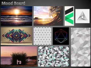
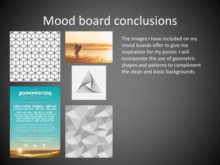
The images I have included on my
mood boards offer to give me
inspiration for my poster. I will
incorporate the use of geometric
shapes and patterns to compliment
the clean and basic backgrounds.
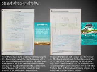
The first hand drawn draft I created aimed to replicate the
2016 Boardmasters layout. The clean background with a
large amount of dead space compliments the subtle beach
at the bottom of the image. The tone of colours are the
same over the 2016 Boardmasters media advertisements.
This hand drawn draft aimed to replicate the clean
aesthetics of the Boardmasters advertisement.
The second hand drawn draft I created aimed to replicate
the 2011 Boardmasters layout. The busy background with
the cliff face offers to represent what the festival really
offers. Being surfing and music. This can be seen with the
two contrasting festival activities shown next to each other.
This hand drawn draft aims to use the same initiative of the
designer, yet offering a different product.
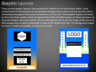
These are the graphic layouts I have produced in relation to my hand drawn drafts. I have
created these on Photoshop and used gradient backgrounds to show how the sky will create a
contrasting tone against the poster conventions and the land. These graphic layouts are based
on the hand drawn drafts, which are based of the 2016 and 2011 posters as those two were my
favourite designs. My poster will be A4 size, allowing the user to see the image of the venue as
t6he background, as well as being able to view all the details from afar. The background images
are kept as simple as possible, to minimise ink costs.
As my original magazine name is ‘ROQ’
I do not think this would fit the needs
of a festival name as ‘ROQ Fest’ seems
dull. It may also be misleading as the
festival does not only feature rock
artist, which would be the immediate
assumption by the audience. ‘FLUID
FEST’ is different and is not specific to a
music genre.
I will use ‘Repetition’ , an ‘eroded’ font style by DaFont. I will use this font as is it has a
different look to a regular Sans Serif style font that may be seen as boring. The font also has a
hand drawn look. This works well with the theme of the festival, going with the beach culture
that the festival portrays. I will use this as the main font to type out the artist names and I will
use a different font for the logo design.
This is a sample as to how the font will
look on the poster. I will use to type
out the artist’s names. This will give a
cleaner look as the Boardmasters style
is. This looks more professional than it
would
with logos and different font styles
from different artists.
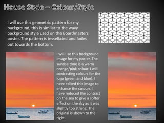
I will use this geometric pattern for my
background, this is similar to the wavy
background style used on the Boardmasters
poster. The pattern is tessellated and fades
out towards the bottom.
I will use this background
image for my poster. The
sunrise tone is a warm
orange/pink colour. I will
contrasting colours for the
logo (green and blue). I
have edited this image to
enhance the colours. I
have reduced the contrast
on the sea to give a softer
effect on the sky as it was
slightly too strong. The
original is shown to the
right.
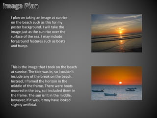
I plan on taking an image at sunrise
on the beach such as this for my
poster background. I will take the
image just as the sun rise over the
surface of the sea. I may include
foreground features such as boats
and buoys.
This is the image that I took on the beach
at sunrise. The tide was in, so I couldn’t
include any of the break on the beach.
Instead, I framed the horizon in the
middle of the frame. There were boats
moored in the bay, so I included them in
the frame. The sun isn't in the middle,
however, if it was, it may have looked
slightly artificial.
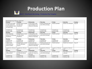
Production Plan
Unit 15 – Print Based Advertising – Production Plan Template
Week beginning: February 16th 2017
Monday Tuesday Wednesday Thursday Friday Saturday Sunday
Decisions are made
on who will be the
main headliners and
on which days
Design layout created
for the main
headliners
Create poster with
main headliners for
release on Saturday
Posters prepared and
sent off for printing
Posters printed Posters are released Day off
Complete by:
January 30th
Complete by:
January 30th
Complete by:
January 30th
Complete by:
January 29th
Complete by:
January 30th
Complete by:
January 30th
Monday Tuesday Wednesday Thursday Friday Saturday Sunday
Start designing
poster for remaining
headliners
Design layout created
for the second
headliners
Create poster with
second headliners for
release on Saturday
Posters prepared and
sent off for printing
Posters printed Posters are released Day off
Monday
Complete by:
February 1st
Tuesday
Complete by:
February 2nd
Wednesday
Complete by:
February 3rd
Thursday
Complete by:
February 4th
Friday
Complete by:
February 5th
Saturday
Complete by:
February 5th
Sunday
Collect artist
information for
poster profiles
Design layout created
for the individual
posters
Create poster for
individual profiles for
release on Saturday
Posters prepared and
sent off for printing
Posters printed Posters are released Day off
Complete by: February
7th
Complete by: February
7th
Complete by: February
8th
Complete by: February
9th
Complete by: February
10th
Complete by: February
11th
Monday Tuesday Wednesday Thursday Friday Saturday Sunday
Start designing final
official poster
Design layout created
for the final official
poster
Create final official
poster for release on
Saturday
Posters prepared and
sent off for printing
Posters printed Final official poster
released
Day off
Complete by: Complete by: Complete by: Complete by: Complete by: Complete by:
February 14th February 15th February 16th February 17th February 18th February 18th
Production Schedule
Important meetings Key Date
Client meeting to discuss poster design 25/10/2017
Designer meeting to discuss image design 27/01/2017
Budget plan 30/01/2017
Post production 01/02/2017
Client approval meeting 03/02/2017
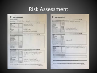
Risk Assessment
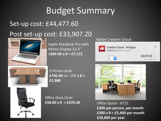
Budget Summary
Set-up cost: £44,477.60
Post set-up cost: £33,907.20
Apple MacBook Pro with
Retina Display 13.3″
£889.00 x 8 = £7,112
2 Person desk
£746.90 inc. VAT x 8 =
£2,988
Adobe Creative Cloud
Office Desk Chair
£58.80 x 8 = £470.40 Office Space - KT22
£300 per person, per month.
£300 x 8 = £2,400 per month
£28,800 per year
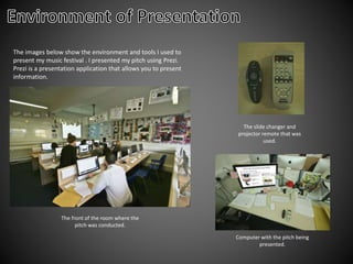
The images below show the environment and tools I used to
present my music festival . I presented my pitch using Prezi.
Prezi is a presentation application that allows you to present
information.
The front of the room where the
pitch was conducted.
Computer with the pitch being
presented.
The slide changer and
projector remote that was
used.
In these four pictures, I am shown presenting my
pitch for my music festival ‘Fluid Fest’.
Canon 7d mark 2
Canon 70-200mm f/4
Manfrotto 055 tripod
SanDisk 16GB SD card
Adobe Photoshop
Lightroom 5

Unit 15 LO4 Pitch

  • 2.
    The aim ofthe video is to portray the vibe of the festival - a DeadMau5 song is played over the video to give some insight as to what genre of music the festival is based around. The video aims to give the impression that the festival is different to others as it is a chilled beach festival. The headline acts are written in text over video clips shot over last year’s festival. The video aims to captivate the viewer and make them feel inclined to buy a ticket. The description of the video reads “With only 34 day's to go, the official Boardmasters trailer for 2016 has landed! From sunrise yoga, to sunset surf sessions, along with some of the best music acts around, the ultimate beach side, summer festival is waiting for you! Are you ready?!” This aims to create hype for the festival and assure the viewers they have made the best decision to go to the festival.
  • 5.
    Mood board conclusions Theimages I have included on my mood boards offer to give me inspiration for my poster. I will incorporate the use of geometric shapes and patterns to compliment the clean and basic backgrounds.
  • 6.
    The first handdrawn draft I created aimed to replicate the 2016 Boardmasters layout. The clean background with a large amount of dead space compliments the subtle beach at the bottom of the image. The tone of colours are the same over the 2016 Boardmasters media advertisements. This hand drawn draft aimed to replicate the clean aesthetics of the Boardmasters advertisement. The second hand drawn draft I created aimed to replicate the 2011 Boardmasters layout. The busy background with the cliff face offers to represent what the festival really offers. Being surfing and music. This can be seen with the two contrasting festival activities shown next to each other. This hand drawn draft aims to use the same initiative of the designer, yet offering a different product.
  • 7.
    These are thegraphic layouts I have produced in relation to my hand drawn drafts. I have created these on Photoshop and used gradient backgrounds to show how the sky will create a contrasting tone against the poster conventions and the land. These graphic layouts are based on the hand drawn drafts, which are based of the 2016 and 2011 posters as those two were my favourite designs. My poster will be A4 size, allowing the user to see the image of the venue as t6he background, as well as being able to view all the details from afar. The background images are kept as simple as possible, to minimise ink costs.
  • 9.
    As my originalmagazine name is ‘ROQ’ I do not think this would fit the needs of a festival name as ‘ROQ Fest’ seems dull. It may also be misleading as the festival does not only feature rock artist, which would be the immediate assumption by the audience. ‘FLUID FEST’ is different and is not specific to a music genre.
  • 10.
    I will use‘Repetition’ , an ‘eroded’ font style by DaFont. I will use this font as is it has a different look to a regular Sans Serif style font that may be seen as boring. The font also has a hand drawn look. This works well with the theme of the festival, going with the beach culture that the festival portrays. I will use this as the main font to type out the artist names and I will use a different font for the logo design. This is a sample as to how the font will look on the poster. I will use to type out the artist’s names. This will give a cleaner look as the Boardmasters style is. This looks more professional than it would with logos and different font styles from different artists.
  • 11.
    I will usethis geometric pattern for my background, this is similar to the wavy background style used on the Boardmasters poster. The pattern is tessellated and fades out towards the bottom. I will use this background image for my poster. The sunrise tone is a warm orange/pink colour. I will contrasting colours for the logo (green and blue). I have edited this image to enhance the colours. I have reduced the contrast on the sea to give a softer effect on the sky as it was slightly too strong. The original is shown to the right.
  • 12.
    I plan ontaking an image at sunrise on the beach such as this for my poster background. I will take the image just as the sun rise over the surface of the sea. I may include foreground features such as boats and buoys. This is the image that I took on the beach at sunrise. The tide was in, so I couldn’t include any of the break on the beach. Instead, I framed the horizon in the middle of the frame. There were boats moored in the bay, so I included them in the frame. The sun isn't in the middle, however, if it was, it may have looked slightly artificial.
  • 13.
    Production Plan Unit 15– Print Based Advertising – Production Plan Template Week beginning: February 16th 2017 Monday Tuesday Wednesday Thursday Friday Saturday Sunday Decisions are made on who will be the main headliners and on which days Design layout created for the main headliners Create poster with main headliners for release on Saturday Posters prepared and sent off for printing Posters printed Posters are released Day off Complete by: January 30th Complete by: January 30th Complete by: January 30th Complete by: January 29th Complete by: January 30th Complete by: January 30th Monday Tuesday Wednesday Thursday Friday Saturday Sunday Start designing poster for remaining headliners Design layout created for the second headliners Create poster with second headliners for release on Saturday Posters prepared and sent off for printing Posters printed Posters are released Day off Monday Complete by: February 1st Tuesday Complete by: February 2nd Wednesday Complete by: February 3rd Thursday Complete by: February 4th Friday Complete by: February 5th Saturday Complete by: February 5th Sunday Collect artist information for poster profiles Design layout created for the individual posters Create poster for individual profiles for release on Saturday Posters prepared and sent off for printing Posters printed Posters are released Day off Complete by: February 7th Complete by: February 7th Complete by: February 8th Complete by: February 9th Complete by: February 10th Complete by: February 11th Monday Tuesday Wednesday Thursday Friday Saturday Sunday Start designing final official poster Design layout created for the final official poster Create final official poster for release on Saturday Posters prepared and sent off for printing Posters printed Final official poster released Day off Complete by: Complete by: Complete by: Complete by: Complete by: Complete by: February 14th February 15th February 16th February 17th February 18th February 18th
  • 14.
    Production Schedule Important meetingsKey Date Client meeting to discuss poster design 25/10/2017 Designer meeting to discuss image design 27/01/2017 Budget plan 30/01/2017 Post production 01/02/2017 Client approval meeting 03/02/2017
  • 15.
  • 16.
    Budget Summary Set-up cost:£44,477.60 Post set-up cost: £33,907.20 Apple MacBook Pro with Retina Display 13.3″ £889.00 x 8 = £7,112 2 Person desk £746.90 inc. VAT x 8 = £2,988 Adobe Creative Cloud Office Desk Chair £58.80 x 8 = £470.40 Office Space - KT22 £300 per person, per month. £300 x 8 = £2,400 per month £28,800 per year
  • 17.
    The images belowshow the environment and tools I used to present my music festival . I presented my pitch using Prezi. Prezi is a presentation application that allows you to present information. The front of the room where the pitch was conducted. Computer with the pitch being presented. The slide changer and projector remote that was used.
  • 18.
    In these fourpictures, I am shown presenting my pitch for my music festival ‘Fluid Fest’.
  • 19.
    Canon 7d mark2 Canon 70-200mm f/4 Manfrotto 055 tripod SanDisk 16GB SD card Adobe Photoshop Lightroom 5

Editor's Notes

  • #13 Photoshoot plan Use template in the Public Drive under Unit 15 – LO2 named Photoshoot plan