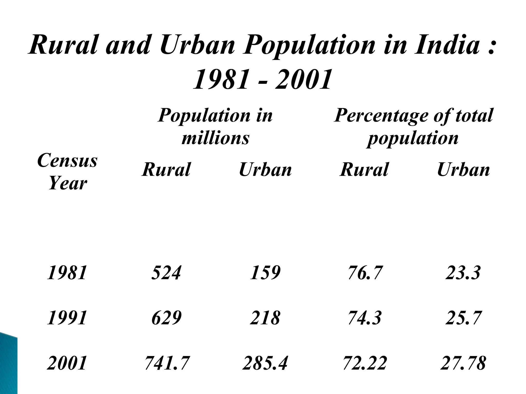
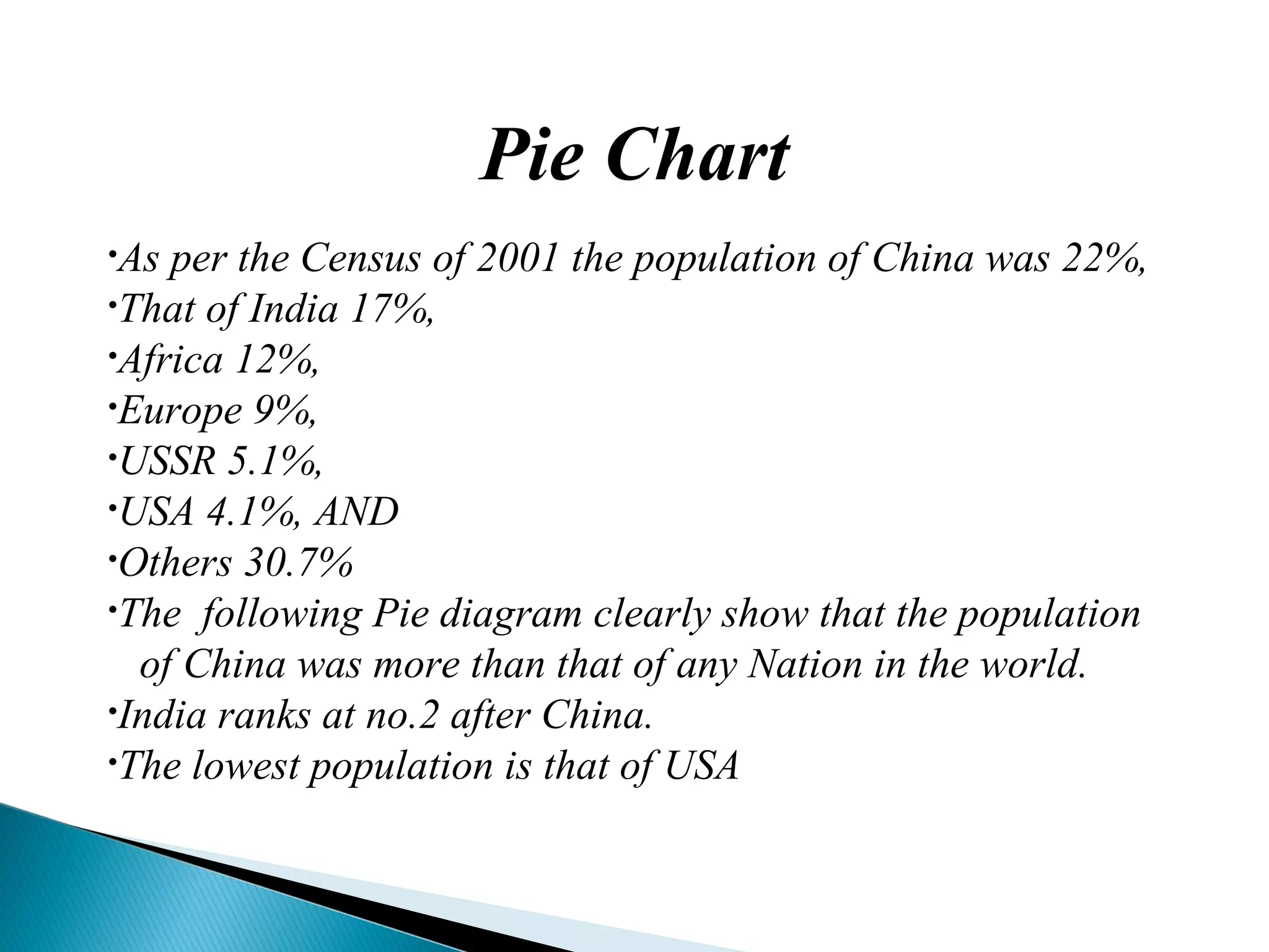
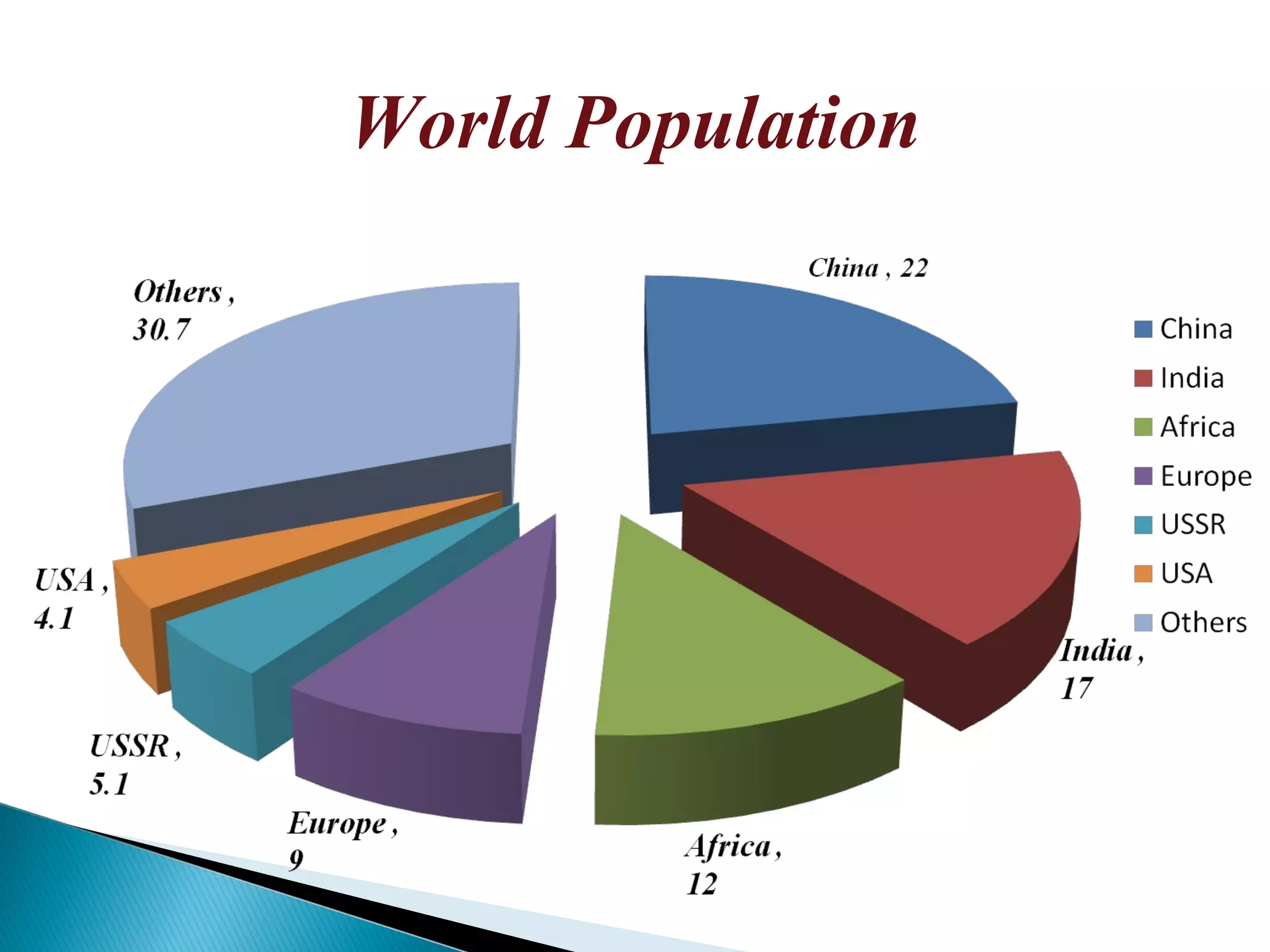
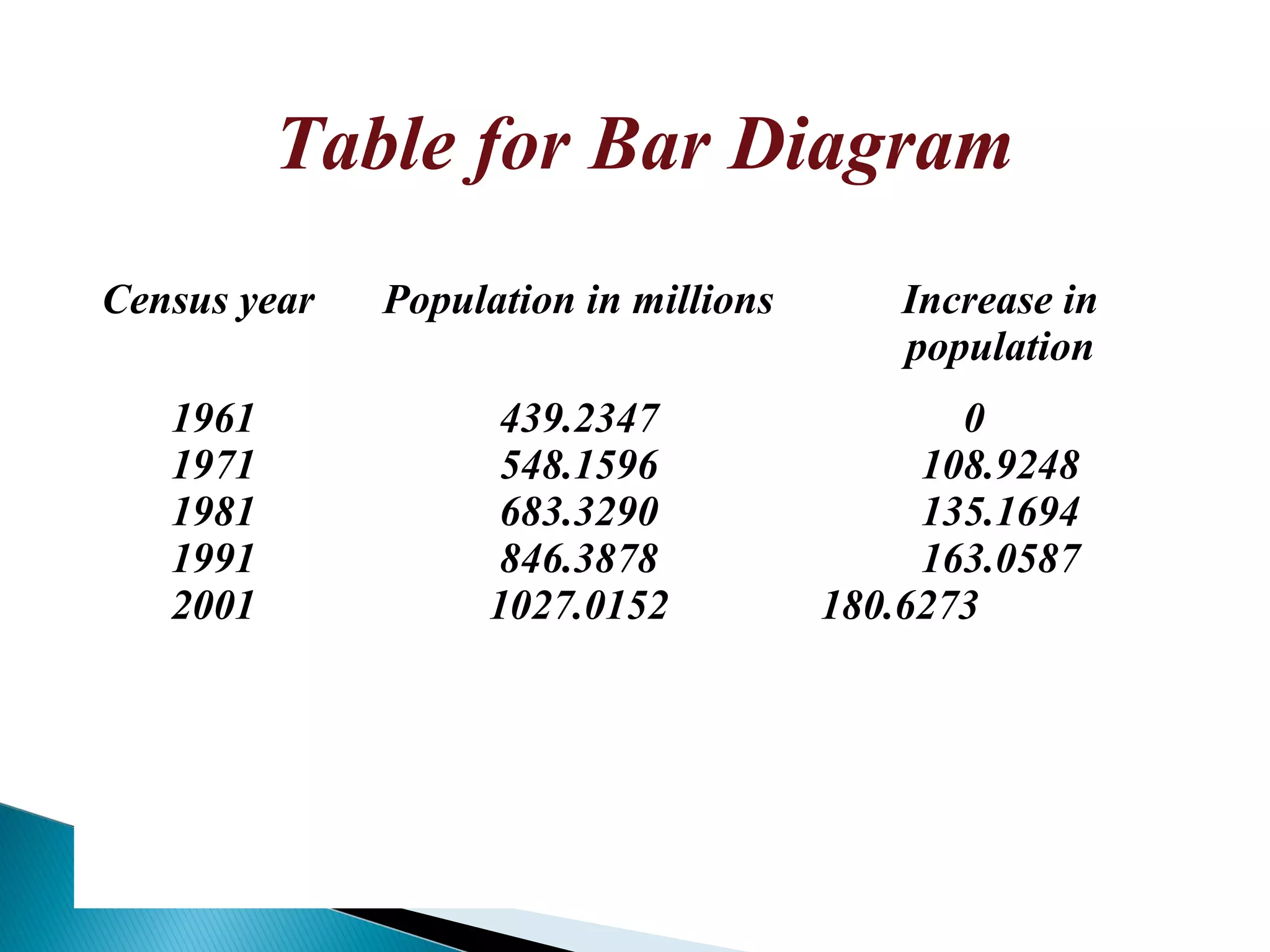
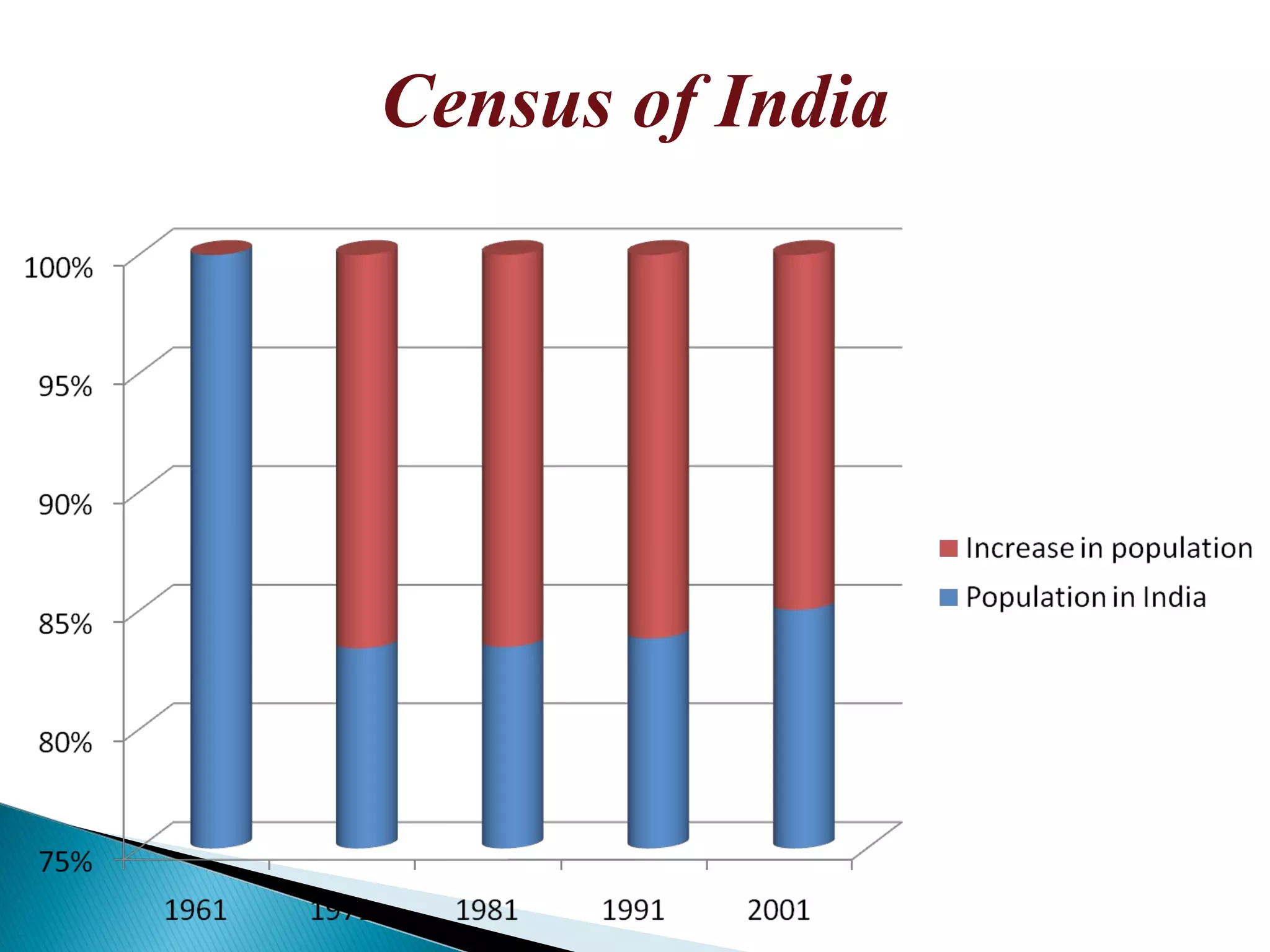
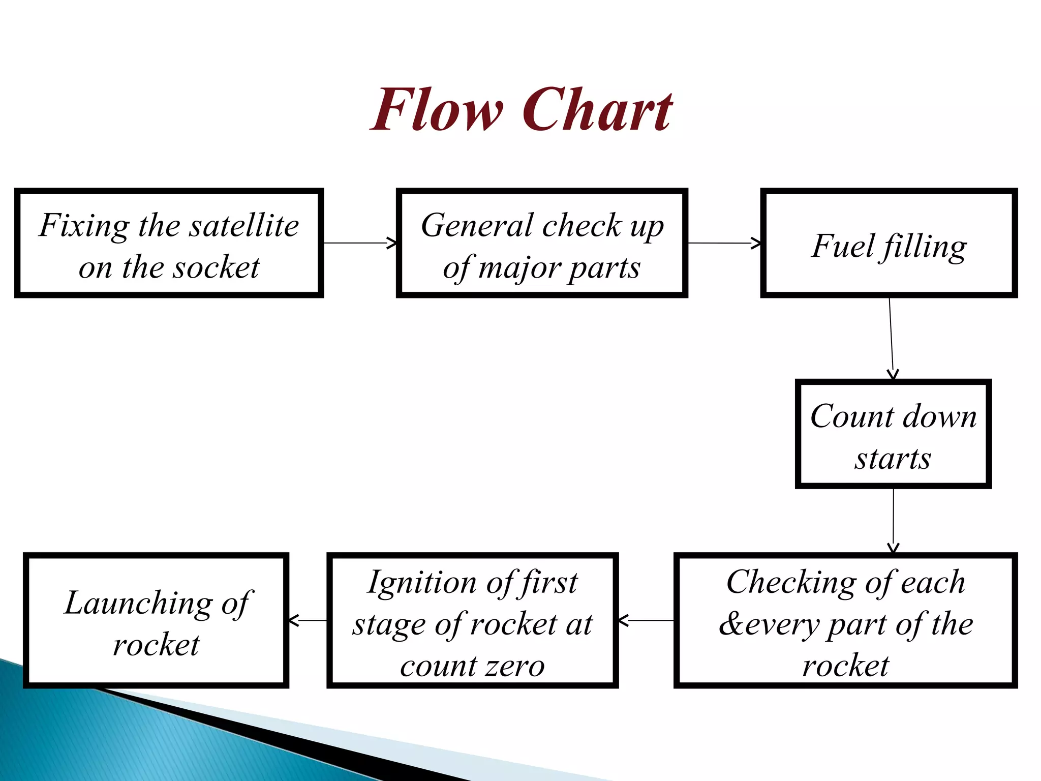
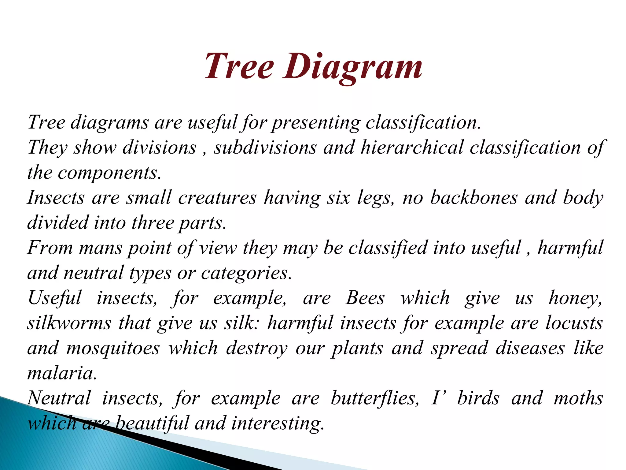
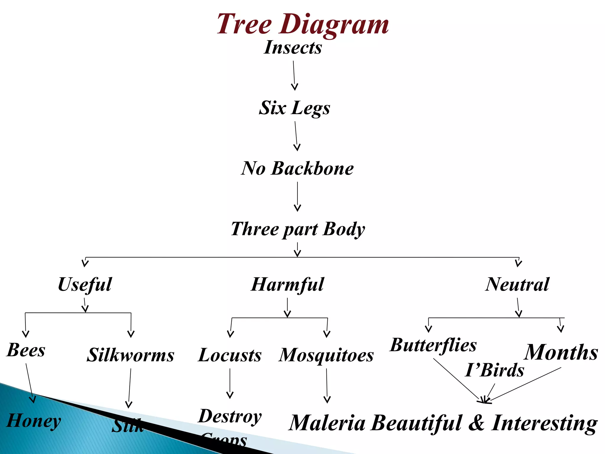
This document presents information on the advantages of diagrammatic presentations compared to narrative presentations. It then provides examples of different types of diagrams - pie charts, bar diagrams, flow charts, and tree diagrams - and what each shows. A pie chart shows the world population distribution by country in 2001. Bar diagrams show India's population growth from 1961-2001. A flow chart maps the stages of a rocket launch. And a tree diagram classifies insects into useful, harmful, and neutral categories. Diagrams allow visualizing and comparing information clearly compared to repetitive words in narratives.


![population st [Autosaved].pptx](https://cdn.slidesharecdn.com/ss_thumbnails/populationstautosaved-230715145356-edb96143-thumbnail.jpg?width=640&height=640&fit=bounds)


