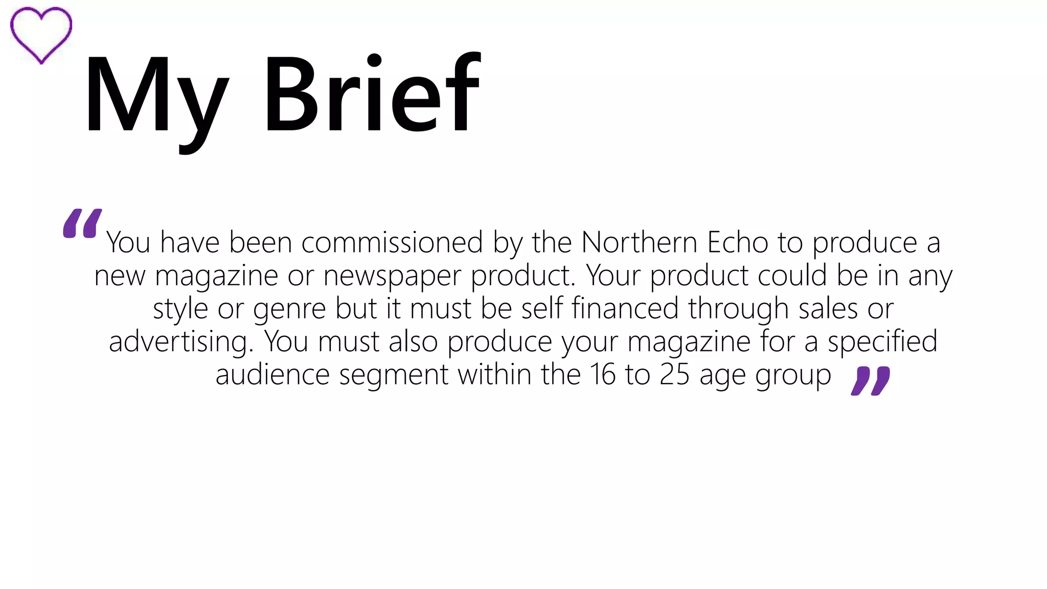
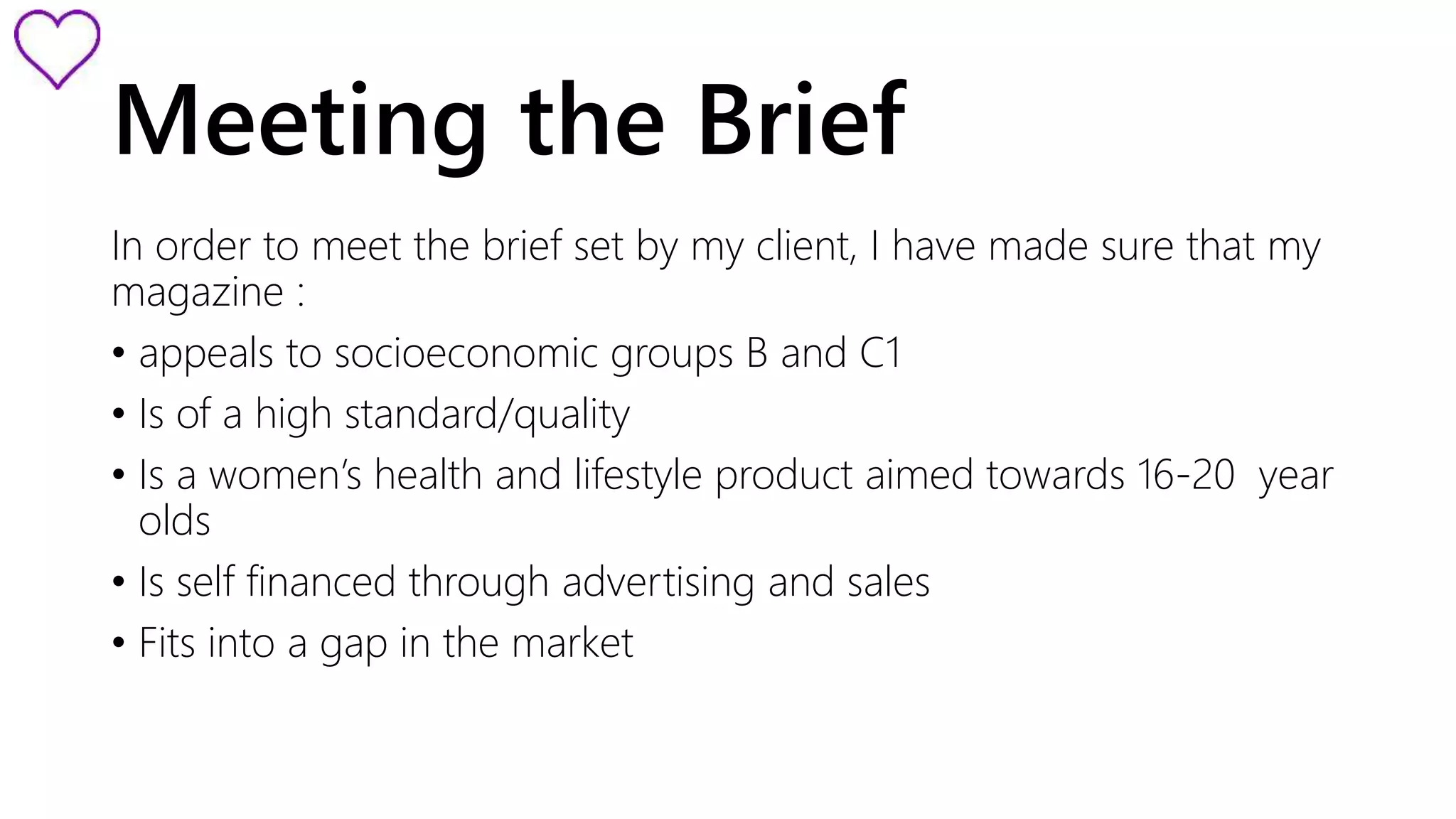
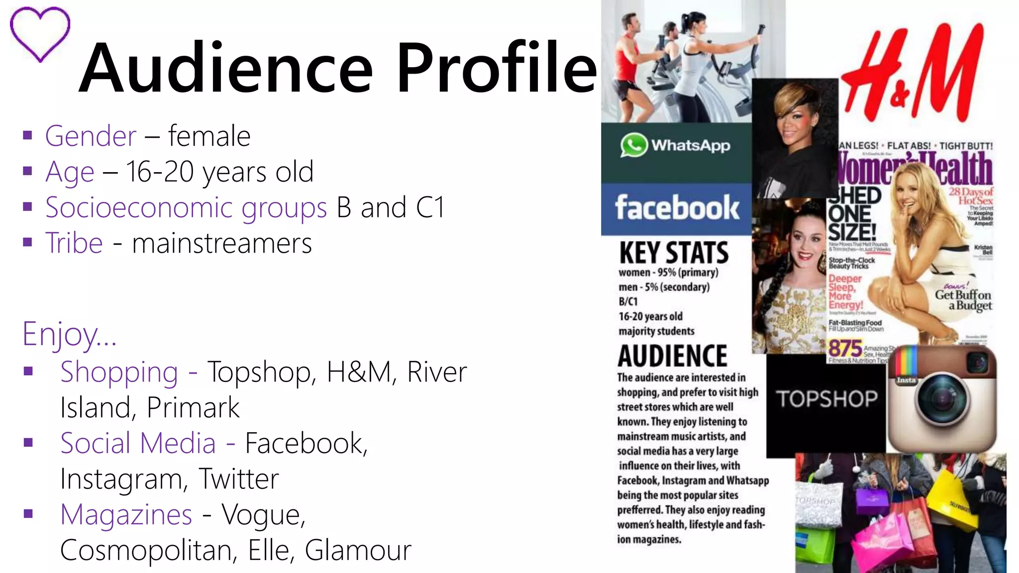
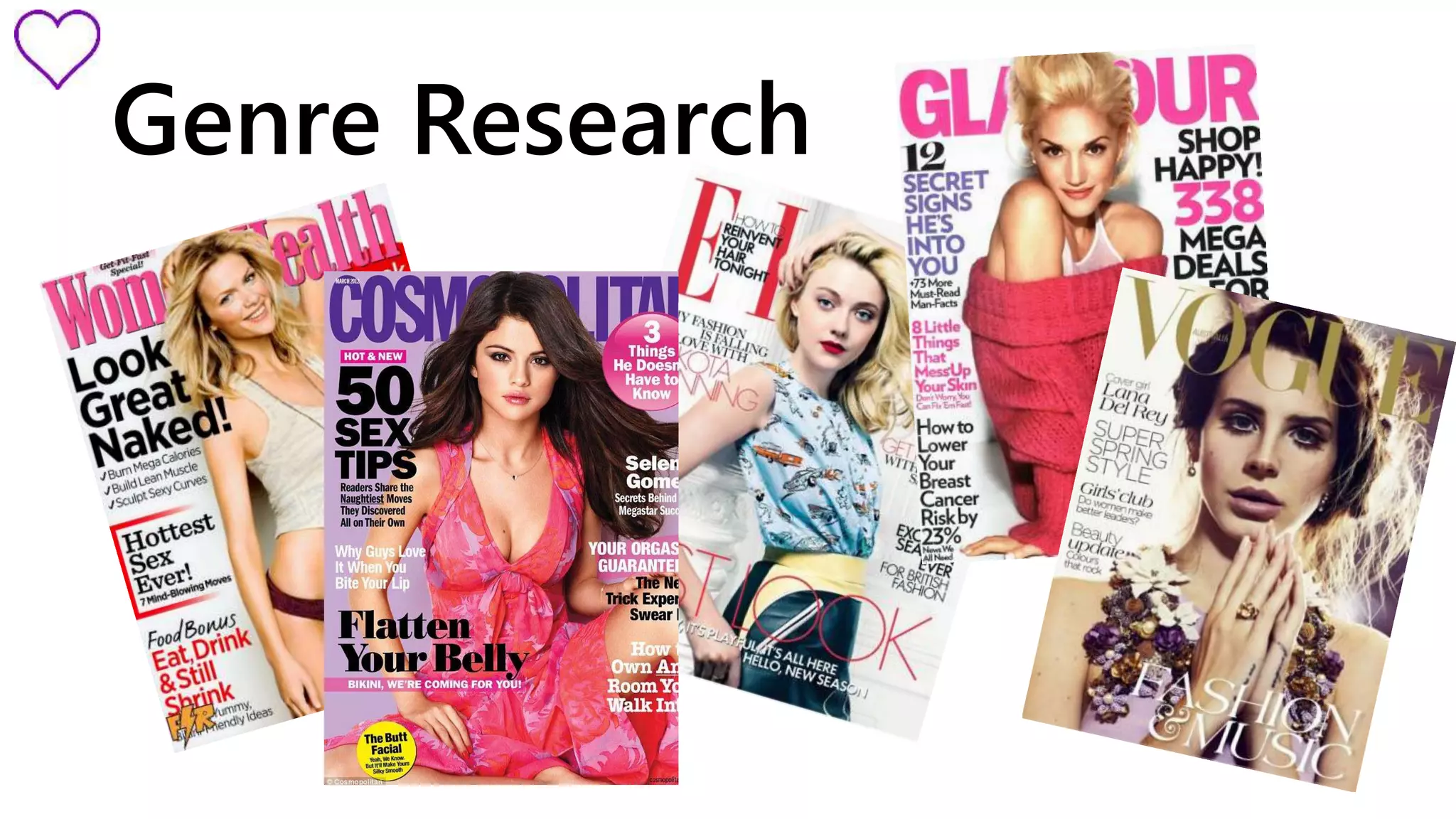
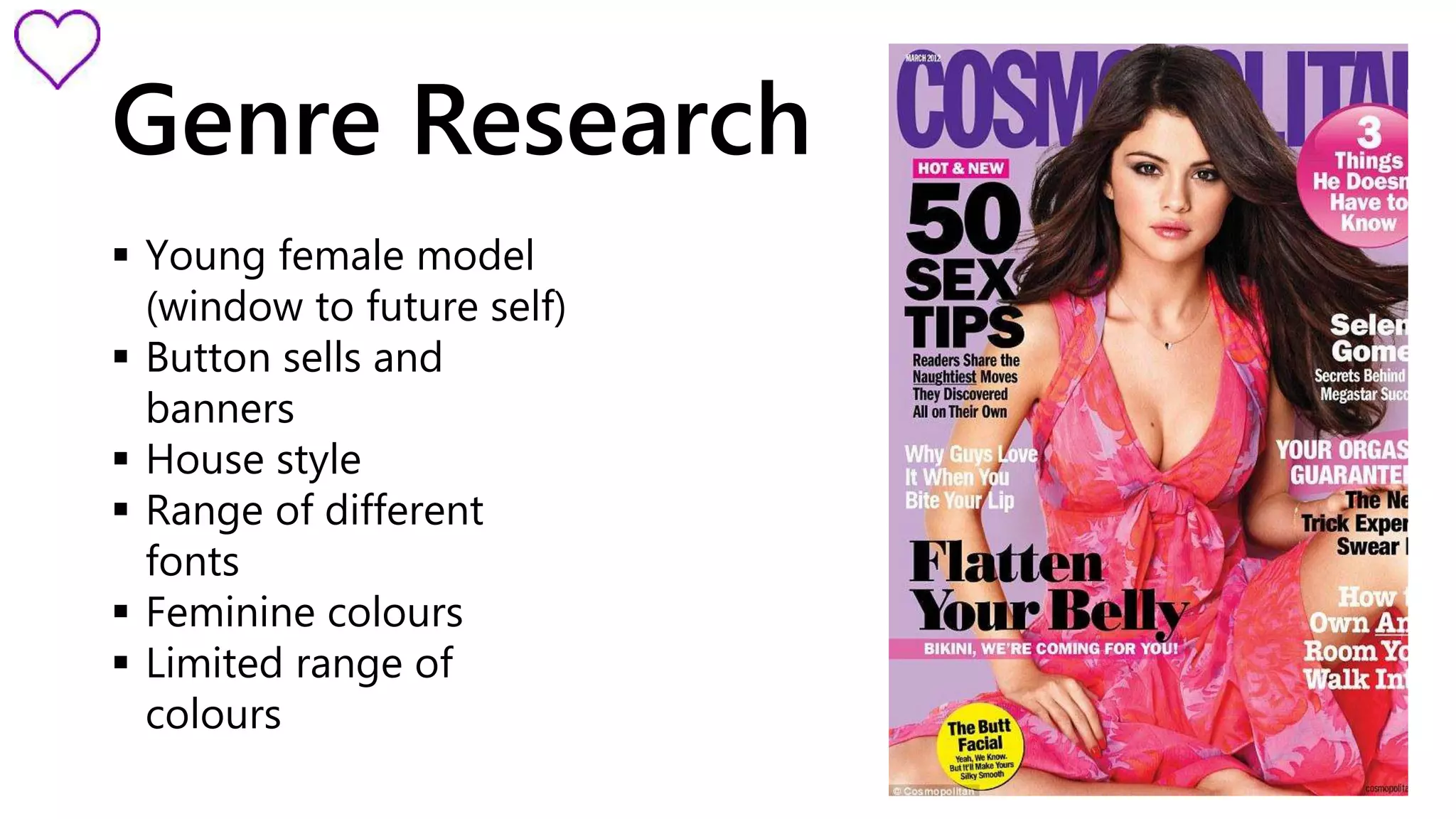
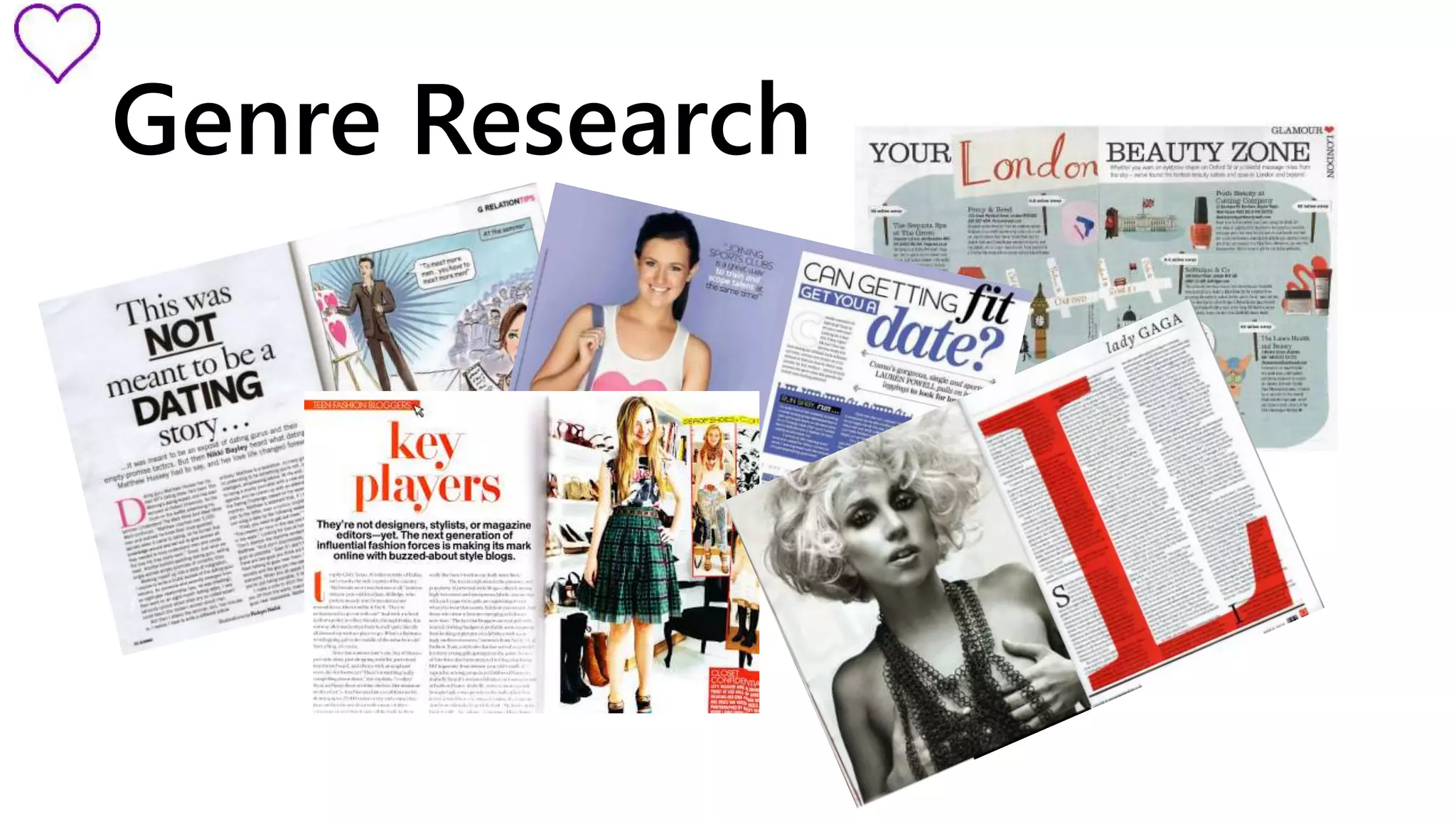
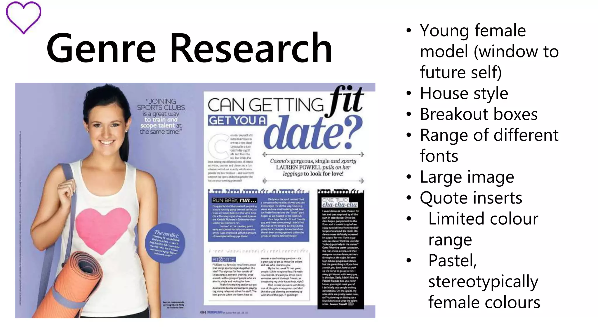
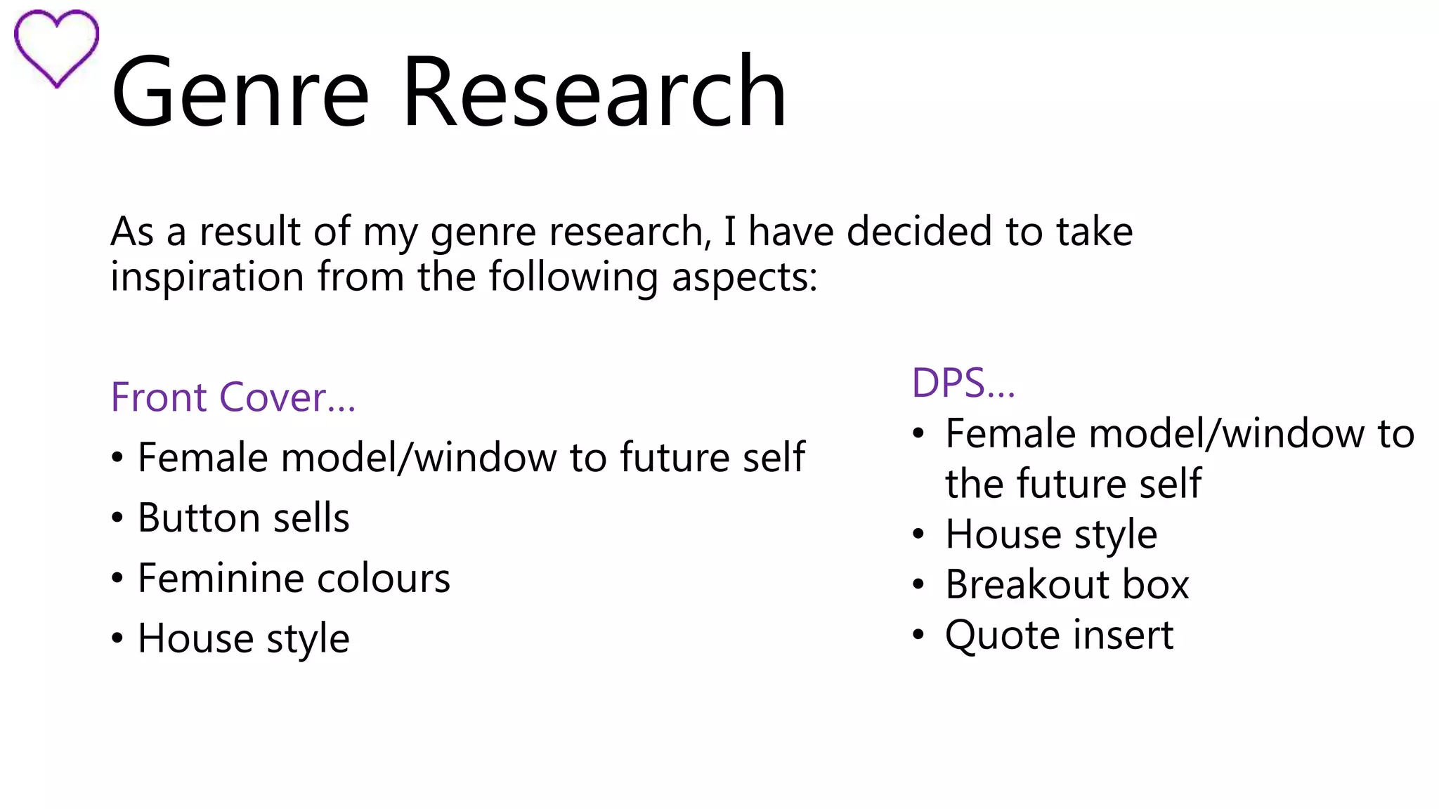
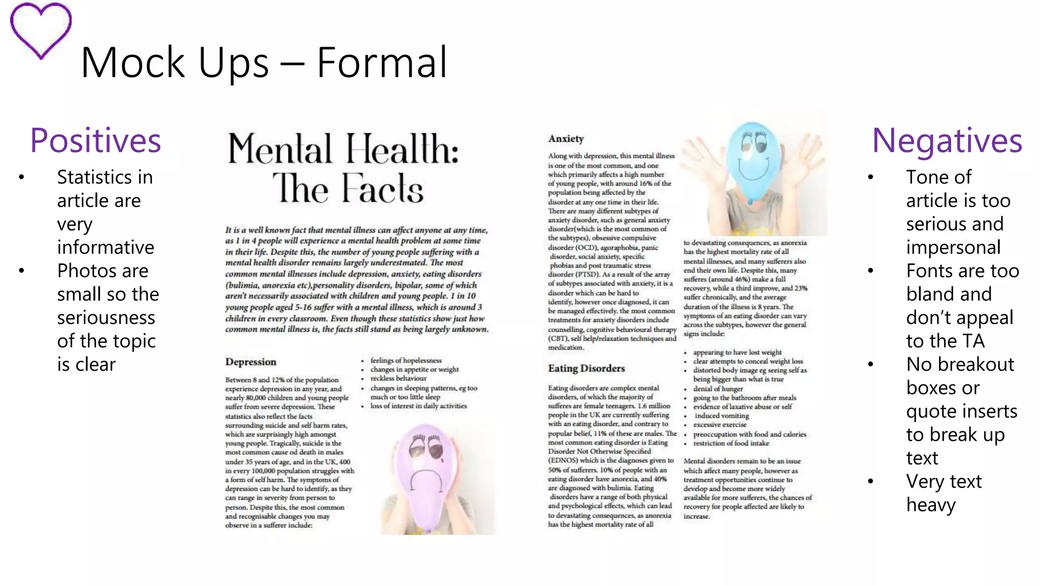
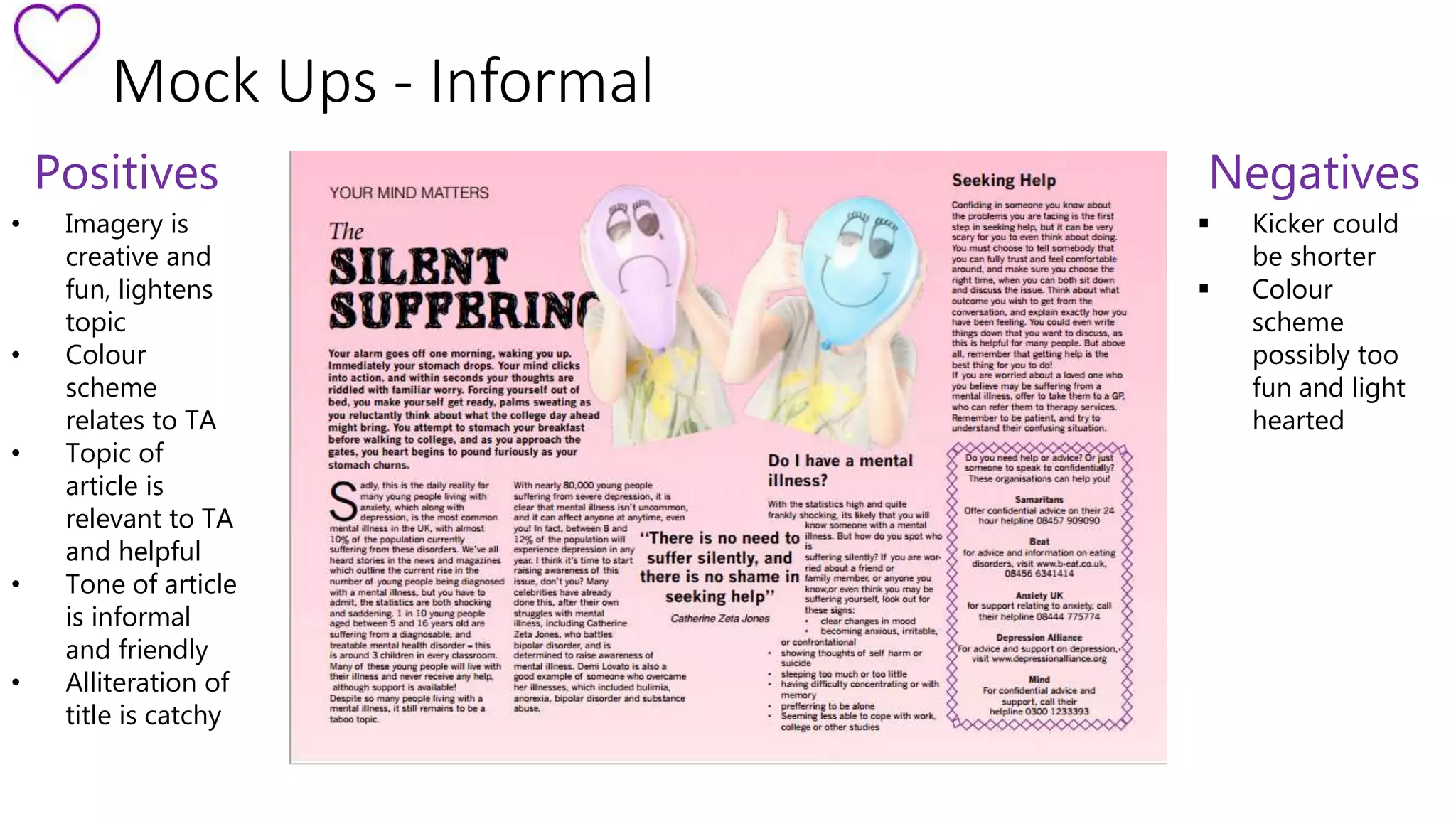
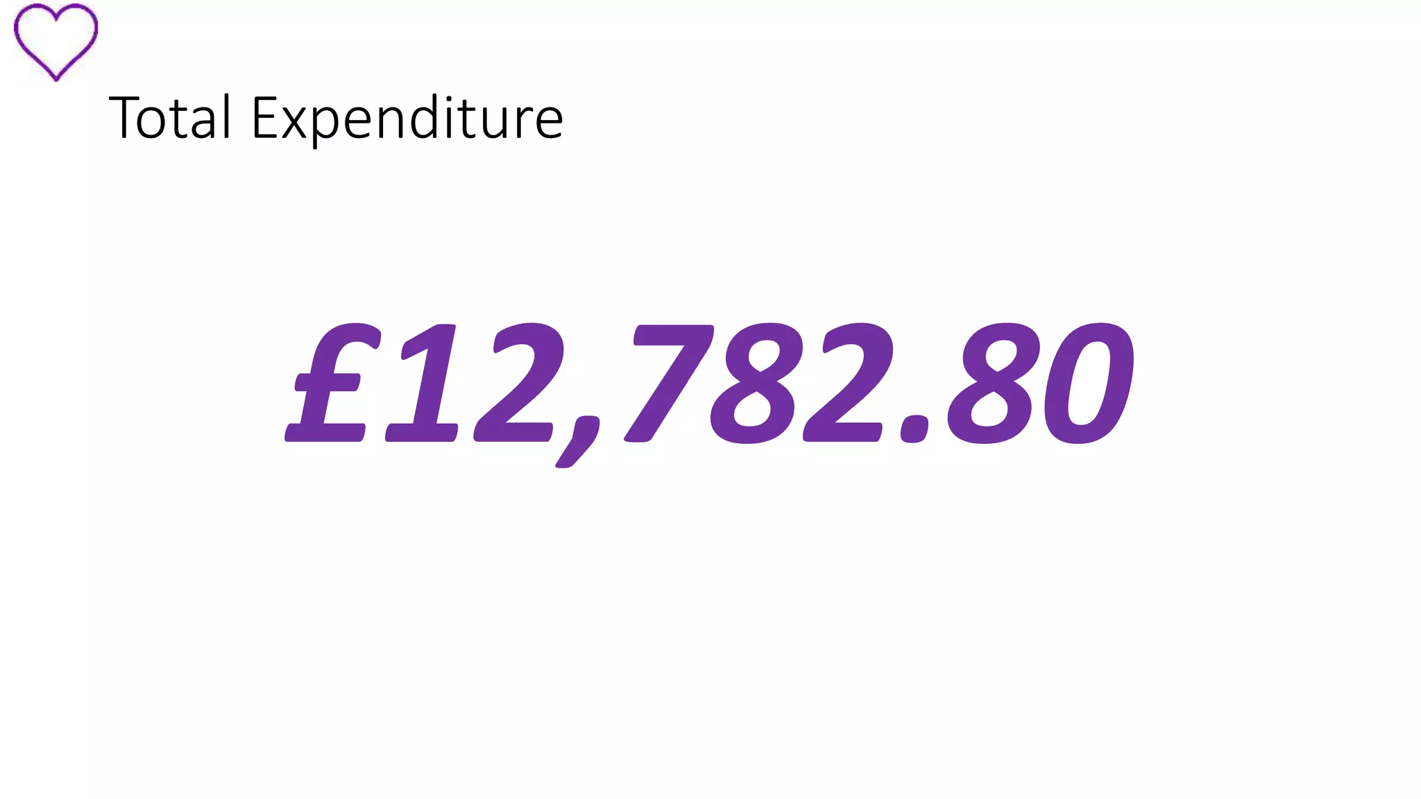
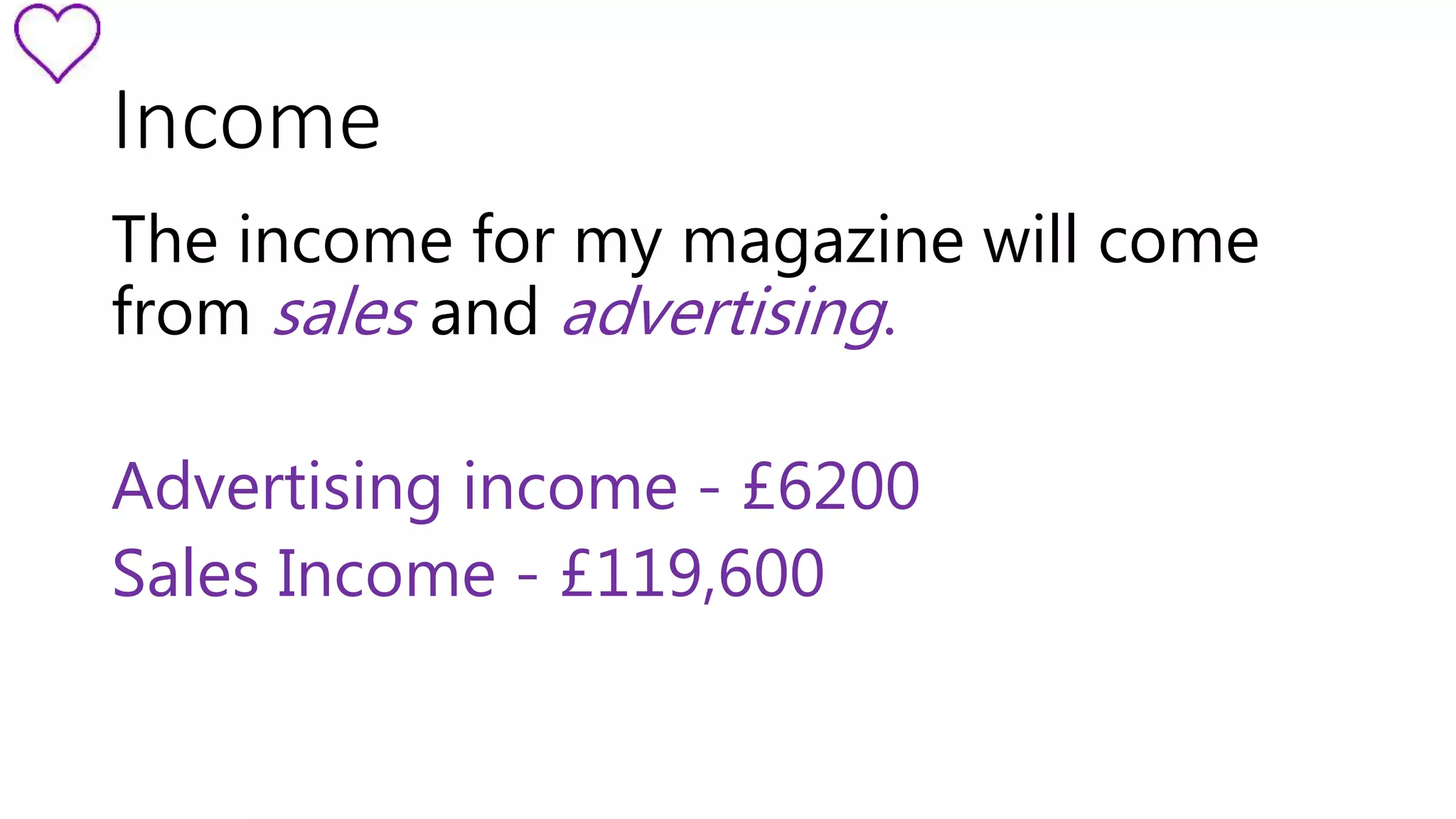
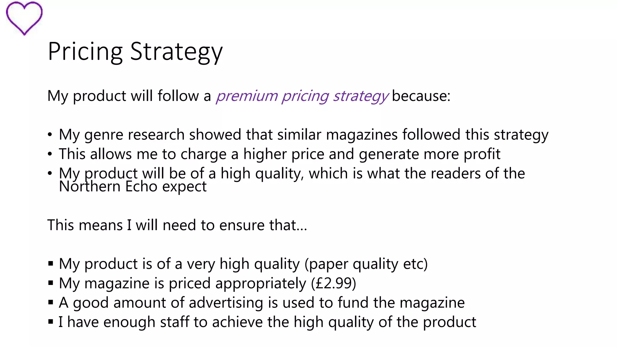
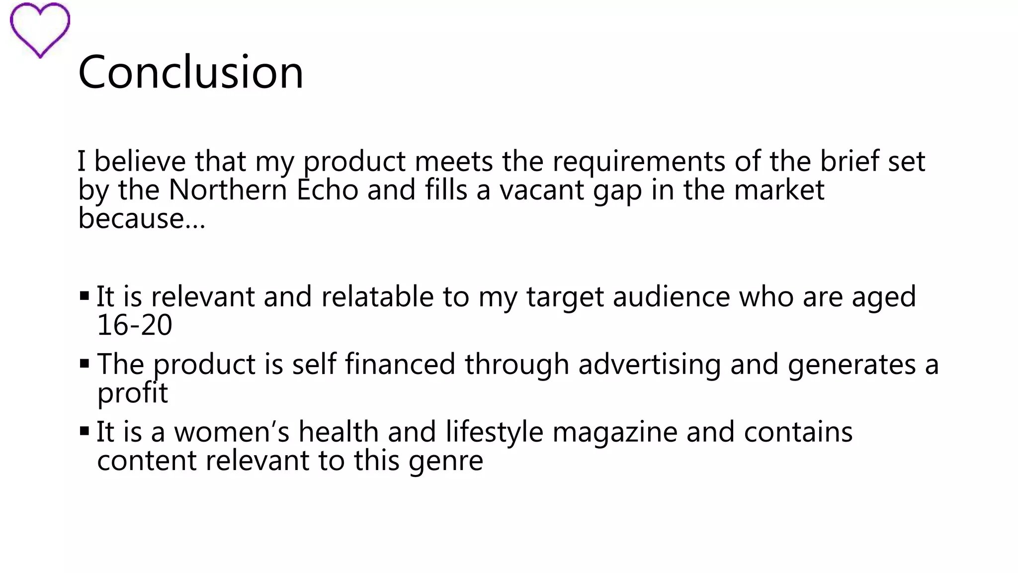
Thrive 
Women’s Health and Lifestyle Magazine 
Grace Dunn
My Brief 
You have been commissioned by the Northern Echo to produce a 
new magazine or newspaper product. Your product could be in any 
style or genre but it must be self financed through sales or 
advertising. You must also produce your magazine for a specified 
audience segment within the 16 to 25 age group 
“ 
”
Meeting the Brief 
In order to meet the brief set by my client, I have made sure that my 
magazine : 
• appeals to socioeconomic groups B and C1 
• Is of a high standard/quality 
• Is a women’s health and lifestyle product aimed towards 16-20 year 
olds 
• Is self financed through advertising and sales 
• Fits into a gap in the market
Points to Consider 
Secondary Audience… 
The Northern Echo has a secondary audience who are likely to view 
product, In order to keep these readers satisfies and avoid offending 
them, I will ensure that my magazine doesn’t include: 
• No taboo language 
• No offensive or inappropriate content 
• No explicit imagery
Points to Consider 
The Independent Press Standards 
Organisation … 
The IPSO are an organisation who work to regulate media content by 
dealing with complaints from members of the public about magazine 
or newspaper content. To do this they follow 16 codes, and 
complaints are dealt with when one or more of these codes have 
been breached. 
I made 5 golden rules for my own 
magazine to ensure that no codes 
are breached by my product…
Golden Rules 
1 
Always take my own photographs or get permission for any photographs I use 
that aren’t my own. 2 
Always get permission from parents before interviewing or photographing 
children 
3 
4 
Make sure I get permission from people before taking their photograph, 
and respect their decision if they don’t want to be interviewed or 
photographed. 
Ensure that none of the content is prejudice or 
discriminatory. 
5 Make sure all information is accurate and correct.
Unique Selling Point 
Thrive fills a vacant space in the magazine market, as 
it is a women’s health and lifestyle magazine 
specifically aimed at teenagers and students aged 16- 
20. Not only this, it also focusses on mental health and 
wellbeing as well as physical.
Audience Profile 
 Gender – female 
 Age – 16-20 years old 
 Socioeconomic groups B and C1 
 Tribe - mainstreamers 
Enjoy… 
 Shopping - Topshop, H&M, River 
Island, Primark 
 Social Media - Facebook, 
Instagram, Twitter 
 Magazines - Vogue, 
Cosmopolitan, Elle, Glamour
Primary Target Audience 
My primary target audience will affect my product in the 
following ways… 
• Feminine colour scheme used throughout 
• Sans serif fonts to appeal to younger readers 
• Articles with topic relevant to the readers, e.g mental health, 
health in the region
Genre Research
Genre Research 
 Young female model 
(window to future self) 
 Button sells and 
banners 
 House style 
 Range of different 
fonts 
 Feminine colours 
 Limited range of 
colours
Genre Research
Genre Research 
• Young female 
model (window to 
future self) 
• House style 
• Breakout boxes 
• Range of different 
fonts 
• Large image 
• Quote inserts 
• Limited colour 
range 
• Pastel, 
stereotypically 
female colours
Genre Research 
As a result of my genre research, I have decided to take 
inspiration from the following aspects: 
Front Cover… 
• Female model/window to future self 
• Button sells 
• Feminine colours 
• House style 
DPS… 
• Female model/window to 
the future self 
• House style 
• Breakout box 
• Quote insert
Mock Ups – Formal 
Positives 
• Statistics in 
article are 
very 
informative 
• Photos are 
small so the 
seriousness 
of the topic 
is clear 
Negatives 
• Tone of 
article is too 
serious and 
impersonal 
• Fonts are too 
bland and 
don’t appeal 
to the TA 
• No breakout 
boxes or 
quote inserts 
to break up 
text 
• Very text 
heavy
Mock Ups - Informal 
Positives 
• Imagery is 
creative and 
fun, lightens 
topic 
• Colour 
scheme 
relates to TA 
• Topic of 
article is 
relevant to TA 
and helpful 
• Tone of article 
is informal 
and friendly 
• Alliteration of 
title is catchy 
Negatives 
 Kicker could 
be shorter 
 Colour 
scheme 
possibly too 
fun and light 
hearted
Mock Up Conclusion 
From my mock up feedback, I have decided to take forward the 
following elements: 
• Colour scheme – feminine colours 
• Informal/friendly tone 
• Imagery 
• Alliteration of title
Flat Plans 
Front Cover… 
 Purple background, stereotypically 
girly colour 
 Range of sell lines – exclamatives, 
commands, questions 
 Limited range of colours, helps to 
create a house style
Flat Plans 
Contents Page… 
 Images from articles to advertise 
each DPS 
 Range of shapes (rectangles, 
circles) creating an active layout 
 Limited range of colours used to 
create a consistent house style 
 Clear title in a serif font
Flat Plans 
North East Health… 
 3 Colour pallet used – black, 
white and red 
 Red connotes danger 
associated with health risks 
of drinking etc 
 Breakout box used in 
between columns 
 Main image is metaphoric, 
symbolising accidents 
 4 columns of text to break 
up article 
 Bold heading with “wrong” 
being larger to tell readers 
the article is focussing on 
problems
Article 
North East Health… 
 Identifies health issues currently affecting the region, e.g. 
smoking, drinking, drugs etc 
 Discusses the severity of each issue and which are most 
common 
 Shows the exact problems the issues can lead to, e.g. obesity 
leading to heart disease etc 
 Research into any schemes or plans already in place to prevent 
or lessen the impact of the issues
Flat Plans 
Dance Yourself Happy… 
 Title page in addition 
to main DPS 
introduces the article 
 House style reflected 
in colour scheme 
(purple and yellow 
being main colours) 
 Two quote inserts 
break up columns of 
text 
 Two breakout boxes 
give extra 
information 
 Main image on title 
page sets theme of 
article 
 Different fonts used 
for main header, 
connoting class and 
happiness
Article 
Dance Yourself Happy… 
 Identifies which different dance styles exist and which are 
popular 
 Research into the mental and physical benefits of dance 
 Research into a particular type of dance (freestyle disco) and 
discusses specific benefits, origins, moves etc 
 Information on dance schools operating in the local area for 
readers to join
Flat Plans 
The Silent Suffering…  Pink background – stereotypically girly 
colour 
 Quote insert to break up columns of 
text 
 Breakout box providing extra 
information 
 Bold header which is also an example 
of alliteration 
 Metaphorical imagery – balloons 
representing masks 
 Four columns of text to break up article
Article 
The Silent Suffering… 
 Information on the most common mental health issues (anxiety, 
depression etc) 
 Tips on how to spot if someone you know is suffering, warning signs, 
symptoms etc 
 Links to websites and charities offering advice and support for people 
suffering with a mental illness 
 Celebrities who suffer from mental health issues and have spoken out 
about their problems
Fonts 
The majority of my fonts are sans serif, as this is what my 
audience are most likely to prefer reading in terms of age 
and socioeconomic class. However some are serif, as 
classy connotations are required in order to appeal to 
the secondary target audience and be relevant to the 
article and its topic.
Expenses 
Journalists 
Photographers 
Models 
Make Up Assistants 
Layout Artists 
Post Production Photographic 
work 
Studio Hire 
Risk Assessment Technical 
Support 
Studio Lighting Technical Support 
Printing Costs
Total Expenditure 
£12,782.80
Advertising Rates 
Double page spread: £1500 
Full page: £900 
Half page vertical: £500 
Half page horizontal: £500 
Prime Positions 
Inside Front: £1300 
Inside back: £1100 
Outside back: £1400
Income 
The income for my magazine will come 
from sales and advertising. 
Advertising income - £6200 
Sales Income - £119,600
Total income 
£125,800
Pricing Strategy 
My product will follow a premium pricing strategy because: 
• My genre research showed that similar magazines followed this strategy 
• This allows me to charge a higher price and generate more profit 
• My product will be of a high quality, which is what the readers of the 
Northern Echo expect 
This means I will need to ensure that… 
 My product is of a very high quality (paper quality etc) 
 My magazine is priced appropriately (£2.99) 
 A good amount of advertising is used to fund the magazine 
 I have enough staff to achieve the high quality of the product
Profit/Loss 
My magazine will make an overall profit of… 
£56,508.60
Distribution 
My magazine will be distributed by Gold Key Media ( 
www.gkml.co.uk ) as they don’t currently have any magazines 
similar to my own. Using a distributor means that I will lose some 
of my potential profit, however it is essential for a premium 
priced magazine to have a distributor. 
It will be sold alongside the Northern Echo, in places such as: 
 Supermarkets 
 Corner shops 
 Newsagents
Commercial Viability 
Pages: 16 
Adverts: 6 pages 
Size: A4 
Paper Quality: 150 gsm coated
Conclusion 
I believe that my product meets the requirements of the brief set 
by the Northern Echo and fills a vacant gap in the market 
because… 
 It is relevant and relatable to my target audience who are aged 
16-20 
 The product is self financed through advertising and generates a 
profit 
 It is a women’s health and lifestyle magazine and contains 
content relevant to this genre
I am happy to answer any 
questions 

Thrive pitch (1) (1) (1)

  • 1.
    Thrive Women’s Healthand Lifestyle Magazine Grace Dunn
  • 2.
    My Brief Youhave been commissioned by the Northern Echo to produce a new magazine or newspaper product. Your product could be in any style or genre but it must be self financed through sales or advertising. You must also produce your magazine for a specified audience segment within the 16 to 25 age group “ ”
  • 3.
    Meeting the Brief In order to meet the brief set by my client, I have made sure that my magazine : • appeals to socioeconomic groups B and C1 • Is of a high standard/quality • Is a women’s health and lifestyle product aimed towards 16-20 year olds • Is self financed through advertising and sales • Fits into a gap in the market
  • 4.
    Points to Consider Secondary Audience… The Northern Echo has a secondary audience who are likely to view product, In order to keep these readers satisfies and avoid offending them, I will ensure that my magazine doesn’t include: • No taboo language • No offensive or inappropriate content • No explicit imagery
  • 5.
    Points to Consider The Independent Press Standards Organisation … The IPSO are an organisation who work to regulate media content by dealing with complaints from members of the public about magazine or newspaper content. To do this they follow 16 codes, and complaints are dealt with when one or more of these codes have been breached. I made 5 golden rules for my own magazine to ensure that no codes are breached by my product…
  • 6.
    Golden Rules 1 Always take my own photographs or get permission for any photographs I use that aren’t my own. 2 Always get permission from parents before interviewing or photographing children 3 4 Make sure I get permission from people before taking their photograph, and respect their decision if they don’t want to be interviewed or photographed. Ensure that none of the content is prejudice or discriminatory. 5 Make sure all information is accurate and correct.
  • 7.
    Unique Selling Point Thrive fills a vacant space in the magazine market, as it is a women’s health and lifestyle magazine specifically aimed at teenagers and students aged 16- 20. Not only this, it also focusses on mental health and wellbeing as well as physical.
  • 8.
    Audience Profile Gender – female  Age – 16-20 years old  Socioeconomic groups B and C1  Tribe - mainstreamers Enjoy…  Shopping - Topshop, H&M, River Island, Primark  Social Media - Facebook, Instagram, Twitter  Magazines - Vogue, Cosmopolitan, Elle, Glamour
  • 9.
    Primary Target Audience My primary target audience will affect my product in the following ways… • Feminine colour scheme used throughout • Sans serif fonts to appeal to younger readers • Articles with topic relevant to the readers, e.g mental health, health in the region
  • 10.
  • 11.
    Genre Research Young female model (window to future self)  Button sells and banners  House style  Range of different fonts  Feminine colours  Limited range of colours
  • 12.
  • 13.
    Genre Research •Young female model (window to future self) • House style • Breakout boxes • Range of different fonts • Large image • Quote inserts • Limited colour range • Pastel, stereotypically female colours
  • 14.
    Genre Research Asa result of my genre research, I have decided to take inspiration from the following aspects: Front Cover… • Female model/window to future self • Button sells • Feminine colours • House style DPS… • Female model/window to the future self • House style • Breakout box • Quote insert
  • 15.
    Mock Ups –Formal Positives • Statistics in article are very informative • Photos are small so the seriousness of the topic is clear Negatives • Tone of article is too serious and impersonal • Fonts are too bland and don’t appeal to the TA • No breakout boxes or quote inserts to break up text • Very text heavy
  • 16.
    Mock Ups -Informal Positives • Imagery is creative and fun, lightens topic • Colour scheme relates to TA • Topic of article is relevant to TA and helpful • Tone of article is informal and friendly • Alliteration of title is catchy Negatives  Kicker could be shorter  Colour scheme possibly too fun and light hearted
  • 17.
    Mock Up Conclusion From my mock up feedback, I have decided to take forward the following elements: • Colour scheme – feminine colours • Informal/friendly tone • Imagery • Alliteration of title
  • 18.
    Flat Plans FrontCover…  Purple background, stereotypically girly colour  Range of sell lines – exclamatives, commands, questions  Limited range of colours, helps to create a house style
  • 19.
    Flat Plans ContentsPage…  Images from articles to advertise each DPS  Range of shapes (rectangles, circles) creating an active layout  Limited range of colours used to create a consistent house style  Clear title in a serif font
  • 20.
    Flat Plans NorthEast Health…  3 Colour pallet used – black, white and red  Red connotes danger associated with health risks of drinking etc  Breakout box used in between columns  Main image is metaphoric, symbolising accidents  4 columns of text to break up article  Bold heading with “wrong” being larger to tell readers the article is focussing on problems
  • 21.
    Article North EastHealth…  Identifies health issues currently affecting the region, e.g. smoking, drinking, drugs etc  Discusses the severity of each issue and which are most common  Shows the exact problems the issues can lead to, e.g. obesity leading to heart disease etc  Research into any schemes or plans already in place to prevent or lessen the impact of the issues
  • 22.
    Flat Plans DanceYourself Happy…  Title page in addition to main DPS introduces the article  House style reflected in colour scheme (purple and yellow being main colours)  Two quote inserts break up columns of text  Two breakout boxes give extra information  Main image on title page sets theme of article  Different fonts used for main header, connoting class and happiness
  • 23.
    Article Dance YourselfHappy…  Identifies which different dance styles exist and which are popular  Research into the mental and physical benefits of dance  Research into a particular type of dance (freestyle disco) and discusses specific benefits, origins, moves etc  Information on dance schools operating in the local area for readers to join
  • 24.
    Flat Plans TheSilent Suffering…  Pink background – stereotypically girly colour  Quote insert to break up columns of text  Breakout box providing extra information  Bold header which is also an example of alliteration  Metaphorical imagery – balloons representing masks  Four columns of text to break up article
  • 25.
    Article The SilentSuffering…  Information on the most common mental health issues (anxiety, depression etc)  Tips on how to spot if someone you know is suffering, warning signs, symptoms etc  Links to websites and charities offering advice and support for people suffering with a mental illness  Celebrities who suffer from mental health issues and have spoken out about their problems
  • 26.
    Fonts The majorityof my fonts are sans serif, as this is what my audience are most likely to prefer reading in terms of age and socioeconomic class. However some are serif, as classy connotations are required in order to appeal to the secondary target audience and be relevant to the article and its topic.
  • 27.
    Expenses Journalists Photographers Models Make Up Assistants Layout Artists Post Production Photographic work Studio Hire Risk Assessment Technical Support Studio Lighting Technical Support Printing Costs
  • 28.
  • 29.
    Advertising Rates Doublepage spread: £1500 Full page: £900 Half page vertical: £500 Half page horizontal: £500 Prime Positions Inside Front: £1300 Inside back: £1100 Outside back: £1400
  • 30.
    Income The incomefor my magazine will come from sales and advertising. Advertising income - £6200 Sales Income - £119,600
  • 31.
  • 32.
    Pricing Strategy Myproduct will follow a premium pricing strategy because: • My genre research showed that similar magazines followed this strategy • This allows me to charge a higher price and generate more profit • My product will be of a high quality, which is what the readers of the Northern Echo expect This means I will need to ensure that…  My product is of a very high quality (paper quality etc)  My magazine is priced appropriately (£2.99)  A good amount of advertising is used to fund the magazine  I have enough staff to achieve the high quality of the product
  • 33.
    Profit/Loss My magazinewill make an overall profit of… £56,508.60
  • 34.
    Distribution My magazinewill be distributed by Gold Key Media ( www.gkml.co.uk ) as they don’t currently have any magazines similar to my own. Using a distributor means that I will lose some of my potential profit, however it is essential for a premium priced magazine to have a distributor. It will be sold alongside the Northern Echo, in places such as:  Supermarkets  Corner shops  Newsagents
  • 35.
    Commercial Viability Pages:16 Adverts: 6 pages Size: A4 Paper Quality: 150 gsm coated
  • 36.
    Conclusion I believethat my product meets the requirements of the brief set by the Northern Echo and fills a vacant gap in the market because…  It is relevant and relatable to my target audience who are aged 16-20  The product is self financed through advertising and generates a profit  It is a women’s health and lifestyle magazine and contains content relevant to this genre
  • 37.
    I am happyto answer any questions 