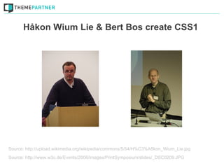
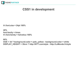
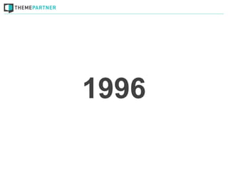
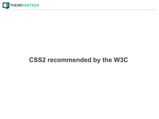
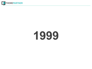
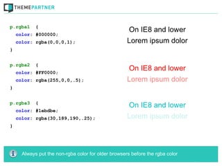
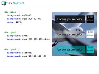
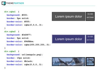
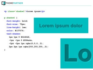
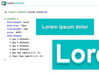
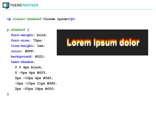
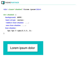
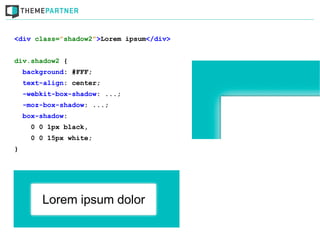
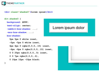
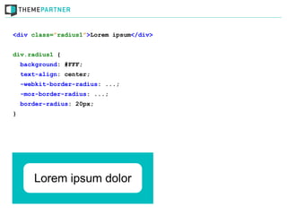
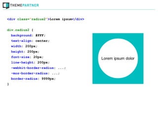
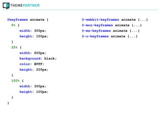
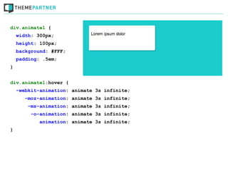
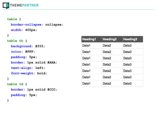
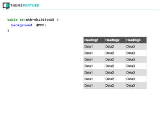
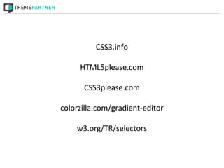
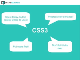
CSS3

            Robin Poort (@rhcpoort)
CEO & co-founder ThemePartner (@theme_partner)
     J and Beyond, Bad Nauheim, may 2012
1993
Robert Raisch proposed "named Stylesheets"


Source: http://ksi.cpsc.ucalgary.ca/archives/WWW-TALK/www-talk-1993q2.messages/443.html
1994
Håkon Wium Lie & Bert Bos create CSS1


Source: http://upload.wikimedia.org/wikipedia/commons/5/54/H%C3%A5kon_Wium_Lie.jpg
Source: http://www.w3c.de/Events/2006/images/PrintSymposium/slides/_DSC0209.JPG
CSS1 in development


h1.font.size = 24pt 100%

40%
font.family = times
h1.font.family = helvetica 100%

60%
AGE > 3d ? background.color = pale_yellow : background.color = white
DISPLAY_HEIGHT > 30cm ? http://NYT.com/style : http://LeMonde.fr/style
1996
CSS1 recommended by the W3C
1998
CSS2 recommended by the W3C
1999
CSS3 mentioned for the first time
1999?!
Using CSS3
Where & when?
Not on the critical layers
don't use it on branding, layout & usability
Progressively enhance!
Make sure the website works in older browsers
Performance problems
   Make your website fast!
Some examples!
p.rgba1     {
    color: #000000;
    color: rgba(0,0,0,1);
}


p.rgba2     {
    color: #FF0000;
    color: rgba(255,0,0,.5);
}


p.rgba3     {
    color: #1ebdbe;
    color: rgba(30,189,190,.25);
}


      Always put the non-rgba color for older browsers before the rgba color
div.rgba1    {
    background: #000000;
    background: rgba(0,0,0,.8);
    color: #FFF;
}


div.rgba2    {
    background: #FFF;
    background: rgba(255,255,255,.25);
}


div.rgba3    {
    background: #1ebdbe;
    background: rgba(30,189,190,.5);
}
div.rgba1    {
    background: #555;
    border: 5px solid;
    border-color: #000;
    border-color: rgba(0,0,0,.3);
}
div.rgba2    {
    background: #3d3877;
    border: 5px solid;
    border-color: #9d9bba;
    border-color: rgba(255,255,255,.5);
}
div.rgba3    {
    background: url(seaguls.png);
    border: 10px solid;
    border-color: #black;
    border-color: rgba(0,0,0,.5);
}
<p class=”shadow1”>Lorem ipsum</p>


p.shadow1 {
    font-weight: bold;
    font-size: 75px;
    line-height: 1em;
    color: #137576;
    text-shadow:
      1px 1px 0 #42d5d6,
      -1px -1px 0 #084a4a,
      -2px -2px 1px rgba(0,0,0,.2),
      2px 2px 1px rgba(255,255,255,.2);
}
<p class=”shadow2”>Lorem ipsum</p>


p.shadow2 {
    font-weight: bold;
    font-size: 75px;
    line-height: 1em;
    color: #FFF;
    text-shadow:
      0 1px 0 #96e0e0,
      0 2px 0 #86e0e0,
      0 3px 0 #76e0e0,
      0 4px 0 #56e0e0,
      0 5px 5px rgba(0,0,0,.3),
      0 10px 10px rgba(0,0,0,.2);
}
<p class=”shadow3”>Lorem ipsum</p>


p.shadow3 {
    font-weight: bold;
    font-size: 75px;
    line-height: 1em;
    color: #FFF;
    background: #222;
    text-shadow:
      0 0 4px black,
      0 -5px 4px #ff3,
      2px -10px 6px #fd3,
      -2px -15px 11px #f80,
      2px -25px 18px #f20;
}
<div class=”shadow1”>Lorem ipsum</div>


div.shadow1 {
    background: #FFF;
    text-align: center;
    -webkit-box-shadow: ...;
    -moz-box-shadow: ...;
    box-shadow:
      5px 5px 0 rgba(0,0,0,.3);
}
<div class=”shadow2”>Lorem ipsum</div>


div.shadow2 {
    background: #FFF;
    text-align: center;
    -webkit-box-shadow: ...;
    -moz-box-shadow: ...;
    box-shadow:
      0 0 1px black,
      0 0 15px white;
}
<div class=”shadow3”>Lorem ipsum</div>


div.shadow3 {
    background: #FFF;
    text-align: center;
    -webkit-box-shadow: ...;
    -moz-box-shadow: ...;
    box-shadow:
      5px 5px 0 white inset,
      -5px -5px 0 white inset,
      6px 6px 0 rgba(0,0,0,.15) inset,
      -6px -6px 0 rgba(0,0,0,.15) inset,
      0 0 20px rgba(0,0,0,.5) inset,
      0 0 7px rgba(0,0,0,.2),
      0 10px 10px -10px black;
}
<div class=”radius1”>Lorem ipsum</div>


div.radius1 {
    background: #FFF;
    text-align: center;
    -webkit-border-radius: ...;
    -moz-border-radius: ...;
    border-radius: 20px;
}
<div class=”radius2”>Lorem ipsum</div>


div.radius2 {
    background: #FFF;
    text-align: center;
    width: 200px;
    height: 200px;
    font-size: 20px;
    line-height: 200px;
    -webkit-border-radius: ...;
    -moz-border-radius: ...;
    border-radius: 9999px;
}
<div class=”radius3”>Lorem ipsum</div>


div.radius3 {
    background: #FFF;
    text-align: center;
    -webkit-border-radius: ...;
    -moz-border-radius: ...;
    border-radius: 20px 60px;
}
<div class=”gradient1”></div>


div.gradient1 {
    /* Basic color */
    background-color: #183c7a;
    /* Chrome, Safari4+ */
    background-image: -webkit-gradient(linear, left top, left bottom,
                         color-stop(0%,#183c7a), color-stop(100%,#84b6f4));
    /* Chrome10+, Safari5.1+ & The rest */
    background-image: -webkit-linear-gradient(top, #183c7a 0%,#84b6f4 100%);
    background-image: -moz-linear-gradient(top, #183c7a 0%, #84b6f4 100%);
    background-image: -o-linear-gradient(top, #183c7a 0%,#84b6f4 100%);
    background-image: -ms-linear-gradient(top, #183c7a 0%,#84b6f4 100%);
    background-image: linear-gradient(top, #183c7a 0%,#84b6f4 100%);
}


      Always start with a solid color for older browsers
<div class=”gradient2”></div>


div.gradient2 {
    /* Basic color */
    background-color: #183c7a;
    /* Chrome, Safari4+ */
    background: -webkit-gradient(radial, center center, 0px, center center,
                100%, color-stop(0%,rgba(24,60,122,1)),
                color-stop(100%,rgba(132,182,244,0.5)));
    /* Chrome10+, Safari5.1+ & The rest */
    background: -webkit-radial-gradient(center, ellipse cover,
                rgba(24,60,122,1) 0%,rgba(132,182,244,0.5) 100%);
    background: -moz-radial-gradient(Same as webkit)
    background: o-radial-gradient(Same as webkit)
    background: radial-gradient(center, ellipse cover,
                rgba(24,60,122,1) 0%,rgba(132,182,244,0.5) 100%);
}
<div class=”gradient3”></div>


div.gradient3 {
    /* Basic color */
    background-color: red;
    /* Chrome, Safari4+ */
    background-image: -webkit-gradient(radial, center center, 0px, center
                        center, 100%, color-stop(0%,rgba(24,60,122,1)),
                        color-stop(100%,rgba(132,182,244,0.5)));
    background-image: -webkit-radial-gradient(center, ellipse cover,
                        rgba(24,60,122,1) 0%,rgba(132,182,244,0.5) 100%);
    background-image: -moz-radial-gradient(Same as webkit)
    background-image: o-radial-gradient(Same as webkit)
    background-image: radial-gradient(center, ellipse cover,
                        rgba(24,60,122,1) 0%,rgba(132,182,244,0.5) 100%);
}
body {
    background: url(../images/pattern2.png) repeat-x top left,
                 url(../images/pattern.png),
                 linear-gradient(top, rgba(0,0,0,.5) 0%,rgba(0,0,0,0) 100%);
    background-color: #1EBDBE;
}


      By setting background-color last you can simply only change the color
div.wordwrap1 {
    word-wrap: normal;
}
div.wordwrap2 {
    word-wrap: break-word;
}
div.textoverflow1 {
    white-space: nowrap;
    overflow: hidden;
    text-overflow: ellipsis;
}
div.textoverflow2 {
    white-space: nowrap;
    overflow: hidden;
    text-overflow: clip;
}

      :hover {overflow:visible} makes the text visible again
a.transition1 {
    background: #FFF;
    color: #000;
    -webkit-transition: background .5s ease-in-out,color .5s ease-in-out;
      -moz-transition: background .5s ease-in-out,color .5s ease-in-out;
       -ms-transition: background .5s ease-in-out,color .5s ease-in-out;
        -o-transition: background .5s ease-in-out,color .5s ease-in-out;
           transition: background .5s ease-in-out,color .5s ease-in-out;
}


a.transition1:hover {
    background: #000;
    color: #FFF;
}


transition: all .5s ease-in-out;
img.transform1 {
    border: 5px solid white;
    box-shadow: 5px 5px 5px rgba(0,0,0,.2);
    transform: rotate(5deg);
}
img.transform2 {
    border: 5px solid white;
    box-shadow: 5px 5px 5px rgba(0,0,0,.2);
    transform: skew(10deg) scale(1.1,1.1) rotate(-5deg)
    translate(10px, 20px);
}


-webkit-transform:
-moz-transform:
-ms-transform:
-o-transform:
@keyframes animate {         @-webkit-keyframes animate {...}
    0% {                     @-moz-keyframes animate {...}
        width: 300px;        @-ms-keyframes animate {...}
        height: 100px;       @-o-keyframes animate {...}
    }
    25% {
        width: 600px;
        background: black;
        color: #FFF;
        height: 200px;
    }
    100% {
        width: 300px;
        height: 100px;
    }
}
div.animate1 {
    width: 300px;
    height: 100px;
    background: #FFF;
    padding: .5em;
}


div.animate1:hover {
    -webkit-animation: animate 3s infinite;
       -moz-animation: animate 3s infinite;
        -ms-animation: animate 3s infinite;
         -o-animation: animate 3s infinite;
            animation: animate 3s infinite;
}
table {
    border-collapse: collapse;
    width: 400px;
}
table th {
    background: #555;
    color: #FFF;
    padding: 5px;
    border: 1px solid #AAA;
    text-align: left;
    font-weight: bold;
}
table td {
    border: 1px solid #CCC;
    padding: 5px;
}
table tr:nth-child(odd) {
    background: #DDD;
}
table tr:nth-child(odd) {
    background: #DDD;
}
table tr:nth-child(5) {
    background: #fcf79f;
}
table tr:nth-child(odd) {
    background: #DDD;
}
table tr:nth-child(5) {
    background: #fcf79f;
}
table tr:first-of-type {
    background: #9fecf9;
}
table tr:nth-child(odd) {
    background: #DDD;
}
table tr:nth-child(5) {
    background: #fcf79f;
}
table tr:first-of-type {
    background: #9fecf9;
}
table tr:last-child {
    background: #9fecf9;
}
Useful websites
Because we're not encyclopedias
CSS3.info

     HTML5please.com

      CSS3please.com

colorzilla.com/gradient-editor

    w3.org/TR/selectors
Questions?
Use it today, but be             Progressively enhance!
careful where to use it


                           CSS3

                                     Don't let it take
        Put users first!
                                          over
Time up

   Robin Poort (@rhcpoort)
ThemePartner (@theme_partner)

Learn to Love CSS3 [English]

  • 1.
    CSS3 Robin Poort (@rhcpoort) CEO & co-founder ThemePartner (@theme_partner) J and Beyond, Bad Nauheim, may 2012
  • 3.
  • 4.
    Robert Raisch proposed"named Stylesheets" Source: http://ksi.cpsc.ucalgary.ca/archives/WWW-TALK/www-talk-1993q2.messages/443.html
  • 5.
  • 6.
    Håkon Wium Lie& Bert Bos create CSS1 Source: http://upload.wikimedia.org/wikipedia/commons/5/54/H%C3%A5kon_Wium_Lie.jpg Source: http://www.w3c.de/Events/2006/images/PrintSymposium/slides/_DSC0209.JPG
  • 7.
    CSS1 in development h1.font.size= 24pt 100% 40% font.family = times h1.font.family = helvetica 100% 60% AGE > 3d ? background.color = pale_yellow : background.color = white DISPLAY_HEIGHT > 30cm ? http://NYT.com/style : http://LeMonde.fr/style
  • 8.
  • 9.
  • 10.
  • 11.
  • 12.
  • 13.
    CSS3 mentioned forthe first time
  • 14.
  • 15.
  • 16.
    Not on thecritical layers don't use it on branding, layout & usability
  • 17.
    Progressively enhance! Make surethe website works in older browsers
  • 18.
    Performance problems Make your website fast!
  • 19.
  • 20.
    p.rgba1 { color: #000000; color: rgba(0,0,0,1); } p.rgba2 { color: #FF0000; color: rgba(255,0,0,.5); } p.rgba3 { color: #1ebdbe; color: rgba(30,189,190,.25); } Always put the non-rgba color for older browsers before the rgba color
  • 21.
    div.rgba1 { background: #000000; background: rgba(0,0,0,.8); color: #FFF; } div.rgba2 { background: #FFF; background: rgba(255,255,255,.25); } div.rgba3 { background: #1ebdbe; background: rgba(30,189,190,.5); }
  • 22.
    div.rgba1 { background: #555; border: 5px solid; border-color: #000; border-color: rgba(0,0,0,.3); } div.rgba2 { background: #3d3877; border: 5px solid; border-color: #9d9bba; border-color: rgba(255,255,255,.5); } div.rgba3 { background: url(seaguls.png); border: 10px solid; border-color: #black; border-color: rgba(0,0,0,.5); }
  • 23.
    <p class=”shadow1”>Lorem ipsum</p> p.shadow1{ font-weight: bold; font-size: 75px; line-height: 1em; color: #137576; text-shadow: 1px 1px 0 #42d5d6, -1px -1px 0 #084a4a, -2px -2px 1px rgba(0,0,0,.2), 2px 2px 1px rgba(255,255,255,.2); }
  • 24.
    <p class=”shadow2”>Lorem ipsum</p> p.shadow2{ font-weight: bold; font-size: 75px; line-height: 1em; color: #FFF; text-shadow: 0 1px 0 #96e0e0, 0 2px 0 #86e0e0, 0 3px 0 #76e0e0, 0 4px 0 #56e0e0, 0 5px 5px rgba(0,0,0,.3), 0 10px 10px rgba(0,0,0,.2); }
  • 25.
    <p class=”shadow3”>Lorem ipsum</p> p.shadow3{ font-weight: bold; font-size: 75px; line-height: 1em; color: #FFF; background: #222; text-shadow: 0 0 4px black, 0 -5px 4px #ff3, 2px -10px 6px #fd3, -2px -15px 11px #f80, 2px -25px 18px #f20; }
  • 26.
    <div class=”shadow1”>Lorem ipsum</div> div.shadow1{ background: #FFF; text-align: center; -webkit-box-shadow: ...; -moz-box-shadow: ...; box-shadow: 5px 5px 0 rgba(0,0,0,.3); }
  • 27.
    <div class=”shadow2”>Lorem ipsum</div> div.shadow2{ background: #FFF; text-align: center; -webkit-box-shadow: ...; -moz-box-shadow: ...; box-shadow: 0 0 1px black, 0 0 15px white; }
  • 28.
    <div class=”shadow3”>Lorem ipsum</div> div.shadow3{ background: #FFF; text-align: center; -webkit-box-shadow: ...; -moz-box-shadow: ...; box-shadow: 5px 5px 0 white inset, -5px -5px 0 white inset, 6px 6px 0 rgba(0,0,0,.15) inset, -6px -6px 0 rgba(0,0,0,.15) inset, 0 0 20px rgba(0,0,0,.5) inset, 0 0 7px rgba(0,0,0,.2), 0 10px 10px -10px black; }
  • 29.
    <div class=”radius1”>Lorem ipsum</div> div.radius1{ background: #FFF; text-align: center; -webkit-border-radius: ...; -moz-border-radius: ...; border-radius: 20px; }
  • 30.
    <div class=”radius2”>Lorem ipsum</div> div.radius2{ background: #FFF; text-align: center; width: 200px; height: 200px; font-size: 20px; line-height: 200px; -webkit-border-radius: ...; -moz-border-radius: ...; border-radius: 9999px; }
  • 31.
    <div class=”radius3”>Lorem ipsum</div> div.radius3{ background: #FFF; text-align: center; -webkit-border-radius: ...; -moz-border-radius: ...; border-radius: 20px 60px; }
  • 32.
    <div class=”gradient1”></div> div.gradient1 { /* Basic color */ background-color: #183c7a; /* Chrome, Safari4+ */ background-image: -webkit-gradient(linear, left top, left bottom, color-stop(0%,#183c7a), color-stop(100%,#84b6f4)); /* Chrome10+, Safari5.1+ & The rest */ background-image: -webkit-linear-gradient(top, #183c7a 0%,#84b6f4 100%); background-image: -moz-linear-gradient(top, #183c7a 0%, #84b6f4 100%); background-image: -o-linear-gradient(top, #183c7a 0%,#84b6f4 100%); background-image: -ms-linear-gradient(top, #183c7a 0%,#84b6f4 100%); background-image: linear-gradient(top, #183c7a 0%,#84b6f4 100%); } Always start with a solid color for older browsers
  • 33.
    <div class=”gradient2”></div> div.gradient2 { /* Basic color */ background-color: #183c7a; /* Chrome, Safari4+ */ background: -webkit-gradient(radial, center center, 0px, center center, 100%, color-stop(0%,rgba(24,60,122,1)), color-stop(100%,rgba(132,182,244,0.5))); /* Chrome10+, Safari5.1+ & The rest */ background: -webkit-radial-gradient(center, ellipse cover, rgba(24,60,122,1) 0%,rgba(132,182,244,0.5) 100%); background: -moz-radial-gradient(Same as webkit) background: o-radial-gradient(Same as webkit) background: radial-gradient(center, ellipse cover, rgba(24,60,122,1) 0%,rgba(132,182,244,0.5) 100%); }
  • 34.
    <div class=”gradient3”></div> div.gradient3 { /* Basic color */ background-color: red; /* Chrome, Safari4+ */ background-image: -webkit-gradient(radial, center center, 0px, center center, 100%, color-stop(0%,rgba(24,60,122,1)), color-stop(100%,rgba(132,182,244,0.5))); background-image: -webkit-radial-gradient(center, ellipse cover, rgba(24,60,122,1) 0%,rgba(132,182,244,0.5) 100%); background-image: -moz-radial-gradient(Same as webkit) background-image: o-radial-gradient(Same as webkit) background-image: radial-gradient(center, ellipse cover, rgba(24,60,122,1) 0%,rgba(132,182,244,0.5) 100%); }
  • 35.
    body { background: url(../images/pattern2.png) repeat-x top left, url(../images/pattern.png), linear-gradient(top, rgba(0,0,0,.5) 0%,rgba(0,0,0,0) 100%); background-color: #1EBDBE; } By setting background-color last you can simply only change the color
  • 36.
    div.wordwrap1 { word-wrap: normal; } div.wordwrap2 { word-wrap: break-word; } div.textoverflow1 { white-space: nowrap; overflow: hidden; text-overflow: ellipsis; } div.textoverflow2 { white-space: nowrap; overflow: hidden; text-overflow: clip; } :hover {overflow:visible} makes the text visible again
  • 37.
    a.transition1 { background: #FFF; color: #000; -webkit-transition: background .5s ease-in-out,color .5s ease-in-out; -moz-transition: background .5s ease-in-out,color .5s ease-in-out; -ms-transition: background .5s ease-in-out,color .5s ease-in-out; -o-transition: background .5s ease-in-out,color .5s ease-in-out; transition: background .5s ease-in-out,color .5s ease-in-out; } a.transition1:hover { background: #000; color: #FFF; } transition: all .5s ease-in-out;
  • 38.
    img.transform1 { border: 5px solid white; box-shadow: 5px 5px 5px rgba(0,0,0,.2); transform: rotate(5deg); } img.transform2 { border: 5px solid white; box-shadow: 5px 5px 5px rgba(0,0,0,.2); transform: skew(10deg) scale(1.1,1.1) rotate(-5deg) translate(10px, 20px); } -webkit-transform: -moz-transform: -ms-transform: -o-transform:
  • 39.
    @keyframes animate { @-webkit-keyframes animate {...} 0% { @-moz-keyframes animate {...} width: 300px; @-ms-keyframes animate {...} height: 100px; @-o-keyframes animate {...} } 25% { width: 600px; background: black; color: #FFF; height: 200px; } 100% { width: 300px; height: 100px; } }
  • 40.
    div.animate1 { width: 300px; height: 100px; background: #FFF; padding: .5em; } div.animate1:hover { -webkit-animation: animate 3s infinite; -moz-animation: animate 3s infinite; -ms-animation: animate 3s infinite; -o-animation: animate 3s infinite; animation: animate 3s infinite; }
  • 41.
    table { border-collapse: collapse; width: 400px; } table th { background: #555; color: #FFF; padding: 5px; border: 1px solid #AAA; text-align: left; font-weight: bold; } table td { border: 1px solid #CCC; padding: 5px; }
  • 42.
    table tr:nth-child(odd) { background: #DDD; }
  • 43.
    table tr:nth-child(odd) { background: #DDD; } table tr:nth-child(5) { background: #fcf79f; }
  • 44.
    table tr:nth-child(odd) { background: #DDD; } table tr:nth-child(5) { background: #fcf79f; } table tr:first-of-type { background: #9fecf9; }
  • 45.
    table tr:nth-child(odd) { background: #DDD; } table tr:nth-child(5) { background: #fcf79f; } table tr:first-of-type { background: #9fecf9; } table tr:last-child { background: #9fecf9; }
  • 47.
  • 48.
    CSS3.info HTML5please.com CSS3please.com colorzilla.com/gradient-editor w3.org/TR/selectors
  • 49.
  • 50.
    Use it today,but be Progressively enhance! careful where to use it CSS3 Don't let it take Put users first! over
  • 51.
    Time up Robin Poort (@rhcpoort) ThemePartner (@theme_partner)

Editor's Notes

  • #2 Use when and where? Some examples. History first
  • #5 Looks hard. I&apos;m happy that in 1994 Hakon and Bert went to work together
  • #8 Very similar as you can see
  • #15 Took a long time. Some browsers found it harder to support/implement CSS2.1 then others
  • #17 No CSS3 logo. Do not use clumns with gaps etc or box-sizing w/o fallback. Not to make things clear on forms. No box-shadow as border on input elements.
  • #18 Think of gradients and RGBA or HSLA for example
  • #19 Things like box-shadow, text-shadow &amp; border-radius on big elements or to much of it
  • #20 I&apos;ll start with RGBA because I will use it in following examples. I won&apos;t get into depth because there&apos;s no time and the sheets will be online.
  • #21 Mozilla 3.x, all Chrome, Safari 3.x, Opera 10.x, IE9, mobile safari Use it on: color; background &amp; border
  • #22 Mozilla 3.x, all Chrome, Safari 3.x, Opera 10.x, IE9, mobile safari Use it on: color; background &amp; border
  • #23 Mozilla 3.x, all Chrome, Safari 3.x, Opera 10.x, IE9, mobile safari Use it on: color; background &amp; border
  • #24 Text-shadow was introduced in CSS2.0 but was removed in CSS2.1 because of compatibility This doesn&apos;t work on IE9! Seperate with a comma!
  • #27 Vendor prefixes!
  • #29 Inset + Smaller shadow + with spread
  • #32 shorthand is ...
  • #33 Most readable or middel color as a background color Webkit has two. I only use the latest one
  • #34 NO background image for transparancy
  • #35 Do give it a background-color and make use of it
  • #37 It doesn&apos;t recognize text yet. It breaks words on width and not on words. Could be improved
  • #38 I always use all because when only some parts &amp;quot;animate&amp;quot; it looks weird DOESN&apos;T work on IE(, sucks
  • #39 4 different transforms + vendor prefixes Doesnt work with commas
  • #40 Use it only for &amp;quot;animations&amp;quot; with more then one frame
  • #48 Nooit te veel zelf onthouden, check altijd je sites