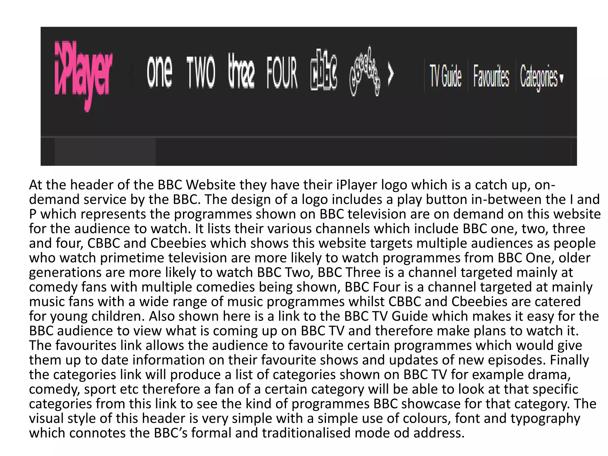
The BBC website homepage features the iPlayer logo and links to various BBC channels. It provides options for viewers to search for programs, see most popular shows, and browse categories. The design uses simple colors, fonts, and layout to maintain the BBC's formal style.
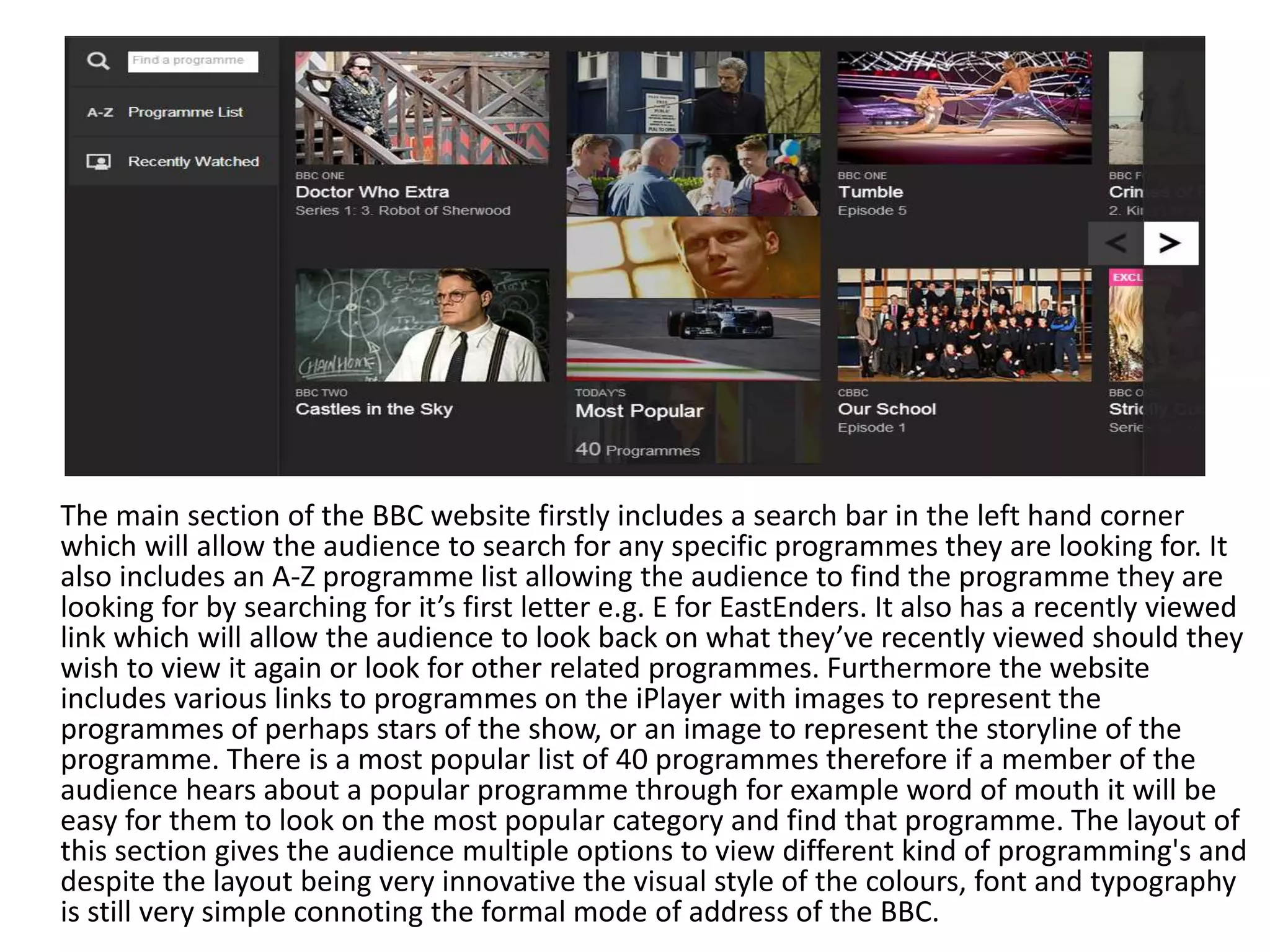
The main website section includes a search bar, A-Z program list, and links to programs on iPlayer. Popular shows are listed, and the layout offers multiple ways to find different types of content. Despite innovative features, the visual style remains simple and formal.
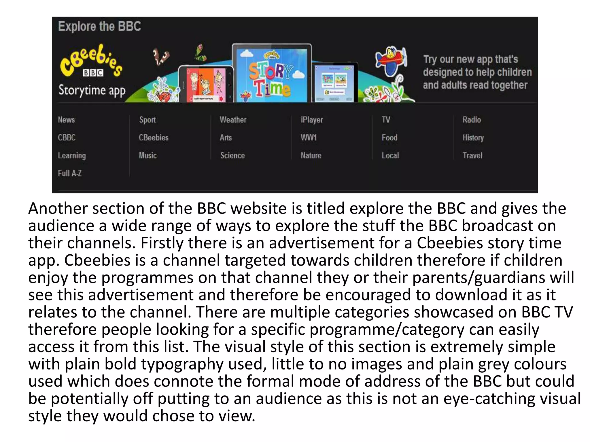
The "Explore the BBC" section promotes apps, lists program categories, and provides external links. However, the plain typography and colors here may not attract audiences as much as


![Computer Networks 01[1 using all terms].pptx](https://cdn.slidesharecdn.com/ss_thumbnails/computernetworks011-251214040533-327dd9f8-thumbnail.jpg?width=640&height=640&fit=bounds)


