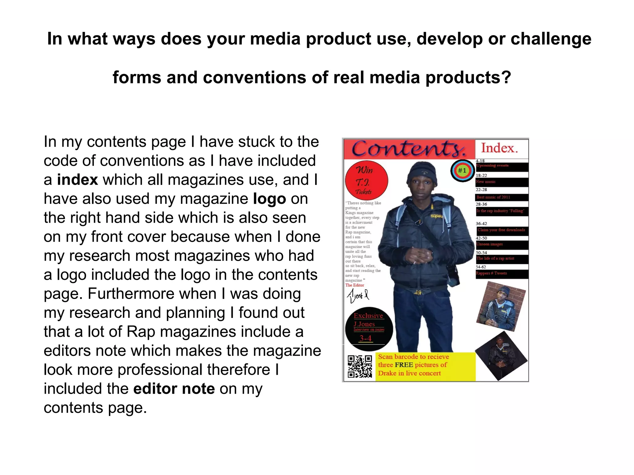
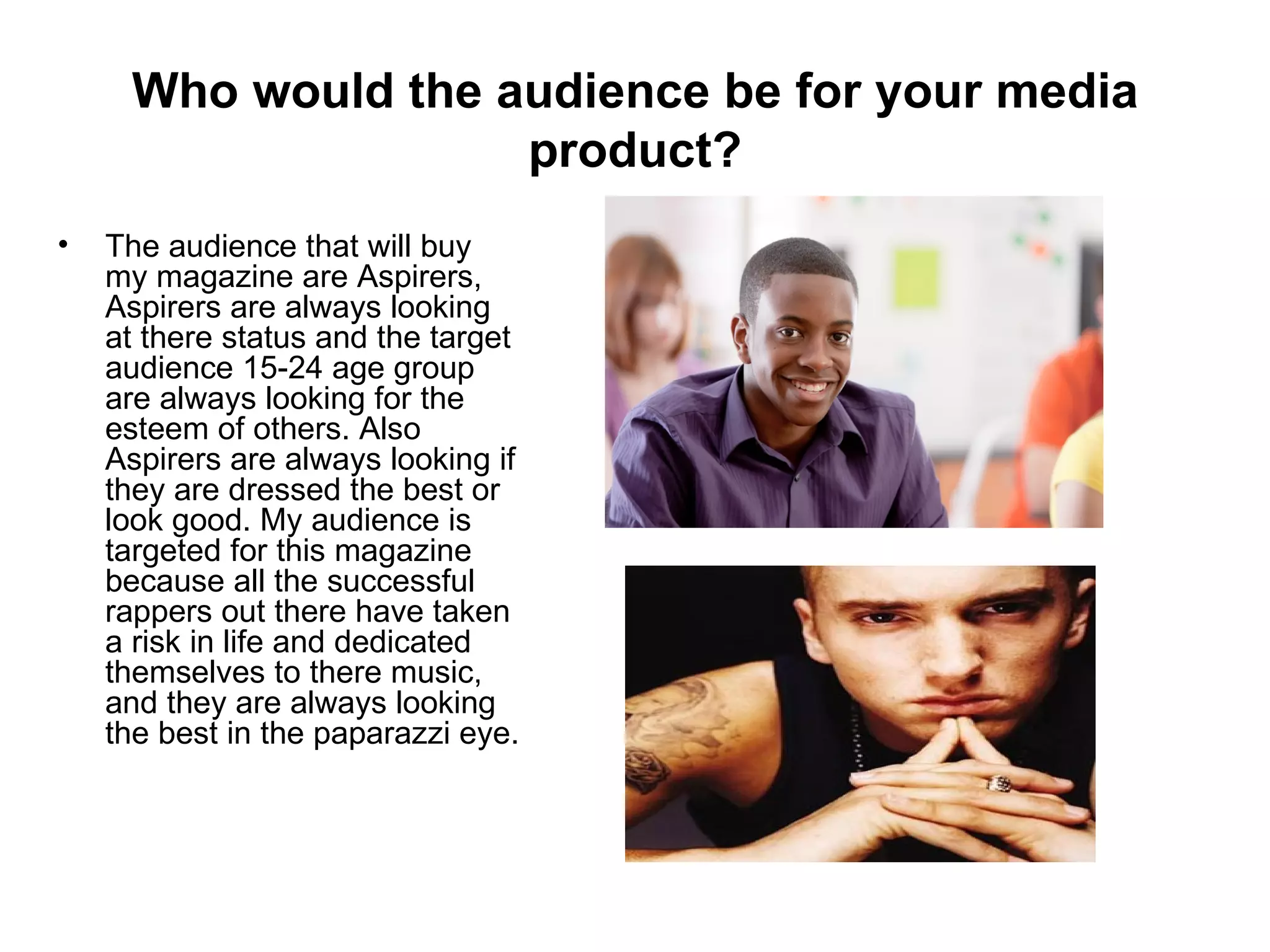
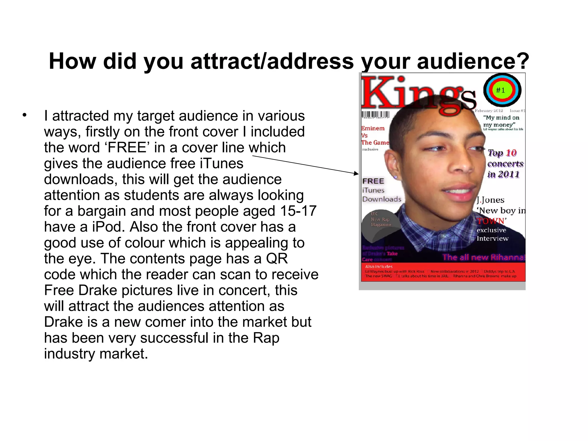
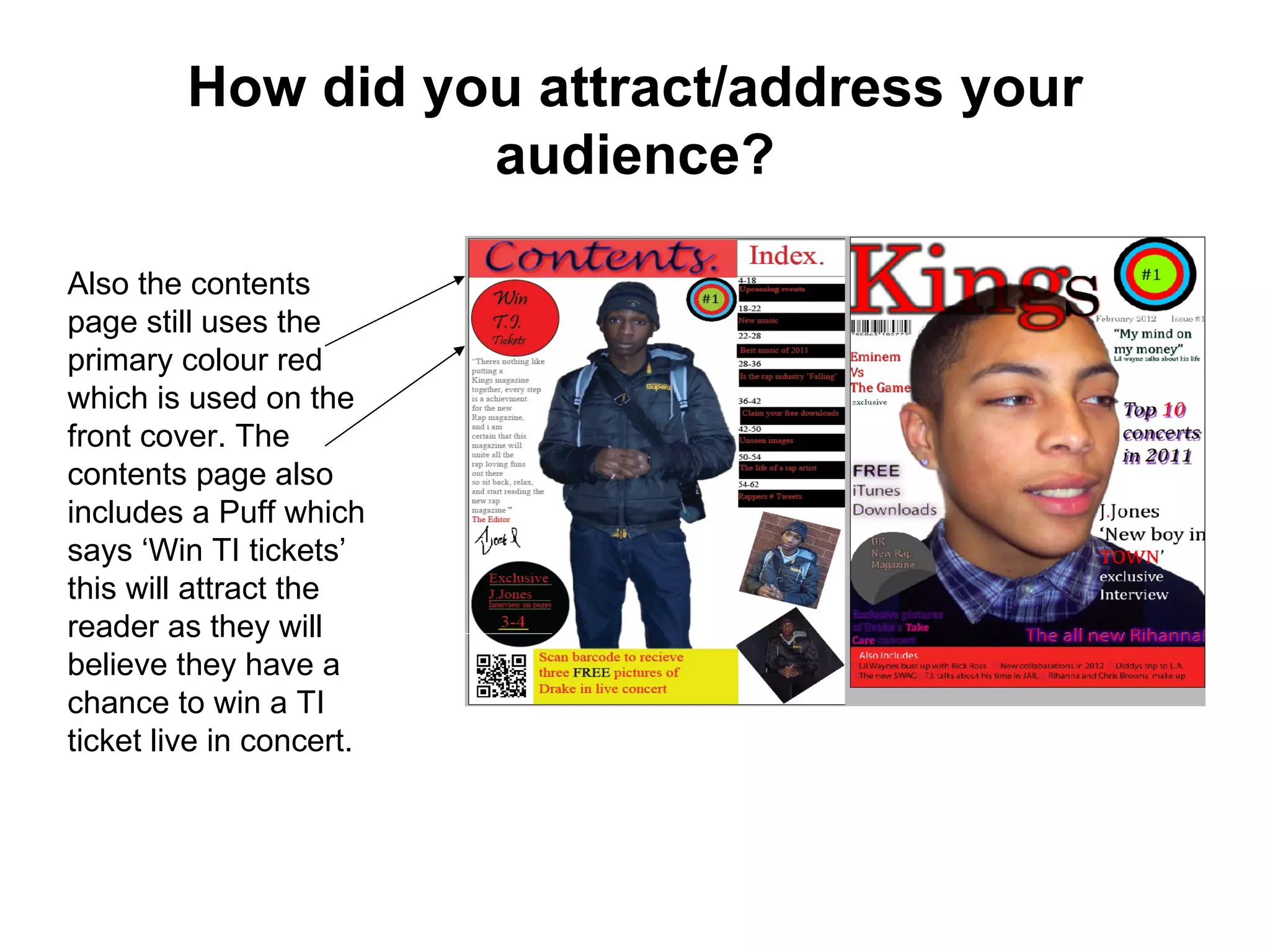
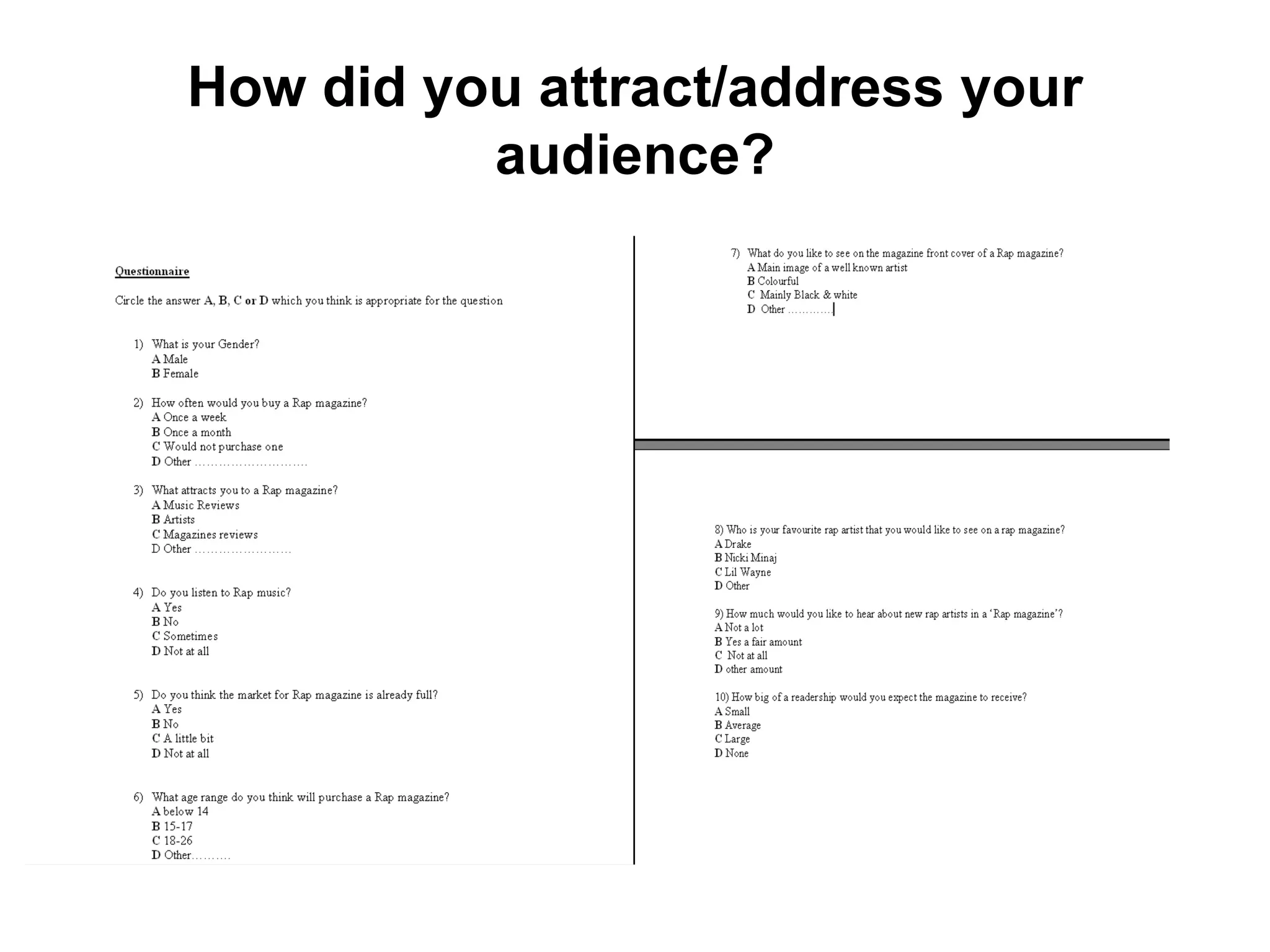
The document discusses how the student's media product challenges some conventions of real media products while also using some conventions. Specifically:
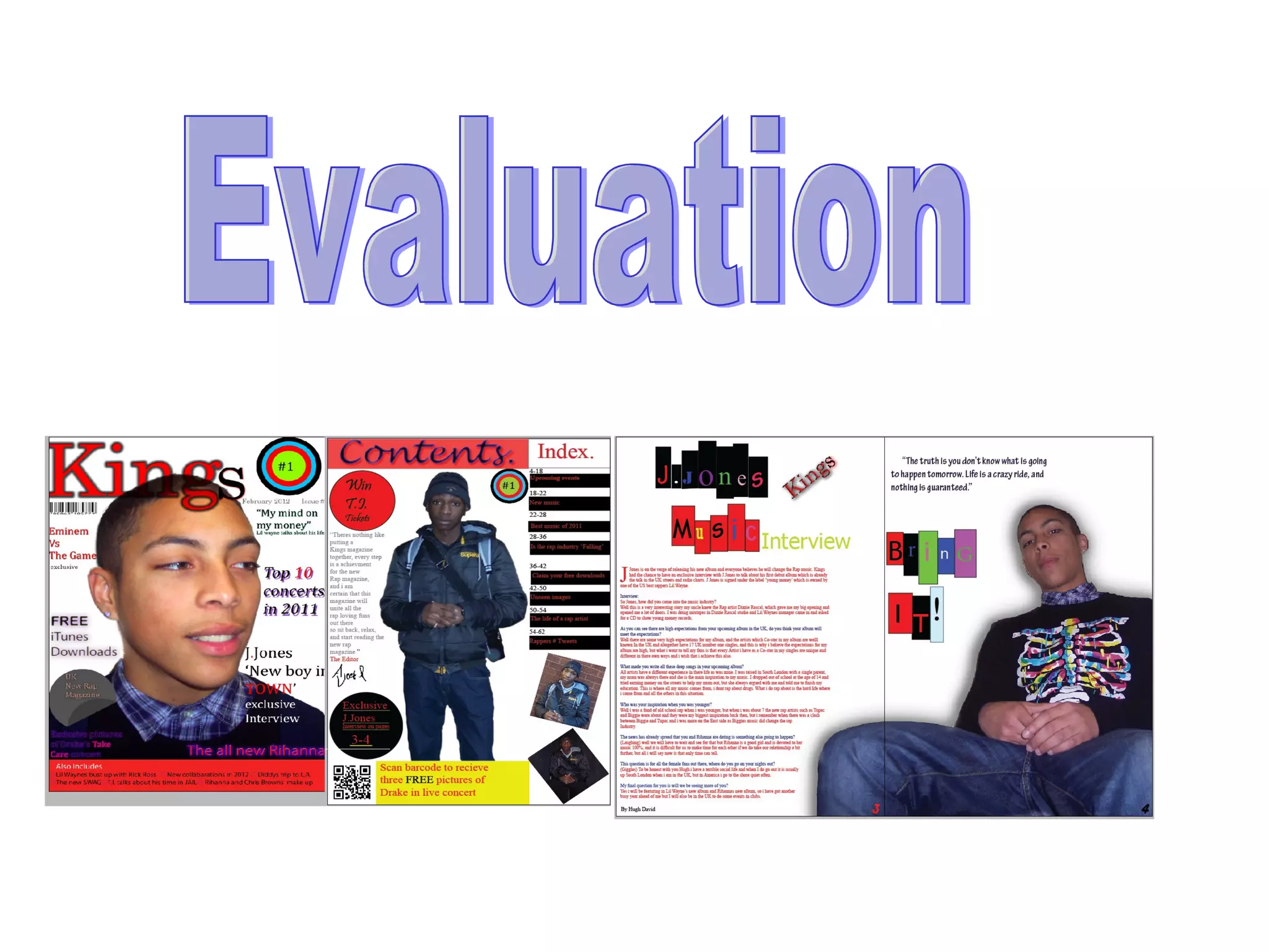
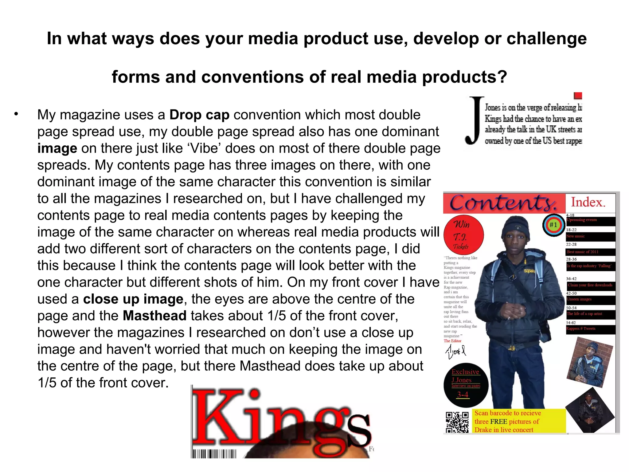
- The contents page keeps the image of the same character across pages, while real media uses different characters.
- The front cover uses a close-up image not centered, while real media does not.
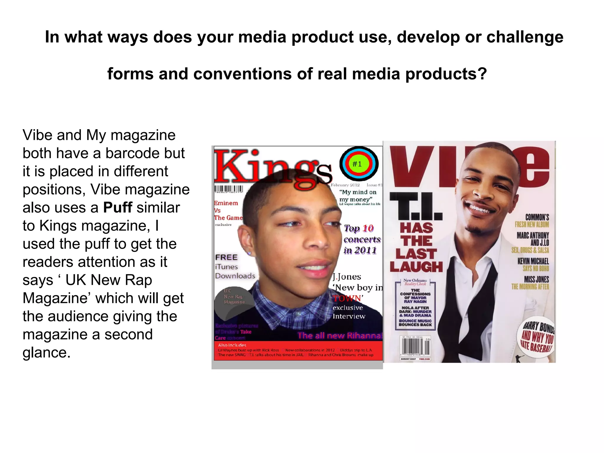
- Placement of the barcode and puff are different than in Vibe magazine.
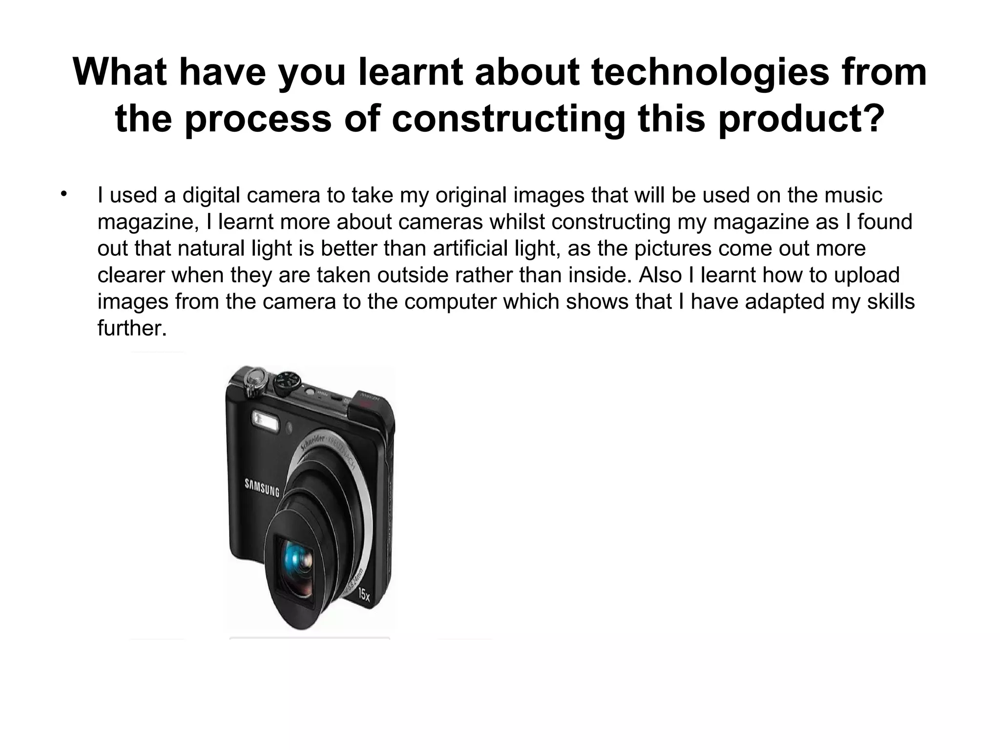
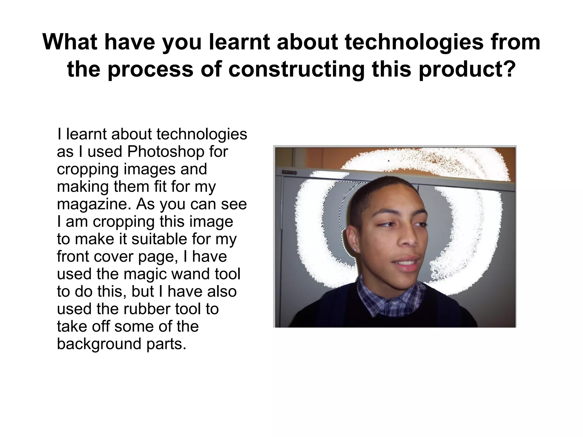
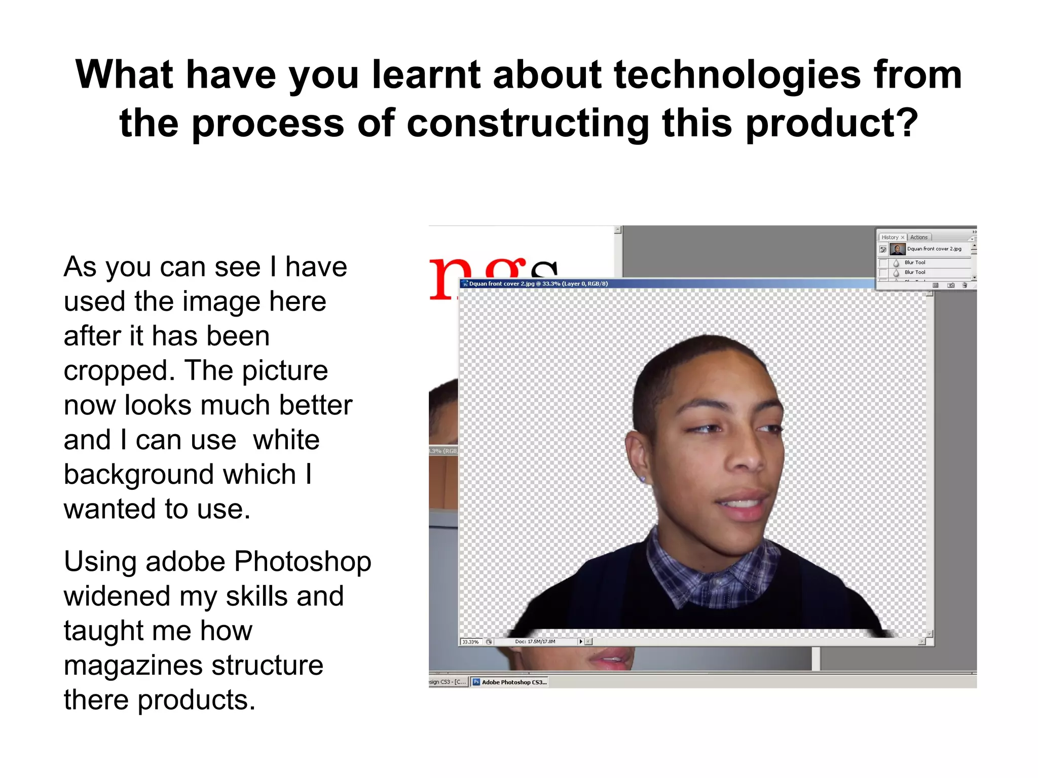
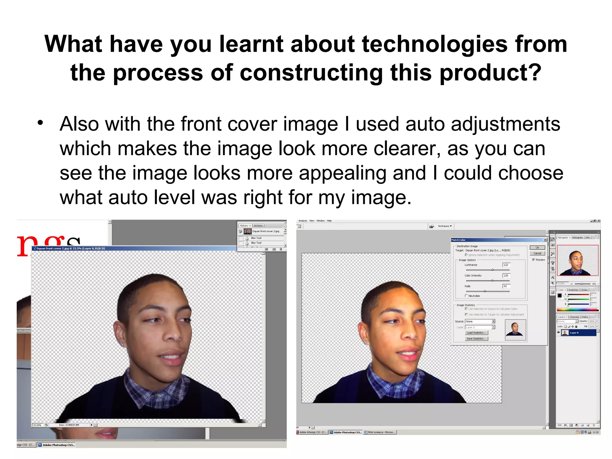
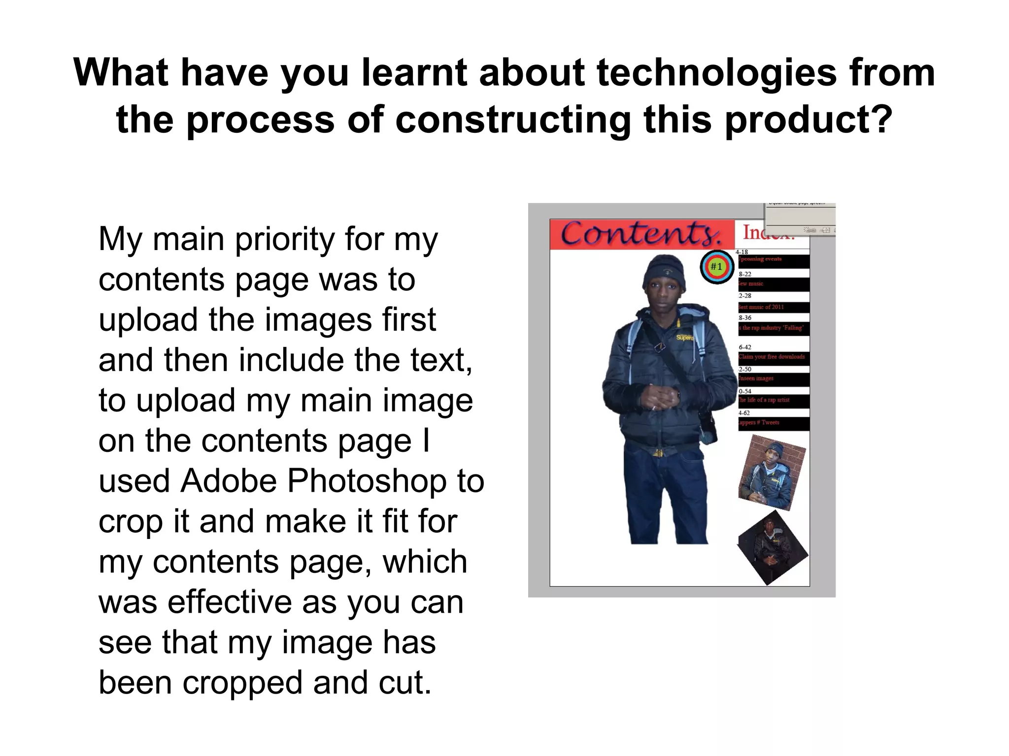
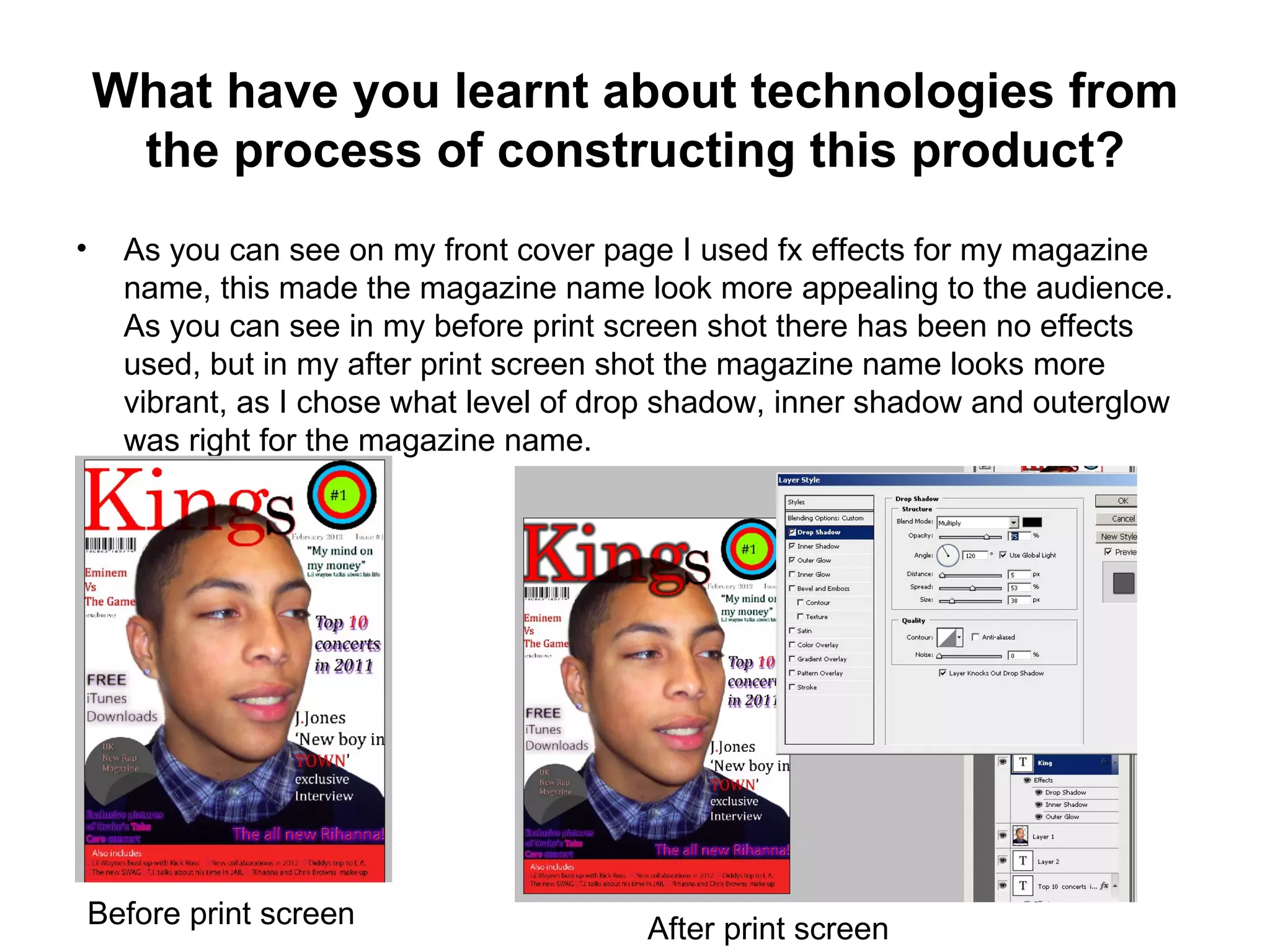
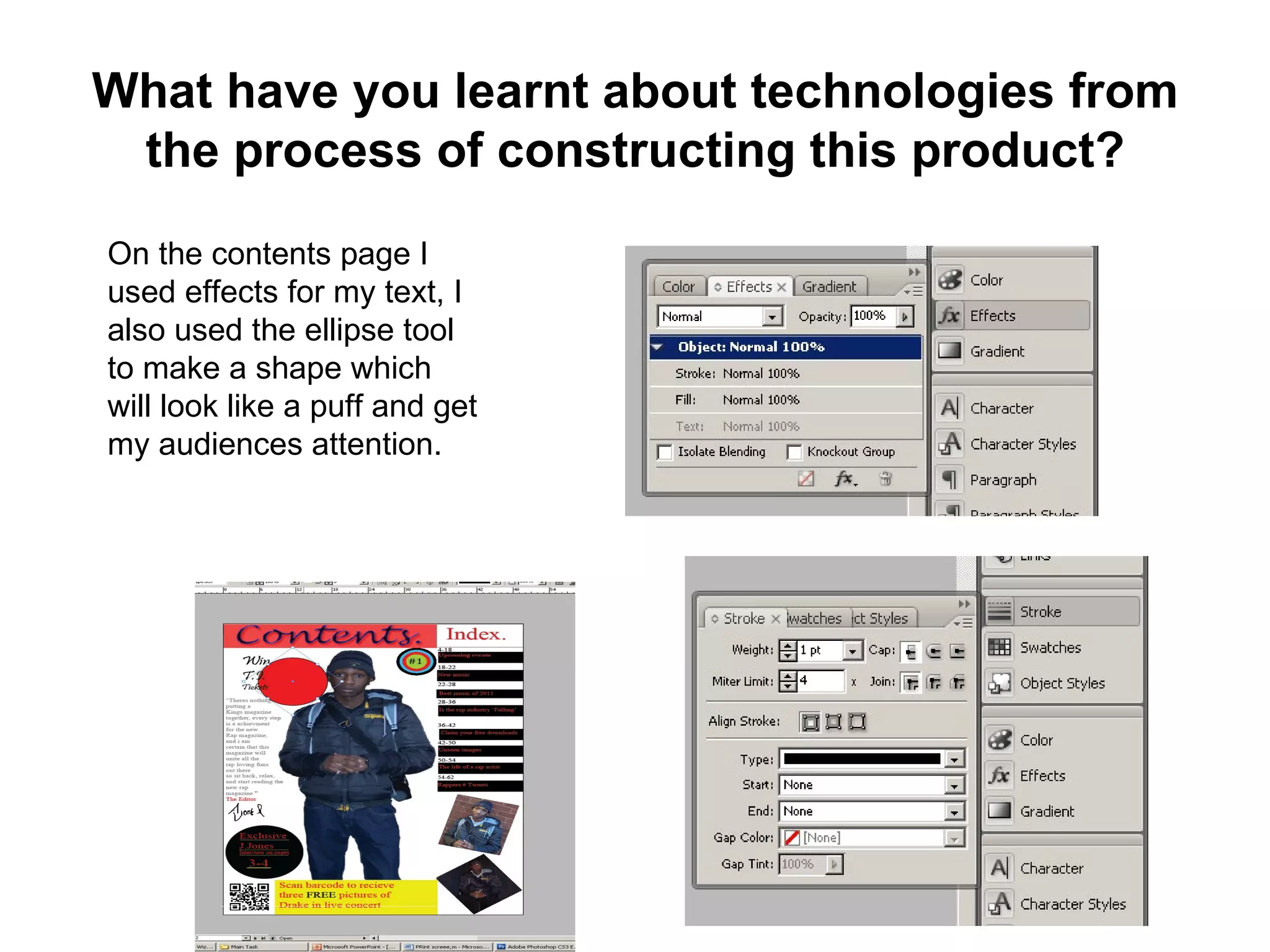
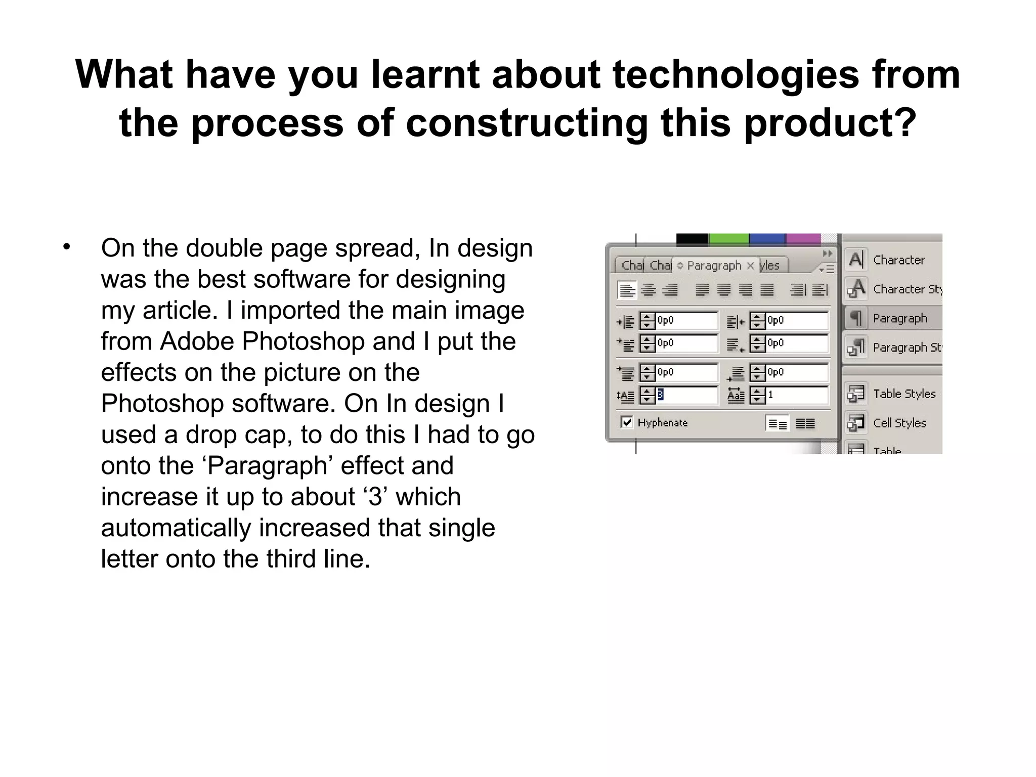
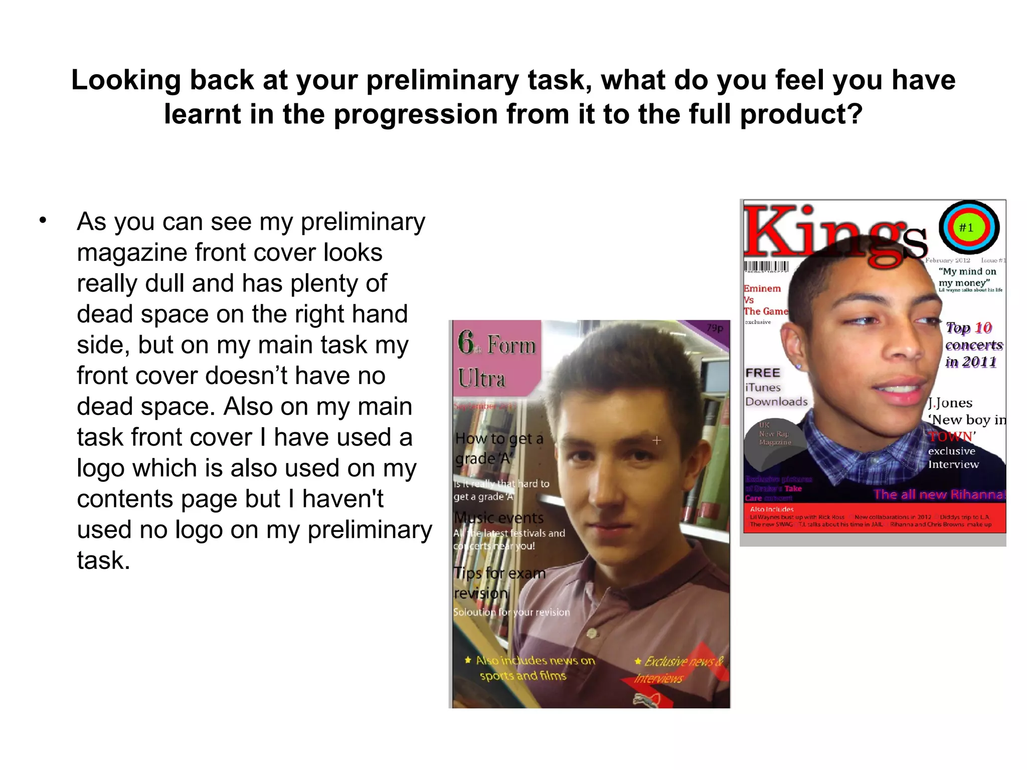
The student learned about technologies like Photoshop, InDesign, and digital cameras through constructing the media product. Skills like cropping, adjusting images, and layout were developed.


![Evaluation[1] (1)](https://cdn.slidesharecdn.com/ss_thumbnails/evaluation11-120304111543-phpapp02-thumbnail.jpg?width=640&height=640&fit=bounds)