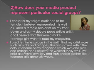
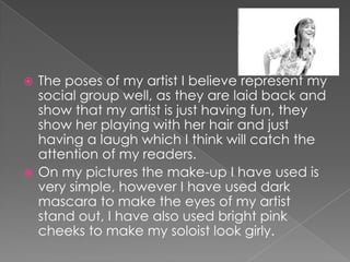
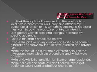
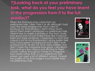
- The document describes a student's process of creating a music magazine as a class project. They wrote an article, took photos, and designed the front cover, contents page, and layout.
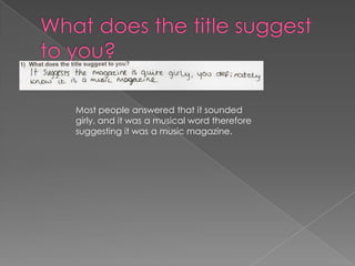
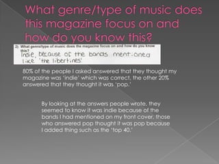
- They surveyed 10 people about the magazine. Respondents said the photos made it look professional and the article seemed genuine and journalistic.
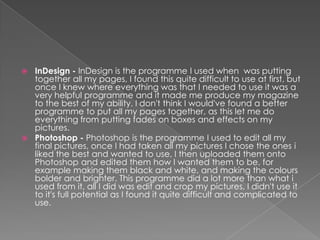
- The student learned about using InDesign, Photoshop, blogging and researching online to design and produce their magazine. They improved at using fonts, colors and images cohesively from their initial task.