The document analyzes various design elements of a music magazine cover and contents page focusing on the band The White Stripes.
It summarizes that the bold logo and tagline sizes prioritize important information for readers. Font and color choices appeal to the rock genre target audience. The cover highlights the band's breakup using red text.
The contents page uses fonts, colors and images consistent with the cover to identify sections. A photo gives readers context for the main article subject. Layout maintains consistency while neatly presenting information.
Language remains informal to engage younger readers, with short sentences for quick scanning. Typography, images and colors follow rock music conventions to effectively promote stories to fans.
This is me looking at different techniques that magazine publishers use to draw the reader in and to define their audience. This is giving me a better understanding of what my magazine should look like according to my audience and is making me understand how important it is to look everything in detail and make sure that people are going to like it.
The Roman Empire A Historical Colossus.pdfkaushalkr1407
The Roman Empire, a vast and enduring power, stands as one of history's most remarkable civilizations, leaving an indelible imprint on the world. It emerged from the Roman Republic, transitioning into an imperial powerhouse under the leadership of Augustus Caesar in 27 BCE. This transformation marked the beginning of an era defined by unprecedented territorial expansion, architectural marvels, and profound cultural influence.
The empire's roots lie in the city of Rome, founded, according to legend, by Romulus in 753 BCE. Over centuries, Rome evolved from a small settlement to a formidable republic, characterized by a complex political system with elected officials and checks on power. However, internal strife, class conflicts, and military ambitions paved the way for the end of the Republic. Julius Caesar’s dictatorship and subsequent assassination in 44 BCE created a power vacuum, leading to a civil war. Octavian, later Augustus, emerged victorious, heralding the Roman Empire’s birth.
Under Augustus, the empire experienced the Pax Romana, a 200-year period of relative peace and stability. Augustus reformed the military, established efficient administrative systems, and initiated grand construction projects. The empire's borders expanded, encompassing territories from Britain to Egypt and from Spain to the Euphrates. Roman legions, renowned for their discipline and engineering prowess, secured and maintained these vast territories, building roads, fortifications, and cities that facilitated control and integration.
The Roman Empire’s society was hierarchical, with a rigid class system. At the top were the patricians, wealthy elites who held significant political power. Below them were the plebeians, free citizens with limited political influence, and the vast numbers of slaves who formed the backbone of the economy. The family unit was central, governed by the paterfamilias, the male head who held absolute authority.
Culturally, the Romans were eclectic, absorbing and adapting elements from the civilizations they encountered, particularly the Greeks. Roman art, literature, and philosophy reflected this synthesis, creating a rich cultural tapestry. Latin, the Roman language, became the lingua franca of the Western world, influencing numerous modern languages.
Roman architecture and engineering achievements were monumental. They perfected the arch, vault, and dome, constructing enduring structures like the Colosseum, Pantheon, and aqueducts. These engineering marvels not only showcased Roman ingenuity but also served practical purposes, from public entertainment to water supply.
2024.06.01 Introducing a competency framework for languag learning materials ...Sandy Millin
http://sandymillin.wordpress.com/iateflwebinar2024
Published classroom materials form the basis of syllabuses, drive teacher professional development, and have a potentially huge influence on learners, teachers and education systems. All teachers also create their own materials, whether a few sentences on a blackboard, a highly-structured fully-realised online course, or anything in between. Despite this, the knowledge and skills needed to create effective language learning materials are rarely part of teacher training, and are mostly learnt by trial and error.
Knowledge and skills frameworks, generally called competency frameworks, for ELT teachers, trainers and managers have existed for a few years now. However, until I created one for my MA dissertation, there wasn’t one drawing together what we need to know and do to be able to effectively produce language learning materials.
This webinar will introduce you to my framework, highlighting the key competencies I identified from my research. It will also show how anybody involved in language teaching (any language, not just English!), teacher training, managing schools or developing language learning materials can benefit from using the framework.
Read| The latest issue of The Challenger is here! We are thrilled to announce that our school paper has qualified for the NATIONAL SCHOOLS PRESS CONFERENCE (NSPC) 2024. Thank you for your unwavering support and trust. Dive into the stories that made us stand out!
How to Make a Field invisible in Odoo 17Celine George
It is possible to hide or invisible some fields in odoo. Commonly using “invisible” attribute in the field definition to invisible the fields. This slide will show how to make a field invisible in odoo 17.
The Art Pastor's Guide to Sabbath | Steve ThomasonSteve Thomason
What is the purpose of the Sabbath Law in the Torah. It is interesting to compare how the context of the law shifts from Exodus to Deuteronomy. Who gets to rest, and why?
Model Attribute Check Company Auto PropertyCeline George
In Odoo, the multi-company feature allows you to manage multiple companies within a single Odoo database instance. Each company can have its own configurations while still sharing common resources such as products, customers, and suppliers.
The French Revolution, which began in 1789, was a period of radical social and political upheaval in France. It marked the decline of absolute monarchies, the rise of secular and democratic republics, and the eventual rise of Napoleon Bonaparte. This revolutionary period is crucial in understanding the transition from feudalism to modernity in Europe.
For more information, visit-www.vavaclasses.com
How to Create Map Views in the Odoo 17 ERPCeline George
The map views are useful for providing a geographical representation of data. They allow users to visualize and analyze the data in a more intuitive manner.
The Indian economy is classified into different sectors to simplify the analysis and understanding of economic activities. For Class 10, it's essential to grasp the sectors of the Indian economy, understand their characteristics, and recognize their importance. This guide will provide detailed notes on the Sectors of the Indian Economy Class 10, using specific long-tail keywords to enhance comprehension.
For more information, visit-www.vavaclasses.com
Palestine last event orientationfvgnh .pptxRaedMohamed3
An EFL lesson about the current events in Palestine. It is intended to be for intermediate students who wish to increase their listening skills through a short lesson in power point.
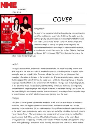
1. ANALYSIS
LEAH ALLIE
COVER
TYPOGRAPHY
The logo of the magazine is bold and significantly more so than the
rest of the text to make sure it’s the first thing the reader sees, the
tagline is greatly reduced in size as it’s less important to the reader.
Sans serif is used to make the text stand out, it masculinizes the
cover which helps to identify the genre of the magazine, the
contrast between red and white helps to make the words as visual
as possible and to help them stand out further. Cleverly, they have
highlighted ‘RIP’ in the word STRIPES, to illustrate the topic of the
article inside (the band split up).
LAYOUT
The layout avoids clutter, this makes it more convenient for the reader to quickly browse over
what may be in the issue, and there is also less information in avoiding clutter so it gives more
reason for a person to look inside. The cover follows the route of the eye this means that
important information is allocated in the formation of a ‘Z’ shape across the page, making sure
that the Logo (NME) is the first thing the reader sees , whilst also following the rule of thirds by
keeping a majority of text on the predominant left hand side . Using a wide shot photograph, to
fill the other two thirds, you can clearly see the entirety of the band members; Drawing in any
fans of the white stripes or people who may be interested in the genre. Placing a box outline on
the cover highlights the reader’s attention, to the text within it, the usage of the box outline helps
to order the cover too which aids the reader when glancing over the cover.
COLOUR
The Genre of the magazine is Alternative and Rock, in this issue the main feature is about rock
musicians, hence the aggressive red and white contrast outlined with a sleek black border,
screaming to the reader that this is a rock magazine. Using different colours to grab the attention
of the reader’s eye , text colouring varies from black, red and white; mimicking the music video to
‘ Seven Nation Army ‘– The white stripes most popular and well known song ,the outfits of the
band members (Jack White and Meg White) follow the colour scheme of the cover . Black
conveys darkness, and possibly connotes to the ‘death’ of their band; Red is an aggressive colour
which portrays the angst and venom that is normally associated with rock music. White fits the
2. ANALYSIS
LEAH ALLIE
colour scheme well as it is used to contrast and stand out from the red. These three colours work
well to attract a younger generation of readers as they are bright but also attract people who
follow the genre
LANGUAGE
The language displayed on the cover is informal, and so appeals to the target group of the
younger generation, short sentences are easier to read and make the process of scanning
quicker. Statements such as ‘Their incredible 14-year story in full ‘the use of the word incredible
entices the reader , words such as ‘special ‘ and ‘finally’ make the reader think it is limited to only
them , as if the cover only wants them to know. Referring back to the use of RIP in the STRIPES,
this also connotes to the end of the band, highlighting it and making the word almost
scandalous.
CONVENTIONS
Typically of the rock genre, angst is illustrated in the cover by its colour scheme and the very
forward, to-the-point, or matter-of-fact styling in the covers language, there is a great deal of
attitude in the language used as there is no explanation and this appeals to the youth who
associate themselves with the genre. Death is also commonly associated with the rock genre, or
at least a fascination of it, this can be alluded to by the black border, the colouring of the text
and of the clothes the subjects wear. Fortunately for the cover designers, The White stripes have
a consistent colour scheme of black, white and red; which is already very stereotypical for the
rock and alternative genre.
3. ANALYSIS
LEAH ALLIE
CONTENTS PAGE.
TYPOGRPHY
The text of the contents page is written in serif, this is to suit the
genre of the magazine, the masculine features help to display the
personality of the magazine. Bold lettering (Sans serif) is used to
highlight main areas of the page such as the main article and other
subtitles, font sizes differ depending on their importance and similarity to the cover or the image
on the page. The main article contains a small amount of detail, compared to the other titles, the
font is much larger as this is the story they are trying to sell to the reader. The page number is
placed next to the title of the article rather than at the bottom of the text like the other stories on
the contents page.
COLOURS
Colours such as white black, red, and yellow match the genre of the Rock magazine. Red is
aggressive and yellow can connote to danger , this attracts readers who like the genre , the white
background aids to contrast between the darker more recessive colours and the brighter more
eye catching ones. The aim of the colour scheme is to present the text in a highly visual manner ,
an almost colour coded layout which expresses a varying importance or dominance of articles,
the colour scheme plays on an angst-fuelled stereotype related to the target group of
adolescents.
IMAGE
Again using a wide shot, it gives the reader a full view of who they are reading about, the image
absorbs a large amount of space, so that readers can almost instantly tell who they are reading
about. Especially if they are a fan. The image itself is dark and poorly lighted, the artist pictured
almost blends into the black background; it displays the artist singing and playing the guitar and
as the stereotype of the genre demands, his hair is unkempt and partially covering his face. The
image of Alex Turner (of the Arctic Monkeys) is informal which would appeal to the age group
the magazine is intended.
4. ANALYSIS
LEAH ALLIE
LAYOUT
Keeping with a consistency, the NME logo remains in the top left corner of the page just before
the masthead, as a reminder of who is presenting you with the latest news in the genre. Despite
the aggressive nature of the magazine, the contents page is neat and tidy, this is so the reader
can easily access areas of the page without much thought ; maintaining a mostly uncluttered
contents page helps the reader to find what they are looking for with ease. The contents column
keeps all of their important information about what to expect from the issue.
LANGUAGE
The language in informal, however there is no usage of slang, meaning the magazine is trying to
reach an older group of teenagers, short sentences and phrases keep the page neat and tidy .
5. ANALYSIS
LEAH ALLIE
DOUBLE SPEAD
TYPOGRAPHY
The combination of sans and sans script helps keep the genre of the magazine consistent whilst
giving insight on the type of person the article is about. By enlarging certain words of the title it
makes it easier for the reader to know that the page they are o is the double spread as it takes up
6. ANALYSIS
LEAH ALLIE
a considerable amount of space. The use of a drop cap gives a formal appearance to the article,
and boasts its relevancy in the magazine. To make the quote stand out, sans has been used, as
the quote itself is aggressive and full of attitude. The By-line is highlighted by a small column
which also sections the page from the title and the text.
COLOURS
The theme of the artist has quite dark but neutral colours such as grey and ever-green which
contrast with the artists pale completion. Relating to the origins of the artist (Clifton, Nottingham)
they have generalised its dreary colours and have tied them into the colour scheme to suit the
artist. Using darker colours such as grey and black help to connote the general mood of the
artist’s genre which is English Indie Folk / Folk Rock.
IMAGE
The close up of the 22 year old artist , Jake Bugg (Jake Edwin Charles Kennedy Bugg)clearly
shows his facial expression and the emotion his face is portraying . This also ties in well with the
general aesthetic of the article, as he seems focused and stern; the second image used in the
double spread is a wide shot which manifests him performing with an acoustic guitar, this helps
display to the reader what genre of music he creates. Fans of the artist will be drawn in by the
close up and people who are new to the artist’s work will study the page over as the close up
clearly shows that this is a feature article.
LAYOUT
Consisting of two sections, the layout of this double spread doesn’t stick to conventional layouts.
The reason being is that there is plenty of writing, so to make it interesting for the reader visually,
they have sectioned it by using a box outline to show a timeline of the artist life leading up to his
stardom. Sectioning the double spread in this way keeps order of the article and is visually
pleasing to the reader. By using the rule of thirds the article maintains a neat presentation, whilst
focusing the attention of the reader to three main parts; the close up image, the text, and the
wide shot image with text. This makes processing the double spread easier for the reader and
prevents confusion.
LANGUAGE
7. ANALYSIS
LEAH ALLIE
Language used is mostly informal, as the interview is with a youth (or a more developed
adolescent). This makes the article relatable to the target population as they are teenagers and
adolescents, the language used makes Jake Bugg seem like the authorities figure for these
adolescents, like a spokesperson whilst also telling his own story.