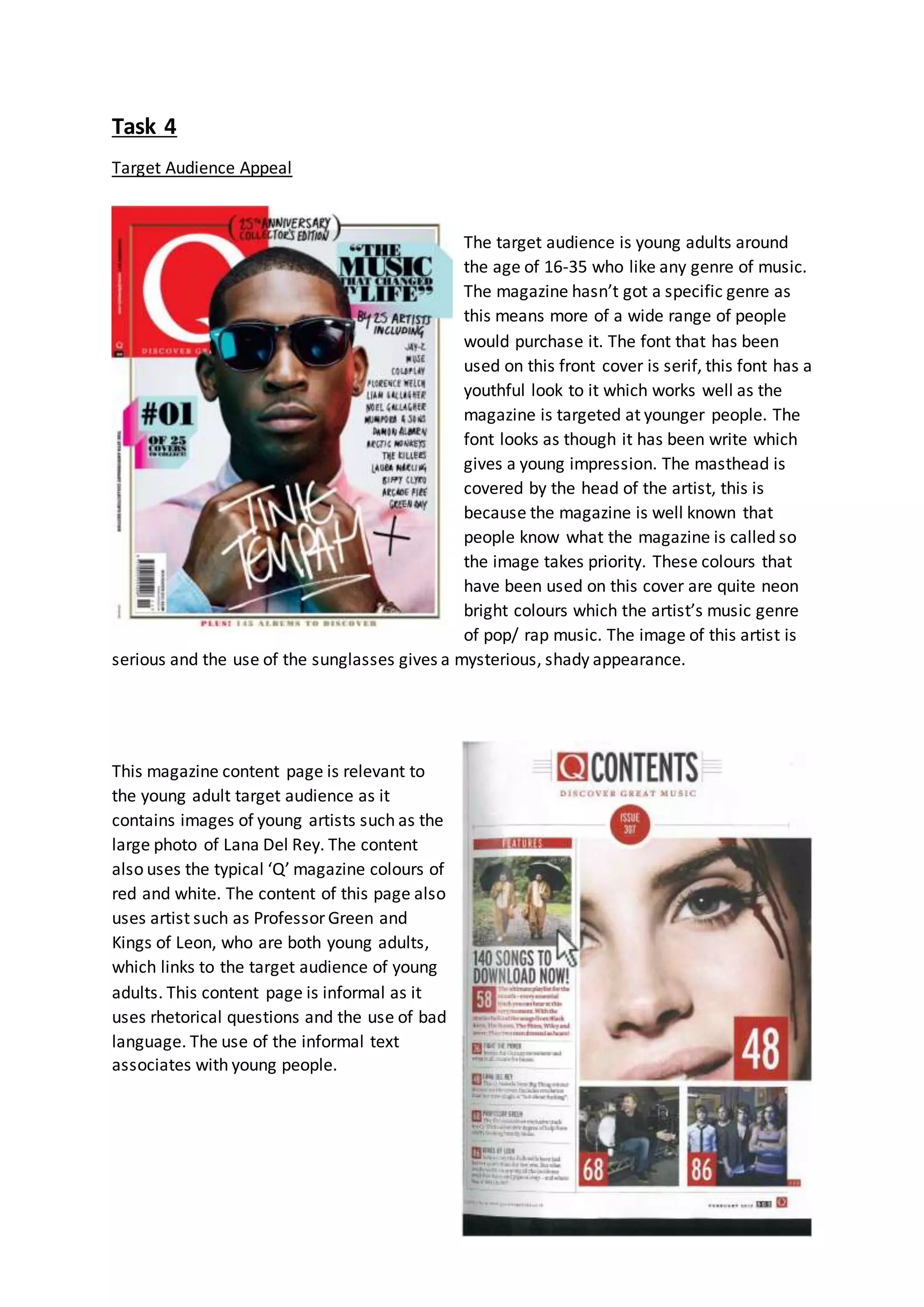
Task 4 
Target Audience Appeal 
The target audience is young adults around 
the age of 16-35 who like any genre of music. 
The magazine hasn’t got a specific genre as 
this means more of a wide range of people 
would purchase it. The font that has been 
used on this front cover is serif, this font has a 
youthful look to it which works well as the 
magazine is targeted at younger people. The 
font looks as though it has been write which 
gives a young impression. The masthead is 
covered by the head of the artist, this is 
because the magazine is well known that 
people know what the magazine is called so 
the image takes priority. These colours that 
have been used on this cover are quite neon 
bright colours which the artist’s music genre 
of pop/ rap music. The image of this artist is 
serious and the use of the sunglasses gives a mysterious, shady appearance. 
This magazine content page is relevant to 
the young adult target audience as it 
contains images of young artists such as the 
large photo of Lana Del Rey. The content 
also uses the typical ‘Q’ magazine colours of 
red and white. The content of this page also 
uses artist such as Professor Green and 
Kings of Leon, who are both young adults, 
which links to the target audience of young 
adults. This content page is informal as it 
uses rhetorical questions and the use of bad 
language. The use of the informal text 
associates with young people.
This double page spread links to it’s specific target audience by the use of this article about 
Lady Gaga, as she is young herself and he music has a younger target audience too. The 
language used is informal, this relates to the younger generation of young adults. The use of 
the large kicker ‘L’ is associated with the name Lady Gaga as the first letter of her stage 
name is ‘L’. The colour of this kicker is the same as the magazines logo. The image gives a 
youthful look by the way she is hardly wearing clothes and the relaxed body language. With 
the image being in black and white, the whole double page spread only consists of three 
colours, red, white and black which are the typical ‘Q’ colours.

Task 4

  • 1.
    Task 4 TargetAudience Appeal The target audience is young adults around the age of 16-35 who like any genre of music. The magazine hasn’t got a specific genre as this means more of a wide range of people would purchase it. The font that has been used on this front cover is serif, this font has a youthful look to it which works well as the magazine is targeted at younger people. The font looks as though it has been write which gives a young impression. The masthead is covered by the head of the artist, this is because the magazine is well known that people know what the magazine is called so the image takes priority. These colours that have been used on this cover are quite neon bright colours which the artist’s music genre of pop/ rap music. The image of this artist is serious and the use of the sunglasses gives a mysterious, shady appearance. This magazine content page is relevant to the young adult target audience as it contains images of young artists such as the large photo of Lana Del Rey. The content also uses the typical ‘Q’ magazine colours of red and white. The content of this page also uses artist such as Professor Green and Kings of Leon, who are both young adults, which links to the target audience of young adults. This content page is informal as it uses rhetorical questions and the use of bad language. The use of the informal text associates with young people.
  • 2.
    This double pagespread links to it’s specific target audience by the use of this article about Lady Gaga, as she is young herself and he music has a younger target audience too. The language used is informal, this relates to the younger generation of young adults. The use of the large kicker ‘L’ is associated with the name Lady Gaga as the first letter of her stage name is ‘L’. The colour of this kicker is the same as the magazines logo. The image gives a youthful look by the way she is hardly wearing clothes and the relaxed body language. With the image being in black and white, the whole double page spread only consists of three colours, red, white and black which are the typical ‘Q’ colours.