
Recommended
More Related Content
What's hot
What's hot (18)
Similar to Task 1 work sheet 2 dimitris theocharis (done)
Similar to Task 1 work sheet 2 dimitris theocharis (done) (20)
More from shaunaeleacy
More from shaunaeleacy (20)
Recently uploaded
Recently uploaded (20)
Task 1 work sheet 2 dimitris theocharis (done)
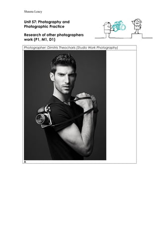
- 1. Shauna Leacy Unit 57: Photography and Photographic Practice Research of other photographers work (P1, M1, D1) Photographer: Dimitris Theocharis (Studio Work Photography) A
- 6. Shauna Leacy F Theme or focus of images A. The photo was taken in a studio it was taken for the Hasselblad Lunar 2013 Campaign. It’s a model stood with the photo taken from waist up it has been edited so that it’s black and white. He’s holding a camera but not in then normal way he’s been positioned so that he’s holding the strap that you use it around your neck so you don’t have to hold the camera whilst it rests on his shoulder. He’s adverting the camera so he’s wearing plain clothes so you focus on the camera instead of his clothing and because he’s a model people will associate the camera with attractive people, it looks like there has been lighting used because the background is a light grey colour. B. This photo was taken in a studio it was taken for the Hasselblad Lunar 2013 Campaign which is to advertise a camera. It’s a female model holding a camera to face the camera that is taking the photo so you can see it but also if you advertise the camera with a model people will be attracted to the product and find it different to normal camera adverts. C. This photo is of Sophie Ellis Bextor a singer the photo is for Schon! Magazine this is
- 7. Shauna Leacy just a portrait picture which has been edited in black and white which gives it a cool effect because it goes with the way she’s styled, the plain grey background makes you focus on her and what she’s wearing it’s a simple picture of her for a magazine shoot the normal type you would find in a magazine which is next to a celebrity interview. D. This photo was taken for the fashion magazine Homme Style SS13 he’s been styled to fit a certain theme in their magazine its plain black white and grey which gives it a certain look that suits fashion type photos it’s been taken in a studio with the background and the lighting but he’s posing like he’s been told to stand like that. E. The photo had been taken for the fashion magazine Homme Style SS13 its again going along with a theme which the magazine or photographer has chosen to go with its two male models styled with similar clothing and hair but different patterns and shapes they have been positioned in a certain way to give it an edgy strange fashion like look. F. This is also been taken for the fashion magazine Homme Style SS13 this is completely different to the other photos because its colourful he has a clouded back drop and has coloured lights facing him a couple different colours and a smoke or powder thrown on him and the photo has been taken to capture the smoke or powder surrounding him. Composition A. The photographer as taken the picture from waist up he has chosen to include the camera, positioning it in a random place so you look at it, they are using a attractive model so then you see him with this product and want this so you can be like him they have chosen not to include much of his outfit because you wouldn’t be paying attention to the camera which is what the campaign is about. B. The photographer as chosen to zoom out a bit more than the other picture he’s now got he model to hold the camera centred and facing towards the photographer again they are using an attractive model to advertise the product it will attract people to the photo and they will want to find out what its for. C. The photographer has zoomed in and gone for a portrait shot, it looks like she’s been told to pose for the photo because she has her hand up on her collar he’s chosen to only include the top part of her body and hasn’t included the rest of her outfit because she is a celebrity its more important to see who it is rather than what’s she’s wearing if its next to a interview in a magazine. D. The photographer has zoomed out all the way so he has captured his whole body, what he’s wearing and the position. He’s been told to stand in a certain way he’s included everything in the photo even having space around him. The only thing I can think of that he hasn’t included is the one side of his face because he’s facing in on direction. E. The photographer hasn’t zoomed out fully but hasn’t zoomed in much it includes the body from the waist up and doesn’t include their legs the lighting gives off a reflection from the glasses they are wearing. The way they are stood like statues gives it a retro look along with what they are wearing. He has framed them so they fit just within the border with a slight gap around them. They are slightly mirroring each other. Overall it looks like it would go really well it a fashion magazine because of how
- 8. Shauna Leacy unusual it looks. F. The photographer has shot from the waist up but it looks like he’s sat down because he has his knee in shot as well, he is framed perfectly in the middle and its slightly zoomed in the lighting brings out the colours even more the backdrop is patterned also. The photographer has included mostly everything apart from he hasn’t included the bottom half of the photo. I think he’s done this to get the effect of the model coming up out of the smoke or that he’s been sat hidden in It. Techniques used A. The shutter speed is average because the photo has both dark and light colours, the depth of field is that nothing is in the background but in the foreground is the model who is the main focus of the photo including the camera he’s adverting, the rule of three is the main reason of the photo is the camera and that being slightly centre is one of the first things you look at. B. the shutter speed is average because you can see the photo perfectly and its in black and white, the depth of field is there is nothing in the background other than a plain grey/black back drop but in the foreground is the model holding the camera, rule of three the centre of the photo is the camera which is the thing that the photo has been taken for which is a good thing. C. the shutter speed is average nothings to bright and nothings to dark, the depth of field is that the singer is in the foreground and it being taken in a studio is that there nothing you can about the background because there isn’t anything in it, the rule of three is that you would thing that her face was centred but her chest is more centred than anything else. D. this photo seems to be a little darker than the rest but it could be due to the shutter speed being slower or it could be because its edited black and white, the depth of field is that there’s isn’t anything in the background and nothing much in the foreground he’s middle, the rule of three Is that his centre of the image. E. this again seems darker than the rest but it could be due to the shutter speed being slower or the editing, there isn’t anything in the background, rule of three is that the clothing is in the middle/centre of the photo which is important for a fashion magazine. F. shutter speed is average nothings to dark or to light the depth of field is that the background is blurred you cant really make out what the backdrop has on it but in the foreground is his knee which is perfectly in focus, rule of three is that his chest is centre this shows he perfectly framed. Strengths & Weaknesses A. The strengths it’s that it’s different to other camera campaigns and the way the photo had been set up and styles. The weaknesses are that there isn’t much focus on the camera its self which is the main subject in the photo also because it’s in black and white you can’t really see much of the camera if the camera had colour you wouldn’t know due to the black and white
- 9. Shauna Leacy B. The strengths again are that it’s different to other camera campaigns and the way the photo had been set up and styles. The weaknesses again is that there isn’t much focus on the camera its self which is the main subject in the photo also because it’s in black and white you can’t really see much of the camera if the camera had colour you wouldn’t know due to the black and white C. The strengths are that it’s styled nice and it’s at a good distance and it’s nice that it’s in black and white because it makes it look sharp with like the fashion side. The weaknesses are that it’s pretty plain and there’s not much happening in it its straight forward and very set up. D. The strengths is that it looks smart and classy with the way he’s stood and what he’s wearing and it would look really good in the magazine its going in. The weaknesses are that it would look better if it was slightly closer just so you can see detail on his clothing like the shirt he’s wearing because you can’t really see much of it from the distance that it’s at. E. The strengths are that its unique because it’s a bit unusual with the way they are dressed and the glasses they have on and the way they are stood it looks very futuristic. The weaknesses are that it is very straight forward and boring with the colour chose with the style they are dressed in I think it would add to the photo to make it better if there he kept it in colour. F. The strengths in this photo is the colour, the colours are bright and look good when they are all put together and the powder/smoke around him makes it look really good. The weaknesses are how little they show of his outfit when it could make the photo look so much better if you could see more it would look good if the smoke surrounded the bottom half.
- 10. Shauna Leacy B. The strengths again are that it’s different to other camera campaigns and the way the photo had been set up and styles. The weaknesses again is that there isn’t much focus on the camera its self which is the main subject in the photo also because it’s in black and white you can’t really see much of the camera if the camera had colour you wouldn’t know due to the black and white C. The strengths are that it’s styled nice and it’s at a good distance and it’s nice that it’s in black and white because it makes it look sharp with like the fashion side. The weaknesses are that it’s pretty plain and there’s not much happening in it its straight forward and very set up. D. The strengths is that it looks smart and classy with the way he’s stood and what he’s wearing and it would look really good in the magazine its going in. The weaknesses are that it would look better if it was slightly closer just so you can see detail on his clothing like the shirt he’s wearing because you can’t really see much of it from the distance that it’s at. E. The strengths are that its unique because it’s a bit unusual with the way they are dressed and the glasses they have on and the way they are stood it looks very futuristic. The weaknesses are that it is very straight forward and boring with the colour chose with the style they are dressed in I think it would add to the photo to make it better if there he kept it in colour. F. The strengths in this photo is the colour, the colours are bright and look good when they are all put together and the powder/smoke around him makes it look really good. The weaknesses are how little they show of his outfit when it could make the photo look so much better if you could see more it would look good if the smoke surrounded the bottom half.