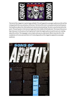
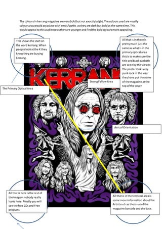
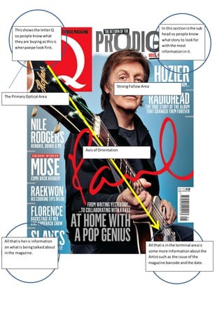
The document summarizes and compares the design elements, target audiences, and genres of two music magazines: Kerrang and Q Magazine. Kerrang uses bold, dark colors that would appeal to emo/goth audiences. The text is large and focuses on punk/rock bands to attract younger readers. Q Magazine uses brighter colors as it covers both rock and chart music. It aims for a slightly broader audience. Both magazines use their logo prominently and include information about artists, issues, and dates in the terminal area.