
Recommended
More Related Content
Similar to Target audience survey.docx
Similar to Target audience survey.docx (20)
More from AmyKilbride2
More from AmyKilbride2 (20)
Recently uploaded
Recently uploaded (20)
Target audience survey.docx
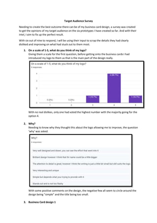
- 1. Target Audience Survey Needing to create the best outcome there can be of my business card design, a survey was created to get the opinions of my target audience on the six prototypes I have created so far. And with their intel, I aim to fix up the perfect result. With six out of nine to respond, I will be using their input to scrap the details they had clearly disliked and improving on what had stuck out to them most. 1. On a scale of 1-5, what do you think of my logo? Giving them a scale for the first question, before getting onto the business cards I had introduced my logo to them as that is the main part of the design really. With no real dislikes, only one had voted the highest number with the majority going for the option 4. 2. Why? Needing to know why they thought this about the logo allowing me to improve, the question ‘why’ was asked. With some positive comments on the design, the negative few all seem to circle around the design being “simple” and the title being too small. 3. Business Card design 1
- 2. As the questions here repeat of my asking for their opinions on each design, I will just title the next few sections as to which design the answers are referring to. Not a design I was going to consider, I still figured I may as well include it in the survey to get more than just my own opinion on it. With a mixed opinion on the result of this, we have one person going for the lowest option, as for the highest being four with only two people choosing it.
- 3. Only getting one compliment on the card design saying that it is “quite smart”, the remaining comments all call out the font of the contact details are too basic and don’t match the style of the logo. With another comment about the title being too small. 4. Business Card design 2
- 4. A much-preferred design compared to the last. All mentioning the font, we have one person who believes the font could be better as the rest appear to approve. Another downside again is the size that is mentioned another time, all easily fixable though. 5. Business Card design 3
- 5. As the designs progress, they clearly improve as two have gave the third design a five on the scale. With many claiming to like the addition of the borders as it allows the text to stand out more, but even one states that there still isn’t enough going on with the design. 6. Business Card design 4
- 6. Winning over a few more of them with the two-sided design, having three participants go with the highest option, we still have one person going for the middle choice. But you can’t win with everyone can you. By the “same negatives as before”, I can only assume that is about the text being too small. Not everyone is a fan of the font used it seems either, with one even saying that it is a little
- 7. too much. Will just adjust the font on the back as that might be what is needed to fix that issue. Getting onto the positive comments now, they all share the same thought of it resulting professionally which is a bonus. 7. Business Card design 5 Another one that seems to be liked, this time the only chosen options were four and five. With most going for four, it shows that the one person who disliked the last one likes what they see with this design.
- 8. With design two and three being referred to when it comes to this design, the participants seem to like the structure with this one a lot more. 8. Business Card design 6 The dislikes are starting to spike back up, already revealing the top two designs from the six.
- 9. With the positives all being about the colour scheme and how it matches the logo, the negatives include the name being unreadable and one just stating they just don’t like it. 9. From all the design, which is your favourite? Using a pie chart for this one, to know which I should go forward with from here the big question was asked. Which is the favourite? With three people liking design four most, it comes in close with design five having two picks. As for design six being favourited by one, the remaining designs were all left untouched leaving me with the last 3 to work it out from. 10. What makes this your favourite design? Although I probably should have found a way to make it clearer as to which design each were talking about, what I was mostly after here was the elements of a design that stood out most to my audience.
- 10. With the third design being liked for its “professional” result of being double sided, it is hard to tell which design the rest are talking about, apart from the one who says they favourite design five for it being visually appealing, but the elements of the structure are all helpful to take note of. 11. What would you change about these designs? Why? The three main suggestions here are about changing the colour of the text to create a more “contrasting colour” alongside increasing the size of the title which I can only assume would go for every design as it is mentioned in every comment pretty much. As for the third, inserting a pattern into the background. Going more specific though, it is suggested for design six to have the full colour made to the same as the background on the logo, whereas with design one they comment on adjusting the fonts. With everything needed now, I can head back over to my business card design and have it finished using the opinions made by my audience. And to finish the survey off, I did thank the participants whilst also giving them an opportunity to comment and/or ask as they pleased. With no respondents there, there is no real point in me including it here.