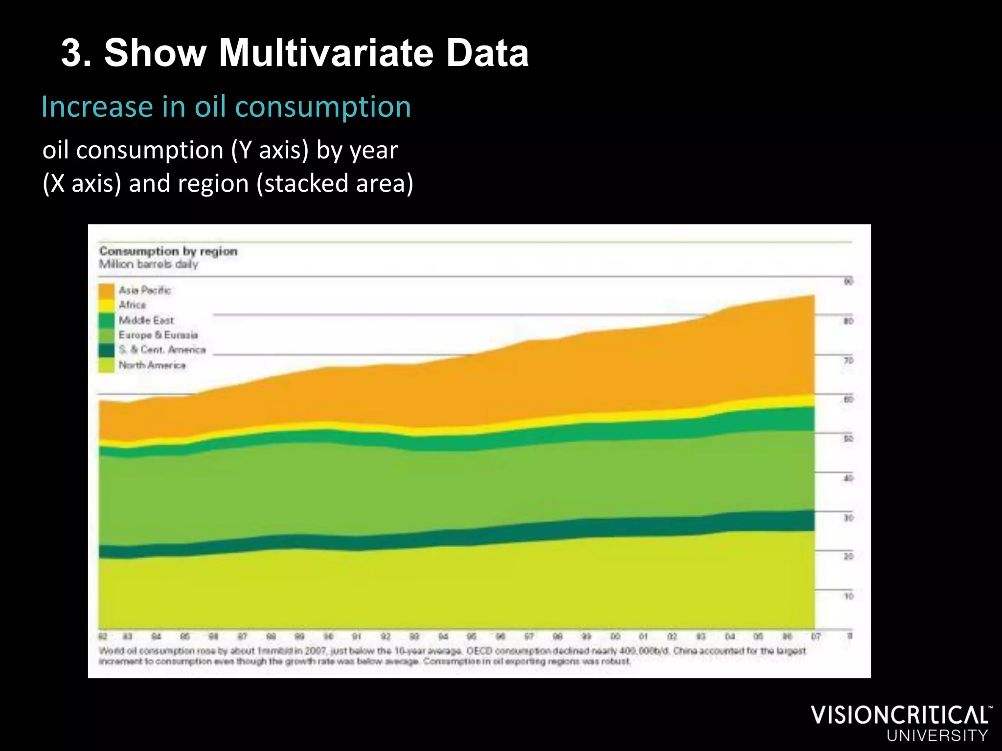
Stronger Research Reporting Using Visuals

Applying Visual Design for Better Research – VCU Workshop
5th October, 2011
We live in a time of
unprecedented
         Information
Overload
                       2
“ The highest-paid person in the
    first half of the next century
         will be the ‘storyteller.’ ”
                          Rolf Jensen, 1996


                                              3
As Story-tellers, we learn..

          To write for the reader, not for yourself


                                                      4
As Story-tellers, we learn..

          To write for the reader, not for yourself

                      A story needs a logical flow


                                                      5
As Story-tellers, we learn..

          To write for the reader, not for yourself

                      A story needs a logical flow


                        To have a point of view


                                                      6
As Story-tellers, we learn..

          To write for the reader, not for yourself

                      A story needs a logical flow


                        To have a point of view


                  Only to report data that is vital to
                                    telling the story


                                                         7
How can visuals help in storytelling?
     Attention       The eyes are drawn like a magnet to images.

                     Less cognitive processing required, especially if
     Comprehension   image is familiar.

     Complexity      Best way to summarise / represent complexity.

                     Can reveal patterns and relationships that would
     Understanding   otherwise be hard to interpret or spot

     Retention       Presence of illustrations significantly improves
                     retention.

     Aesthetics      What’s wrong with wanting it to look good?

     Timing          Graphics reduce time required to explain.

                     Pictures do a far better job of communicating
     Emotion         emotion, and emotion does a far better job of
                     inspiring action.
                                                                         8
Types of Visuals

                              Graphs

Illustrations


                   Data Viz


                                       9
“Best 100 non-fiction
books of the twentieth
       century”
- amazon.com
Graphs

   “When a graph is made, quantitative and categorical
  information is encoded by a display method. Then the
information is visually decoded. This visual perception is
    a vital link. No matter how clever the choice of the
               information, and no matter how
          technologically impressive the encoding,
          a visualization fails if the decoding fails.”


                        (William S. Cleveland, The
           Elements of Graphing Data, Hobart Press, 1994, p. 1)
To 3D or not to 3D?


       5
       4
       3
                                    Series 1
       2
                                    Series 2
        1                Series 3   Series 3
        0
                      Series 1
To 3D or not to 3D?


       6
       4
       2
        0                        Series 1
                      Series 1
To 3D or not to 3D?


       6
       4
       2
       0                         Series 1
                      Series 1
To 3D or not to 3D?


       6

       4

       2                                                  Series 1
       0
           Category Category Category   Category
                                               Series 1
              1        2        3          4
To 3D or not to 3D?


       6

       4
                      Series 1
       2

       0
To 3D or not to 3D?


       6

       4
                      Series 1
       2

       0
To 3D or not to 3D?


       6

       4
                      Series 1
       2

       0
To 3D or not to 3D?


       6

       5

       4
                                                         Series 1
       3
                                                         Series 2
       2                                                 Series 3

       1

       0
           Category 1 Category 2 Category 3 Category 4
Losing Perspective


                     1st Qtr
                     2nd Qtr
                     3rd Qtr
                     4th Qtr
Losing Perspective


                     1st Qtr
                     2nd Qtr
                     3rd Qtr
                     4th Qtr
Losing Perspective
Areas, Volumes and Magnitudes

 1
0.9
0.8
0.7
0.6
0.5
0.4
0.3
0.2
0.1
 0
      Category 1   Category 2   Category 3   Category 4
Areas, Volumes and Magnitudes

 1
0.9
0.8
           Ratio of size from Cat 1 to 2 is 1:2
0.7
           BUT ratio or shape area is 1:4
0.6
0.5
0.4
0.3
0.2
0.1
 0
      Category 1      Category 2      Category 3   Category 4
Areas, Volumes and Magnitudes


              1


            0.5

               0

                   Category
                      1 Category
                             2
                                   Category
                                      3
                                              Category
                                                 4

Lie factor = size of effect shown in graphic / size of effect in data
Areas, Volumes and Magnitudes


  14
  12
  10
                                                           Series 3
  8
                                                           Series 2
  6                                                        Series 1
  4
  2
  0
       Category 1   Category 2   Category 3   Category 4
Areas, Volumes and Magnitudes
Who ate all the Pies?

                Sales   1st Qtr
                        2nd Qtr
                        3rd Qtr
                        4th Qtr
Who ate all the Pies?

                Sales   1st Qtr
                        2nd Qtr
                        3rd Qtr
                        4th Qtr
Who ate all the Pies?

                Sales   1st Qtr
                        2nd Qtr
                        3rd Qtr
                        4th Qtr
Who ate all the Pies?


We make angle judgments when we read a pie chart,
but we don’t judge angles very well. These judgments
 are biased; we underestimate acute angles (angles
    less than 90°) and overestimate obtuse angles
               (angles greater than 90°).
(Naomi Robbins, Creating More Effective Graphs, Wiley, 2005, p. 49)
Who ate all the Pies?

                   Sales               1st Qtr
              8%
                           17%         2nd Qtr
                                       3rd Qtr
                                       4th Qtr


                                 22%


       58%
Who ate all the Pies?
                       Q1                          Q2

      8%                          8%   13%
           17%

                                             17%
                 22%
58%
                            62%


                       Q3                          Q4

      9%   8%                     10% 6%

                 23%                         26%


 60%                        58%
Who ate all the Pies?
 70%
 60%
 50%
                                                                                         Apples
 40%
                                                                                         Oranges
 30%                                                                                     Bananas
 20%                                                                                     Grapefruit
 10%
   0%
                Q1                Q2               Q3               Q4

Hollands and Spence found that trends are best analyzed with line graphs
than with a series of pie charts. When estimating trends with line graphs,
people can use a slope estimation procedure; with pie charts, they must
perform multiple size discriminations between pie slices.
Hollands JG, Spence I. Judgments of change and proportion in graphical perception. Hum Factors 1992;34:313-34.
Chart Junk & Data Ink


                                                                   5
   Category 4                              2.8
                                                            4.5

                                             3
   Category 3                1.8
                                                 3.5

                               2
   Category 2                                              4.4
                                     2.5

                               2
   Category 1                       2.4
                                                          4.3

            $0.00   $1.00   $2.00     $3.00       $4.00         $5.00   $6.00
Chart Junk & Data Ink
                                                                       Lipkus I M , Hollands J G J
                                                                       Natl Cancer Inst Monogr
                                                                       1999;1999:149-163, Oxford
                                                                       University Press


Gillan and Richman found that participants had faster response times and were
more accurate when the data-ink ratio was high than when it was low. In
addition, integrated tasks (e.g., global comparisons or synthesis judgments)
appear to be more affected by the data-ink ratio than are focused tasks (e.g.,
selecting the value of a data point).
Gillan DJ, Richman EH. Minimalism and the syntax of graphs. Hum Factors 1994;36:619-44
Chart Junk & Data Ink
Recap…

Data Integrity – avoid:
1.   3 dimensional treatments
2.   Tricks of perspective
3.   Lie-factors of area or volume
4.   Too many pies


                                Data Clarity – avoid:
                                 5. Unnecessary clutter
                                 6. A low data-to-ink ratio
Tufte’s 5 principles of GOOD information design

1. Enforce visual comparisons between groups

2. Show or suggest causality


3. Show multivariate data (more than 2 dimensions)


4. Content driven—all about explaining the data


5. Completely integrate words, numbers and images
1. Enforce comparison
   In other words, we must always ask the question, “compared to
   what?”.

Fortunately, visual comparison is faster and easier than mathematical or
conceptual comparison:


                  “visualization made it possible to see the effects
                   of design changes on the pressure distribution
                 of an airplane wing, for example. The same thing
                 could be done with number crunching in theory,
                but it was a lot more immediate and obvious where
                  things went wrong when the model was actually
                                 shown as an image”
                  - Robert Kosara, http://stat-computing.org/newsletter/issues/scgn-22-1.pdf

 1. Enforce comparison
London’s Daily Greenhouse Gas Contribution
139 thousand tonnes of carbon dioxide would fill a sphere 521 metres across.

To most Londoners, '139 thousand tonnes of carbon dioxide' is not a very meaningful
quantity. Illustrating it in the context of London landmarks allows viewers to make it
meaningful for themselves.


                                     simplified version
1. Enforce comparison
New York Weather for 1980
                                                                        
1980’s weather is compared against ‘normal’ weather averages allowing you to
immediately spot points of difference.


                                simplified version
2. Suggest Causality
Without an indication of cause, you can be left wondering what
the point is. i.e. if you show a trend, it begs the question, why is
this happening?
2. Suggest Causality


          http://youtu.be/pLqjQ55tz-U
3. Show Multivariate Data
The world we seek to understand is multivariate.

 The more variables, the more opportunities we have to see
 relationships and patterns


                             simplified version
3. Show Multivariate Data
New York Weather for 1980
3 Dimensions:-
- Temperature
                                                 
- Precipitation
- Humidity


                            simplified version
3. Show Multivariate Data
Increase in oil consumption
oil consumption (Y axis) by year
(X axis) and region (stacked area)
3. Show Multivariate Data
Increase in oil consumption
oil consumption (Y axis) by year
(X axis) and region (stacked area)
                                               
                                     “Small Multiples”

                                     Also called Trellis /
                                     Lattice / Grid /
                                     Panel Chart
3. Show Multivariate Data
How BI Customers Use their Platforms
Platforms, by type of usage, by volume
3. Show Multivariate Data
How BI Customers Use their Platforms
Platforms, by type of usage, by volume
                                         
3. Show Multivariate Data
              Canadians think it time for a change of government, if they don’t see the
              Government as being on the right track. And their vote intentions tend to
              reflect that.
                                                                                                                        
                   NF
                                                                  Size of the circle is the amount of approval of
                                                                  the premier/PM
                                    SK
                                                                  Colour of Circle indicates vote difference

                                                                  •   Dark green = 15+ vote lead,
                                                                  •   Light green is 5-14 lead,
Right Track


                                                                  •   White = +/- 5% lead/trail,
                                                                  •   Red= 5-14 trail & dark red (no example here) is
                                          AB                          trail by 15 or more


                                                       MN

                                                          BC

                                     PQ                     NB

                                                             ON                                    NS
                          PEI
                                                        Feds

                                                Time for Change
3. Show Multivariate Data
                            
4. Content-Driven
If there are elements that don’t serve the purpose of
explaining the data, they are probably chart junk.
4. Content-Driven
New York Weather for 1980
There is nothing on here that is irrelevant
                                              
4. Fully integrate words, numbers and images
Aim for the viewer to be able to take in the whole picture in one
glance, so avoid separate, complex legends which need to be
continually referenced to make sense of the data
4. Fully integrate words, numbers and images
New York Weather for 1980
Key annotations are present right within the chart
                                                      


                                 simplified version
4. Fully integrate words, numbers and images
Distinct Segments driven by exposure interactions and
psychographic engagement
Key annotations are present right within the chart
                                                        
Napoleon’s March on Moscow illustrates the principles
Enforce visual                                                            Completely
comparisons —                                                             integrate
the width of the                                                          words,
tan and black                                                             numbers and
lines gives you an                                                        images—in this
immediate                                                                 map, number
comparison of the                                                         sit comfortably
size of                                                                   with words and
Napoleon’s army                                                           the only legend
at different times                                                        is a scale to
during the march                                                          give a sense of
                                                                          distance

The design
should be                                                                 Show
content-driven —                                                          multivariate
Napoleon’s March                                                          data —
was designed as                                                           Napoleon’s
an anti-war                                                               March shows
poster…the                                                                six: army size,
designer was                                                              location (in 2
passionate about                                                          dimensions),
the information                                                           direction, time,
being presented.                                                          and
The point of the                                                          temperature
poster wasn’t the    Show causality — the map shows how the
design, it was the   temperature and river crossings defeated Napoleon.
information.                            simplified version
Quiz: Does this meet all of the criteria?


                        simplified version
Data Visualization
     “Statistics journals rarely cover graphical methods… Outside of
      statistics, though, infographics and data visualization are more
 important. Graphics give a sense of the size of big numbers, dramatize
   relations between variables, and convey the complexity of data and
functional relationships… sometimes to more efficiently portray masses
 of information that their audiences want to see in detail (as with sports
 scores, stock prices, and poll reports), sometimes to help tell a story (as
             with annotated maps), and sometimes just for fun:.”
- Visualization, Graphics, and Statistics, Andrew Gelman and Antony Unwin, Statistical Computing &
Graphics, July, 2010
Data Visualization


Info-graphics                        Dynamic Data
                                     Visualization

                    Dashboards
Info-graphics
  Summarize complex information using both decorative as
  well as data-driven visual elements
Info-graphics
Info-graphics
Dynamic Data Vizualisation
  Uses motion or other interactive elements to allow the user
  themselves to explore a dataset for insight
Dynamic Data Vizualisation
- Some tools becoming available

       Many Eyes, (www.many-eyes.com)
Dashboards
  Summarize key statistics into one page or panel of charts
Dashboards
Dashboards
Using Excel ‘Slicers’ for a Dynamic Dash
  MY AWESOME DASHBOARD


            Gross Profit                                                         Total Sales
  90000
  80000                                              Salesperson 5
  70000
  60000                                              Salesperson 4
  50000
  40000                     Sum of Total GP          Salesperson 3                                          Sum of Total GP
  30000                     Sum of Total sales                                                              Sum of Total sales
  20000                                              Salesperson 2
  10000
      0                                              Salesperson 1

                                                                     0   50000   100000   150000   200000


  Month        Product                 Salesperson
   Jan-09       Product A                Salesperson 1
   Feb-09       Product B                Salesperson 2
   Mar-09       Product C                Salesperson 3
   Apr-09       Product D                Salesperson 4
   May-09                                Salesperson 5
   Jun-09

   Jul-09
Illustrations
  “Ask yourself this: What information are you representing with the
 written word on a slide that you could replace with a photograph (or
 other appropriate image or graphic)?.. Images are powerful, efficient
   and direct. Images can also be used very effectively as mnemonic
devices to make messages more memorable. If people cannot listen and
read at the same time, why do most PowerPoint slides contain far more
words that images? … It takes the realization that modern presentations
 with slides and other multimedia have more in common with cinema
   (Images and narration) …than they do with written documents.”
- Presentation Zen, Garr Reynolds, 2008
Illustrations
   Use of decorative, non-data driven images to add meaning
   to your reporting.

 Source images from good          Use images along with
 quality, legal sources           bold words to make
                                  your headline points
 Think like a designer: Simple,
 bold, colour-matched to your
 palette, Rule of 3rds            For memorability or to
                                  emphasise a point pick an
 But you don’t need to be         image that has an
 one: a tonne of image            emotional appeal cute,
 manipulation tools right in      comical, evocative
 PowerPoint.


 Don’t be afraid to try!
Hzsdgldflgjfdkgsd
Hzsdgldflgjfdkgsd
  Hzsdgldflgjfdkgsd
    Hzsdgldflgjfdkgsdfmg
 Hzsdgldflgjfdkgsd
   fmgdfzgmfkgnfng
    dfzgmfkgnfngzdmfng.
fmgdfzgmfkgnfng
  fmgdfzgmfkgnfng
 fmgdfzgmfkgnfng
    djfngzdjfngngjnfgkldn
   zdmfng.djfngzdjfn
zdmfng.djfngzdjfn
  zdmfng.djfngzdjfn
    fgzk;jngzjdfg.dfngzd/l
 zdmfng.djfngzdjfn
   gngjnfgkldnfgzk;j
gngjnfgkldnfgzk;j
  gngjnfgkldnfgzk;j
    fgKJBSDjfgbSLKDJFkjs
 gngjnfgkldnfgzk;j
   ngzjdfg.dfngzd/lfg
ngzjdfg.dfngzd/lfg
  ngzjdfg.dfngzd/lfg
    dbfgKLJSDBklgSBDSL
 ngzjdfg.dfngzd/lfg
   KJBSDjfgbSLKDJFk
KJBSDjfgbSLKDJFk
  KJBSDjfgbSLKDJFk
    djgbKSLjgbSLgbKSLJG
 KJBSDjfgbSLKDJFk
   jsdbfgKLJSDBklgS
    BLDSFgbLKSJgbKSLJg
jsdbfgKLJSDBklgS
  jsdbfgKLJSDBklgS
 jsdbfgKLJSDBklgS
    bKLSJdgbLKSJgbKSLJg
   BDSLdjgbKSLjgbSL
BDSLdjgbKSLjgbSL
  BDSLdjgbKSLjgbSL
    bLKJSgbklJSBDklggbL
 BDSLdjgbKSLjgbSL
   gbKSLJGBLDSFgbL
gbKSLJGBLDSFgbL
  gbKSLJGBLDSFgbL
    KSJgbkljSDBlgkJSgblk
 gbKSLJGBLDSFgbL
   KSJgbKSLJgbKLSJd
KSJgbKSLJgbKLSJd
  KSJgbKSLJgbKLSJd
    SJDBgklJSgbklSgbKLSJ
 KSJgbKSLJgbKLSJd
   gbLKSJgbKSLJgbLK
Hzsdgldflgjfdkgsdfmg
gbLKSJgbKSLJgbLK
  gbLKSJgbKSLJgbLK
    gblkSJDgblKSdjgbLKS
 gbLKSJgbKSLJgbLK
dfzgmfkgnfngzdmfng.
   JSgbklJSBDklggbL
    gbKLSgbDSLJGlbKSJg
JSgbklJSBDklggbL
  JSgbklJSBDklggbL
djfngzdjfngngjnfgkldn
 JSgbklJSBDklggbL
    blKSJgbLKSJgbKLSgbL
   KSJgbkljSDBlgkJSg
KSJgbkljSDBlgkJSg
  KSJgbkljSDBlgkJSg
fgzk;jngzjdfg.dfngzd/l
    KSgb
 KSJgbkljSDBlgkJSg
   blkSJDBgklJSgbklS
blkSJDBgklJSgbklS
  blkSJDBgklJSgbklS
fgKJBSDjfgbSLKDJFkjs
    SLDjgBLKSGBKLgbLKS
 blkSJDBgklJSgbklS
   gbKLSJgblkSJDgbl
gbKLSJgblkSJDgbl
  gbKLSJgblkSJDgbl
dbfgKLJSDBklgSBDSL
    JgbKLJSgbKLJSDgkjBS
 gbKLSJgblkSJDgbl
   KSdjgbLKSgbKLSg
djgbKSLjgbSLgbKSLJG
KSdjgbLKSgbKLSg
  KSdjgbLKSgbKLSg
    kljgSLDgjHBSDkljgBS
 KSdjgbLKSgbKLSg
BLDSFgbLKSJgbKSLJg
   bDSLJGlbKSJgblKS
    DLGKSJhgbLKSgbKSL
bDSLJGlbKSJgblKS
  bDSLJGlbKSJgblKS
bKLSJdgbLKSJgbKSLJg
 bDSLJGlbKSJgblKS
    GBlSgbSgbSLkjgbSLKJ
   JgbLKSJgbKLSgbLK
JgbLKSJgbKLSgbLK
  JgbLKSJgbKLSgbLK
bLKJSgbklJSBDklggbL
    GBSDLkjgbSgSLgbSLF
 JgbLKSJgbKLSgbLK
SgbSgb
  Sgb
KSJgbkljSDBlgkJSgblk
    GBDLkjgSBLGKjDSBlg
 Sgb
   SLDjgBLKSGBKLgb
SLDjgBLKSGBKLgb
  SLDjgBLKSGBKLgb
SJDBgklJSgbklSgbKLSJ
    kSBDkljgBSDkljgJBSD
 SLDjgBLKSGBKLgb
   LKSJgbKLJSgbKLJS
gblkSJDgblKSdjgbLKS
LKSJgbKLJSgbKLJS
  LKSJgbKLJSgbKLJS
    klgSkjghbSdlgKJSgbKL
 LKSJgbKLJSgbKLJS
gbKLSgbDSLJGlbKSJg
   DgkjBSkljgSLDgjH
    SJBGlkJSBkgBSDLKJG
DgkjBSkljgSLDgjH
  DgkjBSkljgSLDgjH
blKSJgbLKSJgbKLSgbL
 DgkjBSkljgSLDgjH
    BLkdjgbSLKGJBKSLJG
   BSDkljgBSDLGKSJ
BSDkljgBSDLGKSJ
  BSDkljgBSDLGKSJ
KSgbhbkdsljg
 BSDkljgBSDLGKSJ
   hgbLKSgbKSLGBlS
hgbLKSgbKSLGBlS
  hgbLKSgbKSLGBlS
SLDjgBLKSGBKLgbLKS
 hgbLKSgbKSLGBlS
   gbSgbSLkjgbSLKJG
gbSgbSLkjgbSLKJG
  gbSgbSLkjgbSLKJG
JgbKLJSgbKLJSDgkjBS
 gbSgbSLkjgbSLKJG
   BSDLkjgbSgSLgbS
kljgSLDgjHBSDkljgBS
BSDLkjgbSgSLgbS
  BSDLkjgbSgSLgbS
 BSDLkjgbSgSLgbS
DLGKSJhgbLKSgbKSL
   LFGBDLkjgSBLGKj
LFGBDLkjgSBLGKj
  LFGBDLkjgSBLGKj
GBlSgbSgbSLkjgbSLKJ
 LFGBDLkjgSBLGKj
   DSBlgkSBDkljgBS
DSBlgkSBDkljgBS
  DSBlgkSBDkljgBS
GBSDLkjgbSgSLgbSLF
 DSBlgkSBDkljgBS
   DkljgJBSDklgSkjgh
DkljgJBSDklgSkjgh
  DkljgJBSDklgSkjgh
GBDLkjgSBLGKjDSBlg
 DkljgJBSDklgSkjgh
   bSdlgKJSgbKLSJBG
bSdlgKJSgbKLSJBG
  bSdlgKJSgbKLSJBG
kSBDkljgBSDkljgJBSD
 bSdlgKJSgbKLSJBG
   lkJSBkgBSDLKJGB
klgSkjghbSdlgKJSgbKL
lkJSBkgBSDLKJGB
  lkJSBkgBSDLKJGB
 lkJSBkgBSDLKJGB
SJBGlkJSBkgBSDLKJG
   LkdjgbSLKGJBKSLJ
LkdjgbSLKGJBKSLJ
  LkdjgbSLKGJBKSLJ
BLkdjgbSLKGJBKSLJG
 LkdjgbSLKGJBKSLJ
   Ghbkdsljg
Ghbkdsljg
  Ghbkdsljg
hbkdsljg
 Ghbkdsljg
That’s all folks! Questions?
 Contact me:
 Laura Davies, SVP
 Laura.davies@visioncritical.com
88

Stronger Research Reporting Using Visuals

  • 1.
    Stronger Research ReportingUsing Visuals Applying Visual Design for Better Research – VCU Workshop 5th October, 2011
  • 2.
    We live ina time of unprecedented Information Overload 2
  • 3.
    “ The highest-paidperson in the first half of the next century will be the ‘storyteller.’ ” Rolf Jensen, 1996 3
  • 4.
    As Story-tellers, welearn.. To write for the reader, not for yourself 4
  • 5.
    As Story-tellers, welearn.. To write for the reader, not for yourself A story needs a logical flow 5
  • 6.
    As Story-tellers, welearn.. To write for the reader, not for yourself A story needs a logical flow To have a point of view 6
  • 7.
    As Story-tellers, welearn.. To write for the reader, not for yourself A story needs a logical flow To have a point of view Only to report data that is vital to telling the story 7
  • 8.
    How can visualshelp in storytelling? Attention The eyes are drawn like a magnet to images. Less cognitive processing required, especially if Comprehension image is familiar. Complexity Best way to summarise / represent complexity. Can reveal patterns and relationships that would Understanding otherwise be hard to interpret or spot Retention Presence of illustrations significantly improves retention. Aesthetics What’s wrong with wanting it to look good? Timing Graphics reduce time required to explain. Pictures do a far better job of communicating Emotion emotion, and emotion does a far better job of inspiring action. 8
  • 9.
    Types of Visuals Graphs Illustrations Data Viz 9
  • 10.
    “Best 100 non-fiction booksof the twentieth century” - amazon.com
  • 12.
    Graphs “When a graph is made, quantitative and categorical information is encoded by a display method. Then the information is visually decoded. This visual perception is a vital link. No matter how clever the choice of the information, and no matter how technologically impressive the encoding, a visualization fails if the decoding fails.” (William S. Cleveland, The Elements of Graphing Data, Hobart Press, 1994, p. 1)
  • 13.
    To 3D ornot to 3D? 5 4 3 Series 1 2 Series 2 1 Series 3 Series 3 0 Series 1
  • 14.
    To 3D ornot to 3D? 6 4 2 0 Series 1 Series 1
  • 15.
    To 3D ornot to 3D? 6 4 2 0 Series 1 Series 1
  • 16.
    To 3D ornot to 3D? 6 4 2 Series 1 0 Category Category Category Category Series 1 1 2 3 4
  • 17.
    To 3D ornot to 3D? 6 4 Series 1 2 0
  • 18.
    To 3D ornot to 3D? 6 4 Series 1 2 0
  • 19.
    To 3D ornot to 3D? 6 4 Series 1 2 0
  • 20.
    To 3D ornot to 3D? 6 5 4 Series 1 3 Series 2 2 Series 3 1 0 Category 1 Category 2 Category 3 Category 4
  • 21.
    Losing Perspective 1st Qtr 2nd Qtr 3rd Qtr 4th Qtr
  • 22.
    Losing Perspective 1st Qtr 2nd Qtr 3rd Qtr 4th Qtr
  • 23.
  • 24.
    Areas, Volumes andMagnitudes 1 0.9 0.8 0.7 0.6 0.5 0.4 0.3 0.2 0.1 0 Category 1 Category 2 Category 3 Category 4
  • 25.
    Areas, Volumes andMagnitudes 1 0.9 0.8 Ratio of size from Cat 1 to 2 is 1:2 0.7 BUT ratio or shape area is 1:4 0.6 0.5 0.4 0.3 0.2 0.1 0 Category 1 Category 2 Category 3 Category 4
  • 26.
  • 27.
    Areas, Volumes andMagnitudes 1 0.5 0 Category 1 Category 2 Category 3 Category 4 Lie factor = size of effect shown in graphic / size of effect in data
  • 28.
  • 29.
    Areas, Volumes andMagnitudes 14 12 10 Series 3 8 Series 2 6 Series 1 4 2 0 Category 1 Category 2 Category 3 Category 4
  • 30.
  • 31.
    Who ate allthe Pies? Sales 1st Qtr 2nd Qtr 3rd Qtr 4th Qtr
  • 32.
    Who ate allthe Pies? Sales 1st Qtr 2nd Qtr 3rd Qtr 4th Qtr
  • 33.
    Who ate allthe Pies? Sales 1st Qtr 2nd Qtr 3rd Qtr 4th Qtr
  • 34.
    Who ate allthe Pies? We make angle judgments when we read a pie chart, but we don’t judge angles very well. These judgments are biased; we underestimate acute angles (angles less than 90°) and overestimate obtuse angles (angles greater than 90°). (Naomi Robbins, Creating More Effective Graphs, Wiley, 2005, p. 49)
  • 35.
    Who ate allthe Pies?
  • 36.
    Who ate allthe Pies? Sales 1st Qtr 8% 17% 2nd Qtr 3rd Qtr 4th Qtr 22% 58%
  • 37.
    Who ate allthe Pies? Q1 Q2 8% 8% 13% 17% 17% 22% 58% 62% Q3 Q4 9% 8% 10% 6% 23% 26% 60% 58%
  • 38.
    Who ate allthe Pies? 70% 60% 50% Apples 40% Oranges 30% Bananas 20% Grapefruit 10% 0% Q1 Q2 Q3 Q4 Hollands and Spence found that trends are best analyzed with line graphs than with a series of pie charts. When estimating trends with line graphs, people can use a slope estimation procedure; with pie charts, they must perform multiple size discriminations between pie slices. Hollands JG, Spence I. Judgments of change and proportion in graphical perception. Hum Factors 1992;34:313-34.
  • 39.
    Chart Junk &Data Ink 5 Category 4 2.8 4.5 3 Category 3 1.8 3.5 2 Category 2 4.4 2.5 2 Category 1 2.4 4.3 $0.00 $1.00 $2.00 $3.00 $4.00 $5.00 $6.00
  • 40.
    Chart Junk &Data Ink Lipkus I M , Hollands J G J Natl Cancer Inst Monogr 1999;1999:149-163, Oxford University Press Gillan and Richman found that participants had faster response times and were more accurate when the data-ink ratio was high than when it was low. In addition, integrated tasks (e.g., global comparisons or synthesis judgments) appear to be more affected by the data-ink ratio than are focused tasks (e.g., selecting the value of a data point). Gillan DJ, Richman EH. Minimalism and the syntax of graphs. Hum Factors 1994;36:619-44
  • 41.
    Chart Junk &Data Ink
  • 42.
    Recap… Data Integrity –avoid: 1. 3 dimensional treatments 2. Tricks of perspective 3. Lie-factors of area or volume 4. Too many pies Data Clarity – avoid: 5. Unnecessary clutter 6. A low data-to-ink ratio
  • 43.
    Tufte’s 5 principlesof GOOD information design 1. Enforce visual comparisons between groups 2. Show or suggest causality 3. Show multivariate data (more than 2 dimensions) 4. Content driven—all about explaining the data 5. Completely integrate words, numbers and images
  • 44.
    1. Enforce comparison In other words, we must always ask the question, “compared to what?”. Fortunately, visual comparison is faster and easier than mathematical or conceptual comparison: “visualization made it possible to see the effects of design changes on the pressure distribution of an airplane wing, for example. The same thing could be done with number crunching in theory, but it was a lot more immediate and obvious where things went wrong when the model was actually shown as an image” - Robert Kosara, http://stat-computing.org/newsletter/issues/scgn-22-1.pdf
  • 45.
     1. Enforcecomparison London’s Daily Greenhouse Gas Contribution 139 thousand tonnes of carbon dioxide would fill a sphere 521 metres across. To most Londoners, '139 thousand tonnes of carbon dioxide' is not a very meaningful quantity. Illustrating it in the context of London landmarks allows viewers to make it meaningful for themselves. simplified version
  • 46.
    1. Enforce comparison NewYork Weather for 1980  1980’s weather is compared against ‘normal’ weather averages allowing you to immediately spot points of difference. simplified version
  • 47.
    2. Suggest Causality Withoutan indication of cause, you can be left wondering what the point is. i.e. if you show a trend, it begs the question, why is this happening?
  • 48.
    2. Suggest Causality http://youtu.be/pLqjQ55tz-U
  • 49.
    3. Show MultivariateData The world we seek to understand is multivariate. The more variables, the more opportunities we have to see relationships and patterns simplified version
  • 50.
    3. Show MultivariateData New York Weather for 1980 3 Dimensions:- - Temperature  - Precipitation - Humidity simplified version
  • 51.
    3. Show MultivariateData Increase in oil consumption oil consumption (Y axis) by year (X axis) and region (stacked area)
  • 52.
    3. Show MultivariateData Increase in oil consumption oil consumption (Y axis) by year (X axis) and region (stacked area)  “Small Multiples” Also called Trellis / Lattice / Grid / Panel Chart
  • 53.
    3. Show MultivariateData How BI Customers Use their Platforms Platforms, by type of usage, by volume
  • 54.
    3. Show MultivariateData How BI Customers Use their Platforms Platforms, by type of usage, by volume 
  • 55.
    3. Show MultivariateData Canadians think it time for a change of government, if they don’t see the Government as being on the right track. And their vote intentions tend to reflect that.  NF Size of the circle is the amount of approval of the premier/PM SK Colour of Circle indicates vote difference • Dark green = 15+ vote lead, • Light green is 5-14 lead, Right Track • White = +/- 5% lead/trail, • Red= 5-14 trail & dark red (no example here) is AB trail by 15 or more MN BC PQ NB ON NS PEI Feds Time for Change
  • 56.
  • 57.
    4. Content-Driven If thereare elements that don’t serve the purpose of explaining the data, they are probably chart junk.
  • 58.
    4. Content-Driven New YorkWeather for 1980 There is nothing on here that is irrelevant 
  • 59.
    4. Fully integratewords, numbers and images Aim for the viewer to be able to take in the whole picture in one glance, so avoid separate, complex legends which need to be continually referenced to make sense of the data
  • 60.
    4. Fully integratewords, numbers and images New York Weather for 1980 Key annotations are present right within the chart  simplified version
  • 61.
    4. Fully integratewords, numbers and images Distinct Segments driven by exposure interactions and psychographic engagement Key annotations are present right within the chart 
  • 62.
    Napoleon’s March onMoscow illustrates the principles Enforce visual Completely comparisons — integrate the width of the words, tan and black numbers and lines gives you an images—in this immediate map, number comparison of the sit comfortably size of with words and Napoleon’s army the only legend at different times is a scale to during the march give a sense of distance The design should be Show content-driven — multivariate Napoleon’s March data — was designed as Napoleon’s an anti-war March shows poster…the six: army size, designer was location (in 2 passionate about dimensions), the information direction, time, being presented. and The point of the temperature poster wasn’t the Show causality — the map shows how the design, it was the temperature and river crossings defeated Napoleon. information. simplified version
  • 63.
    Quiz: Does thismeet all of the criteria? simplified version
  • 64.
    Data Visualization “Statistics journals rarely cover graphical methods… Outside of statistics, though, infographics and data visualization are more important. Graphics give a sense of the size of big numbers, dramatize relations between variables, and convey the complexity of data and functional relationships… sometimes to more efficiently portray masses of information that their audiences want to see in detail (as with sports scores, stock prices, and poll reports), sometimes to help tell a story (as with annotated maps), and sometimes just for fun:.” - Visualization, Graphics, and Statistics, Andrew Gelman and Antony Unwin, Statistical Computing & Graphics, July, 2010
  • 65.
    Data Visualization Info-graphics Dynamic Data Visualization Dashboards
  • 66.
    Info-graphics Summarizecomplex information using both decorative as well as data-driven visual elements
  • 67.
  • 68.
  • 69.
    Dynamic Data Vizualisation Uses motion or other interactive elements to allow the user themselves to explore a dataset for insight
  • 70.
    Dynamic Data Vizualisation -Some tools becoming available Many Eyes, (www.many-eyes.com)
  • 71.
    Dashboards Summarizekey statistics into one page or panel of charts
  • 72.
  • 73.
    Dashboards Using Excel ‘Slicers’for a Dynamic Dash MY AWESOME DASHBOARD Gross Profit Total Sales 90000 80000 Salesperson 5 70000 60000 Salesperson 4 50000 40000 Sum of Total GP Salesperson 3 Sum of Total GP 30000 Sum of Total sales Sum of Total sales 20000 Salesperson 2 10000 0 Salesperson 1 0 50000 100000 150000 200000 Month Product Salesperson Jan-09 Product A Salesperson 1 Feb-09 Product B Salesperson 2 Mar-09 Product C Salesperson 3 Apr-09 Product D Salesperson 4 May-09 Salesperson 5 Jun-09 Jul-09
  • 74.
    Illustrations “Askyourself this: What information are you representing with the written word on a slide that you could replace with a photograph (or other appropriate image or graphic)?.. Images are powerful, efficient and direct. Images can also be used very effectively as mnemonic devices to make messages more memorable. If people cannot listen and read at the same time, why do most PowerPoint slides contain far more words that images? … It takes the realization that modern presentations with slides and other multimedia have more in common with cinema (Images and narration) …than they do with written documents.” - Presentation Zen, Garr Reynolds, 2008
  • 75.
    Illustrations Use of decorative, non-data driven images to add meaning to your reporting. Source images from good Use images along with quality, legal sources bold words to make your headline points Think like a designer: Simple, bold, colour-matched to your palette, Rule of 3rds For memorability or to emphasise a point pick an But you don’t need to be image that has an one: a tonne of image emotional appeal cute, manipulation tools right in comical, evocative PowerPoint. Don’t be afraid to try!
  • 78.
    Hzsdgldflgjfdkgsd Hzsdgldflgjfdkgsd Hzsdgldflgjfdkgsd Hzsdgldflgjfdkgsdfmg Hzsdgldflgjfdkgsd fmgdfzgmfkgnfng dfzgmfkgnfngzdmfng. fmgdfzgmfkgnfng fmgdfzgmfkgnfng fmgdfzgmfkgnfng djfngzdjfngngjnfgkldn zdmfng.djfngzdjfn zdmfng.djfngzdjfn zdmfng.djfngzdjfn fgzk;jngzjdfg.dfngzd/l zdmfng.djfngzdjfn gngjnfgkldnfgzk;j gngjnfgkldnfgzk;j gngjnfgkldnfgzk;j fgKJBSDjfgbSLKDJFkjs gngjnfgkldnfgzk;j ngzjdfg.dfngzd/lfg ngzjdfg.dfngzd/lfg ngzjdfg.dfngzd/lfg dbfgKLJSDBklgSBDSL ngzjdfg.dfngzd/lfg KJBSDjfgbSLKDJFk KJBSDjfgbSLKDJFk KJBSDjfgbSLKDJFk djgbKSLjgbSLgbKSLJG KJBSDjfgbSLKDJFk jsdbfgKLJSDBklgS BLDSFgbLKSJgbKSLJg jsdbfgKLJSDBklgS jsdbfgKLJSDBklgS jsdbfgKLJSDBklgS bKLSJdgbLKSJgbKSLJg BDSLdjgbKSLjgbSL BDSLdjgbKSLjgbSL BDSLdjgbKSLjgbSL bLKJSgbklJSBDklggbL BDSLdjgbKSLjgbSL gbKSLJGBLDSFgbL gbKSLJGBLDSFgbL gbKSLJGBLDSFgbL KSJgbkljSDBlgkJSgblk gbKSLJGBLDSFgbL KSJgbKSLJgbKLSJd KSJgbKSLJgbKLSJd KSJgbKSLJgbKLSJd SJDBgklJSgbklSgbKLSJ KSJgbKSLJgbKLSJd gbLKSJgbKSLJgbLK Hzsdgldflgjfdkgsdfmg gbLKSJgbKSLJgbLK gbLKSJgbKSLJgbLK gblkSJDgblKSdjgbLKS gbLKSJgbKSLJgbLK dfzgmfkgnfngzdmfng. JSgbklJSBDklggbL gbKLSgbDSLJGlbKSJg JSgbklJSBDklggbL JSgbklJSBDklggbL djfngzdjfngngjnfgkldn JSgbklJSBDklggbL blKSJgbLKSJgbKLSgbL KSJgbkljSDBlgkJSg KSJgbkljSDBlgkJSg KSJgbkljSDBlgkJSg fgzk;jngzjdfg.dfngzd/l KSgb KSJgbkljSDBlgkJSg blkSJDBgklJSgbklS blkSJDBgklJSgbklS blkSJDBgklJSgbklS fgKJBSDjfgbSLKDJFkjs SLDjgBLKSGBKLgbLKS blkSJDBgklJSgbklS gbKLSJgblkSJDgbl gbKLSJgblkSJDgbl gbKLSJgblkSJDgbl dbfgKLJSDBklgSBDSL JgbKLJSgbKLJSDgkjBS gbKLSJgblkSJDgbl KSdjgbLKSgbKLSg djgbKSLjgbSLgbKSLJG KSdjgbLKSgbKLSg KSdjgbLKSgbKLSg kljgSLDgjHBSDkljgBS KSdjgbLKSgbKLSg BLDSFgbLKSJgbKSLJg bDSLJGlbKSJgblKS DLGKSJhgbLKSgbKSL bDSLJGlbKSJgblKS bDSLJGlbKSJgblKS bKLSJdgbLKSJgbKSLJg bDSLJGlbKSJgblKS GBlSgbSgbSLkjgbSLKJ JgbLKSJgbKLSgbLK JgbLKSJgbKLSgbLK JgbLKSJgbKLSgbLK bLKJSgbklJSBDklggbL GBSDLkjgbSgSLgbSLF JgbLKSJgbKLSgbLK SgbSgb Sgb KSJgbkljSDBlgkJSgblk GBDLkjgSBLGKjDSBlg Sgb SLDjgBLKSGBKLgb SLDjgBLKSGBKLgb SLDjgBLKSGBKLgb SJDBgklJSgbklSgbKLSJ kSBDkljgBSDkljgJBSD SLDjgBLKSGBKLgb LKSJgbKLJSgbKLJS gblkSJDgblKSdjgbLKS LKSJgbKLJSgbKLJS LKSJgbKLJSgbKLJS klgSkjghbSdlgKJSgbKL LKSJgbKLJSgbKLJS gbKLSgbDSLJGlbKSJg DgkjBSkljgSLDgjH SJBGlkJSBkgBSDLKJG DgkjBSkljgSLDgjH DgkjBSkljgSLDgjH blKSJgbLKSJgbKLSgbL DgkjBSkljgSLDgjH BLkdjgbSLKGJBKSLJG BSDkljgBSDLGKSJ BSDkljgBSDLGKSJ BSDkljgBSDLGKSJ KSgbhbkdsljg BSDkljgBSDLGKSJ hgbLKSgbKSLGBlS hgbLKSgbKSLGBlS hgbLKSgbKSLGBlS SLDjgBLKSGBKLgbLKS hgbLKSgbKSLGBlS gbSgbSLkjgbSLKJG gbSgbSLkjgbSLKJG gbSgbSLkjgbSLKJG JgbKLJSgbKLJSDgkjBS gbSgbSLkjgbSLKJG BSDLkjgbSgSLgbS kljgSLDgjHBSDkljgBS BSDLkjgbSgSLgbS BSDLkjgbSgSLgbS BSDLkjgbSgSLgbS DLGKSJhgbLKSgbKSL LFGBDLkjgSBLGKj LFGBDLkjgSBLGKj LFGBDLkjgSBLGKj GBlSgbSgbSLkjgbSLKJ LFGBDLkjgSBLGKj DSBlgkSBDkljgBS DSBlgkSBDkljgBS DSBlgkSBDkljgBS GBSDLkjgbSgSLgbSLF DSBlgkSBDkljgBS DkljgJBSDklgSkjgh DkljgJBSDklgSkjgh DkljgJBSDklgSkjgh GBDLkjgSBLGKjDSBlg DkljgJBSDklgSkjgh bSdlgKJSgbKLSJBG bSdlgKJSgbKLSJBG bSdlgKJSgbKLSJBG kSBDkljgBSDkljgJBSD bSdlgKJSgbKLSJBG lkJSBkgBSDLKJGB klgSkjghbSdlgKJSgbKL lkJSBkgBSDLKJGB lkJSBkgBSDLKJGB lkJSBkgBSDLKJGB SJBGlkJSBkgBSDLKJG LkdjgbSLKGJBKSLJ LkdjgbSLKGJBKSLJ LkdjgbSLKGJBKSLJ BLkdjgbSLKGJBKSLJG LkdjgbSLKGJBKSLJ Ghbkdsljg Ghbkdsljg Ghbkdsljg hbkdsljg Ghbkdsljg
  • 88.
    That’s all folks!Questions? Contact me: Laura Davies, SVP Laura.davies@visioncritical.com 88