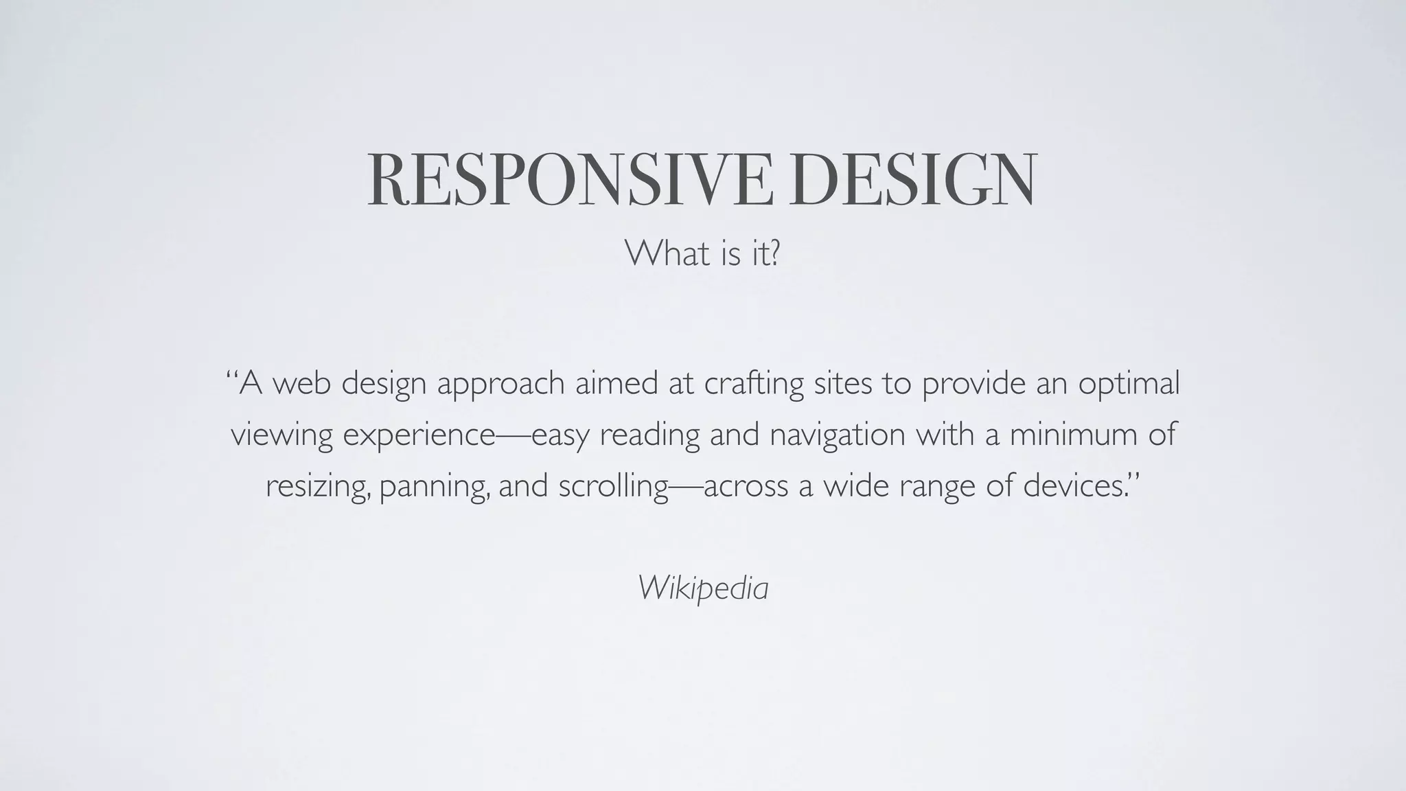
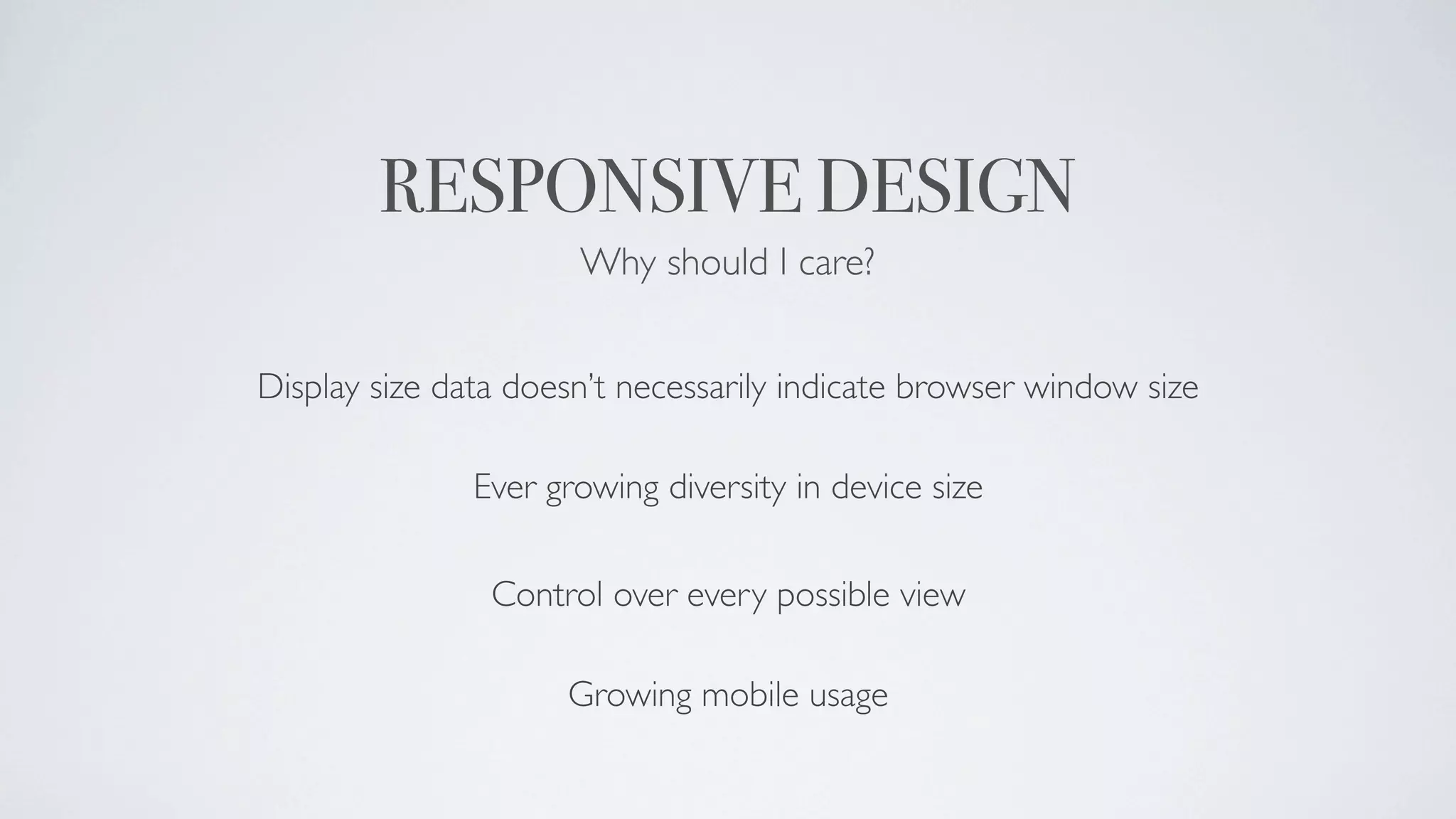
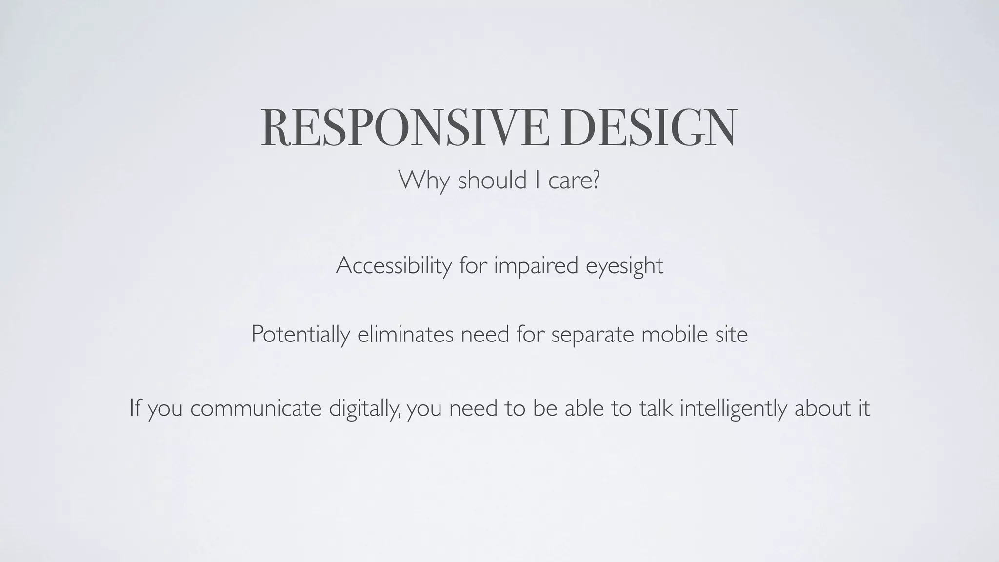
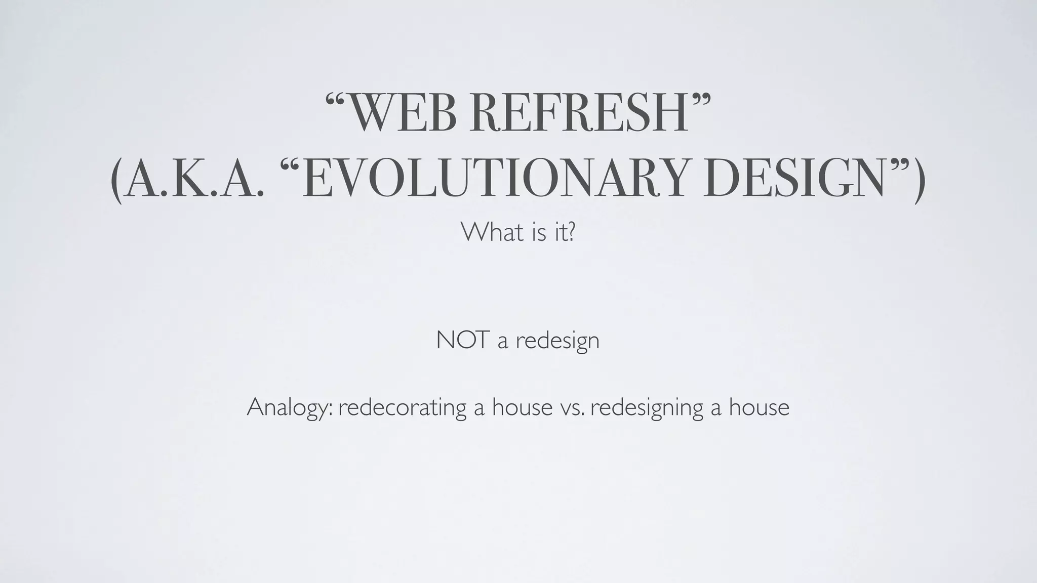
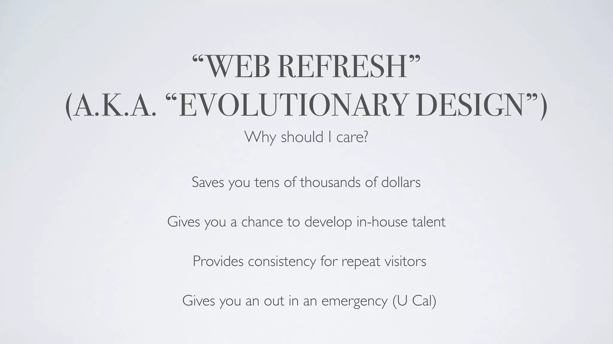
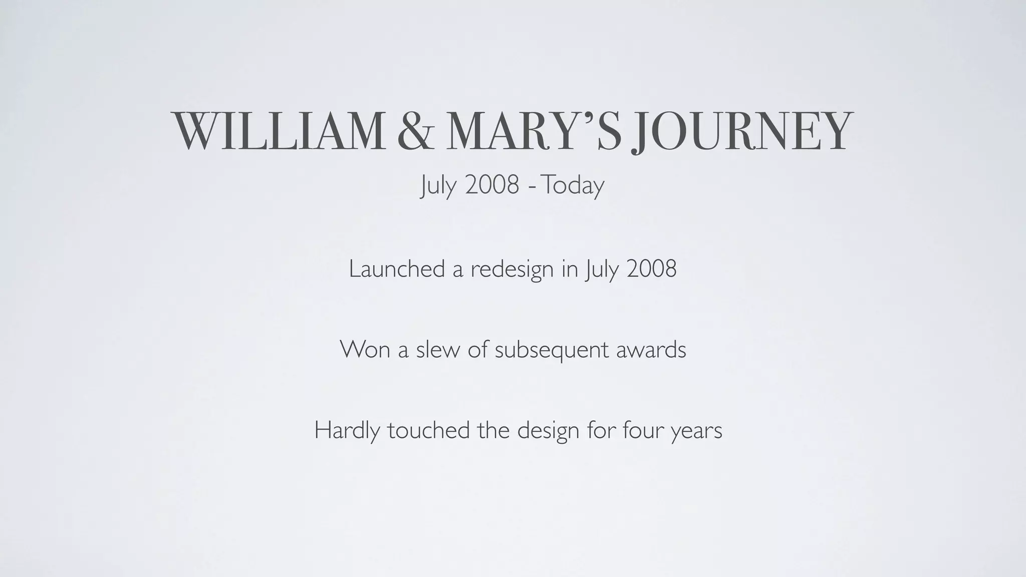
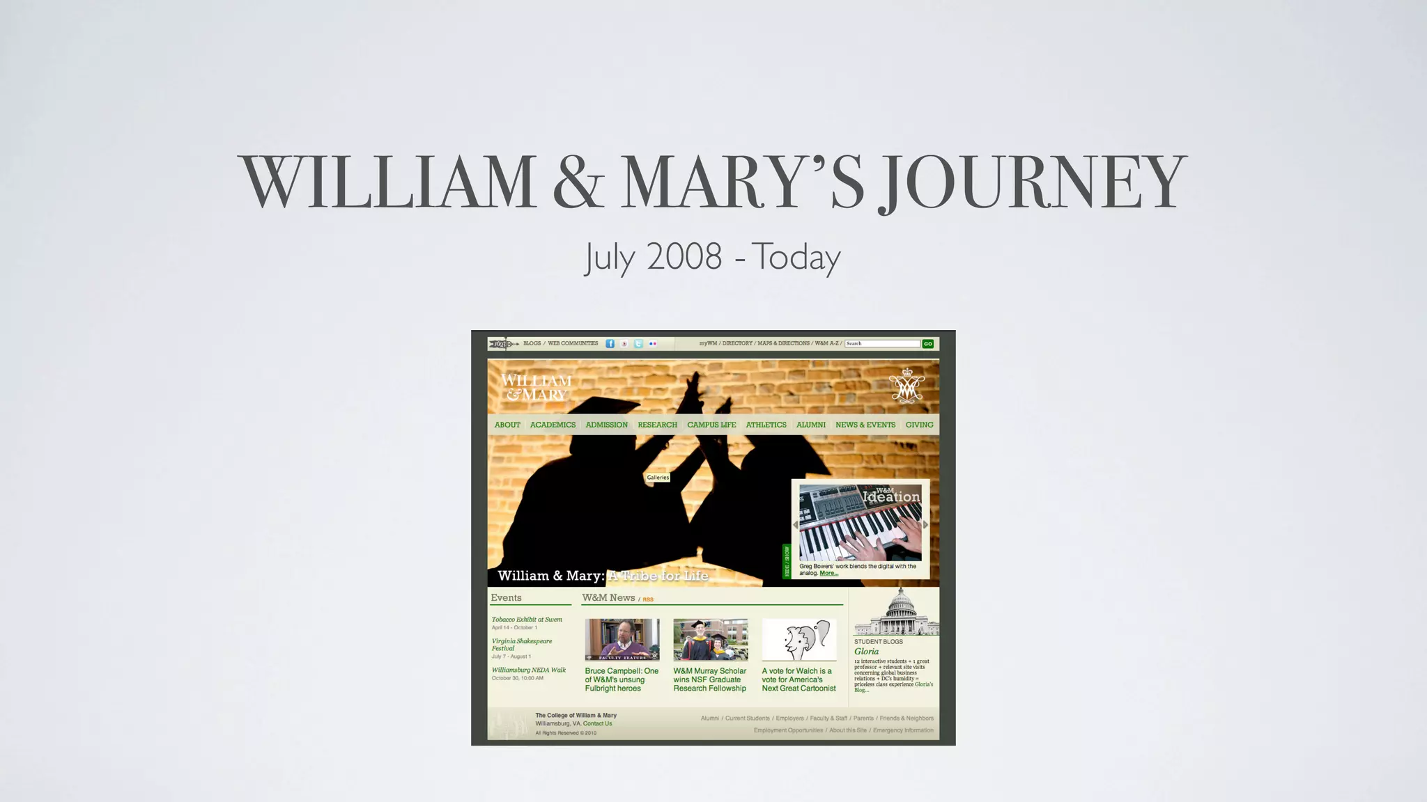
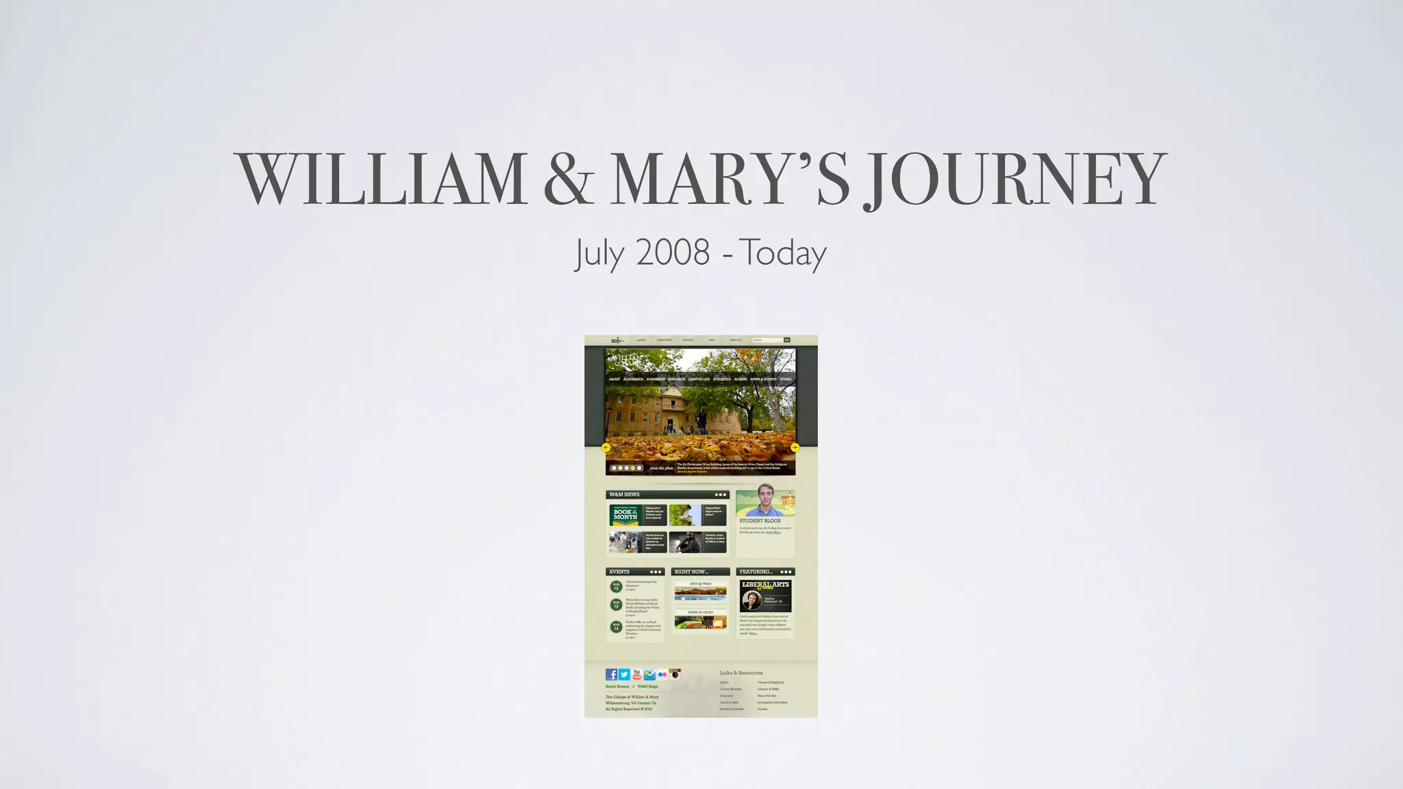
SO RESPONSIVE, SO REFRESHING
              Justin Schoonmaker
          Associate Director of Design
          Office of Creative Services
                William & Mary
ME AT WORK
Art Director   University Branding    Designer    Stuff (Interior Decorating, Instagram, etc.)


                                20%
                                                 30%


                          20%

                                          30%
ME NOT AT WORK
Changing Diapers                      Drinking Starbucks
Drums / Philosophy / Boston Sports    Building Forts
Trying Not to Step On Toys            Lego Star Wars on the Wii


                          7% 8%

                                      25%
                42%
                                     8%
                                8%
ASHER
EDEN
LEVI
THAT’S COOL AND ALL, JUSTIN,
 BUT WHAT’S SO RESPONSIVE
     AND REFRESHING?
RESPONSIVE DESIGN
                            What is it?


“A web design approach aimed at crafting sites to provide an optimal
viewing experience—easy reading and navigation with a minimum of
   resizing, panning, and scrolling—across a wide range of devices.”

                             Wikipedia
RESPONSIVE DESIGN
             What is it?


       Ethan Marcotte (2010)
   designer, usability expert, author


          Mashable (2013)
   “The Year of Responsive Design”
RESPONSIVE DESIGN
         Why should I care?


  Because this is no longer acceptable.
RESPONSIVE DESIGN
     Why should I care?


   And because this is better.
RESPONSIVE DESIGN
                      Why should I care?


Display size data doesn’t necessarily indicate browser window size

               Ever growing diversity in device size

                Control over every possible view

                     Growing mobile usage
RESPONSIVE DESIGN
                             Why should I care?


                      Accessibility for impaired eyesight

             Potentially eliminates need for separate mobile site

If you communicate digitally, you need to be able to talk intelligently about it
“WEB REFRESH”
(A.K.A. “EVOLUTIONARY DESIGN”)
                         What is it?


                       NOT a redesign

     Analogy: redecorating a house vs. redesigning a house
“WEB REFRESH”
(A.K.A. “EVOLUTIONARY DESIGN”)
                  Why should I care?

         Saves you tens of thousands of dollars

      Gives you a chance to develop in-house talent

          Provides consistency for repeat visitors

        Gives you an out in an emergency (U Cal)
SO IF YOU EVER DO THIS...
YOU CAN EASILY REVERT TO THIS.
CAL IS GREAT AND ALL, JUSTIN,
        BUT WHAT DID
    WILLIAM & MARY DO?
WILLIAM & MARY’S JOURNEY
               July 2008 - Today


        Launched a redesign in July 2008


       Won a slew of subsequent awards


     Hardly touched the design for four years
WILLIAM & MARY’S JOURNEY
        July 2008 - Today
WILLIAM & MARY’S JOURNEY
                            July 2008 - Today


               Mid 2011, we needed to “rearrange our closet”


 Homepage refresh happened between 8/11 and 3/12 (leadership turnover)


Cross-campus collaboration with Alumni, Development, and the Business School
WILLIAM & MARY’S JOURNEY
                              July 2008 - Today


                  Launched in 2012 to a lot of great feedback


                  W&M News was happy to have more space


University and College Designer’s Association was happy to give us a design award
WILLIAM & MARY’S JOURNEY
        July 2008 - Today
TELL US MORE, JUSTIN!!!!
DESIGN CONSIDERATIONS
  Need to breathe, but also need more content


              “People don’t scroll”


                Actually, they do
DESIGN CONSIDERATIONS
              Need to breathe, but also need more content


                        http://bit.ly/ZHqZTB

Device diversity makes it almost impossible to define “above the fold”

         Everyone scrolls now: mobile is nothing without it
DESIGN CONSIDERATIONS
The newest generation is born with devices at their fingertips
DESIGN CONSIDERATIONS
          Larger, more informative photos


Stephen Salpukas, our award-winning photographer


             Social media feedback

   Nested photo slideshow with caption space
DESIGN CONSIDERATIONS
                  More contrast


Monochromatic color schemes hit a peak in 2009-ish


   More contrast and color is more popular now
DESIGN CONSIDERATIONS
                        Less boxy


You can now serve rounded corners to people without images
DESIGN CONSIDERATIONS
     Providing “buttons” for tactile navigation


 Provided circles for accessing nested content

 Cut down on links that required text-clicking
DESIGN CONSIDERATIONS
                  Social Media


      Surveyed about two dozen schools


About 80% had social media in footer, not header
RESPONSIVE CONSIDERATIONS

       Do you serve same photos to all devices?


   Spend time getting it to look good in every format
PLANS FOR THE FUTURE
                  Make all sites responsive

                   This is a mammoth task


W&M has over 50,000 webpages with many unique page templates


           6-month timeline for main undergrad site
PLANS FOR THE FUTURE
          Optimizing for Retina Displays

 Retina is not new technology; it’s better technology


            Everyone else will follow suit


           What Apple DOESN’T tell you
PLANS FOR THE FUTURE
                Optimizing for Retina Displays

   Must use graphics/images that are 2x size, NOT 2x resolution


                  Use code to force scale down


The downside: heavier pages OR more code work to detect devices
STOP TALKING TO US, JUSTIN,
 AND LET US TALK A LITTLE.
JUSTIN SCHOONMAKER
     jlscho@wm.edu
       757.221.7984
        @justschoon

So Responsive, So Refreshing

  • 1.
    SO RESPONSIVE, SOREFRESHING Justin Schoonmaker Associate Director of Design Office of Creative Services William & Mary
  • 2.
    ME AT WORK ArtDirector University Branding Designer Stuff (Interior Decorating, Instagram, etc.) 20% 30% 20% 30%
  • 3.
    ME NOT ATWORK Changing Diapers Drinking Starbucks Drums / Philosophy / Boston Sports Building Forts Trying Not to Step On Toys Lego Star Wars on the Wii 7% 8% 25% 42% 8% 8%
  • 4.
  • 5.
  • 6.
  • 7.
    THAT’S COOL ANDALL, JUSTIN, BUT WHAT’S SO RESPONSIVE AND REFRESHING?
  • 8.
    RESPONSIVE DESIGN What is it? “A web design approach aimed at crafting sites to provide an optimal viewing experience—easy reading and navigation with a minimum of resizing, panning, and scrolling—across a wide range of devices.” Wikipedia
  • 9.
    RESPONSIVE DESIGN What is it? Ethan Marcotte (2010) designer, usability expert, author Mashable (2013) “The Year of Responsive Design”
  • 10.
    RESPONSIVE DESIGN Why should I care? Because this is no longer acceptable.
  • 11.
    RESPONSIVE DESIGN Why should I care? And because this is better.
  • 12.
    RESPONSIVE DESIGN Why should I care? Display size data doesn’t necessarily indicate browser window size Ever growing diversity in device size Control over every possible view Growing mobile usage
  • 13.
    RESPONSIVE DESIGN Why should I care? Accessibility for impaired eyesight Potentially eliminates need for separate mobile site If you communicate digitally, you need to be able to talk intelligently about it
  • 14.
    “WEB REFRESH” (A.K.A. “EVOLUTIONARYDESIGN”) What is it? NOT a redesign Analogy: redecorating a house vs. redesigning a house
  • 15.
    “WEB REFRESH” (A.K.A. “EVOLUTIONARYDESIGN”) Why should I care? Saves you tens of thousands of dollars Gives you a chance to develop in-house talent Provides consistency for repeat visitors Gives you an out in an emergency (U Cal)
  • 16.
    SO IF YOUEVER DO THIS...
  • 17.
    YOU CAN EASILYREVERT TO THIS.
  • 18.
    CAL IS GREATAND ALL, JUSTIN, BUT WHAT DID WILLIAM & MARY DO?
  • 19.
    WILLIAM & MARY’SJOURNEY July 2008 - Today Launched a redesign in July 2008 Won a slew of subsequent awards Hardly touched the design for four years
  • 20.
    WILLIAM & MARY’SJOURNEY July 2008 - Today
  • 21.
    WILLIAM & MARY’SJOURNEY July 2008 - Today Mid 2011, we needed to “rearrange our closet” Homepage refresh happened between 8/11 and 3/12 (leadership turnover) Cross-campus collaboration with Alumni, Development, and the Business School
  • 22.
    WILLIAM & MARY’SJOURNEY July 2008 - Today Launched in 2012 to a lot of great feedback W&M News was happy to have more space University and College Designer’s Association was happy to give us a design award
  • 23.
    WILLIAM & MARY’SJOURNEY July 2008 - Today
  • 24.
    TELL US MORE,JUSTIN!!!!
  • 25.
    DESIGN CONSIDERATIONS Need to breathe, but also need more content “People don’t scroll” Actually, they do
  • 26.
    DESIGN CONSIDERATIONS Need to breathe, but also need more content http://bit.ly/ZHqZTB Device diversity makes it almost impossible to define “above the fold” Everyone scrolls now: mobile is nothing without it
  • 27.
    DESIGN CONSIDERATIONS The newestgeneration is born with devices at their fingertips
  • 28.
    DESIGN CONSIDERATIONS Larger, more informative photos Stephen Salpukas, our award-winning photographer Social media feedback Nested photo slideshow with caption space
  • 29.
    DESIGN CONSIDERATIONS More contrast Monochromatic color schemes hit a peak in 2009-ish More contrast and color is more popular now
  • 30.
    DESIGN CONSIDERATIONS Less boxy You can now serve rounded corners to people without images
  • 31.
    DESIGN CONSIDERATIONS Providing “buttons” for tactile navigation Provided circles for accessing nested content Cut down on links that required text-clicking
  • 32.
    DESIGN CONSIDERATIONS Social Media Surveyed about two dozen schools About 80% had social media in footer, not header
  • 33.
    RESPONSIVE CONSIDERATIONS Do you serve same photos to all devices? Spend time getting it to look good in every format
  • 34.
    PLANS FOR THEFUTURE Make all sites responsive This is a mammoth task W&M has over 50,000 webpages with many unique page templates 6-month timeline for main undergrad site
  • 35.
    PLANS FOR THEFUTURE Optimizing for Retina Displays Retina is not new technology; it’s better technology Everyone else will follow suit What Apple DOESN’T tell you
  • 36.
    PLANS FOR THEFUTURE Optimizing for Retina Displays Must use graphics/images that are 2x size, NOT 2x resolution Use code to force scale down The downside: heavier pages OR more code work to detect devices
  • 37.
    STOP TALKING TOUS, JUSTIN, AND LET US TALK A LITTLE.
  • 38.
    JUSTIN SCHOONMAKER jlscho@wm.edu 757.221.7984 @justschoon