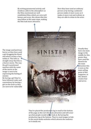
The image used portrays
horror as they have used
a girl dragging the blood
and which creates a face
within it. This tells us
straight away that this is
a horror movie. The way
the girl is positioned
matches with the name
of the movie as the
image is seen to be
expressing the feeling of
sinister.
By having a girl they’ve
have followed codes and
conventions by having a
girl on the front as they
are seen to be vulnerable
and weak.
By writing paranormal activity and
insidious adds to the atmosphere as
the films mentioned are well
established films which are very well
known and scary, this shows that this
may follow in the same steps, making
the film look more attractive.
Usually they
have one main
image in the
middle for this
poster they
have used the
blood to be
the main
attraction this
is seen as the
main selling
point of this
magazine, as
this demon
creates fear
and terror.
Here they have used an ordinary
person as by having a unknown
person makes it more scary as it
makes it more real and realistic as
they are able to relate to the actor.
They’ve placed the production log in small at the bottom
of the page as this isn’t the main attraction and will cover
up what people would rather look at, By having the
production log at the bottom. They’ve used images to link
to the social media websites which attracts the audience
as it stands out.

Sinister poster

  • 1.
    The image usedportrays horror as they have used a girl dragging the blood and which creates a face within it. This tells us straight away that this is a horror movie. The way the girl is positioned matches with the name of the movie as the image is seen to be expressing the feeling of sinister. By having a girl they’ve have followed codes and conventions by having a girl on the front as they are seen to be vulnerable and weak. By writing paranormal activity and insidious adds to the atmosphere as the films mentioned are well established films which are very well known and scary, this shows that this may follow in the same steps, making the film look more attractive. Usually they have one main image in the middle for this poster they have used the blood to be the main attraction this is seen as the main selling point of this magazine, as this demon creates fear and terror. Here they have used an ordinary person as by having a unknown person makes it more scary as it makes it more real and realistic as they are able to relate to the actor. They’ve placed the production log in small at the bottom of the page as this isn’t the main attraction and will cover up what people would rather look at, By having the production log at the bottom. They’ve used images to link to the social media websites which attracts the audience as it stands out.