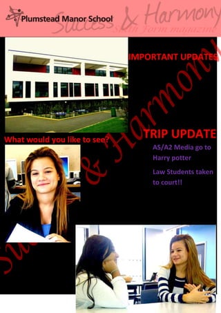
The Sixth Form magazine's first issue provides updates on trips taken by AS/A2 Media students to visit the Harry Potter studio tour and law students visiting a court, and asks readers what else they would like to see covered in the magazine.
The Sixth Form magazine's first issue provides updates on trips taken by AS/A2 Media students to the Harry Potter studio tour and law students visiting a court, and asks readers what else they would like to see covered in the magazine.
This newsletter contains updates about trips taken by students and interviews with previous students about their university experiences. It also asks current students what they would like to see in future newsletters.
The document discusses planning images for a music magazine focused on the R&B genre. It will represent R&B stereotypes through trendy models wearing hats on the front cover in a medium close-up shot. The double page spread will show a model in a medium long shot. Both male and female models ages 16-18 from various ethnicities, mainly black, will be featured to represent typical R&B artists. The front cover male model will have a straight face with no smile, wearing a hoodie and hat, while the female model will be more classy with natural makeup and no props. Camera shots will include medium close-ups for the front cover and contents page, and a medium long shot for the double
The document analyzes the poster for the horror film "Friday the 13th". It notes that the use of the color red signifies danger and blood, while the colors grey, black and red create an atmosphere of darkness and terror. The lighting focuses on a deserted wooded location, suggesting the main character could be alone, and a glimmer of light leaves open a slim chance of escape from the villain. The tagline "Welcome to Crystal Lake" surrounded by black suggests the characters are trapped at the lake, which is depicted as dark and evil in contrast to how lakes are normally seen.
The document compares the cover layout and design conventions between an established magazine and a new magazine called Source. It notes several key differences in how information like the magazine name, cover lines, images, and article text are presented on the covers. The document also discusses decisions made in designing the cover for Source, such as including multiple pictures and pull quotes, as well as using different colors and layouts compared to the established magazine.
My music magazine targets 16-30 year olds and features a smiling black male model on the cover wearing trendy clothing, departing from the more serious poses typically found on other magazines. The layout and design was influenced by Vibe magazine, including placing the model's head over the magazine name on the cover. The magazine would likely be distributed by major companies like Time Inc. and Prometheus Global Media to reach a wide audience across different platforms and expand its recognition. Through constructing the magazine, I learned valuable skills in photography, image editing, layout, and formatting for different platforms to create a professional product.
The document summarizes the design and content choices made for an R&B music magazine targeted at 16-30 year olds. Key points include:
- The cover features a smiling black male model in trendy clothing to represent the target audience while breaking stereotypes of serious poses.
- The magazine aims to appeal to both male and female readers and includes sections beyond just music to draw in a wider range of interests.
- Distribution would likely be through major retailers like WHSmith that have a wide reach, including smaller stores in places like train stations.
The document discusses retaking images for a magazine article to provide more variety and better represent the subject's personality. The author retook pictures of the musician model playing piano and singing into a microphone. One image used shows the model smiling, going against the stereotype of serious R&B artists. The images were edited in Photoshop by cropping out backgrounds and airbrushing faces to look even on white or transparent backgrounds for use in the magazine layout.
The document analyzes how a horror film uses micro-elements to present gender. It discusses several codes and conventions of horror films, including portraying women and children as vulnerable victims and the killer as usually male. The analysis then summarizes the plot of the specific horror film, noting how it follows some typical codes like having the female protagonist become the victim and her power changing over the course of the film so she depends on the male father figure for help. However, it also notes some ways the film breaks conventions by having the female protagonist initially seem stronger than the father and later become too powerful for even religious figures to control.
The document analyzes research on the target audience for a new film. It found that most of the audience is between 15-17 years old and female. A majority go to the cinema very or moderately often. Horror was chosen as the genre because it offers something different than many comedy films and has growing popularity, with slasher being the specific sub-genre since it is scarier than supernatural elements in other genres.
The poster effectively matches the title of the film "The Possession" by showing a hand coming out of the mouth and taking control of the face, hinting at what happens in the horror film. Below the title, the tagline "Darkness lives inside" connects to the image and gives the audience an idea of what the film is about while also creating intrigue. Adding the line "Based on a true story" makes the film scarier by implying such an event could happen to a real person, attracting more viewers by making it seem realistic. The background color of white with black/grey patches symbolizes normality mixed with danger.
The poster effectively matches the title of the film "The Possession" by showing a hand coming out of the mouth and taking control of the face, hinting at the horror to come. Below the title, the tagline "Darkness lives inside" links to the image and creates intrigue about what will happen. Including the line "Based on a true story" makes the film scarier by implying such events could happen to ordinary people. The mix of white and black/grey backgrounds in the poster further suggests normality being invaded by danger.
The document analyzes a movie poster that depicts a girl dragging blood to form a sinister face, conveying that this is a horror film. It discusses how the poster follows conventions like featuring a vulnerable female character. Mentioning other popular horror films like "Paranormal Activity" and "Insidious" aims to position this film similarly. While most posters center around one main image, this poster uses the bloody image and an unknown actor to create fear and make the story more realistic and relatable.
The document analyzes the poster for the horror film "Friday the 13th". It notes that the use of the color red signifies danger and blood, while the colors grey, black and red create an atmosphere of darkness and terror. The lighting focuses on a deserted wooded location, suggesting the main character could be alone, and a glimmer of light leaves open a slim chance of escape from the villain. The tagline "Welcome to Crystal Lake" surrounded by black suggests the characters are trapped at the lake, which is depicted as dark and evil in contrast to how lakes are normally seen.
The document analyzes the poster for the horror film "Friday the 13th". It discusses several elements of the poster and their symbolism:
1) The use of the colors red, grey, and black create an atmosphere of darkness, terror, and signify danger and blood which is typical for a horror film.
2) The lighting focuses on a deserted wooded location, implying the main character could be alone which builds suspense. A small glimmer of light also suggests a slim chance of escape from the villain.
3) The tag line "Welcome to Crystal Lake" surrounded by black suggests the characters are trapped at the lake, which is an unusual, dark, and evil place contrary to how lakes
The document describes the design elements of a movie poster or magazine cover. Key elements include a barcode placed openly to not cover the image, a darker red color used for the text to fit the color scheme, and the magazine title in red to stand out. The film title uses the largest font to catch attention while still matching other fonts. The full page image clearly shows what the magazine or film is about. Additional details like other actors and included articles are also presented.
This document provides a detailed shot-by-shot analysis of the trailer for the film Annabelle. It describes each scene, shot, and edit in the trailer, noting things like camera angles, lighting, sounds, and any elements that build tension. Major events summarized include an initially normal neighborhood setting, dark and scary subsequent shots, sounds of crickets and then a loud noise with blood splatter, glimpses of the killer, a lady holding a creepy doll in the dark with light behind her, flashes of the killer in action, and a final shot of the doll with blood in its eye.
This document analyzes the trailer for the film "Insidious" through a breakdown of shots from 0:00 to 1:47. It describes the establishing shots of the family home, shots of each family member, the darkening tone and increasing tension as strange things begin to happen. Shots of a hand and scary moves between the name of the film build atmosphere. Quick cuts show the issues culminating in an unexpected jump scare from the monster to end the trailer.
This document analyzes and summarizes a movie trailer. It breaks down the trailer scene by scene, noting aspects like the music, camera work, visuals and tone used to build suspense and intrigue around the horror film being advertised. Key details like the production company, director credits and release date are also pointed out. The overall summary aims to give viewers a sense of what to expect from the trailer in terms of storytelling techniques and the type of scary movie being promoted.
The document is an analysis of the trailer for the film "Mama." It provides timestamps and descriptions of various shots and scenes from the trailer to analyze the filmmaking techniques used to build tension and convey the plot. Key moments analyzed include establishing shots of the setting, changes in music to suggest something ominous is about to happen, diegetic sounds of characters and animals to create an unsettling atmosphere, and cuts between the young girl and shadowy figures or the "monster" to build suspense throughout the trailer.
The magazine uses eye-catching design elements to attract its target audience. These include a bright red masthead and the prominent placement of the James Bond actor on the cover holding a gun. These visuals align with the action and violence of Bond films. Additional details like the price and date are de-emphasized so as not to distract from the main image and tagline promoting the quality content within. The design aims to draw in readers within the target 24-50+ age range who are already fans of the Bond franchise.
The document discusses design choices for a music magazine masthead. It notes that red and white provide high contrast and are commonly used color combinations. It plans to use a white masthead with red text to follow conventions while making it distinct. It will also use a bold font and different outline. Additionally, it will have the magazine image overlap the masthead to mimic established designs and draw attention.
The document analyzes the contents pages of three magazines: Billboard magazine, Top of the Pops magazine, and The Magazine. For Billboard, it notes the clear page numbers, use of different text sizes and colors to draw attention to main articles, and placement of charts to make the page stand out. For Top of the Pops, it discusses highlighting important text, using a heading to engage readers, and showing consistency with the front page articles. For The Magazine, it examines the image of rapper Piles that stands out on the neat page, with analysis of his pose, jewelry and tattoos that represent his background and status in the industry.
This document analyzes the front covers of four different music magazines. For each magazine cover, it describes the layout elements including the main cover line, masthead, color schemes used, placement of images and text, and how these design choices work to attract readers' attention and highlight key information. Across the four magazine covers, common techniques included using bold colors and text, centering important details, and featuring popular artists to draw recognition and interest from the target audiences.
Hifsa Hussain evaluates the design elements of her school magazine for sixth form students. She changed the masthead to make the magazine name more prominent in red to draw attention based on survey feedback. On the front cover, she included three relevant images - a long shot of the sixth form building to appeal to students, a close-up of a smiling student doing work, and two students talking. She selected cover lines suggested by her research group on topics appealing to sixth formers like exams, UCAS, and student feedback. The design aims to attract the target audience of 16-18 year old students.
Will Smith is featured prominently on the magazine cover as the main character in the film I Am Legend. The bold red and white text and graphics draw attention to key elements like the film title and Will Smith's name. A short blurb provides context about the film's genre and setting without fully summarizing the plot, enticing readers to learn more by purchasing the magazine.
Will Smith is featured prominently on the magazine cover to promote his starring role in the film I Am Legend, drawing attention to both him and the movie. The bold white text of the title stands out against a red backdrop, representing the danger theme of the film and drawing viewers' attention to its name.
Aleks is an 18-year-old applying for the role of "One Chosen Girl" in her group's movie. She believes she is well-suited for the role because she has been involved in all aspects of the project, including script writing, filming, acting, and editing. Aleks has experience with drama in school and outside activities. She cites her camera skills, ability to improvise, and understanding of the group's vision as qualities that would help her bring the character to life for the movie trailer.
How Barcodes Can Be Leveraged Within Odoo 17Celine George
In this presentation, we will explore how barcodes can be leveraged within Odoo 17 to streamline our manufacturing processes. We will cover the configuration steps, how to utilize barcodes in different manufacturing scenarios, and the overall benefits of implementing this technology.
This presentation was provided by Rebecca Benner, Ph.D., of the American Society of Anesthesiologists, for the second session of NISO's 2024 Training Series "DEIA in the Scholarly Landscape." Session Two: 'Expanding Pathways to Publishing Careers,' was held June 13, 2024.
Philippine Edukasyong Pantahanan at Pangkabuhayan (EPP) CurriculumMJDuyan
(𝐓𝐋𝐄 𝟏𝟎𝟎) (𝐋𝐞𝐬𝐬𝐨𝐧 𝟏)-𝐏𝐫𝐞𝐥𝐢𝐦𝐬
𝐃𝐢𝐬𝐜𝐮𝐬𝐬 𝐭𝐡𝐞 𝐄𝐏𝐏 𝐂𝐮𝐫𝐫𝐢𝐜𝐮𝐥𝐮𝐦 𝐢𝐧 𝐭𝐡𝐞 𝐏𝐡𝐢𝐥𝐢𝐩𝐩𝐢𝐧𝐞𝐬:
- Understand the goals and objectives of the Edukasyong Pantahanan at Pangkabuhayan (EPP) curriculum, recognizing its importance in fostering practical life skills and values among students. Students will also be able to identify the key components and subjects covered, such as agriculture, home economics, industrial arts, and information and communication technology.
𝐄𝐱𝐩𝐥𝐚𝐢𝐧 𝐭𝐡𝐞 𝐍𝐚𝐭𝐮𝐫𝐞 𝐚𝐧𝐝 𝐒𝐜𝐨𝐩𝐞 𝐨𝐟 𝐚𝐧 𝐄𝐧𝐭𝐫𝐞𝐩𝐫𝐞𝐧𝐞𝐮𝐫:
-Define entrepreneurship, distinguishing it from general business activities by emphasizing its focus on innovation, risk-taking, and value creation. Students will describe the characteristics and traits of successful entrepreneurs, including their roles and responsibilities, and discuss the broader economic and social impacts of entrepreneurial activities on both local and global scales.
A Visual Guide to 1 Samuel | A Tale of Two HeartsSteve Thomason
These slides walk through the story of 1 Samuel. Samuel is the last judge of Israel. The people reject God and want a king. Saul is anointed as the first king, but he is not a good king. David, the shepherd boy is anointed and Saul is envious of him. David shows honor while Saul continues to self destruct.
Andreas Schleicher presents PISA 2022 Volume III - Creative Thinking - 18 Jun...EduSkills OECD
Andreas Schleicher, Director of Education and Skills at the OECD presents at the launch of PISA 2022 Volume III - Creative Minds, Creative Schools on 18 June 2024.
1. Sixth Form magazine
SSUE NO: 1 Date: 25th September
TRIP UPDATE
AS/A2 Media go to
Harry potter
Law Students taken
to court!!
What would you like to see?
IMPORTANT UPDATES