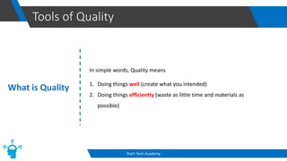
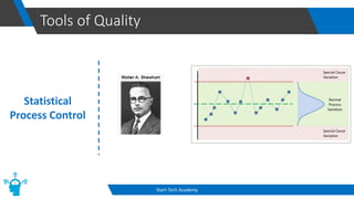
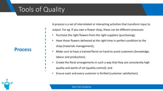
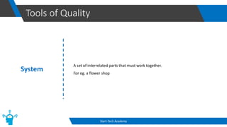
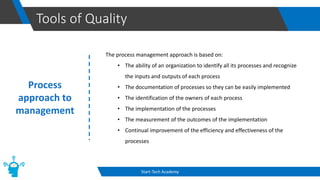
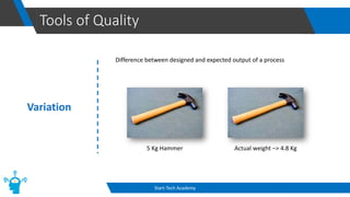
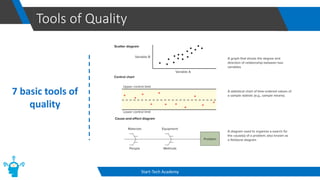
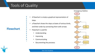
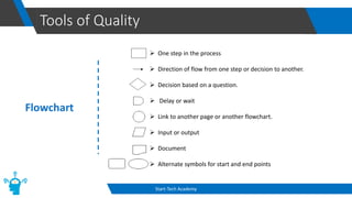
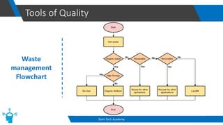
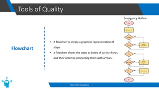
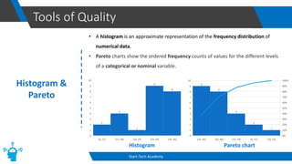
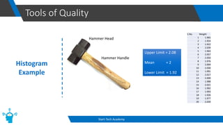
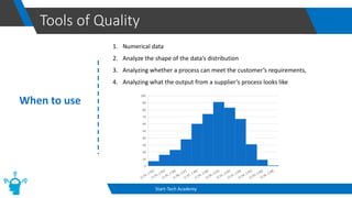
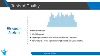
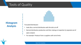
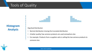
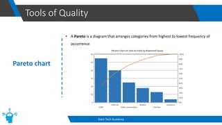
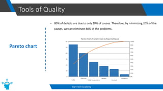
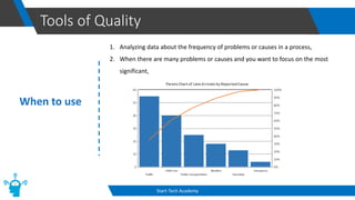
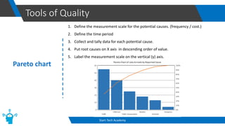
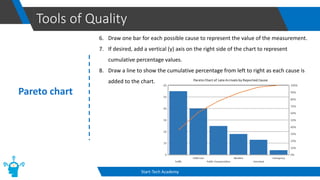
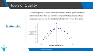
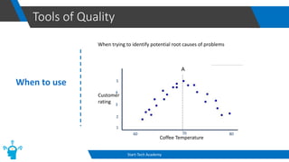
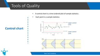
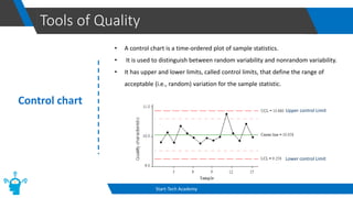
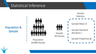
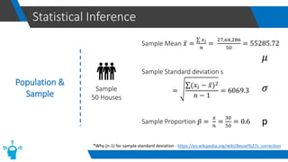
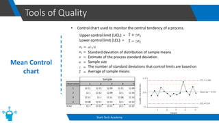
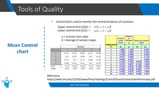
Tools of Quality
Start-Tech Academy
What is Quality
Tools of Quality
Start-Tech Academy
What is Quality
In simple words, Quality means
1. Doing things well (create what you intended)
2. Doing things efficiently (waste as little time and materials as
possible)
Tools of Quality
Start-Tech Academy
What is Quality
People describe quality with some other definitions
1. A product or service that satisfy stated or implied needs
2. A product or service free of deficiencies
3. A product or service that meets customer expectations
4. A product or service that Exceeds customer expectations
5. Superiority to competitors
6. “I’ll know it when I see it”
Tools of Quality
Start-Tech Academy
Statistical
Process Control
Tools of Quality
Start-Tech Academy
Statistical
Process Control
(SPC)
Tools of Quality
Start-Tech Academy
Red Bead
Experiment
Tools of Quality
Start-Tech Academy
Red Bead
Experiment
Tools of Quality
Start-Tech Academy
Red Bead
Experiment
Insights
1. All workers perform within a system that is beyond their control.
2. There will always be some workers that are above the average and some
workers that are below the average.
3. Workers should not be ranked because doing so merely represents a ranking
of the effect of the system on the workers.
4. Only management can change the system.
Tools of Quality
Start-Tech Academy
Process
A process is a set of interrelated or interacting activities that transform input to
output. For eg. If you own a flower shop, these can be different processes
• Purchase the right flowers from the right suppliers (purchasing);
• Have those flowers delivered at the right time in perfect condition to the
shop (materials management);
• Make sure to have a trained florist on hand to assist customers (knowledge,
labour and production);
• Create the floral arrangements in such a way that they are consistently high
quality and works of art (quality control); and
• Ensure each and every customer is thrilled (customer satisfaction).
Tools of Quality
Start-Tech Academy
System
A set of interrelated parts that must work together.
For eg. a flower shop
Tools of Quality
Start-Tech Academy
Process
approach to
management
The process management approach is based on:
• The ability of an organization to identify all its processes and recognize
the inputs and outputs of each process
• The documentation of processes so they can be easily implemented
• The identification of the owners of each process
• The implementation of the processes
• The measurement of the outcomes of the implementation
• Continual improvement of the efficiency and effectiveness of the
processes
Tools of Quality
Start-Tech Academy
Variation
Difference between designed and expected output of a process
5 Kg Hammer Actual weight –> 4.8 Kg
Tools of Quality
Start-Tech Academy
Types of
Variation
Variations can be divided into 2 categories
1. Random or Common variations
Natural variation in the output of a process, created by countless minor
factors. Eg. Older machines generally exhibit a higher degree of natural
variability than newer machines, partly because of worn parts
2. Assignable or Special variation
In process output, a variation whose cause can be identified. A nonrandom
variation. For eg. Tool wear, equipment that needs adjustment, defective
materials, human factors (carelessness, fatigue, noise and other distraction)
Tools of Quality
Start-Tech Academy
Special vs
Common
variation
• Special cause variations can usually be detected and removed by the
individuals operating the process first-hand.
• Common cause variations usually require management action to change
some inherent feature of the process.
• 85/15 rule - The management is responsible for providing the necessary
inputs to correct the majority of variation problems, that is, common causes.
Tools of Quality
Start-Tech Academy
7 basic tools of
quality
• The seven quality tools were originally developed by Japanese professor of
engineering Kaoru Ishikawa.
• The goal was to implement basic, user-friendly tools that workers from various
backgrounds with varied skill sets could implement without extensive training.
• The 7 basic quality tools are as follows:
1. Flow Chart
2. Histogram
3. Cause-and-Effect Diagram
4. Check Sheet
5. Scatter Diagram
6. Control Charts
7. Pareto Charts
Tools of Quality
Start-Tech Academy
7 basic tools of
quality
Tools of Quality
Start-Tech Academy
7 basic tools of
quality
Tools of Quality
Start-Tech Academy
Flowchart
• A flowchart is simply a graphical representation of
steps.
• a flowchart shows the steps as boxes of various kinds,
and their order by connecting them with arrows
• Flowchart is used for
• Understanding
• Improving
• Communicating
• Documenting the proceess
Emergency Hotline
Tools of Quality
Start-Tech Academy
Flowchart
➢ One step in the process
➢ Direction of flow from one step or decision to another.
➢ Decision based on a question.
➢ Delay or wait
➢ Link to another page or another flowchart.
➢ Input or output
➢ Document
➢ Alternate symbols for start and end points
Tools of Quality
Start-Tech Academy
Waste
management
Flowchart
Tools of Quality
Start-Tech Academy
Flowchart
• A flowchart is simply a graphical representation of
steps.
• a flowchart shows the steps as boxes of various kinds,
and their order by connecting them with arrows.
Emergency Hotline
Tools of Quality
Start-Tech Academy
Histogram &
Pareto
• A histogram is an approximate representation of the frequency distribution of
numerical data.
• Pareto charts show the ordered frequency counts of values for the different levels
of a categorical or nominal variable.
Pareto chart
Histogram
Tools of Quality
Start-Tech Academy
Histogram
Example
Hammer Head
Hammer Handle
S.No. Weight
1 1.965
2 1.924
3 1.922
4 2.039
5 1.963
6 2.057
7 2.050
8 1.976
9 2.004
10 2.030
11 1.991
12 2.017
13 2.000
14 1.988
15 2.021
16 1.992
17 1.993
18 1.926
19 1.977
20 2.020
Upper Limit = 2.08
Mean = 2
Lower Limit = 1.92
Tools of Quality
Start-Tech Academy
When to use
1. Numerical data
2. Analyze the shape of the data’s distribution
3. Analyzing whether a process can meet the customer’s requirements,
4. Analyzing what the output from a supplier’s process looks like
Tools of Quality
Start-Tech Academy
Histogram
• A histogram is an approximate representation of the frequency distribution of
numerical data.
Tools of Quality
Start-Tech Academy
Histogram
Analysis
Normal Distribution
• Check the mean and variance
Tools of Quality
Start-Tech Academy
Histogram
Analysis
Skewed Distribution
• Peak is off center and a tail stretches
• Can be due to the natural limit, Example < 0 or hole punch size from punching
machine .
Tools of Quality
Start-Tech Academy
Histogram
Analysis
Double-peaked or bimodal Distribution
• Two peaks
• The outcomes of two processes with different distributions are combined in one
set of data
• For example- Production from a two-shift operation
Tools of Quality
Start-Tech Academy
Histogram
Analysis
Plateau Distribution
• Multiple peaks
• Several processes with normal distributions are combined
• For example- Several workers making the same product in batches
Tools of Quality
Start-Tech Academy
Histogram
Analysis
Truncated Distribution
• looks like a normal distribution with the tails cut off
• Normal distribution production and then relying on inspection to separate out of
specs outputs
• For example- Products from a suppliers with strict limits
Tools of Quality
Start-Tech Academy
Histogram
Analysis
Dog food Distribution
• Normal distribution missing the truncated distribution
• A better quality/ low variance products are used somewhere else
• For example- Products from a suppliers who is selling the low variance products to
someone else
Tools of Quality
Start-Tech Academy
Pareto chart
• A Pareto is a diagram that arranges categories from highest to lowest frequency of
occurrence
Tools of Quality
Start-Tech Academy
Pareto chart
• 80% of defects are due to only 20% of causes. Therefore, by minimizing 20% of the
causes, we can eliminate 80% of the problems.
Tools of Quality
Start-Tech Academy
When to use
1. Analyzing data about the frequency of problems or causes in a process,
2. When there are many problems or causes and you want to focus on the most
significant,
Tools of Quality
Start-Tech Academy
Pareto chart
1. Define the measurement scale for the potential causes. (frequency / cost.)
2. Define the time period
3. Collect and tally data for each potential cause.
4. Put root causes on X axis in descending order of value.
5. Label the measurement scale on the vertical (y) axis.
Tools of Quality
Start-Tech Academy
Pareto chart
6. Draw one bar for each possible cause to represent the value of the measurement.
7. If desired, add a vertical (y) axis on the right side of the chart to represent
cumulative percentage values.
8. Draw a line to show the cumulative percentage from left to right as each cause is
added to the chart.
Tools of Quality
Start-Tech Academy
Scatter plot
A scatter diagram is a chart in which one variable is plotted against another to
determine whether there is a correlation between the two variables. These
diagrams are used to plot the distribution of information in two dimensions.
Coffee Temperature
Customer
rating
80
70
60
1
2
3
4
5
Tools of Quality
Start-Tech Academy
When to use
When trying to identify potential root causes of problems
Coffee Temperature
Customer
rating
80
70
60
1
2
3
4
5
Tools of Quality
Start-Tech Academy
Control chart
• A control chart is a time-ordered plot of sample statistics.
• Each point is a sample statistics
Lower control
Limit
Upper control
Limit
Tools of Quality
Start-Tech Academy
Control chart
• A control chart is a time-ordered plot of sample statistics.
• It is used to distinguish between random variability and nonrandom variability.
• It has upper and lower limits, called control limits, that define the range of
acceptable (i.e., random) variation for the sample statistic.
Lower control Limit
Upper control Limit
Tools of Quality
Start-Tech Academy
Mean
Mean is the average of a data set. It is denoted by µ (mu) or ҧ
𝑥
S.no Observation
1 12
2 11
3 10
4 9
5 8
ҧ
𝑥 =
12 + 11 + 10 + 9 + 8
5
ҧ
𝑥 =
50
5
ҧ
𝑥 = 10
Tools of Quality
Start-Tech Academy
Standard
Deviation
Standard deviation is a measure of dispersement in statistics. “Dispersement” tells you
how much your data is spread out. It is denoted by 𝜎 (sigma)
S.no Observation
1 12
2 11
3 10
4 9
5 8
(12 − 10)2+(11 − 10)2+(10 − 10)2+(9 − 10)2 +(8 − 10)2
5
=
4+1+0+1+4
5
= 2 = 1.41
S.no Observation
1 14
2 12
3 10
4 8
5 6
(14 − 10)2+(12 − 10)2+(10 − 10)2+(8 − 10)2 +(6 − 10)2
5
=
16+4+0+4+16
5
= 8 = 2.82
Statistical Inference
Population &
Sample
Population
10,000 hammers
Sample
50 Hammers
Statistical Inference
Population &
Sample
Population parameter –
Numerical measure of interest related to the population
Population Proportion-
Number of elements in the category of interest/ Total
number of elements
Population mean 𝜇
Standard deviation 𝜎
Population proportion p
Statistical Inference
Population &
Sample
Population
10,000 Houses
Sample
50 Houses
Sample Mean ҧ
𝑥
Sample Standard
deviation s
Sample Proportion ҧ
𝑝
Sample
Statistics
Statistical Inference
Population &
Sample
Sample
50 Houses
Sample Mean ҧ
𝑥 =
σ 𝑥𝑖
𝑛
=
27,64,286
50
= 55285.72
Sample Standard deviation s
=
σ(𝑥𝑖 − ҧ
𝑥)2
𝑛 − 1
= 6069.3
Sample Proportion ҧ
𝑝 =
𝑥
𝑛
=
30
50
= 0.6
𝜇
𝜎
p
*Why (n-1) for sample standard deviation - https://en.wikipedia.org/wiki/Bessel%27s_correction
Tools of Quality
Start-Tech Academy
Control chart
• A control chart is a time-ordered plot of sample statistics.
• It is used to distinguish between random variability and nonrandom variability.
• It has upper and lower limits, called control limits, that define the range of
acceptable (i.e., random) variation for the sample statistic.
Lower control Limit
Upper control Limit
Tools of Quality
Start-Tech Academy
Mean Control
chart
• Control chart used to monitor the central tendency of a process.
Upper control limit (UCL): =
Lower control limit (LCL): =
Standard deviation of distribution of sample means
Estimate of the process standard deviation
Sample size
The number of standard deviations that control limits are based on
Average of sample means
Observation 1 2 3 4 5
1 12.11 12.15 12.09 12.12 12.09
2 12.1 12.12 12.09 12.1 12.14
3 12.11 12.1 12.11 12.08 12.13
4 12.08 12.11 12.15 12.1 12.12
X-bar 12.1 12.12 12.11 12.1 12.12
Sample
Tools of Quality
Start-Tech Academy
Mean Control
chart
• Control chart used to monitor the central tendency of a process.
Upper control limit (UCL): =
Lower control limit (LCL): =
= A factor from table
= Average of sample ranges
Reference:
https://web.mit.edu/2.810/www/files/readings/ControlChartConstantsAndFormulae.pdf
Observation 1 2 3 4 5
1 12.11 12.15 12.09 12.12 12.09
2 12.1 12.12 12.09 12.1 12.14
3 12.11 12.1 12.11 12.08 12.13
4 12.08 12.11 12.15 12.1 12.12
X-bar 12.1 12.12 12.11 12.1 12.12
Range 0.03 0.05 0.06 0.04 0.05
Sample
Tools of Quality
Start-Tech Academy
Range Control
chart
• Control chart used to monitor the dispersion of a process.
Observation 1 2 3 4 5
1 12.11 12.16 12.07 12.17 12.03
2 12.1 12.13 12.06 12.13 12.2
3 12.11 12.09 12.14 12.03 12.13
4 12.08 12.1 12.17 12.07 12.12
X-bar 12.1 12.12 12.11 12.1 12.12
Range 0.03 0.07 0.11 0.14 0.17
Sample
Observation 1 2 3 4 5
1 12.11 12.15 12.09 12.12 12.09
2 12.1 12.12 12.09 12.1 12.14
3 12.11 12.1 12.11 12.08 12.13
4 12.08 12.11 12.15 12.1 12.12
X-bar 12.1 12.12 12.11 12.1 12.12
Range 0.03 0.05 0.06 0.04 0.05
Sample
Tools of Quality
Start-Tech Academy
Range Control
chart
• Control chart used to monitor the dispersion of a process.
Observation 1 2 3 4 5
1 12.11 12.15 12.09 12.12 12.09
2 12.1 12.12 12.09 12.1 12.14
3 12.11 12.1 12.11 12.08 12.13
4 12.08 12.11 12.15 12.1 12.12
X-bar 12.1 12.12 12.11 12.1 12.12
Range 0.03 0.05 0.06 0.04 0.05
Sample
Mean of sample ranges
Tools of Quality
Start-Tech Academy
Control Charts
for Attributes
Used when the process characteristic is counted rather than measured.
1. p-chart is used when the data consist of two categories of items.
a. Good or bad
b. Pass or fail
2. c-chart is used, when the goal is to control the number of occurrences (e.g.,
defects) per unit, For Example
a. Scratches, chips, dents, or errors per item
b. Cracks or faults per unit of distance (e.g., meters, miles)
c. Breaks or tears, per unit of area (e.g., square yard, square meter)
d. Bacteria or pollutants per unit of volume (e.g., gallon, cubic foot, cubic yard)
e. Calls, complaints, failures, equipment breakdowns, or crimes per unit of time
Tools of Quality
Start-Tech Academy
p Chart
A p-chart is used to monitor the proportion of defective items generated by a process.
• The centerline on a p-chart is the average fraction defective in the population, p.
• The standard deviation of the sampling distribution when p is known is
• Control limits
• If p is unknown, which is generally the case,
it can be estimated from samples as ത
𝑃
Tools of Quality
Start-Tech Academy
c Chart
Control chart for attributes, used to monitor the number of defects per unit.
• The mean number of defects per unit is c.
• the standard deviation is 𝑐
• Control limits
• If the value of c is unknown, as is generally the case, the sample estimate, ҧ
𝑐 , is used
in place of c, using
• ҧ
𝑐 = Number of defects ÷ Number of samples.
Tools of Quality
Start-Tech Academy
fishbone
diagram
Also known as cause-and-effect diagram or Ishikawa diagram
The cause-and-effect diagram graphically illustrates the relationship between a given
outcome and all the factors that influence the outcome.
Tools of Quality
Start-Tech Academy
Procedure 1. Agree on a problem statement (effect). Write it at the center right of the flipchart or
whiteboard.
2. Brainstorm the major categories of causes of the problem.
3. Brainstorm all the possible causes of the problem. Ask “Why does this happen?”
4. Ask again, “Why does this happen?” about each cause.
5. When the group runs out of ideas, focus attention to places on the fishbone where
ideas are few.
Tools of Quality
Start-Tech Academy
Determining the
factors
6 Ms in the manufacturing
1. Manpower - the operational and/or functional labor of people engaged in the
design and delivery of a product
2. Method – a production process and its contributing service delivery
processes.
3. Machine - systems, tools, facilities and equipment used for production.
4. Material - raw materials, components and consumables needed to produce a
desired end product.
5. Mother Nature (Environment) – environmental factors that are unpredictable
and uncontrollable like weather, floods, earthquakes, fire, etc.
6. Measurement – manual or automatic inspections and physical
measurements (distance, volume, temperature, pressure, etc.).
Tools of Quality
Start-Tech Academy
Determining the
factors
5 why method
The 5 Whys method, like the fishbone diagram, starts with an underlying problem
statement and then proceeds to ask the question “why?” five times.
1. Why there are large number of rejected cakes? (Under cooking)
2. Why there is an undercooking? (oven was not available)
3. Why oven was not available? (oven stopped working for 30 min)
4. Why oven stopped working? (overheating)
5. Why was there overheating? (temperature gauge was faulty)
Tools of Quality
Start-Tech Academy
fishbone
diagram
Tools of Quality
Start-Tech Academy
fishbone
diagram When to use
• Determining the factors that cause a positive or negative outcome (or effect)
• Focusing on a specific issue without resorting to complaints and irrelevant discussion
• Determining the root causes of a given effect
• Identifying areas where there is a lack of data
Tools of Quality
Start-Tech Academy
fishbone
diagram

Seven tools of quality.pdf

  • 2.
    Tools of Quality Start-TechAcademy What is Quality
  • 3.
    Tools of Quality Start-TechAcademy What is Quality In simple words, Quality means 1. Doing things well (create what you intended) 2. Doing things efficiently (waste as little time and materials as possible)
  • 4.
    Tools of Quality Start-TechAcademy What is Quality People describe quality with some other definitions 1. A product or service that satisfy stated or implied needs 2. A product or service free of deficiencies 3. A product or service that meets customer expectations 4. A product or service that Exceeds customer expectations 5. Superiority to competitors 6. “I’ll know it when I see it”
  • 5.
    Tools of Quality Start-TechAcademy Statistical Process Control
  • 6.
    Tools of Quality Start-TechAcademy Statistical Process Control (SPC)
  • 7.
    Tools of Quality Start-TechAcademy Red Bead Experiment
  • 8.
    Tools of Quality Start-TechAcademy Red Bead Experiment
  • 9.
    Tools of Quality Start-TechAcademy Red Bead Experiment Insights 1. All workers perform within a system that is beyond their control. 2. There will always be some workers that are above the average and some workers that are below the average. 3. Workers should not be ranked because doing so merely represents a ranking of the effect of the system on the workers. 4. Only management can change the system.
  • 10.
    Tools of Quality Start-TechAcademy Process A process is a set of interrelated or interacting activities that transform input to output. For eg. If you own a flower shop, these can be different processes • Purchase the right flowers from the right suppliers (purchasing); • Have those flowers delivered at the right time in perfect condition to the shop (materials management); • Make sure to have a trained florist on hand to assist customers (knowledge, labour and production); • Create the floral arrangements in such a way that they are consistently high quality and works of art (quality control); and • Ensure each and every customer is thrilled (customer satisfaction).
  • 11.
    Tools of Quality Start-TechAcademy System A set of interrelated parts that must work together. For eg. a flower shop
  • 12.
    Tools of Quality Start-TechAcademy Process approach to management The process management approach is based on: • The ability of an organization to identify all its processes and recognize the inputs and outputs of each process • The documentation of processes so they can be easily implemented • The identification of the owners of each process • The implementation of the processes • The measurement of the outcomes of the implementation • Continual improvement of the efficiency and effectiveness of the processes
  • 13.
    Tools of Quality Start-TechAcademy Variation Difference between designed and expected output of a process 5 Kg Hammer Actual weight –> 4.8 Kg
  • 14.
    Tools of Quality Start-TechAcademy Types of Variation Variations can be divided into 2 categories 1. Random or Common variations Natural variation in the output of a process, created by countless minor factors. Eg. Older machines generally exhibit a higher degree of natural variability than newer machines, partly because of worn parts 2. Assignable or Special variation In process output, a variation whose cause can be identified. A nonrandom variation. For eg. Tool wear, equipment that needs adjustment, defective materials, human factors (carelessness, fatigue, noise and other distraction)
  • 15.
    Tools of Quality Start-TechAcademy Special vs Common variation • Special cause variations can usually be detected and removed by the individuals operating the process first-hand. • Common cause variations usually require management action to change some inherent feature of the process. • 85/15 rule - The management is responsible for providing the necessary inputs to correct the majority of variation problems, that is, common causes.
  • 16.
    Tools of Quality Start-TechAcademy 7 basic tools of quality • The seven quality tools were originally developed by Japanese professor of engineering Kaoru Ishikawa. • The goal was to implement basic, user-friendly tools that workers from various backgrounds with varied skill sets could implement without extensive training. • The 7 basic quality tools are as follows: 1. Flow Chart 2. Histogram 3. Cause-and-Effect Diagram 4. Check Sheet 5. Scatter Diagram 6. Control Charts 7. Pareto Charts
  • 17.
    Tools of Quality Start-TechAcademy 7 basic tools of quality
  • 18.
    Tools of Quality Start-TechAcademy 7 basic tools of quality
  • 19.
    Tools of Quality Start-TechAcademy Flowchart • A flowchart is simply a graphical representation of steps. • a flowchart shows the steps as boxes of various kinds, and their order by connecting them with arrows • Flowchart is used for • Understanding • Improving • Communicating • Documenting the proceess Emergency Hotline
  • 20.
    Tools of Quality Start-TechAcademy Flowchart ➢ One step in the process ➢ Direction of flow from one step or decision to another. ➢ Decision based on a question. ➢ Delay or wait ➢ Link to another page or another flowchart. ➢ Input or output ➢ Document ➢ Alternate symbols for start and end points
  • 21.
    Tools of Quality Start-TechAcademy Waste management Flowchart
  • 22.
    Tools of Quality Start-TechAcademy Flowchart • A flowchart is simply a graphical representation of steps. • a flowchart shows the steps as boxes of various kinds, and their order by connecting them with arrows. Emergency Hotline
  • 23.
    Tools of Quality Start-TechAcademy Histogram & Pareto • A histogram is an approximate representation of the frequency distribution of numerical data. • Pareto charts show the ordered frequency counts of values for the different levels of a categorical or nominal variable. Pareto chart Histogram
  • 24.
    Tools of Quality Start-TechAcademy Histogram Example Hammer Head Hammer Handle S.No. Weight 1 1.965 2 1.924 3 1.922 4 2.039 5 1.963 6 2.057 7 2.050 8 1.976 9 2.004 10 2.030 11 1.991 12 2.017 13 2.000 14 1.988 15 2.021 16 1.992 17 1.993 18 1.926 19 1.977 20 2.020 Upper Limit = 2.08 Mean = 2 Lower Limit = 1.92
  • 25.
    Tools of Quality Start-TechAcademy When to use 1. Numerical data 2. Analyze the shape of the data’s distribution 3. Analyzing whether a process can meet the customer’s requirements, 4. Analyzing what the output from a supplier’s process looks like
  • 26.
    Tools of Quality Start-TechAcademy Histogram • A histogram is an approximate representation of the frequency distribution of numerical data.
  • 27.
    Tools of Quality Start-TechAcademy Histogram Analysis Normal Distribution • Check the mean and variance
  • 28.
    Tools of Quality Start-TechAcademy Histogram Analysis Skewed Distribution • Peak is off center and a tail stretches • Can be due to the natural limit, Example < 0 or hole punch size from punching machine .
  • 29.
    Tools of Quality Start-TechAcademy Histogram Analysis Double-peaked or bimodal Distribution • Two peaks • The outcomes of two processes with different distributions are combined in one set of data • For example- Production from a two-shift operation
  • 30.
    Tools of Quality Start-TechAcademy Histogram Analysis Plateau Distribution • Multiple peaks • Several processes with normal distributions are combined • For example- Several workers making the same product in batches
  • 31.
    Tools of Quality Start-TechAcademy Histogram Analysis Truncated Distribution • looks like a normal distribution with the tails cut off • Normal distribution production and then relying on inspection to separate out of specs outputs • For example- Products from a suppliers with strict limits
  • 32.
    Tools of Quality Start-TechAcademy Histogram Analysis Dog food Distribution • Normal distribution missing the truncated distribution • A better quality/ low variance products are used somewhere else • For example- Products from a suppliers who is selling the low variance products to someone else
  • 33.
    Tools of Quality Start-TechAcademy Pareto chart • A Pareto is a diagram that arranges categories from highest to lowest frequency of occurrence
  • 34.
    Tools of Quality Start-TechAcademy Pareto chart • 80% of defects are due to only 20% of causes. Therefore, by minimizing 20% of the causes, we can eliminate 80% of the problems.
  • 35.
    Tools of Quality Start-TechAcademy When to use 1. Analyzing data about the frequency of problems or causes in a process, 2. When there are many problems or causes and you want to focus on the most significant,
  • 36.
    Tools of Quality Start-TechAcademy Pareto chart 1. Define the measurement scale for the potential causes. (frequency / cost.) 2. Define the time period 3. Collect and tally data for each potential cause. 4. Put root causes on X axis in descending order of value. 5. Label the measurement scale on the vertical (y) axis.
  • 37.
    Tools of Quality Start-TechAcademy Pareto chart 6. Draw one bar for each possible cause to represent the value of the measurement. 7. If desired, add a vertical (y) axis on the right side of the chart to represent cumulative percentage values. 8. Draw a line to show the cumulative percentage from left to right as each cause is added to the chart.
  • 38.
    Tools of Quality Start-TechAcademy Scatter plot A scatter diagram is a chart in which one variable is plotted against another to determine whether there is a correlation between the two variables. These diagrams are used to plot the distribution of information in two dimensions. Coffee Temperature Customer rating 80 70 60 1 2 3 4 5
  • 39.
    Tools of Quality Start-TechAcademy When to use When trying to identify potential root causes of problems Coffee Temperature Customer rating 80 70 60 1 2 3 4 5
  • 40.
    Tools of Quality Start-TechAcademy Control chart • A control chart is a time-ordered plot of sample statistics. • Each point is a sample statistics Lower control Limit Upper control Limit
  • 41.
    Tools of Quality Start-TechAcademy Control chart • A control chart is a time-ordered plot of sample statistics. • It is used to distinguish between random variability and nonrandom variability. • It has upper and lower limits, called control limits, that define the range of acceptable (i.e., random) variation for the sample statistic. Lower control Limit Upper control Limit
  • 42.
    Tools of Quality Start-TechAcademy Mean Mean is the average of a data set. It is denoted by µ (mu) or ҧ 𝑥 S.no Observation 1 12 2 11 3 10 4 9 5 8 ҧ 𝑥 = 12 + 11 + 10 + 9 + 8 5 ҧ 𝑥 = 50 5 ҧ 𝑥 = 10
  • 43.
    Tools of Quality Start-TechAcademy Standard Deviation Standard deviation is a measure of dispersement in statistics. “Dispersement” tells you how much your data is spread out. It is denoted by 𝜎 (sigma) S.no Observation 1 12 2 11 3 10 4 9 5 8 (12 − 10)2+(11 − 10)2+(10 − 10)2+(9 − 10)2 +(8 − 10)2 5 = 4+1+0+1+4 5 = 2 = 1.41 S.no Observation 1 14 2 12 3 10 4 8 5 6 (14 − 10)2+(12 − 10)2+(10 − 10)2+(8 − 10)2 +(6 − 10)2 5 = 16+4+0+4+16 5 = 8 = 2.82
  • 44.
  • 45.
    Statistical Inference Population & Sample Populationparameter – Numerical measure of interest related to the population Population Proportion- Number of elements in the category of interest/ Total number of elements Population mean 𝜇 Standard deviation 𝜎 Population proportion p
  • 46.
    Statistical Inference Population & Sample Population 10,000Houses Sample 50 Houses Sample Mean ҧ 𝑥 Sample Standard deviation s Sample Proportion ҧ 𝑝 Sample Statistics
  • 47.
    Statistical Inference Population & Sample Sample 50Houses Sample Mean ҧ 𝑥 = σ 𝑥𝑖 𝑛 = 27,64,286 50 = 55285.72 Sample Standard deviation s = σ(𝑥𝑖 − ҧ 𝑥)2 𝑛 − 1 = 6069.3 Sample Proportion ҧ 𝑝 = 𝑥 𝑛 = 30 50 = 0.6 𝜇 𝜎 p *Why (n-1) for sample standard deviation - https://en.wikipedia.org/wiki/Bessel%27s_correction
  • 48.
    Tools of Quality Start-TechAcademy Control chart • A control chart is a time-ordered plot of sample statistics. • It is used to distinguish between random variability and nonrandom variability. • It has upper and lower limits, called control limits, that define the range of acceptable (i.e., random) variation for the sample statistic. Lower control Limit Upper control Limit
  • 49.
    Tools of Quality Start-TechAcademy Mean Control chart • Control chart used to monitor the central tendency of a process. Upper control limit (UCL): = Lower control limit (LCL): = Standard deviation of distribution of sample means Estimate of the process standard deviation Sample size The number of standard deviations that control limits are based on Average of sample means Observation 1 2 3 4 5 1 12.11 12.15 12.09 12.12 12.09 2 12.1 12.12 12.09 12.1 12.14 3 12.11 12.1 12.11 12.08 12.13 4 12.08 12.11 12.15 12.1 12.12 X-bar 12.1 12.12 12.11 12.1 12.12 Sample
  • 50.
    Tools of Quality Start-TechAcademy Mean Control chart • Control chart used to monitor the central tendency of a process. Upper control limit (UCL): = Lower control limit (LCL): = = A factor from table = Average of sample ranges Reference: https://web.mit.edu/2.810/www/files/readings/ControlChartConstantsAndFormulae.pdf Observation 1 2 3 4 5 1 12.11 12.15 12.09 12.12 12.09 2 12.1 12.12 12.09 12.1 12.14 3 12.11 12.1 12.11 12.08 12.13 4 12.08 12.11 12.15 12.1 12.12 X-bar 12.1 12.12 12.11 12.1 12.12 Range 0.03 0.05 0.06 0.04 0.05 Sample
  • 51.
    Tools of Quality Start-TechAcademy Range Control chart • Control chart used to monitor the dispersion of a process. Observation 1 2 3 4 5 1 12.11 12.16 12.07 12.17 12.03 2 12.1 12.13 12.06 12.13 12.2 3 12.11 12.09 12.14 12.03 12.13 4 12.08 12.1 12.17 12.07 12.12 X-bar 12.1 12.12 12.11 12.1 12.12 Range 0.03 0.07 0.11 0.14 0.17 Sample Observation 1 2 3 4 5 1 12.11 12.15 12.09 12.12 12.09 2 12.1 12.12 12.09 12.1 12.14 3 12.11 12.1 12.11 12.08 12.13 4 12.08 12.11 12.15 12.1 12.12 X-bar 12.1 12.12 12.11 12.1 12.12 Range 0.03 0.05 0.06 0.04 0.05 Sample
  • 52.
    Tools of Quality Start-TechAcademy Range Control chart • Control chart used to monitor the dispersion of a process. Observation 1 2 3 4 5 1 12.11 12.15 12.09 12.12 12.09 2 12.1 12.12 12.09 12.1 12.14 3 12.11 12.1 12.11 12.08 12.13 4 12.08 12.11 12.15 12.1 12.12 X-bar 12.1 12.12 12.11 12.1 12.12 Range 0.03 0.05 0.06 0.04 0.05 Sample Mean of sample ranges
  • 53.
    Tools of Quality Start-TechAcademy Control Charts for Attributes Used when the process characteristic is counted rather than measured. 1. p-chart is used when the data consist of two categories of items. a. Good or bad b. Pass or fail 2. c-chart is used, when the goal is to control the number of occurrences (e.g., defects) per unit, For Example a. Scratches, chips, dents, or errors per item b. Cracks or faults per unit of distance (e.g., meters, miles) c. Breaks or tears, per unit of area (e.g., square yard, square meter) d. Bacteria or pollutants per unit of volume (e.g., gallon, cubic foot, cubic yard) e. Calls, complaints, failures, equipment breakdowns, or crimes per unit of time
  • 54.
    Tools of Quality Start-TechAcademy p Chart A p-chart is used to monitor the proportion of defective items generated by a process. • The centerline on a p-chart is the average fraction defective in the population, p. • The standard deviation of the sampling distribution when p is known is • Control limits • If p is unknown, which is generally the case, it can be estimated from samples as ത 𝑃
  • 55.
    Tools of Quality Start-TechAcademy c Chart Control chart for attributes, used to monitor the number of defects per unit. • The mean number of defects per unit is c. • the standard deviation is 𝑐 • Control limits • If the value of c is unknown, as is generally the case, the sample estimate, ҧ 𝑐 , is used in place of c, using • ҧ 𝑐 = Number of defects ÷ Number of samples.
  • 56.
    Tools of Quality Start-TechAcademy fishbone diagram Also known as cause-and-effect diagram or Ishikawa diagram The cause-and-effect diagram graphically illustrates the relationship between a given outcome and all the factors that influence the outcome.
  • 57.
    Tools of Quality Start-TechAcademy Procedure 1. Agree on a problem statement (effect). Write it at the center right of the flipchart or whiteboard. 2. Brainstorm the major categories of causes of the problem. 3. Brainstorm all the possible causes of the problem. Ask “Why does this happen?” 4. Ask again, “Why does this happen?” about each cause. 5. When the group runs out of ideas, focus attention to places on the fishbone where ideas are few.
  • 58.
    Tools of Quality Start-TechAcademy Determining the factors 6 Ms in the manufacturing 1. Manpower - the operational and/or functional labor of people engaged in the design and delivery of a product 2. Method – a production process and its contributing service delivery processes. 3. Machine - systems, tools, facilities and equipment used for production. 4. Material - raw materials, components and consumables needed to produce a desired end product. 5. Mother Nature (Environment) – environmental factors that are unpredictable and uncontrollable like weather, floods, earthquakes, fire, etc. 6. Measurement – manual or automatic inspections and physical measurements (distance, volume, temperature, pressure, etc.).
  • 59.
    Tools of Quality Start-TechAcademy Determining the factors 5 why method The 5 Whys method, like the fishbone diagram, starts with an underlying problem statement and then proceeds to ask the question “why?” five times. 1. Why there are large number of rejected cakes? (Under cooking) 2. Why there is an undercooking? (oven was not available) 3. Why oven was not available? (oven stopped working for 30 min) 4. Why oven stopped working? (overheating) 5. Why was there overheating? (temperature gauge was faulty)
  • 60.
    Tools of Quality Start-TechAcademy fishbone diagram
  • 61.
    Tools of Quality Start-TechAcademy fishbone diagram When to use • Determining the factors that cause a positive or negative outcome (or effect) • Focusing on a specific issue without resorting to complaints and irrelevant discussion • Determining the root causes of a given effect • Identifying areas where there is a lack of data
  • 62.
    Tools of Quality Start-TechAcademy fishbone diagram