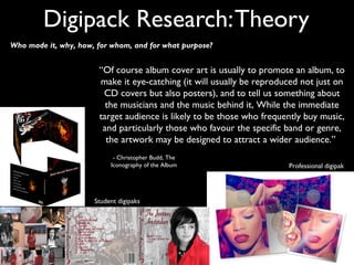
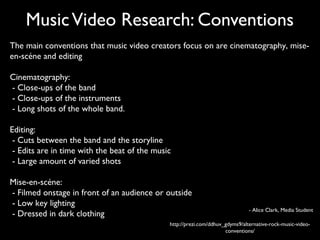
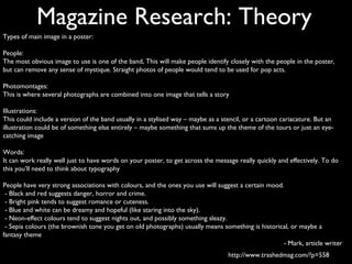
Secondary Research
     Lauren Kilvington
Music Video Research: Theory
 “A look at any professional work will identify conventions but you need to look at material from a
 similar context to your own to see what can be achieved and also what can go wrong.
Ten Things to Avoid

1. Well-known songs.
2. Overdone effects – you shouldn’t use effects just to disguise poor
footage.
3. Aimless driving around.
4. Scenes involving booze, fags or drugs (even simulated).
5. Shots of people just walking around.
6. Speeded up footage or footage run backwards to cover lack of
material.
7. Zooms.
8. Found footage – it should be your own unless there’s an
exceptionally good reason.
9. Atmosphere-less stage footage.
10. Over the top stories.”
                                                                                   - Pete Fraser, Media Magazine
Music Video Research: Theory
   “A student video can never be entirely like a real video. They have
       budgets of thousands of pounds, you have some borrowed
     equipment and enough for a round of sandwiches – but you do
    need to consider exactly what you are planning to deliver before
                     you start the whole process.”
                                                        - Pete Fraser, Media Magazine


Student Music Video


                           Professional Music Video
Magazine Research: Theory
Jason Burns’ article states top tips of how to set out a professional looking magazine.


 1. Plain Background when taking the photograph
    so it is easy to Photoshop.
 2. Photos taken in natural light
 3. Vary angles and shot distances
 4. Take as many images as possible
 5. Try out different fonts                 Professional Advert


 6. Follow the rule of thirds
 7. Think carefully where everything is placed
 8. Make sure everything is selected appropriately
    to suit your theme.
    - Jason Burns, Media Studies teacher
           and A-Level examiner.


                                                           Student album advertisement
Digipack Research: Theory
Who made it, why, how, for whom, and for what purpose?


                       “Of course album cover art is usually to promote an album, to
                       make it eye-catching (it will usually be reproduced not just on
                        CD covers but also posters), and to tell us something about
                         the musicians and the music behind it, While the immediate
                       target audience is likely to be those who frequently buy music,
                        and particularly those who favour the specific band or genre,
                         the artwork may be designed to attract a wider audience.”
                            - Christopher Budd, The
                           Iconography of the Album                    Professional digipak


                      Student digipaks
Music Video Research: Conventions
The main conventions that music video creators focus on are cinematography, mise-
en-scéne and editing

Cinematography:
- Close-ups of the band
- Close-ups of the instruments
- Long shots of the whole band.

Editing:
 - Cuts between the band and the storyline
 - Edits are in time with the beat of the music
 - Large amount of varied shots

Mise-en-scéne:
- Filmed onstage in front of an audience or outside
- Low key lighting
                                                                               - Alice Clark, Media Student
- Dressed in dark clothing
                                              http://prezi.com/ddhuv_gdyms9/alternative-rock-music-video-
                                                                     conventions/
Magazine Research: Theory
Types of main image in a poster:

People:
The most obvious image to use is one of the band, This will make people identify closely with the people in the poster,
but can remove any sense of mystique. Straight photos of people would tend to be used for pop acts.

Photomontages:
This is where several photographs are combined into one image that tells a story

Illustrations:
This could include a version of the band usually in a stylised way – maybe as a stencil, or a cartoon cariacature. But an
illustration could be of something else entirely – maybe something that sums up the theme of the tours or just an eye-
catching image

Words:
It can work really well just to have words on your poster, to get across the message really quickly and effectively. To do
this you’ll need to think about typography

People have very strong associations with colours, and the ones you use will suggest a certain mood.
 - Black and red suggests danger, horror and crime.
 - Bright pink tends to suggest romance or cuteness.
 - Blue and white can be dreamy and hopeful (like staring into the sky).
 - Neon-effect colours tend to suggest nights out, and possibly something sleazy.
 - Sepia colours (the brownish tone you get on old photographs) usually means something is historical, or maybe a
fantasy theme
                                                                                                    - Mark, article writer
                                                                                  http://www.trashedmag.com/?p=558
Proposal
 - These tips have helped my development in the thought process of my music video.
They have made me think of what I can avoid and how to be less predictable with
my ideas. We have chosen a not well known song from a band in Hungary and we
have been in contact and had permission from the band themselves. These tips will
be useful because they are from the chief examiner himself so they will be taken in
and used to our advantage.

 - We now know we have to think about the audience’s understanding and thought
pattern when buying an album. The cover is important to catch the eye of the
audience and entice them to buy the album. We are going to create an album cover
that suits the genre of music and the audience’s needs when it comes to standing out
from other artwork.
 - We know not to expect a high quality professional made music video when it comes
to presenting it. I will try my best in making as good quality as it can be, but it won’t be
as good as someone who has the budget we don’t.

 - We are going to think about the quality of the photographs for our magazine
advertisement. We know the theme and audience is important so we are going to
think about them throughout the project.

Secondary research

  • 1.
    Secondary Research Lauren Kilvington
  • 2.
    Music Video Research:Theory “A look at any professional work will identify conventions but you need to look at material from a similar context to your own to see what can be achieved and also what can go wrong. Ten Things to Avoid 1. Well-known songs. 2. Overdone effects – you shouldn’t use effects just to disguise poor footage. 3. Aimless driving around. 4. Scenes involving booze, fags or drugs (even simulated). 5. Shots of people just walking around. 6. Speeded up footage or footage run backwards to cover lack of material. 7. Zooms. 8. Found footage – it should be your own unless there’s an exceptionally good reason. 9. Atmosphere-less stage footage. 10. Over the top stories.” - Pete Fraser, Media Magazine
  • 3.
    Music Video Research:Theory “A student video can never be entirely like a real video. They have budgets of thousands of pounds, you have some borrowed equipment and enough for a round of sandwiches – but you do need to consider exactly what you are planning to deliver before you start the whole process.” - Pete Fraser, Media Magazine Student Music Video Professional Music Video
  • 4.
    Magazine Research: Theory JasonBurns’ article states top tips of how to set out a professional looking magazine. 1. Plain Background when taking the photograph so it is easy to Photoshop. 2. Photos taken in natural light 3. Vary angles and shot distances 4. Take as many images as possible 5. Try out different fonts Professional Advert 6. Follow the rule of thirds 7. Think carefully where everything is placed 8. Make sure everything is selected appropriately to suit your theme. - Jason Burns, Media Studies teacher and A-Level examiner. Student album advertisement
  • 5.
    Digipack Research: Theory Whomade it, why, how, for whom, and for what purpose? “Of course album cover art is usually to promote an album, to make it eye-catching (it will usually be reproduced not just on CD covers but also posters), and to tell us something about the musicians and the music behind it, While the immediate target audience is likely to be those who frequently buy music, and particularly those who favour the specific band or genre, the artwork may be designed to attract a wider audience.” - Christopher Budd, The Iconography of the Album Professional digipak Student digipaks
  • 6.
    Music Video Research:Conventions The main conventions that music video creators focus on are cinematography, mise- en-scéne and editing Cinematography: - Close-ups of the band - Close-ups of the instruments - Long shots of the whole band. Editing: - Cuts between the band and the storyline - Edits are in time with the beat of the music - Large amount of varied shots Mise-en-scéne: - Filmed onstage in front of an audience or outside - Low key lighting - Alice Clark, Media Student - Dressed in dark clothing http://prezi.com/ddhuv_gdyms9/alternative-rock-music-video- conventions/
  • 7.
    Magazine Research: Theory Typesof main image in a poster: People: The most obvious image to use is one of the band, This will make people identify closely with the people in the poster, but can remove any sense of mystique. Straight photos of people would tend to be used for pop acts. Photomontages: This is where several photographs are combined into one image that tells a story Illustrations: This could include a version of the band usually in a stylised way – maybe as a stencil, or a cartoon cariacature. But an illustration could be of something else entirely – maybe something that sums up the theme of the tours or just an eye- catching image Words: It can work really well just to have words on your poster, to get across the message really quickly and effectively. To do this you’ll need to think about typography People have very strong associations with colours, and the ones you use will suggest a certain mood. - Black and red suggests danger, horror and crime. - Bright pink tends to suggest romance or cuteness. - Blue and white can be dreamy and hopeful (like staring into the sky). - Neon-effect colours tend to suggest nights out, and possibly something sleazy. - Sepia colours (the brownish tone you get on old photographs) usually means something is historical, or maybe a fantasy theme - Mark, article writer http://www.trashedmag.com/?p=558
  • 8.
    Proposal - Thesetips have helped my development in the thought process of my music video. They have made me think of what I can avoid and how to be less predictable with my ideas. We have chosen a not well known song from a band in Hungary and we have been in contact and had permission from the band themselves. These tips will be useful because they are from the chief examiner himself so they will be taken in and used to our advantage. - We now know we have to think about the audience’s understanding and thought pattern when buying an album. The cover is important to catch the eye of the audience and entice them to buy the album. We are going to create an album cover that suits the genre of music and the audience’s needs when it comes to standing out from other artwork. - We know not to expect a high quality professional made music video when it comes to presenting it. I will try my best in making as good quality as it can be, but it won’t be as good as someone who has the budget we don’t. - We are going to think about the quality of the photographs for our magazine advertisement. We know the theme and audience is important so we are going to think about them throughout the project.