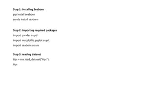
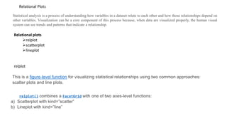
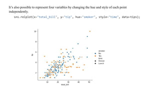
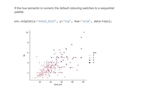
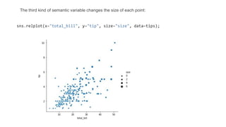
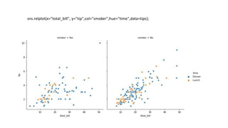
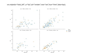
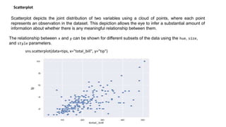
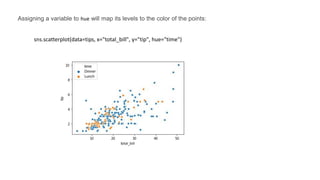
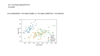
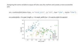
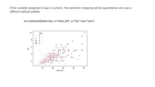
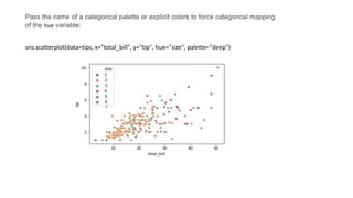
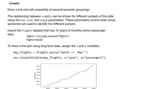
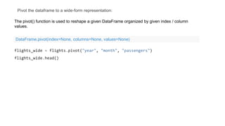
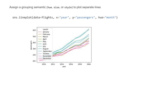
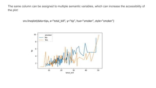
Seaborn visualization
Mr. R. M. Huddar
Dept. of Computer Studies,
CSIBER, Kolhapur
Content
• Introduction
• Installation and importing seaborn package and its datasets
• Relational plots
 relplot
 scatterplot
 lineplot
• Categorical plots
 Barplot
 Countplot
 Boxplot
 Violinplot
 Stripplot
 Swarmplot
 Factorplot
• Regression plots
 Lmplot
• Matrix plots
 Heatmaps
 Clustermaps
INTRODUCTION
Seaborn is a Python data visualization library based on matplotlib. It provides a high-level interface for
drawing attractive and informative statistical graphics.
Seaborn helps you explore and understand your data. Its plotting functions operate on dataframes and
arrays containing whole datasets and internally perform the necessary semantic mapping and statistical
aggregation to produce informative plots.
There is no universally best way to visualize data. Different questions are best answered by different
plots. Seaborn makes it easy to switch between different visual representations by using a consistent
dataset-oriented API.
Step 1: Installing Seaborn
pip install seaborn
conda install seaborn
Step 2: Importing required packages
import pandas as pd
import matplotlib.pyplot as plt
import seaborn as sns
Step 3: reading dataset
tips = sns.load_dataset("tips")
tips
relplot
Statistical analysis is a process of understanding how variables in a dataset relate to each other and how those relationships depend on
other variables. Visualization can be a core component of this process because, when data are visualized properly, the human visual
system can see trends and patterns that indicate a relationship.
Relational Plots
This is a figure-level function for visualizing statistical relationships using two common approaches:
scatter plots and line plots.
relplot() combines a FacetGrid with one of two axes-level functions:
a) Scatterplot with kind=”scatter”
b) Lineplot with kind=”line”
Relational plots
relplot
scatterplot
lineplot
import pandas as pd
import matplotlib.pyplot as plt
import seaborn as sns
tips = sns.load_dataset("tips")
tips
total_bill tip sex smoker day time size
0 16.99 1.01 Female No Sun Dinner 2
1 10.34 1.66 Male No Sun Dinner 3
2 21.01 3.50 Male No Sun Dinner 3
3 23.68 3.31 Male No Sun Dinner 2
4 24.59 3.61 Female No Sun Dinner 4
... ... ... ... ... ... ... ...
239 29.03 5.92 Male No Sat Dinner 3
240 27.18 2.00 Female Yes Sat Dinner 2
seaborn.relplot(x=None, y=None, hue=None, size=None, style=None, data=None, row=None,
col=None, palette=None,markers=None, kind='scatter')
sns.relplot(x="total_bill", y="tip",data=tips);
While the points are plotted in two dimensions, another dimension can be added to the plot by
coloring the points according to a third variable. In seaborn, this is referred to as using a “hue
semantic”
sns.relplot(x="total_bill", y="tip", hue="smoker", data=tips);
To emphasize the difference between the classes, and to improve accessibility, you can
use a different marker style for each class:
sns.relplot(x="total_bill", y="tip", hue="smoker", style="smoker",data=tips);
It’s also possible to represent four variables by changing the hue and style of each point
independently.
sns.relplot(x="total_bill", y="tip", hue="smoker", style="time", data=tips);
If the hue semantic is numeric the default colouring switches to a sequential
palette:
sns.relplot(x="total_bill", y="tip", hue="size", data=tips);
The third kind of semantic variable changes the size of each point:
sns.relplot(x="total_bill", y="tip", size="size", data=tips);
sns.relplot(x="total_bill", y="tip",col="smoker",hue="time",data=tips);
sns.relplot(x="total_bill", y="tip",col="smoker",row="sex",hue="time",data=tips);
sns.relplot(x="total_bill", y="tip", hue="smoker",kind="line",data=tips);
Scatterplot depicts the joint distribution of two variables using a cloud of points, where each point
represents an observation in the dataset. This depiction allows the eye to infer a substantial amount of
information about whether there is any meaningful relationship between them.
Scatterplot
The relationship between x and y can be shown for different subsets of the data using the hue, size,
and style parameters.
sns.scatterplot(data=tips, x="total_bill", y="tip")
Assigning a variable to hue will map its levels to the color of the points:
sns.scatterplot(data=tips, x="total_bill", y="tip", hue="time")
iris = sns.load_dataset("iris")
iris.head
sns.scatterplot(x = iris.sepal_length, y = iris.sepal_width,hue = iris.species)
Assigning the same variable to style will also vary the markers and create a more accessible
plot:
sns.scatterplot(data=tips, x="total_bill", y="tip", hue="time", style="time")
sns.scatterplot(x = iris.sepal_length, y = iris.sepal_width,hue = iris.species,style=iris.species)
If the variable assigned to hue is numeric, the semantic mapping will be quantitative and use a
different default palette:
sns.scatterplot(data=tips, x="total_bill", y="tip", hue="size")
Pass the name of a categorical palette or explicit colors to force categorical mapping
of the hue variable:
sns.scatterplot(data=tips, x="total_bill", y="tip", hue="size", palette="deep")
Lineplot
Draw a line plot with possibility of several semantic groupings.
The relationship between x and y can be shown for different subsets of the data
using the hue, size, and style parameters. These parameters control what visual
semantics are used to identify the different subsets.
Import the flights dataset that has 10 years of monthly airline passenger
data:
To draw a line plot using long-form data, assign the x and y variables:
may_flights = flights.query("month == 'May'")
sns.lineplot(data=may_flights, x="year", y="passengers")
flights = sns.load_dataset("flights")
flights.head()
Pivot the dataframe to a wide-form representation:
flights_wide = flights.pivot("year", "month", "passengers")
flights_wide.head()
The pivot() function is used to reshape a given DataFrame organized by given index / column
values.
DataFrame.pivot(index=None, columns=None, values=None)
To plot a single vector, pass it to data. If the vector is a pandas.Series, it will be plotted against its
index:
sns.lineplot(data=flights_wide["May"])
Assign a grouping semantic (hue, size, or style) to plot separate lines
sns.lineplot(data=flights, x="year", y="passengers", hue="month")
The same column can be assigned to multiple semantic variables, which can increase the accessibility of
the plot:
sns.lineplot(data=tips, x="total_bill", y="tip", hue="smoker", style="smoker")

Seaborn visualization.pptx

  • 1.
    Seaborn visualization Mr. R.M. Huddar Dept. of Computer Studies, CSIBER, Kolhapur
  • 2.
    Content • Introduction • Installationand importing seaborn package and its datasets • Relational plots  relplot  scatterplot  lineplot • Categorical plots  Barplot  Countplot  Boxplot  Violinplot  Stripplot  Swarmplot  Factorplot • Regression plots  Lmplot • Matrix plots  Heatmaps  Clustermaps
  • 3.
    INTRODUCTION Seaborn is aPython data visualization library based on matplotlib. It provides a high-level interface for drawing attractive and informative statistical graphics. Seaborn helps you explore and understand your data. Its plotting functions operate on dataframes and arrays containing whole datasets and internally perform the necessary semantic mapping and statistical aggregation to produce informative plots. There is no universally best way to visualize data. Different questions are best answered by different plots. Seaborn makes it easy to switch between different visual representations by using a consistent dataset-oriented API.
  • 4.
    Step 1: InstallingSeaborn pip install seaborn conda install seaborn Step 2: Importing required packages import pandas as pd import matplotlib.pyplot as plt import seaborn as sns Step 3: reading dataset tips = sns.load_dataset("tips") tips
  • 5.
    relplot Statistical analysis isa process of understanding how variables in a dataset relate to each other and how those relationships depend on other variables. Visualization can be a core component of this process because, when data are visualized properly, the human visual system can see trends and patterns that indicate a relationship. Relational Plots This is a figure-level function for visualizing statistical relationships using two common approaches: scatter plots and line plots. relplot() combines a FacetGrid with one of two axes-level functions: a) Scatterplot with kind=”scatter” b) Lineplot with kind=”line” Relational plots relplot scatterplot lineplot
  • 6.
    import pandas aspd import matplotlib.pyplot as plt import seaborn as sns tips = sns.load_dataset("tips") tips total_bill tip sex smoker day time size 0 16.99 1.01 Female No Sun Dinner 2 1 10.34 1.66 Male No Sun Dinner 3 2 21.01 3.50 Male No Sun Dinner 3 3 23.68 3.31 Male No Sun Dinner 2 4 24.59 3.61 Female No Sun Dinner 4 ... ... ... ... ... ... ... ... 239 29.03 5.92 Male No Sat Dinner 3 240 27.18 2.00 Female Yes Sat Dinner 2
  • 7.
    seaborn.relplot(x=None, y=None, hue=None,size=None, style=None, data=None, row=None, col=None, palette=None,markers=None, kind='scatter') sns.relplot(x="total_bill", y="tip",data=tips);
  • 8.
    While the pointsare plotted in two dimensions, another dimension can be added to the plot by coloring the points according to a third variable. In seaborn, this is referred to as using a “hue semantic” sns.relplot(x="total_bill", y="tip", hue="smoker", data=tips);
  • 9.
    To emphasize thedifference between the classes, and to improve accessibility, you can use a different marker style for each class: sns.relplot(x="total_bill", y="tip", hue="smoker", style="smoker",data=tips);
  • 10.
    It’s also possibleto represent four variables by changing the hue and style of each point independently. sns.relplot(x="total_bill", y="tip", hue="smoker", style="time", data=tips);
  • 11.
    If the huesemantic is numeric the default colouring switches to a sequential palette: sns.relplot(x="total_bill", y="tip", hue="size", data=tips);
  • 12.
    The third kindof semantic variable changes the size of each point: sns.relplot(x="total_bill", y="tip", size="size", data=tips);
  • 13.
  • 14.
  • 15.
  • 16.
    Scatterplot depicts thejoint distribution of two variables using a cloud of points, where each point represents an observation in the dataset. This depiction allows the eye to infer a substantial amount of information about whether there is any meaningful relationship between them. Scatterplot The relationship between x and y can be shown for different subsets of the data using the hue, size, and style parameters. sns.scatterplot(data=tips, x="total_bill", y="tip")
  • 17.
    Assigning a variableto hue will map its levels to the color of the points: sns.scatterplot(data=tips, x="total_bill", y="tip", hue="time")
  • 18.
    iris = sns.load_dataset("iris") iris.head sns.scatterplot(x= iris.sepal_length, y = iris.sepal_width,hue = iris.species)
  • 19.
    Assigning the samevariable to style will also vary the markers and create a more accessible plot: sns.scatterplot(data=tips, x="total_bill", y="tip", hue="time", style="time") sns.scatterplot(x = iris.sepal_length, y = iris.sepal_width,hue = iris.species,style=iris.species)
  • 20.
    If the variableassigned to hue is numeric, the semantic mapping will be quantitative and use a different default palette: sns.scatterplot(data=tips, x="total_bill", y="tip", hue="size")
  • 21.
    Pass the nameof a categorical palette or explicit colors to force categorical mapping of the hue variable: sns.scatterplot(data=tips, x="total_bill", y="tip", hue="size", palette="deep")
  • 22.
    Lineplot Draw a lineplot with possibility of several semantic groupings. The relationship between x and y can be shown for different subsets of the data using the hue, size, and style parameters. These parameters control what visual semantics are used to identify the different subsets. Import the flights dataset that has 10 years of monthly airline passenger data: To draw a line plot using long-form data, assign the x and y variables: may_flights = flights.query("month == 'May'") sns.lineplot(data=may_flights, x="year", y="passengers") flights = sns.load_dataset("flights") flights.head()
  • 23.
    Pivot the dataframeto a wide-form representation: flights_wide = flights.pivot("year", "month", "passengers") flights_wide.head() The pivot() function is used to reshape a given DataFrame organized by given index / column values. DataFrame.pivot(index=None, columns=None, values=None)
  • 24.
    To plot asingle vector, pass it to data. If the vector is a pandas.Series, it will be plotted against its index: sns.lineplot(data=flights_wide["May"])
  • 25.
    Assign a groupingsemantic (hue, size, or style) to plot separate lines sns.lineplot(data=flights, x="year", y="passengers", hue="month")
  • 26.
    The same columncan be assigned to multiple semantic variables, which can increase the accessibility of the plot: sns.lineplot(data=tips, x="total_bill", y="tip", hue="smoker", style="smoker")