Download to read offline


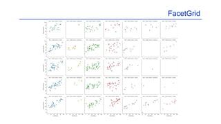

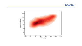

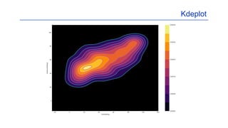

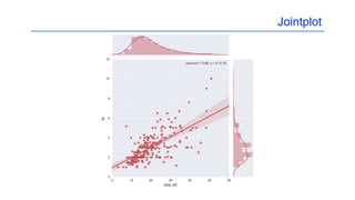
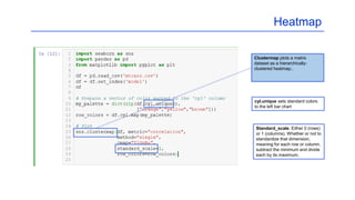
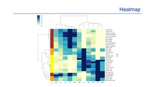


This document provides summaries of various data visualization techniques in Python including: Seaborn is a Python library for statistical graphics and is built on matplotlib. It supports NumPy and Pandas data structures. FacetGrid allows plotting multiple axes showing the same relationship conditioned on different levels of variables from a Pandas DataFrame. It can condition on up to three variables. Kdeplot fits and plots univariate or bivariate kernel density estimates and allows customizing colors, shading, and adding a colorbar. Jointplot provides a wrapper for the JointGrid class to create scatter plots, regression plots, residual plots, and histograms of two variables jointly. Heatmap plots a hierarchically clustered heatmap of a matrix dataset


![python libray for data analytics seaborn[1].pptx](https://cdn.slidesharecdn.com/ss_thumbnails/pythonseaborn1-241222125910-e118d8f2-thumbnail.jpg?width=640&height=640&fit=bounds)


![제 23회 보아즈(BOAZ) 빅데이터 컨퍼런스 - [MBOAX] : ABSA를 활용한 소비자 반응 분석 기반 운영 효율화 대시보드 설계](https://cdn.slidesharecdn.com/ss_thumbnails/3-1boaz23rdconferencemboax-260203102709-9d519923-thumbnail.jpg?width=640&height=640&fit=bounds)


