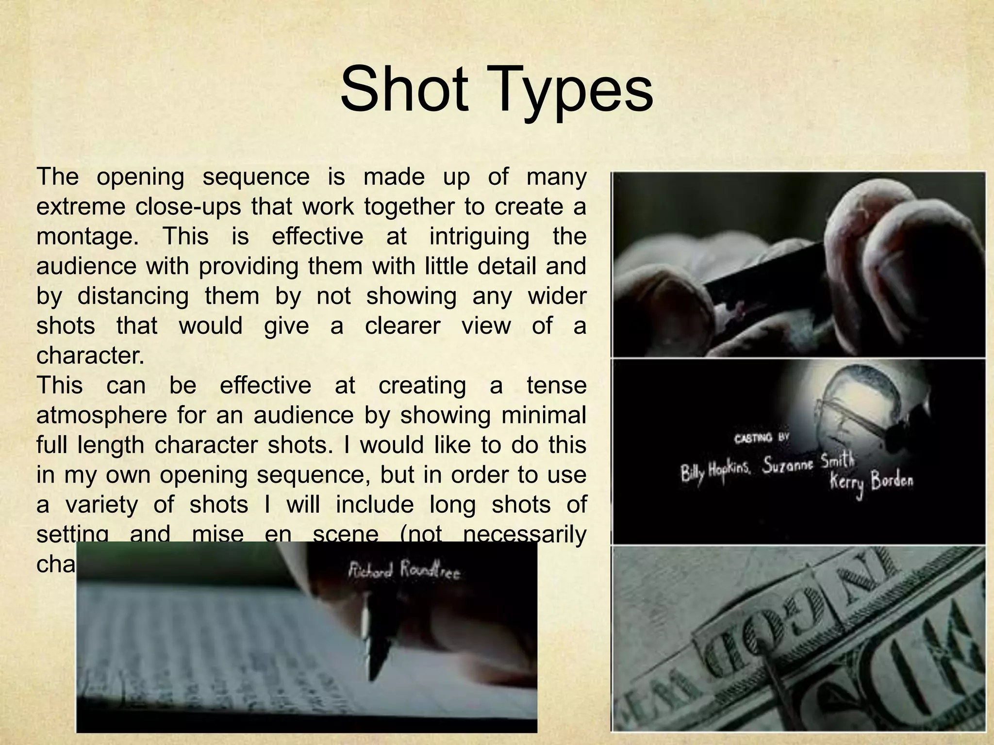
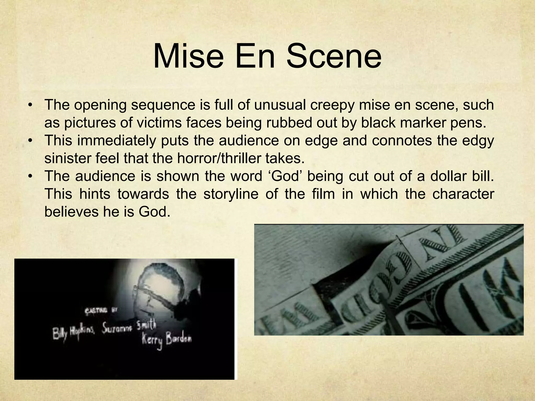
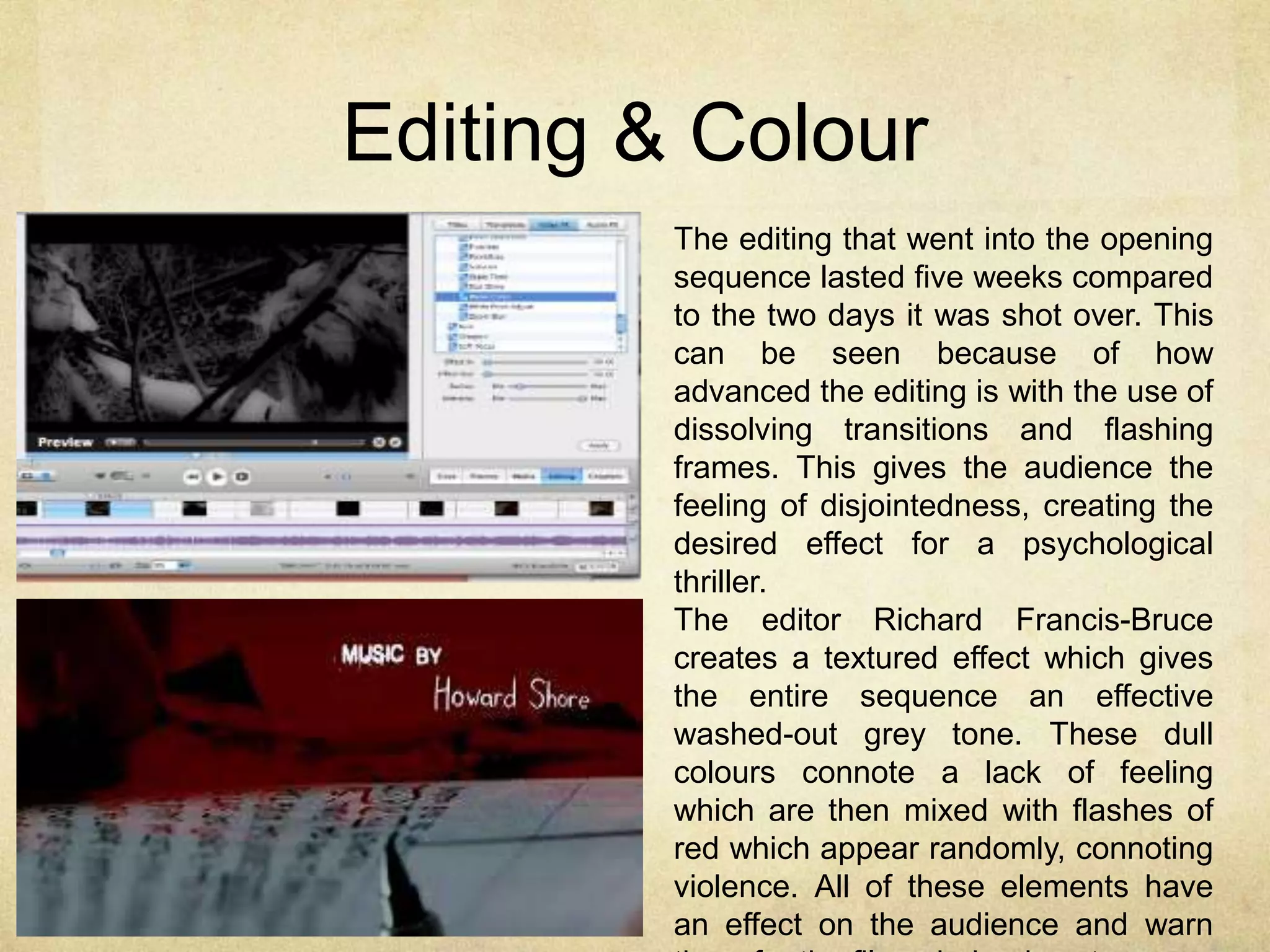
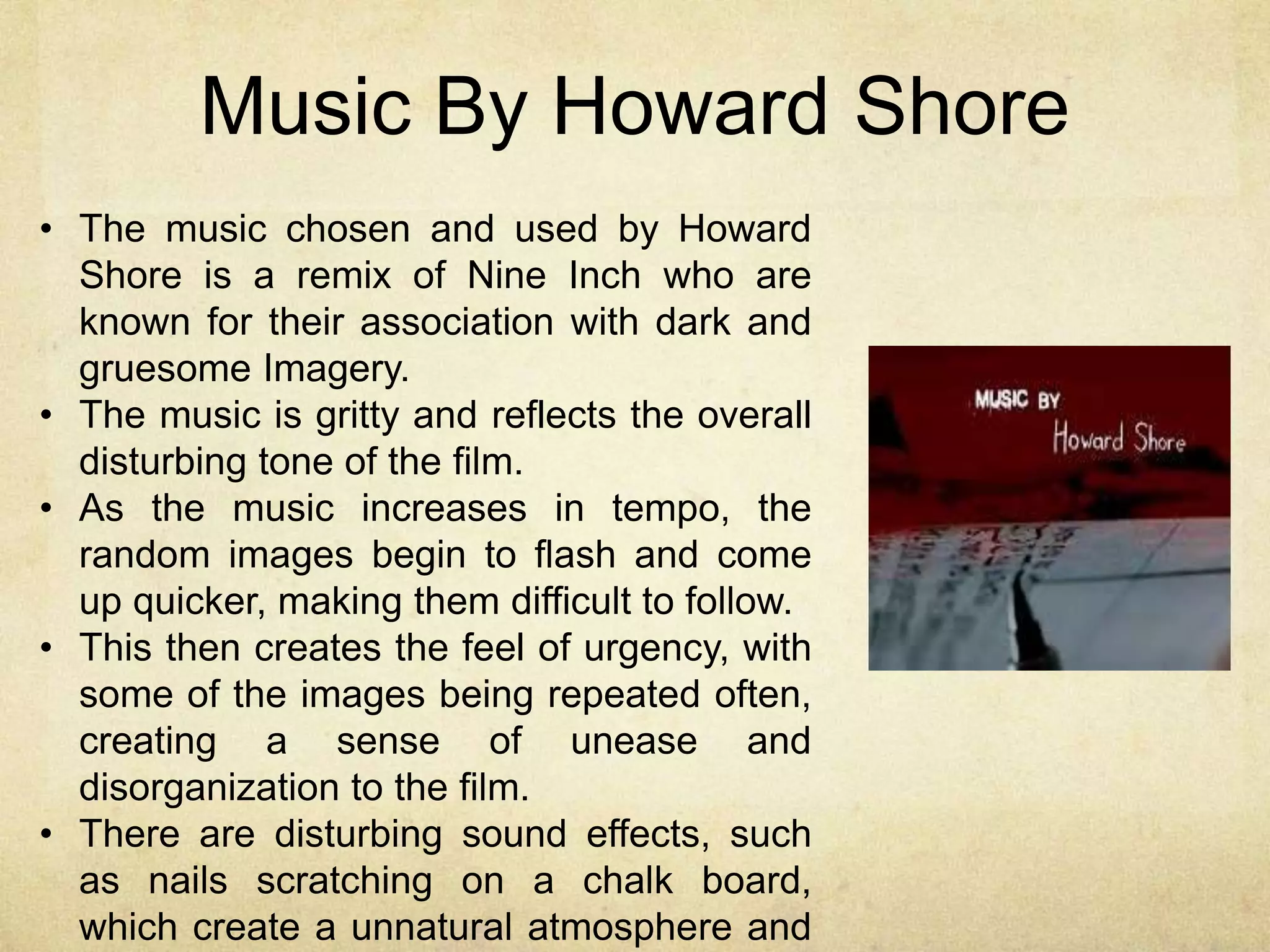
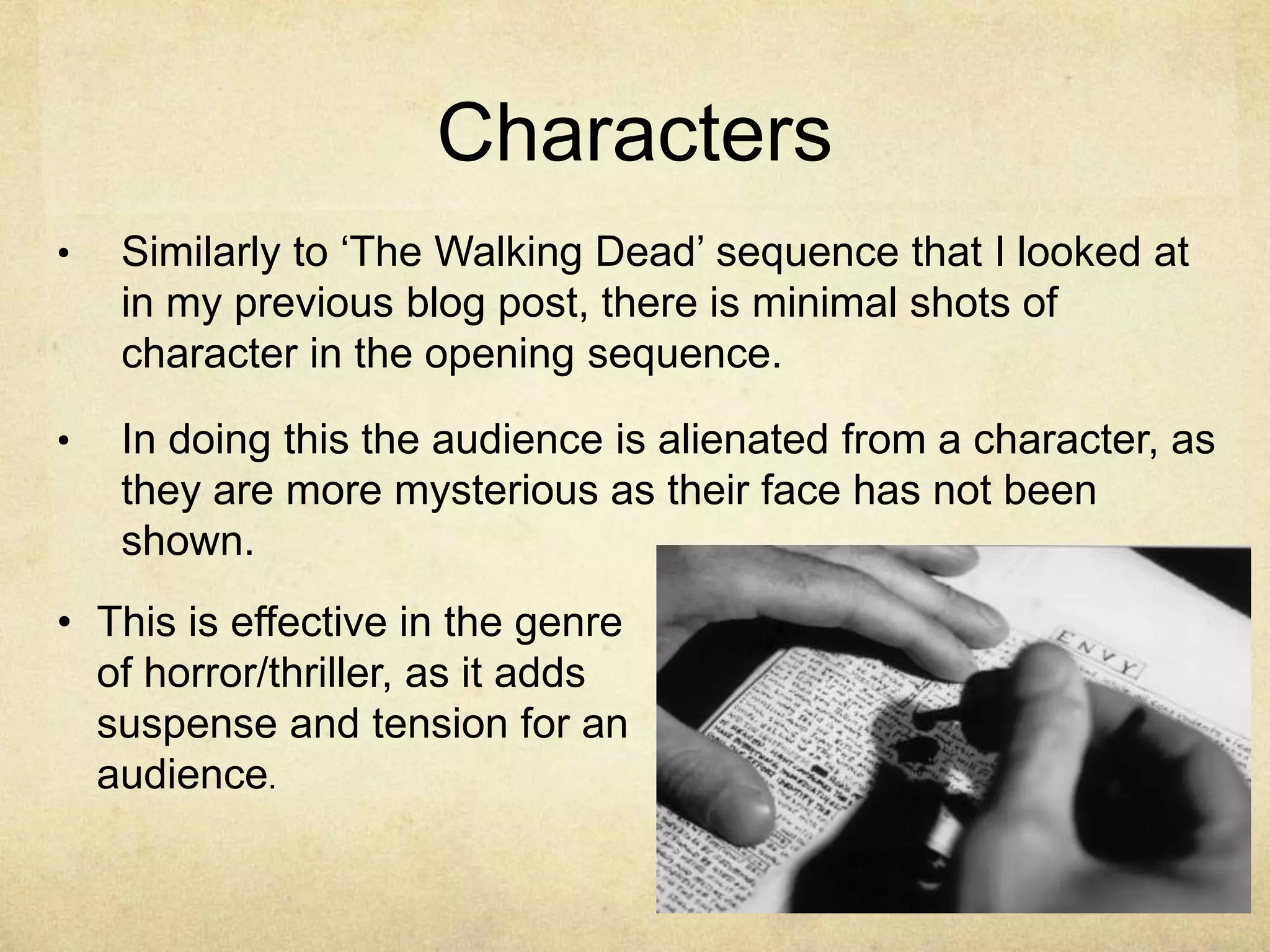
Opening 
sequence 
analysis – 
Se7en 
Directed by David Fincher
Overview 
• Distributer – New Line Cinema 
• The opening sequence of se7en gives the 
audience an insight into the film as it 
introduces the character of the killer (John 
Doe, played by Kevin Spacey) and hints at 
the story. 
• Immediately the title designer Kyle Cooper 
and director David Fincher set the tone and 
atmosphere of Se7en as the disturbing and 
horrific film that it is through their choice of 
shots and titles. 
• Due to the horror/thriller genre, it is clearly 
based at an audience of young adults. 
• Se7en is a well-known psychological thriller 
with horror elements and after watching the 
opening sequence, I feel I want to direct my 
own similarly to this as a psychological 
thriller based film. 
• I do however recognize that in order to meet 
the marking criteria, as well as the clos-ups 
I will need to experiment with a range of
Themes and Typography 
The colours chosen in the opening 
sequence are dark, and dim lit, 
creating the mood and atmosphere 
fit for a thriller/horror. 
The typography used for the 
names, is in a graffiti/handwritten 
style and when names appear they 
are distorted, and look abstract. 
This then gains a shadow 
momentarily, and then goes to the 
next camera shot. This editing 
creates the disturbing and 
uncomfortable feeling for the 
audience which reaches the target 
audience of thriller loving adults.
Shots 
• The shots of the title sequence are a few second frames with 
quick cutaways, not focusing on one particular area; this 
makes it seem as if the audience is seeing something they 
shouldn’t. 
• This then creates the impression that they are witnessing 
some sort of preparation for what is going to take place 
within the film. 
• Another main focus is the extreme close-ups onto objects. 
These limit what the audience is seeing, creating more 
tension and fitting with the thriller genre.
Shot Types 
The opening sequence is made up of many 
extreme close-ups that work together to create a 
montage. This is effective at intriguing the 
audience with providing them with little detail and 
by distancing them by not showing any wider 
shots that would give a clearer view of a 
character. 
This can be effective at creating a tense 
atmosphere for an audience by showing minimal 
full length character shots. I would like to do this 
in my own opening sequence, but in order to use 
a variety of shots I will include long shots of 
setting and mise en scene (not necessarily 
characters).
Mise En Scene 
• The opening sequence is full of unusual creepy mise en scene, such 
as pictures of victims faces being rubbed out by black marker pens. 
• This immediately puts the audience on edge and connotes the edgy 
sinister feel that the horror/thriller takes. 
• The audience is shown the word ‘God’ being cut out of a dollar bill. 
This hints towards the storyline of the film in which the character 
believes he is God.
Editing & Colour 
The editing that went into the opening 
sequence lasted five weeks compared 
to the two days it was shot over. This 
can be seen because of how 
advanced the editing is with the use of 
dissolving transitions and flashing 
frames. This gives the audience the 
feeling of disjointedness, creating the 
desired effect for a psychological 
thriller. 
The editor Richard Francis-Bruce 
creates a textured effect which gives 
the entire sequence an effective 
washed-out grey tone. These dull 
colours connote a lack of feeling 
which are then mixed with flashes of 
red which appear randomly, connoting 
violence. All of these elements have 
an effect on the audience and warn 
them for the films dark edgy story.
Music By Howard Shore 
• The music chosen and used by Howard 
Shore is a remix of Nine Inch who are 
known for their association with dark and 
gruesome Imagery. 
• The music is gritty and reflects the overall 
disturbing tone of the film. 
• As the music increases in tempo, the 
random images begin to flash and come 
up quicker, making them difficult to follow. 
• This then creates the feel of urgency, with 
some of the images being repeated often, 
creating a sense of unease and 
disorganization to the film. 
• There are disturbing sound effects, such 
as nails scratching on a chalk board, 
which create a unnatural atmosphere and
Characters 
• Similarly to ‘The Walking Dead’ sequence that I looked at 
in my previous blog post, there is minimal shots of 
character in the opening sequence. 
• In doing this the audience is alienated from a character, as 
they are more mysterious as their face has not been 
shown. 
• This is effective in the genre 
of horror/thriller, as it adds 
suspense and tension for an 
audience.

Se7en opening sequence

  • 1.
    Opening sequence analysis– Se7en Directed by David Fincher
  • 2.
    Overview • Distributer– New Line Cinema • The opening sequence of se7en gives the audience an insight into the film as it introduces the character of the killer (John Doe, played by Kevin Spacey) and hints at the story. • Immediately the title designer Kyle Cooper and director David Fincher set the tone and atmosphere of Se7en as the disturbing and horrific film that it is through their choice of shots and titles. • Due to the horror/thriller genre, it is clearly based at an audience of young adults. • Se7en is a well-known psychological thriller with horror elements and after watching the opening sequence, I feel I want to direct my own similarly to this as a psychological thriller based film. • I do however recognize that in order to meet the marking criteria, as well as the clos-ups I will need to experiment with a range of
  • 3.
    Themes and Typography The colours chosen in the opening sequence are dark, and dim lit, creating the mood and atmosphere fit for a thriller/horror. The typography used for the names, is in a graffiti/handwritten style and when names appear they are distorted, and look abstract. This then gains a shadow momentarily, and then goes to the next camera shot. This editing creates the disturbing and uncomfortable feeling for the audience which reaches the target audience of thriller loving adults.
  • 4.
    Shots • Theshots of the title sequence are a few second frames with quick cutaways, not focusing on one particular area; this makes it seem as if the audience is seeing something they shouldn’t. • This then creates the impression that they are witnessing some sort of preparation for what is going to take place within the film. • Another main focus is the extreme close-ups onto objects. These limit what the audience is seeing, creating more tension and fitting with the thriller genre.
  • 5.
    Shot Types Theopening sequence is made up of many extreme close-ups that work together to create a montage. This is effective at intriguing the audience with providing them with little detail and by distancing them by not showing any wider shots that would give a clearer view of a character. This can be effective at creating a tense atmosphere for an audience by showing minimal full length character shots. I would like to do this in my own opening sequence, but in order to use a variety of shots I will include long shots of setting and mise en scene (not necessarily characters).
  • 6.
    Mise En Scene • The opening sequence is full of unusual creepy mise en scene, such as pictures of victims faces being rubbed out by black marker pens. • This immediately puts the audience on edge and connotes the edgy sinister feel that the horror/thriller takes. • The audience is shown the word ‘God’ being cut out of a dollar bill. This hints towards the storyline of the film in which the character believes he is God.
  • 7.
    Editing & Colour The editing that went into the opening sequence lasted five weeks compared to the two days it was shot over. This can be seen because of how advanced the editing is with the use of dissolving transitions and flashing frames. This gives the audience the feeling of disjointedness, creating the desired effect for a psychological thriller. The editor Richard Francis-Bruce creates a textured effect which gives the entire sequence an effective washed-out grey tone. These dull colours connote a lack of feeling which are then mixed with flashes of red which appear randomly, connoting violence. All of these elements have an effect on the audience and warn them for the films dark edgy story.
  • 8.
    Music By HowardShore • The music chosen and used by Howard Shore is a remix of Nine Inch who are known for their association with dark and gruesome Imagery. • The music is gritty and reflects the overall disturbing tone of the film. • As the music increases in tempo, the random images begin to flash and come up quicker, making them difficult to follow. • This then creates the feel of urgency, with some of the images being repeated often, creating a sense of unease and disorganization to the film. • There are disturbing sound effects, such as nails scratching on a chalk board, which create a unnatural atmosphere and
  • 9.
    Characters • Similarlyto ‘The Walking Dead’ sequence that I looked at in my previous blog post, there is minimal shots of character in the opening sequence. • In doing this the audience is alienated from a character, as they are more mysterious as their face has not been shown. • This is effective in the genre of horror/thriller, as it adds suspense and tension for an audience.