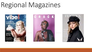
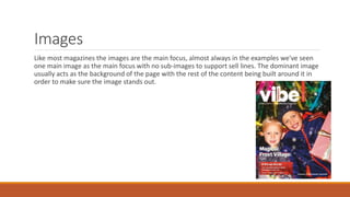
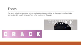
Crack magazine uses bright colors that stand out on shelves and draw readers in. The layout focuses attention on the dominant cover image and masthead by keeping other content minimal. Only essential information like price and issue number are included to emphasize the large, central image. The fonts are also large and bold to draw attention to the masthead separated from other content. Images are the main focus of the page design with one large cover image as the background.