In what way does
your media product
use, develop or
challenge forms and
conventions of real
media products?
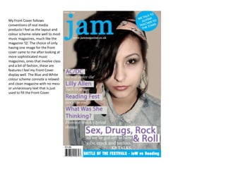
My Front Cover follows
conventions of real media
products I feel as the layout and
colour scheme relate well to most
music magazines, much like the
magazine ‘Q’. The choice of only
having one image for the front
cover came to me after looking at
more sophisticated music
magazines, ones that involve class
and a bit of fashion, these are
features I feel my Front Cover
display well. The Blue and White
colour scheme connote a relaxed
and clean magazine with no mess
or unnecessary text that is just
used to fill the Front Cover.
I feel it challenges forms of real
media as there is little text on the
Front Cover, not a lot of the
articles are featured on the Front
Cover as I feel that is the function
for the Contents Page. It is also
very heavily right handed, there is
not a lot on the left side which
isn’t often done in music
magazine, there is usually an
equal amount of text and pictures
on each side.
How does your
media product
represent particular
social groups?
I feel that my Front Cover
represents elder teenagers and
young adults, females, who are
interested in music, fashion and
their idols and are looking for
inspiration. I think the general
music genre feel for this magazine
is Indie Rock and Indie Grime. The
language used in the Front Cover
connotes youth which may
suggest the music genre and age
range. These social groups will
feel they would enjoy my music
magazine due to the laid back yet
smart look in my Front Cover.
What kind of media
institution might
distribute your media
product and why?
I feel that Bauer Media is a
fantastic media institution for my
media magazine to be distributed
by; it also publishes Q, the music
magazine that inspired my work
the most. It ‘reaches over
nineteen million UK’ residents
which I feel are important
factors, to have such a vast
audience so my magazine would
reach many of the audience’s
wants and needs.

Questions1 3front

  • 2.
    In what waydoes your media product use, develop or challenge forms and conventions of real media products?
  • 3.
    My Front Coverfollows conventions of real media products I feel as the layout and colour scheme relate well to most music magazines, much like the magazine ‘Q’. The choice of only having one image for the front cover came to me after looking at more sophisticated music magazines, ones that involve class and a bit of fashion, these are features I feel my Front Cover display well. The Blue and White colour scheme connote a relaxed and clean magazine with no mess or unnecessary text that is just used to fill the Front Cover.
  • 4.
    I feel itchallenges forms of real media as there is little text on the Front Cover, not a lot of the articles are featured on the Front Cover as I feel that is the function for the Contents Page. It is also very heavily right handed, there is not a lot on the left side which isn’t often done in music magazine, there is usually an equal amount of text and pictures on each side.
  • 5.
    How does your mediaproduct represent particular social groups?
  • 6.
    I feel thatmy Front Cover represents elder teenagers and young adults, females, who are interested in music, fashion and their idols and are looking for inspiration. I think the general music genre feel for this magazine is Indie Rock and Indie Grime. The language used in the Front Cover connotes youth which may suggest the music genre and age range. These social groups will feel they would enjoy my music magazine due to the laid back yet smart look in my Front Cover.
  • 7.
    What kind ofmedia institution might distribute your media product and why?
  • 8.
    I feel thatBauer Media is a fantastic media institution for my media magazine to be distributed by; it also publishes Q, the music magazine that inspired my work the most. It ‘reaches over nineteen million UK’ residents which I feel are important factors, to have such a vast audience so my magazine would reach many of the audience’s wants and needs.