Questionnaire feedback
•Download as DOCX, PDF•
0 likes•87 views
The document summarizes feedback from a questionnaire about different elements of a magazine, including the front cover, contents page, and a double page spread. For the front cover, respondents liked the main image and color scheme but suggested taking the image on a different background or making the masthead bigger. On the contents page, coverlines and images stood out most, while the masthead and word "contents" were popular features. Respondents felt the page could be better filled. For the double page spread, the title and content layout were liked, and a photo with a better composition was suggested to improve it. Overall, respondents thought the magazine looked professional.
Report
Share
Report
Share

Recommended
Evaluation question 3
The document summarizes feedback received from an audience of 15 people who viewed a documentary, listened to a radio trailer, and looked at a double page spread created by the author. The audience completed an anonymous 12 question survey. The author tallied the feedback and presented it in graphs showing what aspects of the projects the audience liked and suggested changing. Overall, the feedback was positive, with most audience members enjoying the documentary and radio trailer and not wanting to change anything. The feedback will help the author improve future media projects.
Question 5
The document summarizes the results of a focus group survey conducted to evaluate a magazine. Key findings from the survey included that 100% of respondents felt the magazine looked professional, the colors were suitable for the genre, the fonts were good, and it captured the eye. Additionally, 90% felt there was enough content and the photos suited the genre. The focus group pointed out the magazine was professional, eye catching, conventional, and appealed to the target audience. The document discusses how the magazine appealed to its target audience through the use of red, black and white colors, fonts, close-up and album art pictures in a scratched and rough style featuring props like hoods associated with an alternative style.
Cronograma grupo 1
La aplicación de herramientas para la planificación y producción de materiales didácticos con TICs propone un cronograma de actividades que incluye 3 etapas: 1) Análisis y diseño de los materiales, 2) Producción de los materiales digitales, 3) Evaluación y ajuste de los materiales producidos.
Industrialización
El documento discute la responsabilidad de los países industrializados en la protección del medio ambiente. Señala que la industrialización ha afectado negativamente el medio ambiente a través del uso de recursos y generación de desechos. Aunque existen leyes internacionales para proteger el medio ambiente, como la CITES, no se cumplen adecuadamente, lo que amenaza la sustentabilidad a largo plazo. El documento concluye que se necesita crear conciencia pública y cumplir las leyes ambientales para preservar los ecosistem
Trabajo ciudadania javier
Azur y Asmar son dos hermanos que crecen en diferentes países debido a que su padre separa a la familia. Cuando crecen, Azur viaja al país de Asmar y descubre que la gente teme a quienes tienen ojos azules. Conoce a Crapox, quien promete ayudarlo a encontrar al hada de los jinn pero lo engaña. Más tarde, Azur encuentra a su madre y hermano. Juntos buscan al hada superando pruebas como domar un león y rescatar a Asmar de asesinos. Al final, Az
Audience feedback....
The document summarizes the results of a survey of 12 people in a target audience. The survey asked 10 questions about a magazine prototype, including whether the color scheme works, if they would buy the magazine, and if the front cover, contents page, double page spread, and images look appropriate and professional.
Questionnaire Results
The document contains the results of a survey about a magazine. The majority of respondents liked the magazine and said they would buy it. Most also liked the color scheme, layout, number of images, and thought it suitable for their age group. Respondents said they would be willing to pay the proposed price. This suggests the magazine was successful at meeting the target audience's preferences.
Magazine Evaluation
The document summarizes the results of a magazine cover evaluation conducted by distributing questionnaires to classmates and others. Key findings from the questionnaires include:
- Most respondents were female, matching the intended target audience
- Over 75% thought the colors worked well
- About a third didn't think the cover seemed authentic enough
- Suggested changes included making the bar code and some text smaller and rearranging the "extra" section
Questionnaire for my music magazine results
The document summarizes the results of a 15-person questionnaire about a music magazine. Most respondents correctly identified the magazine's genre as indie-pop based on the front cover photo. All said the masthead and advert were suitable. While the article and photos on the double-page spread were easy to understand and fit the genre, some felt the masthead and contents page could be improved, such as with more color. Suggestions to make the magazine better included adding more color to spreads, clarifying the contents page, and brightening the front cover.
Audience feedback final
The respondent collected feedback from 10 people (4 male and 6 female) on various aspects of their rock magazine prototype. For the target audience question, most said the target of 25-40 was suitable. For favorite front cover aspects, answers varied but were generally positive. Respondents also varied in their favorite contents page and double page spread parts but most picked imagery. 100% agreed the fonts and article topic were suitable for a rock magazine. Suggested changes were mostly to the strap line, imagery, and color schemes.
Questionnaire results Evaluation
The document is a survey about a music magazine. It asks respondents questions about their favorite parts of the magazine, their opinions on the color scheme, target audience, genre suitability, article purpose, images, front cover influence, presentation, contents page understandability, and suggested changes. The survey gauges reader opinions on various aspects of the magazine's design, content, and ability to achieve its purpose.
Questionnaire results ev_al
The document is a survey about a music magazine. It asks respondents questions about their favorite parts of the magazine, their opinions on the color scheme, target audience, genre suitability, article purpose, images, front cover influence, presentation, contents page understandability, and suggested changes. The survey gauges reader opinions on various design and content aspects of the magazine.
Questionnaire results ev al
The document is a survey about a music magazine. It asks respondents questions about their favorite parts of the magazine, their opinions on the color scheme, target audience, genre suitability, article purpose, images, front cover influence, presentation, contents page understandability, and suggested changes. The survey gauges reader opinions on various aspects of the magazine through multiple choice and rating scale questions.
Feed back questions results
The document provides feedback on a magazine design project. Key points:
1) Survey respondents correctly identified the magazine's intended genre of pop music and glam theme. They also felt the cover star and design made the front cover successful in attracting attention.
2) Respondents found the contents page clear and navigable, and felt the double page spread design was colorful and the article tempting to read.
3) The magazine was seen as appealing to its target audience of females aged 16-21. Suggested improvements related to adding more cover lines or reducing color, but overall the design received positive feedback.
Audience feednbackkkk
The document contains questions from an audience feedback survey about a magazine cover, contents page, and double page article spread. Respondents were asked about the visual design and layout elements, and whether the content and variety seemed interesting. Some felt the cover design was eye-catching but text was too small, while the contents page and double page spread used colorful pictures and layouts to engage readers.
Evaluation question 3
The student learned the following from audience feedback on their magazine and poster:
- The print tasks met genre conventions according to most feedback. However, the poster tagline was not effective for some and needed changing.
- The backgrounds used were suitable according to all feedback.
- The magazine cover lines were not very appealing and were moved to increase appeal.
- The main images were appealing to all feedback.
- While the magazine cover was not appealing to most, changes to cover lines and added material should increase its charm.
- The film poster was appealing to all feedback, though the tagline needs changing as mentioned earlier.
2) What have you learned from your audience feedback?
The respondent created a radio advert, billboard, and newspaper and received feedback through a questionnaire. Most respondents felt the products worked well together and found the billboard message quick to understand. However, half did not find the radio jingle catchy. While pictures were seen as appropriate, some criticisms of the projects were contradictory. The majority felt the newspaper had a good balance of text and images, though its structure was viewed more critically. Overall, the feedback helped the respondent learn what marketing elements were successful or needed improvement.
Audience Feedback on Contents Page
The document summarizes audience feedback from surveys on draft covers and contents pages for a magazine. Key findings include that the layout appealed to most respondents but the writing was hard to read against the pale blue background. Most felt the contents page was effective and stylish but some felt it should be changed. Half said they would change something about the drafts and 40% said they likely wouldn't buy the magazine based on the contents page. Strengths included using typical technical elements and fonts appealing to most, while weaknesses were half wanting changes and 40% unlikely to buy.
Audience Feedback on Contents Page
The document summarizes audience feedback from surveys on draft contents pages for a magazine. Key findings include: the layout and color scheme appealed to most respondents, though one felt the writing could stand out more; the close-up model photo was considered very effective; half of respondents would change something about the drafts; all felt it would appeal to ages 16-30 but 40% said they wouldn't buy it; most liked the fonts. Strengths were the conventional design and appeal to the target age group. Weaknesses were half wanting changes and 40% unlikely to purchase it based on the contents page.
Evaluation - Question 3
The document discusses feedback received from an audience on various elements of a magazine project. Key learnings include:
- Feedback helped refine the minimal front cover design by adding more text in certain areas.
- Suggestions to add more text and follow conventions improved the contents page.
- An advert page design was improved by splitting an image and adding context based on feedback.
- Feedback informed transitioning a billboard design away from a "post-it note" style to a sleeker professional look.
- Consistent application of style elements and imagery across elements incorporated past feedback.
Audience feedback
The document reports on the results of a survey about a magazine prototype. The survey asked questions about the title, colors, model, content, images, headlines, consistency, purchase interest, price, and competitiveness. The majority of respondents provided positive feedback for each element, with a few suggestions for minor adjustments that were considered but not ultimately made. Overall, the feedback indicated the magazine prototype was well-received and needed no major changes.
Evalutation
The document summarizes the results of a survey evaluating a magazine. The survey included 6 questions given to a sample of 10 teenagers. The questions addressed whether the magazine looked professional, had suitable colors, enough content, appropriate fonts, was eye-catching, and had photos that suited the genre. For each question, the document states why it was chosen and shows the results, with high percentages indicating the magazine met specifications related to producing an engaging magazine for teenagers.
Focus group results
The author conducted a focus group with 7 people to get feedback on their final products. They interviewed 2 people in more depth and asked 3 general questions. The focus group feedback suggested improvements could be made to the colors, images, and clarity of photography used in the front cover, contents page, and double page spreads. The audience for the products was identified as teenagers. Some felt the writing and pictures needed to stand out more.
Evalutation
The document contains a survey evaluating a magazine. It includes 6 survey questions about design aspects like professional appearance, suitable colors, enough content, and font and photo choices. 10 teenagers participated and unanimously agreed the magazine looked professional, had suitable colors, enough content, eye-catching design, and photos that suited the genre. The survey provided feedback ensuring the magazine's specifications were met.
Please circle your chosen one
The document appears to be a survey conducted by the creator of a new music magazine to get feedback on various aspects of the magazine from 20 people. The survey questions covered the appeal of the cover page, cover lines, layout of contents page, price, appeal of contents page and an article, and willingness to read and purchase the magazine. The majority of responses were positive for each question, indicating that most elements were successful and appealing to the target audience. However, some responses identified areas for potential improvement such as price and layout of the contents page.
Evaluation Question 1
The documentary uses, develops, and challenges conventions of real media products in the following ways:
1) It adheres to typical documentary codes and conventions like a serious tone, inclusion of opinionated and condemnatory aspects, and factual information.
2) It replicates theories of documentary modes from scholars like Bill Nichols - particularly employing the expository mode with an authoritative voiceover.
3) Aspects of genres like public affairs, cinema verite, and actuality documentary styles are also employed to engage audiences and present the topic realistically.
4) While it incorporates techniques from several modes, the documentary challenges conventions by avoiding styles that did not suit its topic, like the poetic or participatory
Evaluation Question 3
The document discusses audience feedback received for a documentary on social networking. Some key learnings include:
- Questionnaires identified that the target audience wanted to be informed about how social networking is influencing media.
- Audience feedback influenced the direction of the documentary to provide a balanced argument on the issue.
- The documentary mostly followed conventions but some felt the sound levels needed improvement.
- The radio trailer was well-received but the magazine article was less engaging and did not grab much attention.
- Overall, valuable feedback was received that highlighted strengths and weaknesses to consider for future projects.
More Related Content
Similar to Questionnaire feedback
Audience feedback....
The document summarizes the results of a survey of 12 people in a target audience. The survey asked 10 questions about a magazine prototype, including whether the color scheme works, if they would buy the magazine, and if the front cover, contents page, double page spread, and images look appropriate and professional.
Questionnaire Results
The document contains the results of a survey about a magazine. The majority of respondents liked the magazine and said they would buy it. Most also liked the color scheme, layout, number of images, and thought it suitable for their age group. Respondents said they would be willing to pay the proposed price. This suggests the magazine was successful at meeting the target audience's preferences.
Magazine Evaluation
The document summarizes the results of a magazine cover evaluation conducted by distributing questionnaires to classmates and others. Key findings from the questionnaires include:
- Most respondents were female, matching the intended target audience
- Over 75% thought the colors worked well
- About a third didn't think the cover seemed authentic enough
- Suggested changes included making the bar code and some text smaller and rearranging the "extra" section
Questionnaire for my music magazine results
The document summarizes the results of a 15-person questionnaire about a music magazine. Most respondents correctly identified the magazine's genre as indie-pop based on the front cover photo. All said the masthead and advert were suitable. While the article and photos on the double-page spread were easy to understand and fit the genre, some felt the masthead and contents page could be improved, such as with more color. Suggestions to make the magazine better included adding more color to spreads, clarifying the contents page, and brightening the front cover.
Audience feedback final
The respondent collected feedback from 10 people (4 male and 6 female) on various aspects of their rock magazine prototype. For the target audience question, most said the target of 25-40 was suitable. For favorite front cover aspects, answers varied but were generally positive. Respondents also varied in their favorite contents page and double page spread parts but most picked imagery. 100% agreed the fonts and article topic were suitable for a rock magazine. Suggested changes were mostly to the strap line, imagery, and color schemes.
Questionnaire results Evaluation
The document is a survey about a music magazine. It asks respondents questions about their favorite parts of the magazine, their opinions on the color scheme, target audience, genre suitability, article purpose, images, front cover influence, presentation, contents page understandability, and suggested changes. The survey gauges reader opinions on various aspects of the magazine's design, content, and ability to achieve its purpose.
Questionnaire results ev_al
The document is a survey about a music magazine. It asks respondents questions about their favorite parts of the magazine, their opinions on the color scheme, target audience, genre suitability, article purpose, images, front cover influence, presentation, contents page understandability, and suggested changes. The survey gauges reader opinions on various design and content aspects of the magazine.
Questionnaire results ev al
The document is a survey about a music magazine. It asks respondents questions about their favorite parts of the magazine, their opinions on the color scheme, target audience, genre suitability, article purpose, images, front cover influence, presentation, contents page understandability, and suggested changes. The survey gauges reader opinions on various aspects of the magazine through multiple choice and rating scale questions.
Feed back questions results
The document provides feedback on a magazine design project. Key points:
1) Survey respondents correctly identified the magazine's intended genre of pop music and glam theme. They also felt the cover star and design made the front cover successful in attracting attention.
2) Respondents found the contents page clear and navigable, and felt the double page spread design was colorful and the article tempting to read.
3) The magazine was seen as appealing to its target audience of females aged 16-21. Suggested improvements related to adding more cover lines or reducing color, but overall the design received positive feedback.
Audience feednbackkkk
The document contains questions from an audience feedback survey about a magazine cover, contents page, and double page article spread. Respondents were asked about the visual design and layout elements, and whether the content and variety seemed interesting. Some felt the cover design was eye-catching but text was too small, while the contents page and double page spread used colorful pictures and layouts to engage readers.
Evaluation question 3
The student learned the following from audience feedback on their magazine and poster:
- The print tasks met genre conventions according to most feedback. However, the poster tagline was not effective for some and needed changing.
- The backgrounds used were suitable according to all feedback.
- The magazine cover lines were not very appealing and were moved to increase appeal.
- The main images were appealing to all feedback.
- While the magazine cover was not appealing to most, changes to cover lines and added material should increase its charm.
- The film poster was appealing to all feedback, though the tagline needs changing as mentioned earlier.
2) What have you learned from your audience feedback?
The respondent created a radio advert, billboard, and newspaper and received feedback through a questionnaire. Most respondents felt the products worked well together and found the billboard message quick to understand. However, half did not find the radio jingle catchy. While pictures were seen as appropriate, some criticisms of the projects were contradictory. The majority felt the newspaper had a good balance of text and images, though its structure was viewed more critically. Overall, the feedback helped the respondent learn what marketing elements were successful or needed improvement.
Audience Feedback on Contents Page
The document summarizes audience feedback from surveys on draft covers and contents pages for a magazine. Key findings include that the layout appealed to most respondents but the writing was hard to read against the pale blue background. Most felt the contents page was effective and stylish but some felt it should be changed. Half said they would change something about the drafts and 40% said they likely wouldn't buy the magazine based on the contents page. Strengths included using typical technical elements and fonts appealing to most, while weaknesses were half wanting changes and 40% unlikely to buy.
Audience Feedback on Contents Page
The document summarizes audience feedback from surveys on draft contents pages for a magazine. Key findings include: the layout and color scheme appealed to most respondents, though one felt the writing could stand out more; the close-up model photo was considered very effective; half of respondents would change something about the drafts; all felt it would appeal to ages 16-30 but 40% said they wouldn't buy it; most liked the fonts. Strengths were the conventional design and appeal to the target age group. Weaknesses were half wanting changes and 40% unlikely to purchase it based on the contents page.
Evaluation - Question 3
The document discusses feedback received from an audience on various elements of a magazine project. Key learnings include:
- Feedback helped refine the minimal front cover design by adding more text in certain areas.
- Suggestions to add more text and follow conventions improved the contents page.
- An advert page design was improved by splitting an image and adding context based on feedback.
- Feedback informed transitioning a billboard design away from a "post-it note" style to a sleeker professional look.
- Consistent application of style elements and imagery across elements incorporated past feedback.
Audience feedback
The document reports on the results of a survey about a magazine prototype. The survey asked questions about the title, colors, model, content, images, headlines, consistency, purchase interest, price, and competitiveness. The majority of respondents provided positive feedback for each element, with a few suggestions for minor adjustments that were considered but not ultimately made. Overall, the feedback indicated the magazine prototype was well-received and needed no major changes.
Evalutation
The document summarizes the results of a survey evaluating a magazine. The survey included 6 questions given to a sample of 10 teenagers. The questions addressed whether the magazine looked professional, had suitable colors, enough content, appropriate fonts, was eye-catching, and had photos that suited the genre. For each question, the document states why it was chosen and shows the results, with high percentages indicating the magazine met specifications related to producing an engaging magazine for teenagers.
Focus group results
The author conducted a focus group with 7 people to get feedback on their final products. They interviewed 2 people in more depth and asked 3 general questions. The focus group feedback suggested improvements could be made to the colors, images, and clarity of photography used in the front cover, contents page, and double page spreads. The audience for the products was identified as teenagers. Some felt the writing and pictures needed to stand out more.
Evalutation
The document contains a survey evaluating a magazine. It includes 6 survey questions about design aspects like professional appearance, suitable colors, enough content, and font and photo choices. 10 teenagers participated and unanimously agreed the magazine looked professional, had suitable colors, enough content, eye-catching design, and photos that suited the genre. The survey provided feedback ensuring the magazine's specifications were met.
Please circle your chosen one
The document appears to be a survey conducted by the creator of a new music magazine to get feedback on various aspects of the magazine from 20 people. The survey questions covered the appeal of the cover page, cover lines, layout of contents page, price, appeal of contents page and an article, and willingness to read and purchase the magazine. The majority of responses were positive for each question, indicating that most elements were successful and appealing to the target audience. However, some responses identified areas for potential improvement such as price and layout of the contents page.
Similar to Questionnaire feedback (20)
2) What have you learned from your audience feedback?
2) What have you learned from your audience feedback?
More from asmediaf12
Evaluation Question 1
The documentary uses, develops, and challenges conventions of real media products in the following ways:
1) It adheres to typical documentary codes and conventions like a serious tone, inclusion of opinionated and condemnatory aspects, and factual information.
2) It replicates theories of documentary modes from scholars like Bill Nichols - particularly employing the expository mode with an authoritative voiceover.
3) Aspects of genres like public affairs, cinema verite, and actuality documentary styles are also employed to engage audiences and present the topic realistically.
4) While it incorporates techniques from several modes, the documentary challenges conventions by avoiding styles that did not suit its topic, like the poetic or participatory
Evaluation Question 3
The document discusses audience feedback received for a documentary on social networking. Some key learnings include:
- Questionnaires identified that the target audience wanted to be informed about how social networking is influencing media.
- Audience feedback influenced the direction of the documentary to provide a balanced argument on the issue.
- The documentary mostly followed conventions but some felt the sound levels needed improvement.
- The radio trailer was well-received but the magazine article was less engaging and did not grab much attention.
- Overall, valuable feedback was received that highlighted strengths and weaknesses to consider for future projects.
Evaluation Question 3
1) The document discusses audience feedback received for a documentary on social networking. Questionnaires were used to understand the target audience and their opinions on social networking.
2) The feedback showed that while most people were familiar with social networking, 33% did not know its impacts. Audiences wanted expert interviews, facts, and good music in the documentary.
3) Based on the feedback, the documentary mostly followed conventions but some felt the sound quality could be improved. The radio trailer was well-received but the magazine article was less engaging. Overall, the feedback provided valuable insights to better target the intended audience.
Evaluation Question 3
Before creating their documentary, radio trailer, and magazine article, the author conducted research including questionnaires to understand their target audience. They learned that while people were familiar with social networking, 33% did not know its impacts. The audience feedback influenced the direction of the projects.
After creating the products, the author evaluated them with their audience. The documentary followed conventions but its sound quality was sometimes poor. While the radio trailer was well-received, the magazine article was less engaging and did not motivate many to watch the documentary. Overall, the author learned effective audience research methods and gained feedback to improve their work.
Professional interviews and why we chose them
This document discusses three interviews conducted for a documentary about social networks and social media. Mike Hatton, a media teacher, was interviewed to provide information about social media from an educational perspective. Richard Jones, a media technician, was interviewed to discuss how social media is used in education and the college's view of social networking sites. Frances Jones, a sociology teacher, was interviewed to share her knowledge about how social media has impacted socializing and her opinions on the topic.
Professional interviews and why we chose them
The document discusses three interviews conducted for a documentary about social networks and social media. Mike Hatton, a media teacher, was interviewed to provide information about social media from an educational perspective. Richard Jones, a media technician, was interviewed to discuss his experience creating blogs and YouTube accounts for students and share the college's view of social networking sites. Frances Jones, a sociology teacher, was interviewed to offer insight into how socializing online has impacted people from a sociological perspective and give her opinions on the topic.
Questionnaire Results
The document summarizes the results of a 10 question questionnaire. It found that 92% of respondents use social networking sites, most commonly Facebook and Twitter. The majority of respondents were between 16-21 years old and use social media to connect with friends and socialize. Respondents indicated that social media patterns have changed since younger ages, shifting from gaming to connecting. Around 75% correctly understood that 3 in 4 people worldwide use social media, and over half watched documentaries.
Email research
The document describes various emails sent to arrange interviews for a documentary project. An email was received from Hayley, a psychologist, confirming her availability for an interview. However, due to scheduling conflicts they were unable to interview her. Emails were also sent to Kamil, a business teacher, and Nicky, the head of management at a library, but they also could not be interviewed. An email exchange was had with Dave, the CEO of a sustainability company, to arrange an expert interview on the business aspects of social networking for the documentary.
Analysis of Double Page Spread-Radio Times
The document summarizes a double page spread from the magazine Radio Times. It is split into four columns with the main focus on images, including a large central image of Eric and Ernie. The colors used are red, black, white, and grey to create a simple yet bold design. Text is kept concise to appeal to readers who prefer images over large blocks of text. Key elements like headings, bylines, and page numbers follow standard magazine conventions.
Target audience
Our documentary focuses on how social networking sites affect students. It will examine how students are the biggest users of social media and how this extensive use can impact them. By targeting the student demographic, our documentary aims to educate them about the effects of social networking so they can help spread this message to others.
Catfish, Too Poor for Posh School and MBFRGW
The document analyzes three documentaries to find techniques that could be useful for its own documentary about social networks. It summarizes that Catfish uses a globe opening to symbolize social networking globally and extreme close-ups of screens to show its focus on technology. Too Poor for Posh School uses music to set the tone and clever shots to engage audiences. My Big Fat Royal Gypsy Wedding uses fast-paced edits in its opening to quickly introduce the topic and a title sequence to excite viewers.
How has our research helped us towards our documentary
The researchers conducted primary and secondary research in multiple ways for their documentary. The primary research through surveys of their target audience was useful to get viewer opinions and create a credible documentary that meets their needs. The factual information from secondary research helped the researchers gain a better understanding of social networking to effectively convey this insight in their documentary.
Final proposal
Our documentary will examine the effects of social networking on students through a balanced, expository lens. We will interview students, teachers, and conduct a questionnaire to understand social media's impact from different perspectives. The documentary will have a formal voiceover and include stock footage of students using social media online and on their phones. We will conduct primary research through surveys and a focus group, and secondary research using recent statistics about social networking habits.
Questionnaire Results
The document summarizes the results of a 10 question questionnaire about social networking usage. It found that 92% of respondents use social networking sites, most commonly Facebook and Twitter. The majority of respondents were between 16-21 years old. Most people use social networking to connect with friends and socialize rather than for business purposes. Attitudes towards social networking have changed since respondents were younger, shifting from gaming to connecting with others. The document also provides statistics on global social networking usage.
What is social networking
The first social networking site was email, which allowed people to exchange digital messages as early as 1971. Social networks later developed on the internet, allowing users to communicate and share information through profiles and posts. Today, over 1.7 billion people worldwide use social media, with Facebook alone having over 1.4 billion users. While social networks allow people to stay connected and share updates, they can also negatively impact privacy and lead to distractions or overuse.
Question five
The document discusses design choices for a magazine called "JHEEZ". It describes using red for the masthead to make it stand out, and enlarging the z in the name. It also mentions including a competition to attract readers and buy the magazine. An exclusive interview with Chris and Rihanna is highlighted on the cover to appeal to the target teenage audience. The price of £1.50 is kept low to encourage initial sales as it is a new magazine. The contents page uses varied images of artists to give a flavor of what is inside. Bold colors are used against a black background following the color scheme without being too bright. Competitions are highlighted to engage readers. An article uses questions and answers split between
Task 2
The magazine uses a pink color scheme and images of boy bands to appeal to its young, female target audience. There is no single dominant image on the cover, focusing more on cover lines. Inside, article pages use pink banners and mastheads for branding and easy-to-read fonts with short sentences and many images. Advertisements blend in with the page layout and color scheme rather than standing out.
Evaluation Q1
The document provides details on the layout and design choices for a magazine spread. Key elements include a masthead in green and red colors at the top, a date, price, and barcode in the top right corner. Cover lines are placed in a C-shape and the main image features an artist making eye contact. Promotional offers, a clothing voucher, and consistent color scheme are included. The double page spread uses a large image of the artist and keeps the same font and color scheme throughout the interview-style article.
Evaluation Q6
The document discusses the equipment and software used to create a magazine. The author took photos with a digital camera and learned to import them into Adobe programs like Photoshop and InDesign. These Adobe programs allowed the author to effectively manipulate many aspects of the magazine, like images, fonts, colors and textures to construct the magazine pages.
Evalutation Q1
This magazine product uses conventions of real magazines such as:
- A masthead at the top of the front cover and contents page
- Placement of the barcode, date, price and cover lines on the front cover
- Consistent color scheme and fonts throughout
- Inclusion of promotional offers, clothing vouchers, and album information
- Double page spreads with large images and article layouts using interviews
More from asmediaf12 (20)
How has our research helped us towards our documentary
How has our research helped us towards our documentary
Questionnaire feedback
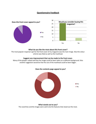
- 1. Questionnaire Feedback 30 Does this front cover appeal to you? Would you consider buying this 25 magazine? 20 15 Yes 10 No 5 0 Yes No What do you like the most about this front cover? The most popular response I got for the front cover of my magazine was the main image. Also the colour scheme was liked as well as the masthead. Suggest one improvement that can be made to the front cover. Many of the people I asked said that the image could’ve been taken on a different background. Also another suggestion would be that the size of the masthead could’ve been bigger. Does the contents page appeal to you? Yes No What stands out to you? The coverlines and the images were said to be the features that stood out the most.
- 2. What do you like the most about the contents page? The style of the masthead and the word contents were the most popular features said by the people I asked. Suggest one improvement that can be made to the contents page. Collectively, the people that I asked said that the space on the page could have been occupied more. Does the double page spread appeal to you? 30 25 20 15 10 5 0 Yes No What do you like the most about the double page spread? The title of the article and the layout of the content on the page were liked by the people I asked. Suggest one improvement that can be made to the double page spread. Many suggested that an image could be taken with a better mise-en-scene. Overall do you think my magazine looks professional? No Yes 0 5 10 15 20 25 30