The document summarizes the results of a magazine cover evaluation conducted by distributing questionnaires to classmates and others. Key findings from the questionnaires include:
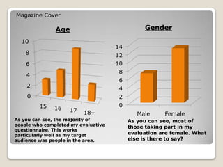
- Most respondents were female, matching the intended target audience
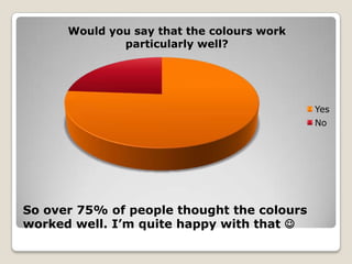
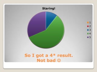
- Over 75% thought the colors worked well
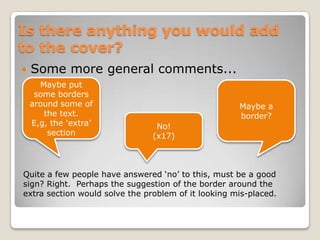
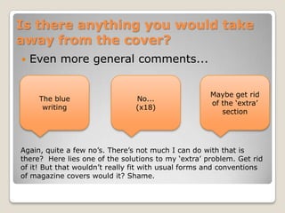
- About a third didn't think the cover seemed authentic enough
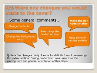
- Suggested changes included making the bar code and some text smaller and rearranging the "extra" section