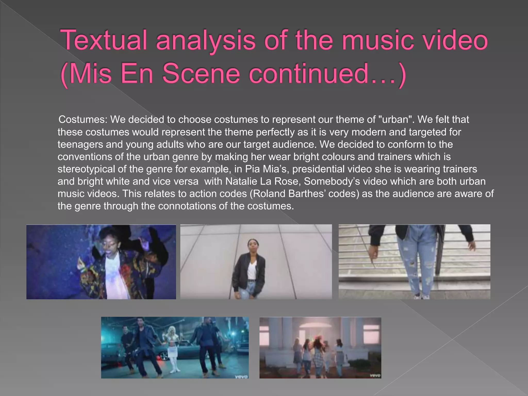
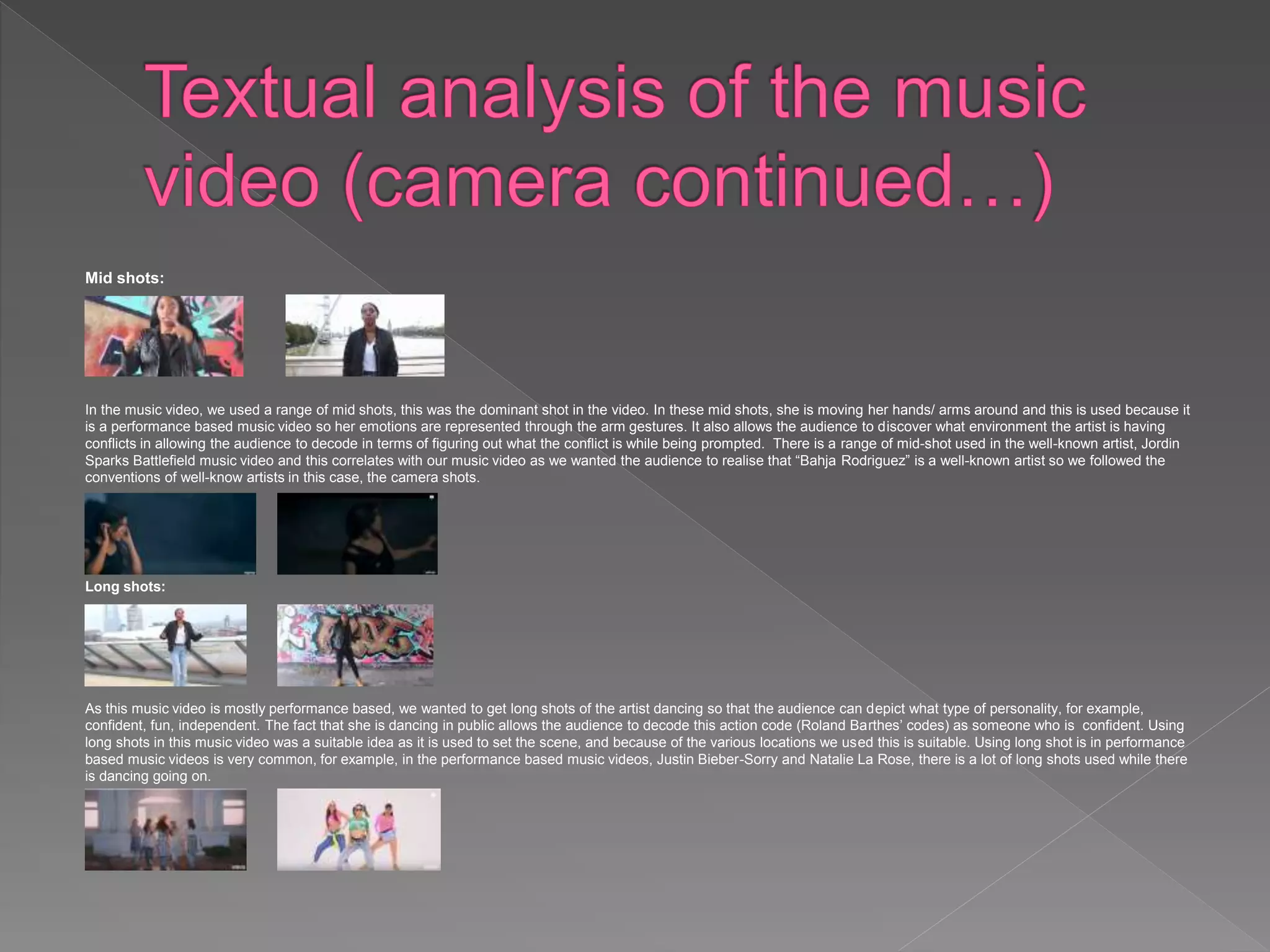
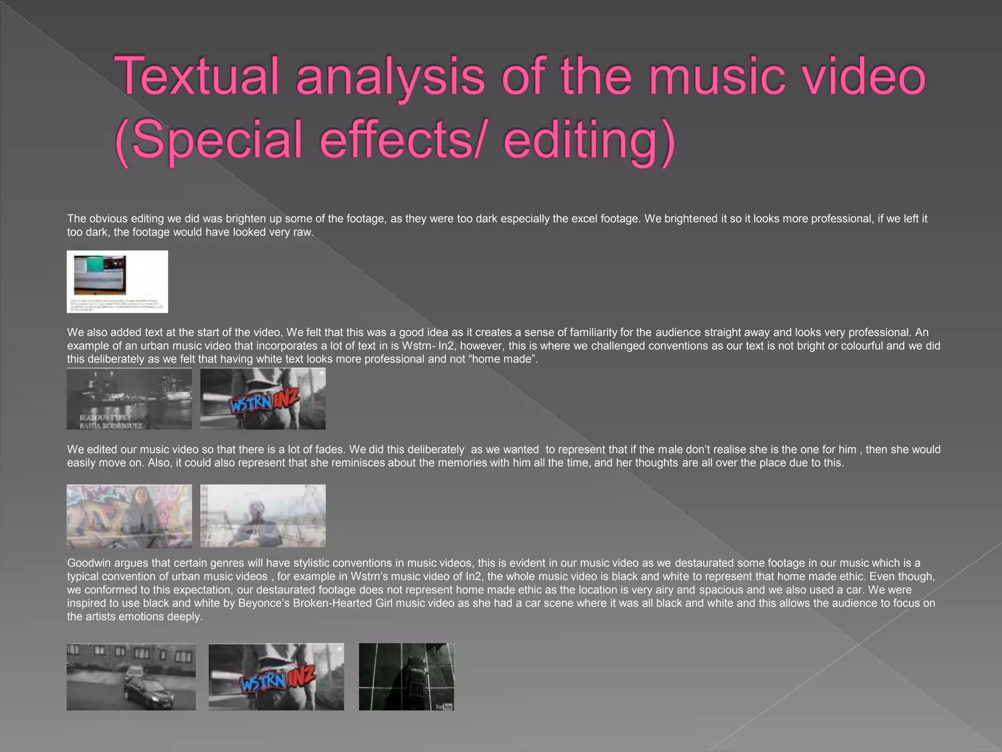
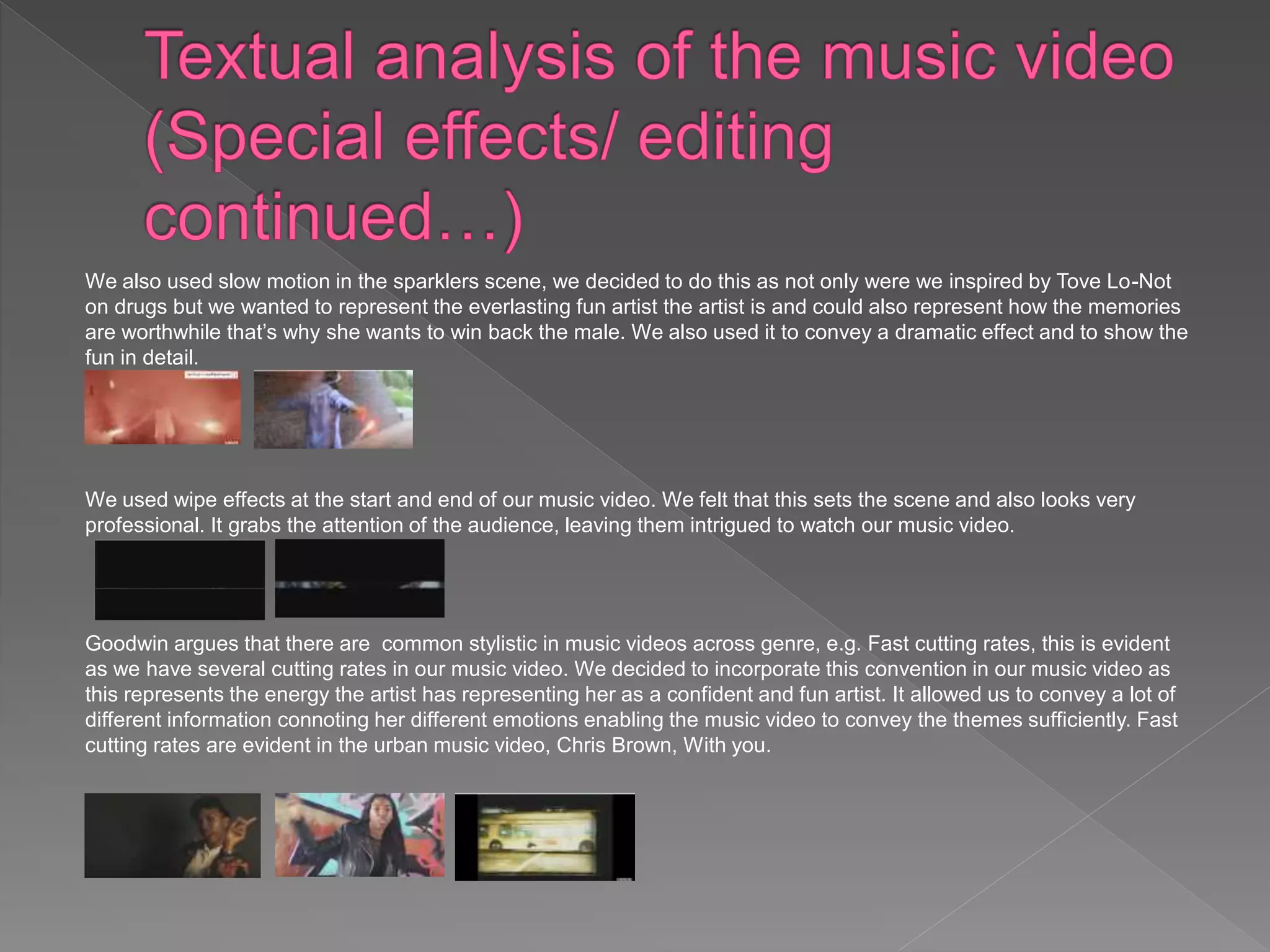
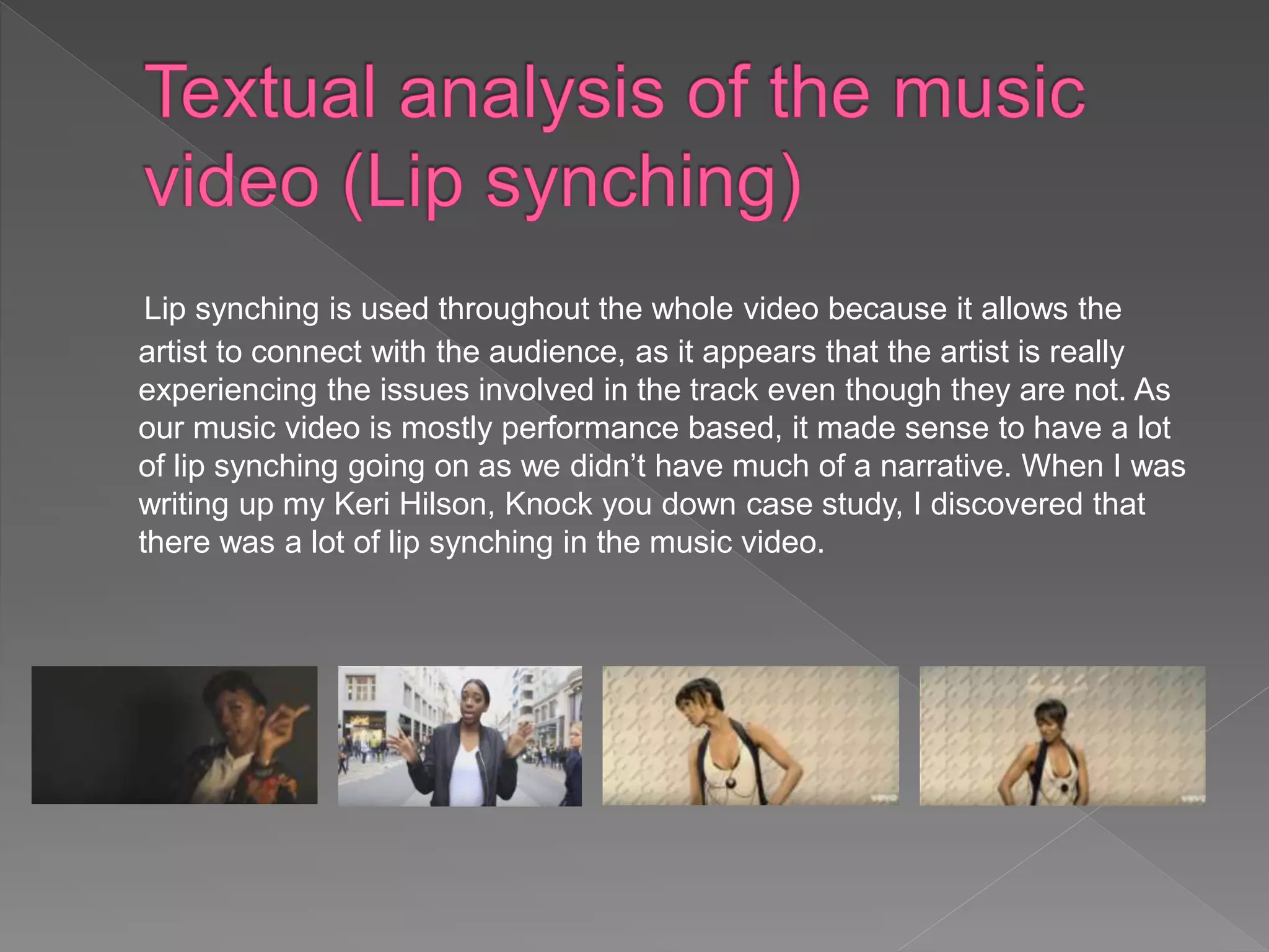
Our genre of our media products is Urban. I chose to both conform and challenge our chosen genre, which I will be exploring in this presentation. Many writers
argue that music videos include authorage. This is evident in our music video as our authorage is quirky, this is represented through the use of costumes and
locations as they are bright and bold and this relates to Roland’s Barthes theory of codes as through the use of bright and bold costumes and locations, we as the
audience are able easily read decode the significance of the bright and bold costumes, the significance being an authorage of quirky, these relates to Barthes
Action codes.
To summarise however, for example, a way in which we conformed to conventions of our chosen genre, Urban, was to use a variety of outside, airy, spacious
locations in our video. This was used to create a sense of familiarity of our genre instantly for the audience for example, in the urban music video, I know there’s
going to be (Good times) by Jamie xx, there is a variety of spacious locations in the music video.
The way in which we challenged conventions of our chosen genre was through for example, our print products in which we kept quite simple with not a lot of colours
or text, this is challenging conventions of our chosen genre as in the CD digipaks we looked at for the case studies, we found that the CD digipaks of our genre
were bright and bold for example, in M.I.A’s album below. We decided to not conform to this convention as we felt that keeping our print products simple would
make our print products look more professional.
 For our music video, we decided to use the song, Jealous Type, which is by Bahja Rodriguez.
 The track is about a couple, whereby a female character likes the male in the couple and thinks she is better for him than his
girlfriend, she is confident that she is the one for him. The female character is quite dismissive of the males girlfriend, however,
she makes it perfectly clear that she is not jealous as she knows she’s better than his girlfriend. This links to the structuralist
Narrative theory by Levi Strauss whereby he argues that for there to be tension (helps narrative move forward) there must be
binary oppositions (goodies and badies), this links to our music video as the males girlfriend is depicted negatively, “no bitch can
out show me” and this conflict allows our music video to “maintain audience interest” as there is an interesting conflict. When I
was typing out my case studies, I found that, Keri Hilson’s music video, Knock You Down, included binary oppositions, for
example, there was a love triangle going on between Keri and two other males.
 Love
 Love triangle
 Past
 Present
 Future
 Couples
 Relationships
 Confidence
 Independence
These themes allow the audience to be actively involved as they have to decode and figure out these
themes by themselves and this helps the narrative move forward, decoding can be done through
various connotations for example, in our music video every time the lyrics “check” comes on the same
finger gesture is repeated connoting the theme of confidence.
In our music video, we used a variety of locations and these locations were repeated several
times in the music video. This could suggest that these locations have significance in her life
which could represent that these are the locations where the artist and the male used to go, so
these locations hold special memories for her, suggesting that the male means a lot to her. The
different locations repeated several times are portrayed as symbolic of her past life of her and
the male being in a relationship however, they have departed hence why she is alone in these
locations which suggests that these memories are everlasting. Furthermore, these reoccurring
locations connotes a narrative element, in terms of there being significance behind these
locations and this relates to Barthes theory of codes as these repeated locations are action
codes for nostalgia (Goodwin- mood of video) in terms of these locations holding special
memories for her hence why they keep getting repeated. This action code is repeated in I Know
there’s Going to Be (Good Times) as various locations are repeated and this correlates with the
lyrics “Good Times” suggesting that these locations relates to the mood of the video (Goodwin) in
terms of nostalgia.
Furthermore, while the artist is lip synching “check” she uses the
same gesture with her fingers this is repeated several times while
“check” is repeated in the lyrics several times. While she does this,
it is quite rapid which represents that she will not be chasing after
him for long, so if he don’t realise what he is missing out on with a
relationship with her than he will loose her forever. Also, this could
also connote her confidence about herself. This motif is an action
code (Roland Barthes’ codes), as the gesture easily gives
information about her personality- confident.
The video is narrative based as the car scene suggests that she is ready to go out and party and also take her
mind of things. Also, the several different locations represent a narrative element as these locations have
significance in her relationship with him through being repeated (action code- Roland Barthes’ codes.)
The video is also performance based as the artist dances in the music video a lot and also the use of the
projectors suggest that it is more of a performance based video as the projector design connotes fun which is
what the genre is about. Also, in urban music videos, there is hardly any narratives so we both conformed and
subverted these expectations. for example in Justin Beiber’s Sorry video is performance based also, Natalie
La Rose, Somebody’s video.
Props: To make our music video more realistic and professional we decided to use sparklers . We used the sparklers to create a dramatic end so that the music video
is memorable. Also, it gives a professional look to our video which is what we want, furthermore, it represents our target audience as sparklers are mainly used by
young people. We also used a car. We used a car in our music video as it links directly to the lyrics. Also, in most urban music videos, there is a car so we thought it
would be good if we followed the conventions of urban music videos so that the audience can easily identify the genre. Also, we had our minds set on using a car from
the start as we wanted somewhere where it is isolated. As we had our minds set on a car, we decided to look at music videos with cars in it and we found one (below) in
which we took inspiration from as the storyline from that song is similar to our song, in Beyoncé, Broken-Hearted Girl.
Locations: we used spacious locations to represent our urban genre (spacious locations is in the music video, I know there’s going to be (Good times) which is an urban
music video. The locations we used were to set the scene as they represented her exact mood in every verse. Many writers argue that music videos include authorage.
This is evident in our music video as our authorage is quirky, this is represented through locations as they are bright and bold and this relates to Roland’s Barthes
theory of codes as through the use of bright and bold locations, we as the audience are able easily read decode the significance of the bright and bold locations, the
significance being an authorage of quirky, these relates to Barthes Action codes. As the locations are public it represents the theme of confidence as she is lip synching
in front of random people (Action code- Roland Barthes)
Costumes: We decided to choose costumes to represent our theme of "urban". We felt that
these costumes would represent the theme perfectly as it is very modern and targeted for
teenagers and young adults who are our target audience. We decided to conform to the
conventions of the urban genre by making her wear bright colours and trainers which is
stereotypical of the genre for example, in Pia Mia’s, presidential video she is wearing trainers
and bright white and vice versa with Natalie La Rose, Somebody’s video which are both urban
music videos. This relates to action codes (Roland Barthes’ codes) as the audience are aware of
the genre through the connotations of the costumes.
When we were planning our music video, we decided to use a wide range of different shot types, we decided to do this as we felt that it will
helps us convey the artists emotions, thoughts, feelings sufficiently as different shot types have different connotations. Also it allows the
atmosphere to be conveyed and creates a mood for the music video. For example, we decided to use mid-shots, establishing shots, long
shots etc…
Establishing shot:
The music video starts of with an establishing in which not only does it set the scene but also sets the mood (Goodwin- the mood of the video-
nostalgia). The fact that the location is isolated, suggests that if she doesn’t get back with the male she will end up alone. It also connotes that
they have been trapped in the love triangle relationship for a long time and as a result, there will be no resolution apart from the artist and the
male getting back together. Furthermore, it could represent that this is where the conflict began. This could be representative of the most
important location out of the range of locations that hold the most special memories of him and her. The establishing shot at the start is an
enigma code as the audience has to work out the significance behind having an establishing shot at the start without showing the artist face or
narrative, this is mysterious which allows the audience to have several different interpretations. An example of an urban music video, that
started of with an establishing shot is the song, I know there’s going to be (Good times) by Jamie xx.
Mid shots:
In the music video, we used a range of mid shots, this was the dominant shot in the video. In these mid shots, she is moving her hands/ arms around and this is used because it
is a performance based music video so her emotions are represented through the arm gestures. It also allows the audience to discover what environment the artist is having
conflicts in allowing the audience to decode in terms of figuring out what the conflict is while being prompted. There is a range of mid-shot used in the well-known artist, Jordin
Sparks Battlefield music video and this correlates with our music video as we wanted the audience to realise that “Bahja Rodriguez” is a well-known artist so we followed the
conventions of well-know artists in this case, the camera shots.
Long shots:
As this music video is mostly performance based, we wanted to get long shots of the artist dancing so that the audience can depict what type of personality, for example,
confident, fun, independent. The fact that she is dancing in public allows the audience to decode this action code (Roland Barthes’ codes) as someone who is confident. Using
long shots in this music video was a suitable idea as it is used to set the scene, and because of the various locations we used this is suitable. Using long shot is in performance
based music videos is very common, for example, in the performance based music videos, Justin Bieber-Sorry and Natalie La Rose, there is a lot of long shots used while there
is dancing going on.
The obvious editing we did was brighten up some of the footage, as they were too dark especially the excel footage. We brightened it so it looks more professional, if we left it
too dark, the footage would have looked very raw.
We also added text at the start of the video, We felt that this was a good idea as it creates a sense of familiarity for the audience straight away and looks very professional. An
example of an urban music video that incorporates a lot of text in is Wstrn- In2, however, this is where we challenged conventions as our text is not bright or colourful and we did
this deliberately as we felt that having white text looks more professional and not “home made”.
We edited our music video so that there is a lot of fades. We did this deliberately as we wanted to represent that if the male don’t realise she is the one for him , then she would
easily move on. Also, it could also represent that she reminisces about the memories with him all the time, and her thoughts are all over the place due to this.
Goodwin argues that certain genres will have stylistic conventions in music videos, this is evident in our music video as we destaurated some footage in our music which is a
typical convention of urban music videos , for example in Wstrn’s music video of In2, the whole music video is black and white to represent that home made ethic. Even though,
we conformed to this expectation, our destaurated footage does not represent home made ethic as the location is very airy and spacious and we also used a car. We were
inspired to use black and white by Beyonce’s Broken-Hearted Girl music video as she had a car scene where it was all black and white and this allows the audience to focus on
the artists emotions deeply.
We also used slow motion in the sparklers scene, we decided to do this as not only were we inspired by Tove Lo-Not
on drugs but we wanted to represent the everlasting fun artist the artist is and could also represent how the memories
are worthwhile that’s why she wants to win back the male. We also used it to convey a dramatic effect and to show the
fun in detail.
We used wipe effects at the start and end of our music video. We felt that this sets the scene and also looks very
professional. It grabs the attention of the audience, leaving them intrigued to watch our music video.
Goodwin argues that there are common stylistic in music videos across genre, e.g. Fast cutting rates, this is evident
as we have several cutting rates in our music video. We decided to incorporate this convention in our music video as
this represents the energy the artist has representing her as a confident and fun artist. It allowed us to convey a lot of
different information connoting her different emotions enabling the music video to convey the themes sufficiently. Fast
cutting rates are evident in the urban music video, Chris Brown, With you.
Lip synching is used throughout the whole video because it allows the
artist to connect with the audience, as it appears that the artist is really
experiencing the issues involved in the track even though they are not. As
our music video is mostly performance based, it made sense to have a lot
of lip synching going on as we didn’t have much of a narrative. When I was
writing up my Keri Hilson, Knock you down case study, I discovered that
there was a lot of lip synching in the music video.
The target audience is young adults preferably in relationships and in love with people they can't have. Also, to an extent the target
audience will be teenagers as it has an urban, modern feel to it which is what teenagers like to watch and hear. The modern feel is
represented through the costumes and locations. We decided to choose costumes to represent our theme of "urban". We felt that
these costumes would represent the theme perfectly as it is very modern and targeted for teenagers and young adults who are our
target audience. We decided to conform to the conventions of the urban genre by making her wear bright colours and trainers which is
stereotypical of the genre for example, in Pia Mia’s, presidential video she is wearing trainers and bright white and vice versa with
Natalie La Rose, Somebody’s video which are both urban music videos. This relates to action codes (Roland Barthes’ codes) as the
audience are aware of the genre through the connotations of the costumes.
At the beginning of making our music video, we
downloaded the song. We did not make any changes to
the song apart from cutting the song a bit at the end as
the backing music we felt was too long but apart from
that we felt that the song was perfect. So we put our
footage on Final Cut Pro and synched it with the music.
The front cover is a mid-shot taken by a DSLR camera, also using a projector for the background design. I
chose to use a mid-shot as it allows the audience to see her arm gestures, her arm gestures are significant as
it connotes the theme confidence also, represents her in a seductive manner as she is slightly leaned back
attracting the male gaze. She isn’t looking directly at the camera as it represents her attitude. The mid-shot
allows the audience to see the correlation of her facial expression and body language. I decided to brighten
the image, to make her and the design stand out as the image was initially dark, she is in full focus as we
wanted to represent her as a well-known artist and someone who is dominant in the music industry. One of the
case studies I used to help me construct the front cover, was Tinashe’s Aquarius front cover as you can see I
was very inspired by this case study, this is evident in how similar my front cover looks to hers in terms of
using the same camera shot and the projector and also, no eye contact. I decided to conform to this as I liked
how simple but elegant the album cover looked which gave a professional look to the front cover. They both
are simple covers so it allows the audience to offer different perceptions about what the song is about.
This where I subverted expectations of back covers, as my back cover is
almost like an establishing shot unlike the others above which I did case
studies on, they either had just text or a large image and text. I decided to
subvert this as I felt that the back cover was not as important as the back
cover, so I thought I’d focus more on the layout rather than the image,
positioning the image like how I did allowed me to create a neat, simple
professional layout . The text and the picture are equally dominant and this
was done deliberately to represent that the music is what made her
successful. The artist is looking directly at the camera this represents her
music conveying personal emotions. I brightened the image as it was initially
too dark .
I decided to use a range of different camera shots for the insert to convey
different emotions. They were all taken at eye level so that it allows the
audience to connect with the artist personally. I did not have to edit the
pictures as they were already bright, I did have to crop the images though
so that they are positioned well . These images were taken at the Mile
End Skate Park which correlates with the music video so it allows the
audience to create a sense of familiarity. I was inspired to do three
sections by my case study of Rihanna’s Loud album in which she had an
insert made up of three sections, I felt that this was very eye-catching as
it didn’t look too crammed in and also looked elegant.
I decided to keep the image of the CD very similar using the projector
design so that it combines with the rest of the CD as this print runs
throughout the single. In my case studies (Rihanna-Loud and M.I.A-
Arular), the CD’s that used prints, implemented the print onto the CD, so
I conformed to this as I feel that it makes my single look professional.
The advert image is positioned in the centre so that all the focus in on the artist. The
image takes up the whole background, this represents her as being a successful
artist as through this she will be perceived as confident (theme.) This image attracts
the male gaze as she is posing in a seductive manner. The mid-shot allows the
audience to see the correlation of her facial expression and body language. I decided
to brighten the image, to make her and the design stand out as the image was
initially dark, she is in full focus as we wanted to represent her as a well-known artist
and someone who is dominant in the music industry. When I was creating my case
studies, I realised that most of the adverts positioned the artist in the middle, I
decided to conform to this as it would make it more eye-catching.
As a group we decided to use the text, minion pro. We felt that it
looked professional, bold and stands out. Also, in my case studies
of similar genre, Rihanna-Loud and Tinashe- Aquarius, the lettering
was thin and very simple, and we felt that minion pro correlated
with this so we decided as a group to use this text throughout our
print products.
I decided to keep my layout very simple with very little text
this is in contrast to my case study (M.I.A) in which the layout
was disorganised. I subverted this as I felt that it would look
more professional keeping my layout of my digipak simple as
it allows the audience to focus on the image of the artist
more and this allows the audience to offer the interpretation
of the artist being successful as the main focus is on her.
As a group we decided to use a house style of red,
white, black throughout our print products as we felt that
these colours look very modern as they compliment
each other and this will represent our genre of urban.
During the research stage, we decided to look at music videos of the similar genre to our music track to get some
inspiration/ ideas from this.
We looked at Beyonce-Broken Hearted Girl:
When we were annotating our music track lyrics, we were struggling on how to present the car, especially the lyrics "Nights
like this I be cruising". However, when we saw this music video, we knew that the birds eye view of the car would be
perfect as it correlates with the lyrics perfectly. Also, the birds eye view gives a modern, urban look to the music video and
this is what we wanted our music video to look like. It allows the audience to realise that there is a perspective behind this
as we are trying to portray that the female actor is fine with being alone, and is independent and confident and simply can
have fun alone. Furthermore, it subconsciously represents that the male actor will end up regretting not being a relationship
with her and once she goes, she's gone forever and he will be missing out. Just like Beyonce is shown in a close-up, we
included this in our music video as we believe that it set the scene as it gave the audience a perspective of her emotion
right from the start, and because she is alone, shows her true emotion.
We also looked at Tove Lo-Not on drugs:
When watching this video, we were attracted to the use of sparklers in this video, so we
all decided that we wanted to use sparklers in our video and so we did. We thought that
it would represent the artist as a fun, independent character and that she does not need
anyone to have fun. We edited the sparkler shots so that it is slow motion, to give our
music video an everlasting dramatic effect. Also, we used the sparklers towards the end
which is a contrast to the start as the first scene is in black and white whereas, the last
scene is in colour representing that the male actor is missing out on a relationship with
her and indeed "no chick can out do her".
In my CD Digipak case study, I looked at Tinashe’s Album.
We were inspired by this CD cover as we felt that it looks professional and also looks eye-
catching. We also liked how simple the cover looks with a pop of colour, and this is something we
wanted to represent in our print products as we thought that it would look professional and a result
we used three colours (house style.) Furthermore, we realised that this CD cover used projectors
for the background, which is what we used for our music video, so as a result, we decided to use a
projector for our photoshoot as it correlates with our music video.

Question One A2 Media Evaluation

  • 2.
    Our genre ofour media products is Urban. I chose to both conform and challenge our chosen genre, which I will be exploring in this presentation. Many writers argue that music videos include authorage. This is evident in our music video as our authorage is quirky, this is represented through the use of costumes and locations as they are bright and bold and this relates to Roland’s Barthes theory of codes as through the use of bright and bold costumes and locations, we as the audience are able easily read decode the significance of the bright and bold costumes, the significance being an authorage of quirky, these relates to Barthes Action codes. To summarise however, for example, a way in which we conformed to conventions of our chosen genre, Urban, was to use a variety of outside, airy, spacious locations in our video. This was used to create a sense of familiarity of our genre instantly for the audience for example, in the urban music video, I know there’s going to be (Good times) by Jamie xx, there is a variety of spacious locations in the music video. The way in which we challenged conventions of our chosen genre was through for example, our print products in which we kept quite simple with not a lot of colours or text, this is challenging conventions of our chosen genre as in the CD digipaks we looked at for the case studies, we found that the CD digipaks of our genre were bright and bold for example, in M.I.A’s album below. We decided to not conform to this convention as we felt that keeping our print products simple would make our print products look more professional.
  • 3.
     For ourmusic video, we decided to use the song, Jealous Type, which is by Bahja Rodriguez.  The track is about a couple, whereby a female character likes the male in the couple and thinks she is better for him than his girlfriend, she is confident that she is the one for him. The female character is quite dismissive of the males girlfriend, however, she makes it perfectly clear that she is not jealous as she knows she’s better than his girlfriend. This links to the structuralist Narrative theory by Levi Strauss whereby he argues that for there to be tension (helps narrative move forward) there must be binary oppositions (goodies and badies), this links to our music video as the males girlfriend is depicted negatively, “no bitch can out show me” and this conflict allows our music video to “maintain audience interest” as there is an interesting conflict. When I was typing out my case studies, I found that, Keri Hilson’s music video, Knock You Down, included binary oppositions, for example, there was a love triangle going on between Keri and two other males.
  • 4.
     Love  Lovetriangle  Past  Present  Future  Couples  Relationships  Confidence  Independence These themes allow the audience to be actively involved as they have to decode and figure out these themes by themselves and this helps the narrative move forward, decoding can be done through various connotations for example, in our music video every time the lyrics “check” comes on the same finger gesture is repeated connoting the theme of confidence.
  • 5.
    In our musicvideo, we used a variety of locations and these locations were repeated several times in the music video. This could suggest that these locations have significance in her life which could represent that these are the locations where the artist and the male used to go, so these locations hold special memories for her, suggesting that the male means a lot to her. The different locations repeated several times are portrayed as symbolic of her past life of her and the male being in a relationship however, they have departed hence why she is alone in these locations which suggests that these memories are everlasting. Furthermore, these reoccurring locations connotes a narrative element, in terms of there being significance behind these locations and this relates to Barthes theory of codes as these repeated locations are action codes for nostalgia (Goodwin- mood of video) in terms of these locations holding special memories for her hence why they keep getting repeated. This action code is repeated in I Know there’s Going to Be (Good Times) as various locations are repeated and this correlates with the lyrics “Good Times” suggesting that these locations relates to the mood of the video (Goodwin) in terms of nostalgia.
  • 6.
    Furthermore, while theartist is lip synching “check” she uses the same gesture with her fingers this is repeated several times while “check” is repeated in the lyrics several times. While she does this, it is quite rapid which represents that she will not be chasing after him for long, so if he don’t realise what he is missing out on with a relationship with her than he will loose her forever. Also, this could also connote her confidence about herself. This motif is an action code (Roland Barthes’ codes), as the gesture easily gives information about her personality- confident.
  • 7.
    The video isnarrative based as the car scene suggests that she is ready to go out and party and also take her mind of things. Also, the several different locations represent a narrative element as these locations have significance in her relationship with him through being repeated (action code- Roland Barthes’ codes.) The video is also performance based as the artist dances in the music video a lot and also the use of the projectors suggest that it is more of a performance based video as the projector design connotes fun which is what the genre is about. Also, in urban music videos, there is hardly any narratives so we both conformed and subverted these expectations. for example in Justin Beiber’s Sorry video is performance based also, Natalie La Rose, Somebody’s video.
  • 8.
    Props: To makeour music video more realistic and professional we decided to use sparklers . We used the sparklers to create a dramatic end so that the music video is memorable. Also, it gives a professional look to our video which is what we want, furthermore, it represents our target audience as sparklers are mainly used by young people. We also used a car. We used a car in our music video as it links directly to the lyrics. Also, in most urban music videos, there is a car so we thought it would be good if we followed the conventions of urban music videos so that the audience can easily identify the genre. Also, we had our minds set on using a car from the start as we wanted somewhere where it is isolated. As we had our minds set on a car, we decided to look at music videos with cars in it and we found one (below) in which we took inspiration from as the storyline from that song is similar to our song, in Beyoncé, Broken-Hearted Girl. Locations: we used spacious locations to represent our urban genre (spacious locations is in the music video, I know there’s going to be (Good times) which is an urban music video. The locations we used were to set the scene as they represented her exact mood in every verse. Many writers argue that music videos include authorage. This is evident in our music video as our authorage is quirky, this is represented through locations as they are bright and bold and this relates to Roland’s Barthes theory of codes as through the use of bright and bold locations, we as the audience are able easily read decode the significance of the bright and bold locations, the significance being an authorage of quirky, these relates to Barthes Action codes. As the locations are public it represents the theme of confidence as she is lip synching in front of random people (Action code- Roland Barthes)
  • 9.
    Costumes: We decidedto choose costumes to represent our theme of "urban". We felt that these costumes would represent the theme perfectly as it is very modern and targeted for teenagers and young adults who are our target audience. We decided to conform to the conventions of the urban genre by making her wear bright colours and trainers which is stereotypical of the genre for example, in Pia Mia’s, presidential video she is wearing trainers and bright white and vice versa with Natalie La Rose, Somebody’s video which are both urban music videos. This relates to action codes (Roland Barthes’ codes) as the audience are aware of the genre through the connotations of the costumes.
  • 10.
    When we wereplanning our music video, we decided to use a wide range of different shot types, we decided to do this as we felt that it will helps us convey the artists emotions, thoughts, feelings sufficiently as different shot types have different connotations. Also it allows the atmosphere to be conveyed and creates a mood for the music video. For example, we decided to use mid-shots, establishing shots, long shots etc… Establishing shot: The music video starts of with an establishing in which not only does it set the scene but also sets the mood (Goodwin- the mood of the video- nostalgia). The fact that the location is isolated, suggests that if she doesn’t get back with the male she will end up alone. It also connotes that they have been trapped in the love triangle relationship for a long time and as a result, there will be no resolution apart from the artist and the male getting back together. Furthermore, it could represent that this is where the conflict began. This could be representative of the most important location out of the range of locations that hold the most special memories of him and her. The establishing shot at the start is an enigma code as the audience has to work out the significance behind having an establishing shot at the start without showing the artist face or narrative, this is mysterious which allows the audience to have several different interpretations. An example of an urban music video, that started of with an establishing shot is the song, I know there’s going to be (Good times) by Jamie xx.
  • 11.
    Mid shots: In themusic video, we used a range of mid shots, this was the dominant shot in the video. In these mid shots, she is moving her hands/ arms around and this is used because it is a performance based music video so her emotions are represented through the arm gestures. It also allows the audience to discover what environment the artist is having conflicts in allowing the audience to decode in terms of figuring out what the conflict is while being prompted. There is a range of mid-shot used in the well-known artist, Jordin Sparks Battlefield music video and this correlates with our music video as we wanted the audience to realise that “Bahja Rodriguez” is a well-known artist so we followed the conventions of well-know artists in this case, the camera shots. Long shots: As this music video is mostly performance based, we wanted to get long shots of the artist dancing so that the audience can depict what type of personality, for example, confident, fun, independent. The fact that she is dancing in public allows the audience to decode this action code (Roland Barthes’ codes) as someone who is confident. Using long shots in this music video was a suitable idea as it is used to set the scene, and because of the various locations we used this is suitable. Using long shot is in performance based music videos is very common, for example, in the performance based music videos, Justin Bieber-Sorry and Natalie La Rose, there is a lot of long shots used while there is dancing going on.
  • 12.
    The obvious editingwe did was brighten up some of the footage, as they were too dark especially the excel footage. We brightened it so it looks more professional, if we left it too dark, the footage would have looked very raw. We also added text at the start of the video, We felt that this was a good idea as it creates a sense of familiarity for the audience straight away and looks very professional. An example of an urban music video that incorporates a lot of text in is Wstrn- In2, however, this is where we challenged conventions as our text is not bright or colourful and we did this deliberately as we felt that having white text looks more professional and not “home made”. We edited our music video so that there is a lot of fades. We did this deliberately as we wanted to represent that if the male don’t realise she is the one for him , then she would easily move on. Also, it could also represent that she reminisces about the memories with him all the time, and her thoughts are all over the place due to this. Goodwin argues that certain genres will have stylistic conventions in music videos, this is evident in our music video as we destaurated some footage in our music which is a typical convention of urban music videos , for example in Wstrn’s music video of In2, the whole music video is black and white to represent that home made ethic. Even though, we conformed to this expectation, our destaurated footage does not represent home made ethic as the location is very airy and spacious and we also used a car. We were inspired to use black and white by Beyonce’s Broken-Hearted Girl music video as she had a car scene where it was all black and white and this allows the audience to focus on the artists emotions deeply.
  • 13.
    We also usedslow motion in the sparklers scene, we decided to do this as not only were we inspired by Tove Lo-Not on drugs but we wanted to represent the everlasting fun artist the artist is and could also represent how the memories are worthwhile that’s why she wants to win back the male. We also used it to convey a dramatic effect and to show the fun in detail. We used wipe effects at the start and end of our music video. We felt that this sets the scene and also looks very professional. It grabs the attention of the audience, leaving them intrigued to watch our music video. Goodwin argues that there are common stylistic in music videos across genre, e.g. Fast cutting rates, this is evident as we have several cutting rates in our music video. We decided to incorporate this convention in our music video as this represents the energy the artist has representing her as a confident and fun artist. It allowed us to convey a lot of different information connoting her different emotions enabling the music video to convey the themes sufficiently. Fast cutting rates are evident in the urban music video, Chris Brown, With you.
  • 14.
    Lip synching isused throughout the whole video because it allows the artist to connect with the audience, as it appears that the artist is really experiencing the issues involved in the track even though they are not. As our music video is mostly performance based, it made sense to have a lot of lip synching going on as we didn’t have much of a narrative. When I was writing up my Keri Hilson, Knock you down case study, I discovered that there was a lot of lip synching in the music video.
  • 15.
    The target audienceis young adults preferably in relationships and in love with people they can't have. Also, to an extent the target audience will be teenagers as it has an urban, modern feel to it which is what teenagers like to watch and hear. The modern feel is represented through the costumes and locations. We decided to choose costumes to represent our theme of "urban". We felt that these costumes would represent the theme perfectly as it is very modern and targeted for teenagers and young adults who are our target audience. We decided to conform to the conventions of the urban genre by making her wear bright colours and trainers which is stereotypical of the genre for example, in Pia Mia’s, presidential video she is wearing trainers and bright white and vice versa with Natalie La Rose, Somebody’s video which are both urban music videos. This relates to action codes (Roland Barthes’ codes) as the audience are aware of the genre through the connotations of the costumes.
  • 16.
    At the beginningof making our music video, we downloaded the song. We did not make any changes to the song apart from cutting the song a bit at the end as the backing music we felt was too long but apart from that we felt that the song was perfect. So we put our footage on Final Cut Pro and synched it with the music.
  • 17.
    The front coveris a mid-shot taken by a DSLR camera, also using a projector for the background design. I chose to use a mid-shot as it allows the audience to see her arm gestures, her arm gestures are significant as it connotes the theme confidence also, represents her in a seductive manner as she is slightly leaned back attracting the male gaze. She isn’t looking directly at the camera as it represents her attitude. The mid-shot allows the audience to see the correlation of her facial expression and body language. I decided to brighten the image, to make her and the design stand out as the image was initially dark, she is in full focus as we wanted to represent her as a well-known artist and someone who is dominant in the music industry. One of the case studies I used to help me construct the front cover, was Tinashe’s Aquarius front cover as you can see I was very inspired by this case study, this is evident in how similar my front cover looks to hers in terms of using the same camera shot and the projector and also, no eye contact. I decided to conform to this as I liked how simple but elegant the album cover looked which gave a professional look to the front cover. They both are simple covers so it allows the audience to offer different perceptions about what the song is about.
  • 18.
    This where Isubverted expectations of back covers, as my back cover is almost like an establishing shot unlike the others above which I did case studies on, they either had just text or a large image and text. I decided to subvert this as I felt that the back cover was not as important as the back cover, so I thought I’d focus more on the layout rather than the image, positioning the image like how I did allowed me to create a neat, simple professional layout . The text and the picture are equally dominant and this was done deliberately to represent that the music is what made her successful. The artist is looking directly at the camera this represents her music conveying personal emotions. I brightened the image as it was initially too dark .
  • 19.
    I decided touse a range of different camera shots for the insert to convey different emotions. They were all taken at eye level so that it allows the audience to connect with the artist personally. I did not have to edit the pictures as they were already bright, I did have to crop the images though so that they are positioned well . These images were taken at the Mile End Skate Park which correlates with the music video so it allows the audience to create a sense of familiarity. I was inspired to do three sections by my case study of Rihanna’s Loud album in which she had an insert made up of three sections, I felt that this was very eye-catching as it didn’t look too crammed in and also looked elegant.
  • 20.
    I decided tokeep the image of the CD very similar using the projector design so that it combines with the rest of the CD as this print runs throughout the single. In my case studies (Rihanna-Loud and M.I.A- Arular), the CD’s that used prints, implemented the print onto the CD, so I conformed to this as I feel that it makes my single look professional.
  • 21.
    The advert imageis positioned in the centre so that all the focus in on the artist. The image takes up the whole background, this represents her as being a successful artist as through this she will be perceived as confident (theme.) This image attracts the male gaze as she is posing in a seductive manner. The mid-shot allows the audience to see the correlation of her facial expression and body language. I decided to brighten the image, to make her and the design stand out as the image was initially dark, she is in full focus as we wanted to represent her as a well-known artist and someone who is dominant in the music industry. When I was creating my case studies, I realised that most of the adverts positioned the artist in the middle, I decided to conform to this as it would make it more eye-catching.
  • 22.
    As a groupwe decided to use the text, minion pro. We felt that it looked professional, bold and stands out. Also, in my case studies of similar genre, Rihanna-Loud and Tinashe- Aquarius, the lettering was thin and very simple, and we felt that minion pro correlated with this so we decided as a group to use this text throughout our print products.
  • 23.
    I decided tokeep my layout very simple with very little text this is in contrast to my case study (M.I.A) in which the layout was disorganised. I subverted this as I felt that it would look more professional keeping my layout of my digipak simple as it allows the audience to focus on the image of the artist more and this allows the audience to offer the interpretation of the artist being successful as the main focus is on her.
  • 24.
    As a groupwe decided to use a house style of red, white, black throughout our print products as we felt that these colours look very modern as they compliment each other and this will represent our genre of urban.
  • 25.
    During the researchstage, we decided to look at music videos of the similar genre to our music track to get some inspiration/ ideas from this. We looked at Beyonce-Broken Hearted Girl: When we were annotating our music track lyrics, we were struggling on how to present the car, especially the lyrics "Nights like this I be cruising". However, when we saw this music video, we knew that the birds eye view of the car would be perfect as it correlates with the lyrics perfectly. Also, the birds eye view gives a modern, urban look to the music video and this is what we wanted our music video to look like. It allows the audience to realise that there is a perspective behind this as we are trying to portray that the female actor is fine with being alone, and is independent and confident and simply can have fun alone. Furthermore, it subconsciously represents that the male actor will end up regretting not being a relationship with her and once she goes, she's gone forever and he will be missing out. Just like Beyonce is shown in a close-up, we included this in our music video as we believe that it set the scene as it gave the audience a perspective of her emotion right from the start, and because she is alone, shows her true emotion.
  • 26.
    We also lookedat Tove Lo-Not on drugs: When watching this video, we were attracted to the use of sparklers in this video, so we all decided that we wanted to use sparklers in our video and so we did. We thought that it would represent the artist as a fun, independent character and that she does not need anyone to have fun. We edited the sparkler shots so that it is slow motion, to give our music video an everlasting dramatic effect. Also, we used the sparklers towards the end which is a contrast to the start as the first scene is in black and white whereas, the last scene is in colour representing that the male actor is missing out on a relationship with her and indeed "no chick can out do her".
  • 27.
    In my CDDigipak case study, I looked at Tinashe’s Album. We were inspired by this CD cover as we felt that it looks professional and also looks eye- catching. We also liked how simple the cover looks with a pop of colour, and this is something we wanted to represent in our print products as we thought that it would look professional and a result we used three colours (house style.) Furthermore, we realised that this CD cover used projectors for the background, which is what we used for our music video, so as a result, we decided to use a projector for our photoshoot as it correlates with our music video.