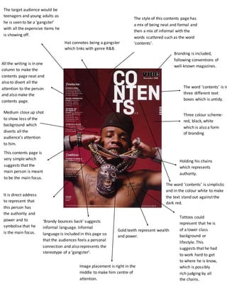
1. Branding is included,
following conventions of
well-known magazines.
The word ‘contents’ is in
three different text
boxes which is untidy.
Three colour scheme-red,
black, white
which is also a form
of branding
All the writing is in one
column to make the
contents page neat and
also to divert all the
attention to the person
and also make the
contents page.
readable.
This contents page is
very simple which
suggests that the
main person is meant
to be the main focus.
Holding his chains
which represents
authority.
The word ‘contents’ is simplistic
and in the colour white to make
the text stand out against the
dark red.
Hat connotes being a gangster
which links with genre R&B.
Gold teeth represent wealth
and power.
Medium close up shot
to show less of the
background which
diverts all the
audience’s attention
to him.
It is direct address
to represent that
this person has
the authority and
power and to
symbolise that he
is the main focus.
‘Brandy bounces back’ suggests
informal language. Informal
language is included in this page so
that the audiences feels a personal
connection and also represents the
stereotype of a ‘gangster’.
The style of this contents page has
a mix of being neat and formal and
then a mix of informal with the
words scattered such as the word
‘contents’.
Tattoos could
represent that he is
of a lower class
background or
lifestyle. This
suggests that he had
to work hard to get
to where he is know,
which is possibly
rich judging by all
the chains.
Image placement is right in the
middle to make him centre of
attention.
The target audience would be
teenagers and young adults as
he is seen to be a ‘gangster’
with all the expensive items he
is showing off.