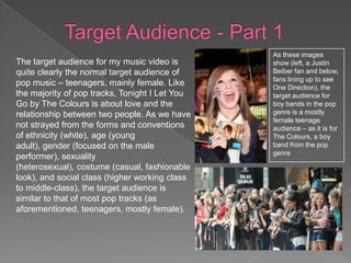
As these images
The target audience for my music video is       show (left, a Justin
quite clearly the normal target audience of     Beiber fan and below,
                                                fans lining up to see
pop music – teenagers, mainly female. Like      One Direction), the
the majority of pop tracks, Tonight I Let You   target audience for
Go by The Colours is about love and the         boy bands in the pop
relationship between two people. As we have     genre is a mostly
                                                female teenage
not strayed from the forms and conventions      audience – as it is for
of ethnicity (white), age (young                The Colours, a boy
adult), gender (focused on the male             band from the pop
                                                genre
performer), sexuality
(heterosexual), costume (casual, fashionable
look), and social class (higher working class
to middle-class), the target audience is
similar to that of most pop tracks (as
aforementioned, teenagers, mostly female).
I have established who the target audience is, now I will establish more about
them and what media texts they are influenced by.

Their media interests are usually mainstream – often they will watch programs
such as soap operas (EastEnders, for example). My music video uses typical
housing estates, like the ones seen in soap operas, as locations – this links my
music video to this type of TV show, and therefore the mutual target audience.

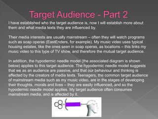
In addition, the hypodermic needle model (the associated diagram is shown
below) applies to this target audience. The hypodermic needle model suggests
that we as an audience are passive, and that our behaviour and thinking is
affected by the creators of media texts. Teenagers, the common target audience
of mainstream media such as my music video, are in the stages of developing
their thoughts, morals and lives – they are easily influenced, and so the
hypodermic needle model applies. My target audience often consumes
mainstream media, and is affected by it.
Social media is a big part of modern culture, and is used as a
significant part of marketing for most forms of media. For example,
the thriller film Animal Kingdom used social media sites such as
Facebook to allow people who were interested in the relatively small
film find information on the film easily. They would then share this
information with other people who they are connected to on
Facebook. Essentially, this results in free and effective advertising. I
used Facebook to show people my music video and gather feedback
as it would allow my friends, and then their friends (and so on) to see
the music video and potentially give me feedback.
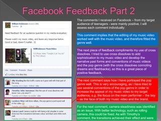
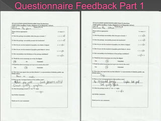
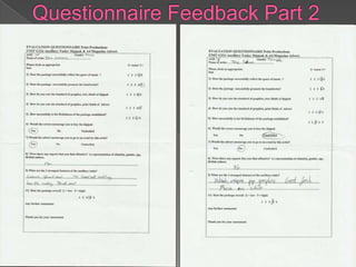
The comments I received on Facebook – from my target
audience of teenagers - were mainly positive. I will
assess each comment individually:

This comment implies that the editing of my music video
worked well with the music video, and therefore fitted the
genre well.

The next piece of feedback compliments my use of cross
dissolves. I tried to use cross dissolves to add
sophistication to my music video and develop the
narrative past forms and conventions of music videos
and the pop genre (with the cross dissolves connoting
dreams and flashbacks), so this is a great piece of
positive feedback.

The next comment says how I have portrayed the pop
genre well. This is very encouraging, as I have tried to
use several conventions of the pop genre in order to
increase the appeal of my music video to my target
audience, e.g. the focus on the main performer – the boy
– as the face of both my music video and the brand.

For the next comment, camera steadiness was identified
as an issue. With better technology, such as rolling
camera, this could be fixed. As with Timothy’s
comment, the transitions achieved their effect and were
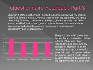
Question 1 of the questionnaire I handed out concerns how well my product
      reflects its genre of music. My music video is form the pop genre, and I have
      used many forms and conventions of the pop genre to establish this. The
      soap-opera like locations and generic representations of aspects such as
      age, gender and ethnicity target my package at a pop image and
      subsequently pop target audience.

6
                                                                            The graph on the left shows that
5                                                                           the feedback I received is positive
4
                                                                            in terms of how well I have
                                                                            reflected the pop genre with my
3
                                                                            package of products. All of my
2                                                                           responses indicate a successful
1
                                                                            association with the genre, and as
                                                                            this is what I was trying to achieve
0
    Questionnaire 1   Questionnaire 2   Questionnaire 3   Questionnaire 4
                                                                            by using forms and conventions of
                                                                            the pop genre, this is a good sign.
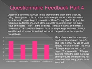
Question 2 concerns how well I have promoted the artist of the track. By
      using close-ups and a focus on the main male performer – who represents
      the artists – in my package, I have utilized Gaze Theory (that looking at the
      main male performer often with close-up shots would make him the main
      focus of the gaze – look – of the audience) to make the artist of the track I
      have used - The Colours – the main focus of my package. Because of this, I
      would hope that my audience feedback would be positive for this aspect of
      my package.
6                                                                   My audience feedback was very
5                                                                   positive – two 5/5s and two 4/5s.
                                                                    This tells me that my use of Gaze
4
                                                                    Theory to make my artist the focus
3                                                                   of the package has worked as
2                                                                   hoped. The convention of the pop
                                                                    genre to make the artist the focus
1
                                                                    of the products and marketing has
0                                                                   translated over to my products as
    Questionnaire 1 Questionnaire 2 Questionnaire 3 Questionnaire 4
                                                                    intended.
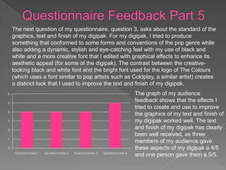
The next question of my questionnaire, question 3, asks about the standard of the
    graphics, text and finish of my digipak. For my digipak, I tried to produce
    something that conformed to some forms and conventions of the pop genre while
    also adding a dynamic, stylish and eye-catching feel with my use of black and
    white and a more creative font that I edited with graphical effects to enhance its
    aesthetic appeal (for some of the digipak). The contrast between the creative-
    looking black and white font and the bright font used for the logo of The Colours
    (which uses a font similar to pop artists such as Coldplay, a similar artist) creates
    a distinct look that I used to improve the text and finish of my digipak.
6                                                                            The graph of my audience
5
                                                                             feedback shows that the effects I
                                                                             tried to create and use to improve
4
                                                                             the graphics of my text and finish of
3                                                                            my digipak worked well. The text
2
                                                                             and finish of my digipak has clearly
                                                                             been well received, as three
1
                                                                             members of my audience gave
0                                                                            these aspects of my digipak a 4/5
     Questionnaire 1   Questionnaire 2   Questionnaire 3   Questionnaire 4
                                                                             and one person gave them a 5/5.
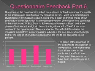
Question 4 of the questionnaire asked my audience for feedback about the quality
    of the graphics and print finish of my magazine advert. I went for a simplistic and
    stylish look on my magazine advert, using only a black and white image of our
    striking lyric card shot (which is a modernised version of the iconic lyric card shot
    in the music video for Bob Dylan’s Subterranean Homesick Blues) and a few
    pieces of text. As in the digipak, I used the logo I made for The Colours as a
    contrast to the dynamic use of black and white. This effect differentiates the
    magazine advert from similar magazine adverts in the pop genre while the bright
    text for the logo of The Colours ensures that the link to the pop genre is still
    present.
6
                                                                             The graph of the response of
5                                                                            my audience to this question is
4
                                                                             very positive. With high scores
                                                                             from all members of the
3
                                                                             audience, the effect I was
2                                                                            trying to achieve seems to
1
                                                                             have been as successful as I
                                                                             hoped.
0
     Questionnaire 1   Questionnaire 2   Questionnaire 3   Questionnaire 4
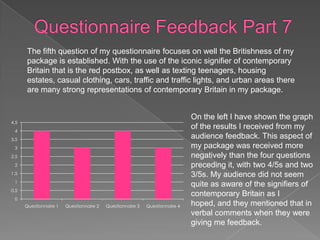
The fifth question of my questionnaire focuses on well the Britishness of my
       package is established. With the use of the iconic signifier of contemporary
       Britain that is the red postbox, as well as texting teenagers, housing
       estates, casual clothing, cars, traffic and traffic lights, and urban areas there
       are many strong representations of contemporary Britain in my package.


                                                                              On the left I have shown the graph
4.5
 4
                                                                              of the results I received from my
3.5
                                                                              audience feedback. This aspect of
 3                                                                            my package was received more
2.5                                                                           negatively than the four questions
 2                                                                            preceding it, with two 4/5s and two
1.5                                                                           3/5s. My audience did not seem
 1
                                                                              quite as aware of the signifiers of
0.5
                                                                              contemporary Britain as I
 0
      Questionnaire 1   Questionnaire 2   Questionnaire 3   Questionnaire 4   hoped, and they mentioned that in
                                                                              verbal comments when they were
                                                                              giving me feedback.
In conclusion, while certain aspects - such as using steadier
shots and improving the clarity of the signifiers of
contemporary Britain (and therefore the Britishness of the
package) – could be improved, the general tone of my
audience feedback was very positive. Due to my audience
feedback, I feel that if I recreated my package, it would be
even better as I now know which parts of my package were
successful and which were not as successful.

Question 3 - Evaluation

  • 2.
    As these images Thetarget audience for my music video is show (left, a Justin quite clearly the normal target audience of Beiber fan and below, fans lining up to see pop music – teenagers, mainly female. Like One Direction), the the majority of pop tracks, Tonight I Let You target audience for Go by The Colours is about love and the boy bands in the pop relationship between two people. As we have genre is a mostly female teenage not strayed from the forms and conventions audience – as it is for of ethnicity (white), age (young The Colours, a boy adult), gender (focused on the male band from the pop genre performer), sexuality (heterosexual), costume (casual, fashionable look), and social class (higher working class to middle-class), the target audience is similar to that of most pop tracks (as aforementioned, teenagers, mostly female).
  • 3.
    I have establishedwho the target audience is, now I will establish more about them and what media texts they are influenced by. Their media interests are usually mainstream – often they will watch programs such as soap operas (EastEnders, for example). My music video uses typical housing estates, like the ones seen in soap operas, as locations – this links my music video to this type of TV show, and therefore the mutual target audience. In addition, the hypodermic needle model (the associated diagram is shown below) applies to this target audience. The hypodermic needle model suggests that we as an audience are passive, and that our behaviour and thinking is affected by the creators of media texts. Teenagers, the common target audience of mainstream media such as my music video, are in the stages of developing their thoughts, morals and lives – they are easily influenced, and so the hypodermic needle model applies. My target audience often consumes mainstream media, and is affected by it.
  • 4.
    Social media isa big part of modern culture, and is used as a significant part of marketing for most forms of media. For example, the thriller film Animal Kingdom used social media sites such as Facebook to allow people who were interested in the relatively small film find information on the film easily. They would then share this information with other people who they are connected to on Facebook. Essentially, this results in free and effective advertising. I used Facebook to show people my music video and gather feedback as it would allow my friends, and then their friends (and so on) to see the music video and potentially give me feedback.
  • 5.
    The comments Ireceived on Facebook – from my target audience of teenagers - were mainly positive. I will assess each comment individually: This comment implies that the editing of my music video worked well with the music video, and therefore fitted the genre well. The next piece of feedback compliments my use of cross dissolves. I tried to use cross dissolves to add sophistication to my music video and develop the narrative past forms and conventions of music videos and the pop genre (with the cross dissolves connoting dreams and flashbacks), so this is a great piece of positive feedback. The next comment says how I have portrayed the pop genre well. This is very encouraging, as I have tried to use several conventions of the pop genre in order to increase the appeal of my music video to my target audience, e.g. the focus on the main performer – the boy – as the face of both my music video and the brand. For the next comment, camera steadiness was identified as an issue. With better technology, such as rolling camera, this could be fixed. As with Timothy’s comment, the transitions achieved their effect and were
  • 8.
    Question 1 ofthe questionnaire I handed out concerns how well my product reflects its genre of music. My music video is form the pop genre, and I have used many forms and conventions of the pop genre to establish this. The soap-opera like locations and generic representations of aspects such as age, gender and ethnicity target my package at a pop image and subsequently pop target audience. 6 The graph on the left shows that 5 the feedback I received is positive 4 in terms of how well I have reflected the pop genre with my 3 package of products. All of my 2 responses indicate a successful 1 association with the genre, and as this is what I was trying to achieve 0 Questionnaire 1 Questionnaire 2 Questionnaire 3 Questionnaire 4 by using forms and conventions of the pop genre, this is a good sign.
  • 9.
    Question 2 concernshow well I have promoted the artist of the track. By using close-ups and a focus on the main male performer – who represents the artists – in my package, I have utilized Gaze Theory (that looking at the main male performer often with close-up shots would make him the main focus of the gaze – look – of the audience) to make the artist of the track I have used - The Colours – the main focus of my package. Because of this, I would hope that my audience feedback would be positive for this aspect of my package. 6 My audience feedback was very 5 positive – two 5/5s and two 4/5s. This tells me that my use of Gaze 4 Theory to make my artist the focus 3 of the package has worked as 2 hoped. The convention of the pop genre to make the artist the focus 1 of the products and marketing has 0 translated over to my products as Questionnaire 1 Questionnaire 2 Questionnaire 3 Questionnaire 4 intended.
  • 10.
    The next questionof my questionnaire, question 3, asks about the standard of the graphics, text and finish of my digipak. For my digipak, I tried to produce something that conformed to some forms and conventions of the pop genre while also adding a dynamic, stylish and eye-catching feel with my use of black and white and a more creative font that I edited with graphical effects to enhance its aesthetic appeal (for some of the digipak). The contrast between the creative- looking black and white font and the bright font used for the logo of The Colours (which uses a font similar to pop artists such as Coldplay, a similar artist) creates a distinct look that I used to improve the text and finish of my digipak. 6 The graph of my audience 5 feedback shows that the effects I tried to create and use to improve 4 the graphics of my text and finish of 3 my digipak worked well. The text 2 and finish of my digipak has clearly been well received, as three 1 members of my audience gave 0 these aspects of my digipak a 4/5 Questionnaire 1 Questionnaire 2 Questionnaire 3 Questionnaire 4 and one person gave them a 5/5.
  • 11.
    Question 4 ofthe questionnaire asked my audience for feedback about the quality of the graphics and print finish of my magazine advert. I went for a simplistic and stylish look on my magazine advert, using only a black and white image of our striking lyric card shot (which is a modernised version of the iconic lyric card shot in the music video for Bob Dylan’s Subterranean Homesick Blues) and a few pieces of text. As in the digipak, I used the logo I made for The Colours as a contrast to the dynamic use of black and white. This effect differentiates the magazine advert from similar magazine adverts in the pop genre while the bright text for the logo of The Colours ensures that the link to the pop genre is still present. 6 The graph of the response of 5 my audience to this question is 4 very positive. With high scores from all members of the 3 audience, the effect I was 2 trying to achieve seems to 1 have been as successful as I hoped. 0 Questionnaire 1 Questionnaire 2 Questionnaire 3 Questionnaire 4
  • 12.
    The fifth questionof my questionnaire focuses on well the Britishness of my package is established. With the use of the iconic signifier of contemporary Britain that is the red postbox, as well as texting teenagers, housing estates, casual clothing, cars, traffic and traffic lights, and urban areas there are many strong representations of contemporary Britain in my package. On the left I have shown the graph 4.5 4 of the results I received from my 3.5 audience feedback. This aspect of 3 my package was received more 2.5 negatively than the four questions 2 preceding it, with two 4/5s and two 1.5 3/5s. My audience did not seem 1 quite as aware of the signifiers of 0.5 contemporary Britain as I 0 Questionnaire 1 Questionnaire 2 Questionnaire 3 Questionnaire 4 hoped, and they mentioned that in verbal comments when they were giving me feedback.
  • 13.
    In conclusion, whilecertain aspects - such as using steadier shots and improving the clarity of the signifiers of contemporary Britain (and therefore the Britishness of the package) – could be improved, the general tone of my audience feedback was very positive. Due to my audience feedback, I feel that if I recreated my package, it would be even better as I now know which parts of my package were successful and which were not as successful.