The document summarizes feedback received from an audience focus group on a video project. Key learnings include:
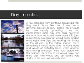
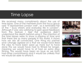
- More daytime clips of London and slower time lapses would have improved the video but required extra filming.
- Feedback on the use of Vivaldi music was mixed but the creators felt it conveyed a "London experience" as intended.
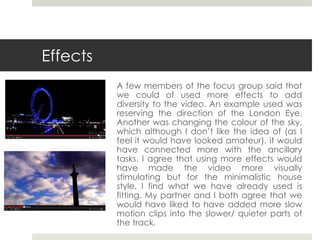
- Effects like reversing the London Eye or changing sky colors could have added diversity but may have looked amateur.
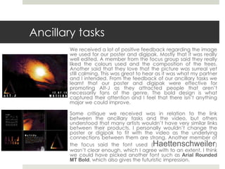
- Positive feedback was received on the poster and packaging design though a more readable font could have been used.