MEDIA EVALUATION
Question 2: How does your media product represent particular
social groups?
THE SOCIAL GROUP?
I made this audience profile to make
a all around demographic of the
user that would pick up the
magazine. This had to be very
specific because we had to idolise
and pick out who and what the
person would be like.
The first thing I looked at was what
type of person would be interested in
this magazine, so this was looking at
things like the gender and how much
income this type of person would be
receiving. Overall we had to stereotype
and really be brutal with the facts we
were giving to this made up individual.
I said that the individual would be more
male because of the type of genre that
we would be portraying. When doing
this we had to be quite sexist with our
choosing just so we could cater for our
audience. We also said that these people
would have little to no family and aged
between 17 up to 30.
Next we had to look at the interests
of the user, this included things like
loud music and underground gigs. I
said this because it correlated with
the genre of the magazine. All of the
factor that have gone into making
the genre really be portrayed in way I
produce my pages.
FRONT COVER IMPLICATIONS
Before I even started to create my
front cover I had to take into
consideration the audience I had
given to I and what the audience
wanted. to do this I had to really get
to know my demographic and what
made them want to buy a product
like this.
I wanted to really have a clean look
to the front cover to show this
urban but professional look to
whole piece. I did this by not using
so much shading to the text and not
having many 3D effects just to keep
it flat and tidy.
Because my gender demographic
was more male I wanted to keep all
the colours more dark and
mysterious because of the vibe it
was trying to show. This made the
front cover individual more
intriguing so the reader would want
to look into it.
The masthead was made to show
how the name ‘Criminal’ was this
hard hitting and power named
magazine and with the shading and
all the dark effects that are applied
to it adds to the feel.
The various amount of fonts that
are displayed on the front of the
cover shows the variety of content
that is in the magazine
CONTENTS IMPLICATIONS
In the featured section of the
contents is here to showcase all of
the great artists that are out there.
this draws the attention to these
because this would be the the thing
that the people that are going to be
reading this will look for first. By
doing this it starts the reader at the
left side of the page and then read
down, this creates a fluidity to the
way that a person read it.
The ticket section of the contents is
made so the user has the chance to
explore different people and start to
broaden there genres. this then
leads onto the criminal picks
section, this is the selected bits of
the magazine that people can read
and enjoy based on the title of the
article.
The picture that are on the right
side are the articles that are
featured and these pictures leave
the user more intrigued about that
article because the picture doesn't
show too much.
DOUBLE PAGE SPREAD IMPLICATIONS
With the picture on the double page
spread image I wanted to have the
reader see the person for who he is.
so I did this because for the person
to understand a person before they
read it. plus the reader can see the
whole person not just a cut version
of themselves.
With the way the page layout works with how a person reads and
understands the page is in different sections for the user to read. I used a
thin black font on this white background to the show how clean this
magazine was.
With the large drop cap and images
I created environment that by
looking at the results from what my
audience wanted to see, I could see
that the clean style was a
resounding yes in the polls. This is
why I have used this elegant but
also professional look to the pages.
OTHER REPRESENTATIONS
Vibe shows a very similar audience
to the criminal one I had created,
and you can see by having the same
audience and demographic it can
display that in the way the front
cover is shown.
With all of these font cover we can
see already that the individual is
always looking at the camera and
looking in some ways angry or
powerful. this show the genre of the
magazine.
Overall the different magazines that
correlate to the genre really have
the same sort of professional look
to them but sill have contrasting
colours to support that overall look
to the magazine.
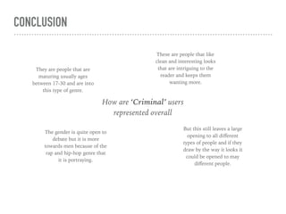
CONCLUSION
How are ‘Criminal’ users
represented overall
They are people that are
maturing usually ages
between 17-30 and are into
this type of genre.
These are people that like
clean and interesting looks
that are intriguing to the
reader and keeps them
wanting more.
The gender is quite open to
debate but it is more
towards men because of the
rap and hip-hop genre that
it is portraying.
But this still leaves a large
opening to all different
types of people and if they
draw by the way it looks it
could be opened to may
different people.

Question 2

  • 1.
    MEDIA EVALUATION Question 2:How does your media product represent particular social groups?
  • 2.
    THE SOCIAL GROUP? Imade this audience profile to make a all around demographic of the user that would pick up the magazine. This had to be very specific because we had to idolise and pick out who and what the person would be like. The first thing I looked at was what type of person would be interested in this magazine, so this was looking at things like the gender and how much income this type of person would be receiving. Overall we had to stereotype and really be brutal with the facts we were giving to this made up individual. I said that the individual would be more male because of the type of genre that we would be portraying. When doing this we had to be quite sexist with our choosing just so we could cater for our audience. We also said that these people would have little to no family and aged between 17 up to 30. Next we had to look at the interests of the user, this included things like loud music and underground gigs. I said this because it correlated with the genre of the magazine. All of the factor that have gone into making the genre really be portrayed in way I produce my pages.
  • 3.
    FRONT COVER IMPLICATIONS BeforeI even started to create my front cover I had to take into consideration the audience I had given to I and what the audience wanted. to do this I had to really get to know my demographic and what made them want to buy a product like this. I wanted to really have a clean look to the front cover to show this urban but professional look to whole piece. I did this by not using so much shading to the text and not having many 3D effects just to keep it flat and tidy. Because my gender demographic was more male I wanted to keep all the colours more dark and mysterious because of the vibe it was trying to show. This made the front cover individual more intriguing so the reader would want to look into it. The masthead was made to show how the name ‘Criminal’ was this hard hitting and power named magazine and with the shading and all the dark effects that are applied to it adds to the feel. The various amount of fonts that are displayed on the front of the cover shows the variety of content that is in the magazine
  • 4.
    CONTENTS IMPLICATIONS In thefeatured section of the contents is here to showcase all of the great artists that are out there. this draws the attention to these because this would be the the thing that the people that are going to be reading this will look for first. By doing this it starts the reader at the left side of the page and then read down, this creates a fluidity to the way that a person read it. The ticket section of the contents is made so the user has the chance to explore different people and start to broaden there genres. this then leads onto the criminal picks section, this is the selected bits of the magazine that people can read and enjoy based on the title of the article. The picture that are on the right side are the articles that are featured and these pictures leave the user more intrigued about that article because the picture doesn't show too much.
  • 5.
    DOUBLE PAGE SPREADIMPLICATIONS With the picture on the double page spread image I wanted to have the reader see the person for who he is. so I did this because for the person to understand a person before they read it. plus the reader can see the whole person not just a cut version of themselves. With the way the page layout works with how a person reads and understands the page is in different sections for the user to read. I used a thin black font on this white background to the show how clean this magazine was. With the large drop cap and images I created environment that by looking at the results from what my audience wanted to see, I could see that the clean style was a resounding yes in the polls. This is why I have used this elegant but also professional look to the pages.
  • 6.
    OTHER REPRESENTATIONS Vibe showsa very similar audience to the criminal one I had created, and you can see by having the same audience and demographic it can display that in the way the front cover is shown. With all of these font cover we can see already that the individual is always looking at the camera and looking in some ways angry or powerful. this show the genre of the magazine. Overall the different magazines that correlate to the genre really have the same sort of professional look to them but sill have contrasting colours to support that overall look to the magazine.
  • 7.
    CONCLUSION How are ‘Criminal’users represented overall They are people that are maturing usually ages between 17-30 and are into this type of genre. These are people that like clean and interesting looks that are intriguing to the reader and keeps them wanting more. The gender is quite open to debate but it is more towards men because of the rap and hip-hop genre that it is portraying. But this still leaves a large opening to all different types of people and if they draw by the way it looks it could be opened to may different people.