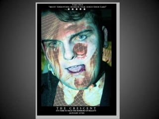
The document discusses the goals for a film poster and magazine that would summarize and promote a student film trailer. The poster aims to portray the two main characters, Oskar and Bronte, in a merged image to suggest that Bronte is trapped inside Oskar. This connects to the trailer's plot and creates intrigue for the audience. The magazine features Bronte alone to avoid overexposing the actor who plays Oskar and to maintain his character's realism. It uses images of Bronte in positions of entrapment and fear to convey the same emotions as the trailer through minimal production elements like emotion rather than graphic violence.
2. For our poster we wanted to portray what our films mainly about. To do this
we used we wanted use both Oskar and Bronte as the subjects so that it is
instantly linked and recognised with our trailer. The plot of our trailer is that
Bronte is the final girl so we wanted to convey this by merging together both
Oskar and Bronte and making it seem as if Bronte is trapped inside him. This
connects with our trailer as we don’t see Bronte escape from Oskar and will
make the audience want to see if she does eventually run away. Giving this
merging effect helps clarify what our trailer is about and can also suggest that
two worlds are interfacing and gives an underlying fear to our audience. Using
bright colours in the poster gives the modern edgy look on horror which links
into the highly contrasted effects we used in our trailer. Using these bright
colours rather than the dark levels of light normally featured in horror posters
reverses the normal horror conventions and is what I believe makes our horror
product stand out. It also makes the subjects and the trailer seem quite creepy
and dangerous as we are not conforming to the rules of horror.
3.
4. With our magazine we wanted it to be powerful but quite simple and not too overwhelming.
This way through the magazine we can show the simple ways we have created horror through
our trailer, for example the minimal use of weapons, blood and killing scenes and also show
our most adventurous scenes through our poster. Both aspects have in turn still created horror.
In our magazine we wanted to feature one subject and we chose to use Bronte. We chose
Bronte instead of Oskar as in our trailer Oskar is featured in many of the shots, as said before I
believe that this is a positive aspect for our trailer. So, this is why we didn’t want Oskar to be
featured in the magazine as we didn’t want to eliminate the realism of his character and
feature his face on a film magazine which would reinforce the fact that he is just an actor. We
wanted to show a lot of the villain, Oskar, through real time footage to incorporate a realistic
outlook on the issue and having him exposed on the magazine as well as the poster may take
away this authenticity. We again wanted to present the emotion of entrapment through Bronte
as we merged an image of her positioned to be going crazy over her and a second image of her
kneeling down with a belt tied over her mouth. This image shows the fear that is also conveyed
in the horror trailer of Bronte trying to run away from and being dragged away by Oskar. The
emotion used in the poster is what brings out the aspects of fear and terror of the trailer. This
shows the simple ways we created horror in our trailer as most of the suspense and terror is
shown through emotion and this is also shown through the delicacy of the belt. These
disturbing approaches to horror in our images are all powered on the way direction has been
given and the way they have then been presented. Rather than using gallons of blood and
wound marks to bring fear and this forms from the basis of our trailer. We wanted to show
Bronte again trying to break free. I believe this and the ‘merging of images’ theme is what has
branded our film from the magazine and poster.