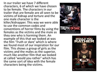
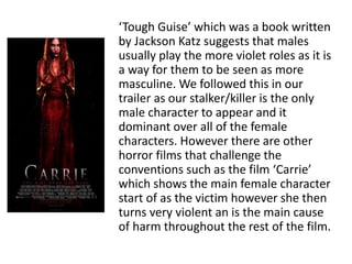
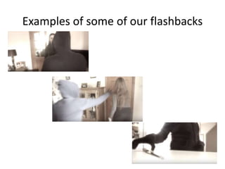
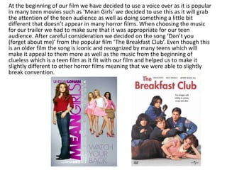
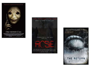
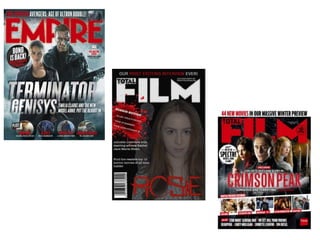
Evaluation- Question 1
In what ways does your media product
use, develop or challenge forms and
conventions of real media products?
In our trailer we have 7 different
characters, 6 of which we have chosen
to be female. The characters in our
trailer that are female are all seen to be
victims of kidnap and torture and the
one male character is the
killer/kidnapper. This way we were able
to use the common codes and
conventions of horror films by using the
females as the victims and the male as
they one who is harming them. An
example of this that we looked at was
the film ‘Truth or dare’ which is where
we found most of our inspiration for our
film. This shows a group of girls as the
victims and the males as the superior,
much like another film that we looked
at called ‘would you rather’ which has
the same sort of idea with the female
characters being the victims.
‘Tough Guise’ which was a book written
by Jackson Katz suggests that males
usually play the more violet roles as it is
a way for them to be seen as more
masculine. We followed this in our
trailer as our stalker/killer is the only
male character to appear and it
dominant over all of the female
characters. However there are other
horror films that challenge the
conventions such as the film ‘Carrie’
which shows the main female character
start of as the victim however she then
turns very violent an is the main cause
of harm throughout the rest of the film.
When doing our research for our trailer we looked at the films
‘Truth or Dare’ and ‘Would you rather’. In both of these films
they contained flashbacks during the parts where the victims
were being tortured. We really liked this da so decided to
recreate it in our trailer. In our trailer it shows the victims also
being tortured but it also shows flashbacks of actions that
look similar. For example we have footage of a hooded figure
wearing gloves snatch a knife from the side, to mirror this In a
flash back we have someone picking up a pen and writing
something down. Another ay that we did this was we also
filmed a shot of the victim’s hair being pulled, to mirror this in
a flashback we filmed the same victim playing with her hair.
We decided to use this convention as it appeared in more
than one horror film and we thought that it would be very
effective and it fit in well with our plot. We also believed that
it would be a strong way to help us get our story across to the
audience.
Examples of some of our flashbacks
We also had to look into the codes and conventions that real
horror films have in order for us to make sure ours was similar
and had the right sort of content and used similar techniques.
Using the Blumler and Katz uses and gratification theory I was
able to find out the sort of people that are most likely to
watch a horror movie and why they would watch it. The main
reason that people choose to watch a horror film is either for
entertainment or social interaction. Horror films allow people
to gain enjoyment from watching them as well as a feeling of
escapism. This is because horror films are usually based on
things that wouldn’t happen in everyday life therefore it gives
the audience a chance to forgot about their everyday lives and
fully engage with the film. Audiences may also use horror
films as a topic of conversation and discuss it with others.
Audiences may do this with horrors to find out if others
reactions to the film were similar to their own.
We decided that our film trailer was going to be primarily
for a teen audience. We decided to do this, as it is one of
the most popular audiences for a horror movie. Another
reason why we chose to do this as we are teenagers
ourselves and we know what sort of things we think is
affective in a horror film. This way we were able to
incorporate this into our trailer to make it appeal to the
teen audience. Another way that we made it appeal to
the teen audience is by using teenagers as the characters
for our films. This makes the film more relatable as it is
watching people onscreen that are the same age as them.
Although this is a horror film we looked at other teen
movies to give us a few ideas.
At the beginning of our film we have decided to use a voice over as it is popular
in many teen movies such as ‘Mean Girls’ we decided to use this as it will grab
the attention of the teen audience as well as doing something a little bit
different that doesn’t appear in many horror films. When choosing the music
for our trailer we had to make sure that it was appropriate for our teen
audience. After careful consideration we decided on the song ‘Don’t you
(forget about me)’ from the popular film ‘The Breakfast Club’. Even though this
is an older film the song is iconic and recognized by many teens which will
make it appeal to them more as well as the music from the beginning of
clueless which is a teen film as it fit with our film and helped us to make it
slightly different to other horror films meaning that we were able to slightly
break convention.
When I started designing my poster I looked at existing horror posters
such as ‘one missed call’ and ‘the return’. When I was looking at these
posters I realized that these are two different types of horror poster.
‘one missed call’ shows a masked face that takes up the majority of the
poster. This suggests that this is one of the main characters in the film
and scares the audience before they have even watched it. However
the poster for ‘the return’ just shows an icy looking eye with a hand in
the pupil. This gives away nothing about the film so it may intrigue the
audience. For the main image on my poster I decided to use an image
of the stalker walking away from the house where he has left the
victims in the trailer. I decided to edit this image and place it more
than once on the poster to show him walking further and further away.
I also edited it to made him fade into the dark background
When doing my research I found out that they usually release both a
teaser poster and a main poster. For my film I decided that I was going
to release a main poster. For my poster I decided not to follow the
main conventions of the film poster. In most horror posters the main
image is placed in the centre of the poster and is much larger than the
other images. My main images is slightly off centre with the image
faded out and placed behind it. However I did make sure that this
image took up the majority of the space on the poster to catch the
audiences eye. I also decided to follow another convention of typical
horror posters by making it very dull and dark. This is shown on both of
the film posters that I looked at. I have also decided to place the credit
block at the bottom of my poster under my image and the tagline and
release date at the top of the poster which is also a typical convention
of all film poster, not just horrors.
I decided to use the main victims face as the main image for my magazine.
The picture that I chose to use shows her with messy hair, and a very pale
grey coloured face. I also decided to fade a picture of the stalker into the
background of the magazine, which shows him looking over his shoulder at
the victim. I also decided to follow another convention of typical horror
posters by making it very dull and dark. I decided to look at film magazines
such as ‘Total Film’ and ‘Empire’ to help me gain inspiration for my magazine.
After looking at several examples of these magazines I decided that I would
base my magazine on ‘total Film’ mainly because I liked the way it was set out
and I think it fits in better with my trailer. To do this I remade the total film
logo to place at the top of my magazine which is done on the real magazines
to make it look as realistic as possible. To make my poster seem even more
realistic I included the date of the magazine and the issue number. When
creating the magazine I also made a bullet to make certain information stand
out. I decided to make this a horror edition so that it fits well with my trailer. I
used a blood splatter as the bullet as think links with one of the scenes in our
trailer where you see blood splatters on the floor an the stalker videoing
himself walking. I also used the bullet to advertise other films. To make sure
this was realistic I researched other horror films that are being released this
year. I also added headlines for the top 10 horror movies and an interview
with our main character in the trailer who us featured on the front of the
magazine as the main image.
Evaluation- Question 1

Evaluation- Question 1

  • 1.
    Evaluation- Question 1 Inwhat ways does your media product use, develop or challenge forms and conventions of real media products?
  • 2.
    In our trailerwe have 7 different characters, 6 of which we have chosen to be female. The characters in our trailer that are female are all seen to be victims of kidnap and torture and the one male character is the killer/kidnapper. This way we were able to use the common codes and conventions of horror films by using the females as the victims and the male as they one who is harming them. An example of this that we looked at was the film ‘Truth or dare’ which is where we found most of our inspiration for our film. This shows a group of girls as the victims and the males as the superior, much like another film that we looked at called ‘would you rather’ which has the same sort of idea with the female characters being the victims.
  • 3.
    ‘Tough Guise’ whichwas a book written by Jackson Katz suggests that males usually play the more violet roles as it is a way for them to be seen as more masculine. We followed this in our trailer as our stalker/killer is the only male character to appear and it dominant over all of the female characters. However there are other horror films that challenge the conventions such as the film ‘Carrie’ which shows the main female character start of as the victim however she then turns very violent an is the main cause of harm throughout the rest of the film.
  • 4.
    When doing ourresearch for our trailer we looked at the films ‘Truth or Dare’ and ‘Would you rather’. In both of these films they contained flashbacks during the parts where the victims were being tortured. We really liked this da so decided to recreate it in our trailer. In our trailer it shows the victims also being tortured but it also shows flashbacks of actions that look similar. For example we have footage of a hooded figure wearing gloves snatch a knife from the side, to mirror this In a flash back we have someone picking up a pen and writing something down. Another ay that we did this was we also filmed a shot of the victim’s hair being pulled, to mirror this in a flashback we filmed the same victim playing with her hair. We decided to use this convention as it appeared in more than one horror film and we thought that it would be very effective and it fit in well with our plot. We also believed that it would be a strong way to help us get our story across to the audience.
  • 5.
    Examples of someof our flashbacks
  • 6.
    We also hadto look into the codes and conventions that real horror films have in order for us to make sure ours was similar and had the right sort of content and used similar techniques. Using the Blumler and Katz uses and gratification theory I was able to find out the sort of people that are most likely to watch a horror movie and why they would watch it. The main reason that people choose to watch a horror film is either for entertainment or social interaction. Horror films allow people to gain enjoyment from watching them as well as a feeling of escapism. This is because horror films are usually based on things that wouldn’t happen in everyday life therefore it gives the audience a chance to forgot about their everyday lives and fully engage with the film. Audiences may also use horror films as a topic of conversation and discuss it with others. Audiences may do this with horrors to find out if others reactions to the film were similar to their own.
  • 7.
    We decided thatour film trailer was going to be primarily for a teen audience. We decided to do this, as it is one of the most popular audiences for a horror movie. Another reason why we chose to do this as we are teenagers ourselves and we know what sort of things we think is affective in a horror film. This way we were able to incorporate this into our trailer to make it appeal to the teen audience. Another way that we made it appeal to the teen audience is by using teenagers as the characters for our films. This makes the film more relatable as it is watching people onscreen that are the same age as them. Although this is a horror film we looked at other teen movies to give us a few ideas.
  • 8.
    At the beginningof our film we have decided to use a voice over as it is popular in many teen movies such as ‘Mean Girls’ we decided to use this as it will grab the attention of the teen audience as well as doing something a little bit different that doesn’t appear in many horror films. When choosing the music for our trailer we had to make sure that it was appropriate for our teen audience. After careful consideration we decided on the song ‘Don’t you (forget about me)’ from the popular film ‘The Breakfast Club’. Even though this is an older film the song is iconic and recognized by many teens which will make it appeal to them more as well as the music from the beginning of clueless which is a teen film as it fit with our film and helped us to make it slightly different to other horror films meaning that we were able to slightly break convention.
  • 9.
    When I starteddesigning my poster I looked at existing horror posters such as ‘one missed call’ and ‘the return’. When I was looking at these posters I realized that these are two different types of horror poster. ‘one missed call’ shows a masked face that takes up the majority of the poster. This suggests that this is one of the main characters in the film and scares the audience before they have even watched it. However the poster for ‘the return’ just shows an icy looking eye with a hand in the pupil. This gives away nothing about the film so it may intrigue the audience. For the main image on my poster I decided to use an image of the stalker walking away from the house where he has left the victims in the trailer. I decided to edit this image and place it more than once on the poster to show him walking further and further away. I also edited it to made him fade into the dark background
  • 11.
    When doing myresearch I found out that they usually release both a teaser poster and a main poster. For my film I decided that I was going to release a main poster. For my poster I decided not to follow the main conventions of the film poster. In most horror posters the main image is placed in the centre of the poster and is much larger than the other images. My main images is slightly off centre with the image faded out and placed behind it. However I did make sure that this image took up the majority of the space on the poster to catch the audiences eye. I also decided to follow another convention of typical horror posters by making it very dull and dark. This is shown on both of the film posters that I looked at. I have also decided to place the credit block at the bottom of my poster under my image and the tagline and release date at the top of the poster which is also a typical convention of all film poster, not just horrors.
  • 12.
    I decided touse the main victims face as the main image for my magazine. The picture that I chose to use shows her with messy hair, and a very pale grey coloured face. I also decided to fade a picture of the stalker into the background of the magazine, which shows him looking over his shoulder at the victim. I also decided to follow another convention of typical horror posters by making it very dull and dark. I decided to look at film magazines such as ‘Total Film’ and ‘Empire’ to help me gain inspiration for my magazine. After looking at several examples of these magazines I decided that I would base my magazine on ‘total Film’ mainly because I liked the way it was set out and I think it fits in better with my trailer. To do this I remade the total film logo to place at the top of my magazine which is done on the real magazines to make it look as realistic as possible. To make my poster seem even more realistic I included the date of the magazine and the issue number. When creating the magazine I also made a bullet to make certain information stand out. I decided to make this a horror edition so that it fits well with my trailer. I used a blood splatter as the bullet as think links with one of the scenes in our trailer where you see blood splatters on the floor an the stalker videoing himself walking. I also used the bullet to advertise other films. To make sure this was realistic I researched other horror films that are being released this year. I also added headlines for the top 10 horror movies and an interview with our main character in the trailer who us featured on the front of the magazine as the main image.