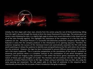
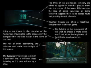
The document analyzes the opening title sequences of the horror films Friday the 13th (2009) and Sinister (2012) based on uses and gratifications theory. It discusses how the titles provide subtle hints about the plot and convey information about the production companies. Both films manipulate colors, fonts, and positioning of titles to suit the horror genre and build suspense. Friday the 13th uses red imagery and delays revealing the main title, while Sinister incorporates found footage into its titles to reflect the plot. The analysis concludes the titles are an important way to impact audiences and will inform the opening titles of the author's own media project.


