Download to read offline
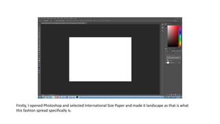
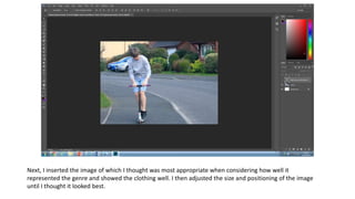


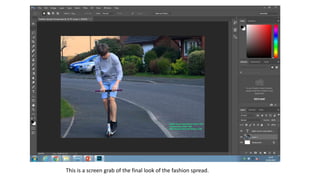
First, the author opened Photoshop and selected a landscape format to create a fashion spread. Next, they inserted an image that well represented the genre and showed the clothing, adjusting its size and position. Finally, the author added pricing in a small lime green font, adjusted the brightness and contrast to enhance the greens in the image, and captured a screen grab of the final fashion spread.


