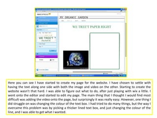
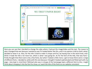
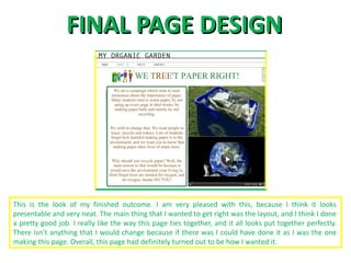
Process of creating Website

 Click to edit MasterPage
           ‘About us’ subtitle style
Here you can see I have started to create my page for the website. I have chosen to settle with
having the text along one side with both the image and video on the other. Starting to create the
website wasn’t that hard. I was able to figure out what to do, after just playing with wix a little. I
went onto the editor and started to edit my page. The main thing that I thought I would find most
difficult was adding the video onto the page, but surprisingly it was really easy. However, one thing I
did struggle on was changing the colour of the text box. I had tried to do many things, but the way I
overcame this problem was by picking a thicker lined text box, and just changing the colour of the
line, and I was able to get what I wanted.
Here you can see that I decided to change the sides where I had put the image/video and the text. The reason to
why I changed that was because I wanted to see if it looked better like this, and in my opinion it did so that’s what I
decided to leave it as. Also, for the title I tried to make it unique and fun, by having tree in the word treat, and I
think it made the title a lot more fun, which is what I was going for. As for the font of the title, that was hard. I
firstly thought that there were only a few fonts, but when I looked a little more, I got to know there were a range
of different fonts. I decided to settle with this one because I thought it looked sophisticated and fitted well with my
page. I also kept in mind that if Michael who was in charge of the homepage kept a different font to this, I might
think about changing it into the font he chose, as I want the title of the fonts on our website consistent.
Here I have added images. What I had to do was click on an icon which said ‘add images’ on it. After
that I had many options to choose from, which enabled me to pick a way in which I wanted my
images to appear. There were two different ways that I decided to try out, and the one that I liked
better was the one I would settle with. The one above was one which had them rotating. I had to
upload the images I wanted. I had three images that I wanted to have, but because there was space
for 5 images I had to delete two of them. This was easily done because all I had to do was click a
button which said ‘delete’. I didn’t really like the way these images appeared because it just didn’t
look good.
This was the other way that I tried to have my images. This was a lot different as it would make my
images run as a slideshow. I was more fond of this way, and that’s why I decided to settle with this.
However, some of the images I had chosen were too big, so they didn’t show up in the right size on
my page. I couldn’t find a way to solve this issue, then to just choose other images because it was
hard to figure out what I had to do. I tried to find a way, but apart from changing the images there
was nothing else I could do. Once, I had changed the images, they looked a lot better, and fit well
too. So, I just chose to go with this way of my images showing up.
Once everything was done (text, images and video) I wanted to play around a little more
with the layout of my page. As I mentioned before in my opinion, they layout is key. So,
what I have done here is I moved the text box to being right at the top of the page; and
have the images and video below it. I thought that by having a lot of text at the top of
the page, it made my page look a little boring, so I didn’t stick to this layout and decided
to go to the layout I had previous to this one.
Once everything was in position, I had to give the final finishing touched to my page. This is when I
concentrated on the colours. Firstly, because I had the word ‘tree’ in my title I wanted to make it
brown, so that when people read it they knew that the word tree’s in it. Also, it makes our message
clear to them too. After that, I looked at the text. By having it just black, it looked really boring and I
wanted my page to be anything but boring. Keeping this thought in mind I looked at the colour
scheme of my existing page, and I thought that brown would look best, and it did. After that I
thought I was finished, but for some reason it still looked really empty. What I done then was added
a little image in the top left hand corner. That definitely made the page look a lot better.
FINAL PAGE DESIGN


This is the look of my finished outcome. I am very pleased with this, because I think it looks
presentable and very neat. The main thing that I wanted to get right was the layout, and I think I done
a pretty good job. I really like the way this page ties together, and it all looks put together perfectly.
There isn’t anything that I would change because if there was I could have done it as I was the one
making this page. Overall, this page had definitely turned out to be how I wanted it.

Process of Creating my Page for Website

  • 1.
    Process of creatingWebsite Click to edit MasterPage ‘About us’ subtitle style
  • 2.
    Here you cansee I have started to create my page for the website. I have chosen to settle with having the text along one side with both the image and video on the other. Starting to create the website wasn’t that hard. I was able to figure out what to do, after just playing with wix a little. I went onto the editor and started to edit my page. The main thing that I thought I would find most difficult was adding the video onto the page, but surprisingly it was really easy. However, one thing I did struggle on was changing the colour of the text box. I had tried to do many things, but the way I overcame this problem was by picking a thicker lined text box, and just changing the colour of the line, and I was able to get what I wanted.
  • 3.
    Here you cansee that I decided to change the sides where I had put the image/video and the text. The reason to why I changed that was because I wanted to see if it looked better like this, and in my opinion it did so that’s what I decided to leave it as. Also, for the title I tried to make it unique and fun, by having tree in the word treat, and I think it made the title a lot more fun, which is what I was going for. As for the font of the title, that was hard. I firstly thought that there were only a few fonts, but when I looked a little more, I got to know there were a range of different fonts. I decided to settle with this one because I thought it looked sophisticated and fitted well with my page. I also kept in mind that if Michael who was in charge of the homepage kept a different font to this, I might think about changing it into the font he chose, as I want the title of the fonts on our website consistent.
  • 4.
    Here I haveadded images. What I had to do was click on an icon which said ‘add images’ on it. After that I had many options to choose from, which enabled me to pick a way in which I wanted my images to appear. There were two different ways that I decided to try out, and the one that I liked better was the one I would settle with. The one above was one which had them rotating. I had to upload the images I wanted. I had three images that I wanted to have, but because there was space for 5 images I had to delete two of them. This was easily done because all I had to do was click a button which said ‘delete’. I didn’t really like the way these images appeared because it just didn’t look good.
  • 5.
    This was theother way that I tried to have my images. This was a lot different as it would make my images run as a slideshow. I was more fond of this way, and that’s why I decided to settle with this. However, some of the images I had chosen were too big, so they didn’t show up in the right size on my page. I couldn’t find a way to solve this issue, then to just choose other images because it was hard to figure out what I had to do. I tried to find a way, but apart from changing the images there was nothing else I could do. Once, I had changed the images, they looked a lot better, and fit well too. So, I just chose to go with this way of my images showing up.
  • 6.
    Once everything wasdone (text, images and video) I wanted to play around a little more with the layout of my page. As I mentioned before in my opinion, they layout is key. So, what I have done here is I moved the text box to being right at the top of the page; and have the images and video below it. I thought that by having a lot of text at the top of the page, it made my page look a little boring, so I didn’t stick to this layout and decided to go to the layout I had previous to this one.
  • 7.
    Once everything wasin position, I had to give the final finishing touched to my page. This is when I concentrated on the colours. Firstly, because I had the word ‘tree’ in my title I wanted to make it brown, so that when people read it they knew that the word tree’s in it. Also, it makes our message clear to them too. After that, I looked at the text. By having it just black, it looked really boring and I wanted my page to be anything but boring. Keeping this thought in mind I looked at the colour scheme of my existing page, and I thought that brown would look best, and it did. After that I thought I was finished, but for some reason it still looked really empty. What I done then was added a little image in the top left hand corner. That definitely made the page look a lot better.
  • 8.
    FINAL PAGE DESIGN Thisis the look of my finished outcome. I am very pleased with this, because I think it looks presentable and very neat. The main thing that I wanted to get right was the layout, and I think I done a pretty good job. I really like the way this page ties together, and it all looks put together perfectly. There isn’t anything that I would change because if there was I could have done it as I was the one making this page. Overall, this page had definitely turned out to be how I wanted it.