Download to read offline


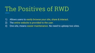


This document discusses the importance and benefits of responsive web design (RWD). It notes that RWD allows websites to automatically adapt to different screen sizes and devices like mobile phones and tablets. This is important because mobile usage now exceeds desktop usage. Responsive sites improve the user experience across devices and can increase engagement. They help sites rank higher in search engines like Google. Responsive designs also tend to have lower bounce rates and allow sites to reach a wider audience in a unified way compared to having separate mobile and desktop sites. The document encourages readers to adopt responsive design to stay competitive with other businesses.


