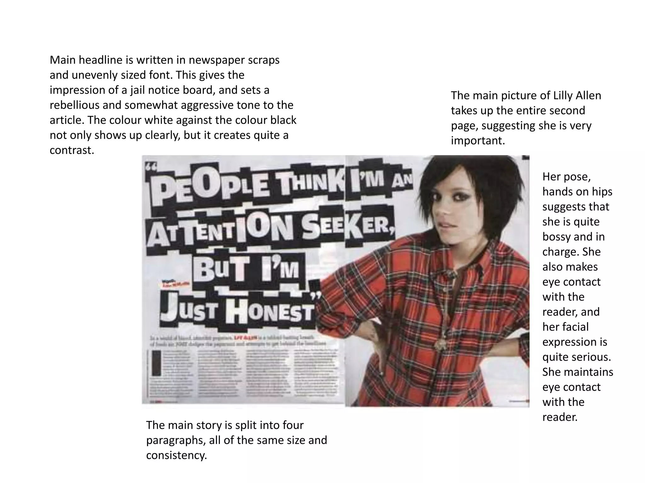
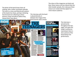
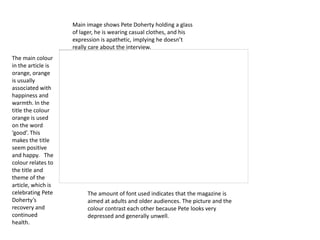
Main headline is written in newspaper scraps
and unevenly sized font. This gives the
impression of a jail notice board, and sets a             The main picture of Lilly Allen
rebellious and somewhat aggressive tone to the            takes up the entire second
article. The colour white against the colour black        page, suggesting she is very
not only shows up clearly, but it creates quite a         important.
contrast.

                                                                            Her pose,
                                                                            hands on hips
                                                                            suggests that
                                                                            she is quite
                                                                            bossy and in
                                                                            charge. She
                                                                            also makes
                                                                            eye contact
                                                                            with the
                                                                            reader, and
                                                                            her facial
                                                                            expression is
                                                                            quite serious.
                                                                            She maintains
                                                                            eye contact
                                                                            with the
                                                                            reader.
                   The main story is split into four
                   paragraphs, all of the same size and
                   consistency.
The colour of the magazines are black and
                                                                             blue, these colours are less vibrant than the
The photo of the band shows them all                                         other double spreads, this is because these
relaxing, with a rather nonchalant attitude.                                 colours are muted and they appeal to a
The room is a mess and littered with posters                                 more mature audience.
of the bands live shows, perhaps indicating
that the band are reflecting on there          The interview with the band
previous songs and albums before they          is placed directly in-
release there new album.                       between the image of the
                                               band and the other articles
                                                                                                  The interview is
                                                                                                  spread evenly
                                                                                                  throughout the two
                                                                                                  pages, this gives the
                                                                                                  reader incentive to
                                                                                                  read ahead, there is
                                                                                                  also a picture of the
                                                                                                  band doing a live
                                                                                                  performance.
Main image shows Pete Doherty holding a glass
                    of lager, he is wearing casual clothes, and his
                    expression is apathetic, implying he doesn’t
                    really care about the interview.
The main colour
in the article is
orange, orange
is usually
associated with
happiness and
warmth. In the
title the colour
orange is used
on the word
‘good’. This
makes the title
seem positive
and happy. The
colour relates to
the title and
theme of the
article, which is
celebrating Pete         The amount of font used indicates that the magazine is
Doherty’s                aimed at adults and older audiences. The picture and the
recovery and             colour contrast each other because Pete looks very
continued                depressed and generally unwell.
health.

Presentation2

  • 1.
    Main headline iswritten in newspaper scraps and unevenly sized font. This gives the impression of a jail notice board, and sets a The main picture of Lilly Allen rebellious and somewhat aggressive tone to the takes up the entire second article. The colour white against the colour black page, suggesting she is very not only shows up clearly, but it creates quite a important. contrast. Her pose, hands on hips suggests that she is quite bossy and in charge. She also makes eye contact with the reader, and her facial expression is quite serious. She maintains eye contact with the reader. The main story is split into four paragraphs, all of the same size and consistency.
  • 2.
    The colour ofthe magazines are black and blue, these colours are less vibrant than the The photo of the band shows them all other double spreads, this is because these relaxing, with a rather nonchalant attitude. colours are muted and they appeal to a The room is a mess and littered with posters more mature audience. of the bands live shows, perhaps indicating that the band are reflecting on there The interview with the band previous songs and albums before they is placed directly in- release there new album. between the image of the band and the other articles The interview is spread evenly throughout the two pages, this gives the reader incentive to read ahead, there is also a picture of the band doing a live performance.
  • 3.
    Main image showsPete Doherty holding a glass of lager, he is wearing casual clothes, and his expression is apathetic, implying he doesn’t really care about the interview. The main colour in the article is orange, orange is usually associated with happiness and warmth. In the title the colour orange is used on the word ‘good’. This makes the title seem positive and happy. The colour relates to the title and theme of the article, which is celebrating Pete The amount of font used indicates that the magazine is Doherty’s aimed at adults and older audiences. The picture and the recovery and colour contrast each other because Pete looks very continued depressed and generally unwell. health.