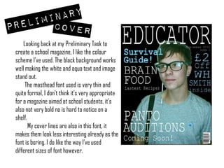
- The author reviewed their preliminary work on creating a school magazine and found that while the color scheme worked well, the thin and formal font used for the masthead and cover lines lacked interest and boldness.
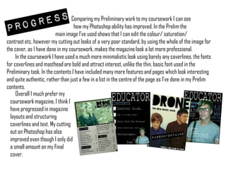
- Initially, the contents page looked empty without many page numbers or features. Comparing it to their coursework, the author saw improvements in their Photoshop skills and magazine layout abilities, using bolder fonts, a more minimalistic design, and a fully fleshed out contents page.
- Overall, the author preferred their coursework magazine and felt they had progressed in skills like magazine structuring, layout, and image editing.