There's typical criminal background, this
implies that the film is a crime and has
something to do with criminals
Deep’s facial expression s of
him smirking, this makes the
audience want to know why he
is smiling
The title is centered within
the poster and its in bigger
font out all the text . This
makes it the main focus.
Medium close up on his face
helps show his facial expression
Includes a website address to
advertise the film more and give the
audience more o an insight to the
film
The lighting hits main character
making him the main attraction and
also highlight his expression
Dark colours are used as a background
to help represent the genre crime
Short tagline to hint to the
audience that the criminal in
the film is an extremely bad
character and that the plot
will be intense.
Plain clear font which is quite
a big size to stand out from
the background
Character is centralised and made the main focus of
the poster, this is because the actor is very well
known and would attract the audience as they
recognise him.
This is a type of teaser or
character poster as the main
character and the poster
doesn't’t give too much away
making the audience want to
know more.
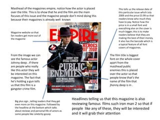
Big plus sign , telling readers that they get
even more on this magazine. Followed by
the headline at the bottom which talks
about reviews and personal life of actors as
some people like celebrity gossip
This tells us the release date of
this particular issue which July
2009 and the price £3.99 so that
readers know who much they
have to pay. Notice how the
price is in a small font and
everything else on the cover is
much bigger, this is to make
readers believe that they are
making the best of their money.
It also has the barcode which is
a typical feature of all font
covers of magazines.
Masthead of the magazines empire, notice how the actor is placed
over the title. This is to show that he and the film are the main
focuses of this issue and the magazine people don’t mind doing this
because their magazines is already well known
Magazine website so that
fan readers get more out of
the magazine
The film title is biggest
font on the whole cover
apart from the
masthead public
enemies this is placed
over the actor so that
people know that’s the
name of the film that
jhonny deep is in .
From the image we can
see the famous actor
Johnny deep . If there
are people who really
like this actor they will
be interested on this
magazine. The fact that
he's holding a gun tells
us that this film is a
gangster crime film.
Headlines telling us that this magazine is also
reviewing famous films such iron man 2 so that if
people like any of these, they will be interested
and it will grab their attention
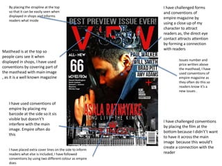
Issues number and
price written above
the masthead, I have
used conventions of
empire magazine as
they often do this so
readers know it’s a
new issues .
I have placed extra cover lines on the side to inform
readers what else is included, I have followed
conventions by using two different colour as empire
does
By placing the strapline at the top
so that it can be easily seen when
displayed in shops and informs
readers what inside
Masthead is at the top so
people cans see it when
displayed in shops, I have used
conventions by covering part of
the masthead with main image
, as it is a well known magazine
I have used conventions of
empire by placing my
barcode at the side so it sis
visible but doesn't’t
interfere with the main
image. Empire often do
this
I have challenged forms
and conventions of
empire magazine by
using a close up of my
character to attract
readers as, the direct eye
contact attracts attention
by forming a connection
with readers
I have challenged conventions
by placing the film at the
bottom because I didn't’t want
to have it across the main
image because this would’t
create a connection with the
reader
I have followed conventions by
placing the production and
distribution logos at the bottom
to inform the audience that well
known companies have worked
on the film. I have also added
links to websites which people
can visit as the public enemies
poster has.
I have conformed to
conventions of film
posters by adding my
own tagline and placed it
under the film title,
because when I
researched real media
product most film poster
also did this .
I have used forms and
conventions by placing
the cast and crew at the
bottom in white, so that
the text can be seen
against the black
background, the font is
different to other text on
the poster and easy to
read.
I used form and
conventions of the public
enemies poster by using
similar image of a
character form your trailer
. I have also used lighting
effect on my image same
as the public enemies
poster
The film title is near
the bottom of the
page so like the
public enemies
poster it fills up some
empty black

Evaluation Question 1 plan

  • 1.
    There's typical criminalbackground, this implies that the film is a crime and has something to do with criminals Deep’s facial expression s of him smirking, this makes the audience want to know why he is smiling The title is centered within the poster and its in bigger font out all the text . This makes it the main focus. Medium close up on his face helps show his facial expression Includes a website address to advertise the film more and give the audience more o an insight to the film The lighting hits main character making him the main attraction and also highlight his expression Dark colours are used as a background to help represent the genre crime Short tagline to hint to the audience that the criminal in the film is an extremely bad character and that the plot will be intense. Plain clear font which is quite a big size to stand out from the background Character is centralised and made the main focus of the poster, this is because the actor is very well known and would attract the audience as they recognise him. This is a type of teaser or character poster as the main character and the poster doesn't’t give too much away making the audience want to know more.
  • 2.
    Big plus sign, telling readers that they get even more on this magazine. Followed by the headline at the bottom which talks about reviews and personal life of actors as some people like celebrity gossip This tells us the release date of this particular issue which July 2009 and the price £3.99 so that readers know who much they have to pay. Notice how the price is in a small font and everything else on the cover is much bigger, this is to make readers believe that they are making the best of their money. It also has the barcode which is a typical feature of all font covers of magazines. Masthead of the magazines empire, notice how the actor is placed over the title. This is to show that he and the film are the main focuses of this issue and the magazine people don’t mind doing this because their magazines is already well known Magazine website so that fan readers get more out of the magazine The film title is biggest font on the whole cover apart from the masthead public enemies this is placed over the actor so that people know that’s the name of the film that jhonny deep is in . From the image we can see the famous actor Johnny deep . If there are people who really like this actor they will be interested on this magazine. The fact that he's holding a gun tells us that this film is a gangster crime film. Headlines telling us that this magazine is also reviewing famous films such iron man 2 so that if people like any of these, they will be interested and it will grab their attention
  • 3.
    Issues number and pricewritten above the masthead, I have used conventions of empire magazine as they often do this so readers know it’s a new issues . I have placed extra cover lines on the side to inform readers what else is included, I have followed conventions by using two different colour as empire does By placing the strapline at the top so that it can be easily seen when displayed in shops and informs readers what inside Masthead is at the top so people cans see it when displayed in shops, I have used conventions by covering part of the masthead with main image , as it is a well known magazine I have used conventions of empire by placing my barcode at the side so it sis visible but doesn't’t interfere with the main image. Empire often do this I have challenged forms and conventions of empire magazine by using a close up of my character to attract readers as, the direct eye contact attracts attention by forming a connection with readers I have challenged conventions by placing the film at the bottom because I didn't’t want to have it across the main image because this would’t create a connection with the reader
  • 4.
    I have followedconventions by placing the production and distribution logos at the bottom to inform the audience that well known companies have worked on the film. I have also added links to websites which people can visit as the public enemies poster has. I have conformed to conventions of film posters by adding my own tagline and placed it under the film title, because when I researched real media product most film poster also did this . I have used forms and conventions by placing the cast and crew at the bottom in white, so that the text can be seen against the black background, the font is different to other text on the poster and easy to read. I used form and conventions of the public enemies poster by using similar image of a character form your trailer . I have also used lighting effect on my image same as the public enemies poster The film title is near the bottom of the page so like the public enemies poster it fills up some empty black