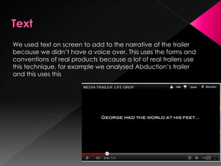
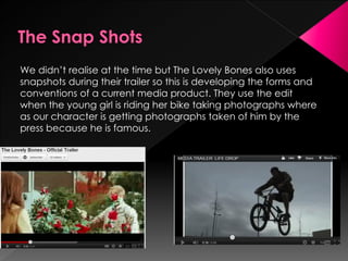
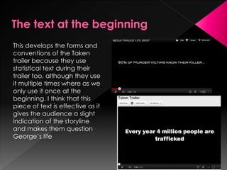
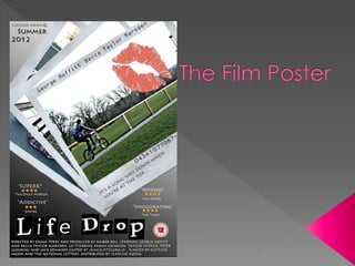
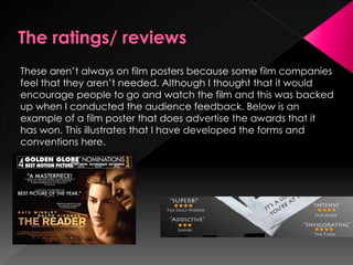
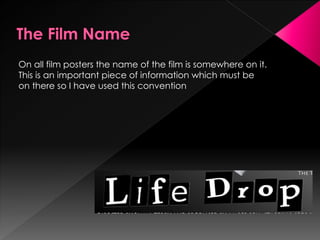
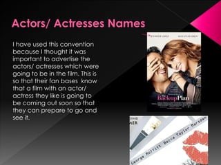
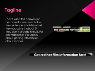
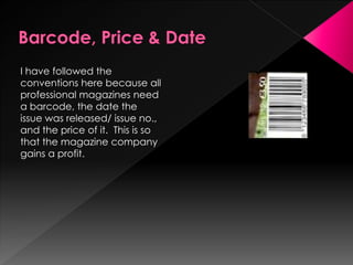
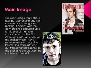
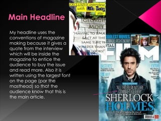
This follows forms and
conventions of real media
products because we put
the production company
animation on at the
beginning of the trailer so
that the audience instantly
knows who created the film.
The rewind part at the beginning of the trailer develops the forms
and conventions because when we conducted our audience
feedback somebody said that the had never seen this technique
used before, therefore meaning that tit stands out from other
current film trailers.
This develops what the
makers of Paranormal
Activity 3 did because they
use this technique a lot
during their trailer to show
flash backs and because it is
filmed using a video camera
where as we use the ‘noise’
for when Becca has stopped
rewinding the tape of
George and at the very end
of the trailer with the
institutional information.
We used text on screen to add to the narrative of the trailer
because we didn’t have a voice over. This uses the forms and
conventions of real products because a lot of real trailers use
this technique, for example we analysed Abduction’s trailer
and this uses this
This follows the typical forms and conventions of trailer making
because the audience needs to establish themselves who they
think the main character is and we helped this with the use of
screen time each character had.
We followed the convention
of having a recognisable film
font which appeared close
to the end of the trailer. I
think this technique is done
so that it encourages the
audience to watch the
whole of the trailer so that
they can find out the name
then.
This is what encourages the audience to go and watch the film
because in our case they may want to know how George has
ended up in the hostage situation and what is going to happen to
him. This is generally almost right at the end of the trailer so that it
makes sure that the audience wants to watch it.
As our trailer only is 55 seconds long, this
means that it is classed as a teaser trailer.
Although we have challenged the forms
and conventions of real media products
here because we have still arranged the
trailer like a full length trailer, just with not
as much footage. We thought that this
may make the trailer stand out from the
crowd and more interesting because you
are still receiving the same information
about the film, just in half the time.
This needs to be visible on all film trailers so we added this in at
the end so that the audience would need to watch the whole
trailer to find out when the film was going to be released. This
follows the traditional forms and conventions of trailer making.
The institutional information at the end follows forms and
conventions of trailer making. Although the way we laid it out
may not because usually the role of the person is in a smaller
font and then their name is bigger where as we have written
it all in one size
Our editing and music follows the forms and codes of trailer
making because the pace of the editing and music gradually
begins to pick up the pace as the trailer goes on. It then stops to
give the name of the film and then plays the hook part at the end.
We didn’t realise at the time but The Lovely Bones also uses
snapshots during their trailer so this is developing the forms and
conventions of a current media product. They use the edit
when the young girl is riding her bike taking photographs where
as our character is getting photographs taken of him by the
press because he is famous.
This develops the forms and
conventions of the Taken
trailer because they use
statistical text during their
trailer too, although they use
it multiple times where as we
only use it once at the
beginning. I think that this
piece of text is effective as it
gives the audience a slight
indication of the storyline
and makes them question
George’s life
These aren’t always on film posters because some film companies
feel that they aren’t needed. Although I thought that it would
encourage people to go and watch the film and this was backed
up when I conducted the audience feedback. Below is an
example of a film poster that does advertise the awards that it
has won. This illustrates that I have developed the forms and
conventions here.
On all film posters the name of the film is somewhere on it.
This is an important piece of information which must be
on there so I have used this convention
I have used this convention
because I thought it was
important to advertise the
actors/ actresses which were
going to be in the film. This is
so that their fan bases know
that a film with an actor/
actress they like is going to
be coming out soon so that
they can prepare to go and
see it.
The main image challenges
the conventions of real
products because usually the
main image of a film poster is
a mid shot and you can see
the character’s face where
as mine is a long shot with
the character riding away.
This was done on purpose
because I wanted it to look
like the character didn’t
know the picture was being
took because their stalker
has taken it. This therefore
gives the audience an
indication of the storyline.
This is an important to have
on a film poster so that
everyone who produced/
distributed/ funded the film
gets recognition for their
efforts; this is why I have used
this convention and put the
institutional information at the
bottom of the page.
This is a convention which I
have challenged because
this is not usually on a film
poster. I thought that I might
as well advertise the fact it’s
a twelve on the film poster so
that the target audience are
aware of this and
encourages them to go and
see the film
This is a convention which I
have used because there is
no point in creating a film
poster if it does not inform the
audience when the film is to
come out, or even give a
hint about it.
If taglines are good enough
they can sometimes become
a form of advertisement in
themselves. This is why I have
used this convention, so that
this phrase can be
associated with our film
I have used the conventions
of typical magazine making
with the mast head as I have
used a bold, readable font
which can be recognised as
‘Film Blaze’s’ font. Sometimes
film magazines cover some
of the magazine name over
with the main image but I
have not done this because
my magazine is not well
known enough to do so.
I have used this convention
because it sometimes helps
the audience establish what
the magazine is about (if
they don’t already know). For
film magazines it is usually
about getting information
about movies
I have followed the
conventions here because all
professional magazines need
a barcode, the date the
issue was released/ issue no.,
and the price of it. This is so
that the magazine company
gains a profit.
The main image that I chose
uses but also challenges the
conventions of magazine
making. It agrees with the
conventions because it uses
a mid shot of the main
character out of the film.
Although is uses an effect on
the image which I have
never seen on a magazine
before. This makes it stand
out from other magazines on
the shelf and encourages the
audience to read it.
My headline uses the
conventions of magazine
making because it gives a
quote from the interview
which will be inside the
magazine to entice the
audience to buy the issue
and read more. Also it is
written using the largest font
on the page (par the
masthead) so that the
audience know that this is
the main article.
These do follow the forms and
conventions of magazine
making with the language
which they are written in
because they use words which
are made to entice the
audience in like for example
NEW releases. Although it does
challenge the conventions too
because my target audience
picked up on the fact that
they are readable but don’t
completely stand out on the
page. This is something which I
have learnt for the future
because articles need to jump
out of the page to catch the
audience’s attention
This develops on the forms
and conventions of
magazine making because
although some magazines
do have some small images
on their front cover, they
normally put these in boxes
to border them where I have
put them in a film real to
emphasise even further that
this is a film magazine.
Overall I think that I have mainly used forms
 and conventions rather than develop or
 challenge them. This is because I wanted
 my products to look professional like
 products currently on the market and for
 them to understand different aspects in
 them. Although I have challenged some
 aspects like the effects I put on my images
 and I think that sometimes when you push
 the boundaries like this, it definitely pays off.

Eval qu1

  • 3.
    This follows formsand conventions of real media products because we put the production company animation on at the beginning of the trailer so that the audience instantly knows who created the film.
  • 4.
    The rewind partat the beginning of the trailer develops the forms and conventions because when we conducted our audience feedback somebody said that the had never seen this technique used before, therefore meaning that tit stands out from other current film trailers.
  • 5.
    This develops whatthe makers of Paranormal Activity 3 did because they use this technique a lot during their trailer to show flash backs and because it is filmed using a video camera where as we use the ‘noise’ for when Becca has stopped rewinding the tape of George and at the very end of the trailer with the institutional information.
  • 6.
    We used texton screen to add to the narrative of the trailer because we didn’t have a voice over. This uses the forms and conventions of real products because a lot of real trailers use this technique, for example we analysed Abduction’s trailer and this uses this
  • 7.
    This follows thetypical forms and conventions of trailer making because the audience needs to establish themselves who they think the main character is and we helped this with the use of screen time each character had.
  • 8.
    We followed theconvention of having a recognisable film font which appeared close to the end of the trailer. I think this technique is done so that it encourages the audience to watch the whole of the trailer so that they can find out the name then.
  • 9.
    This is whatencourages the audience to go and watch the film because in our case they may want to know how George has ended up in the hostage situation and what is going to happen to him. This is generally almost right at the end of the trailer so that it makes sure that the audience wants to watch it.
  • 10.
    As our traileronly is 55 seconds long, this means that it is classed as a teaser trailer. Although we have challenged the forms and conventions of real media products here because we have still arranged the trailer like a full length trailer, just with not as much footage. We thought that this may make the trailer stand out from the crowd and more interesting because you are still receiving the same information about the film, just in half the time.
  • 11.
    This needs tobe visible on all film trailers so we added this in at the end so that the audience would need to watch the whole trailer to find out when the film was going to be released. This follows the traditional forms and conventions of trailer making.
  • 12.
    The institutional informationat the end follows forms and conventions of trailer making. Although the way we laid it out may not because usually the role of the person is in a smaller font and then their name is bigger where as we have written it all in one size
  • 13.
    Our editing andmusic follows the forms and codes of trailer making because the pace of the editing and music gradually begins to pick up the pace as the trailer goes on. It then stops to give the name of the film and then plays the hook part at the end.
  • 14.
    We didn’t realiseat the time but The Lovely Bones also uses snapshots during their trailer so this is developing the forms and conventions of a current media product. They use the edit when the young girl is riding her bike taking photographs where as our character is getting photographs taken of him by the press because he is famous.
  • 15.
    This develops theforms and conventions of the Taken trailer because they use statistical text during their trailer too, although they use it multiple times where as we only use it once at the beginning. I think that this piece of text is effective as it gives the audience a slight indication of the storyline and makes them question George’s life
  • 17.
    These aren’t alwayson film posters because some film companies feel that they aren’t needed. Although I thought that it would encourage people to go and watch the film and this was backed up when I conducted the audience feedback. Below is an example of a film poster that does advertise the awards that it has won. This illustrates that I have developed the forms and conventions here.
  • 18.
    On all filmposters the name of the film is somewhere on it. This is an important piece of information which must be on there so I have used this convention
  • 19.
    I have usedthis convention because I thought it was important to advertise the actors/ actresses which were going to be in the film. This is so that their fan bases know that a film with an actor/ actress they like is going to be coming out soon so that they can prepare to go and see it.
  • 20.
    The main imagechallenges the conventions of real products because usually the main image of a film poster is a mid shot and you can see the character’s face where as mine is a long shot with the character riding away. This was done on purpose because I wanted it to look like the character didn’t know the picture was being took because their stalker has taken it. This therefore gives the audience an indication of the storyline.
  • 21.
    This is animportant to have on a film poster so that everyone who produced/ distributed/ funded the film gets recognition for their efforts; this is why I have used this convention and put the institutional information at the bottom of the page.
  • 22.
    This is aconvention which I have challenged because this is not usually on a film poster. I thought that I might as well advertise the fact it’s a twelve on the film poster so that the target audience are aware of this and encourages them to go and see the film
  • 23.
    This is aconvention which I have used because there is no point in creating a film poster if it does not inform the audience when the film is to come out, or even give a hint about it.
  • 24.
    If taglines aregood enough they can sometimes become a form of advertisement in themselves. This is why I have used this convention, so that this phrase can be associated with our film
  • 26.
    I have usedthe conventions of typical magazine making with the mast head as I have used a bold, readable font which can be recognised as ‘Film Blaze’s’ font. Sometimes film magazines cover some of the magazine name over with the main image but I have not done this because my magazine is not well known enough to do so.
  • 27.
    I have usedthis convention because it sometimes helps the audience establish what the magazine is about (if they don’t already know). For film magazines it is usually about getting information about movies
  • 28.
    I have followedthe conventions here because all professional magazines need a barcode, the date the issue was released/ issue no., and the price of it. This is so that the magazine company gains a profit.
  • 29.
    The main imagethat I chose uses but also challenges the conventions of magazine making. It agrees with the conventions because it uses a mid shot of the main character out of the film. Although is uses an effect on the image which I have never seen on a magazine before. This makes it stand out from other magazines on the shelf and encourages the audience to read it.
  • 30.
    My headline usesthe conventions of magazine making because it gives a quote from the interview which will be inside the magazine to entice the audience to buy the issue and read more. Also it is written using the largest font on the page (par the masthead) so that the audience know that this is the main article.
  • 31.
    These do followthe forms and conventions of magazine making with the language which they are written in because they use words which are made to entice the audience in like for example NEW releases. Although it does challenge the conventions too because my target audience picked up on the fact that they are readable but don’t completely stand out on the page. This is something which I have learnt for the future because articles need to jump out of the page to catch the audience’s attention
  • 32.
    This develops onthe forms and conventions of magazine making because although some magazines do have some small images on their front cover, they normally put these in boxes to border them where I have put them in a film real to emphasise even further that this is a film magazine.
  • 33.
    Overall I thinkthat I have mainly used forms and conventions rather than develop or challenge them. This is because I wanted my products to look professional like products currently on the market and for them to understand different aspects in them. Although I have challenged some aspects like the effects I put on my images and I think that sometimes when you push the boundaries like this, it definitely pays off.