Verified Trusted Call Girls Adugodi💘 9352852248 Good Looking standard Profil...
NYC council logo advert warns of challenges of teenage parenthood
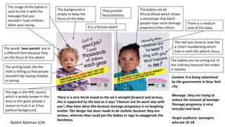
1. The logo is the NYC council
which is widely known in the
area so this gives people a
reason to trust it as it has
political background.
They provide
facts/statistics
The image of the babies is
used to link in with the
message that you
shouldn’t have children
when your young.
The words ‘teen parent’ are in
a different font because they
are the focus of the advert.
It is a factual advert
The babies are all
African/black which shows
a stereotype that black
people have more teenage
pregnancy than others.
The text was done to look like
a child's handwriting which
links in with the adverts focus.
The writing looks like the
child is telling us that people
shouldn’t be having children
so young
The background is
empty to keep the
focus on the baby
There is a medium
shot of the baby.
Nadim Rahman 61N
There is a very harsh mood as the ad is straight forward and serious,
this is supported by the text as it says “chances are he wont stay with
you”, they have done this because teenage pregnancy is no laughing
matter. The design has been made to be realistic because they are
serious, whereas they could put the babies in rags to exaggerate the
harshness.
Context: it is being advertised
by the government in New York
city.
Message: they are trying to
reduce the amount of teenage.
Teenage pregnancy is very
stressful and hard.
Target audience: teenagers
who are 16-18.
The babies are not acting out of
the ordinary because the makes
it realistic