Presentation1
•Download as PPTX, PDF•
0 likes•59 views
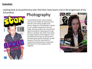
The document reflects on the learning from the author's preliminary magazine design task to their final product. They learned that using a medium long shot allows viewers to see more details about the subject's clothing and stance to reveal information about the target audience. They also learned the importance of styling subjects in genre-appropriate clothing. Additionally, they realized the need for a strong, easy-to-read house style with only a few dominant colors. The font used in the final product is more attention-grabbing and clearly conveys the genre, while the preliminary font was too subtle.
Report
Share
Report
Share

Recommended
Final Evaluation Question 7
From their preliminary task to final product, the student learned important Photoshop skills like cropping, fading, cloning, and healing tools. They also learned how to attract their target audience and make their magazine look more professional through camera shots, mise-en-scene techniques, and rule of thirds composition. Researching other magazines inspired taking photos outside with natural lighting.
Completed question 7
From their preliminary task to final product, the student learned important Photoshop skills like cropping, fading, cloning, and healing tools. They also learned how to attract their target audience and make their magazine look more professional through camera shots, mise-en-scene techniques, and rule of thirds composition. Researching other magazines inspired taking photos outside with natural lighting.
Question 7
The author learned several lessons from their preliminary magazine task that they applied to the final product. For the final cover, they ensured the text was neat and the color was consistent. They added more content like images to the contents page so it offered more value. They also improved the column structure by adding two new columns. Like the preliminary task, the model in the final magazine directly addresses the audience. However, they used a higher quality DSLR camera compared to a phone for the preliminary task. They also used color schemes like red and black cover lines to better capture the audience's attention.
Final Evaluation 7 power point
James has learned a lot in progressing from his preliminary task to his full magazine product. He has improved his use of mise-en-scene in shots by considering wardrobe choices and genre. He has also learned how to use lighting better to avoid shadows and focus on his subject. James has incorporated more variety in poses and styles to keep readers interested. He has paid closer attention to layout, fonts, text size and placement to make his magazine more visually appealing and reader-friendly. Overall, James feels the differences between his preliminary task and final magazine show how much he has grown in skills like photography, styling and magazine design.
Question 7
In her music magazine project, Emily learned many new skills from her preliminary cover page to the final product. She gained proficiency in Photoshop tools like the healing brush and drop shadow to make images look professionally edited. Her photography skills improved from learning proper lighting and using the rule of thirds. She also learned to establish a consistent color scheme to give the magazine a polished, professional look and house style.
Presentation1
This document discusses the conventions used in magazine design. It describes the magazine's house style which uses four main colors - blue, purple, yellow and pink - to make the magazine easily identifiable to its target audience of young girls. It also discusses other common magazine elements like the skyline at the top with the magazine slogan, use of a pop star image on the cover appealing to the target audience, and fonts chosen to match the house style and target demographic.
Question 7
The student improved several aspects of their magazine from the preliminary to the final version. They ensured the front cover had neatly arranged consistent coloring. They added more content to the contents page. They also included two new columns.
For the final magazine, the student again used a model directly looking at the camera to directly address the audience. They used a higher quality DSLR camera compared to a phone for the preliminary.
The student used an unusual color scheme of pink and black cover lines to catch the audience's attention. They found red did not work as well as pink in the preliminary.
6
The magazine uses most conventions of real magazines, such as featuring a female model on the cover and using similar font styles and placements. However, it challenges conventions in two ways. It uses a black and white photo with the model's face covered by hair, to create a mysterious atmosphere. It also uses brighter, more eye-catching colors than typical magazines, which often use duller colors.
Question 7
The document discusses what was learned from a preliminary task to the final product. It notes that more research, writing, colors, and attention to detail were applied this time. Professional photography was also used along with prepared models. Learning proper use of tools and what was required helped improve the final magazine, which had a better name, cover, contents and color scheme compared to the preliminary version.
Question 7
From creating a preliminary task to a final product, the author learned several skills. They gained proficiency in Photoshop and felt comfortable designing a magazine. The author also learned to attract their target audience of 17-year-olds through relatable images and text. Between drafts, the author's use of mise-en-scene improved, incorporating a variety of photo locations, camera shots, and lighting techniques to make the final magazine look more professional.
Evaluation of media
1) In creating his full music magazine, the student improved his photography skills, particularly cropping images more precisely with smoother edges.
2) He also learned to choose fonts more carefully to match the conventions and feel of the magazine, selecting a retro font for his music magazine.
3) The content on the front page of his music magazine was more appropriate for the target audience, including a free poster offer relevant to the genre of indie/folk music.
Evaluation q 7
The student learned several important skills when progressing from their preliminary school magazine task to the final product:
1) Researching other similar magazines helped with layout, content ideas, photography, and fonts, making the final product more professional.
2) Planning photography in advance saved time versus the preliminary task.
3) Skills in tools like Prezi and Blogger were improved for presenting research findings.
4) Photography techniques like lighting, rule of thirds, and positioning models were better applied.
5) Layout and design skills such as banners, color palettes, fonts, and column layout made the final product resemble a real magazine more closely.
Developing ideas
Brandon Parker proposes creating promotional materials for a rebranding of the soft drink IRN-BRU, including point of sale displays, billboards, posters, leaflets, in-store media, website headers, sponsorships, and competitions. Parker plans to initially stick to IRN-BRU's original color scheme but may modify the colors. All media would use the same color scheme and Parker would source existing IRN-BRU images while also taking their own photos to coordinate the project and make it look more professional. Parker likes IRN-BRU's existing fonts but wants to make the branding their own personal version.
Question 7
The document discusses the learning and development the author experienced from their preliminary college magazine task to their full music magazine product. Some key lessons learned include using a maximum of 3 fonts and colors to improve professionalism, taking higher quality photographs with DSLR cameras rather than phones, developing a coordinated color scheme, and improving the layout to be more inspired and visually appealing like commercial magazines. Overall, the author felt they improved in areas like photography, design, and developing a polished, professional final product based on their initial experience and feedback received.
Initial plans - print project
This document outlines Joy Buck's initial plans for her magazine project. She considers doing a dog magazine or video game magazine but is unsure if she can complete those ideas. She creates mind maps exploring 3 potential topics. Her final mind map leads her to create a magazine about being a tomboy. She creates a mood board analyzing the repetition in color, style and mood of the images. This will influence the aesthetic of her magazine. She develops a schedule with tasks like taking photos, finalizing writing and layout, and completing the project in 5 weeks.
evalq7
The preliminary task taught the student basic skills in using Photoshop to design a magazine cover, including experimenting with fonts, colors, and editing images. For the actual task, the student enhanced their Photoshop skills by editing images more advancedly and creating unique text styles using effects like drop shadows. While the preliminary images were basic, the actual task images were improved by focusing on presentation and avoiding subjects wearing white on white backgrounds. Font usage also improved from just downloading fonts to editing texts to make them stand out more professionally with effects in the actual task magazine.
Evaq7
The preliminary task taught the student basic skills in using Photoshop to design a magazine cover, including experimenting with fonts, colors, and editing images. For the actual task, the student enhanced their Photoshop skills by editing images more advancedly and creating unique text styles using effects like drop shadows. While the preliminary images were basic, the actual task images were improved by focusing on presentation and avoiding subjects wearing white on white backgrounds. Font usage also improved from just downloading fonts to editing texts to make them stand out more professionally with effects in the actual task magazine.
Looking back at your preliminary task, what
The document discusses what the author has learned from their preliminary task to their final magazine project in Photoshop. They learned new Photoshop skills like making pictures look professional and giving sell lines a 3D effect. They also became more confident experimenting with tools and being more creative. As a result, their final magazine stood out more and looked better than the preliminary version.
Question 7
The student learned several key things in progressing from their preliminary task to the final production of a music magazine spread. They improved the masthead design, switched to artificial lighting for a more professional look, varied the model photos with different outfits, and organized the layout into a neater, more mature structure. Through research on codes and conventions, and practice with Photoshop tools, the student gained skills in image editing, effective masthead design, and creating a polished layout that better met industry standards.
Mood Board of Magazines
The document discusses mood boards from magazine front covers, contents pages, and double page spreads that will inspire the layout, color schemes, poses, and styles for a magazine cover and contents that the author is creating. Specifically, it notes that red and high key lighting are popular for indie magazine covers, contents should use 2-3 images, and the author will do a question and answer interview spread with the image on the right and text on the left, differing from most magazines' left-side dominant image.
Colouyr scheme
This document outlines the color scheme for a magazine, noting that it is very bright which fits the genre and is intended to attract younger audiences. The color scheme is similar but differentiated from other magazines to help the magazine stand out on shelves.
2
This document provides design inspiration from existing magazine covers, contents pages, and spreads. It notes that red is a popular color for indie magazine covers along with direct addresses and eye-level shots. Contents pages typically use 2-3 images in a layout inspired by Q magazine. A double-page spread will feature an interview in a question-and-answer style with the image on the right and text on the left to differ from magazines that usually place the dominant image on the left.
Design inspiration
This document provides design inspiration from existing magazine covers, contents pages, and spreads. It notes that red is a popular color for indie magazine covers along with direct addresses and eye-level shots. Contents pages typically use 2-3 images in a layout inspired by Q magazine. A double-page spread will feature an interview in a question-and-answer style with the image on the right and text on the left to differ from magazines that usually place the dominant image on the left.
Images that i did or didnt use
The document discusses choosing images for a magazine cover and contents page. For the cover, the author selected a photo of a woman with tattoos and urban style against a brick wall background. This fit the intended audience. The full body shot was cropped to a medium shot. Finding images for the contents page proved more difficult as not all posed fit the hip hop genre. Revealing or unclear photos were rejected in favor of more sophisticated images matching the music magazine theme.
Question 7 progression
The document provides an analysis comparing the typography, layout, images, color, and mode of address between a preliminary magazine cover task and the author's recently completed magazine.
For the preliminary task, the author used a bold font in all caps to make the text stand out. The layout was spacious but plain. The image quality was lower due to using a phone camera instead of proper equipment. Black text on a white background helped the title stand out against a bright image.
For the completed magazine, the author demonstrated improvements in layout, image quality, knowledge of appropriate shots, increased color usage, and a more conventional image and pull quotes to match the rap genre. The comparisons highlight what aspects the author learned and
Question seven
My research and planning for my second music magazine was more detailed and focused than for my preliminary task. I looked specifically at other music magazines and gathered primary and secondary feedback. The photography, graphics, and layout of the music magazine showed more organization and development compared to the preliminary task. While the preliminary task helped me learn the software, my second magazine benefited from increased knowledge and focus during production.
Task 6 - Magazine advert
This document discusses three magazine advertisement designs for Irn-Bru:
1) The first design was basic and only featured a can and bolt collaborating well.
2) The second design had a better theme and included key features like the brand logo and catchy slogans to make it suitable for use as a poster.
3) The third design continued the theme of using humor, featuring a man running for gold with Irn-Bru's help, though the fonts and colors were not entirely satisfactory.
Presentation3
The document discusses the software and tools used to create an indie rock magazine, including Photoshop, Publisher, and Blogger. Photoshop allowed for image resizing and layering of text, while Publisher was used to generate initial drafts. Feedback from intended audiences was incorporated between drafts to improve layout, text size, and placement of elements. The final magazine was shared on Blogger.
Theoretical framework
This document outlines the theoretical framework for a study on students' performance in English. It discusses key language techniques students should develop like organizing ideas, using appropriate words and grammar. It also reviews theories from educators that effective teaching requires considering student objectives, developing curriculum appropriately, and helping students become active learners. The study aims to evaluate student performance in English and teaching methods based on these theoretical constructs to help establish guidance implications.
Audience institution
Q magazine targets readers aged 15-24, focusing on indie music but also covering pop and R&B. It provides information on its ownership, mission, publication schedule, and reasons for advertisers to choose it. The document also discusses Q's brand expansions like awards shows, subscribers, and social media followers. Similarly to Q, NME targets younger readers and males, remains popular through radio, events and awards, and covers more genres than just indie. The document considers title and branding ideas for a new music magazine.
More Related Content
What's hot
Question 7
The document discusses what was learned from a preliminary task to the final product. It notes that more research, writing, colors, and attention to detail were applied this time. Professional photography was also used along with prepared models. Learning proper use of tools and what was required helped improve the final magazine, which had a better name, cover, contents and color scheme compared to the preliminary version.
Question 7
From creating a preliminary task to a final product, the author learned several skills. They gained proficiency in Photoshop and felt comfortable designing a magazine. The author also learned to attract their target audience of 17-year-olds through relatable images and text. Between drafts, the author's use of mise-en-scene improved, incorporating a variety of photo locations, camera shots, and lighting techniques to make the final magazine look more professional.
Evaluation of media
1) In creating his full music magazine, the student improved his photography skills, particularly cropping images more precisely with smoother edges.
2) He also learned to choose fonts more carefully to match the conventions and feel of the magazine, selecting a retro font for his music magazine.
3) The content on the front page of his music magazine was more appropriate for the target audience, including a free poster offer relevant to the genre of indie/folk music.
Evaluation q 7
The student learned several important skills when progressing from their preliminary school magazine task to the final product:
1) Researching other similar magazines helped with layout, content ideas, photography, and fonts, making the final product more professional.
2) Planning photography in advance saved time versus the preliminary task.
3) Skills in tools like Prezi and Blogger were improved for presenting research findings.
4) Photography techniques like lighting, rule of thirds, and positioning models were better applied.
5) Layout and design skills such as banners, color palettes, fonts, and column layout made the final product resemble a real magazine more closely.
Developing ideas
Brandon Parker proposes creating promotional materials for a rebranding of the soft drink IRN-BRU, including point of sale displays, billboards, posters, leaflets, in-store media, website headers, sponsorships, and competitions. Parker plans to initially stick to IRN-BRU's original color scheme but may modify the colors. All media would use the same color scheme and Parker would source existing IRN-BRU images while also taking their own photos to coordinate the project and make it look more professional. Parker likes IRN-BRU's existing fonts but wants to make the branding their own personal version.
Question 7
The document discusses the learning and development the author experienced from their preliminary college magazine task to their full music magazine product. Some key lessons learned include using a maximum of 3 fonts and colors to improve professionalism, taking higher quality photographs with DSLR cameras rather than phones, developing a coordinated color scheme, and improving the layout to be more inspired and visually appealing like commercial magazines. Overall, the author felt they improved in areas like photography, design, and developing a polished, professional final product based on their initial experience and feedback received.
Initial plans - print project
This document outlines Joy Buck's initial plans for her magazine project. She considers doing a dog magazine or video game magazine but is unsure if she can complete those ideas. She creates mind maps exploring 3 potential topics. Her final mind map leads her to create a magazine about being a tomboy. She creates a mood board analyzing the repetition in color, style and mood of the images. This will influence the aesthetic of her magazine. She develops a schedule with tasks like taking photos, finalizing writing and layout, and completing the project in 5 weeks.
evalq7
The preliminary task taught the student basic skills in using Photoshop to design a magazine cover, including experimenting with fonts, colors, and editing images. For the actual task, the student enhanced their Photoshop skills by editing images more advancedly and creating unique text styles using effects like drop shadows. While the preliminary images were basic, the actual task images were improved by focusing on presentation and avoiding subjects wearing white on white backgrounds. Font usage also improved from just downloading fonts to editing texts to make them stand out more professionally with effects in the actual task magazine.
Evaq7
The preliminary task taught the student basic skills in using Photoshop to design a magazine cover, including experimenting with fonts, colors, and editing images. For the actual task, the student enhanced their Photoshop skills by editing images more advancedly and creating unique text styles using effects like drop shadows. While the preliminary images were basic, the actual task images were improved by focusing on presentation and avoiding subjects wearing white on white backgrounds. Font usage also improved from just downloading fonts to editing texts to make them stand out more professionally with effects in the actual task magazine.
Looking back at your preliminary task, what
The document discusses what the author has learned from their preliminary task to their final magazine project in Photoshop. They learned new Photoshop skills like making pictures look professional and giving sell lines a 3D effect. They also became more confident experimenting with tools and being more creative. As a result, their final magazine stood out more and looked better than the preliminary version.
Question 7
The student learned several key things in progressing from their preliminary task to the final production of a music magazine spread. They improved the masthead design, switched to artificial lighting for a more professional look, varied the model photos with different outfits, and organized the layout into a neater, more mature structure. Through research on codes and conventions, and practice with Photoshop tools, the student gained skills in image editing, effective masthead design, and creating a polished layout that better met industry standards.
Mood Board of Magazines
The document discusses mood boards from magazine front covers, contents pages, and double page spreads that will inspire the layout, color schemes, poses, and styles for a magazine cover and contents that the author is creating. Specifically, it notes that red and high key lighting are popular for indie magazine covers, contents should use 2-3 images, and the author will do a question and answer interview spread with the image on the right and text on the left, differing from most magazines' left-side dominant image.
Colouyr scheme
This document outlines the color scheme for a magazine, noting that it is very bright which fits the genre and is intended to attract younger audiences. The color scheme is similar but differentiated from other magazines to help the magazine stand out on shelves.
2
This document provides design inspiration from existing magazine covers, contents pages, and spreads. It notes that red is a popular color for indie magazine covers along with direct addresses and eye-level shots. Contents pages typically use 2-3 images in a layout inspired by Q magazine. A double-page spread will feature an interview in a question-and-answer style with the image on the right and text on the left to differ from magazines that usually place the dominant image on the left.
Design inspiration
This document provides design inspiration from existing magazine covers, contents pages, and spreads. It notes that red is a popular color for indie magazine covers along with direct addresses and eye-level shots. Contents pages typically use 2-3 images in a layout inspired by Q magazine. A double-page spread will feature an interview in a question-and-answer style with the image on the right and text on the left to differ from magazines that usually place the dominant image on the left.
Images that i did or didnt use
The document discusses choosing images for a magazine cover and contents page. For the cover, the author selected a photo of a woman with tattoos and urban style against a brick wall background. This fit the intended audience. The full body shot was cropped to a medium shot. Finding images for the contents page proved more difficult as not all posed fit the hip hop genre. Revealing or unclear photos were rejected in favor of more sophisticated images matching the music magazine theme.
Question 7 progression
The document provides an analysis comparing the typography, layout, images, color, and mode of address between a preliminary magazine cover task and the author's recently completed magazine.
For the preliminary task, the author used a bold font in all caps to make the text stand out. The layout was spacious but plain. The image quality was lower due to using a phone camera instead of proper equipment. Black text on a white background helped the title stand out against a bright image.
For the completed magazine, the author demonstrated improvements in layout, image quality, knowledge of appropriate shots, increased color usage, and a more conventional image and pull quotes to match the rap genre. The comparisons highlight what aspects the author learned and
Question seven
My research and planning for my second music magazine was more detailed and focused than for my preliminary task. I looked specifically at other music magazines and gathered primary and secondary feedback. The photography, graphics, and layout of the music magazine showed more organization and development compared to the preliminary task. While the preliminary task helped me learn the software, my second magazine benefited from increased knowledge and focus during production.
Task 6 - Magazine advert
This document discusses three magazine advertisement designs for Irn-Bru:
1) The first design was basic and only featured a can and bolt collaborating well.
2) The second design had a better theme and included key features like the brand logo and catchy slogans to make it suitable for use as a poster.
3) The third design continued the theme of using humor, featuring a man running for gold with Irn-Bru's help, though the fonts and colors were not entirely satisfactory.
Presentation3
The document discusses the software and tools used to create an indie rock magazine, including Photoshop, Publisher, and Blogger. Photoshop allowed for image resizing and layering of text, while Publisher was used to generate initial drafts. Feedback from intended audiences was incorporated between drafts to improve layout, text size, and placement of elements. The final magazine was shared on Blogger.
What's hot (20)
Viewers also liked
Theoretical framework
This document outlines the theoretical framework for a study on students' performance in English. It discusses key language techniques students should develop like organizing ideas, using appropriate words and grammar. It also reviews theories from educators that effective teaching requires considering student objectives, developing curriculum appropriately, and helping students become active learners. The study aims to evaluate student performance in English and teaching methods based on these theoretical constructs to help establish guidance implications.
Audience institution
Q magazine targets readers aged 15-24, focusing on indie music but also covering pop and R&B. It provides information on its ownership, mission, publication schedule, and reasons for advertisers to choose it. The document also discusses Q's brand expansions like awards shows, subscribers, and social media followers. Similarly to Q, NME targets younger readers and males, remains popular through radio, events and awards, and covers more genres than just indie. The document considers title and branding ideas for a new music magazine.
Specxy
The glasses company sells eyeglasses and offers free eye tests. It aims to target busy ABC1 adults who may not have time for regular eye exams. Specsavers was founded in 1984 and has over 1,390 stores worldwide. The company's most recent ad campaign showed people humorously misunderstanding situations due to poor eyesight. It competes with Vision Express, Boots, and local opticians. The proposed new ad will feature a person struggling to see and being helped by a Specsavers saleswoman, with the slogan "HD glasses for a HD life."
Presentation1
The author made several changes to their double page spread for a magazine article, including changing the main image to one that was less pixelated and more relevant to the article topic. They also changed the font colors to alternate between pink and blue for questions to improve readability. Captions were added to pictures advertised as posters to provide more clarity and color to make them stand out. Extra text was also added to the contents page to fill white space according to magazine design conventions.
changes to my magazine
I changed the picture on my double page spread because the previous image was pixelated and similar to the front cover. I also alternated the font colors between pink and blue for questions to follow the house style while using black for the main text to improve readability. Captions were added to pictures advertised as free posters to make it clearer who is included and add more color to make them stand out.
Presentation3
All3Media is a British television production company known for shows like Skins, Midsummer Murders, and Shameless. It is owned by Steve Morrison and produces programming in multiple genres across countries like the US, New Zealand, Germany, and Netherlands. As an international company operating across different markets, All3Media faces commercial pressures that can affect the products it produces.
woop woop
All3Media is a British television production company known for shows like Skins, Midsummer Murders, and Shameless. It is owned by Steve Morrison and produces programming in multiple genres across countries like the US, New Zealand, Germany, and Netherlands. As an international company operating across different markets, it faces commercial pressures that can affect the products it produces.
Single camera
The document discusses different types of television shows including serials, series, and single dramas. Serials are ongoing shows without seasons that air weekly, like soap operas. Series return yearly with new seasons across different genres. Single dramas tell a complete story within their runtime and do not return. The document also covers narrative structures and whether stories are realistic or not.
Specxy
This document summarizes a glasses company and their advertising strategy. The company offers eye exams and glasses to correct vision problems. They were founded in 1984 and now have over 1,300 stores. Their recent ads show people in amusing situations due to vision problems. Their competitors include Vision Express, Boots, and local opticians. Their new ad will show someone struggling to see and their saleswoman will promote their deals, using hardsell techniques. Their slogan will be "HD glasses for a HD life."
Specxy
This document summarizes a glasses company and their advertising strategy. The company offers eye exams and glasses to correct vision problems. They were founded in 1984 and have over 1,300 stores. One of their advertising campaigns showed humorous situations where people couldn't see well. The company plans to advertise their deals by having a saleswoman help someone struggling to see and will use hard sell techniques with the slogan "HD glasses for a HD life."
Single camera production
The document discusses different types of television shows including serials, series, and single dramas. Serials are ongoing shows without seasons that air weekly, like soap operas. Series return yearly with new seasons across different genres. Single dramas finish within their runtime and do not return, covering various genres and storylines. The document also covers narrative structures and realism in storytelling.
Viewers also liked (12)
Similar to Presentation1
Question 7
Looking back at my preliminary task, I have improved in several key areas in my final product:
1) Layout - My preliminary layout was unorganized while my final product had a well-spaced, professional layout inspired by real magazines.
2) Photography - I learned to use professional cameras and lighting to take higher quality photos for my final product compared to my preliminary task.
3) Balance of images and text - My final product had an equal balance of images and text based on audience research, unlike my text-light preliminary product.
4) Professional design elements - My final product had professionally selected fonts, logo, and models compared to the less polished preliminary design.
Evaluation 7 final
The student has learned many improvements in photography, design, and magazine production from their preliminary school magazine task to the final magazine product. Specifically:
1) Their photography skills improved through learning techniques like depth of field, lighting, framing models effectively, and using Photoshop tools.
2) The design of the magazine improved by using more professional fonts, strategically placing cover lines, and designing a contents page influenced by existing magazines.
3) Their overall knowledge of magazine elements like page count, layout, and price improved to create a more polished final magazine.
Q7
The student learned significant skills for creating magazines over the course of their coursework. They started with little knowledge of software like InDesign and Photoshop, but learned to use them proficiently. This allowed the student to make their preliminary magazine cover aesthetically basic compared to their final cover, which featured larger titles, graphics, and stood out more. The student also improved their ability to effectively layout pages like the contents page and feature columns. Through practicing with the software, the student was able to create higher quality images and graphics for their final magazine.
Skill development
The document summarizes the skills and techniques the author has learned from creating a preliminary college magazine to a final hip hop and rap magazine. The author's photography skills improved by using a DSLR camera instead of an iPhone, allowing for higher quality photos. Composition and shooting techniques also improved, such as using closer shots. Presentation skills grew from the preliminary to final magazine, including using varied fonts and ensuring proper text alignment. In Photoshop, tools like the blending options, burn/dodge tool, and magnetic lasso tool were utilized. Feedback was gathered to help create a magazine that best appealed to the target audience.
Evaluation Question 7
Looking back at your preliminary task, what do you feel you have learnt in the progression from it to the full product?
Q7 (1))
Heidi compares her preliminary magazine cover task to her final product, noting several ways her skills and use of conventions improved. In her preliminary task, she lacked conventions like proper images, fonts, and layout that matched the magazine's genre. For her final product, she researched conventions to create a more professional and appealing design. This included choosing images, fonts, and a layout that fit the target audience's interests to better convey the magazine's tone and content.
Eval q7
The document discusses what the author learned between their preliminary task and final product for an evaluation question. They learned advanced Photoshop skills to layout their magazine professionally. Research taught them magazine standards for layout, design, and content. Time management was important to complete the substantial work. Looking back, the preliminary task appears unprofessional compared to the main product, showing their skills development in ICT and design. Areas like color schemes, content amount, and lighting quality improved. The author gained knowledge in photography lighting and using models to convey moods.
Evaluation question 7
The document discusses what the author learned from their preliminary school magazine task to their final product. Specifically:
1) The importance of images and mise-en-scene, as plain backgrounds and uncropped photos hurt the preliminary magazine. Styling models to match the genre improved the final product.
2) Directing skills improved from giving little direction initially to being more confident and getting better posed photos.
3) Choosing fonts, like a bold masthead, and positioning text professionally made the final product look more polished. Layout choices also helped elements stand out more.
Final product and preliminary comparison
- The document compares the author's preliminary magazine cover and contents page draft to their final product.
- For the preliminary tasks, the author had little knowledge of design conventions and their use of images, layout, fonts and other elements was poor and lacked professionalism.
- For the final product, the author conducted research into conventions for the rock music genre and applied this knowledge to create a high quality cover and contents page that made effective use of conventions and appealed to the target audience.
- The author's skills in areas like photography, image editing, layout, fonts, colors and creating a mode of address improved greatly from the preliminary to final tasks thanks to learning about conventions and best practices.
Evaluation q7
1) The author learned many new skills between their preliminary task and final magazine production, including how to take better quality photos using lighting and camera settings, how to edit photos using Photoshop, how to design professional page layouts and use different fonts.
2) These new skills allowed the author to create a final magazine that was much higher quality and more professional looking compared to their preliminary task.
3) Researching magazine codes and conventions also helped the author design a final magazine that would appeal more to their target audience.
Evaluation q7
The student felt they learned several important skills in progressing from their preliminary school magazine task to the final product. Specifically, the student learned how to more professionally edit images, use grids to create symmetrical page layouts, implement consistent color schemes and fonts, and conduct research to have a clearer vision for the final design. The student also felt more confident using Photoshop tools like the magic wand and lighting setups when taking photos. Overall, the progression allowed the student to learn the skills needed to design an appealing magazine through practice and research.
Evaluationquezzie7
1) The document discusses the improvements made to the layout, design, and production quality of the author's magazine from their preliminary to final product.
2) For the final product, the author conducted more research on professional magazine conventions and used tools like Photoshop and InDesign to create a layout that was better aligned, balanced white space, and incorporated consistent fonts and color schemes.
3) The author also improved their photography skills by booking a professional photoshoot and learning techniques like lighting and framing to produce higher quality images for the final magazine.
3. experiments finished
The document summarizes experiments the author conducted to design magazine covers and double page spreads. For the magazine covers, the author experimented with traditional and blurred photographic styles, and found adjusting brightness, contrast and layer positioning helped make the designs look like real magazines. For the double page spread, the author kept the design simple with a background photo and writing over top, learning this created a realistic magazine look. The experiments informed elements the author will include in their final magazine product design.
evaluation Question 7
The document compares the student's preliminary school magazine task to their final production. For the preliminary task, the student did not conduct in-depth research or planning. However, for the final production the student looked closely at professional magazines to inform their own design choices. As a result, the final production followed professional conventions more closely through elements like bold colors, structured layouts, and relevant photos. The student learned the importance of thorough research, planning, and following industry forms and conventions to create a more polished final product.
Evaluation q7
1) The author learned many new skills between their preliminary task and final magazine production, including how to properly use lighting, cameras, and photo editing software to improve image quality.
2) They gained knowledge around magazine layout, formatting, and font choices from research that helped structure their final production to look more professional.
3) Applying these new skills like advanced text and image manipulation allowed the author to create a double page magazine spread that was consistent and of high quality, meeting their target audience's needs.
Evaluation draft 7
The student learned significant skills in using Photoshop and magazine design from their preliminary school magazine task to their final product. In their preliminary cover, the font and color scheme were not eye-catching and the cover lines were poorly aligned. However, their final cover had a more effective color scheme that drew attention, well-aligned cover lines, and improved image editing. Their preliminary contents page lacked professionalism with misaligned images of inconsistent sizes and little design elements, whereas their final work showed mastery of layout, formatting and aesthetics. Overall, they improved skills in image editing, cover design, font selection and use of color schemes to create a polished, visually appealing final magazine.
AS Evaluation
This document summarizes an evaluation of a media product created by the author. The evaluation discusses how the product represents social groups through the use of a young female model. It also describes the intended audience as young teen girls and discusses how various design elements like colors, fonts, and informal language were used to attract and address this audience. The author reflects on learning Photoshop skills like editing images, selecting objects, and adjusting colors and tones. Overall the evaluation demonstrates growth in research, photography, and design skills from an initial preliminary task to the completed media product.
Question 6
The document discusses the technologies and techniques the author learned while creating an indie magazine as part of a school project. They learned how to use a DSLR camera, tripod, and lighting to take professional quality photos. In Photoshop, they learned editing skills like cropping, color balancing, adding filters and effects. In InDesign, they learned layout skills like adding strokes, changing colors, cropping text, and using opacity. Websites like Dafont, Prezi, Pinterest, and Survey Monkey helped with research, fonts, presentation, inspiration, and understanding the target audience.
Evaluationquestion7
Looking back at his preliminary work, the author feels he has made significant progress in skills and the quality of his work from the preliminary magazine to the final music magazine. He learned new software like Photoshop and how to conduct research and planning. Specific skills progressed like using Photoshop to add images and text, grab colors, and create a cohesive design. The author's knowledge of language usage, photo editing, and overall magazine production improved. He was able to apply lessons from the preliminary work to create a higher quality final product.
Evaluation Seven
The document compares the author's preliminary magazine task to their final magazine, highlighting improvements in their Photoshop skills and the quality of the images. For the preliminary task, the author was new to Photoshop and images were of lower quality due to lighting and background issues. However, for the final magazine, the author had gained Photoshop skills like cutting out images neatly and using layers. They also planned images better by considering location, lighting, and model positioning. Researching other magazines also helped with layout, style choices, and generating creative ideas. Overall, thorough research and planning were essential for the success of the final magazine.
Similar to Presentation1 (20)
Presentation1
- 1. Evaluation Looking back at my preliminary task I feel that I have learnt a lot in the progression of my full product. Photography In my preliminary task I used a medium close up as this makes her stand out more and she is also looking straight at the camera. However in my full product i decide to use a medium long shot for my main image. This way we get to see more of what type of clothing he is wearing and the way that he is standing. This reveals more about the target audience of the magazine. From my preliminary task we can see that she is not wearing any specific clothing to do with the genre. From this I learnt that it is important to style the person in particular clothing to fit in with the genre of the magazine.
- 2. House style From both tasks I think that there is a certain house style that is kept throughout. However I think that the house style throughout my preliminary task does not stand out straight away and the colour of the font is hard to see and read. In my final product you can instantly see the strong colour that stands out on the page and dominates the page. On both tasks however I have used three main colours for my house style and I learnt that from the preliminary task it is important to not have too many colours on the page and that just by having a few main house style colours makes the magazine look more professional.
- 3. Font The fonts used are different in both products. I think the font I have used in my final product is a lot more shocking and stands out straight away. You can also get what type of genre it comes from. The font used in my preliminary task was much more subtle and didn't give much away about the genre it was also positioned in just a plain way at the top of the page. With my final product I decide that it would stand out more and look more interesting if it was slanted across the page.