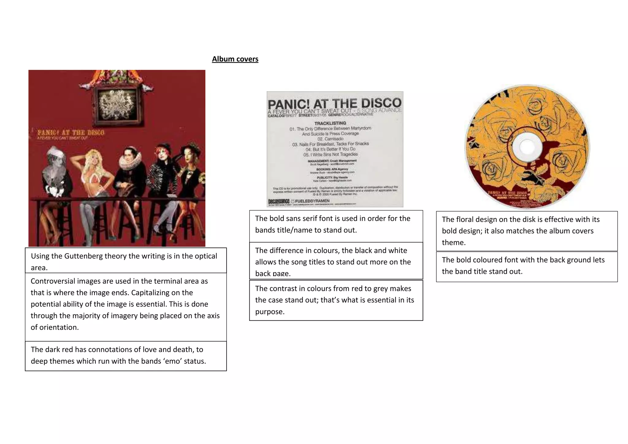
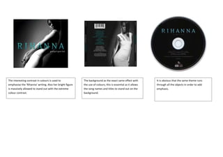
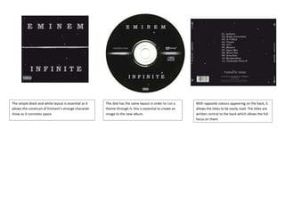
Album covers


                                                                  The bold sans serif font is used in order for the     The floral design on the disk is effective with its
                                                                  bands title/name to stand out.                        bold design; it also matches the album covers
                                                                                                                        theme.
                                                                  The difference in colours, the black and white
Using the Guttenberg theory the writing is in the optical                                                               The bold coloured font with the back ground lets
                                                                  allows the song titles to stand out more on the
area.                                                                                                                   the band title stand out.
                                                                  back page.
Controversial images are used in the terminal area as
that is where the image ends. Capitalizing on the                 The contrast in colours from red to grey makes
potential ability of the image is essential. This is done         the case stand out; that’s what is essential in its
through the majority of imagery being placed on the axis          purpose.
of orientation.

The dark red has connotations of love and death, to
deep themes which run with the bands ‘emo’ status.
The interesting contrast in colours is used to            The background as the exact same effect with         It is obvious that the same theme runs
emphasise the ‘Rihanna’ writing. Also her bright figure   the use of colours, this is essential as it allows   through all the objects in order to add
is massively allowed to stand out with the extreme        the song names and titles to stand out on the        emphasis.
colour contrast.                                          background.
The simple black and white layout is essential as it   The disk has the same layout in order to run a     With opposite colours appearing on the back, it
allows the construct of Eminem’s strange character     theme through it, this is essential to create an   allows the titles to be easily read. The titles are
show as it connotes space.                             image to the new album.                            written central to the back which allows the full
                                                                                                          focus on them.
Album covers
Album covers
Album covers
Album covers
Album covers
Album covers

Album covers

  • 1.
    Album covers The bold sans serif font is used in order for the The floral design on the disk is effective with its bands title/name to stand out. bold design; it also matches the album covers theme. The difference in colours, the black and white Using the Guttenberg theory the writing is in the optical The bold coloured font with the back ground lets allows the song titles to stand out more on the area. the band title stand out. back page. Controversial images are used in the terminal area as that is where the image ends. Capitalizing on the The contrast in colours from red to grey makes potential ability of the image is essential. This is done the case stand out; that’s what is essential in its through the majority of imagery being placed on the axis purpose. of orientation. The dark red has connotations of love and death, to deep themes which run with the bands ‘emo’ status.
  • 2.
    The interesting contrastin colours is used to The background as the exact same effect with It is obvious that the same theme runs emphasise the ‘Rihanna’ writing. Also her bright figure the use of colours, this is essential as it allows through all the objects in order to add is massively allowed to stand out with the extreme the song names and titles to stand out on the emphasis. colour contrast. background.
  • 3.
    The simple blackand white layout is essential as it The disk has the same layout in order to run a With opposite colours appearing on the back, it allows the construct of Eminem’s strange character theme through it, this is essential to create an allows the titles to be easily read. The titles are show as it connotes space. image to the new album. written central to the back which allows the full focus on them.